05Ngoặc góc
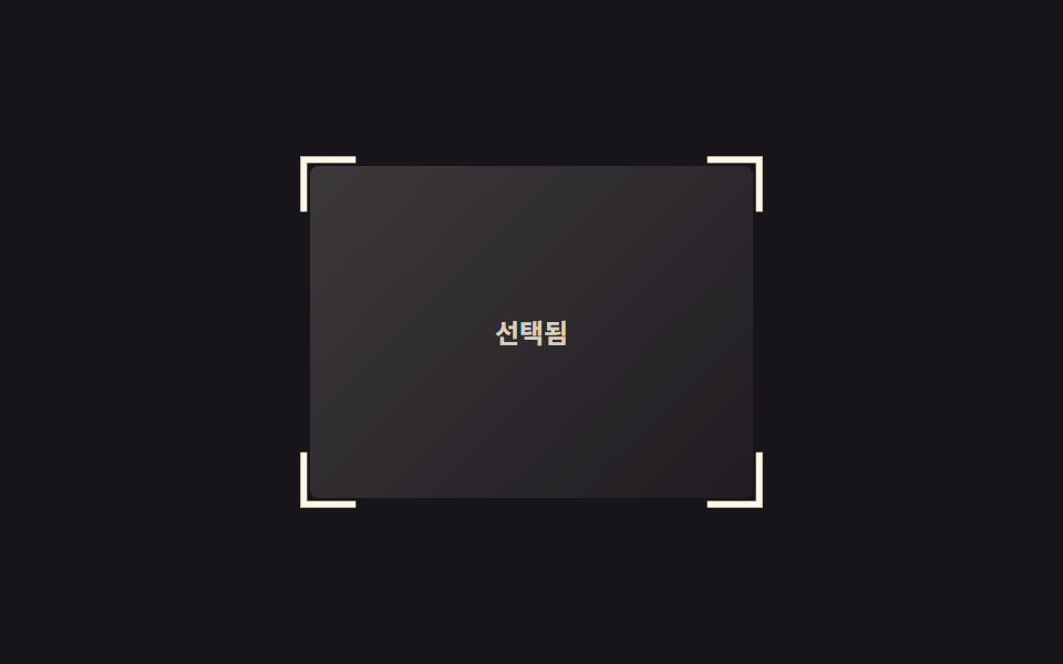
Bốn ngoặc chữ L đặt riêng ở bốn góc, khi hover trượt ra ngoài theo đường chéo, mở rộng như khung lấy nét của máy ảnh.
Dùng choKhung chọn trong thư viện ảnh, chỉ báo focus của card
transform: translate4개 요소0.3초
<main class="stage">
  <div class="frame is-demo" tabindex="0">
    <span class="frame__bracket frame__bracket--tl" aria-hidden="true"></span>
    <span class="frame__bracket frame__bracket--tr" aria-hidden="true"></span>
    <span class="frame__bracket frame__bracket--bl" aria-hidden="true"></span>
    <span class="frame__bracket frame__bracket--br" aria-hidden="true"></span>
    <span class="frame__label">Đã chọn</span>
  </div>
</main>
@use "../../../../site/static/demo-tokens" as *;
$duration: $dur-base; // 실제 호버 시 브래킷이 벌어지는 시간
$easing: $ease-pop;
$color: $subject-cream; // 브래킷 색
@include stage($stage-ink);
.stage { padding: clamp(6px, 2.4vw, 16px); }
.frame {
position: relative;
width: min(200px, 64vw);
aspect-ratio: 4 / 3;
border-radius: 4px;
background: linear-gradient(135deg, rgba($color, .16), rgba($color, .04));
display: grid;
place-items: center;
outline: none;
}
.frame__bracket {
position: absolute;
width: 22px;
height: 22px;
border: 3px solid $color;
transition: transform $duration $easing;
}
.frame__bracket--tl { top: -3px; left: -3px; border-right: 0; border-bottom: 0; }
.frame__bracket--tr { top: -3px; right: -3px; border-left: 0; border-bottom: 0; }
.frame__bracket--bl { bottom: -3px; left: -3px; border-right: 0; border-top: 0; }
.frame__bracket--br { bottom: -3px; right: -3px; border-left: 0; border-top: 0; }
.frame:hover .frame__bracket--tl, .frame:focus-visible .frame__bracket--tl { transform: translate(-6px, -6px); }
.frame:hover .frame__bracket--tr, .frame:focus-visible .frame__bracket--tr { transform: translate(6px, -6px); }
.frame:hover .frame__bracket--bl, .frame:focus-visible .frame__bracket--bl { transform: translate(-6px, 6px); }
.frame:hover .frame__bracket--br, .frame:focus-visible .frame__bracket--br { transform: translate(6px, 6px); }
// 데모 루프: 2초 안에서 벌어짐 → 유지 → 되돌아옴
.frame.is-demo .frame__bracket--tl { animation: open-tl $dur-loop $easing infinite; }
.frame.is-demo .frame__bracket--tr { animation: open-tr $dur-loop $easing infinite; }
.frame.is-demo .frame__bracket--bl { animation: open-bl $dur-loop $easing infinite; }
.frame.is-demo .frame__bracket--br { animation: open-br $dur-loop $easing infinite; }
@keyframes open-tl { 0%, 15% { transform: translate(0, 0); } 50%, 70% { transform: translate(-6px, -6px); } 100% { transform: translate(0, 0); } }
@keyframes open-tr { 0%, 15% { transform: translate(0, 0); } 50%, 70% { transform: translate(6px, -6px); } 100% { transform: translate(0, 0); } }
@keyframes open-bl { 0%, 15% { transform: translate(0, 0); } 50%, 70% { transform: translate(-6px, 6px); } 100% { transform: translate(0, 0); } }
@keyframes open-br { 0%, 15% { transform: translate(0, 0); } 50%, 70% { transform: translate(6px, 6px); } 100% { transform: translate(0, 0); } }
.frame__label { font-weight: 600; font-size: clamp(11px, 3vw, 12px); line-height: 1; font-family: inherit; color: rgba($color, .8); }
@media (prefers-reduced-motion: reduce) {
.frame.is-demo .frame__bracket { animation: none; }
}html, body {
margin: 0;
overflow: hidden;
}
.stage {
box-sizing: border-box;
min-height: 100vh;
display: grid;
place-items: center;
margin: 0;
background: #17141a;
font-family: -apple-system, "Segoe UI", "Noto Sans KR", sans-serif;
padding: clamp(8px, 4vw, 24px);
}
.stage {
padding: clamp(6px, 2.4vw, 16px);
}
.frame {
position: relative;
width: min(200px, 64vw);
aspect-ratio: 4/3;
border-radius: 4px;
background: linear-gradient(135deg, rgba(255, 247, 230, 0.16), rgba(255, 247, 230, 0.04));
display: grid;
place-items: center;
outline: none;
}
.frame__bracket {
position: absolute;
width: 22px;
height: 22px;
border: 3px solid #fff7e6;
transition: transform 300ms cubic-bezier(0.2, 1.4, 0.4, 1);
}
.frame__bracket--tl {
top: -3px;
left: -3px;
border-right: 0;
border-bottom: 0;
}
.frame__bracket--tr {
top: -3px;
right: -3px;
border-left: 0;
border-bottom: 0;
}
.frame__bracket--bl {
bottom: -3px;
left: -3px;
border-right: 0;
border-top: 0;
}
.frame__bracket--br {
bottom: -3px;
right: -3px;
border-left: 0;
border-top: 0;
}
.frame:hover .frame__bracket--tl, .frame:focus-visible .frame__bracket--tl {
transform: translate(-6px, -6px);
}
.frame:hover .frame__bracket--tr, .frame:focus-visible .frame__bracket--tr {
transform: translate(6px, -6px);
}
.frame:hover .frame__bracket--bl, .frame:focus-visible .frame__bracket--bl {
transform: translate(-6px, 6px);
}
.frame:hover .frame__bracket--br, .frame:focus-visible .frame__bracket--br {
transform: translate(6px, 6px);
}
.frame.is-demo .frame__bracket--tl {
animation: open-tl 2s cubic-bezier(0.2, 1.4, 0.4, 1) infinite;
}
.frame.is-demo .frame__bracket--tr {
animation: open-tr 2s cubic-bezier(0.2, 1.4, 0.4, 1) infinite;
}
.frame.is-demo .frame__bracket--bl {
animation: open-bl 2s cubic-bezier(0.2, 1.4, 0.4, 1) infinite;
}
.frame.is-demo .frame__bracket--br {
animation: open-br 2s cubic-bezier(0.2, 1.4, 0.4, 1) infinite;
}
@keyframes open-tl {
0%, 15% {
transform: translate(0, 0);
}
50%, 70% {
transform: translate(-6px, -6px);
}
100% {
transform: translate(0, 0);
}
}
@keyframes open-tr {
0%, 15% {
transform: translate(0, 0);
}
50%, 70% {
transform: translate(6px, -6px);
}
100% {
transform: translate(0, 0);
}
}
@keyframes open-bl {
0%, 15% {
transform: translate(0, 0);
}
50%, 70% {
transform: translate(-6px, 6px);
}
100% {
transform: translate(0, 0);
}
}
@keyframes open-br {
0%, 15% {
transform: translate(0, 0);
}
50%, 70% {
transform: translate(6px, 6px);
}
100% {
transform: translate(0, 0);
}
}
.frame__label {
font-weight: 600;
font-size: clamp(11px, 3vw, 12px);
line-height: 1;
font-family: inherit;
color: rgba(255, 247, 230, 0.8);
}
@media (prefers-reduced-motion: reduce) {
.frame.is-demo .frame__bracket {
animation: none;
}
}import type { CSSProperties } from "react";
import styles from "./CornerBracketsFrame.module.scss";
export type CornerBracketsFrameProps = {
label: string;
/** 브래킷이 벌어지는 시간 (기본 2000ms, 루프용) */
duration?: number;
easing?: string;
/** 브래킷 색 */
color?: string;
};
type Vars = CSSProperties & { "--duration"?: string; "--easing"?: string; "--color"?: string };
export default function CornerBracketsFrame({
label,
duration = 2000,
easing = "cubic-bezier(.2,1.4,.4,1)",
color = "#fff7e6",
}: CornerBracketsFrameProps) {
const vars: Vars = { "--duration": `${duration}ms`, "--easing": easing, "--color": color };
return (
<div className={styles.frame} style={vars} tabIndex={0}>
<span className={`${styles.bracket} ${styles.tl}`} aria-hidden="true" />
<span className={`${styles.bracket} ${styles.tr}`} aria-hidden="true" />
<span className={`${styles.bracket} ${styles.bl}`} aria-hidden="true" />
<span className={`${styles.bracket} ${styles.br}`} aria-hidden="true" />
<span className={styles.label}>{label}</span>
</div>
);
}05 Ngoặc góc — Diện tích đo được 1.503% · khung hình chuyển động 15/23Nguyên tác GODRICH · SCSS và React nằm trong tệp zip · 9 CSS Border Animations — dán 1 dòng là chạy
Bài viết chứa demo này
 9 CSS Border Animations — dán 1 dòng là chạyCSS border animation là hiệu ứng viền của card hay ô nhập di chuyển, phát sáng hoặc đổi màu bằng thuần CSS để báo một tr Xem tất cả demo trong bài này