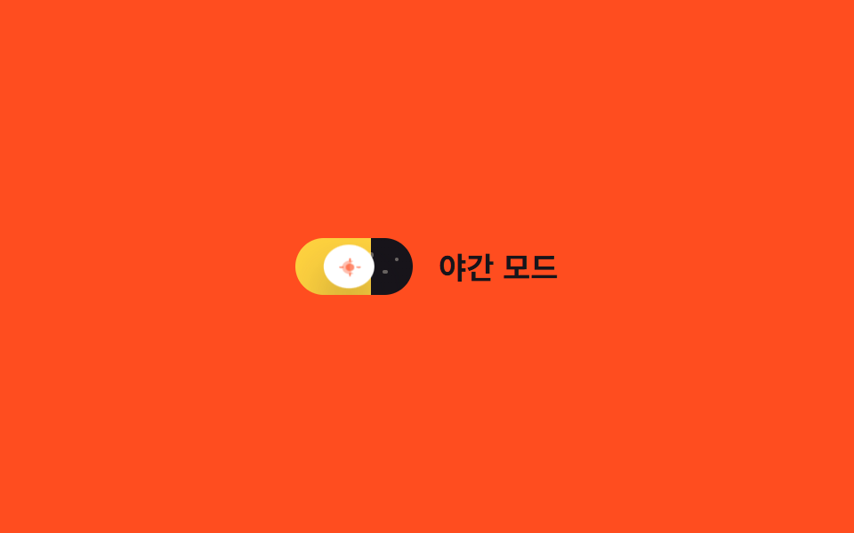
07Toggle icon mặt trời/mặt trăng
Chính track nơi núm di chuyển trở thành bầu trời, gradient nền chuyển từ màu ngày sang màu đêm trong khi vài chấm sao hiện dần qua opacity.
Dùng choSwitch đổi theme, cài đặt kiểu app thời tiết
background-position별 opacity0.5초
<main class="stage">
  <label class="switch is-demo">
    <input type="checkbox" class="switch__input" role="switch">
    <span class="switch__track">
      <span class="switch__star switch__star--1"></span>
      <span class="switch__star switch__star--2"></span>
      <span class="switch__star switch__star--3"></span>
      <span class="switch__knob">
        <svg class="switch__icon switch__icon--sun" viewBox="0 0 16 16" width="11" height="11" aria-hidden="true">
          <circle cx="8" cy="8" r="3.2" fill="currentColor"/>
          <g stroke="currentColor" stroke-width="1.4" stroke-linecap="round">
            <line x1="8" y1="0.5" x2="8" y2="2.4"/>
            <line x1="8" y1="13.6" x2="8" y2="15.5"/>
            <line x1="0.5" y1="8" x2="2.4" y2="8"/>
            <line x1="13.6" y1="8" x2="15.5" y2="8"/>
          </g>
        </svg>
        <svg class="switch__icon switch__icon--moon" viewBox="0 0 16 16" width="11" height="11" aria-hidden="true">
          <path d="M10.5 2.5a6 6 0 100 11 7 7 0 010-11z" fill="currentColor"/>
        </svg>
      </span>
    </span>
    <span class="switch__label">Chế độ ban đêm</span>
  </label>
</main>@use "../../../../site/static/demo-tokens" as *;
// ── 변수 3개 ──────────────────────────────
$duration: $dur-enter;
$easing: $ease-out;
$color: $stage-ink;
// ── 데모 무대 ───────────────────────────────
@include stage($stage-orange);
.switch {
position: relative;
display: inline-flex; align-items: center; gap: clamp(10px, 3vw, 14px);
cursor: pointer;
-webkit-tap-highlight-color: transparent;
}
.switch__input {
position: absolute; inset: 0; width: 100%; height: 100%;
margin: 0; opacity: 0; cursor: pointer;
}
.switch__track {
position: relative; overflow: hidden;
width: clamp(56px, 15vw, 66px); height: clamp(28px, 7.5vw, 32px);
border-radius: $r-pill;
background-image: linear-gradient(90deg, $stage-yellow 0%, $stage-yellow 50%, $color 50%, $color 100%);
background-size: 200% 100%;
background-position: 0% 0%;
transition: background-position $duration $easing;
}
.switch__star {
position: absolute; top: 30%; width: 2.5px; height: 2.5px; border-radius: 50%;
background: $subject-cream; opacity: 0;
transition: opacity $duration $easing;
}
.switch__star--1 { left: 62%; top: 26%; }
.switch__star--2 { left: 74%; top: 55%; }
.switch__star--3 { left: 84%; top: 34%; }
.switch__knob {
position: absolute; top: 3px; left: 3px; z-index: 1;
display: grid; place-items: center;
width: clamp(22px, 6vw, 26px); height: clamp(22px, 6vw, 26px);
border-radius: 50%;
background: $stage-paper;
box-shadow: $shadow-raised;
color: $stage-orange;
transform: translateX(0);
transition: transform $duration cubic-bezier(0.34, 1.56, 0.64, 1), color $duration $easing, box-shadow $duration $easing;
}
.switch__icon { grid-area: 1 / 1; transition: opacity $duration $easing; }
.switch__icon--sun { opacity: 1; }
.switch__icon--moon { opacity: 0; }
.switch__label { color: $subject-ink; font-weight: 600; font-size: clamp(14px, 4vw, 17px); line-height: 1; font-family: inherit; }
// ── 실제 동작: 트랙 자체가 하늘, 노브 안 아이콘이 크로스페이드 ──────
.switch__input:checked ~ .switch__track { background-position: 100% 0%; }
.switch__input:checked ~ .switch__track .switch__star { opacity: 1; }
.switch__input:checked ~ .switch__track .switch__knob {
transform: translateX(clamp(28px, 8vw, 34px));
color: $subject-ink;
box-shadow: 0 20px 32px rgba(23, 20, 26, .4);
}
.switch__input:checked ~ .switch__track .switch__icon--sun { opacity: 0; }
.switch__input:checked ~ .switch__track .switch__icon--moon { opacity: 1; }
.switch__input:focus-visible ~ .switch__track {
outline: 2px solid $subject-ink; outline-offset: 3px;
}
// ── 데모 루프 ─────────────────────────────
// 한 겹: 노브는 도착 지점을 지나쳤다 찌그러지며 안착하고(스프링+squash),
// 밤으로 갈 때 노브 그림자가 깊어진다(blur 증가·offset 하강 — 더 붙는 느낌).
.switch.is-demo .switch__track { animation: sky-loop $dur-loop $easing infinite; }
.switch.is-demo .switch__star--1,
.switch.is-demo .switch__star--2,
.switch.is-demo .switch__star--3 { animation: star-loop $dur-loop $easing infinite; }
.switch.is-demo .switch__knob { animation: knob-spring-loop $dur-loop $easing infinite, knob-shadow-loop $dur-loop $easing infinite; }
.switch.is-demo .switch__icon--sun { animation: sun-loop $dur-loop $easing infinite; }
.switch.is-demo .switch__icon--moon { animation: moon-loop $dur-loop $easing infinite; }
@keyframes sky-loop { 0%, 15% { background-position: 0% 0%; } 40%, 60% { background-position: 100% 0%; } 85%, 100% { background-position: 0% 0%; } }
@keyframes star-loop { 0%, 15% { opacity: 0; } 40%, 60% { opacity: 1; } 85%, 100% { opacity: 0; } }
@keyframes knob-loop {
0%, 15% { transform: translateX(0); }
40%, 60% { transform: translateX(34px); }
85%, 100% { transform: translateX(0); }
}
@keyframes knob-spring-loop {
0%, 15% { transform: translateX(0) scaleX(1) scaleY(1); }
38% { transform: translateX(37px) scaleX(1.25) scaleY(.85); } // 오버슈트 + 도착 순간 squash
43% { transform: translateX(33px) scaleX(1.08) scaleY(.94); } // 되튕기며 회복
47%, 60% { transform: translateX(34px) scaleX(1) scaleY(1); } // 안착
84% { transform: translateX(-2px) scaleX(.92) scaleY(1.06); } // 출발 반동
85%, 100% { transform: translateX(0) scaleX(1) scaleY(1); }
}
@keyframes knob-shadow-loop {
0%, 15% { box-shadow: $shadow-raised; }
40%, 60% { box-shadow: 0 20px 32px rgba(23, 20, 26, .4); }
85%, 100% { box-shadow: $shadow-raised; }
}
@keyframes sun-loop { 0%, 15% { opacity: 1; } 40%, 60% { opacity: 0; } 85%, 100% { opacity: 1; } }
@keyframes moon-loop { 0%, 15% { opacity: 0; } 40%, 60% { opacity: 1; } 85%, 100% { opacity: 0; } }
@media (prefers-reduced-motion: reduce) {
.switch.is-demo .switch__track, .switch.is-demo .switch__star--1, .switch.is-demo .switch__star--2,
.switch.is-demo .switch__star--3, .switch.is-demo .switch__knob, .switch.is-demo .switch__icon--sun,
.switch.is-demo .switch__icon--moon { animation: none !important; }
.switch__track, .switch__star, .switch__knob, .switch__icon { transition: none; }
}html, body {
margin: 0;
overflow: hidden;
}
.stage {
box-sizing: border-box;
min-height: 100vh;
display: grid;
place-items: center;
margin: 0;
background: #ff4d1f;
font-family: -apple-system, "Segoe UI", "Noto Sans KR", sans-serif;
padding: clamp(8px, 4vw, 24px);
}
.switch {
position: relative;
display: inline-flex;
align-items: center;
gap: clamp(10px, 3vw, 14px);
cursor: pointer;
-webkit-tap-highlight-color: transparent;
}
.switch__input {
position: absolute;
inset: 0;
width: 100%;
height: 100%;
margin: 0;
opacity: 0;
cursor: pointer;
}
.switch__track {
position: relative;
overflow: hidden;
width: clamp(56px, 15vw, 66px);
height: clamp(28px, 7.5vw, 32px);
border-radius: 999px;
background-image: linear-gradient(90deg, #ffd23f 0%, #ffd23f 50%, #17141a 50%, #17141a 100%);
background-size: 200% 100%;
background-position: 0% 0%;
transition: background-position 600ms ease-out;
}
.switch__star {
position: absolute;
top: 30%;
width: 2.5px;
height: 2.5px;
border-radius: 50%;
background: #fff7e6;
opacity: 0;
transition: opacity 600ms ease-out;
}
.switch__star--1 {
left: 62%;
top: 26%;
}
.switch__star--2 {
left: 74%;
top: 55%;
}
.switch__star--3 {
left: 84%;
top: 34%;
}
.switch__knob {
position: absolute;
top: 3px;
left: 3px;
z-index: 1;
display: grid;
place-items: center;
width: clamp(22px, 6vw, 26px);
height: clamp(22px, 6vw, 26px);
border-radius: 50%;
background: #ffffff;
box-shadow: 0 14px 24px rgba(23, 20, 26, 0.32);
color: #ff4d1f;
transform: translateX(0);
transition: transform 600ms cubic-bezier(0.34, 1.56, 0.64, 1), color 600ms ease-out, box-shadow 600ms ease-out;
}
.switch__icon {
grid-area: 1/1;
transition: opacity 600ms ease-out;
}
.switch__icon--sun {
opacity: 1;
}
.switch__icon--moon {
opacity: 0;
}
.switch__label {
color: #17141a;
font-weight: 600;
font-size: clamp(14px, 4vw, 17px);
line-height: 1;
font-family: inherit;
}
.switch__input:checked ~ .switch__track {
background-position: 100% 0%;
}
.switch__input:checked ~ .switch__track .switch__star {
opacity: 1;
}
.switch__input:checked ~ .switch__track .switch__knob {
transform: translateX(clamp(28px, 8vw, 34px));
color: #17141a;
box-shadow: 0 20px 32px rgba(23, 20, 26, 0.4);
}
.switch__input:checked ~ .switch__track .switch__icon--sun {
opacity: 0;
}
.switch__input:checked ~ .switch__track .switch__icon--moon {
opacity: 1;
}
.switch__input:focus-visible ~ .switch__track {
outline: 2px solid #17141a;
outline-offset: 3px;
}
.switch.is-demo .switch__track {
animation: sky-loop 2s ease-out infinite;
}
.switch.is-demo .switch__star--1,
.switch.is-demo .switch__star--2,
.switch.is-demo .switch__star--3 {
animation: star-loop 2s ease-out infinite;
}
.switch.is-demo .switch__knob {
animation: knob-spring-loop 2s ease-out infinite, knob-shadow-loop 2s ease-out infinite;
}
.switch.is-demo .switch__icon--sun {
animation: sun-loop 2s ease-out infinite;
}
.switch.is-demo .switch__icon--moon {
animation: moon-loop 2s ease-out infinite;
}
@keyframes sky-loop {
0%, 15% {
background-position: 0% 0%;
}
40%, 60% {
background-position: 100% 0%;
}
85%, 100% {
background-position: 0% 0%;
}
}
@keyframes star-loop {
0%, 15% {
opacity: 0;
}
40%, 60% {
opacity: 1;
}
85%, 100% {
opacity: 0;
}
}
@keyframes knob-loop {
0%, 15% {
transform: translateX(0);
}
40%, 60% {
transform: translateX(34px);
}
85%, 100% {
transform: translateX(0);
}
}
@keyframes knob-spring-loop {
0%, 15% {
transform: translateX(0) scaleX(1) scaleY(1);
}
38% {
transform: translateX(37px) scaleX(1.25) scaleY(0.85);
}
43% {
transform: translateX(33px) scaleX(1.08) scaleY(0.94);
}
47%, 60% {
transform: translateX(34px) scaleX(1) scaleY(1);
}
84% {
transform: translateX(-2px) scaleX(0.92) scaleY(1.06);
}
85%, 100% {
transform: translateX(0) scaleX(1) scaleY(1);
}
}
@keyframes knob-shadow-loop {
0%, 15% {
box-shadow: 0 14px 24px rgba(23, 20, 26, 0.32);
}
40%, 60% {
box-shadow: 0 20px 32px rgba(23, 20, 26, 0.4);
}
85%, 100% {
box-shadow: 0 14px 24px rgba(23, 20, 26, 0.32);
}
}
@keyframes sun-loop {
0%, 15% {
opacity: 1;
}
40%, 60% {
opacity: 0;
}
85%, 100% {
opacity: 1;
}
}
@keyframes moon-loop {
0%, 15% {
opacity: 0;
}
40%, 60% {
opacity: 1;
}
85%, 100% {
opacity: 0;
}
}
@media (prefers-reduced-motion: reduce) {
.switch.is-demo .switch__track, .switch.is-demo .switch__star--1, .switch.is-demo .switch__star--2,
.switch.is-demo .switch__star--3, .switch.is-demo .switch__knob, .switch.is-demo .switch__icon--sun,
.switch.is-demo .switch__icon--moon {
animation: none !important;
}
.switch__track, .switch__star, .switch__knob, .switch__icon {
transition: none;
}
}document.querySelectorAll(".switch").forEach(function (s) {
var input = s.querySelector(".switch__input");
var sync = function () { input.setAttribute("aria-checked", String(input.checked)); };
input.addEventListener("pointerdown", function () { s.classList.remove("is-demo"); });
input.addEventListener("change", sync);
sync();
});import { useState } from "react";
import type { ChangeEvent, CSSProperties } from "react";
import styles from "./DayNightToggle.module.scss";
export type DayNightToggleProps = {
label?: string;
duration?: number;
easing?: string;
/** 밤 트랙 색 */
color?: string;
defaultChecked?: boolean;
onChange?: (checked: boolean) => void;
};
type Vars = CSSProperties & { "--duration"?: string; "--easing"?: string; "--color"?: string };
export default function DayNightToggle({
label = "야간 모드",
duration = 600,
easing = "ease-out",
color = "#17141a",
defaultChecked = false,
onChange,
}: DayNightToggleProps) {
const [checked, setChecked] = useState(defaultChecked);
const vars: Vars = { "--duration": `${duration}ms`, "--easing": easing, "--color": color };
return (
<label className={styles.switch} style={vars}>
<input
type="checkbox"
role="switch"
aria-checked={checked}
className={styles.switch__input}
checked={checked}
onChange={(e: ChangeEvent<HTMLInputElement>) => { setChecked(e.target.checked); onChange?.(e.target.checked); }}
/>
<span className={styles.switch__track}>
<span className={`${styles.switch__star} ${styles["switch__star--1"]}`} />
<span className={`${styles.switch__star} ${styles["switch__star--2"]}`} />
<span className={`${styles.switch__star} ${styles["switch__star--3"]}`} />
<span className={styles.switch__knob}>
<svg className={styles["switch__icon--sun"]} viewBox="0 0 16 16" width="11" height="11" aria-hidden="true">
<circle cx="8" cy="8" r="3.2" fill="currentColor" />
<g stroke="currentColor" strokeWidth={1.4} strokeLinecap="round">
<line x1="8" y1="0.5" x2="8" y2="2.4" />
<line x1="8" y1="13.6" x2="8" y2="15.5" />
<line x1="0.5" y1="8" x2="2.4" y2="8" />
<line x1="13.6" y1="8" x2="15.5" y2="8" />
</g>
</svg>
<svg className={styles["switch__icon--moon"]} viewBox="0 0 16 16" width="11" height="11" aria-hidden="true">
<path d="M10.5 2.5a6 6 0 100 11 7 7 0 010-11z" fill="currentColor" />
</svg>
</span>
</span>
<span className={styles.switch__label}>{label}</span>
</label>
);
}07 Toggle icon mặt trời/mặt trăng — Diện tích đo được 1.343% · khung hình chuyển động 17/23Nguyên tác GODRICH · SCSS và React nằm trong tệp zip · 9 CSS Toggle Switches — dán 1 dòng là chạy
Bài viết chứa demo này
 9 CSS Toggle Switches — dán 1 dòng là chạyCSS toggle switch là control chỉ dùng một input checkbox để bật tắt thật, còn track và núm là lớp vỏ CSS phủ lên trên. C Xem tất cả demo trong bài này