09Chấm pulse gợi ý thông tin
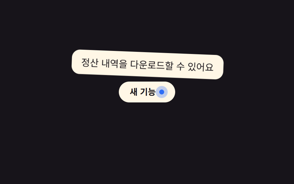
Một quầng sáng mờ phía sau chấm nhỏ phóng to rồi mờ dần liên tục, báo hiệu có thông tin đáng xem trước khi bạn kịp hover vào.
Dùng chohuy hiệu tính năng mới, icon trợ giúp ở góc màn hình cài đặt
@keyframes pulse-ring2초 주기opacity 감쇠
<main class="stage">
  <div class="tip-wrap">
    <span class="badge" aria-describedby="tip09">Tính năng mới<i class="dot" aria-hidden="true"></i></span>
    <span class="tooltip is-demo" role="tooltip" id="tip09">Bạn có thể tải xuống lịch sử thanh toán</span>
  </div>
</main>
@use "../../../../site/static/demo-tokens" as *;
$duration: $dur-loop; // 점 펄스·툴팁 공통 주기
$easing: $ease-out;
$color: $subject-blue; // 점 색
@include stage($stage-ink);
.tip-wrap { position: relative; display: inline-block; }
.badge {
display: inline-flex;
align-items: center;
gap: 6px;
padding: 10px 18px;
border-radius: $r-pill;
background: $subject-cream;
color: $stage-ink;
font-weight: 600;
font-size: 14px;
line-height: 1;
font-family: inherit;
}
.dot {
position: relative;
width: 8px;
height: 8px;
border-radius: 50%;
background: $color;
&::before { // 은은하게 커졌다 작아지는 펄스 링
content: "";
position: absolute;
inset: -6px;
border-radius: 50%;
background: $color;
opacity: .5;
animation: pulse-ring $duration $easing infinite;
}
}
.tooltip {
position: absolute;
bottom: calc(100% + 8px);
left: 50%;
transform-origin: bottom center; // 규칙8: 버튼 쪽 아래변 축 — 흔들림의 회전 중심
transform: translate(-50%, 4px);
opacity: 0;
background: $subject-cream;
color: $stage-ink;
padding: 8px 14px;
border-radius: $r-control;
font-size: clamp(12px, 3.4vw, 14px);
max-width: clamp(150px, 44vw, 220px);
white-space: nowrap; // 한글은 글자마다 줄바꿈 후보라, 없으면 세로로 한 글자씩 쪼개진다
pointer-events: none;
}
.tooltip.is-demo {
animation: tip-loop $duration $easing infinite;
}
@keyframes pulse-ring {
0%, 100% { transform: scale(.6); opacity: .5; }
50% { transform: scale(1.6); opacity: 0; }
}
// 툴팁 등장에 스프링 한 겹 — 스케일 .85 → 1.12 오버슛 → 감쇠 반동, 회전은 아래변 축으로 2.6° → -1.5° → .6° 감쇠
@keyframes tip-loop {
0% { opacity: 0; transform: translate(-50%, 4px) scale(.85) rotate(0deg); }
12% { opacity: 1; transform: translate(-50%, 0) scale(1.12) rotate(2.6deg); }
22% { opacity: 1; transform: translate(-50%, 0) scale(.95) rotate(-1.5deg); }
30% { opacity: 1; transform: translate(-50%, 0) scale(1.03) rotate(.6deg); }
36%, 55% { opacity: 1; transform: translate(-50%, 0) scale(1) rotate(0deg); }
80% { opacity: 0; transform: translate(-50%, 4px) scale(.85) rotate(0deg); }
100% { opacity: 0; transform: translate(-50%, 4px) scale(.85) rotate(0deg); }
}
@media (prefers-reduced-motion: reduce) {
.dot::before { animation: none; opacity: .3; }
.tooltip.is-demo { animation: none; opacity: 1; transform: translate(-50%, 0) scale(1) rotate(0deg); }
}html, body {
margin: 0;
overflow: hidden;
}
.stage {
box-sizing: border-box;
min-height: 100vh;
display: grid;
place-items: center;
margin: 0;
background: #17141a;
font-family: -apple-system, "Segoe UI", "Noto Sans KR", sans-serif;
padding: clamp(8px, 4vw, 24px);
}
.tip-wrap {
position: relative;
display: inline-block;
}
.badge {
display: inline-flex;
align-items: center;
gap: 6px;
padding: 10px 18px;
border-radius: 999px;
background: #fff7e6;
color: #17141a;
font-weight: 600;
font-size: 14px;
line-height: 1;
font-family: inherit;
}
.dot {
position: relative;
width: 8px;
height: 8px;
border-radius: 50%;
background: #2f6df6;
}
.dot::before {
content: "";
position: absolute;
inset: -6px;
border-radius: 50%;
background: #2f6df6;
opacity: 0.5;
animation: pulse-ring 2s ease-out infinite;
}
.tooltip {
position: absolute;
bottom: calc(100% + 8px);
left: 50%;
transform-origin: bottom center;
transform: translate(-50%, 4px);
opacity: 0;
background: #fff7e6;
color: #17141a;
padding: 8px 14px;
border-radius: 12px;
font-size: clamp(12px, 3.4vw, 14px);
max-width: clamp(150px, 44vw, 220px);
white-space: nowrap;
pointer-events: none;
}
.tooltip.is-demo {
animation: tip-loop 2s ease-out infinite;
}
@keyframes pulse-ring {
0%, 100% {
transform: scale(0.6);
opacity: 0.5;
}
50% {
transform: scale(1.6);
opacity: 0;
}
}
@keyframes tip-loop {
0% {
opacity: 0;
transform: translate(-50%, 4px) scale(0.85) rotate(0deg);
}
12% {
opacity: 1;
transform: translate(-50%, 0) scale(1.12) rotate(2.6deg);
}
22% {
opacity: 1;
transform: translate(-50%, 0) scale(0.95) rotate(-1.5deg);
}
30% {
opacity: 1;
transform: translate(-50%, 0) scale(1.03) rotate(0.6deg);
}
36%, 55% {
opacity: 1;
transform: translate(-50%, 0) scale(1) rotate(0deg);
}
80% {
opacity: 0;
transform: translate(-50%, 4px) scale(0.85) rotate(0deg);
}
100% {
opacity: 0;
transform: translate(-50%, 4px) scale(0.85) rotate(0deg);
}
}
@media (prefers-reduced-motion: reduce) {
.dot::before {
animation: none;
opacity: 0.3;
}
.tooltip.is-demo {
animation: none;
opacity: 1;
transform: translate(-50%, 0) scale(1) rotate(0deg);
}
}import { useState } from "react";
import type { CSSProperties, ReactNode } from "react";
import styles from "./PulseDotTooltip.module.scss";
export type PulseDotTooltipProps = {
label: ReactNode;
text: string;
duration?: number;
easing?: string;
color?: string;
};
type Vars = CSSProperties & { "--duration"?: string; "--easing"?: string; "--color"?: string };
export default function PulseDotTooltip({
label,
text,
duration = 200,
easing = "ease-out",
color = "#2f6df6",
}: PulseDotTooltipProps) {
const [open, setOpen] = useState(false);
const vars: Vars = { "--duration": `${duration}ms`, "--easing": easing, "--color": color };
return (
<span className={styles.wrap} style={vars}>
<span
className={styles.badge}
tabIndex={0}
aria-describedby="pulse-tooltip"
onMouseEnter={() => setOpen(true)}
onMouseLeave={() => setOpen(false)}
onFocus={() => setOpen(true)}
onBlur={() => setOpen(false)}
>
{label}
<i className={styles.dot} aria-hidden="true" />
</span>
<span id="pulse-tooltip" role="tooltip" className={styles.tooltip} data-open={open}>
{text}
</span>
</span>
);
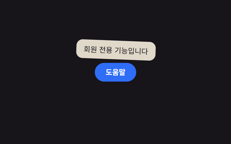
}09 Chấm pulse gợi ý thông tin — Diện tích đo được 7.869% · khung hình chuyển động 20/23Nguyên tác GODRICH · SCSS và React nằm trong tệp zip · 9 CSS tooltip examples — copy dán một dòng là chạy
Bài viết chứa demo này
 9 CSS tooltip examples — copy dán một dòng là chạyCSS tooltip examples ở đây là chín kiểu bong bóng chú thích hiện lên khi bạn hover hoặc focus vào một phần tử, hầu hết c Xem tất cả demo trong bài này