04Thanh đo độ mạnh mật khẩu
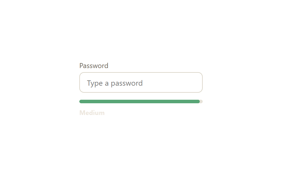
Thanh đo đổi màu từ đỏ sang cam rồi xanh lá khi bạn gõ, dựa trên độ dài và kiểu ký tự, còn nhãn bên cạnh báo yếu/trung bình/mạnh theo thời gian thực.
Dùng choÔ nhập mật khẩu khi đăng ký, màn hình đổi mật khẩu
input 이벤트커스텀 프로퍼티 --strengtharia-live
<main class="stage">
  <div class="pw-card is-demo">
    <label class="pw-card__label" for="pw">Password</label>
    <input class="pw-input" id="pw" type="password" placeholder="Type a password">
    <div class="pw-meter">
      <span class="pw-meter__fill"></span>
    </div>
    <p class="pw-status" aria-live="polite">
      <span class="pw-status__text pw-status__text--weak">Weak</span>
      <span class="pw-status__text pw-status__text--medium">Medium</span>
      <span class="pw-status__text pw-status__text--strong">Strong</span>
    </p>
  </div>
</main>
@use "../../../../site/static/demo-tokens" as *;
$duration: $dur-base; // 막대 너비·색이 바뀌는 시간
$easing: $ease-out;
$color: $error; // 약함 색 기준값
@include stage($stage-paper);
.pw-card {
width: min(210px, 80vw);
display: flex;
flex-direction: column;
gap: $sp-1;
}
.pw-card__label { font-size: 12px; color: #6b6455; font-family: inherit; }
.pw-input {
box-sizing: border-box;
width: 100%;
padding: $sp-2 $sp-3;
border: 1.5px solid #d8d2c4;
border-radius: $r-sm;
font-size: 13px;
font-family: inherit;
color: $stage-ink;
margin-bottom: $sp-2;
&:focus { outline: none; border-color: $subject-blue; }
}
.pw-meter {
height: 6px;
border-radius: $r-xs;
background: #e6e2d8;
overflow: hidden;
}
.pw-meter__fill {
display: block;
height: 100%;
width: 0%;
background: $color;
border-radius: $r-xs;
transition: width $duration $easing, background-color $duration $easing;
}
.pw-status {
position: relative;
height: 14px;
margin: $sp-1 0 0;
}
.pw-status__text {
position: absolute;
left: 0; top: 0;
font-size: 11px;
font-weight: 700;
font-family: inherit;
opacity: 0;
transition: opacity $duration $easing;
}
.pw-status__text--weak { color: $error; }
.pw-status__text--medium { color: #9c7c4d; }
.pw-status__text--strong { color: #51a474; }
.pw-card.is-demo .pw-meter__fill { animation: fill-cycle $dur-loop $easing infinite; }
.pw-card.is-demo .pw-status__text--weak { animation: show-weak $dur-loop $easing infinite; }
.pw-card.is-demo .pw-status__text--medium { animation: show-medium $dur-loop $easing infinite; }
.pw-card.is-demo .pw-status__text--strong { animation: show-strong $dur-loop $easing infinite; }
@keyframes fill-cycle {
0%, 5% { width: 0%; background: $color; }
30% { width: 35%; background: $color; }
55% { width: 65%; background: #c8af8f; }
80%, 100% { width: 100%; background: #51a474; }
}
@keyframes show-weak { 0%, 5% { opacity: 0; } 12%, 45% { opacity: 1; } 55%, 100% { opacity: 0; } }
@keyframes show-medium { 0%, 50% { opacity: 0; } 58%, 70% { opacity: 1; } 78%, 100% { opacity: 0; } }
@keyframes show-strong { 0%, 75% { opacity: 0; } 83%, 100% { opacity: 1; } }
@media (prefers-reduced-motion: reduce) {
.pw-meter__fill, .pw-status__text { transition: none; }
.pw-card.is-demo .pw-meter__fill,
.pw-card.is-demo .pw-status__text--weak,
.pw-card.is-demo .pw-status__text--medium,
.pw-card.is-demo .pw-status__text--strong { animation: none; }
}html, body {
margin: 0;
overflow: hidden;
}
.stage {
box-sizing: border-box;
min-height: 100vh;
display: grid;
place-items: center;
margin: 0;
background: #ffffff;
font-family: -apple-system, "Segoe UI", "Noto Sans KR", sans-serif;
padding: clamp(8px, 4vw, 24px);
}
.pw-card {
width: min(210px, 80vw);
display: flex;
flex-direction: column;
gap: 4px;
}
.pw-card__label {
font-size: 12px;
color: #6b6455;
font-family: inherit;
}
.pw-input {
box-sizing: border-box;
width: 100%;
padding: 8px 12px;
border: 1.5px solid #d8d2c4;
border-radius: 8px;
font-size: 13px;
font-family: inherit;
color: #17141a;
margin-bottom: 8px;
}
.pw-input:focus {
outline: none;
border-color: #2f6df6;
}
.pw-meter {
height: 6px;
border-radius: 4px;
background: #e6e2d8;
overflow: hidden;
}
.pw-meter__fill {
display: block;
height: 100%;
width: 0%;
background: #c2361a;
border-radius: 4px;
transition: width 300ms ease-out, background-color 300ms ease-out;
}
.pw-status {
position: relative;
height: 14px;
margin: 4px 0 0;
}
.pw-status__text {
position: absolute;
left: 0;
top: 0;
font-size: 11px;
font-weight: 700;
font-family: inherit;
opacity: 0;
transition: opacity 300ms ease-out;
}
.pw-status__text--weak {
color: #c2361a;
}
.pw-status__text--medium {
color: #9c7c4d;
}
.pw-status__text--strong {
color: #51a474;
}
.pw-card.is-demo .pw-meter__fill {
animation: fill-cycle 2s ease-out infinite;
}
.pw-card.is-demo .pw-status__text--weak {
animation: show-weak 2s ease-out infinite;
}
.pw-card.is-demo .pw-status__text--medium {
animation: show-medium 2s ease-out infinite;
}
.pw-card.is-demo .pw-status__text--strong {
animation: show-strong 2s ease-out infinite;
}
@keyframes fill-cycle {
0%, 5% {
width: 0%;
background: #c2361a;
}
30% {
width: 35%;
background: #c2361a;
}
55% {
width: 65%;
background: #c8af8f;
}
80%, 100% {
width: 100%;
background: #51a474;
}
}
@keyframes show-weak {
0%, 5% {
opacity: 0;
}
12%, 45% {
opacity: 1;
}
55%, 100% {
opacity: 0;
}
}
@keyframes show-medium {
0%, 50% {
opacity: 0;
}
58%, 70% {
opacity: 1;
}
78%, 100% {
opacity: 0;
}
}
@keyframes show-strong {
0%, 75% {
opacity: 0;
}
83%, 100% {
opacity: 1;
}
}
@media (prefers-reduced-motion: reduce) {
.pw-meter__fill, .pw-status__text {
transition: none;
}
.pw-card.is-demo .pw-meter__fill,
.pw-card.is-demo .pw-status__text--weak,
.pw-card.is-demo .pw-status__text--medium,
.pw-card.is-demo .pw-status__text--strong {
animation: none;
}
}var inp=document.getElementById('pw'),
fill=document.querySelector('.pw-meter__fill'),
card=document.querySelector('.pw-card');
inp.addEventListener('input',function(){
card.classList.remove('is-demo');
var v=inp.value, s=0;
if(v.length>=6)s++;
if(/[a-z]/.test(v)&&/[A-Z]/.test(v))s++;
if(/[0-9]/.test(v))s++;
if(/[^A-Za-z0-9]/.test(v))s++;
var pct=v.length?[15,40,70,100,100][s]:0;
var col=['#b27062','#b27062','#c8af8f','#51a474','#51a474'][s];
fill.style.width=pct+'%'; fill.style.background=col;
});import { useMemo, useState, type ChangeEvent, type CSSProperties } from "react";
import styles from "./PasswordStrengthMeter.module.scss";
export type PasswordStrengthMeterProps = {
/** 막대 너비·색이 바뀌는 시간 (기본 300ms) */
duration?: number;
easing?: string;
};
const LEVELS = ["", "Weak", "Weak", "Medium", "Strong", "Strong"];
const COLORS = ["#e6e2d8", "#c2361a", "#c2361a", "#ff9d1f", "#1f9d55", "#1f9d55"];
const WIDTHS = [0, 15, 15, 40, 70, 100];
function score(v: string) {
let s = 0;
if (v.length >= 6) s++;
if (/[a-z]/.test(v) && /[A-Z]/.test(v)) s++;
if (/[0-9]/.test(v)) s++;
if (/[^A-Za-z0-9]/.test(v)) s++;
return v.length ? s + 1 : 0;
}
/** input 이벤트마다 길이·문자 조합을 다시 계산해 막대 너비·색·라벨을 갱신한다 */
export default function PasswordStrengthMeter({ duration = 300, easing = "ease-out" }: PasswordStrengthMeterProps) {
const [value, setValue] = useState("");
const s = useMemo(() => score(value), [value]);
const style = { "--duration": `${duration}ms`, "--easing": easing } as CSSProperties;
const onChange = (e: ChangeEvent<HTMLInputElement>) => setValue(e.target.value);
return (
<div className={styles.card} style={style}>
<label className={styles.label} htmlFor="pw-react">Password</label>
<input className={styles.input} id="pw-react" type="password" value={value} onChange={onChange} placeholder="Type a password" />
<div className={styles.meter}>
<span className={styles.fill} style={{ width: `${WIDTHS[s]}%`, background: COLORS[s] }} />
</div>
<p className={styles.status} aria-live="polite" style={{ color: COLORS[s] }}>{LEVELS[s]}</p>
</div>
);
}04 Thanh đo độ mạnh mật khẩu — Diện tích đo được 1.076% · khung hình chuyển động 19/23Nguyên tác GODRICH · SCSS và React nằm trong tệp zip · 9 mẫu form đăng ký & đăng nhập copy-paste được
Bài viết chứa demo này
 9 mẫu form đăng ký & đăng nhập copy-paste đượcMột mẫu form đăng ký tưởng chỉ có ô email, mật khẩu — nhưng là chín quyết định nhỏ: chất liệu thẻ, layout, tiến trình từ Xem tất cả demo trong bài này