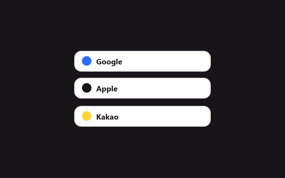
05Hàng nút đăng nhập mạng xã hội
Các nút đăng nhập kiểu Google, Apple, Kakao xếp thành một hàng và hơi nhô lên, đổ bóng đậm hơn ngay khi con trỏ chạm vào.
Dùng choMàn hình ưu tiên đăng nhập mạng xã hội đặt trước form email, dịch vụ muốn xếp nhiều cách đăng nhập cạnh nhau
transform: translateY 호버stagger animation-delayfocus-visible 링
<main class="stage">
  <div class="social-row is-demo">
    <button class="social-btn social-btn--a" type="button" aria-label="Continue with Google">
      <span class="social-btn__dot"></span>Google
    </button>
    <button class="social-btn social-btn--b" type="button" aria-label="Continue with Apple">
      <span class="social-btn__dot"></span>Apple
    </button>
    <button class="social-btn social-btn--c" type="button" aria-label="Continue with Kakao">
      <span class="social-btn__dot"></span>Kakao
    </button>
  </div>
</main>
@use "../../../../site/static/demo-tokens" as *;
$duration: $dur-instant; // 버튼 lift 전환 시간
$easing: $ease-out;
$color: $subject-blue; // Google 점 색
@include stage($stage-ink);
.social-row {
width: min(230px, 86vw);
display: flex;
flex-direction: column;
gap: $sp-3;
}
.social-btn {
display: flex;
align-items: center;
gap: $sp-2;
padding: $sp-2 $sp-3;
border: 1.5px solid #e6e2d8;
border-radius: $r-control;
background: $stage-paper;
color: $stage-ink;
font-size: 13px;
font-weight: 700;
font-family: inherit;
cursor: pointer;
box-shadow: 0 1px 0 rgba(23, 20, 26, .04);
transition: transform $duration $easing, box-shadow $duration $easing;
&:hover, &:focus-visible { transform: translateY(-3px); box-shadow: $shadow-press; }
&:focus-visible { outline: 2px solid $color; outline-offset: 2px; }
&:active { transform: translateY(-1px); }
}
.social-btn__dot { width: 16px; height: 16px; border-radius: 50%; flex: 0 0 auto; }
.social-btn--a .social-btn__dot { background: $color; }
.social-btn--b .social-btn__dot { background: $stage-ink; }
.social-btn--c .social-btn__dot { background: $stage-yellow; }
.social-row.is-demo .social-btn--a { animation: lift $dur-loop $easing infinite; }
.social-row.is-demo .social-btn--b { animation: lift $dur-loop $easing infinite; animation-delay: calc(#{$dur-loop} / 3); }
.social-row.is-demo .social-btn--c { animation: lift $dur-loop $easing infinite; animation-delay: calc(#{$dur-loop} / 3 * 2); }
@keyframes lift {
0%, 88%, 100% { transform: translateY(0); box-shadow: 0 1px 0 rgba(23, 20, 26, .04); }
12%, 22% { transform: translateY(-3px); box-shadow: $shadow-press; }
}
@media (prefers-reduced-motion: reduce) {
.social-btn { transition: none; }
.social-row.is-demo .social-btn--a,
.social-row.is-demo .social-btn--b,
.social-row.is-demo .social-btn--c { animation: none; }
}html, body {
margin: 0;
overflow: hidden;
}
.stage {
box-sizing: border-box;
min-height: 100vh;
display: grid;
place-items: center;
margin: 0;
background: #17141a;
font-family: -apple-system, "Segoe UI", "Noto Sans KR", sans-serif;
padding: clamp(8px, 4vw, 24px);
}
.social-row {
width: min(230px, 86vw);
display: flex;
flex-direction: column;
gap: 12px;
}
.social-btn {
display: flex;
align-items: center;
gap: 8px;
padding: 8px 12px;
border: 1.5px solid #e6e2d8;
border-radius: 12px;
background: #ffffff;
color: #17141a;
font-size: 13px;
font-weight: 700;
font-family: inherit;
cursor: pointer;
box-shadow: 0 1px 0 rgba(23, 20, 26, 0.04);
transition: transform 140ms ease-out, box-shadow 140ms ease-out;
}
.social-btn:hover, .social-btn:focus-visible {
transform: translateY(-3px);
box-shadow: 0 6px 12px rgba(23, 20, 26, 0.32);
}
.social-btn:focus-visible {
outline: 2px solid #2f6df6;
outline-offset: 2px;
}
.social-btn:active {
transform: translateY(-1px);
}
.social-btn__dot {
width: 16px;
height: 16px;
border-radius: 50%;
flex: 0 0 auto;
}
.social-btn--a .social-btn__dot {
background: #2f6df6;
}
.social-btn--b .social-btn__dot {
background: #17141a;
}
.social-btn--c .social-btn__dot {
background: #ffd23f;
}
.social-row.is-demo .social-btn--a {
animation: lift 2s ease-out infinite;
}
.social-row.is-demo .social-btn--b {
animation: lift 2s ease-out infinite;
animation-delay: calc(2s / 3);
}
.social-row.is-demo .social-btn--c {
animation: lift 2s ease-out infinite;
animation-delay: calc(2s / 3 * 2);
}
@keyframes lift {
0%, 88%, 100% {
transform: translateY(0);
box-shadow: 0 1px 0 rgba(23, 20, 26, 0.04);
}
12%, 22% {
transform: translateY(-3px);
box-shadow: 0 6px 12px rgba(23, 20, 26, 0.32);
}
}
@media (prefers-reduced-motion: reduce) {
.social-btn {
transition: none;
}
.social-row.is-demo .social-btn--a,
.social-row.is-demo .social-btn--b,
.social-row.is-demo .social-btn--c {
animation: none;
}
}import type { CSSProperties } from "react";
import styles from "./SocialLoginRow.module.scss";
export type SocialLoginRowProps = {
/** 호버 lift 전환 시간 (기본 140ms) */
duration?: number;
easing?: string;
color?: string;
onSelect?: (provider: "google" | "apple" | "kakao") => void;
};
/** 클릭한 provider 를 그대로 콜백으로 넘긴다 — 실제 OAuth 시작은 호출부 몫 */
export default function SocialLoginRow({
duration = 140,
easing = "ease-out",
color = "#2f6df6",
onSelect,
}: SocialLoginRowProps) {
const style = { "--duration": `${duration}ms`, "--easing": easing, "--color": color } as CSSProperties;
return (
<div className={styles.row} style={style}>
{(["google", "apple", "kakao"] as const).map((p) => (
<button key={p} type="button" className={styles.btn} onClick={() => onSelect?.(p)}>
<span className={`${styles.dot} ${styles[p]}`} />
{p[0].toUpperCase() + p.slice(1)}
</button>
))}
</div>
);
}05 Hàng nút đăng nhập mạng xã hội — Diện tích đo được 4.935% · khung hình chuyển động 21/23Nguyên tác GODRICH · SCSS và React nằm trong tệp zip · 9 mẫu form đăng ký & đăng nhập copy-paste được
Bài viết chứa demo này
 9 mẫu form đăng ký & đăng nhập copy-paste đượcMột mẫu form đăng ký tưởng chỉ có ô email, mật khẩu — nhưng là chín quyết định nhỏ: chất liệu thẻ, layout, tiến trình từ Xem tất cả demo trong bài này