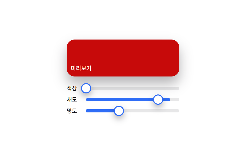
02Material slider — a color picker that composes a preview color from three handle positions
The position ratio of each of the hue, saturation, and lightness handles is recomputed into three separate values, and those three combine to recalculate the preview swatch's color every time.
Best forDesign tool color panels, theme customizers
valuesAtsetThumbaria-valuenow
<main class="stage">
<section class="panel">
  <div class="preview" id="preview">
    <span class="previewLabel">Preview</span>
  </div>
  <div class="sliders">
    <div class="row">
      <span class="rowLabel">Hue</span>
      <div class="track">
        <div class="fill fillHue" id="fillH"></div>
        <div class="thumb" id="thumbH" role="slider" aria-label="Hue" aria-valuemin="0" aria-valuemax="360" aria-valuenow="0"></div>
      </div>
    </div>
    <div class="row">
      <span class="rowLabel">Saturation</span>
      <div class="track">
        <div class="fill fillSat" id="fillS"></div>
        <div class="thumb" id="thumbS" role="slider" aria-label="Saturation" aria-valuemin="0" aria-valuemax="100" aria-valuenow="0"></div>
      </div>
    </div>
    <div class="row">
      <span class="rowLabel">Lightness</span>
      <div class="track">
        <div class="fill fillLight" id="fillL"></div>
        <div class="thumb" id="thumbL" role="slider" aria-label="Lightness" aria-valuemin="0" aria-valuemax="100" aria-valuenow="0"></div>
      </div>
    </div>
  </div>
</section>
</main>@use "../../../../site/static/demo-tokens" as *;
@include stage($stage-paper);
.panel {
display: flex;
flex-direction: column;
align-items: stretch;
gap: $sp-4;
width: 100%;
max-width: 220px;
}
.preview {
height: 56px;
border-radius: $r-card;
display: flex;
align-items: flex-end;
padding: $sp-2;
box-shadow: $shadow-raised;
color: $subject-cream;
&.is-ink {
color: $subject-ink;
}
}
.previewLabel {
font-family: -apple-system, "Segoe UI", "Noto Sans KR", sans-serif;
font-weight: 500;
font-size: 11px;
line-height: 1.3;
}
.sliders {
display: flex;
flex-direction: column;
gap: $sp-2;
}
.row {
display: flex;
align-items: center;
gap: $sp-2;
}
.rowLabel {
flex: 0 0 auto;
width: 30px;
color: $subject-ink;
font-family: -apple-system, "Segoe UI", "Noto Sans KR", sans-serif;
font-weight: 500;
font-size: 11px;
line-height: 1.3;
}
.track {
position: relative;
flex: 1 1 auto;
height: 6px;
border-radius: $r-pill;
background: rgba($subject-ink, .1);
}
.fill {
position: absolute;
inset: 0;
border-radius: $r-pill;
transform-origin: left center;
transform: scaleX(0);
}
.fillHue { background: $subject-blue; }
.fillSat { background: $subject-blue; }
.fillLight { background: $subject-blue; }
.thumb {
position: absolute;
top: 50%;
left: 0;
width: 16px;
height: 16px;
border-radius: $r-pill;
background: $stage-paper;
border: 2px solid $subject-blue;
box-shadow: $shadow-press;
}
@media (max-width: 340px) {
.panel { max-width: 168px; }
.preview { height: 44px; }
.rowLabel { width: 24px; font-size: 10px; }
}
@media (prefers-reduced-motion: reduce) {
.thumb { transition: none; }
}html, body {
margin: 0;
overflow: hidden;
}
.stage {
box-sizing: border-box;
min-height: 100vh;
display: grid;
place-items: center;
margin: 0;
background: #ffffff;
font-family: -apple-system, "Segoe UI", "Noto Sans KR", sans-serif;
padding: clamp(8px, 4vw, 24px);
}
.panel {
display: flex;
flex-direction: column;
align-items: stretch;
gap: 16px;
width: 100%;
max-width: 220px;
}
.preview {
height: 56px;
border-radius: 16px;
display: flex;
align-items: flex-end;
padding: 8px;
box-shadow: 0 14px 24px rgba(23, 20, 26, 0.32);
color: #fff7e6;
}
.preview.is-ink {
color: #17141a;
}
.previewLabel {
font-family: -apple-system, "Segoe UI", "Noto Sans KR", sans-serif;
font-weight: 500;
font-size: 11px;
line-height: 1.3;
}
.sliders {
display: flex;
flex-direction: column;
gap: 8px;
}
.row {
display: flex;
align-items: center;
gap: 8px;
}
.rowLabel {
flex: 0 0 auto;
width: 30px;
color: #17141a;
font-family: -apple-system, "Segoe UI", "Noto Sans KR", sans-serif;
font-weight: 500;
font-size: 11px;
line-height: 1.3;
}
.track {
position: relative;
flex: 1 1 auto;
height: 6px;
border-radius: 999px;
background: rgba(23, 20, 26, 0.1);
}
.fill {
position: absolute;
inset: 0;
border-radius: 999px;
transform-origin: left center;
transform: scaleX(0);
}
.fillHue {
background: #2f6df6;
}
.fillSat {
background: #2f6df6;
}
.fillLight {
background: #2f6df6;
}
.thumb {
position: absolute;
top: 50%;
left: 0;
width: 16px;
height: 16px;
border-radius: 999px;
background: #ffffff;
border: 2px solid #2f6df6;
box-shadow: 0 6px 12px rgba(23, 20, 26, 0.32);
}
@media (max-width: 340px) {
.panel {
max-width: 168px;
}
.preview {
height: 44px;
}
.rowLabel {
width: 24px;
font-size: 10px;
}
}
@media (prefers-reduced-motion: reduce) {
.thumb {
transition: none;
}
}// Material 슬라이더(02) — Hue·Saturation·Lightness 세 손잡이의 트랙 위치 비율을 각각 다시 구하고,
// 세 값을 합쳐 Preview 색을 매 프레임 다시 계산한다. 실키·실서버 요청 없음.
(function () {
var previewEl = document.getElementById('preview');
var thumbH = document.getElementById('thumbH');
var thumbS = document.getElementById('thumbS');
var thumbL = document.getElementById('thumbL');
var fillH = document.getElementById('fillH');
var fillS = document.getElementById('fillS');
var fillL = document.getElementById('fillL');
if (!previewEl || !thumbH || !thumbS || !thumbL || !fillH || !fillS || !fillL) return;
var reduce = window.matchMedia('(prefers-reduced-motion: reduce)').matches;
var CYCLE_MS = 2000;
var TRACK_W = 156;
function hslToRgb(h, s, l) {
s /= 100; l /= 100;
var k = function (n) { return (n + h / 30) % 12; };
var a = s * Math.min(l, 1 - l);
var f = function (n) { return l - a * Math.max(-1, Math.min(k(n) - 3, Math.min(9 - k(n), 1))); };
return [Math.round(f(0) * 255), Math.round(f(8) * 255), Math.round(f(4) * 255)];
}
function valuesAt(t) {
var p = t / CYCLE_MS;
var h, s, l;
if (p < 1 / 3) {
var local = p / (1 / 3);
h = local * 360; s = 60; l = 50;
} else if (p < 2 / 3) {
var local2 = (p - 1 / 3) / (1 / 3);
h = 360; s = 20 + local2 * 70; l = 50;
} else {
var local3 = (p - 2 / 3) / (1 / 3);
h = 360; s = 90; l = 20 + local3 * 60;
}
return { h: h % 360, s: s, l: l };
}
function setThumb(thumbEl, fillEl, ratio) {
var x = ratio * TRACK_W;
thumbEl.style.transform = 'translate(calc(-50% + ' + x.toFixed(2) + 'px), -50%)';
fillEl.style.transform = 'scaleX(' + ratio.toFixed(4) + ')';
}
function apply(t) {
var v = valuesAt(t);
setThumb(thumbH, fillH, v.h / 360);
setThumb(thumbS, fillS, v.s / 100);
setThumb(thumbL, fillL, v.l / 100);
var rgb = hslToRgb(v.h, v.s, v.l);
var brightness = (rgb[0] * 299 + rgb[1] * 587 + rgb[2] * 114) / 1000;
previewEl.style.background = 'hsl(' + v.h.toFixed(1) + 'deg ' + v.s.toFixed(1) + '% ' + v.l.toFixed(1) + '%)';
previewEl.classList.toggle('is-ink', brightness > 150);
thumbH.setAttribute('aria-valuenow', Math.round(v.h));
thumbS.setAttribute('aria-valuenow', Math.round(v.s));
thumbL.setAttribute('aria-valuenow', Math.round(v.l));
}
if (reduce) {
apply(0);
return;
}
var start = null;
function loop(ts) {
if (start === null) start = ts;
var t = (ts - start) % CYCLE_MS;
apply(t);
requestAnimationFrame(loop);
}
requestAnimationFrame(loop);
})();import { useEffect, useRef } from "react";
import styles from "./ColorPickerMaterialSlider.module.scss";
// Material 슬라이더 — 색조·채도·명도 세 손잡이의 트랙 위치 비율을 각각 다시 구하고
// 세 값을 합쳐 미리보기 색을 매 프레임 다시 계산한다. 실키·실서버 요청 없음.
const CYCLE_MS = 2000;
const TRACK_W = 156;
function hslToRgb(h: number, s: number, l: number): [number, number, number] {
s /= 100;
l /= 100;
const k = (n: number) => (n + h / 30) % 12;
const a = s * Math.min(l, 1 - l);
const f = (n: number) => l - a * Math.max(-1, Math.min(k(n) - 3, Math.min(9 - k(n), 1)));
return [Math.round(f(0) * 255), Math.round(f(8) * 255), Math.round(f(4) * 255)];
}
function valuesAt(t: number) {
const p = t / CYCLE_MS;
let h: number, s: number, l: number;
if (p < 1 / 3) {
const local = p / (1 / 3);
h = local * 360; s = 60; l = 50;
} else if (p < 2 / 3) {
const local2 = (p - 1 / 3) / (1 / 3);
h = 360; s = 20 + local2 * 70; l = 50;
} else {
const local3 = (p - 2 / 3) / (1 / 3);
h = 360; s = 90; l = 20 + local3 * 60;
}
return { h: h % 360, s, l };
}
export default function ColorPickerMaterialSlider() {
const previewRef = useRef<HTMLDivElement>(null);
const thumbHRef = useRef<HTMLDivElement>(null);
const thumbSRef = useRef<HTMLDivElement>(null);
const thumbLRef = useRef<HTMLDivElement>(null);
const fillHRef = useRef<HTMLDivElement>(null);
const fillSRef = useRef<HTMLDivElement>(null);
const fillLRef = useRef<HTMLDivElement>(null);
useEffect(() => {
const preview = previewRef.current;
const thumbH = thumbHRef.current;
const thumbS = thumbSRef.current;
const thumbL = thumbLRef.current;
const fillH = fillHRef.current;
const fillS = fillSRef.current;
const fillL = fillLRef.current;
if (!preview || !thumbH || !thumbS || !thumbL || !fillH || !fillS || !fillL) return;
const reduce = window.matchMedia("(prefers-reduced-motion: reduce)").matches;
function setThumb(thumbEl: HTMLDivElement, fillEl: HTMLDivElement, ratio: number) {
const x = ratio * TRACK_W;
thumbEl.style.transform = `translate(calc(-50% + ${x.toFixed(2)}px), -50%)`;
fillEl.style.transform = `scaleX(${ratio.toFixed(4)})`;
}
function apply(t: number) {
const v = valuesAt(t);
setThumb(thumbH!, fillH!, v.h / 360);
setThumb(thumbS!, fillS!, v.s / 100);
setThumb(thumbL!, fillL!, v.l / 100);
const rgb = hslToRgb(v.h, v.s, v.l);
const brightness = (rgb[0] * 299 + rgb[1] * 587 + rgb[2] * 114) / 1000;
preview!.style.background = `hsl(${v.h.toFixed(1)}deg ${v.s.toFixed(1)}% ${v.l.toFixed(1)}%)`;
preview!.classList.toggle(styles.isInk, brightness > 150);
thumbH!.setAttribute("aria-valuenow", String(Math.round(v.h)));
thumbS!.setAttribute("aria-valuenow", String(Math.round(v.s)));
thumbL!.setAttribute("aria-valuenow", String(Math.round(v.l)));
}
if (reduce) {
apply(0);
return;
}
let start: number | null = null;
let raf = 0;
function loop(ts: number) {
if (start === null) start = ts;
const t = (ts - start) % CYCLE_MS;
apply(t);
raf = requestAnimationFrame(loop);
}
raf = requestAnimationFrame(loop);
return () => cancelAnimationFrame(raf);
}, []);
return (
<div className={styles.stage}>
<section className={styles.panel}>
<div className={styles.preview} ref={previewRef}>
<span className={styles.previewLabel}>미리보기</span>
</div>
<div className={styles.sliders}>
<div className={styles.row}>
<span className={styles.rowLabel}>색상</span>
<div className={styles.track}>
<div className={`${styles.fill} ${styles.fillHue}`} ref={fillHRef} />
<div className={styles.thumb} ref={thumbHRef} role="slider" aria-label="색상" aria-valuemin={0} aria-valuemax={360} aria-valuenow={0} />
</div>
</div>
<div className={styles.row}>
<span className={styles.rowLabel}>채도</span>
<div className={styles.track}>
<div className={`${styles.fill} ${styles.fillSat}`} ref={fillSRef} />
<div className={styles.thumb} ref={thumbSRef} role="slider" aria-label="채도" aria-valuemin={0} aria-valuemax={100} aria-valuenow={0} />
</div>
</div>
<div className={styles.row}>
<span className={styles.rowLabel}>명도</span>
<div className={styles.track}>
<div className={`${styles.fill} ${styles.fillLight}`} ref={fillLRef} />
<div className={styles.thumb} ref={thumbLRef} role="slider" aria-label="명도" aria-valuemin={0} aria-valuemax={100} aria-valuenow={0} />
</div>
</div>
</div>
</section>
</div>
);
}02 Material slider — a color picker that composes a preview color from three handle positions — Measured area 17.368% · moving frames 23/23Original by GODRICH · SCSS and React ship in the zip · 9 Color Picker Design Patterns (Copy-Paste)
The post this demo lives in
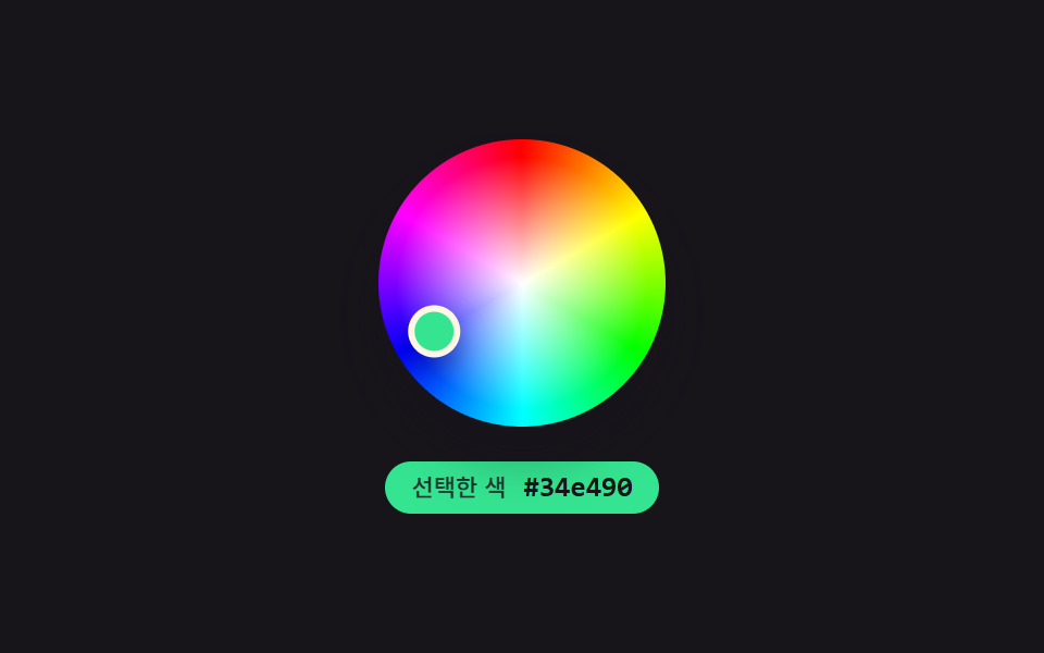 9 Color Picker Design Patterns (Copy-Paste)Nine color-picker UIs that compute: a point's angle turns into a hue, swatch brightness flips the check-icon color, and See all demos in this post
If you like this effect - similar demos
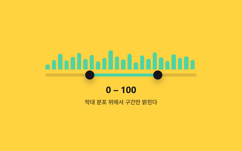 Inputs06 Range Slider That Picks a Span Over a Histogram BackgroundDual Range Slider UI — 9 Two-Handle Patterns
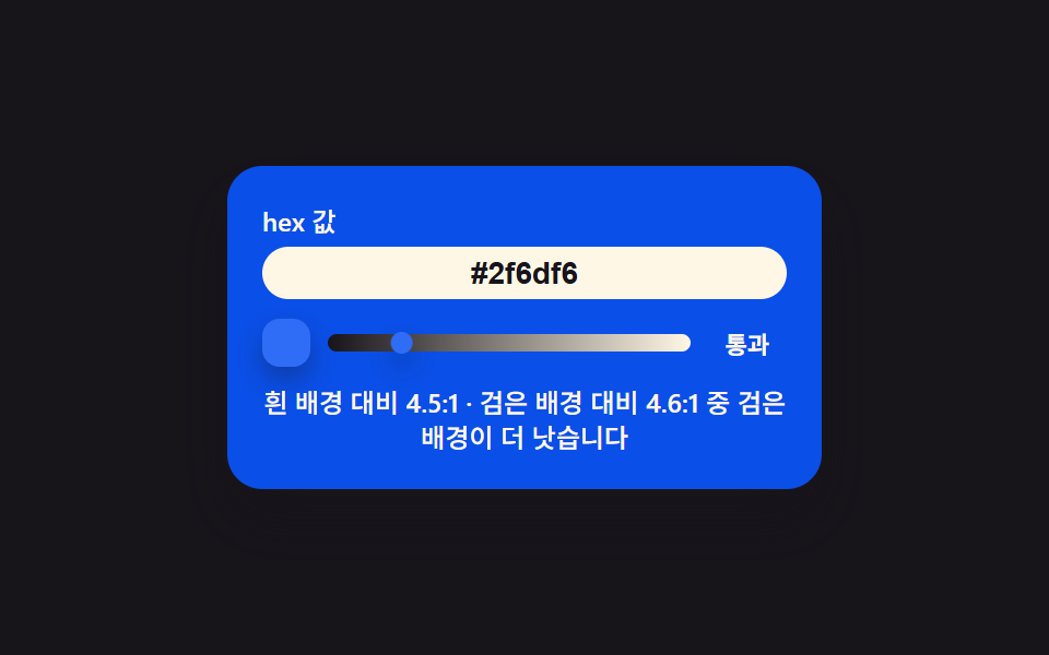 Inputs05 Contrast Badge That Crosses a Pass Line From a Hex ValueCSS Calculator Design: 9 Inputs, Unit Converter UI
 Inputs07 Live currency format — a stepper that recomputes digit-grouping positions every time its value changesNumber Stepper UI: 9 Interaction Patterns