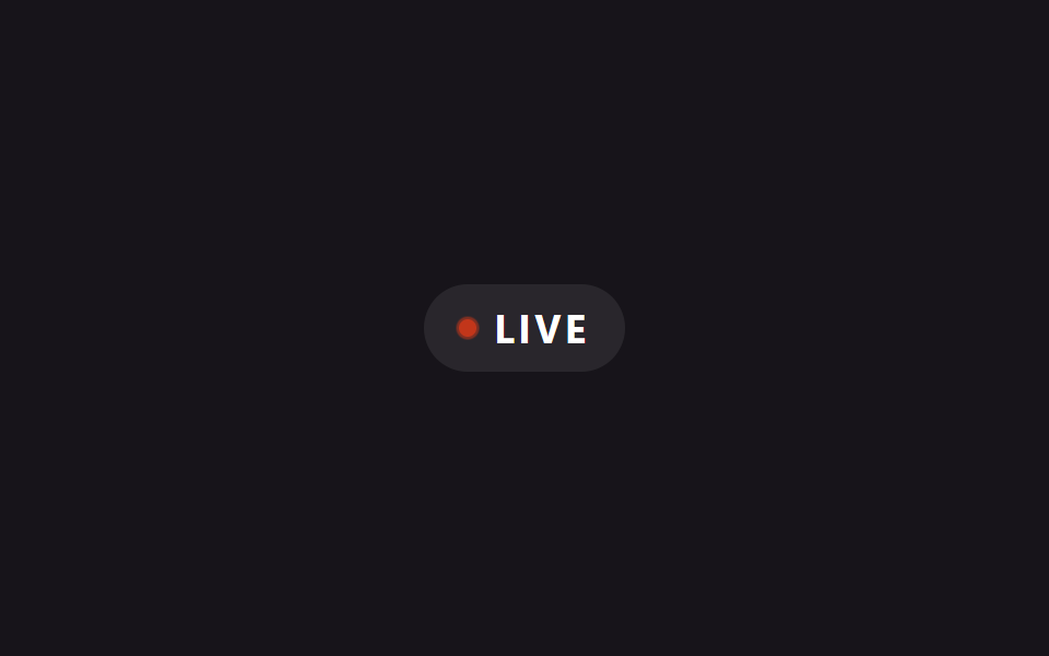
05Live pulse dot badge
A ::before circle behind the dot repeatedly scales outward while its opacity fades to 0, reading like a radar ping broadcasting outward from a live source.
Best forLive-stream or in-progress event markers, online-status indicators
::before scale·opacityaria-label@keyframes ping
<main class="stage is-demo">
  <span class="badge" aria-label="live now">
    <span class="dot"></span>
    LIVE
  </span>
</main>
@use "../../../../site/static/demo-tokens" as *;
// ── 변수 3개 ──────────────────────────────────────────
$duration: $dur-loop; // 2s — 핑 한 주기
$easing: $ease-out;
$color: $error;
@include stage($stage-ink);
.badge {
display: inline-flex; align-items: center; gap: $sp-2;
padding: $sp-2 $sp-4;
border-radius: $r-pill;
background: rgba($stage-paper, .08);
color: $stage-paper;
font-family: -apple-system, "Segoe UI", "Noto Sans KR", sans-serif;
font-weight: 700;
font-size: 18px;
letter-spacing: .1em;
}
.dot {
position: relative;
width: $sp-2; height: $sp-2;
border-radius: 50%;
background: $color;
}
.dot::before {
content: "";
position: absolute; inset: 0;
border-radius: 50%;
background: $color;
}
.stage.is-demo .dot::before {
animation: ping $duration $easing infinite;
}
@keyframes ping {
0% { transform: scale(1); opacity: .7; }
70%, 100% { transform: scale(2.6); opacity: 0; }
}
@media (prefers-reduced-motion: reduce) {
.stage.is-demo .dot::before { animation: none; opacity: 0; }
}html, body {
margin: 0;
overflow: hidden;
}
.stage {
box-sizing: border-box;
min-height: 100vh;
display: grid;
place-items: center;
margin: 0;
background: #17141a;
font-family: -apple-system, "Segoe UI", "Noto Sans KR", sans-serif;
padding: clamp(8px, 4vw, 24px);
}
.badge {
display: inline-flex;
align-items: center;
gap: 8px;
padding: 8px 16px;
border-radius: 999px;
background: rgba(255, 255, 255, 0.08);
color: #ffffff;
font-family: -apple-system, "Segoe UI", "Noto Sans KR", sans-serif;
font-weight: 700;
font-size: 18px;
letter-spacing: 0.1em;
}
.dot {
position: relative;
width: 8px;
height: 8px;
border-radius: 50%;
background: #c2361a;
}
.dot::before {
content: "";
position: absolute;
inset: 0;
border-radius: 50%;
background: #c2361a;
}
.stage.is-demo .dot::before {
animation: ping 2s ease-out infinite;
}
@keyframes ping {
0% {
transform: scale(1);
opacity: 0.7;
}
70%, 100% {
transform: scale(2.6);
opacity: 0;
}
}
@media (prefers-reduced-motion: reduce) {
.stage.is-demo .dot::before {
animation: none;
opacity: 0;
}
}import type { CSSProperties } from "react";
import styles from "./BadgeLivePulseDot.module.scss";
export type BadgeLivePulseDotProps = {
duration?: number;
easing?: string;
color?: string;
label?: string;
};
export default function BadgeLivePulseDot({
duration = 2000,
easing = "ease-out",
color = "#c2361a",
label = "LIVE",
}: BadgeLivePulseDotProps) {
const vars: CSSProperties = { "--duration": `${duration}ms`, "--easing": easing, "--color": color } as CSSProperties;
return (
<span className={styles.badge} style={vars} aria-label="live now">
<span className={styles.dot} />
{label}
</span>
);
}05 Live pulse dot badge — Measured area 0.147% · moving frames 8/23Original by GODRICH · SCSS and React ship in the zip · 9 CSS Badge Design Ideas — New, Sale, Verified
The post this demo lives in
 9 CSS Badge Design Ideas — New, Sale, VerifiedA badge is the small label on a thumbnail or name that shows status at a glance — new, sale, verified, sold out. Good CS See all demos in this post