08Compare column highlight
In a comparison table, only the hovered column brightens its border and scales up slightly to stand out.
Best forSide-by-side plan comparison tables, feature-by-feature grids
scaleborder-color180ms
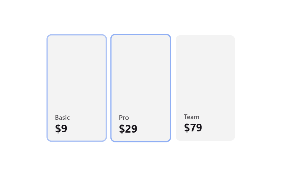
<main class="stage">
  <div class="ch-table is-demo">
    <div class="ch-col">
      <span class="ch-col__tag">Basic</span>
      <span class="ch-col__price">$9</span>
    </div>
    <div class="ch-col">
      <span class="ch-col__tag">Pro</span>
      <span class="ch-col__price">$29</span>
    </div>
    <div class="ch-col">
      <span class="ch-col__tag">Team</span>
      <span class="ch-col__price">$79</span>
    </div>
  </div>
</main>
@use "../../../../site/static/demo-tokens" as *;
// ── 변수 3개 ──────────────────────────────────────────
$duration: 180ms;
$easing: $ease-out;
$color: $subject-blue;
@include stage($stage-paper);
.ch-table {
width: min(320px, 88vw);
aspect-ratio: 320 / 180;
display: flex;
gap: $sp-2;
}
.ch-col {
flex: 1 1 0;
box-sizing: border-box;
border-radius: $r-sm;
border: 2px solid transparent;
padding: $sp-3;
display: flex;
flex-direction: column;
justify-content: flex-end;
gap: $sp-1;
background: rgba(23, 20, 26, .05);
color: $subject-ink;
font: 600 12px/1 -apple-system, "Segoe UI", sans-serif;
transition: transform $duration $easing, border-color $duration $easing, background $duration $easing;
}
.ch-col__tag { opacity: .7; font-size: 11px; }
.ch-col__price { font-size: 18px; font-weight: 700; }
// 실사용: 마우스를 올린 열만 확대 + 테두리
.ch-col:hover {
transform: scale(1.05);
border-color: $color;
background: rgba(23, 20, 26, .08);
}
// 데모 루프: is-demo 는 열마다 순서대로 같은 강조를 반복 재생 (캡처용)
@keyframes ch-pulse {
0%, 66%, 100% { transform: scale(1); border-color: transparent; }
16% { transform: scale(1.05); border-color: $color; }
}
.ch-table.is-demo .ch-col { animation: ch-pulse $dur-loop * 1.5 $easing infinite; }
.ch-table.is-demo .ch-col:nth-child(2) { animation-delay: #{$dur-loop * 0.5}; }
.ch-table.is-demo .ch-col:nth-child(3) { animation-delay: #{$dur-loop}; }
@media (prefers-reduced-motion: reduce) {
.ch-col:hover,
.ch-table.is-demo .ch-col { animation: none !important; transform: none !important; border-color: transparent !important; }
}html, body {
margin: 0;
overflow: hidden;
}
.stage {
box-sizing: border-box;
min-height: 100vh;
display: grid;
place-items: center;
margin: 0;
background: #ffffff;
font-family: -apple-system, "Segoe UI", "Noto Sans KR", sans-serif;
padding: clamp(8px, 4vw, 24px);
}
.ch-table {
width: min(320px, 88vw);
aspect-ratio: 320/180;
display: flex;
gap: 8px;
}
.ch-col {
flex: 1 1 0;
box-sizing: border-box;
border-radius: 8px;
border: 2px solid transparent;
padding: 12px;
display: flex;
flex-direction: column;
justify-content: flex-end;
gap: 4px;
background: rgba(23, 20, 26, 0.05);
color: #17141a;
font: 600 12px/1 -apple-system, "Segoe UI", sans-serif;
transition: transform 180ms ease-out, border-color 180ms ease-out, background 180ms ease-out;
}
.ch-col__tag {
opacity: 0.7;
font-size: 11px;
}
.ch-col__price {
font-size: 18px;
font-weight: 700;
}
.ch-col:hover {
transform: scale(1.05);
border-color: #2f6df6;
background: rgba(23, 20, 26, 0.08);
}
@keyframes ch-pulse {
0%, 66%, 100% {
transform: scale(1);
border-color: transparent;
}
16% {
transform: scale(1.05);
border-color: #2f6df6;
}
}
.ch-table.is-demo .ch-col {
animation: ch-pulse 3s ease-out infinite;
}
.ch-table.is-demo .ch-col:nth-child(2) {
animation-delay: 1s;
}
.ch-table.is-demo .ch-col:nth-child(3) {
animation-delay: 2s;
}
@media (prefers-reduced-motion: reduce) {
.ch-col:hover,
.ch-table.is-demo .ch-col {
animation: none !important;
transform: none !important;
border-color: transparent !important;
}
}import { CSSProperties } from "react";
import styles from "./CompareColumnHighlight.module.scss";
export interface CompareColumnHighlightProps {
duration?: string;
easing?: string;
color?: string;
}
const COLS = [
{ tag: "Basic", price: "$9" },
{ tag: "Pro", price: "$29" },
{ tag: "Team", price: "$79" },
];
export default function CompareColumnHighlight({
duration = "180ms",
easing = "ease-out",
color = "#2f6df6",
}: CompareColumnHighlightProps) {
const style = { "--duration": duration, "--easing": easing, "--color": color } as CSSProperties;
return (
<div className={styles.table} style={style}>
{COLS.map((c) => (
<div key={c.tag} className={styles.col}>
<span className={styles.tag}>{c.tag}</span>
<span className={styles.price}>{c.price}</span>
</div>
))}
</div>
);
}08 Compare column highlight — Measured area 5.153% · moving frames 23/23Original by GODRICH · SCSS and React ship in the zip · 9 CSS Pricing Table Animations You Can Copy-Paste
The post this demo lives in
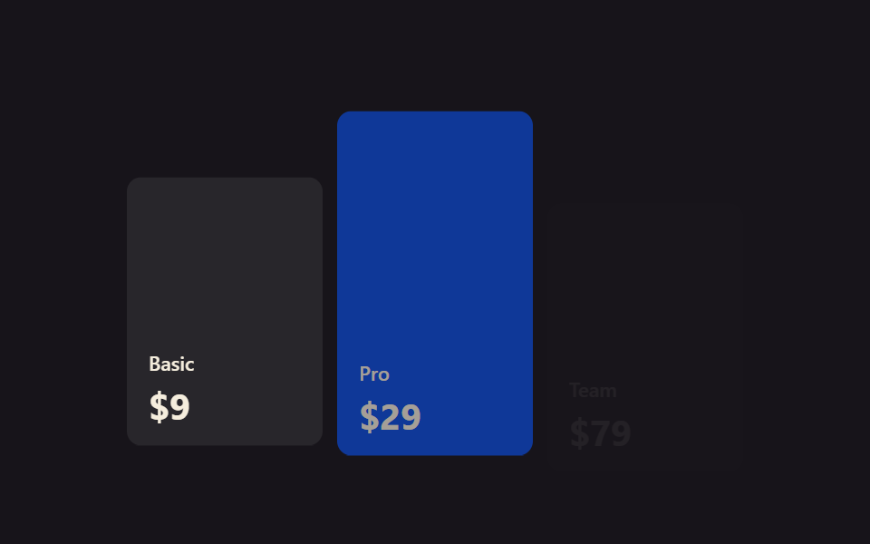 9 CSS Pricing Table Animations You Can Copy-PasteA pricing table is the Free/Pro/Team grid every subscription site shows before checkout, and a good CSS pricing table ad See all demos in this post