03Avatar list
A round avatar plus two lines, repeated.
Best forChats, follower lists
5줄작게글 한 줄

<main class="stage">
  <div class="list">
    <div class="row"><span class="avatar"></span><span class="meta"><span class="l1"></span><span class="l2"></span></span></div>
    <div class="row"><span class="avatar"></span><span class="meta"><span class="l1"></span><span class="l2"></span></span></div>
    <div class="row"><span class="avatar"></span><span class="meta"><span class="l1"></span><span class="l2"></span></span></div>
    <div class="row"><span class="avatar"></span><span class="meta"><span class="l1"></span><span class="l2"></span></span></div>
    <div class="row"><span class="avatar"></span><span class="meta"><span class="l1"></span><span class="l2"></span></span></div>
    <span class="sheen" aria-hidden="true"></span>
  </div>
</main>
@use "../../../../site/static/demo-tokens" as *;
// ── 변수 3개 ──────────────────────────────────────────
$duration: $dur-loop; // 빛이 목록 전체를 훑는 시간
$easing: $ease-out;
$color: $subject-cream; // 아바타·막대 색 (주황 무대라 크림)
@include stage($stage-orange);
.list {
position: relative; // 훑는 빛의 기준
overflow: hidden; // 빛이 목록 밖으로 안 나가게
width: clamp(210px, 76%, 320px);
display: grid;
gap: clamp(6px, 2.4vw, 12px);
border-radius: $r-card;
}
.row { display: flex; align-items: center; gap: clamp(8px, 2.6vw, 12px); }
.avatar {
flex: none;
width: clamp(20px, 6.4vw, 32px);
height: clamp(20px, 6.4vw, 32px);
border-radius: $r-pill; // 동그란 아바타
background: rgba($color, .22);
}
.meta { flex: 1; display: grid; gap: 5px; }
.l1 { height: clamp(8px, 2.6vw, 11px); border-radius: $r-control; background: rgba($color, .22); width: 78%; }
.l2 { height: clamp(6px, 2.2vw, 9px); border-radius: $r-control; background: rgba($color, .14); width: 48%; }
.row:nth-child(2) .l1 { width: 55%; }
.row:nth-child(3) .l1 { width: 90%; }
.row:nth-child(4) .l1 { width: 62%; }
.row:nth-child(5) .l1 { width: 82%; }
// ── 빛 한 줄기가 목록 전체를 한 번에 훑는다 (01·02는 막대마다, 03은 하나로) ──
.sheen {
position: absolute;
inset: 0;
background: linear-gradient(90deg, transparent, rgba($stage-paper, .4), transparent);
transform: translateX(-120%);
animation: shimmer $duration $easing infinite;
pointer-events: none;
}
@keyframes shimmer {
to { transform: translateX(120%); }
}
@media (prefers-reduced-motion: reduce) {
.sheen { animation: none !important; opacity: 0; }
}html, body {
margin: 0;
overflow: hidden;
}
.stage {
box-sizing: border-box;
min-height: 100vh;
display: grid;
place-items: center;
margin: 0;
background: #ff4d1f;
font-family: -apple-system, "Segoe UI", "Noto Sans KR", sans-serif;
padding: clamp(8px, 4vw, 24px);
}
.list {
position: relative;
overflow: hidden;
width: clamp(210px, 76%, 320px);
display: grid;
gap: clamp(6px, 2.4vw, 12px);
border-radius: 16px;
}
.row {
display: flex;
align-items: center;
gap: clamp(8px, 2.6vw, 12px);
}
.avatar {
flex: none;
width: clamp(20px, 6.4vw, 32px);
height: clamp(20px, 6.4vw, 32px);
border-radius: 999px;
background: rgba(255, 247, 230, 0.22);
}
.meta {
flex: 1;
display: grid;
gap: 5px;
}
.l1 {
height: clamp(8px, 2.6vw, 11px);
border-radius: 12px;
background: rgba(255, 247, 230, 0.22);
width: 78%;
}
.l2 {
height: clamp(6px, 2.2vw, 9px);
border-radius: 12px;
background: rgba(255, 247, 230, 0.14);
width: 48%;
}
.row:nth-child(2) .l1 {
width: 55%;
}
.row:nth-child(3) .l1 {
width: 90%;
}
.row:nth-child(4) .l1 {
width: 62%;
}
.row:nth-child(5) .l1 {
width: 82%;
}
.sheen {
position: absolute;
inset: 0;
background: linear-gradient(90deg, transparent, rgba(255, 255, 255, 0.4), transparent);
transform: translateX(-120%);
animation: shimmer 2s ease-out infinite;
pointer-events: none;
}
@keyframes shimmer {
to {
transform: translateX(120%);
}
}
@media (prefers-reduced-motion: reduce) {
.sheen {
animation: none !important;
opacity: 0;
}
}import type { CSSProperties } from "react";
import styles from "./AvatarListSkeleton.module.scss";
export type AvatarListSkeletonProps = {
/** 빛이 목록 전체를 훑는 시간 (기본 2000ms) */
duration?: number;
/** CSS easing (기본 ease-out) */
easing?: string;
/** 아바타·막대 색 */
color?: string;
/** 줄 수 (기본 5) */
rows?: number;
className?: string;
};
const L1_WIDTHS = ["78%", "55%", "90%", "62%", "82%"];
export default function AvatarListSkeleton({
duration = 2000,
easing = "ease-out",
color = "#fff7e6",
rows = 5,
className = "",
}: AvatarListSkeletonProps) {
const vars = { "--duration": `${duration}ms`, "--easing": easing, "--color": color } as CSSProperties;
return (
<div className={`${styles.list} ${className}`} style={vars}>
{Array.from({ length: rows }).map((_, i) => (
<div key={i} className={styles.row}>
<span className={styles.avatar} />
<span className={styles.meta}>
<span className={styles.l1} style={{ width: L1_WIDTHS[i % L1_WIDTHS.length] } as CSSProperties} />
<span className={styles.l2} />
</span>
</div>
))}
<span className={styles.sheen} aria-hidden="true" />
</div>
);
}03 Avatar list — Measured area 44.317% · moving frames 17/23Original by GODRICH · SCSS and React ship in the zip · 9 CSS Skeleton Loading Screens, Copy-Paste Ready
The post this demo lives in
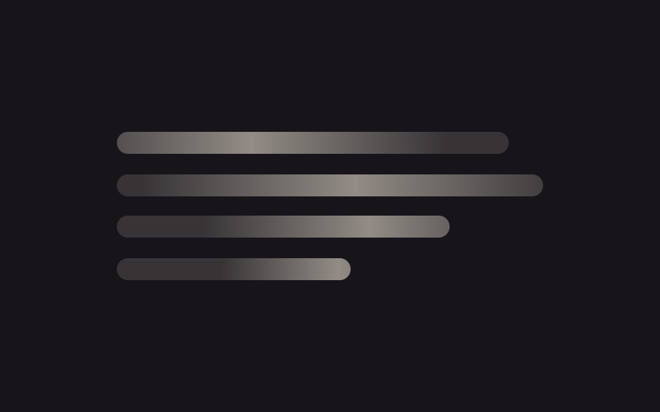 9 CSS Skeleton Loading Screens, Copy-Paste ReadyA css skeleton loading screen swaps a blank page for gray shapes that mirror the layout while data loads. Nine SCSS buil See all demos in this post
If you like this effect - similar demos
 Loaders02 Skeleton row append — a list computing its preview row count from the viewport heightInfinite Scroll Loading: 9 Essential UI Patterns
 Loaders03 List where empty outlined slots fill in one card at a timePage Loading Animation CSS: 9 Route-Change Demos
 Loaders04 Avatar pulse sync — a ring recomputing its beat from typing duration9 Typing Indicator CSS Patterns (Chat UI)