09A Pure CSS Sunset Gradient Moving Its Stops Through Registered Properties
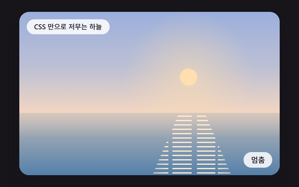
The gradient colors and stop positions are declared as registered properties so keyframes can interpolate between values, letting the sky set slowly without any JavaScript.
Best forA lightweight sunset background
@property--sky-top--stop-a--sun-y
<main class="stage">
<div class="sc" id="scRoot">
  <input class="sc__toggle" type="checkbox" id="scPause" aria-label="Pause">
  <div class="sc__sky"></div>
  <div class="sc__sea"><div class="sc__glint"></div></div>
  <p class="sc__status" role="status" aria-live="polite">A sky that sets with CSS alone</p>
  <label class="sc__btn" for="scPause"><span class="sc__off">Pause</span><span class="sc__on">Play</span></label>
</div>
</main>
@use "../../../../site/static/demo-tokens" as *;
@include stage($stage-ink);
$duration: 3.2s;
$easing: ease-in-out;
$horizon: 62%;
$sun-x: 65%;
@property --sky-top {
syntax: "<color>";
inherits: true;
initial-value: #807eb6;
}
@property --sky-mid {
syntax: "<color>";
inherits: true;
initial-value: #b38fa8;
}
@property --sky-low {
syntax: "<color>";
inherits: true;
initial-value: #e6b7ab;
}
@property --stop-a {
syntax: "<percentage>";
inherits: true;
initial-value: 44%;
}
@property --stop-b {
syntax: "<percentage>";
inherits: true;
initial-value: 63%;
}
@property --sun-y {
syntax: "<percentage>";
inherits: true;
initial-value: 56.0%;
}
@property --sun {
syntax: "<color>";
inherits: true;
initial-value: #e4bca4;
}
@property --sea-top {
syntax: "<color>";
inherits: true;
initial-value: #bc8d8f;
}
@property --sea-deep {
syntax: "<color>";
inherits: true;
initial-value: #3e5c8a;
}
@property --glint-a {
syntax: "<number>";
inherits: true;
initial-value: 0.98;
}
@keyframes sunset {
0% {
--sky-top: #a1c1e3;
--sky-mid: #bacee8;
--sky-low: #f0e2de;
--stop-a: 30%;
--stop-b: 66%;
--sun-y: 32.0%;
--sun: #ffe9bf;
--sea-top: #b9c0cc;
--sea-deep: #5480aa;
--glint-a: 1;
}
30% {
--sky-top: #96a0d6;
--sky-mid: #c0b3c3;
--sky-low: #ffd0a6;
--stop-a: 38%;
--stop-b: 64%;
--sun-y: 47.0%;
--sun: #ffd4a2;
--sea-top: #c3b4a7;
--sea-deep: #5480aa;
--glint-a: 1;
}
55% {
--sky-top: #807eb6;
--sky-mid: #b38fa8;
--sky-low: #e6b7ab;
--stop-a: 44%;
--stop-b: 63%;
--sun-y: 56.0%;
--sun: #e4bca4;
--sea-top: #bc8d8f;
--sea-deep: #3e5c8a;
--glint-a: 0.98;
}
80% {
--sky-top: #5c5c9c;
--sky-mid: #966d96;
--sky-low: #df959a;
--stop-a: 48%;
--stop-b: 62%;
--sun-y: 62.0%;
--sun: #e1a99c;
--sea-top: #ac6f85;
--sea-deep: #304474;
--glint-a: 0.3;
}
100% {
--sky-top: #393c74;
--sky-mid: #5f5283;
--sky-low: #99729a;
--stop-a: 50%;
--stop-b: 62%;
--sun-y: 67.0%;
--sun: #e09a97;
--sea-top: #705b86;
--sea-deep: #243062;
--glint-a: 0;
}
}
@keyframes shimmer {
50% { transform: translate(.6em, 7px); }
to { transform: translate(0, 14px); }
}
.sc {
position: relative;
width: min(92vw, calc(160vh - 12.8vw));
aspect-ratio: 480 / 300;
font-size: calc(min(92vw, 160vh - 12.8vw) / 30);
margin: 0 auto;
border-radius: $r-card;
overflow: hidden;
box-shadow: $shadow-raised;
background: $subject-ink;
animation: sunset $duration $easing infinite alternate;
}
.sc__sky {
position: absolute;
inset: 0;
background:
radial-gradient(circle at $sun-x var(--sun-y), color-mix(in srgb, var(--sun) 55%, transparent) 0, transparent 7.5em),
radial-gradient(circle at $sun-x var(--sun-y), var(--sun) 0.94em, transparent 1.04em),
linear-gradient(180deg, var(--sky-top) 0%, var(--sky-mid) var(--stop-a), var(--sky-low) var(--stop-b));
}
.sc__sea {
position: absolute;
left: 0;
right: 0;
top: $horizon;
bottom: 0;
overflow: hidden;
background:
linear-gradient(180deg, color-mix(in srgb, var(--sky-low) 45%, transparent) 0, transparent 40%),
linear-gradient(180deg, var(--sea-top), var(--sea-deep));
}
.sc__glint {
position: absolute;
inset: -1em 0;
background:
repeating-linear-gradient(180deg, color-mix(in srgb, var(--sun) 55%, white) 0 2px, transparent 2px 7px),
repeating-linear-gradient(180deg, white 0 1px, transparent 1px 14px);
clip-path: polygon(61% 0, 69% 0, 82% 100%, 48% 100%);
mask-image:
linear-gradient(90deg, transparent 40%, #000 56%, #000 74%, transparent 90%),
repeating-linear-gradient(90deg, #000 0 6%, transparent 6% 7.5%, #000 7.5% 15%, transparent 15% 17%, #000 17% 24%, transparent 24% 25%);
mask-composite: intersect;
opacity: var(--glint-a);
animation: shimmer 1.6s linear infinite;
}
.sc__toggle {
position: absolute;
width: 1px;
height: 1px;
opacity: 0;
}
.sc__status {
position: absolute;
left: $sp-3;
top: $sp-3;
max-width: 62%;
margin: 0;
padding: $sp-1 $sp-3;
border-radius: $r-pill;
background: rgba(255, 255, 255, .85);
color: $subject-ink;
font-weight: 500;
font-size: 11px;
line-height: 1.4;
pointer-events: none;
}
.sc__btn {
position: absolute;
right: $sp-3;
bottom: $sp-3;
margin: 0;
padding: $sp-1 $sp-3;
border-radius: $r-pill;
background: rgba(255, 255, 255, .85);
color: $subject-ink;
font-weight: 500;
font-size: 12px;
line-height: 1.4;
cursor: pointer;
}
.sc__on { display: none; }
.sc__toggle:checked ~ .sc__btn .sc__on { display: inline; }
.sc__toggle:checked ~ .sc__btn .sc__off { display: none; }
.sc__toggle:focus-visible ~ .sc__btn { outline: 2px solid #ffffff; outline-offset: 2px; }
.sc:has(.sc__toggle:checked),
.sc:has(.sc__toggle:checked) .sc__glint {
animation-play-state: paused;
}
@media (max-width: 340px) {
.sc__btn { font-size: 10px; padding: $sp-1 $sp-2; }
.sc__status { font-size: 10px; max-width: 58%; }
}
@media (prefers-reduced-motion: reduce) {
.sc, .sc__glint { animation: none; }
}html, body {
margin: 0;
overflow: hidden;
}
.stage {
box-sizing: border-box;
min-height: 100vh;
display: grid;
place-items: center;
margin: 0;
background: #17141a;
font-family: -apple-system, "Segoe UI", "Noto Sans KR", sans-serif;
padding: clamp(8px, 4vw, 24px);
}
@property --sky-top {
syntax: "<color>";
inherits: true;
initial-value: #807eb6;
}
@property --sky-mid {
syntax: "<color>";
inherits: true;
initial-value: #b38fa8;
}
@property --sky-low {
syntax: "<color>";
inherits: true;
initial-value: #e6b7ab;
}
@property --stop-a {
syntax: "<percentage>";
inherits: true;
initial-value: 44%;
}
@property --stop-b {
syntax: "<percentage>";
inherits: true;
initial-value: 63%;
}
@property --sun-y {
syntax: "<percentage>";
inherits: true;
initial-value: 56%;
}
@property --sun {
syntax: "<color>";
inherits: true;
initial-value: #e4bca4;
}
@property --sea-top {
syntax: "<color>";
inherits: true;
initial-value: #bc8d8f;
}
@property --sea-deep {
syntax: "<color>";
inherits: true;
initial-value: #3e5c8a;
}
@property --glint-a {
syntax: "<number>";
inherits: true;
initial-value: 0.98;
}
@keyframes sunset {
0% {
--sky-top: #a1c1e3;
--sky-mid: #bacee8;
--sky-low: #f0e2de;
--stop-a: 30%;
--stop-b: 66%;
--sun-y: 32.0%;
--sun: #ffe9bf;
--sea-top: #b9c0cc;
--sea-deep: #5480aa;
--glint-a: 1;
}
30% {
--sky-top: #96a0d6;
--sky-mid: #c0b3c3;
--sky-low: #ffd0a6;
--stop-a: 38%;
--stop-b: 64%;
--sun-y: 47.0%;
--sun: #ffd4a2;
--sea-top: #c3b4a7;
--sea-deep: #5480aa;
--glint-a: 1;
}
55% {
--sky-top: #807eb6;
--sky-mid: #b38fa8;
--sky-low: #e6b7ab;
--stop-a: 44%;
--stop-b: 63%;
--sun-y: 56.0%;
--sun: #e4bca4;
--sea-top: #bc8d8f;
--sea-deep: #3e5c8a;
--glint-a: 0.98;
}
80% {
--sky-top: #5c5c9c;
--sky-mid: #966d96;
--sky-low: #df959a;
--stop-a: 48%;
--stop-b: 62%;
--sun-y: 62.0%;
--sun: #e1a99c;
--sea-top: #ac6f85;
--sea-deep: #304474;
--glint-a: 0.3;
}
100% {
--sky-top: #393c74;
--sky-mid: #5f5283;
--sky-low: #99729a;
--stop-a: 50%;
--stop-b: 62%;
--sun-y: 67.0%;
--sun: #e09a97;
--sea-top: #705b86;
--sea-deep: #243062;
--glint-a: 0;
}
}
@keyframes shimmer {
50% {
transform: translate(0.6em, 7px);
}
to {
transform: translate(0, 14px);
}
}
.sc {
position: relative;
width: min(92vw, 160vh - 12.8vw);
aspect-ratio: 480/300;
font-size: calc(min(92vw, 160vh - 12.8vw) / 30);
margin: 0 auto;
border-radius: 16px;
overflow: hidden;
box-shadow: 0 14px 24px rgba(23, 20, 26, 0.32);
background: #17141a;
animation: sunset 3.2s ease-in-out infinite alternate;
}
.sc__sky {
position: absolute;
inset: 0;
background: radial-gradient(circle at 65% var(--sun-y), color-mix(in srgb, var(--sun) 55%, transparent) 0, transparent 7.5em), radial-gradient(circle at 65% var(--sun-y), var(--sun) 0.94em, transparent 1.04em), linear-gradient(180deg, var(--sky-top) 0%, var(--sky-mid) var(--stop-a), var(--sky-low) var(--stop-b));
}
.sc__sea {
position: absolute;
left: 0;
right: 0;
top: 62%;
bottom: 0;
overflow: hidden;
background: linear-gradient(180deg, color-mix(in srgb, var(--sky-low) 45%, transparent) 0, transparent 40%), linear-gradient(180deg, var(--sea-top), var(--sea-deep));
}
.sc__glint {
position: absolute;
inset: -1em 0;
background: repeating-linear-gradient(180deg, color-mix(in srgb, var(--sun) 55%, white) 0 2px, transparent 2px 7px), repeating-linear-gradient(180deg, white 0 1px, transparent 1px 14px);
clip-path: polygon(61% 0, 69% 0, 82% 100%, 48% 100%);
mask-image: linear-gradient(90deg, transparent 40%, #000 56%, #000 74%, transparent 90%), repeating-linear-gradient(90deg, #000 0 6%, transparent 6% 7.5%, #000 7.5% 15%, transparent 15% 17%, #000 17% 24%, transparent 24% 25%);
mask-composite: intersect;
opacity: var(--glint-a);
animation: shimmer 1.6s linear infinite;
}
.sc__toggle {
position: absolute;
width: 1px;
height: 1px;
opacity: 0;
}
.sc__status {
position: absolute;
left: 12px;
top: 12px;
max-width: 62%;
margin: 0;
padding: 4px 12px;
border-radius: 999px;
background: rgba(255, 255, 255, 0.85);
color: #17141a;
font-weight: 500;
font-size: 11px;
line-height: 1.4;
pointer-events: none;
}
.sc__btn {
position: absolute;
right: 12px;
bottom: 12px;
margin: 0;
padding: 4px 12px;
border-radius: 999px;
background: rgba(255, 255, 255, 0.85);
color: #17141a;
font-weight: 500;
font-size: 12px;
line-height: 1.4;
cursor: pointer;
}
.sc__on {
display: none;
}
.sc__toggle:checked ~ .sc__btn .sc__on {
display: inline;
}
.sc__toggle:checked ~ .sc__btn .sc__off {
display: none;
}
.sc__toggle:focus-visible ~ .sc__btn {
outline: 2px solid #ffffff;
outline-offset: 2px;
}
.sc:has(.sc__toggle:checked),
.sc:has(.sc__toggle:checked) .sc__glint {
animation-play-state: paused;
}
@media (max-width: 340px) {
.sc__btn {
font-size: 10px;
padding: 4px 8px;
}
.sc__status {
font-size: 10px;
max-width: 58%;
}
}
@media (prefers-reduced-motion: reduce) {
.sc, .sc__glint {
animation: none;
}
}import styles from "./SsPropertyGradientStopsLoop.module.scss";
export default function SsPropertyGradientStopsLoop() {
return (
<main className={styles.stage}>
<div className={styles.sc}>
<input className={styles.sc__toggle} type="checkbox" id="scPause" aria-label="멈춤" />
<div className={styles.sc__sky} />
<div className={styles.sc__sea}><div className={styles.sc__glint} /></div>
<p className={styles.sc__status} role="status" aria-live="polite">CSS 만으로 저무는 하늘</p>
<label className={styles.sc__btn} htmlFor="scPause"><span className={styles.sc__off}>멈춤</span><span className={styles.sc__on}>재생</span></label>
</div>
</main>
);
}09 A Pure CSS Sunset Gradient Moving Its Stops Through Registered Properties — Measured area 73.117% · moving frames 23/23Original by GODRICH · SCSS and React ship in the zip · CSS Sunset Gradient: 9 Demos With a Living Sky
The post this demo lives in
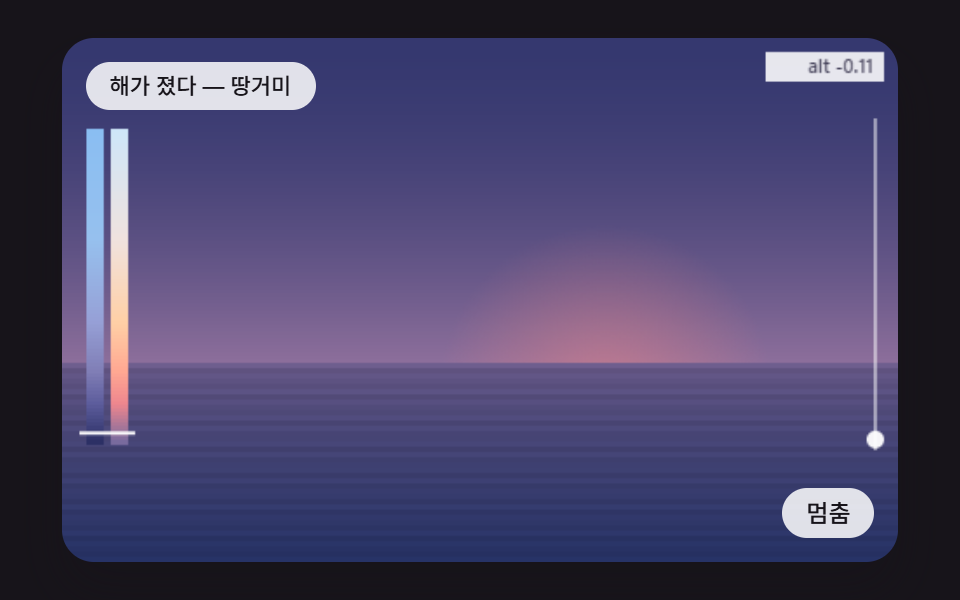 CSS Sunset Gradient: 9 Demos With a Living SkyA css sunset gradient from two blended colors keeps the sky unchanged as the sun sinks, gives the sea no road of light a See all demos in this post
If you like this effect - similar demos
 Creative UI06 Energy gradient backgroundAudio Visualizer JavaScript: 9 Parts, No Library
 Creative UI01 Stacked box shadowCSS Generator: 9 Sliders That Write the Code
 Creative UI01 An Ordered Dither That Stamps a Moving Gradient in Two Colors with a Bayer MatrixCSS Dither: 9 Scenes Drawn by Threshold Math