07GitHub repo stats card embed
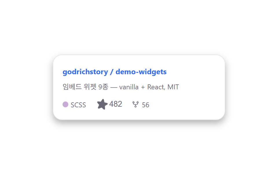
The star icon wiggles side to side on a loop as if inviting a click, and a real click actually bumps the star count and fills its color.
Best forA repo card inside an open-source project write-up, a code link on a portfolio page
rotate wiggle looparia-pressed star togglelanguage dot
<main class="stage is-demo">
  <div class="ghcard">
    <div class="ghcard__head">
      <span class="ghcard__repo">godrichstory / demo-widgets</span>
    </div>
    <p class="ghcard__desc">9 embed widgets — vanilla + React, MIT</p>
    <div class="ghcard__stats">
      <span class="ghcard__lang"><i class="ghcard__dot" aria-hidden="true"></i>SCSS</span>
      <button class="ghcard__star" type="button" aria-pressed="false">
        <svg class="ic-star" viewBox="0 0 256 256" width="20" height="20" aria-hidden="true"><g fill="currentColor"><path d="m229.06 108.79l-48.7 42l14.88 62.79a8.4 8.4 0 0 1-12.52 9.17L128 189.09l-54.72 33.65a8.4 8.4 0 0 1-12.52-9.17l14.88-62.79l-48.7-42A8.46 8.46 0 0 1 31.73 94l63.91-5.2l24.62-59.6a8.36 8.36 0 0 1 15.48 0l24.62 59.6l63.91 5.2a8.46 8.46 0 0 1 4.79 14.79" opacity=".2"/><path d="M239.18 97.26A16.38 16.38 0 0 0 224.92 86l-59-4.76l-22.78-55.09a16.36 16.36 0 0 0-30.27 0L90.11 81.23L31.08 86a16.46 16.46 0 0 0-9.37 28.86l45 38.83L53 211.75a16.38 16.38 0 0 0 24.5 17.82l50.5-31.08l50.53 31.08A16.4 16.4 0 0 0 203 211.75l-13.76-58.07l45-38.83a16.43 16.43 0 0 0 4.94-17.59Z"/></g></svg>
        <span class="ghcard__star-count">482</span>
      </button>
      <span class="ghcard__fork">
        <svg viewBox="0 0 256 256" width="14" height="14" aria-hidden="true"><g fill="currentColor"><path d="M88 64a24 24 0 1 1-24-24a24 24 0 0 1 24 24m104-24a24 24 0 1 0 24 24a24 24 0 0 0-24-24" opacity=".2"/><path d="M224 64a32 32 0 1 0-40 31v17a8 8 0 0 1-8 8H80a8 8 0 0 1-8-8V95a32 32 0 1 0-16 0v17a24 24 0 0 0 24 24h40v25a32 32 0 1 0 16 0v-25h40a24 24 0 0 0 24-24V95a32.06 32.06 0 0 0 24-31M48 64a16 16 0 1 1 16 16a16 16 0 0 1-16-16m96 128a16 16 0 1 1-16-16a16 16 0 0 1 16 16m48-112a16 16 0 1 1 16-16a16 16 0 0 1-16 16"/></g></svg>
        56
      </span>
    </div>
  </div>
</main>
@use "../../../../site/static/demo-tokens" as *;
// ── 변수 3개 ──────────────────────────────────────────
$duration: $dur-loop; // 2s — 별 아이콘 안내 펄스
$easing: $ease-pop;
$color: $subject-blue;
@include stage($stage-paper);
.ghcard {
width: 264px;
padding: $sp-4;
border-radius: $r-card;
border: 1px solid #e7e5ea;
background: #fff;
box-shadow: $shadow-press;
font-family: -apple-system, "Segoe UI", "Noto Sans KR", sans-serif;
}
.ghcard__repo { font-size: 13px; font-weight: 700; color: $color; }
.ghcard__desc { margin: $sp-2 0 $sp-3; font-size: 12px; color: #6b6875; line-height: 1.5; }
.ghcard__stats { display: flex; align-items: center; gap: $sp-4; font-size: 12px; color: #6b6875; }
.ghcard__lang { display: flex; align-items: center; gap: $sp-1; }
.ghcard__dot { width: 10px; height: 10px; border-radius: 50%; background: #caabd6; display: inline-block; }
.ghcard__star, .ghcard__fork { display: flex; align-items: center; gap: $sp-1; }
.ghcard__star { border: 0; background: none; padding: 0; cursor: pointer; color: #6b6875; }
.ghcard__star:hover, .ghcard__star.is-active { color: #baa272; }
.ghcard__star.is-active .ic-star { fill: #baa272; }
// 자동 재생 루프 — 별 아이콘이 눌러보라는 듯 전 구간 계속 흔들린다 (절반 넘게 멈춰 있으면 프레임 판정에서 떨어진다)
.stage.is-demo .ghcard__star .ic-star { animation: ghcard-wiggle $duration $easing infinite; transform-origin: 50% 90%; }
@keyframes ghcard-wiggle {
0% { transform: rotate(0) scale(1); }
20% { transform: rotate(-16deg) scale(1.15); }
40% { transform: rotate(12deg) scale(1.05); }
60% { transform: rotate(-10deg) scale(1.15); }
80% { transform: rotate(8deg) scale(1.05); }
100% { transform: rotate(0) scale(1); }
}
@media (prefers-reduced-motion: reduce) {
.stage.is-demo .ghcard__star .ic-star { animation: none; }
}html, body {
margin: 0;
overflow: hidden;
}
.stage {
box-sizing: border-box;
min-height: 100vh;
display: grid;
place-items: center;
margin: 0;
background: #ffffff;
font-family: -apple-system, "Segoe UI", "Noto Sans KR", sans-serif;
padding: clamp(8px, 4vw, 24px);
}
.ghcard {
width: 264px;
padding: 16px;
border-radius: 16px;
border: 1px solid #e7e5ea;
background: #fff;
box-shadow: 0 6px 12px rgba(23, 20, 26, 0.32);
font-family: -apple-system, "Segoe UI", "Noto Sans KR", sans-serif;
}
.ghcard__repo {
font-size: 13px;
font-weight: 700;
color: #2f6df6;
}
.ghcard__desc {
margin: 8px 0 12px;
font-size: 12px;
color: #6b6875;
line-height: 1.5;
}
.ghcard__stats {
display: flex;
align-items: center;
gap: 16px;
font-size: 12px;
color: #6b6875;
}
.ghcard__lang {
display: flex;
align-items: center;
gap: 4px;
}
.ghcard__dot {
width: 10px;
height: 10px;
border-radius: 50%;
background: #caabd6;
display: inline-block;
}
.ghcard__star, .ghcard__fork {
display: flex;
align-items: center;
gap: 4px;
}
.ghcard__star {
border: 0;
background: none;
padding: 0;
cursor: pointer;
color: #6b6875;
}
.ghcard__star:hover, .ghcard__star.is-active {
color: #baa272;
}
.ghcard__star.is-active .ic-star {
fill: #baa272;
}
.stage.is-demo .ghcard__star .ic-star {
animation: ghcard-wiggle 2s cubic-bezier(0.2, 1.4, 0.4, 1) infinite;
transform-origin: 50% 90%;
}
@keyframes ghcard-wiggle {
0% {
transform: rotate(0) scale(1);
}
20% {
transform: rotate(-16deg) scale(1.15);
}
40% {
transform: rotate(12deg) scale(1.05);
}
60% {
transform: rotate(-10deg) scale(1.15);
}
80% {
transform: rotate(8deg) scale(1.05);
}
100% {
transform: rotate(0) scale(1);
}
}
@media (prefers-reduced-motion: reduce) {
.stage.is-demo .ghcard__star .ic-star {
animation: none;
}
}// 실제 동작: Star 버튼을 누르면 카운트가 오르내리고 별이 채워진 상태로 바뀐다.
var btn = document.querySelector('.ghcard__star');
var count = document.querySelector('.ghcard__star-count');
btn.addEventListener('click', function () {
var pressed = btn.getAttribute('aria-pressed') === 'true';
btn.setAttribute('aria-pressed', String(!pressed));
btn.classList.toggle('is-active', !pressed);
count.textContent = parseInt(count.textContent, 10) + (pressed ? -1 : 1);
});import { useState } from "react";
import type { CSSProperties } from "react";
import styles from "./GithubRepoCard.module.scss";
export type GithubRepoCardProps = {
duration?: number;
easing?: string;
color?: string;
repo?: string;
};
export default function GithubRepoCard({ duration = 2000, easing = "cubic-bezier(.2,1.4,.4,1)", color = "#2f6df6", repo = "godrichstory / demo-widgets" }: GithubRepoCardProps) {
const vars: CSSProperties = { "--duration": `${duration}ms`, "--easing": easing, "--color": color } as CSSProperties;
const [starred, setStarred] = useState(false);
const [stars, setStars] = useState(482);
return (
<div className={styles.card} style={vars}>
<div><span className={styles.repo}>{repo}</span></div>
<p className={styles.desc}>임베드 위젯 9종 — vanilla + React, MIT</p>
<div className={styles.stats}>
<span className={styles.lang}><i className={styles.dot} aria-hidden="true" />SCSS</span>
<button
className={`${styles.star} ${starred ? styles.active : ""}`}
type="button" aria-pressed={starred}
onClick={() => { setStarred((v) => !v); setStars((n) => n + (starred ? -1 : 1)); }}
>
<svg className={styles.icStar} viewBox="0 0 256 256" width="20" height="20" aria-hidden="true"><g fill="currentColor">
<path opacity=".2" d="m229.06 108.79l-48.7 42l14.88 62.79a8.4 8.4 0 0 1-12.52 9.17L128 189.09l-54.72 33.65a8.4 8.4 0 0 1-12.52-9.17l14.88-62.79l-48.7-42A8.46 8.46 0 0 1 31.73 94l63.91-5.2l24.62-59.6a8.36 8.36 0 0 1 15.48 0l24.62 59.6l63.91 5.2a8.46 8.46 0 0 1 4.79 14.79" />
<path d="M239.18 97.26A16.38 16.38 0 0 0 224.92 86l-59-4.76l-22.78-55.09a16.36 16.36 0 0 0-30.27 0L90.11 81.23L31.08 86a16.46 16.46 0 0 0-9.37 28.86l45 38.83L53 211.75a16.38 16.38 0 0 0 24.5 17.82l50.5-31.08l50.53 31.08A16.4 16.4 0 0 0 203 211.75l-13.76-58.07l45-38.83a16.43 16.43 0 0 0 4.94-17.59Z" />
</g></svg>
<span>{stars}</span>
</button>
<span className={styles.fork}>
<svg viewBox="0 0 256 256" width="14" height="14" aria-hidden="true"><g fill="currentColor">
<path opacity=".2" d="M88 64a24 24 0 1 1-24-24a24 24 0 0 1 24 24m104-24a24 24 0 1 0 24 24a24 24 0 0 0-24-24" />
<path d="M224 64a32 32 0 1 0-40 31v17a8 8 0 0 1-8 8H80a8 8 0 0 1-8-8V95a32 32 0 1 0-16 0v17a24 24 0 0 0 24 24h40v25a32 32 0 1 0 16 0v-25h40a24 24 0 0 0 24-24V95a32.06 32.06 0 0 0 24-31M48 64a16 16 0 1 1 16 16a16 16 0 0 1-16-16m96 128a16 16 0 1 1-16-16a16 16 0 0 1 16 16m48-112a16 16 0 1 1 16-16a16 16 0 0 1-16 16" />
</g></svg>
56
</span>
</div>
</div>
);
}07 GitHub repo stats card embed — Measured area 0.198% · moving frames 23/23Original by GODRICH · SCSS and React ship in the zip · 9 Social Share Button Design Embed Widgets
The post this demo lives in
 9 Social Share Button Design Embed WidgetsSocial share button design is a small standalone card for one job — share, reviews, contact. Copy-paste a few lines of C See all demos in this post
If you like this effect - similar demos
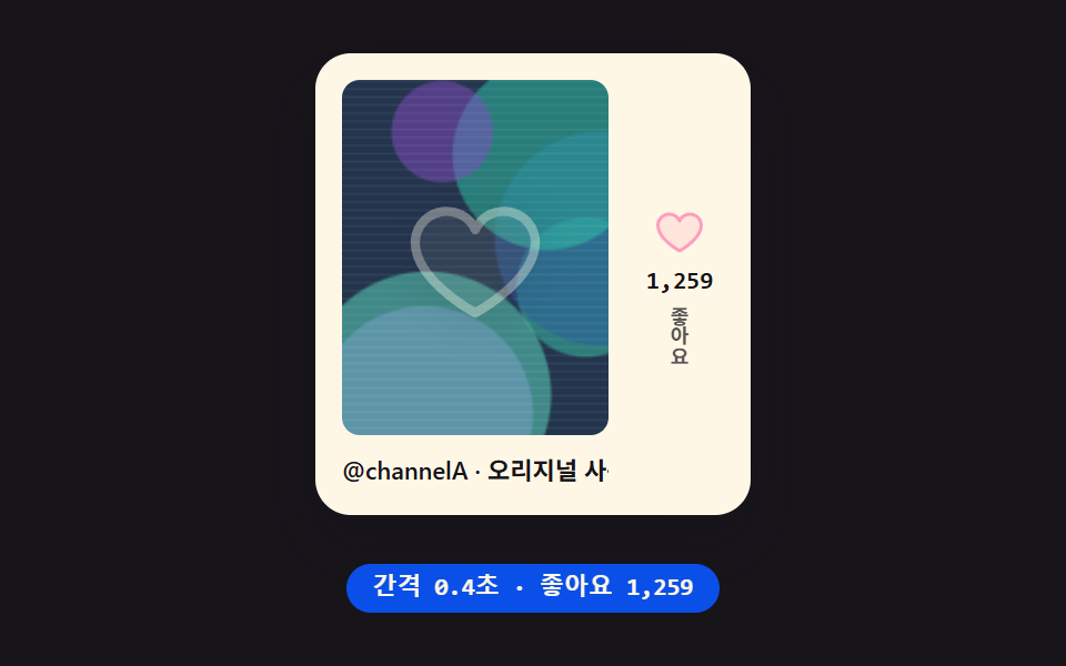 Embeds05 TikTok embed mock — a card that recomputes its like count from elapsed time9 YouTube Embed Code UI Patterns (Copy-Paste)
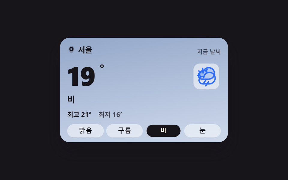 Embeds01 Current-conditions card whose sky and copy swap togetherWeather Widget Design — 9 Widgets, No Library
 Embeds01 Play/pause morph button9 Custom Video Player CSS Controls, No Video File