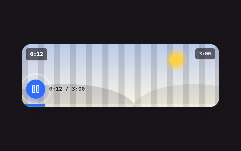
01Play/pause morph button
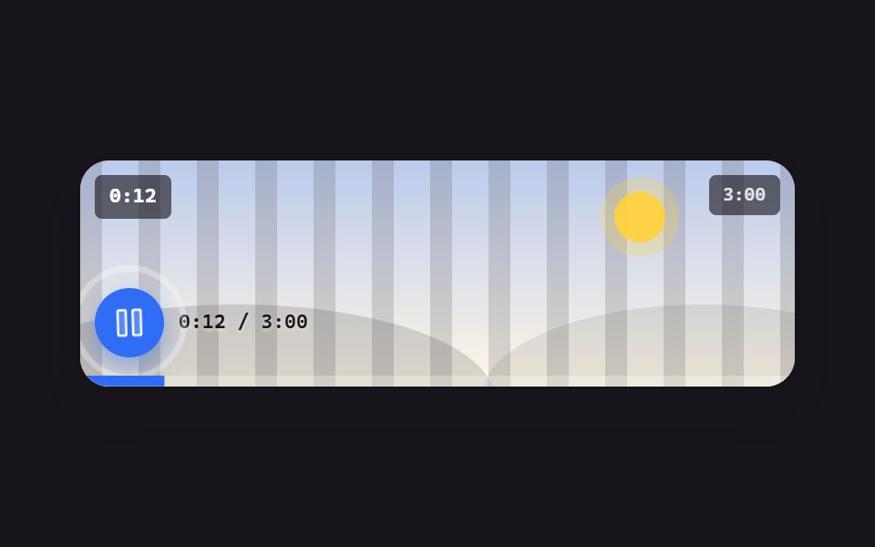
Pressing the button spins the play triangle into the pause bars while the clock beside it actually runs, and a single ripple ring confirms each press.
Best forA hero section with an embedded intro video where the very first play button has to feel alive
transform-originaria-labelripple
<main class="stage">
  <figure class="pl is-demo is-playing" id="pl">
    <div class="pl__screen">
      <div class="pl__stripes" aria-hidden="true"></div>
      <div class="pl__world" aria-hidden="true"><span class="pl__sun"></span><span class="pl__hill pl__hill--a"></span><span class="pl__hill pl__hill--b"></span></div>
      <span class="pl__clock" id="clock">0:12</span>
      <span class="pl__badge">3:00</span>
      <div class="pl__bar">
        <button class="pp" type="button" id="pp" aria-label="Pause">
          <span class="pp__ring" aria-hidden="true"></span>
          <span class="pp__ic pp__ic--play" aria-hidden="true"><svg viewBox="0 0 256 256" width="20" height="20"><g fill="currentColor"><path d="M228.23 134.69L84.15 222.81A8 8 0 0 1 72 216.12V39.88a8 8 0 0 1 12.15-6.69l144.08 88.12a7.82 7.82 0 0 1 0 13.38" opacity=".2"/><path d="M232.4 114.49L88.32 26.35a16 16 0 0 0-16.2-.3A15.86 15.86 0 0 0 64 39.87v176.26A15.94 15.94 0 0 0 80 232a16.07 16.07 0 0 0 8.36-2.35l144.04-88.14a15.81 15.81 0 0 0 0-27ZM80 215.94V40l143.83 88Z"/></g></svg></span>
          <span class="pp__ic pp__ic--pause" aria-hidden="true"><svg viewBox="0 0 256 256" width="20" height="20"><g fill="currentColor"><path d="M208 48v160a8 8 0 0 1-8 8h-40a8 8 0 0 1-8-8V48a8 8 0 0 1 8-8h40a8 8 0 0 1 8 8M96 40H56a8 8 0 0 0-8 8v160a8 8 0 0 0 8 8h40a8 8 0 0 0 8-8V48a8 8 0 0 0-8-8" opacity=".2"/><path d="M200 32h-40a16 16 0 0 0-16 16v160a16 16 0 0 0 16 16h40a16 16 0 0 0 16-16V48a16 16 0 0 0-16-16m0 176h-40V48h40ZM96 32H56a16 16 0 0 0-16 16v160a16 16 0 0 0 16 16h40a16 16 0 0 0 16-16V48a16 16 0 0 0-16-16m0 176H56V48h40Z"/></g></svg></span>
        </button>
        <span class="pl__time"><b id="t-now">0:12</b> / 3:00</span>
      </div>
      <span class="pl__fillwrap" aria-hidden="true"><span class="pl__fill" id="fill"></span></span>
    </div>
  </figure>
</main>
@use "../../../../site/static/demo-tokens" as *;
$duration: $dur-quick;
$easing: $ease-pop;
$color: $subject-blue;
@include stage($stage-ink);
.pl {
position: relative;
box-sizing: border-box;
width: min(392px, 92vw);
margin: 0;
border-radius: $r-card;
background: $subject-cream;
box-shadow: $shadow-raised;
overflow: hidden;
}
.pl__screen {
position: relative;
height: clamp(96px, 26vw, 140px);
overflow: hidden;
background: linear-gradient(180deg, rgba(47, 109, 246, .32), rgba(255, 247, 230, .96));
}
.pl__stripes {
position: absolute;
inset: 0 -72px;
background: repeating-linear-gradient(90deg, rgba(23, 20, 26, .14) 0 12px, transparent 12px 32px);
animation-name: pl-pan;
animation-duration: $dur-loop;
animation-timing-function: linear;
animation-iteration-count: infinite;
}
@keyframes pl-pan { from { transform: translateX(0); } to { transform: translateX(-64px); } }
.pl__world { position: absolute; inset: 0; }
.pl__sun {
position: absolute; right: 18%; top: 14%;
width: 28px; height: 28px; border-radius: 50%;
background: rgba(255, 210, 63, .95);
box-shadow: 0 0 0 8px rgba(255, 210, 63, .25);
}
.pl__hill { position: absolute; bottom: -46%; height: 82%; border-radius: 50%; }
.pl__hill--a { left: -14%; width: 72%; background: rgba(23, 20, 26, .15); }
.pl__hill--b { right: -18%; width: 62%; background: rgba(23, 20, 26, .09); }
.pl__clock {
position: absolute; left: $sp-2; top: $sp-2;
padding: $sp-1 $sp-2;
border-radius: $r-xs;
background: rgba(23, 20, 26, .62);
color: #fff;
font-family: ui-monospace, "Cascadia Mono", Menlo, Consolas, monospace;
font-size: 11px; line-height: 16px; font-weight: 700;
}
.pl__badge {
position: absolute; right: $sp-2; top: $sp-2;
padding: $sp-1 $sp-2;
border-radius: $r-xs;
background: rgba(23, 20, 26, .62);
color: rgba(255, 255, 255, .85);
font-family: ui-monospace, "Cascadia Mono", Menlo, Consolas, monospace;
font-size: 10px; line-height: 14px; font-weight: 600;
}
.pl__bar {
position: absolute; left: 0; right: 0; bottom: 0;
display: flex; align-items: center; gap: $sp-2;
padding: 0 $sp-2 calc(#{$sp-2} + 8px);
}
.pl__time {
color: $subject-ink; // 화면 아래쪽은 크림이라 흰 글자가 1.35~2.10:1 이었다 — 잉크로 8.69~13.49:1
font-family: ui-monospace, "Cascadia Mono", Menlo, Consolas, monospace;
font-size: 11px; line-height: 14px; font-weight: 600;
text-shadow: 0 1px 2px rgba(255, 247, 230, .6);
}
.pl__time b { font-weight: 700; }
.pp {
position: relative;
box-sizing: border-box;
width: 38px; height: 38px;
flex: 0 0 auto;
display: inline-flex; align-items: center; justify-content: center;
border: 0;
border-radius: 50%;
background: $color;
color: #fff;
cursor: pointer;
box-shadow: 0 6px 14px rgba(47, 109, 246, .45);
transition: transform $duration $easing;
}
.pp:hover { transform: scale(1.06); }
.pp:active { transform: scale(.94); }
.pp:focus-visible { outline: 2px solid $stage-yellow; outline-offset: 2px; }
.pp__ic {
position: absolute; inset: 0;
display: inline-flex; align-items: center; justify-content: center;
transition: opacity $duration $easing, transform $duration $easing;
}
.pp__ic--pause { opacity: 0; transform: rotate(120deg) scale(.3); }
.pl.is-playing .pp__ic--play { opacity: 0; transform: rotate(-120deg) scale(.3); }
.pl.is-playing .pp__ic--pause { opacity: 1; transform: none; }
.pp__ring {
position: absolute; inset: 0;
border: 2px solid rgba(255, 255, 255, .8);
border-radius: 50%;
opacity: 0;
transform: scale(1);
}
.pl__fillwrap { position: absolute; left: 0; right: 0; bottom: 0; height: 6px; background: rgba(255, 255, 255, .28); }
.pl__fill {
display: block; height: 100%;
background: $color;
transform-origin: left center; // 규칙8: 좌변서 차오름
transform: scaleX(.07);
}
// ── 자동 루프: 재생 중(일시정지 아이콘) → 멈춤(재생 아이콘) → 다시 재생. 원은 상태가 바뀌는 순간마다 한 번 퍼진다 ──
.pl.is-demo .pp__ic--play {
animation-name: pp-play; animation-duration: $dur-loop;
animation-timing-function: $easing; animation-iteration-count: infinite;
}
.pl.is-demo .pp__ic--pause {
animation-name: pp-pause; animation-duration: $dur-loop;
animation-timing-function: $easing; animation-iteration-count: infinite;
}
.pl.is-demo .pp__ring {
animation-name: pp-ring; animation-duration: $dur-loop;
animation-timing-function: ease-out; animation-iteration-count: infinite;
}
.pl.is-demo .pl__fill {
animation-name: pp-fill; animation-duration: $dur-loop;
animation-timing-function: linear; animation-iteration-count: infinite;
}
@keyframes pp-play {
0%, 38% { opacity: 0; transform: rotate(-120deg) scale(.3); }
50%, 78% { opacity: 1; transform: none; }
90%, 100% { opacity: 0; transform: rotate(-120deg) scale(.3); }
}
@keyframes pp-pause {
0%, 38% { opacity: 1; transform: none; }
50%, 78% { opacity: 0; transform: rotate(120deg) scale(.3); }
90%, 100% { opacity: 1; transform: none; }
}
@keyframes pp-ring {
0%, 36% { opacity: 0; transform: scale(.9); }
42% { opacity: .9; }
56% { opacity: 0; transform: scale(1.9); }
76% { opacity: 0; transform: scale(.9); }
82% { opacity: .9; }
96%, 100% { opacity: 0; transform: scale(1.9); }
}
@keyframes pp-fill {
0% { transform: scaleX(.07); }
38% { transform: scaleX(.3); }
50%, 78% { transform: scaleX(.3); }
90%, 100% { transform: scaleX(.07); }
}
@media (prefers-reduced-motion: reduce) {
.pl.is-demo .pp__ic--play, .pl.is-demo .pp__ic--pause, .pl.is-demo .pp__ring,
.pl.is-demo .pl__fill, .pl__stripes { animation: none !important; }
.pp, .pp__ic { transition: none; }
}html, body {
margin: 0;
overflow: hidden;
}
.stage {
box-sizing: border-box;
min-height: 100vh;
display: grid;
place-items: center;
margin: 0;
background: #17141a;
font-family: -apple-system, "Segoe UI", "Noto Sans KR", sans-serif;
padding: clamp(8px, 4vw, 24px);
}
.pl {
position: relative;
box-sizing: border-box;
width: min(392px, 92vw);
margin: 0;
border-radius: 16px;
background: #fff7e6;
box-shadow: 0 14px 24px rgba(23, 20, 26, 0.32);
overflow: hidden;
}
.pl__screen {
position: relative;
height: clamp(96px, 26vw, 140px);
overflow: hidden;
background: linear-gradient(180deg, rgba(47, 109, 246, 0.32), rgba(255, 247, 230, 0.96));
}
.pl__stripes {
position: absolute;
inset: 0 -72px;
background: repeating-linear-gradient(90deg, rgba(23, 20, 26, 0.14) 0 12px, transparent 12px 32px);
animation-name: pl-pan;
animation-duration: 2s;
animation-timing-function: linear;
animation-iteration-count: infinite;
}
@keyframes pl-pan {
from {
transform: translateX(0);
}
to {
transform: translateX(-64px);
}
}
.pl__world {
position: absolute;
inset: 0;
}
.pl__sun {
position: absolute;
right: 18%;
top: 14%;
width: 28px;
height: 28px;
border-radius: 50%;
background: rgba(255, 210, 63, 0.95);
box-shadow: 0 0 0 8px rgba(255, 210, 63, 0.25);
}
.pl__hill {
position: absolute;
bottom: -46%;
height: 82%;
border-radius: 50%;
}
.pl__hill--a {
left: -14%;
width: 72%;
background: rgba(23, 20, 26, 0.15);
}
.pl__hill--b {
right: -18%;
width: 62%;
background: rgba(23, 20, 26, 0.09);
}
.pl__clock {
position: absolute;
left: 8px;
top: 8px;
padding: 4px 8px;
border-radius: 4px;
background: rgba(23, 20, 26, 0.62);
color: #fff;
font-family: ui-monospace, "Cascadia Mono", Menlo, Consolas, monospace;
font-size: 11px;
line-height: 16px;
font-weight: 700;
}
.pl__badge {
position: absolute;
right: 8px;
top: 8px;
padding: 4px 8px;
border-radius: 4px;
background: rgba(23, 20, 26, 0.62);
color: rgba(255, 255, 255, 0.85);
font-family: ui-monospace, "Cascadia Mono", Menlo, Consolas, monospace;
font-size: 10px;
line-height: 14px;
font-weight: 600;
}
.pl__bar {
position: absolute;
left: 0;
right: 0;
bottom: 0;
display: flex;
align-items: center;
gap: 8px;
padding: 0 8px calc(8px + 8px);
}
.pl__time {
color: #17141a;
font-family: ui-monospace, "Cascadia Mono", Menlo, Consolas, monospace;
font-size: 11px;
line-height: 14px;
font-weight: 600;
text-shadow: 0 1px 2px rgba(255, 247, 230, 0.6);
}
.pl__time b {
font-weight: 700;
}
.pp {
position: relative;
box-sizing: border-box;
width: 38px;
height: 38px;
flex: 0 0 auto;
display: inline-flex;
align-items: center;
justify-content: center;
border: 0;
border-radius: 50%;
background: #2f6df6;
color: #fff;
cursor: pointer;
box-shadow: 0 6px 14px rgba(47, 109, 246, 0.45);
transition: transform 220ms cubic-bezier(0.2, 1.4, 0.4, 1);
}
.pp:hover {
transform: scale(1.06);
}
.pp:active {
transform: scale(0.94);
}
.pp:focus-visible {
outline: 2px solid #ffd23f;
outline-offset: 2px;
}
.pp__ic {
position: absolute;
inset: 0;
display: inline-flex;
align-items: center;
justify-content: center;
transition: opacity 220ms cubic-bezier(0.2, 1.4, 0.4, 1), transform 220ms cubic-bezier(0.2, 1.4, 0.4, 1);
}
.pp__ic--pause {
opacity: 0;
transform: rotate(120deg) scale(0.3);
}
.pl.is-playing .pp__ic--play {
opacity: 0;
transform: rotate(-120deg) scale(0.3);
}
.pl.is-playing .pp__ic--pause {
opacity: 1;
transform: none;
}
.pp__ring {
position: absolute;
inset: 0;
border: 2px solid rgba(255, 255, 255, 0.8);
border-radius: 50%;
opacity: 0;
transform: scale(1);
}
.pl__fillwrap {
position: absolute;
left: 0;
right: 0;
bottom: 0;
height: 6px;
background: rgba(255, 255, 255, 0.28);
}
.pl__fill {
display: block;
height: 100%;
background: #2f6df6;
transform-origin: left center;
transform: scaleX(0.07);
}
.pl.is-demo .pp__ic--play {
animation-name: pp-play;
animation-duration: 2s;
animation-timing-function: cubic-bezier(0.2, 1.4, 0.4, 1);
animation-iteration-count: infinite;
}
.pl.is-demo .pp__ic--pause {
animation-name: pp-pause;
animation-duration: 2s;
animation-timing-function: cubic-bezier(0.2, 1.4, 0.4, 1);
animation-iteration-count: infinite;
}
.pl.is-demo .pp__ring {
animation-name: pp-ring;
animation-duration: 2s;
animation-timing-function: ease-out;
animation-iteration-count: infinite;
}
.pl.is-demo .pl__fill {
animation-name: pp-fill;
animation-duration: 2s;
animation-timing-function: linear;
animation-iteration-count: infinite;
}
@keyframes pp-play {
0%, 38% {
opacity: 0;
transform: rotate(-120deg) scale(0.3);
}
50%, 78% {
opacity: 1;
transform: none;
}
90%, 100% {
opacity: 0;
transform: rotate(-120deg) scale(0.3);
}
}
@keyframes pp-pause {
0%, 38% {
opacity: 1;
transform: none;
}
50%, 78% {
opacity: 0;
transform: rotate(120deg) scale(0.3);
}
90%, 100% {
opacity: 1;
transform: none;
}
}
@keyframes pp-ring {
0%, 36% {
opacity: 0;
transform: scale(0.9);
}
42% {
opacity: 0.9;
}
56% {
opacity: 0;
transform: scale(1.9);
}
76% {
opacity: 0;
transform: scale(0.9);
}
82% {
opacity: 0.9;
}
96%, 100% {
opacity: 0;
transform: scale(1.9);
}
}
@keyframes pp-fill {
0% {
transform: scaleX(0.07);
}
38% {
transform: scaleX(0.3);
}
50%, 78% {
transform: scaleX(0.3);
}
90%, 100% {
transform: scaleX(0.07);
}
}
@media (prefers-reduced-motion: reduce) {
.pl.is-demo .pp__ic--play, .pl.is-demo .pp__ic--pause, .pl.is-demo .pp__ring,
.pl.is-demo .pl__fill, .pl__stripes {
animation: none !important;
}
.pp, .pp__ic {
transition: none;
}
}// 실제 동작: 버튼으로 Play/일시정지를 바꾸고 더미 Play 시계를 걷는다.
var root = document.getElementById('pl'),
btn = document.getElementById('pp'),
clock = document.getElementById('clock'),
now = document.getElementById('t-now'),
fill = document.getElementById('fill');
var DUR = 180, t = 12, playing = true, last = Date.now();
function fmt(s) { s = Math.floor(s); return Math.floor(s / 60) + ':' + ('0' + (s % 60)).slice(-2); }
function paint() {
clock.textContent = fmt(t);
now.textContent = fmt(t);
fill.style.transform = 'scaleX(' + (t / DUR).toFixed(4) + ')';
}
setInterval(function () {
var n = Date.now();
if (playing) t = (t + (n - last) / 1000) % DUR;
last = n;
paint();
}, 250);
function toggle() {
root.classList.remove('is-demo');
playing = !playing;
root.classList.toggle('is-playing', playing);
btn.setAttribute('aria-label', playing ? 'Pause' : 'Play');
}
btn.addEventListener('click', toggle);import { useEffect, useState } from "react";
import type { CSSProperties } from "react";
import styles from "./PlayPauseMorph.module.scss";
export type PlayPauseMorphProps = {
/** 더미 영상 길이(초) */
total?: number;
/** 시작 위치(초) */
start?: number;
duration?: number;
easing?: string;
color?: string;
};
type Vars = CSSProperties & { "--duration"?: string; "--easing"?: string; "--color"?: string };
function fmt(s: number) {
const n = Math.floor(s);
return Math.floor(n / 60) + ":" + ("0" + (n % 60)).slice(-2);
}
function PlayIcon() {
return (
<svg viewBox="0 0 256 256" width="20" height="20" aria-hidden="true">
<g fill="currentColor">
<path d="M228.23 134.69L84.15 222.81A8 8 0 0 1 72 216.12V39.88a8 8 0 0 1 12.15-6.69l144.08 88.12a7.82 7.82 0 0 1 0 13.38" opacity=".2" />
<path d="M232.4 114.49L88.32 26.35a16 16 0 0 0-16.2-.3A15.86 15.86 0 0 0 64 39.87v176.26A15.94 15.94 0 0 0 80 232a16.07 16.07 0 0 0 8.36-2.35l144.04-88.14a15.81 15.81 0 0 0 0-27ZM80 215.94V40l143.83 88Z" />
</g>
</svg>
);
}
function PauseIcon() {
return (
<svg viewBox="0 0 256 256" width="20" height="20" aria-hidden="true">
<g fill="currentColor">
<path d="M208 48v160a8 8 0 0 1-8 8h-40a8 8 0 0 1-8-8V48a8 8 0 0 1 8-8h40a8 8 0 0 1 8 8M96 40H56a8 8 0 0 0-8 8v160a8 8 0 0 0 8 8h40a8 8 0 0 0 8-8V48a8 8 0 0 0-8-8" opacity=".2" />
<path d="M200 32h-40a16 16 0 0 0-16 16v160a16 16 0 0 0 16 16h40a16 16 0 0 0 16-16V48a16 16 0 0 0-16-16m0 176h-40V48h40ZM96 32H56a16 16 0 0 0-16 16v160a16 16 0 0 0 16 16h40a16 16 0 0 0 16-16V48a16 16 0 0 0-16-16m0 176H56V48h40Z" />
</g>
</svg>
);
}
export default function PlayPauseMorph({
total = 180,
start = 12,
duration = 220,
easing = "cubic-bezier(.2,1.4,.4,1)",
color = "#2f6df6",
}: PlayPauseMorphProps) {
const [playing, setPlaying] = useState(true);
const [t, setT] = useState(start);
const [pulse, setPulse] = useState(0);
const vars: Vars = { "--duration": `${duration}ms`, "--easing": easing, "--color": color };
// 더미 재생 시계 — 바닐라의 setInterval(250ms) 를 그대로
useEffect(() => {
if (!playing) return;
let last = Date.now();
const id = setInterval(() => {
const n = Date.now();
const step = (n - last) / 1000;
last = n;
setT((p) => (p + step) % total);
}, 250);
return () => clearInterval(id);
}, [playing, total]);
function toggle() {
setPlaying((p) => !p);
setPulse((p) => p + 1);
}
return (
<figure className={`${styles.player} ${playing ? styles.isPlaying : ""}`} style={vars}>
<div className={styles.screen}>
<div className={styles.stripes} aria-hidden="true" />
<div className={styles.world} aria-hidden="true">
<span className={styles.sun} />
<span className={`${styles.hill} ${styles.hillA}`} />
<span className={`${styles.hill} ${styles.hillB}`} />
</div>
<span className={styles.clock}>{fmt(t)}</span>
<span className={styles.badge}>{fmt(total)}</span>
<div className={styles.bar}>
<button
className={styles.pp}
type="button"
aria-label={playing ? "일시정지" : "재생"}
onClick={toggle}
>
{pulse > 0 ? <span key={pulse} className={styles.ring} aria-hidden="true" /> : null}
<span className={`${styles.ic} ${styles.icPlay}`}>
<PlayIcon />
</span>
<span className={`${styles.ic} ${styles.icPause}`}>
<PauseIcon />
</span>
</button>
<span className={styles.time}>
<b>{fmt(t)}</b> / {fmt(total)}
</span>
</div>
<span className={styles.fillwrap} aria-hidden="true">
<span className={styles.fill} style={{ transform: `scaleX(${(t / total).toFixed(4)})` }} />
</span>
</div>
</figure>
);
}01 Play/pause morph button — Measured area 31.303% · moving frames 23/23Original by GODRICH · SCSS and React ship in the zip · 9 Custom Video Player CSS Controls, No Video File
The post this demo lives in
 9 Custom Video Player CSS Controls, No Video FileA custom video player css setup replaces the browser's default control bar with your own markup and styles. All nine con See all demos in this post