09Vertical side rail
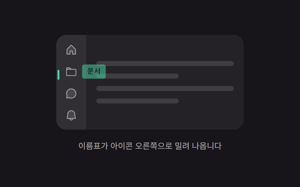
From the icon column pinned to the left edge of the screen, name tags slide out to the right of the icons one after another, and the active dot steps down by an equal stride.
Best forEditors and dashboards that move the menu to the left edge because vertical space is too precious
translateYopacityaria-current
<main class="stage">
  <div class="sr is-demo" id="sr" style="--row: 0">
    <div class="sr__frame">
      <nav class="sr__rail" aria-label="Main menu">
        <i class="sr__dot" aria-hidden="true"></i>
        <button class="sr__btn" type="button">
          <svg xmlns="http://www.w3.org/2000/svg" viewBox="0 0 256 256" aria-hidden="true"><g fill="currentColor"><path d="M216 120v96h-64v-64h-48v64H40v-96a8 8 0 0 1 2.34-5.66l80-80a8 8 0 0 1 11.32 0l80 80A8 8 0 0 1 216 120" opacity=".2"/><path d="m219.31 108.68l-80-80a16 16 0 0 0-22.62 0l-80 80A15.87 15.87 0 0 0 32 120v96a8 8 0 0 0 8 8h64a8 8 0 0 0 8-8v-56h32v56a8 8 0 0 0 8 8h64a8 8 0 0 0 8-8v-96a15.87 15.87 0 0 0-4.69-11.32M208 208h-48v-56a8 8 0 0 0-8-8h-48a8 8 0 0 0-8 8v56H48v-88l80-80l80 80Z"/></g></svg>
          <span class="sr__label">Home</span>
        </button>
        <button class="sr__btn" type="button">
          <svg xmlns="http://www.w3.org/2000/svg" viewBox="0 0 256 256" aria-hidden="true"><g fill="currentColor"><path d="M128 80H32V56a8 8 0 0 1 8-8h52.69a8 8 0 0 1 5.65 2.34Z" opacity=".2"/><path d="M216 72h-84.69L104 44.69A15.86 15.86 0 0 0 92.69 40H40a16 16 0 0 0-16 16v144.62A15.4 15.4 0 0 0 39.38 216h177.51A15.13 15.13 0 0 0 232 200.89V88a16 16 0 0 0-16-16M92.69 56l16 16H40V56ZM216 200H40V88h176Z"/></g></svg>
          <span class="sr__label">Docs</span>
        </button>
        <button class="sr__btn" type="button">
          <svg xmlns="http://www.w3.org/2000/svg" viewBox="0 0 256 256" aria-hidden="true"><g fill="currentColor"><path d="M224 128a96 96 0 0 1-144.07 83.11l-37.39 12.47a8 8 0 0 1-10.12-10.12l12.47-37.39A96 96 0 1 1 224 128" opacity=".2"/><path d="M128 24a104 104 0 0 0-91.82 152.88l-11.35 34.05a16 16 0 0 0 20.24 20.24l34.05-11.35A104 104 0 1 0 128 24m0 192a87.87 87.87 0 0 1-44.06-11.81a8 8 0 0 0-6.54-.67L40 216l12.47-37.4a8 8 0 0 0-.66-6.54A88 88 0 1 1 128 216"/></g></svg>
          <span class="sr__label">Threads</span>
        </button>
        <button class="sr__btn" type="button">
          <svg xmlns="http://www.w3.org/2000/svg" viewBox="0 0 256 256" aria-hidden="true"><g fill="currentColor"><path d="M208 192H48a8 8 0 0 1-6.88-12C47.71 168.6 56 139.81 56 104a72 72 0 0 1 144 0c0 35.82 8.3 64.6 14.9 76a8 8 0 0 1-6.9 12" opacity=".2"/><path d="M221.8 175.94c-5.55-9.56-13.8-36.61-13.8-71.94a80 80 0 1 0-160 0c0 35.34-8.26 62.38-13.81 71.94A16 16 0 0 0 48 200h40.81a40 40 0 0 0 78.38 0H208a16 16 0 0 0 13.8-24.06M128 216a24 24 0 0 1-22.62-16h45.24A24 24 0 0 1 128 216m-80-32c7.7-13.24 16-43.92 16-80a64 64 0 1 1 128 0c0 36.05 8.28 66.73 16 80Z"/></g></svg>
          <span class="sr__label">Alerts</span>
        </button>
      </nav>
      <div class="sr__body" aria-hidden="true">
        <span class="sr__line"></span>
        <span class="sr__line sr__line--short"></span>
        <span class="sr__line"></span>
        <span class="sr__line sr__line--short"></span>
      </div>
    </div>
    <p class="sr__cap">Name tags slide out to the right of the icons</p>
  </div>
</main>@use "../../../../site/static/demo-tokens" as *;
$duration: $dur-quick;
$easing: $ease-spring;
$color: $subject-mint;
@include stage($stage-ink);
@property --row {
syntax: "<integer>";
inherits: true;
initial-value: 0;
}
.sr {
--row: 0;
display: flex;
flex-direction: column;
align-items: center;
gap: $sp-4;
}
.sr__frame {
position: relative;
display: flex;
width: min(300px, 88vw);
height: 152px;
border-radius: $r-card;
overflow: hidden;
background: rgba(255, 255, 255, .06);
}
.sr__rail {
position: relative;
flex: 0 0 auto;
display: flex;
flex-direction: column;
gap: $sp-1;
padding: $sp-2;
background: rgba(255, 255, 255, .06);
}
.sr__dot {
position: absolute;
top: 20px;
left: 2px;
width: 3px;
height: 16px;
border-radius: $r-pill;
background: $color;
// 한 칸 = 버튼 32px + gap 4px = 36px
transform: translateY(calc(var(--row) * 36px));
transition: transform $duration $easing;
}
.sr__btn {
position: relative;
width: 32px;
height: 32px;
display: grid;
place-items: center;
padding: 0;
border: 0;
border-radius: $r-sm;
background: none;
color: rgba(255, 255, 255, .55);
cursor: pointer;
transition: color $duration $easing;
}
.sr__btn svg { width: 20px; height: 20px; display: block; }
.sr__btn:focus-visible { outline: 2px solid $color; outline-offset: 2px; }
.sr__btn[aria-current="page"] { color: #fff; }
.sr__label {
position: absolute;
top: 50%;
left: calc(100% + #{$sp-1});
padding: $sp-1 $sp-2;
border-radius: $r-xs;
background: $color;
color: #10231c;
font-size: 11px;
font-weight: 700;
line-height: 1.4;
white-space: nowrap;
pointer-events: none;
opacity: 0;
transform: translateY(-50%) translateX(-6px);
transition: transform $duration $easing, opacity $duration $easing;
}
.sr__btn:hover .sr__label,
.sr__btn:focus-visible .sr__label { opacity: 1; transform: translateY(-50%) translateX(0); }
.sr__body {
flex: 1 1 auto;
display: flex;
flex-direction: column;
justify-content: center;
gap: $sp-3;
padding: $sp-4;
}
.sr__line {
height: 8px;
border-radius: $r-pill;
background: rgba(255, 255, 255, .12);
}
.sr__line--short { width: 60%; }
.sr__cap {
margin: 0;
font-size: 13px;
line-height: 1.5;
color: rgba(255, 255, 255, .62);
}
/* 자동 재생 — 이름표가 위에서부터 차례로 밀려 나오고 점이 따라 내려간다 */
.is-demo .sr__label {
animation-name: sr-slide;
animation-duration: 2s;
animation-timing-function: $ease-spring;
animation-iteration-count: infinite;
}
.is-demo .sr__btn:nth-of-type(2) .sr__label { animation-delay: .4s; }
.is-demo .sr__btn:nth-of-type(3) .sr__label { animation-delay: .8s; }
.is-demo .sr__btn:nth-of-type(4) .sr__label { animation-delay: 1.2s; }
.is-demo .sr__dot {
animation-name: sr-dot;
animation-duration: 2s;
animation-timing-function: $ease-spring;
animation-iteration-count: infinite;
}
.is-demo .sr__btn {
animation-name: sr-lit;
animation-duration: 2s;
animation-timing-function: steps(1, end);
animation-iteration-count: infinite;
}
.is-demo .sr__btn:nth-of-type(2) { animation-delay: .4s; }
.is-demo .sr__btn:nth-of-type(3) { animation-delay: .8s; }
.is-demo .sr__btn:nth-of-type(4) { animation-delay: 1.2s; }
@keyframes sr-slide {
0% { opacity: 0; transform: translateY(-50%) translateX(-6px); }
6% { opacity: 1; transform: translateY(-50%) translateX(0); }
16% { opacity: 1; transform: translateY(-50%) translateX(0); }
20% { opacity: 0; transform: translateY(-50%) translateX(-6px); }
100% { opacity: 0; transform: translateY(-50%) translateX(-6px); }
}
@keyframes sr-dot {
0%, 16% { transform: translateY(0); }
20%, 36% { transform: translateY(36px); }
40%, 56% { transform: translateY(72px); }
60%, 76% { transform: translateY(108px); }
88%, 100% { transform: translateY(0); }
}
@keyframes sr-lit {
0% { color: rgba(255, 255, 255, .55); }
6% { color: #fff; }
20% { color: rgba(255, 255, 255, .55); }
100% { color: rgba(255, 255, 255, .55); }
}
@media (max-width: 340px) {
.sr__frame { height: 128px; }
.sr__body { padding: $sp-3; gap: $sp-2; }
.sr__cap { font-size: 12px; }
}
@media (prefers-reduced-motion: reduce) {
.is-demo .sr__label,
.is-demo .sr__dot,
.is-demo .sr__btn { animation-name: none; }
.sr__label,
.sr__dot,
.sr__btn { transition: none; }
}@charset "UTF-8";
html, body {
margin: 0;
overflow: hidden;
}
.stage {
box-sizing: border-box;
min-height: 100vh;
display: grid;
place-items: center;
margin: 0;
background: #17141a;
font-family: -apple-system, "Segoe UI", "Noto Sans KR", sans-serif;
padding: clamp(8px, 4vw, 24px);
}
@property --row {
syntax: "<integer>";
inherits: true;
initial-value: 0;
}
.sr {
--row: 0;
display: flex;
flex-direction: column;
align-items: center;
gap: 16px;
}
.sr__frame {
position: relative;
display: flex;
width: min(300px, 88vw);
height: 152px;
border-radius: 16px;
overflow: hidden;
background: rgba(255, 255, 255, 0.06);
}
.sr__rail {
position: relative;
flex: 0 0 auto;
display: flex;
flex-direction: column;
gap: 4px;
padding: 8px;
background: rgba(255, 255, 255, 0.06);
}
.sr__dot {
position: absolute;
top: 20px;
left: 2px;
width: 3px;
height: 16px;
border-radius: 999px;
background: #4cd4a6;
transform: translateY(calc(var(--row) * 36px));
transition: transform 220ms cubic-bezier(0.2, 0.8, 0.2, 1);
}
.sr__btn {
position: relative;
width: 32px;
height: 32px;
display: grid;
place-items: center;
padding: 0;
border: 0;
border-radius: 8px;
background: none;
color: rgba(255, 255, 255, 0.55);
cursor: pointer;
transition: color 220ms cubic-bezier(0.2, 0.8, 0.2, 1);
}
.sr__btn svg {
width: 20px;
height: 20px;
display: block;
}
.sr__btn:focus-visible {
outline: 2px solid #4cd4a6;
outline-offset: 2px;
}
.sr__btn[aria-current=page] {
color: #fff;
}
.sr__label {
position: absolute;
top: 50%;
left: calc(100% + 4px);
padding: 4px 8px;
border-radius: 4px;
background: #4cd4a6;
color: #10231c;
font-size: 11px;
font-weight: 700;
line-height: 1.4;
white-space: nowrap;
pointer-events: none;
opacity: 0;
transform: translateY(-50%) translateX(-6px);
transition: transform 220ms cubic-bezier(0.2, 0.8, 0.2, 1), opacity 220ms cubic-bezier(0.2, 0.8, 0.2, 1);
}
.sr__btn:hover .sr__label,
.sr__btn:focus-visible .sr__label {
opacity: 1;
transform: translateY(-50%) translateX(0);
}
.sr__body {
flex: 1 1 auto;
display: flex;
flex-direction: column;
justify-content: center;
gap: 12px;
padding: 16px;
}
.sr__line {
height: 8px;
border-radius: 999px;
background: rgba(255, 255, 255, 0.12);
}
.sr__line--short {
width: 60%;
}
.sr__cap {
margin: 0;
font-size: 13px;
line-height: 1.5;
color: rgba(255, 255, 255, 0.62);
}
/* 자동 재생 — 이름표가 위에서부터 차례로 밀려 나오고 점이 따라 내려간다 */
.is-demo .sr__label {
animation-name: sr-slide;
animation-duration: 2s;
animation-timing-function: cubic-bezier(0.2, 0.8, 0.2, 1);
animation-iteration-count: infinite;
}
.is-demo .sr__btn:nth-of-type(2) .sr__label {
animation-delay: 0.4s;
}
.is-demo .sr__btn:nth-of-type(3) .sr__label {
animation-delay: 0.8s;
}
.is-demo .sr__btn:nth-of-type(4) .sr__label {
animation-delay: 1.2s;
}
.is-demo .sr__dot {
animation-name: sr-dot;
animation-duration: 2s;
animation-timing-function: cubic-bezier(0.2, 0.8, 0.2, 1);
animation-iteration-count: infinite;
}
.is-demo .sr__btn {
animation-name: sr-lit;
animation-duration: 2s;
animation-timing-function: steps(1, end);
animation-iteration-count: infinite;
}
.is-demo .sr__btn:nth-of-type(2) {
animation-delay: 0.4s;
}
.is-demo .sr__btn:nth-of-type(3) {
animation-delay: 0.8s;
}
.is-demo .sr__btn:nth-of-type(4) {
animation-delay: 1.2s;
}
@keyframes sr-slide {
0% {
opacity: 0;
transform: translateY(-50%) translateX(-6px);
}
6% {
opacity: 1;
transform: translateY(-50%) translateX(0);
}
16% {
opacity: 1;
transform: translateY(-50%) translateX(0);
}
20% {
opacity: 0;
transform: translateY(-50%) translateX(-6px);
}
100% {
opacity: 0;
transform: translateY(-50%) translateX(-6px);
}
}
@keyframes sr-dot {
0%, 16% {
transform: translateY(0);
}
20%, 36% {
transform: translateY(36px);
}
40%, 56% {
transform: translateY(72px);
}
60%, 76% {
transform: translateY(108px);
}
88%, 100% {
transform: translateY(0);
}
}
@keyframes sr-lit {
0% {
color: rgba(255, 255, 255, 0.55);
}
6% {
color: #fff;
}
20% {
color: rgba(255, 255, 255, 0.55);
}
100% {
color: rgba(255, 255, 255, 0.55);
}
}
@media (max-width: 340px) {
.sr__frame {
height: 128px;
}
.sr__body {
padding: 12px;
gap: 8px;
}
.sr__cap {
font-size: 12px;
}
}
@media (prefers-reduced-motion: reduce) {
.is-demo .sr__label,
.is-demo .sr__dot,
.is-demo .sr__btn {
animation-name: none;
}
.sr__label,
.sr__dot,
.sr__btn {
transition: none;
}
}// 실제 동작: 클릭 → --row 교체(활성 점이 같은 간격씩 내려간다). 호버·포커스는 CSS 가 이름표를 민다.
var root = document.getElementById('sr');
var btns = Array.prototype.slice.call(root.querySelectorAll('.sr__btn'));
btns[0].setAttribute('aria-current', 'page');
btns.forEach(function (b, i) {
b.addEventListener('pointerenter', function () { root.classList.remove('is-demo'); });
b.addEventListener('click', function () {
root.classList.remove('is-demo');
root.style.setProperty('--row', i);
btns.forEach(function (x) { x.removeAttribute('aria-current'); });
b.setAttribute('aria-current', 'page');
});
});import { useState } from "react";
import type { CSSProperties } from "react";
import styles from "./SideRailDock.module.scss";
export type SideRailDockProps = {
/** 처음 켜져 있는 줄 (0부터) */
start?: number;
duration?: number;
easing?: string;
color?: string;
};
type Vars = CSSProperties & { "--row"?: string; "--duration"?: string; "--easing"?: string; "--color"?: string };
export default function SideRailDock({
start = 0,
duration = 220,
easing = "cubic-bezier(.2,.8,.2,1)",
color = "#4cd4a6",
}: SideRailDockProps) {
// 활성 줄 번호. 점은 이 수 × 36px 만큼 내려간다 (버튼 32px + gap 4px)
const [row, setRow] = useState(start);
const vars: Vars = {
"--row": `${row}`,
"--duration": `${duration}ms`,
"--easing": easing,
"--color": color,
};
return (
<div className={styles.sr} style={vars}>
<div className={styles.frame}>
<nav className={styles.rail} aria-label="Main menu">
<i className={styles.dot} aria-hidden="true" />
<button
className={styles.btn}
type="button"
aria-current={row === 0 ? "page" : undefined}
onClick={() => setRow(0)}
>
<svg xmlns="http://www.w3.org/2000/svg" viewBox="0 0 256 256" aria-hidden="true"><g fill="currentColor"><path d="M216 120v96h-64v-64h-48v64H40v-96a8 8 0 0 1 2.34-5.66l80-80a8 8 0 0 1 11.32 0l80 80A8 8 0 0 1 216 120" opacity=".2"/><path d="m219.31 108.68l-80-80a16 16 0 0 0-22.62 0l-80 80A15.87 15.87 0 0 0 32 120v96a8 8 0 0 0 8 8h64a8 8 0 0 0 8-8v-56h32v56a8 8 0 0 0 8 8h64a8 8 0 0 0 8-8v-96a15.87 15.87 0 0 0-4.69-11.32M208 208h-48v-56a8 8 0 0 0-8-8h-48a8 8 0 0 0-8 8v56H48v-88l80-80l80 80Z"/></g></svg>
<span className={styles.label}>Home</span>
</button>
<button
className={styles.btn}
type="button"
aria-current={row === 1 ? "page" : undefined}
onClick={() => setRow(1)}
>
<svg xmlns="http://www.w3.org/2000/svg" viewBox="0 0 256 256" aria-hidden="true"><g fill="currentColor"><path d="M128 80H32V56a8 8 0 0 1 8-8h52.69a8 8 0 0 1 5.65 2.34Z" opacity=".2"/><path d="M216 72h-84.69L104 44.69A15.86 15.86 0 0 0 92.69 40H40a16 16 0 0 0-16 16v144.62A15.4 15.4 0 0 0 39.38 216h177.51A15.13 15.13 0 0 0 232 200.89V88a16 16 0 0 0-16-16M92.69 56l16 16H40V56ZM216 200H40V88h176Z"/></g></svg>
<span className={styles.label}>Files</span>
</button>
<button
className={styles.btn}
type="button"
aria-current={row === 2 ? "page" : undefined}
onClick={() => setRow(2)}
>
<svg xmlns="http://www.w3.org/2000/svg" viewBox="0 0 256 256" aria-hidden="true"><g fill="currentColor"><path d="M224 128a96 96 0 0 1-144.07 83.11l-37.39 12.47a8 8 0 0 1-10.12-10.12l12.47-37.39A96 96 0 1 1 224 128" opacity=".2"/><path d="M128 24a104 104 0 0 0-91.82 152.88l-11.35 34.05a16 16 0 0 0 20.24 20.24l34.05-11.35A104 104 0 1 0 128 24m0 192a87.87 87.87 0 0 1-44.06-11.81a8 8 0 0 0-6.54-.67L40 216l12.47-37.4a8 8 0 0 0-.66-6.54A88 88 0 1 1 128 216"/></g></svg>
<span className={styles.label}>Chat</span>
</button>
<button
className={styles.btn}
type="button"
aria-current={row === 3 ? "page" : undefined}
onClick={() => setRow(3)}
>
<svg xmlns="http://www.w3.org/2000/svg" viewBox="0 0 256 256" aria-hidden="true"><g fill="currentColor"><path d="M208 192H48a8 8 0 0 1-6.88-12C47.71 168.6 56 139.81 56 104a72 72 0 0 1 144 0c0 35.82 8.3 64.6 14.9 76a8 8 0 0 1-6.9 12" opacity=".2"/><path d="M221.8 175.94c-5.55-9.56-13.8-36.61-13.8-71.94a80 80 0 1 0-160 0c0 35.34-8.26 62.38-13.81 71.94A16 16 0 0 0 48 200h40.81a40 40 0 0 0 78.38 0H208a16 16 0 0 0 13.8-24.06M128 216a24 24 0 0 1-22.62-16h45.24A24 24 0 0 1 128 216m-80-32c7.7-13.24 16-43.92 16-80a64 64 0 1 1 128 0c0 36.05 8.28 66.73 16 80Z"/></g></svg>
<span className={styles.label}>Alerts</span>
</button>
</nav>
<div className={styles.body} aria-hidden="true">
<span className={styles.line} />
<span className={`${styles.line} ${styles.lineShort}`} />
<span className={styles.line} />
<span className={`${styles.line} ${styles.lineShort}`} />
</div>
</div>
<p className={styles.cap}>The name tag slides out to the right of the icon</p>
</div>
);
}09 Vertical side rail — Measured area 3.178% · moving frames 16/23Original by GODRICH · SCSS and React ship in the zip · Mac Dock CSS — 9 Floating Dock Styles, No Library
The post this demo lives in
 Mac Dock CSS — 9 Floating Dock Styles, No LibraryMac dock CSS is the plain-CSS way to rebuild that floating strip of icons at a screen edge: a short bar, a few icon butt See all demos in this post
If you like this effect - similar demos
 Transitions07 Vertical tabs9 CSS Tab Switch Animations — No Library, Pure CSS
 Transitions05 Sticky sub-nav that announces the current section9 mega menu ui patterns, link list to site map
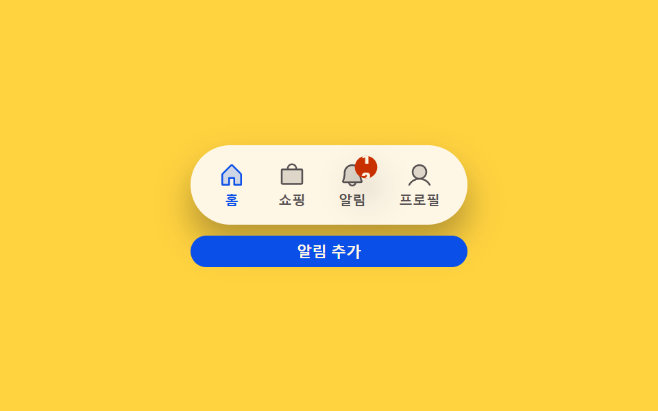 Transitions03 Badge count-bump toggle — each time a notification count value rises, that display's size value grows once then settles backCSS Bottom Navigation Bar: 9 Transition Patterns