02Angle and stop gradient
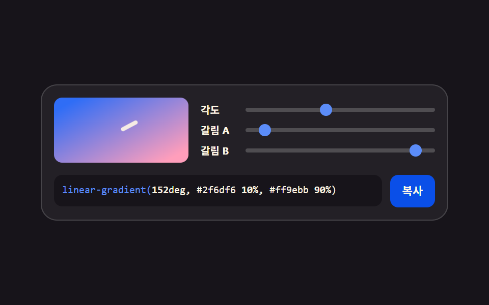
An angle slider turns the linear-gradient direction while two stop sliders push the point where the colors meet. The preview repaints on the spot.
Best forHero backgrounds, button fills, a band joining two brand colors
linear-gradient--grad-angle--grad-stop-b
<main class="stage">
<div class="gen is-demo" id="gen">
  <div class="gen__top">
    <div class="gen__preview" aria-hidden="true"><span class="gen__angle-mark"></span></div>
    <div class="gen__grid">
      <label class="gen__row">
        <span class="gen__lab">Angle</span>
        <span class="gen__slot">
          <input class="gen__rng" type="range" min="0" max="360" step="5" value="45" data-var="--grad-angle" aria-label="Gradient angle">
          <span class="gen__thumb" aria-hidden="true"></span>
        </span>
      </label>
      <label class="gen__row">
        <span class="gen__lab">Stop A</span>
        <span class="gen__slot">
          <input class="gen__rng" type="range" min="0" max="100" step="5" value="30" data-var="--grad-stop-a" aria-label="First color stop position">
          <span class="gen__thumb" aria-hidden="true"></span>
        </span>
      </label>
      <label class="gen__row">
        <span class="gen__lab">Stop B</span>
        <span class="gen__slot">
          <input class="gen__rng" type="range" min="0" max="100" step="5" value="75" data-var="--grad-stop-b" aria-label="Second color stop position">
          <span class="gen__thumb" aria-hidden="true"></span>
        </span>
      </label>
    </div>
  </div>
  <div class="gen__out">
    <code class="gen__code"><span class="gen__prop">linear-gradient(</span><span class="gen__v gen__v--angle"></span>deg, #2f6df6 <span class="gen__v gen__v--a"></span>%, #ff9ebb <span class="gen__v gen__v--b"></span>%)</code>
    <button class="gen__copy" type="button" id="copy">Copy</button>
  </div>
</div>
</main>@use "../../../../site/static/demo-tokens" as *;
// 각도와 정지점 그라디언트 — 각도·갈림 두 지점을 사용자 지정 속성 셋에 모은다.
// 미리보기·손잡이·코드 숫자 전부 같은 속성을 읽는다(01 과 같은 체계).
// 각도 눈금 마크가 미리보기 모서리를 따라 돈다 — 값이 방향이라는 걸 눈으로 보여 준다.
$duration: $dur-loop;
$easing: $ease-spring;
$color: $subject-blue-light;
$mono: ui-monospace, SFMono-Regular, "SF Mono", Consolas, "Liberation Mono", monospace;
$line: rgba(255, 255, 255, .16);
$track: rgba(255, 255, 255, .2);
$rail: 4px;
$thumb: 12px;
@property --grad-angle { syntax: "<integer>"; inherits: true; initial-value: 45; }
@property --grad-stop-a { syntax: "<integer>"; inherits: true; initial-value: 30; }
@property --grad-stop-b { syntax: "<integer>"; inherits: true; initial-value: 75; }
@include stage($stage-ink);
.gen {
min-width: 0; // stage grid item 의 자동 최소폭(min-content) 을 끊는다 — BD9
--grad-angle: 45;
--grad-stop-a: 30;
--grad-stop-b: 75;
display: flex; flex-direction: column; gap: $sp-3;
box-sizing: border-box; width: min(100%, 400px);
padding: $sp-3; border: 1px solid $line; border-radius: $r-card;
background: rgba(255, 255, 255, .05);
}
.gen__top { display: flex; align-items: center; gap: $sp-3; }
// ── 미리보기 — 각도가 속성 하나로 방향을 돌린다
.gen__preview {
position: relative; flex: 0 0 auto;
box-sizing: border-box; width: 132px; height: 64px;
border-radius: $r-sm; overflow: hidden;
background: linear-gradient(calc(var(--grad-angle) * 1deg), $subject-blue calc(var(--grad-stop-a) * 1%), $subject-pink calc(var(--grad-stop-b) * 1%));
}
// 각도 눈금 — 미리보기 왼쪽 위 모서리에서 회전하는 짧은 막대
.gen__angle-mark {
position: absolute; left: 50%; top: 50%;
width: 18px; height: 4px; margin: -2px 0 0 -18px;
border-radius: $r-pill; background: $subject-cream;
transform-origin: 18px 2px;
transform: rotate(calc(var(--grad-angle) * 1deg));
opacity: .9;
}
.gen__grid { flex: 1 1 auto; min-width: 0; display: grid; grid-template-columns: minmax(0, 1fr); gap: $sp-1; }
.gen__row { display: flex; align-items: center; gap: $sp-1; cursor: pointer; }
.gen__lab {
flex: 0 0 auto; width: 40px;
color: $subject-cream;
font-weight: 700; font-size: 10px; line-height: 1.4;
}
.gen__slot {
position: relative; flex: 1 1 auto; min-width: 0;
display: grid; align-items: center; height: 16px;
}
.gen__slot::before {
content: ""; grid-area: 1 / 1;
height: $rail; border-radius: $r-pill; background: $track;
}
.gen__rng {
grid-area: 1 / 1; appearance: none; -webkit-appearance: none;
width: 100%; min-width: 0; height: 16px; margin: 0; background: transparent;
cursor: pointer;
}
.gen__rng::-webkit-slider-thumb {
-webkit-appearance: none; appearance: none;
width: $thumb; height: $thumb; border: 0; border-radius: 50%;
background: transparent;
}
.gen__rng::-moz-range-thumb {
width: $thumb; height: $thumb; border: 0; border-radius: 50%;
background: transparent;
}
.gen__rng:focus-visible { outline: 2px solid $color; outline-offset: 2px; border-radius: $r-pill; }
.gen__thumb {
position: absolute; top: 50%; left: calc(var(--pct) * 1%);
width: $thumb; height: $thumb; margin-top: -($thumb * .5); margin-left: -($thumb * .5);
border-radius: 50%; background: $color;
pointer-events: none;
}
.gen__row:nth-child(1) .gen__thumb { --pct: calc(var(--grad-angle) / 360 * 100); }
.gen__row:nth-child(2) .gen__thumb { --pct: var(--grad-stop-a); }
.gen__row:nth-child(3) .gen__thumb { --pct: var(--grad-stop-b); }
.gen__out { display: flex; align-items: flex-start; gap: $sp-2; }
.gen__code {
flex: 1 1 auto; min-width: 0;
padding: $sp-2; border-radius: $r-sm;
background: $subject-ink; color: $subject-cream;
font-family: $mono; font-weight: 500; font-size: 10px; line-height: 1.5;
white-space: nowrap; overflow: hidden;
}
.gen__prop { color: $subject-blue-light; }
.gen__v { font-weight: 700; }
.gen__v--angle::after { counter-reset: v var(--grad-angle); content: counter(v); }
.gen__v--a::after { counter-reset: v var(--grad-stop-a); content: counter(v); }
.gen__v--b::after { counter-reset: v var(--grad-stop-b); content: counter(v); }
.gen__copy {
flex: 0 0 auto;
padding: $sp-2 $sp-3; border: 0; border-radius: $r-sm;
background: $subject-blue-deep; color: $subject-cream;
font-family: inherit; font-weight: 700; font-size: 11px; line-height: 1.4;
cursor: pointer;
}
.gen__copy:focus-visible { outline: 2px solid $color; outline-offset: 2px; }
// ── 격자 미리보기
@keyframes gradAngle { 0%, 100% { --grad-angle: 45; } 35% { --grad-angle: 210; } 70% { --grad-angle: 315; } }
@keyframes gradStopA { 0%, 100% { --grad-stop-a: 30; } 40% { --grad-stop-a: 45; } 80% { --grad-stop-a: 10; } }
@keyframes gradStopB { 0%, 100% { --grad-stop-b: 75; } 50% { --grad-stop-b: 55; } 85% { --grad-stop-b: 90; } }
.gen.is-demo {
animation-name: gradAngle, gradStopA, gradStopB;
animation-duration: $duration;
animation-timing-function: $easing;
animation-iteration-count: infinite;
}
@media (prefers-reduced-motion: reduce) {
.gen.is-demo { animation: none !important; }
}
@media (max-width: 340px) {
.gen { gap: $sp-2; padding: $sp-2; }
.gen__top { gap: $sp-2; }
.gen__preview { width: 104px; height: 56px; }
.gen__code { font-size: 9px; }
}@property --grad-angle {
syntax: "<integer>";
inherits: true;
initial-value: 45;
}
@property --grad-stop-a {
syntax: "<integer>";
inherits: true;
initial-value: 30;
}
@property --grad-stop-b {
syntax: "<integer>";
inherits: true;
initial-value: 75;
}
html, body {
margin: 0;
overflow: hidden;
}
.stage {
box-sizing: border-box;
min-height: 100vh;
display: grid;
place-items: center;
margin: 0;
background: #17141a;
font-family: -apple-system, "Segoe UI", "Noto Sans KR", sans-serif;
padding: clamp(8px, 4vw, 24px);
}
.gen {
min-width: 0;
--grad-angle: 45;
--grad-stop-a: 30;
--grad-stop-b: 75;
display: flex;
flex-direction: column;
gap: 12px;
box-sizing: border-box;
width: min(100%, 400px);
padding: 12px;
border: 1px solid rgba(255, 255, 255, 0.16);
border-radius: 16px;
background: rgba(255, 255, 255, 0.05);
}
.gen__top {
display: flex;
align-items: center;
gap: 12px;
}
.gen__preview {
position: relative;
flex: 0 0 auto;
box-sizing: border-box;
width: 132px;
height: 64px;
border-radius: 8px;
overflow: hidden;
background: linear-gradient(calc(var(--grad-angle) * 1deg), #2f6df6 calc(var(--grad-stop-a) * 1%), #ff9ebb calc(var(--grad-stop-b) * 1%));
}
.gen__angle-mark {
position: absolute;
left: 50%;
top: 50%;
width: 18px;
height: 4px;
margin: -2px 0 0 -18px;
border-radius: 999px;
background: #fff7e6;
transform-origin: 18px 2px;
transform: rotate(calc(var(--grad-angle) * 1deg));
opacity: 0.9;
}
.gen__grid {
flex: 1 1 auto;
min-width: 0;
display: grid;
grid-template-columns: minmax(0, 1fr);
gap: 4px;
}
.gen__row {
display: flex;
align-items: center;
gap: 4px;
cursor: pointer;
}
.gen__lab {
flex: 0 0 auto;
width: 40px;
color: #fff7e6;
font-weight: 700;
font-size: 10px;
line-height: 1.4;
}
.gen__slot {
position: relative;
flex: 1 1 auto;
min-width: 0;
display: grid;
align-items: center;
height: 16px;
}
.gen__slot::before {
content: "";
grid-area: 1/1;
height: 4px;
border-radius: 999px;
background: rgba(255, 255, 255, 0.2);
}
.gen__rng {
grid-area: 1/1;
appearance: none;
-webkit-appearance: none;
width: 100%;
min-width: 0;
height: 16px;
margin: 0;
background: transparent;
cursor: pointer;
}
.gen__rng::-webkit-slider-thumb {
-webkit-appearance: none;
appearance: none;
width: 12px;
height: 12px;
border: 0;
border-radius: 50%;
background: transparent;
}
.gen__rng::-moz-range-thumb {
width: 12px;
height: 12px;
border: 0;
border-radius: 50%;
background: transparent;
}
.gen__rng:focus-visible {
outline: 2px solid #5b8cf8;
outline-offset: 2px;
border-radius: 999px;
}
.gen__thumb {
position: absolute;
top: 50%;
left: calc(var(--pct) * 1%);
width: 12px;
height: 12px;
margin-top: -6px;
margin-left: -6px;
border-radius: 50%;
background: #5b8cf8;
pointer-events: none;
}
.gen__row:nth-child(1) .gen__thumb {
--pct: calc(var(--grad-angle) / 360 * 100);
}
.gen__row:nth-child(2) .gen__thumb {
--pct: var(--grad-stop-a);
}
.gen__row:nth-child(3) .gen__thumb {
--pct: var(--grad-stop-b);
}
.gen__out {
display: flex;
align-items: flex-start;
gap: 8px;
}
.gen__code {
flex: 1 1 auto;
min-width: 0;
padding: 8px;
border-radius: 8px;
background: #17141a;
color: #fff7e6;
font-family: ui-monospace, SFMono-Regular, "SF Mono", Consolas, "Liberation Mono", monospace;
font-weight: 500;
font-size: 10px;
line-height: 1.5;
white-space: nowrap;
overflow: hidden;
}
.gen__prop {
color: #5b8cf8;
}
.gen__v {
font-weight: 700;
}
.gen__v--angle::after {
counter-reset: v var(--grad-angle);
content: counter(v);
}
.gen__v--a::after {
counter-reset: v var(--grad-stop-a);
content: counter(v);
}
.gen__v--b::after {
counter-reset: v var(--grad-stop-b);
content: counter(v);
}
.gen__copy {
flex: 0 0 auto;
padding: 8px 12px;
border: 0;
border-radius: 8px;
background: #0a4fe8;
color: #fff7e6;
font-family: inherit;
font-weight: 700;
font-size: 11px;
line-height: 1.4;
cursor: pointer;
}
.gen__copy:focus-visible {
outline: 2px solid #5b8cf8;
outline-offset: 2px;
}
@keyframes gradAngle {
0%, 100% {
--grad-angle: 45;
}
35% {
--grad-angle: 210;
}
70% {
--grad-angle: 315;
}
}
@keyframes gradStopA {
0%, 100% {
--grad-stop-a: 30;
}
40% {
--grad-stop-a: 45;
}
80% {
--grad-stop-a: 10;
}
}
@keyframes gradStopB {
0%, 100% {
--grad-stop-b: 75;
}
50% {
--grad-stop-b: 55;
}
85% {
--grad-stop-b: 90;
}
}
.gen.is-demo {
animation-name: gradAngle, gradStopA, gradStopB;
animation-duration: 2s;
animation-timing-function: cubic-bezier(0.2, 0.8, 0.2, 1);
animation-iteration-count: infinite;
}
@media (prefers-reduced-motion: reduce) {
.gen.is-demo {
animation: none !important;
}
}
@media (max-width: 340px) {
.gen {
gap: 8px;
padding: 8px;
}
.gen__top {
gap: 8px;
}
.gen__preview {
width: 104px;
height: 56px;
}
.gen__code {
font-size: 9px;
}
}var gen = document.getElementById('gen');
var copyBtn = document.getElementById('copy');
var ranges = Array.prototype.slice.call(gen.querySelectorAll('.gen__rng'));
var COPY_LABEL = 'Copy';
var DONE_LABEL = 'Copied';
// 세 값 모두 gen 의 사용자 지정 속성 — 미리보기·손잡이·코드 숫자가 같은 곳을 읽는다
function readVar(name) {
return parseInt(getComputedStyle(gen).getPropertyValue(name), 10) || 0;
}
function gradientText() {
return 'linear-gradient(' + readVar('--grad-angle') + 'deg, #2f6df6 ' + readVar('--grad-stop-a') + '%, #ff9ebb ' + readVar('--grad-stop-b') + '%);';
}
// 클립보드는 iframe·http 환경에서 막힐 수 있다 — 거부된 프로미스를 반드시 catch 로 받아 선택 방식으로 떨어진다
function fallbackCopy(text) {
var area = document.createElement('textarea');
area.value = text;
area.setAttribute('readonly', '');
area.style.position = 'fixed';
area.style.opacity = '0';
document.body.appendChild(area);
area.select();
try { document.execCommand('copy'); } catch (err) { /* 여기까지 막히면 조용히 포기한다 */ }
document.body.removeChild(area);
}
ranges.forEach(function (input) {
input.addEventListener('input', function () {
gen.classList.remove('is-demo');
gen.style.setProperty(input.dataset.var, input.value);
});
input.addEventListener('pointerdown', function () { gen.classList.remove('is-demo'); });
});
copyBtn.addEventListener('click', function () {
gen.classList.remove('is-demo');
var text = gradientText();
if (navigator.clipboard && navigator.clipboard.writeText) {
navigator.clipboard.writeText(text).catch(function () { fallbackCopy(text); });
} else {
fallbackCopy(text);
}
copyBtn.textContent = DONE_LABEL;
setTimeout(function () { copyBtn.textContent = COPY_LABEL; }, 1200);
});import { useState, useMemo } from 'react';
import styles from './GradientStops.module.scss';
type Axis = { key: string; cssVar: string; label: string; min: number; max: number };
// ambient 선언에 React 이벤트 제네릭이 없어 로컬 타입으로 받는다 (blog-demo TS7006 항)
type RangeEvt = { target: { value: string } };
const AXES: Axis[] = [
{ key: 'angle', cssVar: '--grad-angle', label: '각도', min: 0, max: 360 },
{ key: 'stopA', cssVar: '--grad-stop-a', label: '갈림 A', min: 0, max: 100 },
{ key: 'stopB', cssVar: '--grad-stop-b', label: '갈림 B', min: 0, max: 100 }
];
export type GradientStopsProps = {
duration?: string;
easing?: string;
color?: string;
};
export default function GradientStops({ duration = '2s', easing = 'cubic-bezier(.2, .8, .2, 1)', color = '#5b8cf8' }: GradientStopsProps) {
const [values, setValues] = useState<Record<string, number>>({ angle: 45, stopA: 30, stopB: 75 });
const [live, setLive] = useState(true);
const codeText = useMemo(() => {
return `linear-gradient(${values.angle}deg, #2f6df6 ${values.stopA}%, #ff9ebb ${values.stopB}%);`;
}, [values]);
const style = {
'--dur-loop': duration,
'--ease-spring': easing,
'--accent': color,
'--grad-angle': values.angle,
'--grad-stop-a': values.stopA,
'--grad-stop-b': values.stopB
} as Record<string, string | number>;
function copy() {
setLive(false);
try {
navigator.clipboard.writeText(codeText);
} catch (err) {
/* 클립보드가 막힌 환경에서는 조용히 넘어간다 */
}
}
return (
<div className={live ? `${styles.gen} ${styles.isDemo}` : styles.gen} style={style}>
<div className={styles.top}>
<div className={styles.preview} aria-hidden="true"><span className={styles.angleMark}></span></div>
<div className={styles.grid}>
{AXES.map((axis) => (
<label className={styles.row} key={axis.key}>
<span className={styles.lab}>{axis.label}</span>
<span className={styles.slot}>
<input
className={styles.rng}
type="range"
min={axis.min}
max={axis.max}
step={5}
value={values[axis.key]}
aria-label={axis.label}
onChange={(e: RangeEvt) => {
setLive(false);
setValues((v) => ({ ...v, [axis.key]: Number(e.target.value) }));
}}
/>
<span
className={styles.thumb}
aria-hidden="true"
style={{ left: `${((values[axis.key] - axis.min) / (axis.max - axis.min)) * 100}%` }}
/>
</span>
</label>
))}
</div>
</div>
<div className={styles.out}>
<code className={styles.code}>
<span className={styles.prop}>linear-gradient(</span>{values.angle}deg, #2f6df6 {values.stopA}%, #ff9ebb {values.stopB}%)
</code>
<button className={styles.copy} type="button" onClick={copy}>복사</button>
</div>
</div>
);
}02 Angle and stop gradient — Measured area 8.818% · moving frames 23/23Original by GODRICH · SCSS and React ship in the zip · CSS Generator: 9 Sliders That Write the Code
The post this demo lives in
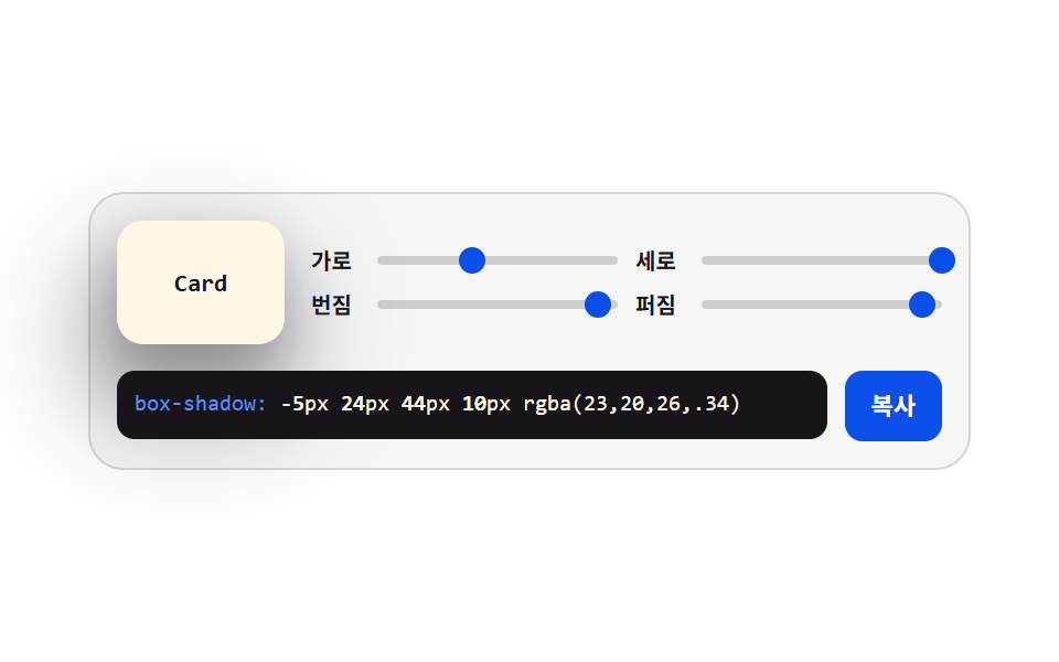 CSS Generator: 9 Sliders That Write the CodeA CSS generator is a small panel that turns a CSS value into a control you can move: drag a slider, read the code. Nine See all demos in this post
If you like this effect - similar demos
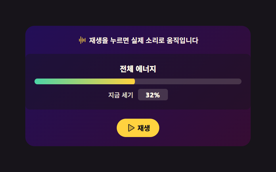 Creative UI06 Energy gradient backgroundAudio Visualizer JavaScript: 9 Parts, No Library
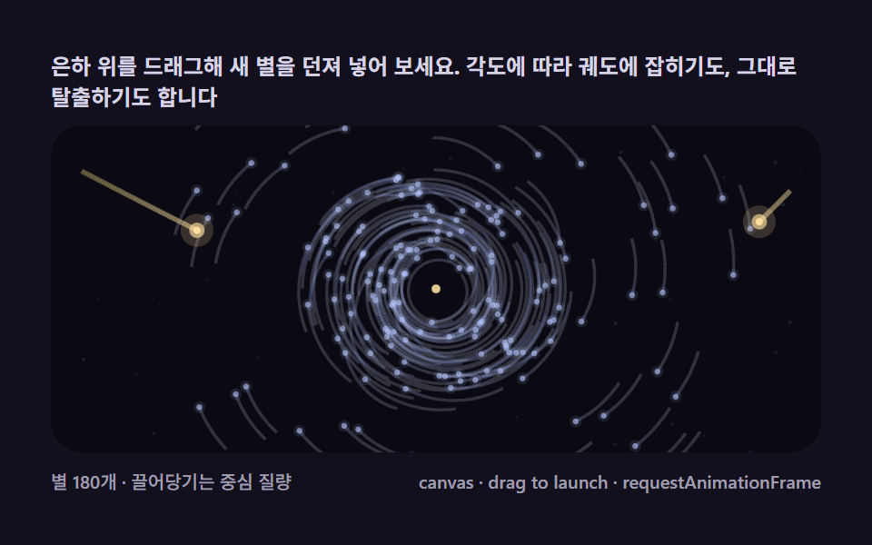 Creative UI07 Launch a comet — drag angle and power to throw a star in yourselfN Body Simulation, 9 Ways (Galaxy, No Library)
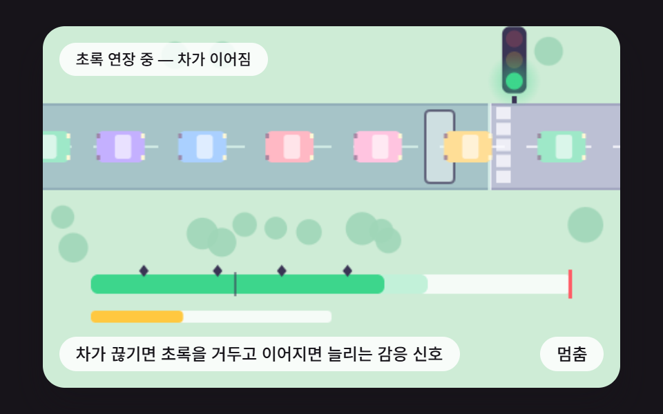 Creative UI09 A Responsive Signal That Ends Green When Cars Stop Coming and Extends It While They DoTraffic Light CSS: 9 Demos With Queues and Waves