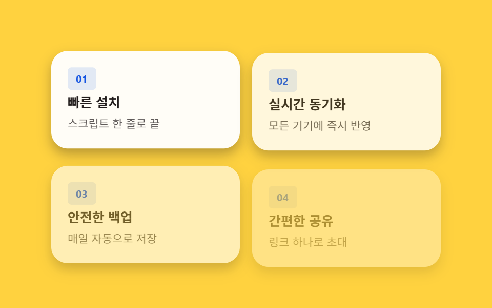
02Feature card grid — cards revealing in order from a visible-ratio value
Once a card's visible-ratio value crosses a threshold, it appears in turn starting at a time computed from its order value times a fixed interval.
Best forA features section, a list of service strengths
--ianimation-delaytranslateY
<main class="stage" id="stage">
  <div class="grid is-demo">
    <article class="card" style="--i:0">
      <p class="card__badge">01</p>
      <h3 class="card__title">Fast install</h3>
      <p class="card__desc">Done with one line of script</p>
    </article>
    <article class="card" style="--i:1">
      <p class="card__badge">02</p>
      <h3 class="card__title">Real-time sync</h3>
      <p class="card__desc">Instantly reflected on every device</p>
    </article>
    <article class="card" style="--i:2">
      <p class="card__badge">03</p>
      <h3 class="card__title">Secure backup</h3>
      <p class="card__desc">Saved automatically every day</p>
    </article>
    <article class="card" style="--i:3">
      <p class="card__badge">04</p>
      <h3 class="card__title">Easy sharing</h3>
      <p class="card__desc">Invite with a single link</p>
    </article>
  </div>
</main>
@use "../../../../site/static/demo-tokens" as *;
// 계산 상수: 카드 순서 값(--i) × 간격 상수(스태거 간격)
$stagger-step: 120ms;
$duration: $dur-enter;
$easing: $ease-out;
$color: $subject-blue-deep;
@include stage($stage-yellow);
.grid {
display: grid;
grid-template-columns: repeat(2, 1fr);
gap: $sp-3;
width: 100%;
max-width: 380px;
}
.card {
box-sizing: border-box;
display: flex;
flex-direction: column;
gap: $sp-1;
padding: $sp-4;
border-radius: $r-card;
background: $stage-paper;
box-shadow: $shadow-press;
opacity: 0;
transform: translateY(14px);
}
.card__badge {
margin: 0;
align-self: flex-start;
padding: $sp-1 $sp-2;
border-radius: $r-xs;
background: rgba($color, .12);
color: $color;
font-weight: 700;
font-size: 10px;
line-height: 1.4;
}
.card__title {
margin: 0;
color: $subject-ink;
font-weight: 600;
font-size: 13px;
line-height: 1.3;
}
.card__desc {
margin: 0;
color: rgba($subject-ink, .72);
font-weight: 400;
font-size: 11px;
line-height: 1.5;
}
.is-demo .card {
animation: card-in $duration $easing both;
animation-delay: calc(var(--i) * #{$stagger-step});
}
@keyframes card-in {
0% { opacity: 0; transform: translateY(14px); }
100% { opacity: 1; transform: translateY(0); }
}
@media (max-width: 340px) {
.grid { gap: $sp-2; max-width: 280px; }
.card { padding: $sp-2 $sp-3; gap: 0; }
.card__title { font-size: 12px; }
.card__desc { font-size: 10px; }
}
@media (prefers-reduced-motion: reduce) {
.is-demo .card { animation: none; opacity: 1; transform: none; }
}html, body {
margin: 0;
overflow: hidden;
}
.stage {
box-sizing: border-box;
min-height: 100vh;
display: grid;
place-items: center;
margin: 0;
background: #ffd23f;
font-family: -apple-system, "Segoe UI", "Noto Sans KR", sans-serif;
padding: clamp(8px, 4vw, 24px);
}
.grid {
display: grid;
grid-template-columns: repeat(2, 1fr);
gap: 12px;
width: 100%;
max-width: 380px;
}
.card {
box-sizing: border-box;
display: flex;
flex-direction: column;
gap: 4px;
padding: 16px;
border-radius: 16px;
background: #ffffff;
box-shadow: 0 6px 12px rgba(23, 20, 26, 0.32);
opacity: 0;
transform: translateY(14px);
}
.card__badge {
margin: 0;
align-self: flex-start;
padding: 4px 8px;
border-radius: 4px;
background: rgba(10, 79, 232, 0.12);
color: #0a4fe8;
font-weight: 700;
font-size: 10px;
line-height: 1.4;
}
.card__title {
margin: 0;
color: #17141a;
font-weight: 600;
font-size: 13px;
line-height: 1.3;
}
.card__desc {
margin: 0;
color: rgba(23, 20, 26, 0.72);
font-weight: 400;
font-size: 11px;
line-height: 1.5;
}
.is-demo .card {
animation: card-in 600ms ease-out both;
animation-delay: calc(var(--i) * 120ms);
}
@keyframes card-in {
0% {
opacity: 0;
transform: translateY(14px);
}
100% {
opacity: 1;
transform: translateY(0);
}
}
@media (max-width: 340px) {
.grid {
gap: 8px;
max-width: 280px;
}
.card {
padding: 8px 12px;
gap: 0;
}
.card__title {
font-size: 12px;
}
.card__desc {
font-size: 10px;
}
}
@media (prefers-reduced-motion: reduce) {
.is-demo .card {
animation: none;
opacity: 1;
transform: none;
}
}import type { CSSProperties } from "react";
import styles from "./FeatureGrid.module.scss";
// 카드 순서 값(--i)에 간격 상수(스태거 간격)를 곱한 값을 animation-delay 로 써서 카드가 순서대로 뜬다.
// 계산 겹: 카드 순서 값(--i) × 간격 상수 -> animation-delay. 리스너 없음(자동 재생).
type Vars = CSSProperties & { "--i"?: number };
const FEATURES = [
{ badge: "01", title: "빠른 설치", desc: "스크립트 한 줄로 끝" },
{ badge: "02", title: "실시간 동기화", desc: "모든 기기에 즉시 반영" },
{ badge: "03", title: "안전한 백업", desc: "매일 자동으로 저장" },
{ badge: "04", title: "간편한 공유", desc: "링크 하나로 초대" },
];
export default function FeatureGrid() {
return (
<main className={styles.stage}>
<div className={`${styles.grid} ${styles["is-demo"]}`}>
{FEATURES.map((item, i) => (
<article
key={item.badge}
className={styles.card}
style={{ "--i": i } as Vars}
>
<p className={styles.card__badge}>{item.badge}</p>
<h3 className={styles.card__title}>{item.title}</h3>
<p className={styles.card__desc}>{item.desc}</p>
</article>
))}
</div>
</main>
);
}02 Feature card grid — cards revealing in order from a visible-ratio value — Measured area 57.951% · moving frames 12/23Original by GODRICH · SCSS and React ship in the zip · Hero Section Design Examples: 9 Patterns
The post this demo lives in
 Hero Section Design Examples: 9 PatternsHero section design examples: One sets a card reveal delay from its order value past a visibility threshold; one resizes See all demos in this post