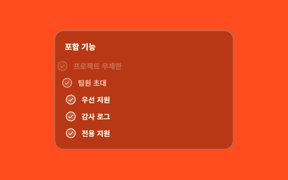
06Included features light up row by row
The features included in a plan switch on one row at a time from the top, and the starting state is pinned in advance so no row flashes fully drawn while it waits its turn.
Best forThe included-feature list inside a plan card, checklist-style comparison cells
animation-delayanimation-fill-mode--i
<main class="stage">
  <div class="fc is-demo">
    <div class="fc__card" id="fc-card" tabindex="0">
      <span class="fc__title">What is included</span>
      <ul class="fc__list">
        <li class="fc__row" style="--i: 0">
          <span class="fc__ic" aria-hidden="true"><svg viewBox="0 0 256 256" width="20" height="20"><g fill="currentColor"><path d="M224 128a96 96 0 1 1-96-96a96 96 0 0 1 96 96" opacity=".2"/><path d="M173.66 98.34a8 8 0 0 1 0 11.32l-56 56a8 8 0 0 1-11.32 0l-24-24a8 8 0 0 1 11.32-11.32L112 148.69l50.34-50.35a8 8 0 0 1 11.32 0M232 128A104 104 0 1 1 128 24a104.11 104.11 0 0 1 104 104m-16 0a88 88 0 1 0-88 88a88.1 88.1 0 0 0 88-88"/></g></svg></span>
          <span class="fc__label">Unlimited projects included</span>
        </li>
        <li class="fc__row" style="--i: 1">
          <span class="fc__ic" aria-hidden="true"><svg viewBox="0 0 256 256" width="20" height="20"><g fill="currentColor"><path d="M224 128a96 96 0 1 1-96-96a96 96 0 0 1 96 96" opacity=".2"/><path d="M173.66 98.34a8 8 0 0 1 0 11.32l-56 56a8 8 0 0 1-11.32 0l-24-24a8 8 0 0 1 11.32-11.32L112 148.69l50.34-50.35a8 8 0 0 1 11.32 0M232 128A104 104 0 1 1 128 24a104.11 104.11 0 0 1 104 104m-16 0a88 88 0 1 0-88 88a88.1 88.1 0 0 0 88-88"/></g></svg></span>
          <span class="fc__label">Invite teammates</span>
        </li>
        <li class="fc__row" style="--i: 2">
          <span class="fc__ic" aria-hidden="true"><svg viewBox="0 0 256 256" width="20" height="20"><g fill="currentColor"><path d="M224 128a96 96 0 1 1-96-96a96 96 0 0 1 96 96" opacity=".2"/><path d="M173.66 98.34a8 8 0 0 1 0 11.32l-56 56a8 8 0 0 1-11.32 0l-24-24a8 8 0 0 1 11.32-11.32L112 148.69l50.34-50.35a8 8 0 0 1 11.32 0M232 128A104 104 0 1 1 128 24a104.11 104.11 0 0 1 104 104m-16 0a88 88 0 1 0-88 88a88.1 88.1 0 0 0 88-88"/></g></svg></span>
          <span class="fc__label">Priority support</span>
        </li>
        <li class="fc__row" style="--i: 3">
          <span class="fc__ic" aria-hidden="true"><svg viewBox="0 0 256 256" width="20" height="20"><g fill="currentColor"><path d="M224 128a96 96 0 1 1-96-96a96 96 0 0 1 96 96" opacity=".2"/><path d="M173.66 98.34a8 8 0 0 1 0 11.32l-56 56a8 8 0 0 1-11.32 0l-24-24a8 8 0 0 1 11.32-11.32L112 148.69l50.34-50.35a8 8 0 0 1 11.32 0M232 128A104 104 0 1 1 128 24a104.11 104.11 0 0 1 104 104m-16 0a88 88 0 1 0-88 88a88.1 88.1 0 0 0 88-88"/></g></svg></span>
          <span class="fc__label">Audit log</span>
        </li>
        <li class="fc__row" style="--i: 4">
          <span class="fc__ic" aria-hidden="true"><svg viewBox="0 0 256 256" width="20" height="20"><g fill="currentColor"><path d="M224 128a96 96 0 1 1-96-96a96 96 0 0 1 96 96" opacity=".2"/><path d="M173.66 98.34a8 8 0 0 1 0 11.32l-56 56a8 8 0 0 1-11.32 0l-24-24a8 8 0 0 1 11.32-11.32L112 148.69l50.34-50.35a8 8 0 0 1 11.32 0M232 128A104 104 0 1 1 128 24a104.11 104.11 0 0 1 104 104m-16 0a88 88 0 1 0-88 88a88.1 88.1 0 0 0 88-88"/></g></svg></span>
          <span class="fc__label">Dedicated support</span>
        </li>
      </ul>
    </div>
  </div>
</main>@use "../../../../site/static/demo-tokens" as *;
$duration: $dur-base;
$easing: $ease-spring;
$color: $subject-cream;
$stagger: 160ms;
@include stage($stage-orange);
.fc {
box-sizing: border-box;
font-family: -apple-system, "Segoe UI", "Noto Sans KR", sans-serif;
color: $color;
}
.fc__card {
box-sizing: border-box;
width: min(300px, 88vw);
padding: $sp-4;
display: flex;
flex-direction: column;
gap: $sp-3;
border: 2px solid rgba(255, 255, 255, .22);
border-radius: $r-card;
background-color: rgba(0, 0, 0, .28); // 크림 글자가 4.5:1 을 넘게 무대 주황을 눌러 둔다 (실측 5.4:1)
}
.fc__card:focus-visible { outline: 2px solid $color; outline-offset: 2px; }
.fc__title {
font-size: 13px;
line-height: 20px;
font-weight: 800;
opacity: 1;
}
.fc__list {
margin: 0;
padding: 0;
list-style: none;
display: flex;
flex-direction: column;
gap: $sp-2;
}
// 정적 상태 — 루프 밖에서는 다섯 줄이 전부 보인다. 연출은 이 위에 덧씌운다
.fc__row {
display: flex;
align-items: center;
gap: $sp-2;
opacity: 1;
transform: translateX(0);
}
.fc__ic {
display: inline-flex;
flex: 0 0 auto;
color: $color;
}
.fc__ic svg { display: block; }
.fc__label {
flex: 1 1 auto;
min-width: 0;
font-size: 12px;
line-height: 18px;
font-weight: 700;
white-space: nowrap;
overflow: hidden;
text-overflow: ellipsis;
}
// ── 자동 루프 ──
// 줄마다 --i 로 시차를 준다. animation: 단축을 쓰면 delay 가 0 으로 리셋되므로 낱개 속성으로만 쓰고,
// 늦게 시작하는 줄이 0프레임에 완성 상태로 번쩍이지 않게 fill-mode: backwards 를 반드시 함께 둔다
.fc.is-demo .fc__row {
animation-name: fc-line;
animation-duration: $dur-loop;
animation-timing-function: $easing;
animation-iteration-count: infinite;
animation-delay: calc(var(--i) * #{$stagger});
animation-fill-mode: backwards;
}
// 꺼진 줄도 옅게 남는다. 다섯 줄을 한꺼번에 투명하게 지우면 그 한 프레임이 가장 크게 변한 장이 되어
// 대표 이미지가 거의 빈 화면으로 뽑힌다 (255-03 계열 함정). 끄는 일도 줄마다 제 시차로 맡긴다
@keyframes fc-line {
0% { opacity: .26; transform: translateX(-14px); }
12% { opacity: 1; transform: translateX(0); }
74% { opacity: 1; transform: translateX(0); }
86% { opacity: .26; transform: translateX(-14px); }
100% { opacity: .26; transform: translateX(-14px); }
}
// 사람이 올리거나 초점을 주면 같은 순서로 한 번 돈다
.fc:not(.is-demo) .fc__card:hover .fc__row,
.fc:not(.is-demo) .fc__card:focus-within .fc__row {
animation-name: fc-in;
animation-duration: $duration;
animation-timing-function: $easing;
animation-iteration-count: 1;
animation-delay: calc(var(--i) * #{$stagger});
animation-fill-mode: backwards;
}
@keyframes fc-in {
from { opacity: 0; transform: translateX(-14px); }
to { opacity: 1; transform: translateX(0); }
}
@media (max-width: 340px) {
.fc__card { padding: $sp-3; gap: $sp-2; }
.fc__list { gap: $sp-1; }
.fc__title { font-size: 12px; line-height: 16px; }
.fc__label { font-size: 11px; line-height: 16px; }
.fc__ic svg { width: 16px; height: 16px; }
}
@media (prefers-reduced-motion: reduce) {
.fc.is-demo .fc__row,
.fc:not(.is-demo) .fc__card:hover .fc__row,
.fc:not(.is-demo) .fc__card:focus-within .fc__row { animation: none !important; }
.fc.is-demo .fc__row { opacity: 1; transform: translateX(0); }
}html, body {
margin: 0;
overflow: hidden;
}
.stage {
box-sizing: border-box;
min-height: 100vh;
display: grid;
place-items: center;
margin: 0;
background: #ff4d1f;
font-family: -apple-system, "Segoe UI", "Noto Sans KR", sans-serif;
padding: clamp(8px, 4vw, 24px);
}
.fc {
box-sizing: border-box;
font-family: -apple-system, "Segoe UI", "Noto Sans KR", sans-serif;
color: #fff7e6;
}
.fc__card {
box-sizing: border-box;
width: min(300px, 88vw);
padding: 16px;
display: flex;
flex-direction: column;
gap: 12px;
border: 2px solid rgba(255, 255, 255, 0.22);
border-radius: 16px;
background-color: rgba(0, 0, 0, 0.28);
}
.fc__card:focus-visible {
outline: 2px solid #fff7e6;
outline-offset: 2px;
}
.fc__title {
font-size: 13px;
line-height: 20px;
font-weight: 800;
opacity: 1;
}
.fc__list {
margin: 0;
padding: 0;
list-style: none;
display: flex;
flex-direction: column;
gap: 8px;
}
.fc__row {
display: flex;
align-items: center;
gap: 8px;
opacity: 1;
transform: translateX(0);
}
.fc__ic {
display: inline-flex;
flex: 0 0 auto;
color: #fff7e6;
}
.fc__ic svg {
display: block;
}
.fc__label {
flex: 1 1 auto;
min-width: 0;
font-size: 12px;
line-height: 18px;
font-weight: 700;
white-space: nowrap;
overflow: hidden;
text-overflow: ellipsis;
}
.fc.is-demo .fc__row {
animation-name: fc-line;
animation-duration: 2s;
animation-timing-function: cubic-bezier(0.2, 0.8, 0.2, 1);
animation-iteration-count: infinite;
animation-delay: calc(var(--i) * 160ms);
animation-fill-mode: backwards;
}
@keyframes fc-line {
0% {
opacity: 0.26;
transform: translateX(-14px);
}
12% {
opacity: 1;
transform: translateX(0);
}
74% {
opacity: 1;
transform: translateX(0);
}
86% {
opacity: 0.26;
transform: translateX(-14px);
}
100% {
opacity: 0.26;
transform: translateX(-14px);
}
}
.fc:not(.is-demo) .fc__card:hover .fc__row,
.fc:not(.is-demo) .fc__card:focus-within .fc__row {
animation-name: fc-in;
animation-duration: 300ms;
animation-timing-function: cubic-bezier(0.2, 0.8, 0.2, 1);
animation-iteration-count: 1;
animation-delay: calc(var(--i) * 160ms);
animation-fill-mode: backwards;
}
@keyframes fc-in {
from {
opacity: 0;
transform: translateX(-14px);
}
to {
opacity: 1;
transform: translateX(0);
}
}
@media (max-width: 340px) {
.fc__card {
padding: 12px;
gap: 8px;
}
.fc__list {
gap: 4px;
}
.fc__title {
font-size: 12px;
line-height: 16px;
}
.fc__label {
font-size: 11px;
line-height: 16px;
}
.fc__ic svg {
width: 16px;
height: 16px;
}
}
@media (prefers-reduced-motion: reduce) {
.fc.is-demo .fc__row,
.fc:not(.is-demo) .fc__card:hover .fc__row,
.fc:not(.is-demo) .fc__card:focus-within .fc__row {
animation: none !important;
}
.fc.is-demo .fc__row {
opacity: 1;
transform: translateX(0);
}
}// 시차는 전부 CSS 몫이다 — 줄마다 --i 가 있고 animation-delay: calc(var(--i) * 160ms) 가 순서를 만든다.
// JS 는 사람이 카드에 닿는 순간 자동 루프를 끄기만 한다. 그 뒤로는 호버·초점이 같은 순서로 한 번 돌린다.
var root = document.querySelector('.fc');
var card = document.getElementById('fc-card');
function stop() { root.classList.remove('is-demo'); }
card.addEventListener('pointerenter', stop);
card.addEventListener('focusin', stop);
card.addEventListener('click', stop);import { useState } from "react";
import type { CSSProperties } from "react";
import styles from "./FeatureCheckStagger.module.scss";
export type FeatureCheckStaggerProps = {
title?: string;
features?: string[];
/** 한 줄과 다음 줄 사이의 시차(ms) */
stagger?: number;
duration?: number;
easing?: string;
color?: string;
};
type Vars = CSSProperties & {
"--duration"?: string;
"--easing"?: string;
"--color"?: string;
"--stagger"?: string;
};
type RowVars = CSSProperties & { "--i"?: number };
const FEATURES = [
"Unlimited projects included",
"Invite teammates",
"Priority support",
"Audit log",
"Dedicated support",
];
// Phosphor Duotone check-circle — 손으로 그리지 않고 내려받은 path 를 그대로 쓴다
function CheckIcon() {
return (
<svg viewBox="0 0 256 256" width="20" height="20">
<g fill="currentColor">
<path d="M224 128a96 96 0 1 1-96-96a96 96 0 0 1 96 96" opacity=".2" />
<path d="M173.66 98.34a8 8 0 0 1 0 11.32l-56 56a8 8 0 0 1-11.32 0l-24-24a8 8 0 0 1 11.32-11.32L112 148.69l50.34-50.35a8 8 0 0 1 11.32 0M232 128A104 104 0 1 1 128 24a104.11 104.11 0 0 1 104 104m-16 0a88 88 0 1 0-88 88a88.1 88.1 0 0 0 88-88" />
</g>
</svg>
);
}
export default function FeatureCheckStagger({
title = "What is included",
features = FEATURES,
stagger = 160,
duration = 300,
easing = "cubic-bezier(.2, .8, .2, 1)",
color = "#fff7e6",
}: FeatureCheckStaggerProps) {
const [demo, setDemo] = useState(true);
const vars: Vars = {
"--duration": `${duration}ms`,
"--easing": easing,
"--color": color,
"--stagger": `${stagger}ms`,
};
// 사람이 카드에 닿으면 자동 루프를 끈다 — 그 뒤로는 호버·초점이 같은 순서로 한 번 돌린다
const stop = () => setDemo(false);
return (
<div className={`${styles.fc} ${demo ? styles.isDemo : ""}`} style={vars}>
<div className={styles.card} tabIndex={0} onPointerEnter={stop} onFocus={stop} onClick={stop}>
<span className={styles.title}>{title}</span>
<ul className={styles.list}>
{features.map((f, i) => (
<li key={f} className={styles.row} style={{ "--i": i } as RowVars}>
<span className={styles.ic} aria-hidden="true">
<CheckIcon />
</span>
<span className={styles.label}>{f}</span>
</li>
))}
</ul>
</div>
</div>
);
}06 Included features light up row by row — Measured area 3.764% · moving frames 17/23Original by GODRICH · SCSS and React ship in the zip · Pricing Table Design: 9 Live Interactions
The post this demo lives in
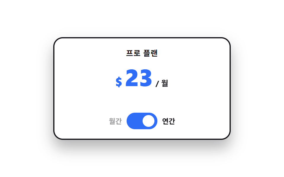 Pricing Table Design: 9 Live InteractionsIn pricing table design, the work happens on top of the cards, not inside them. All nine run on vanilla JS and SCSS, and See all demos in this post
If you like this effect - similar demos
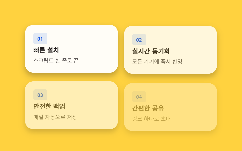 Landing sections02 Feature card grid — cards revealing in order from a visible-ratio valueHero Section Design Examples: 9 Patterns
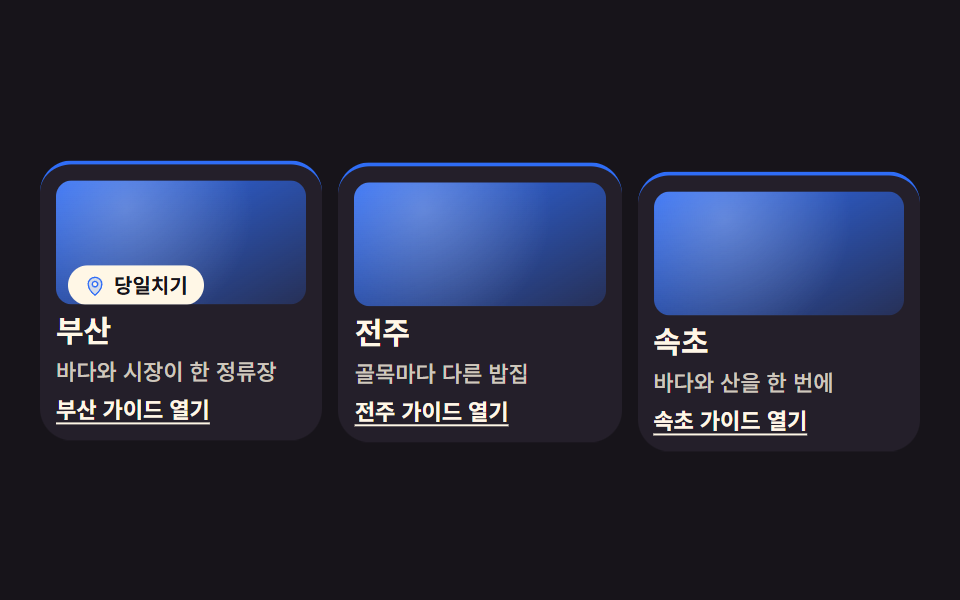 Landing sections01 City guide grid cardCSS Card Design Examples — 9 Content Card Types
 Landing sections04 Anchored price stackLanding Page Conversion: 9 Sections That Convert