06Head shake on failure
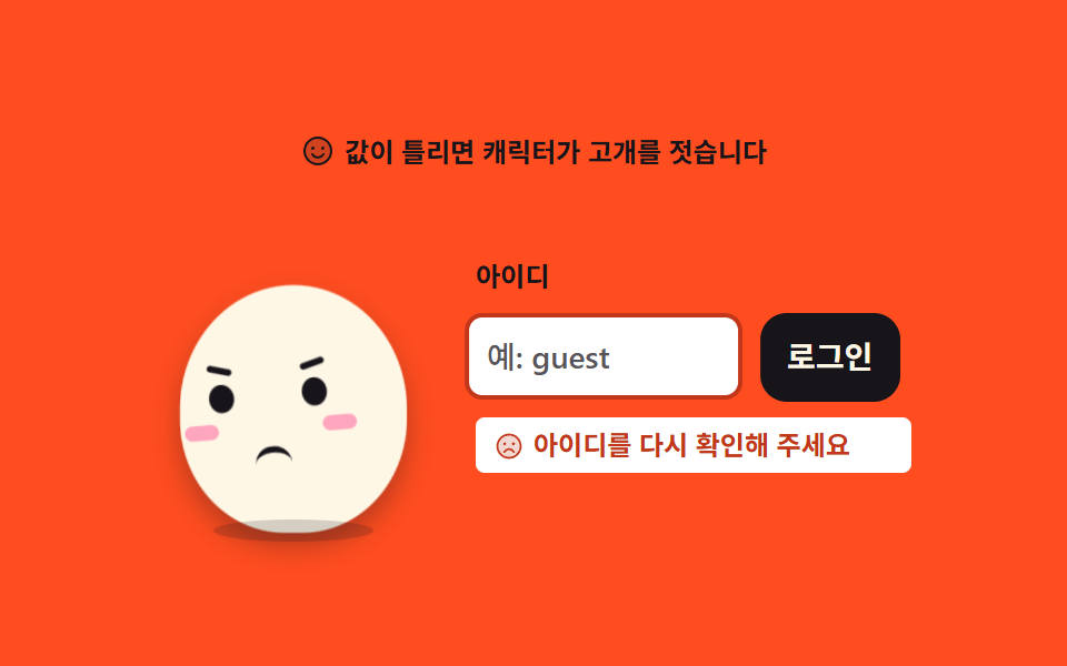
When the value is wrong the character shakes its head and the field rocks on the same beat. The face swaps in one frame so no in-between expression appears.
Best forA form failure spot such as a wrong password or a taken username, where the reader must type again
translateXsteps(1, end)aria-liveanimation-name
<svg width="0" height="0" style="position:absolute" aria-hidden="true">
  <defs>
    <symbol id="ico-smiley" viewBox="0 0 256 256" fill="currentColor"><path d="M224 128a96 96 0 1 1-96-96a96 96 0 0 1 96 96" opacity=".2"/><path d="M128 24a104 104 0 1 0 104 104A104.11 104.11 0 0 0 128 24m0 192a88 88 0 1 1 88-88a88.1 88.1 0 0 1-88 88M80 108a12 12 0 1 1 12 12a12 12 0 0 1-12-12m96 0a12 12 0 1 1-12-12a12 12 0 0 1 12 12m-1.08 48c-10.29 17.79-27.39 28-46.92 28s-36.63-10.2-46.92-28a8 8 0 1 1 13.84-8c7.47 12.91 19.21 20 33.08 20s25.61-7.1 33.08-20a8 8 0 1 1 13.84 8"/></symbol>
    <symbol id="ico-smiley-sad" viewBox="0 0 256 256" fill="currentColor"><path d="M224 128a96 96 0 1 1-96-96a96 96 0 0 1 96 96" opacity=".2"/><path d="M128 24a104 104 0 1 0 104 104A104.11 104.11 0 0 0 128 24m0 192a88 88 0 1 1 88-88a88.1 88.1 0 0 1-88 88M80 108a12 12 0 1 1 12 12a12 12 0 0 1-12-12m96 0a12 12 0 1 1-12-12a12 12 0 0 1 12 12m-1.08 64a8 8 0 1 1-13.84 8c-7.47-12.91-19.21-20-33.08-20s-25.61 7.1-33.08 20a8 8 0 1 1-13.84-8c10.29-17.79 27.39-28 46.92-28s36.63 10.2 46.92 28"/></symbol>
  </defs>
</svg>
<main class="stage">
<div class="mb is-demo" id="mb">
  <p class="mb__hint">
    <svg class="mb__ico" aria-hidden="true"><use href="#ico-smiley"/></svg>
    <span>A wrong value and the mascot shakes its head</span>
  </p>

  <div class="mb__row">
    <!-- 캐릭터는 아이콘이 아니라 이 데모의 피사체라 손으로 그린다 (01 과 같은 몸·이목구비).
         얼굴은 두 벌(웃는·슬픈)을 겹쳐 두고 steps(1, end) 로 한 프레임에 갈아 끼운다. -->
    <div class="mb__char" aria-label="Mascot shaking its head" role="img">
      <span class="mb__body">
        <span class="mb__head">
          <span class="mb__face mb__face--ok">
            <i class="mb__eye mb__eye--l"></i>
            <i class="mb__eye mb__eye--r"></i>
            <i class="mb__cheek mb__cheek--l"></i>
            <i class="mb__cheek mb__cheek--r"></i>
            <i class="mb__mouth mb__mouth--smile"></i>
          </span>
          <span class="mb__face mb__face--no">
            <i class="mb__eye mb__eye--l"></i>
            <i class="mb__eye mb__eye--r"></i>
            <i class="mb__brow mb__brow--l"></i>
            <i class="mb__brow mb__brow--r"></i>
            <i class="mb__cheek mb__cheek--l"></i>
            <i class="mb__cheek mb__cheek--r"></i>
            <i class="mb__mouth mb__mouth--frown"></i>
          </span>
        </span>
      </span>
      <span class="mb__shadow"></span>
    </div>

    <div class="mb__form">
      <label class="mb__label" for="mbField">User ID</label>
      <div class="mb__box">
        <input class="mb__input" id="mbField" type="text" placeholder="e.g. guest" autocomplete="off">
        <button class="mb__go" id="mbGo" type="button">Sign in</button>
      </div>
      <!-- 오류는 색(테두리)만으로 알리지 않고 글자로도 말한다 (WCAG 1.4.1).
           role="alert" 는 assertive 실시간 영역 — 글이 나타나는 순간 스크린 리더가 읽는다.
           자리는 처음부터 확보(visibility 토글)해 등장할 때 줄이 튀지 않게 한다. -->
      <p class="mb__error" id="mbErr" role="alert" aria-live="assertive">
        <svg class="mb__errIco" aria-hidden="true"><use href="#ico-smiley-sad"/></svg>
        <span>Check your ID again</span>
      </p>
    </div>
  </div>
</div>
</main>@use "../../../../site/static/demo-tokens" as *;
// 고개 젓는 실패 — 값이 틀리면 얼굴이 좌우로 흔들리고 입력칸이 같은 박자로 덜컹인다.
// 표정 교체(웃는 얼굴 → 슬픈 얼굴)와 오류 문구·테두리는 steps(1, end) 로 한 프레임에 컷 —
// 반쯤 섞인 중간 얼굴이 유령 프레임으로 남지 않게 한다(237 실측).
// 컷만 있으면 움직인 프레임이 두세 장으로 떨어지므로(BD3), 컷은 상태(큰 면적)에만 쓰고
// 흔들림(transform)은 보간으로 채워 프레임을 만든다.
$duration: $dur-loop;
$easing: $ease-spring;
$color: $subject-cream; // 몸색 — 주황 무대 위 크림 몸 (01 과 같은 캐릭터)
@include stage($stage-orange);
.mb { display: flex; flex-direction: column; align-items: center; gap: $sp-3; width: 100%; max-width: 340px; }
.mb__hint {
display: flex; align-items: center; gap: $sp-1; margin: 0;
font-weight: 700; font-size: clamp(10px, 2.8vw, 12px); line-height: 1.4; color: $subject-ink;
}
.mb__ico { width: 16px; height: 16px; flex: 0 0 auto; color: $subject-ink; }
.mb__row { display: flex; align-items: center; justify-content: center; gap: $sp-5; width: 100%; }
// ── 캐릭터 (01 과 같은 몸 — 타원 하나에 이목구비) ───────────────────
.mb__char { position: relative; width: 124px; height: 152px; display: grid; place-items: end center; flex: 0 0 auto; }
.mb__body {
position: relative; display: block; width: 100px; height: 114px;
border-radius: 50% 50% 46% 46%;
background: $color;
transform-origin: 50% 100%; // 발바닥이 바닥에 붙어 있다 — 붙는 지점이 있는 요소라 중심 아님 (규칙 8 예외)
box-shadow: $shadow-press;
}
// 고개 — 얼굴 두 벌을 겹쳐 담는 그룹. 흔들림(translateX + rotate)은 이 그룹에.
.mb__head { position: absolute; inset: 0; transform-origin: 50% 86%; // 원점은 목 — 고개를 젓는 축이라 중심 아님 (규칙 8 예외)
}
.mb__face { position: absolute; inset: 0; }
.mb__eye {
position: absolute; top: 44px; width: 11px; height: 13px;
border-radius: 50%; background: $subject-ink;
}
.mb__eye--l { left: 24px; }
.mb__eye--r { right: 24px; }
.mb__brow {
position: absolute; top: 36px; width: 11px; height: 3px;
border-radius: $r-pill; background: $subject-ink;
}
.mb__brow--l { left: 24px; transform: rotate(16deg); }
.mb__brow--r { right: 24px; transform: rotate(-16deg); }
.mb__cheek {
position: absolute; top: 62px; width: 15px; height: 7px;
border-radius: $r-pill; background: $subject-pink; opacity: .9;
}
.mb__cheek--l { left: 12px; }
.mb__cheek--r { right: 12px; }
.mb__mouth {
position: absolute; left: 50%; margin-left: -8px; width: 16px; height: 9px;
}
.mb__mouth--smile { top: 68px; border-bottom: 3px solid $subject-ink; border-radius: 0 0 $r-pill $r-pill; }
.mb__mouth--frown { top: 74px; border-top: 3px solid $subject-ink; border-radius: $r-pill $r-pill 0 0; }
.mb__shadow {
position: absolute; left: 50%; bottom: -4px; width: 72px; height: 10px; margin-left: -36px;
border-radius: 50%;
background: rgba(23, 20, 26, .18);
}
// ── 폼 ───────────────────────────────────────────────────────
.mb__form { display: flex; flex-direction: column; gap: $sp-2; flex: 1 1 auto; min-width: 0; }
.mb__label { margin: 0; font-weight: 700; font-size: clamp(10px, 2.6vw, 12px); line-height: 1.4; color: $subject-ink; }
.mb__box { display: flex; align-items: stretch; gap: $sp-2; }
.mb__input {
flex: 1 1 auto; min-width: 0; box-sizing: border-box;
padding: $sp-2; border: 2px solid rgba($subject-ink, .25); border-radius: $r-sm;
background: $stage-paper; color: $subject-ink;
font-weight: 500; font-size: clamp(12px, 3vw, 14px); line-height: 1.4; font-family: inherit;
}
.mb__input::placeholder { color: rgba($subject-ink, .72); } // 알파 흐림이 아니라 7.27:1 색으로 (대비 규칙)
.mb__go {
flex: 0 0 auto; padding: $sp-2 $sp-3; border: 0; border-radius: $r-control;
background: $subject-ink; color: $subject-cream; cursor: pointer;
font-weight: 700; font-size: clamp(12px, 3vw, 14px); line-height: 1.4; font-family: inherit;
}
.mb__input:focus-visible, .mb__go:focus-visible { outline: 2px solid $subject-ink; outline-offset: 2px; }
// 오류 문구 — 페이퍼 면을 깔고 그 위에 $error 글자(5.37:1). 색만이 아니라 글자로도 알린다.
// 자리는 visibility 로 토글 — display 바꾸면 폭이 무너진다 (274 실측).
.mb__error {
display: flex; align-items: center; gap: $sp-1; margin: 0;
padding: $sp-1 $sp-2; border-radius: $r-xs;
background: $stage-paper; color: $error;
font-weight: 700; font-size: clamp(10px, 2.6vw, 12px); line-height: 1.4;
visibility: hidden;
}
.mb__errIco { width: 14px; height: 14px; flex: 0 0 auto; color: $error; }
// 정적 경로 — JS 가 붙이는 is-no / is-shake 로만 상태가 바뀐다 (.is-demo 를 떼고도 성립)
.mb.is-no .mb__face--ok { visibility: hidden; }
.mb.is-no .mb__face--no { visibility: visible; }
.mb.is-no .mb__error { visibility: visible; }
.mb.is-no .mb__input { border-color: $error; }
// ── 미리보기 루프 (2초 안에: 확인 누름 → 컷 → 고개 젓기 + 칸 흔들림) ──
// 시차를 주지 않으므로 animation: 단축 대신 낱개 속성만 쓴다 (240 실측: 단축은 delay 를 0으로 리셋).
@keyframes sePress { // 버튼 누름 신호 — 이 장면의 방아쇠
0% { transform: scale(1); }
3% { transform: scale(.94); }
7%, 100% { transform: scale(1); }
}
@keyframes seBody { // 몸은 얼굴과 반대 위상으로 살짝 눌린다 (흔들림의 무게중심)
0% { transform: scale(1, 1); }
6% { transform: scale(.99, 1.02); }
11% { transform: scale(1, 1); }
18% { transform: scale(1.03, .97); }
26% { transform: scale(1, 1); }
34% { transform: scale(1.02, .98); }
42%, 100% { transform: scale(1, 1); }
}
@keyframes seHead { // 고개 젓기 — 상태 컷(12%)과 동시에 시작해 72% 에 진정
0%, 11% { transform: translateX(0) rotate(0deg); }
18% { transform: translateX(-10px) rotate(-7deg); }
26% { transform: translateX(10px) rotate(7deg); }
34% { transform: translateX(-9px) rotate(-6deg); }
42% { transform: translateX(9px) rotate(6deg); }
48% { transform: translateX(-7px) rotate(-5deg); }
54% { transform: translateX(7px) rotate(5deg); }
60% { transform: translateX(-4px) rotate(-3deg); }
66% { transform: translateX(4px) rotate(3deg); }
72%, 100% { transform: translateX(0) rotate(0deg); }
}
@keyframes seBox { // 입력칸 — 고개와 같은 박자(18·26·34·42·48·54·60%) 로 덜컹인다
0%, 11% { transform: translateX(0); }
18% { transform: translateX(-7px); }
26% { transform: translateX(7px); }
34% { transform: translateX(-6px); }
42% { transform: translateX(6px); }
48% { transform: translateX(-4px); }
54% { transform: translateX(4px); }
60% { transform: translateX(-2px); }
66% { transform: translateX(2px); }
72%, 100% { transform: translateX(0); }
}
// 상태 교체는 전부 같은 지점(11% → 12%)에서 한 프레임에 컷 — steps(1, end) 가 지켜 준다
@keyframes seFaceOk { 0%, 11% { visibility: visible; } 12%, 100% { visibility: hidden; } }
@keyframes seFaceNo { 0%, 11% { visibility: hidden; } 12%, 100% { visibility: visible; } }
@keyframes seErrIn { 0%, 11% { visibility: hidden; } 12%, 100% { visibility: visible; } }
@keyframes seEdge { 0%, 11% { border-color: rgba($subject-ink, .25); } 12%, 100% { border-color: $error; } }
// 진정한 뒤(78%) 슬픈 얼굴로 한 번 깜빡인다 — 뒤반의 프레임을 채우는 컷 (반쯤 감긴 유령 없음)
@keyframes seBlink2 {
0%, 76% { transform: scaleY(1); }
78%, 82% { transform: scaleY(.08); }
84%, 100% { transform: scaleY(1); }
}
.mb.is-demo .mb__go {
animation-name: sePress;
animation-duration: $duration;
animation-timing-function: $ease-pop;
animation-iteration-count: infinite;
}
.mb.is-demo .mb__body {
animation-name: seBody;
animation-duration: $duration;
animation-timing-function: $easing;
animation-iteration-count: infinite;
}
.mb.is-demo .mb__head {
animation-name: seHead;
animation-duration: $duration;
animation-timing-function: $easing;
animation-iteration-count: infinite;
}
.mb.is-demo .mb__box {
animation-name: seBox;
animation-duration: $duration;
animation-timing-function: $easing;
animation-iteration-count: infinite;
}
.mb.is-demo .mb__face--ok { animation-name: seFaceOk; animation-duration: $duration; animation-timing-function: steps(1, end); animation-iteration-count: infinite; }
.mb.is-demo .mb__face--no { animation-name: seFaceNo; animation-duration: $duration; animation-timing-function: steps(1, end); animation-iteration-count: infinite; }
.mb.is-demo .mb__error { animation-name: seErrIn; animation-duration: $duration; animation-timing-function: steps(1, end); animation-iteration-count: infinite; }
.mb.is-demo .mb__input { animation-name: seEdge; animation-duration: $duration; animation-timing-function: steps(1, end); animation-iteration-count: infinite; }
.mb.is-demo .mb__eye {
transform-origin: 50% 50%;
animation-name: seBlink2;
animation-duration: $duration;
animation-timing-function: steps(1, end);
animation-iteration-count: infinite;
}
// 실제 조작 — 확인을 누르면 640ms 흔들림이 한 번 재생되고 animationend 로 클래스가 떨어진다
@keyframes seHeadQ {
0% { transform: translateX(-10px) rotate(-7deg); }
9% { transform: translateX(10px) rotate(7deg); }
18% { transform: translateX(-9px) rotate(-6deg); }
27% { transform: translateX(9px) rotate(6deg); }
36% { transform: translateX(-7px) rotate(-5deg); }
45% { transform: translateX(7px) rotate(5deg); }
55% { transform: translateX(-4px) rotate(-3deg); }
64% { transform: translateX(4px) rotate(3deg); }
73%, 100% { transform: translateX(0) rotate(0deg); }
}
@keyframes seBoxQ {
0% { transform: translateX(-7px); }
9% { transform: translateX(7px); }
18% { transform: translateX(-6px); }
27% { transform: translateX(6px); }
36% { transform: translateX(-4px); }
45% { transform: translateX(4px); }
55% { transform: translateX(-2px); }
64% { transform: translateX(2px); }
73%, 100% { transform: translateX(0); }
}
@keyframes seBodyQ {
0% { transform: scale(1.03, .97); }
9% { transform: scale(1, 1); }
18% { transform: scale(1.02, .98); }
27%, 100% { transform: scale(1, 1); }
}
.mb.is-shake .mb__head {
animation-name: seHeadQ; animation-duration: 640ms; animation-timing-function: $easing; animation-iteration-count: 1;
}
.mb.is-shake .mb__box {
animation-name: seBoxQ; animation-duration: 640ms; animation-timing-function: $easing; animation-iteration-count: 1;
}
.mb.is-shake .mb__body {
animation-name: seBodyQ; animation-duration: 640ms; animation-timing-function: $easing; animation-iteration-count: 1;
}
@media (max-width: 340px) {
.mb { gap: $sp-2; }
.mb__row { gap: $sp-3; }
// 무대가 grid 라 .mb 는 grid item 의 자동 최소크기(min-content)로 버틴다 — 풀지 않으면
// 폼·input 이 아무리 줄어도 줄 전체가 309px 로 고정돼 320px 무대에서 가로로 넘친다 (BD9 실측 328px).
// input 의 size 속성 내재 최소폭(약 177px)도 함께 푼다. 흔들림 translateX 여유까지 이 안에 든다.
.mb { min-width: 0; }
.mb__form, .mb__box, .mb__input { min-width: 0; }
.mb__error, .mb__label { overflow-wrap: anywhere; }
.mb__char { width: 96px; height: 122px; }
.mb__body { width: 78px; height: 90px; }
.mb__eye { top: 34px; width: 9px; height: 11px; }
.mb__eye--l { left: 17px; }
.mb__eye--r { right: 17px; }
.mb__brow { top: 27px; width: 9px; }
.mb__brow--l { left: 17px; }
.mb__brow--r { right: 17px; }
.mb__cheek { top: 49px; width: 12px; }
.mb__cheek--l { left: 9px; }
.mb__cheek--r { right: 9px; }
.mb__mouth--smile { top: 54px; }
.mb__mouth--frown { top: 58px; }
.mb__shadow { width: 56px; margin-left: -28px; }
.mb__go { padding: $sp-1 $sp-2; }
.mb__error { padding: $sp-1; }
}
// reduce — 미리보기 운동을 끊고 '틀렸을 때' 한 장으로 보여 준다. 특이도를 이기려 !important
@media (prefers-reduced-motion: reduce) {
.mb.is-demo .mb__go,
.mb.is-demo .mb__body,
.mb.is-demo .mb__head,
.mb.is-demo .mb__box,
.mb.is-demo .mb__face--ok,
.mb.is-demo .mb__face--no,
.mb.is-demo .mb__error,
.mb.is-demo .mb__input,
.mb.is-demo .mb__eye,
.mb.is-shake .mb__head,
.mb.is-shake .mb__box,
.mb.is-shake .mb__body { animation: none !important; }
.mb.is-demo .mb__error { visibility: visible !important; }
.mb.is-demo .mb__face--ok { visibility: hidden !important; }
.mb.is-demo .mb__face--no { visibility: visible !important; }
.mb.is-demo .mb__input { border-color: $error !important; }
}html, body {
margin: 0;
overflow: hidden;
}
.stage {
box-sizing: border-box;
min-height: 100vh;
display: grid;
place-items: center;
margin: 0;
background: #ff4d1f;
font-family: -apple-system, "Segoe UI", "Noto Sans KR", sans-serif;
padding: clamp(8px, 4vw, 24px);
}
.mb {
display: flex;
flex-direction: column;
align-items: center;
gap: 12px;
width: 100%;
max-width: 340px;
}
.mb__hint {
display: flex;
align-items: center;
gap: 4px;
margin: 0;
font-weight: 700;
font-size: clamp(10px, 2.8vw, 12px);
line-height: 1.4;
color: #17141a;
}
.mb__ico {
width: 16px;
height: 16px;
flex: 0 0 auto;
color: #17141a;
}
.mb__row {
display: flex;
align-items: center;
justify-content: center;
gap: 20px;
width: 100%;
}
.mb__char {
position: relative;
width: 124px;
height: 152px;
display: grid;
place-items: end center;
flex: 0 0 auto;
}
.mb__body {
position: relative;
display: block;
width: 100px;
height: 114px;
border-radius: 50% 50% 46% 46%;
background: #fff7e6;
transform-origin: 50% 100%;
box-shadow: 0 6px 12px rgba(23, 20, 26, 0.32);
}
.mb__head {
position: absolute;
inset: 0;
transform-origin: 50% 86%;
}
.mb__face {
position: absolute;
inset: 0;
}
.mb__eye {
position: absolute;
top: 44px;
width: 11px;
height: 13px;
border-radius: 50%;
background: #17141a;
}
.mb__eye--l {
left: 24px;
}
.mb__eye--r {
right: 24px;
}
.mb__brow {
position: absolute;
top: 36px;
width: 11px;
height: 3px;
border-radius: 999px;
background: #17141a;
}
.mb__brow--l {
left: 24px;
transform: rotate(16deg);
}
.mb__brow--r {
right: 24px;
transform: rotate(-16deg);
}
.mb__cheek {
position: absolute;
top: 62px;
width: 15px;
height: 7px;
border-radius: 999px;
background: #ff9ebb;
opacity: 0.9;
}
.mb__cheek--l {
left: 12px;
}
.mb__cheek--r {
right: 12px;
}
.mb__mouth {
position: absolute;
left: 50%;
margin-left: -8px;
width: 16px;
height: 9px;
}
.mb__mouth--smile {
top: 68px;
border-bottom: 3px solid #17141a;
border-radius: 0 0 999px 999px;
}
.mb__mouth--frown {
top: 74px;
border-top: 3px solid #17141a;
border-radius: 999px 999px 0 0;
}
.mb__shadow {
position: absolute;
left: 50%;
bottom: -4px;
width: 72px;
height: 10px;
margin-left: -36px;
border-radius: 50%;
background: rgba(23, 20, 26, 0.18);
}
.mb__form {
display: flex;
flex-direction: column;
gap: 8px;
flex: 1 1 auto;
min-width: 0;
}
.mb__label {
margin: 0;
font-weight: 700;
font-size: clamp(10px, 2.6vw, 12px);
line-height: 1.4;
color: #17141a;
}
.mb__box {
display: flex;
align-items: stretch;
gap: 8px;
}
.mb__input {
flex: 1 1 auto;
min-width: 0;
box-sizing: border-box;
padding: 8px;
border: 2px solid rgba(23, 20, 26, 0.25);
border-radius: 8px;
background: #ffffff;
color: #17141a;
font-weight: 500;
font-size: clamp(12px, 3vw, 14px);
line-height: 1.4;
font-family: inherit;
}
.mb__input::placeholder {
color: rgba(23, 20, 26, 0.72);
}
.mb__go {
flex: 0 0 auto;
padding: 8px 12px;
border: 0;
border-radius: 12px;
background: #17141a;
color: #fff7e6;
cursor: pointer;
font-weight: 700;
font-size: clamp(12px, 3vw, 14px);
line-height: 1.4;
font-family: inherit;
}
.mb__input:focus-visible, .mb__go:focus-visible {
outline: 2px solid #17141a;
outline-offset: 2px;
}
.mb__error {
display: flex;
align-items: center;
gap: 4px;
margin: 0;
padding: 4px 8px;
border-radius: 4px;
background: #ffffff;
color: #c2361a;
font-weight: 700;
font-size: clamp(10px, 2.6vw, 12px);
line-height: 1.4;
visibility: hidden;
}
.mb__errIco {
width: 14px;
height: 14px;
flex: 0 0 auto;
color: #c2361a;
}
.mb.is-no .mb__face--ok {
visibility: hidden;
}
.mb.is-no .mb__face--no {
visibility: visible;
}
.mb.is-no .mb__error {
visibility: visible;
}
.mb.is-no .mb__input {
border-color: #c2361a;
}
@keyframes sePress {
0% {
transform: scale(1);
}
3% {
transform: scale(0.94);
}
7%, 100% {
transform: scale(1);
}
}
@keyframes seBody {
0% {
transform: scale(1, 1);
}
6% {
transform: scale(0.99, 1.02);
}
11% {
transform: scale(1, 1);
}
18% {
transform: scale(1.03, 0.97);
}
26% {
transform: scale(1, 1);
}
34% {
transform: scale(1.02, 0.98);
}
42%, 100% {
transform: scale(1, 1);
}
}
@keyframes seHead {
0%, 11% {
transform: translateX(0) rotate(0deg);
}
18% {
transform: translateX(-10px) rotate(-7deg);
}
26% {
transform: translateX(10px) rotate(7deg);
}
34% {
transform: translateX(-9px) rotate(-6deg);
}
42% {
transform: translateX(9px) rotate(6deg);
}
48% {
transform: translateX(-7px) rotate(-5deg);
}
54% {
transform: translateX(7px) rotate(5deg);
}
60% {
transform: translateX(-4px) rotate(-3deg);
}
66% {
transform: translateX(4px) rotate(3deg);
}
72%, 100% {
transform: translateX(0) rotate(0deg);
}
}
@keyframes seBox {
0%, 11% {
transform: translateX(0);
}
18% {
transform: translateX(-7px);
}
26% {
transform: translateX(7px);
}
34% {
transform: translateX(-6px);
}
42% {
transform: translateX(6px);
}
48% {
transform: translateX(-4px);
}
54% {
transform: translateX(4px);
}
60% {
transform: translateX(-2px);
}
66% {
transform: translateX(2px);
}
72%, 100% {
transform: translateX(0);
}
}
@keyframes seFaceOk {
0%, 11% {
visibility: visible;
}
12%, 100% {
visibility: hidden;
}
}
@keyframes seFaceNo {
0%, 11% {
visibility: hidden;
}
12%, 100% {
visibility: visible;
}
}
@keyframes seErrIn {
0%, 11% {
visibility: hidden;
}
12%, 100% {
visibility: visible;
}
}
@keyframes seEdge {
0%, 11% {
border-color: rgba(23, 20, 26, 0.25);
}
12%, 100% {
border-color: #c2361a;
}
}
@keyframes seBlink2 {
0%, 76% {
transform: scaleY(1);
}
78%, 82% {
transform: scaleY(0.08);
}
84%, 100% {
transform: scaleY(1);
}
}
.mb.is-demo .mb__go {
animation-name: sePress;
animation-duration: 2s;
animation-timing-function: cubic-bezier(0.2, 1.4, 0.4, 1);
animation-iteration-count: infinite;
}
.mb.is-demo .mb__body {
animation-name: seBody;
animation-duration: 2s;
animation-timing-function: cubic-bezier(0.2, 0.8, 0.2, 1);
animation-iteration-count: infinite;
}
.mb.is-demo .mb__head {
animation-name: seHead;
animation-duration: 2s;
animation-timing-function: cubic-bezier(0.2, 0.8, 0.2, 1);
animation-iteration-count: infinite;
}
.mb.is-demo .mb__box {
animation-name: seBox;
animation-duration: 2s;
animation-timing-function: cubic-bezier(0.2, 0.8, 0.2, 1);
animation-iteration-count: infinite;
}
.mb.is-demo .mb__face--ok {
animation-name: seFaceOk;
animation-duration: 2s;
animation-timing-function: steps(1, end);
animation-iteration-count: infinite;
}
.mb.is-demo .mb__face--no {
animation-name: seFaceNo;
animation-duration: 2s;
animation-timing-function: steps(1, end);
animation-iteration-count: infinite;
}
.mb.is-demo .mb__error {
animation-name: seErrIn;
animation-duration: 2s;
animation-timing-function: steps(1, end);
animation-iteration-count: infinite;
}
.mb.is-demo .mb__input {
animation-name: seEdge;
animation-duration: 2s;
animation-timing-function: steps(1, end);
animation-iteration-count: infinite;
}
.mb.is-demo .mb__eye {
transform-origin: 50% 50%;
animation-name: seBlink2;
animation-duration: 2s;
animation-timing-function: steps(1, end);
animation-iteration-count: infinite;
}
@keyframes seHeadQ {
0% {
transform: translateX(-10px) rotate(-7deg);
}
9% {
transform: translateX(10px) rotate(7deg);
}
18% {
transform: translateX(-9px) rotate(-6deg);
}
27% {
transform: translateX(9px) rotate(6deg);
}
36% {
transform: translateX(-7px) rotate(-5deg);
}
45% {
transform: translateX(7px) rotate(5deg);
}
55% {
transform: translateX(-4px) rotate(-3deg);
}
64% {
transform: translateX(4px) rotate(3deg);
}
73%, 100% {
transform: translateX(0) rotate(0deg);
}
}
@keyframes seBoxQ {
0% {
transform: translateX(-7px);
}
9% {
transform: translateX(7px);
}
18% {
transform: translateX(-6px);
}
27% {
transform: translateX(6px);
}
36% {
transform: translateX(-4px);
}
45% {
transform: translateX(4px);
}
55% {
transform: translateX(-2px);
}
64% {
transform: translateX(2px);
}
73%, 100% {
transform: translateX(0);
}
}
@keyframes seBodyQ {
0% {
transform: scale(1.03, 0.97);
}
9% {
transform: scale(1, 1);
}
18% {
transform: scale(1.02, 0.98);
}
27%, 100% {
transform: scale(1, 1);
}
}
.mb.is-shake .mb__head {
animation-name: seHeadQ;
animation-duration: 640ms;
animation-timing-function: cubic-bezier(0.2, 0.8, 0.2, 1);
animation-iteration-count: 1;
}
.mb.is-shake .mb__box {
animation-name: seBoxQ;
animation-duration: 640ms;
animation-timing-function: cubic-bezier(0.2, 0.8, 0.2, 1);
animation-iteration-count: 1;
}
.mb.is-shake .mb__body {
animation-name: seBodyQ;
animation-duration: 640ms;
animation-timing-function: cubic-bezier(0.2, 0.8, 0.2, 1);
animation-iteration-count: 1;
}
@media (max-width: 340px) {
.mb {
gap: 8px;
}
.mb__row {
gap: 12px;
}
.mb {
min-width: 0;
}
.mb__form, .mb__box, .mb__input {
min-width: 0;
}
.mb__error, .mb__label {
overflow-wrap: anywhere;
}
.mb__char {
width: 96px;
height: 122px;
}
.mb__body {
width: 78px;
height: 90px;
}
.mb__eye {
top: 34px;
width: 9px;
height: 11px;
}
.mb__eye--l {
left: 17px;
}
.mb__eye--r {
right: 17px;
}
.mb__brow {
top: 27px;
width: 9px;
}
.mb__brow--l {
left: 17px;
}
.mb__brow--r {
right: 17px;
}
.mb__cheek {
top: 49px;
width: 12px;
}
.mb__cheek--l {
left: 9px;
}
.mb__cheek--r {
right: 9px;
}
.mb__mouth--smile {
top: 54px;
}
.mb__mouth--frown {
top: 58px;
}
.mb__shadow {
width: 56px;
margin-left: -28px;
}
.mb__go {
padding: 4px 8px;
}
.mb__error {
padding: 4px;
}
}
@media (prefers-reduced-motion: reduce) {
.mb.is-demo .mb__go,
.mb.is-demo .mb__body,
.mb.is-demo .mb__head,
.mb.is-demo .mb__box,
.mb.is-demo .mb__face--ok,
.mb.is-demo .mb__face--no,
.mb.is-demo .mb__error,
.mb.is-demo .mb__input,
.mb.is-demo .mb__eye,
.mb.is-shake .mb__head,
.mb.is-shake .mb__box,
.mb.is-shake .mb__body {
animation: none !important;
}
.mb.is-demo .mb__error {
visibility: visible !important;
}
.mb.is-demo .mb__face--ok {
visibility: hidden !important;
}
.mb.is-demo .mb__face--no {
visibility: visible !important;
}
.mb.is-demo .mb__input {
border-color: #c2361a !important;
}
}// 확인을 누르면 루트에 is-shake 를 붙이고, 애니메이션이 끝나면(animationend) 뗀다.
// 정답은 가짜 값 guest — 실제 계정·Password 문자열은 이 데모에 없다.
(function () {
var root = document.getElementById('mb');
var field = document.getElementById('mbField');
var err = document.getElementById('mbErr');
var go = document.getElementById('mbGo');
var ANSWER = 'guest';
function judge() {
root.classList.remove('is-demo');
var ok = field.value.trim().toLowerCase() === ANSWER;
root.classList.toggle('is-no', !ok);
if (ok) return;
root.classList.remove('is-shake');
void root.offsetWidth; // 클래스를 뗐다 붙여 흔들림을 처음 프레임부터 다시 튀긴다
root.classList.add('is-shake');
field.focus({ preventScroll: true });
}
function wake() { root.classList.remove('is-demo'); }
go.addEventListener('click', judge);
field.addEventListener('keydown', function (e) { if (e.key === 'Enter') judge(); });
field.addEventListener('pointerdown', wake);
// 흔들림이 끝나면 상태만 남기고 운동 클래스를 뗀다 — 다시 누르면 또 흔들린다
root.addEventListener('animationend', function (e) {
if (e.target.classList.contains('mb__box')) root.classList.remove('is-shake');
});
}());// ShakeError — 고개 젓는 실패. vanilla 판과 같은 마크업·타이밍.
// 정답은 가짜 값 guest — 실제 계정·비밀번호 문자열은 이 데모에 없다.
import { useState } from "react";
import type { CSSProperties } from "react";
import styles from "./ShakeError.module.scss";
export type ShakeErrorProps = {
duration?: number;
easing?: string;
color?: string;
};
type Vars = CSSProperties & { "--duration"?: string; "--easing"?: string; "--color"?: string };
type KeyEvt = { key: string };
type InpEvt = { target: { value: string } };
const ANSWER = "guest";
const HINT_TEXT = "값이 틀리면 캐릭터가 고개를 젓습니다";
const CHAR_LABEL = "고개를 젓는 마스코트";
const LABEL_TEXT = "아이디";
const PLACEHOLDER = "예: guest";
const GO_TEXT = "로그인";
const ERROR_TEXT = "아이디를 다시 확인해 주세요";
export default function ShakeError({
duration = 2000,
easing = "cubic-bezier(.2, .8, .2, 1)",
color = "#fff7e6",
}: ShakeErrorProps) {
const [value, setValue] = useState("");
const [demo, setDemo] = useState(true);
const [no, setNo] = useState(false);
const [shake, setShake] = useState(false);
const vars: Vars = {
"--duration": `${duration}ms`,
"--easing": easing,
"--color": color,
};
function judge() {
setDemo(false);
const ok = value.trim().toLowerCase() === ANSWER;
setNo(!ok);
if (ok) return;
setShake(false);
// 두 프레임을 건너 뛰어 흔들림을 처음부터 다시 튀긴다 (vanilla 의 void offsetWidth 와 같은 역할)
requestAnimationFrame(() => { requestAnimationFrame(() => setShake(true)); });
}
const cls = [
styles.root,
demo ? styles.isDemo : "",
no ? styles.no : "",
shake ? styles.shake : "",
].filter(Boolean).join(" ");
return (
<main className={styles.stage}>
<svg width="0" height="0" style={{ position: "absolute" }} aria-hidden="true">
<defs>
<symbol id="ico-smiley" viewBox="0 0 256 256" fill="currentColor"><path d="M224 128a96 96 0 1 1-96-96a96 96 0 0 1 96 96" opacity=".2"/><path d="M128 24a104 104 0 1 0 104 104A104.11 104.11 0 0 0 128 24m0 192a88 88 0 1 1 88-88a88.1 88.1 0 0 1-88 88M80 108a12 12 0 1 1 12 12a12 12 0 0 1-12-12m96 0a12 12 0 1 1-12-12a12 12 0 0 1 12 12m-1.08 48c-10.29 17.79-27.39 28-46.92 28s-36.63-10.2-46.92-28a8 8 0 1 1 13.84-8c7.47 12.91 19.21 20 33.08 20s25.61-7.1 33.08-20a8 8 0 1 1 13.84 8"/></symbol>
<symbol id="ico-smiley-sad" viewBox="0 0 256 256" fill="currentColor"><path d="M224 128a96 96 0 1 1-96-96a96 96 0 0 1 96 96" opacity=".2"/><path d="M128 24a104 104 0 1 0 104 104A104.11 104.11 0 0 0 128 24m0 192a88 88 0 1 1 88-88a88.1 88.1 0 0 1-88 88M80 108a12 12 0 1 1 12 12a12 12 0 0 1-12-12m96 0a12 12 0 1 1-12-12a12 12 0 0 1 12 12m-1.08 64a8 8 0 1 1-13.84 8c-7.47-12.91-19.21-20-33.08-20s-25.61 7.1-33.08 20a8 8 0 1 1-13.84-8c10.29-17.79 27.39-28 46.92-28s36.63 10.2 46.92 28"/></symbol>
</defs>
</svg>
<div className={cls} style={vars}>
<p className={styles.hint}>
<svg className={styles.ico} aria-hidden="true"><use href="#ico-smiley" /></svg>
<span>{HINT_TEXT}</span>
</p>
<div className={styles.row}>
<div className={styles.char} aria-label={CHAR_LABEL} role="img">
<span className={styles.body}>
<span className={styles.head}>
<span className={`${styles.face} ${styles.faceOk}`}>
<i className={`${styles.eye} ${styles.eyeL}`}></i>
<i className={`${styles.eye} ${styles.eyeR}`}></i>
<i className={`${styles.cheek} ${styles.cheekL}`}></i>
<i className={`${styles.cheek} ${styles.cheekR}`}></i>
<i className={`${styles.mouth} ${styles.mouthSmile}`}></i>
</span>
<span className={`${styles.face} ${styles.faceNo}`}>
<i className={`${styles.eye} ${styles.eyeL}`}></i>
<i className={`${styles.eye} ${styles.eyeR}`}></i>
<i className={`${styles.brow} ${styles.browL}`}></i>
<i className={`${styles.brow} ${styles.browR}`}></i>
<i className={`${styles.cheek} ${styles.cheekL}`}></i>
<i className={`${styles.cheek} ${styles.cheekR}`}></i>
<i className={`${styles.mouth} ${styles.mouthFrown}`}></i>
</span>
</span>
</span>
<span className={styles.shadow}></span>
</div>
<div className={styles.form}>
<label className={styles.label} htmlFor="mbField">{LABEL_TEXT}</label>
<div className={styles.box} onAnimationEnd={() => setShake(false)}>
<input
className={styles.input}
id="mbField"
type="text"
placeholder={PLACEHOLDER}
autoComplete="off"
value={value}
onChange={(e: InpEvt) => { setValue(e.target.value); setDemo(false); }}
onKeyDown={(e: KeyEvt) => { if (e.key === "Enter") judge(); }}
/>
<button className={styles.go} type="button" onClick={judge}>{GO_TEXT}</button>
</div>
<p className={styles.error} role="alert" aria-live="assertive">
<svg className={styles.errIco} aria-hidden="true"><use href="#ico-smiley-sad" /></svg>
<span>{ERROR_TEXT}</span>
</p>
</div>
</div>
</div>
</main>
);
}06 Head shake on failure — Measured area 9.047% · moving frames 19/23Original by GODRICH · SCSS and React ship in the zip · Mascot Animation: 9 CSS Parts from Wave to Sleep
The post this demo lives in
 Mascot Animation: 9 CSS Parts from Wave to SleepA mascot animation is a small drawn character that reacts to what the screen is doing: waving at a new visitor, pointing See all demos in this post