02Form height that measures each step and flows to it
Steps hold different numbers of fields, so the box jumps; a single --h registered as a length fixes it by measuring the next step and letting the box flow to that number.
Best forApplication forms with uneven field counts, surveys whose help text changes length per step
@property--hrole="progressbar"
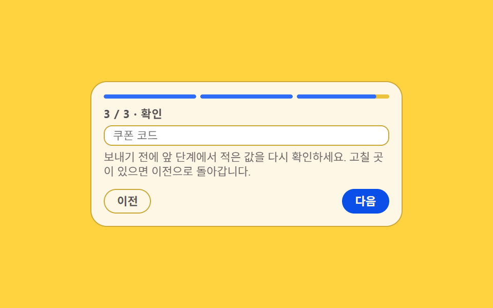
<main class="stage">
  <section class="ah is-demo" id="ah" aria-label="Application form whose steps hold different field counts">
    <div class="ah__bar" id="ah-bar" role="progressbar" aria-valuemin="1" aria-valuemax="3" aria-valuenow="1" aria-label="Step progress">
      <span class="ah__seg" data-seg="1"><span class="ah__seg-f"></span></span>
      <span class="ah__seg" data-seg="2"><span class="ah__seg-f"></span></span>
      <span class="ah__seg" data-seg="3"><span class="ah__seg-f"></span></span>
    </div>
    <div class="ah__box" id="ah-box">
      <div class="ah__panel is-on" data-step="1">
        <p class="ah__t">1 / 3 · Account</p>
        <input class="ah__f" type="text" placeholder="Email">
        <input class="ah__f" type="text" placeholder="Password">
      </div>
      <div class="ah__panel" data-step="2">
        <p class="ah__t">2 / 3 · Delivery</p>
        <input class="ah__f" type="text" placeholder="Recipient">
        <input class="ah__f" type="text" placeholder="Address">
        <input class="ah__f" type="text" placeholder="Phone">
      </div>
      <div class="ah__panel" data-step="3">
        <p class="ah__t">3 / 3 · Review</p>
        <input class="ah__f" type="text" placeholder="Coupon code">
        <p class="ah__note">Check what you typed on earlier steps before sending. Go back if something needs a fix.</p>
      </div>
    </div>
    <div class="ah__foot">
      <button class="ah__btn" type="button" id="ah-prev">Back</button>
      <button class="ah__btn ah__btn--go" type="button" id="ah-next">Next</button>
    </div>
  </section>
</main>@use "sass:color";
@use "../../../../site/static/demo-tokens" as *;
$duration: $dur-base;
$easing: $ease-spring;
$color: $subject-blue;
@include stage($stage-yellow);
$line: color.mix($subject-ink, $stage-yellow, 22%);
$soft: color.mix($subject-ink, $stage-yellow, 8%);
// 단계마다 다른 상자 높이. 길이형으로 등록해야 보간된다 —
// 등록하지 않은 커스텀 속성은 중간값이 없어 높이가 툭 튄다
@property --h {
syntax: "<length>";
inherits: true;
initial-value: 63px;
}
// 패널 셋의 실측 높이(측정값과 맞춰 둔 루프용 값)
$h1: 63px;
$h2: 87px;
$h3: 70px;
.ah {
box-sizing: border-box;
width: min(304px, 92vw);
padding: $sp-3;
border: 1px solid $line;
border-radius: $r-card;
background: $subject-cream;
color: $subject-ink;
font-family: -apple-system, "Segoe UI", "Noto Sans KR", sans-serif;
font-size: 12px;
line-height: 1.3;
}
// ── 진행 막대 ─────────────────────────────────────
.ah__bar {
display: grid;
grid-template-columns: repeat(3, 1fr);
gap: $sp-1;
margin-bottom: $sp-2;
}
.ah__seg {
height: 4px;
border-radius: $r-pill;
background: $soft;
overflow: hidden;
}
.ah__seg-f {
display: block;
height: 100%;
border-radius: inherit;
background: $color;
transform: scaleX(0);
transform-origin: left center; // 규칙8: 단계 막대 좌측에서 채움
transition: transform $duration $easing;
}
// 정적(사람이 조작하는) 경로 — .is-demo 를 떼도 진행 상태가 보여야 한다
.ah__seg.is-done .ah__seg-f { transform: scaleX(1); }
// ── 높이가 흐르는 상자 ─────────────────────────────
.ah__box {
--h: #{$h1};
display: grid;
align-items: start;
height: var(--h);
overflow: hidden;
transition: --h $duration $easing;
}
.ah__panel {
display: grid;
grid-area: 1 / 1;
align-content: start;
gap: $sp-1;
opacity: 0;
visibility: hidden;
}
.ah__panel.is-on { opacity: 1; visibility: visible; }
.ah__t {
margin: 0;
color: rgba($subject-ink, .72);
font-size: 11px;
font-weight: 700;
letter-spacing: .04em;
}
.ah__f {
box-sizing: border-box;
width: 100%;
height: 20px;
margin: 0;
padding: 0 $sp-2;
border: 1px solid $line;
border-radius: $r-sm;
background: $stage-paper;
color: $subject-ink;
font-family: inherit;
font-size: 11px;
line-height: 1.3;
}
.ah__f:focus-visible { outline: 2px solid $color; outline-offset: 2px; }
.ah__note {
margin: 0;
color: color.mix($subject-ink, $subject-cream, 62%);
font-size: 11px;
line-height: 1.25;
}
// ── 발판 ─────────────────────────────────────────
.ah__foot {
display: grid;
grid-template-columns: auto auto;
justify-content: space-between;
gap: $sp-2;
margin-top: $sp-2;
}
.ah__btn {
margin: 0;
padding: $sp-1 $sp-3;
border: 1px solid $line;
border-radius: $r-pill;
background: transparent;
color: color.mix($subject-ink, $subject-cream, 70%);
font-family: inherit;
font-size: 11px;
font-weight: 700;
line-height: 1.3;
cursor: pointer;
}
.ah__btn--go { border-color: $subject-blue-deep; background: $subject-blue-deep; color: $subject-cream; }
.ah__btn:focus-visible { outline: 2px solid $color; outline-offset: 2px; }
// ── 격자 미리보기 전용 2초 루프 ─────────────────────
// --h 는 등록돼 있으니 키프레임 사이가 보간된다(상자가 흐른다).
// 패널 교체만 steps(1, end) 로 한 프레임에 자른다 — 반투명 유령 금지
@keyframes ah-h {
0%, 18% { --h: #{$h1}; }
30%, 46% { --h: #{$h2}; }
58%, 72% { --h: #{$h3}; }
86%, 100% { --h: #{$h1}; }
}
@keyframes ah-p1 {
0%, 17% { opacity: 1; visibility: visible; }
18%, 71% { opacity: 0; visibility: hidden; }
72%, 100% { opacity: 1; visibility: visible; }
}
@keyframes ah-p2 {
0%, 17% { opacity: 0; visibility: hidden; }
18%, 45% { opacity: 1; visibility: visible; }
46%, 100% { opacity: 0; visibility: hidden; }
}
@keyframes ah-p3 {
0%, 45% { opacity: 0; visibility: hidden; }
46%, 71% { opacity: 1; visibility: visible; }
72%, 100% { opacity: 0; visibility: hidden; }
}
@keyframes ah-seg2 {
0%, 17% { transform: scaleX(0); }
18% { transform: scaleX(0); }
30%, 71% { transform: scaleX(1); }
84%, 100% { transform: scaleX(0); }
}
@keyframes ah-seg3 {
0%, 45% { transform: scaleX(0); }
46% { transform: scaleX(0); }
58%, 71% { transform: scaleX(1); }
84%, 100% { transform: scaleX(0); }
}
.ah.is-demo {
// 루프 중에는 전환을 끈다 — 전환이 살아 있으면 캐스케이드에서 애니메이션을 덮는다
.ah__box, .ah__seg-f { transition: none; }
.ah__box {
animation-name: ah-h;
animation-duration: $dur-loop;
animation-timing-function: $easing;
animation-iteration-count: infinite;
}
.ah__panel[data-step="1"] { animation-name: ah-p1; }
.ah__panel[data-step="2"] { animation-name: ah-p2; }
.ah__panel[data-step="3"] { animation-name: ah-p3; }
.ah__panel {
animation-duration: $dur-loop;
animation-timing-function: steps(1, end);
animation-iteration-count: infinite;
}
.ah__seg[data-seg="2"] .ah__seg-f { animation-name: ah-seg2; }
.ah__seg[data-seg="3"] .ah__seg-f { animation-name: ah-seg3; }
.ah__seg[data-seg="2"] .ah__seg-f,
.ah__seg[data-seg="3"] .ah__seg-f {
animation-duration: $dur-loop;
animation-timing-function: $easing;
animation-iteration-count: infinite;
}
}
@media (max-width: 340px) {
.ah { padding: $sp-2; font-size: 11px; }
.ah__btn { padding: 0 $sp-2; }
.ah__note { font-size: 10px; }
}
@media (prefers-reduced-motion: reduce) {
.ah.is-demo .ah__box,
.ah.is-demo .ah__panel,
.ah.is-demo .ah__seg-f { animation: none !important; transition: none !important; }
// 움직임만 끄고 진행 상태는 남긴다 — 칸 셋짜리 2단계에 맞춰진 상자
.ah.is-demo .ah__box { --h: #{$h2} !important; }
.ah.is-demo .ah__panel[data-step="1"],
.ah.is-demo .ah__panel[data-step="3"] { opacity: 0 !important; visibility: hidden !important; }
.ah.is-demo .ah__panel[data-step="2"] { opacity: 1 !important; visibility: visible !important; }
.ah.is-demo .ah__seg[data-seg="1"] .ah__seg-f,
.ah.is-demo .ah__seg[data-seg="2"] .ah__seg-f { transform: scaleX(1) !important; }
.ah.is-demo .ah__seg[data-seg="3"] .ah__seg-f { transform: scaleX(0) !important; }
}html, body {
margin: 0;
overflow: hidden;
}
.stage {
box-sizing: border-box;
min-height: 100vh;
display: grid;
place-items: center;
margin: 0;
background: #ffd23f;
font-family: -apple-system, "Segoe UI", "Noto Sans KR", sans-serif;
padding: clamp(8px, 4vw, 24px);
}
@property --h {
syntax: "<length>";
inherits: true;
initial-value: 63px;
}
.ah {
box-sizing: border-box;
width: min(304px, 92vw);
padding: 12px;
border: 1px solid rgb(79.9843137255%, 65.9607843137%, 21.5137254902%);
border-radius: 16px;
background: #fff7e6;
color: #17141a;
font-family: -apple-system, "Segoe UI", "Noto Sans KR", sans-serif;
font-size: 12px;
line-height: 1.3;
}
.ah__bar {
display: grid;
grid-template-columns: repeat(3, 1fr);
gap: 4px;
margin-bottom: 8px;
}
.ah__seg {
height: 4px;
border-radius: 999px;
background: rgb(92.7215686275%, 76.3921568627%, 23.5450980392%);
overflow: hidden;
}
.ah__seg-f {
display: block;
height: 100%;
border-radius: inherit;
background: #2f6df6;
transform: scaleX(0);
transform-origin: left center;
transition: transform 300ms cubic-bezier(0.2, 0.8, 0.2, 1);
}
.ah__seg.is-done .ah__seg-f {
transform: scaleX(1);
}
.ah__box {
--h: 63px;
display: grid;
align-items: start;
height: var(--h);
overflow: hidden;
transition: --h 300ms cubic-bezier(0.2, 0.8, 0.2, 1);
}
.ah__panel {
display: grid;
grid-area: 1/1;
align-content: start;
gap: 4px;
opacity: 0;
visibility: hidden;
}
.ah__panel.is-on {
opacity: 1;
visibility: visible;
}
.ah__t {
margin: 0;
color: rgba(23, 20, 26, 0.72);
font-size: 11px;
font-weight: 700;
letter-spacing: 0.04em;
}
.ah__f {
box-sizing: border-box;
width: 100%;
height: 20px;
margin: 0;
padding: 0 8px;
border: 1px solid rgb(79.9843137255%, 65.9607843137%, 21.5137254902%);
border-radius: 8px;
background: #ffffff;
color: #17141a;
font-family: inherit;
font-size: 11px;
line-height: 1.3;
}
.ah__f:focus-visible {
outline: 2px solid #2f6df6;
outline-offset: 2px;
}
.ah__note {
margin: 0;
color: rgb(43.5921568627%, 41.6705882353%, 40.5960784314%);
font-size: 11px;
line-height: 1.25;
}
.ah__foot {
display: grid;
grid-template-columns: auto auto;
justify-content: space-between;
gap: 8px;
margin-top: 8px;
}
.ah__btn {
margin: 0;
padding: 4px 12px;
border: 1px solid rgb(79.9843137255%, 65.9607843137%, 21.5137254902%);
border-radius: 999px;
background: transparent;
color: rgb(36.3137254902%, 34.5490196078%, 34.1960784314%);
font-family: inherit;
font-size: 11px;
font-weight: 700;
line-height: 1.3;
cursor: pointer;
}
.ah__btn--go {
border-color: #0a4fe8;
background: #0a4fe8;
color: #fff7e6;
}
.ah__btn:focus-visible {
outline: 2px solid #2f6df6;
outline-offset: 2px;
}
@keyframes ah-h {
0%, 18% {
--h: 63px;
}
30%, 46% {
--h: 87px;
}
58%, 72% {
--h: 70px;
}
86%, 100% {
--h: 63px;
}
}
@keyframes ah-p1 {
0%, 17% {
opacity: 1;
visibility: visible;
}
18%, 71% {
opacity: 0;
visibility: hidden;
}
72%, 100% {
opacity: 1;
visibility: visible;
}
}
@keyframes ah-p2 {
0%, 17% {
opacity: 0;
visibility: hidden;
}
18%, 45% {
opacity: 1;
visibility: visible;
}
46%, 100% {
opacity: 0;
visibility: hidden;
}
}
@keyframes ah-p3 {
0%, 45% {
opacity: 0;
visibility: hidden;
}
46%, 71% {
opacity: 1;
visibility: visible;
}
72%, 100% {
opacity: 0;
visibility: hidden;
}
}
@keyframes ah-seg2 {
0%, 17% {
transform: scaleX(0);
}
18% {
transform: scaleX(0);
}
30%, 71% {
transform: scaleX(1);
}
84%, 100% {
transform: scaleX(0);
}
}
@keyframes ah-seg3 {
0%, 45% {
transform: scaleX(0);
}
46% {
transform: scaleX(0);
}
58%, 71% {
transform: scaleX(1);
}
84%, 100% {
transform: scaleX(0);
}
}
.ah.is-demo .ah__box, .ah.is-demo .ah__seg-f {
transition: none;
}
.ah.is-demo .ah__box {
animation-name: ah-h;
animation-duration: 2s;
animation-timing-function: cubic-bezier(0.2, 0.8, 0.2, 1);
animation-iteration-count: infinite;
}
.ah.is-demo .ah__panel[data-step="1"] {
animation-name: ah-p1;
}
.ah.is-demo .ah__panel[data-step="2"] {
animation-name: ah-p2;
}
.ah.is-demo .ah__panel[data-step="3"] {
animation-name: ah-p3;
}
.ah.is-demo .ah__panel {
animation-duration: 2s;
animation-timing-function: steps(1, end);
animation-iteration-count: infinite;
}
.ah.is-demo .ah__seg[data-seg="2"] .ah__seg-f {
animation-name: ah-seg2;
}
.ah.is-demo .ah__seg[data-seg="3"] .ah__seg-f {
animation-name: ah-seg3;
}
.ah.is-demo .ah__seg[data-seg="2"] .ah__seg-f,
.ah.is-demo .ah__seg[data-seg="3"] .ah__seg-f {
animation-duration: 2s;
animation-timing-function: cubic-bezier(0.2, 0.8, 0.2, 1);
animation-iteration-count: infinite;
}
@media (max-width: 340px) {
.ah {
padding: 8px;
font-size: 11px;
}
.ah__btn {
padding: 0 8px;
}
.ah__note {
font-size: 10px;
}
}
@media (prefers-reduced-motion: reduce) {
.ah.is-demo .ah__box,
.ah.is-demo .ah__panel,
.ah.is-demo .ah__seg-f {
animation: none !important;
transition: none !important;
}
.ah.is-demo .ah__box {
--h: 87px !important;
}
.ah.is-demo .ah__panel[data-step="1"],
.ah.is-demo .ah__panel[data-step="3"] {
opacity: 0 !important;
visibility: hidden !important;
}
.ah.is-demo .ah__panel[data-step="2"] {
opacity: 1 !important;
visibility: visible !important;
}
.ah.is-demo .ah__seg[data-seg="1"] .ah__seg-f,
.ah.is-demo .ah__seg[data-seg="2"] .ah__seg-f {
transform: scaleX(1) !important;
}
.ah.is-demo .ah__seg[data-seg="3"] .ah__seg-f {
transform: scaleX(0) !important;
}
}// 실제 동작: 단계를 바꿀 때마다 그 패널의 실제 높이를 재서 --h 에 넣는다.
// --h 는 길이형으로 등록돼 있어 상자가 그 값까지 흐른다(짐작한 고정 높이가 아니다).
var ah = document.getElementById('ah');
var ahBox = document.getElementById('ah-box');
var ahBar = document.getElementById('ah-bar');
var ahPanels = [].slice.call(ah.querySelectorAll('.ah__panel'));
var ahSegs = [].slice.call(ah.querySelectorAll('.ah__seg'));
var ahStep = 1;
function ahGo(n) {
ahStep = Math.max(1, Math.min(ahPanels.length, n));
ahPanels.forEach(function (p, i) { p.classList.toggle('is-on', i + 1 === ahStep); });
ahSegs.forEach(function (s, i) { s.classList.toggle('is-done', i + 1 <= ahStep); });
var h = Math.ceil(ahPanels[ahStep - 1].getBoundingClientRect().height);
ahBox.style.setProperty('--h', h + 'px');
ahBar.setAttribute('aria-valuenow', String(ahStep));
}
function ahMove(d) { ah.classList.remove('is-demo'); ahGo(ahStep + d); }
document.getElementById('ah-next').addEventListener('click', function () { ahMove(1); });
document.getElementById('ah-prev').addEventListener('click', function () { ahMove(-1); });
ah.addEventListener('keydown', function (e) {
if (e.key === 'ArrowRight') { e.preventDefault(); ahMove(1); }
if (e.key === 'ArrowLeft') { e.preventDefault(); ahMove(-1); }
});
ahGo(1);import { useCallback, useEffect, useRef, useState } from "react";
import type { CSSProperties } from "react";
import styles from "./AutoHeightTransition.module.scss";
export type AutoHeightStep = {
/** "1 / 3 · Account" */
title: string;
/** placeholder of each field on this step */
fields: string[];
note?: string;
};
export type AutoHeightTransitionProps = {
steps?: AutoHeightStep[];
prevLabel?: string;
nextLabel?: string;
groupLabel?: string;
progressLabel?: string;
/** 격자 미리보기용 2초 자동 루프. 사람이 손대면 꺼진다 */
demo?: boolean;
duration?: number;
easing?: string;
color?: string;
};
type KeyEvt = { key: string; preventDefault(): void };
type Box<T> = { current: T };
const DEFAULT_STEPS: AutoHeightStep[] = [
{ title: "1 / 3 · Account", fields: ["Email", "Password"] },
{ title: "2 / 3 · Delivery", fields: ["Recipient", "Address", "Phone"] },
{
title: "3 / 3 · Review",
fields: ["Coupon code"],
note: "Check what you typed on earlier steps before sending. Go back if something needs a fix.",
},
];
export default function AutoHeightTransition({
steps = DEFAULT_STEPS,
prevLabel = "Back",
nextLabel = "Next",
groupLabel = "Application form with uneven field counts",
progressLabel = "Step progress",
demo = true,
duration = 300,
easing = "cubic-bezier(.2,.8,.2,1)",
color = "#2f6df6",
}: AutoHeightTransitionProps) {
const [step, setStep] = useState(1);
const [live, setLive] = useState(demo);
const [h, setH] = useState<number | null>(null);
const panels = useRef<HTMLDivElement[]>([]) as Box<HTMLDivElement[]>;
// 다음 패널의 실제 높이를 재서 --h 에 넣는다 — 짐작한 고정 높이가 아니다
const measure = useCallback((n: number) => {
const el = panels.current[n - 1];
if (el) setH(Math.ceil(el.getBoundingClientRect().height));
}, []);
useEffect(() => {
measure(step);
}, [measure, step]);
function move(d: number) {
setLive(false);
setStep((p) => Math.max(1, Math.min(steps.length, p + d)));
}
function onKey(e: KeyEvt) {
if (e.key === "ArrowRight") {
e.preventDefault();
move(1);
}
if (e.key === "ArrowLeft") {
e.preventDefault();
move(-1);
}
}
const vars: CSSProperties = {
"--duration": `${duration}ms`,
"--easing": easing,
"--color": color,
};
const boxVars: CSSProperties = h === null ? {} : { "--h": `${h}px` };
const cls = [styles.ah, live ? styles.isDemo : ""].filter(Boolean).join(" ");
return (
<section className={cls} style={vars} aria-label={groupLabel} onKeyDown={onKey}>
<div
className={styles.bar}
role="progressbar"
aria-valuemin={1}
aria-valuemax={steps.length}
aria-valuenow={step}
aria-label={progressLabel}
>
{steps.map((s, i) => (
<span
key={s.title}
className={[styles.seg, i + 1 <= step ? styles.isDone : ""].filter(Boolean).join(" ")}
data-seg={i + 1}
>
<span className={styles.segF} />
</span>
))}
</div>
<div className={styles.box} style={boxVars}>
{steps.map((s, i) => (
<div
key={s.title}
className={[styles.panel, i + 1 === step ? styles.isOn : ""].filter(Boolean).join(" ")}
data-step={i + 1}
ref={(el: HTMLDivElement | null) => {
if (el) panels.current[i] = el;
}}
>
<p className={styles.t}>{s.title}</p>
{s.fields.map((f) => (
<input key={f} className={styles.f} type="text" placeholder={f} />
))}
{s.note ? <p className={styles.note}>{s.note}</p> : null}
</div>
))}
</div>
<div className={styles.foot}>
<button className={styles.btn} type="button" onClick={() => move(-1)}>
{prevLabel}
</button>
<button className={[styles.btn, styles.btnGo].join(" ")} type="button" onClick={() => move(1)}>
{nextLabel}
</button>
</div>
</section>
);
}02 Form height that measures each step and flows to it — Measured area 22.462% · moving frames 10/23Original by GODRICH · SCSS and React ship in the zip · 9 Multi Step Form UI Patterns — Branch and Resume
The post this demo lives in
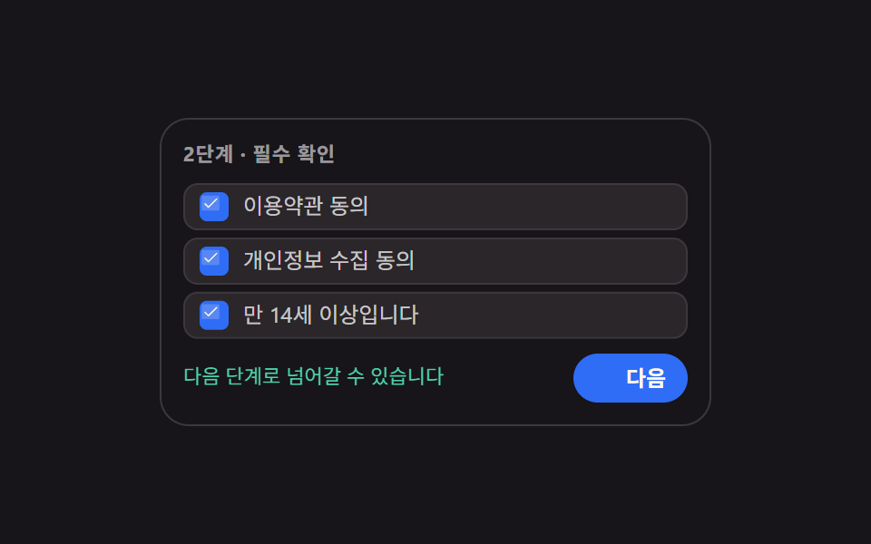 9 Multi Step Form UI Patterns — Branch and ResumeA multi step form ui splits one long form into screens and collects answers in order. All nine read real values, run rea See all demos in this post
If you like this effect - similar demos
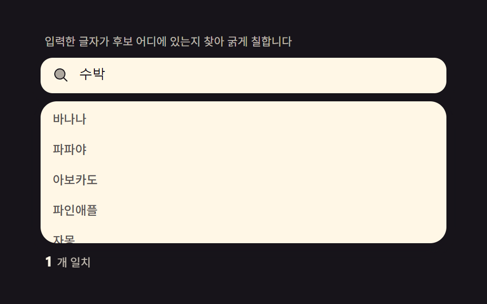 Inputs01 Match highlight — locating the typed letters inside each suggestion and bolding that spanAutocomplete Input: 9 Search Dropdowns
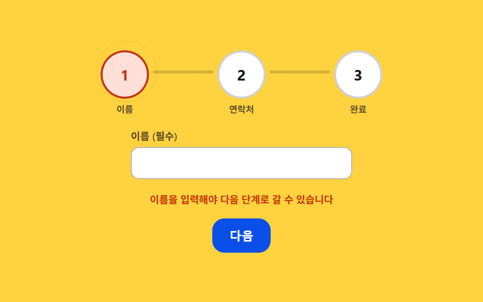 Inputs06 Step Ring That Shakes and Tightens on Validation FailureStep Indicator UI: 9 Physics-Based Patterns
 Inputs01 Quantity change that tints the line total and the grand total togetherCheckout Page Design — 9 Cart Patterns, No Library