09Press-into-shadow button
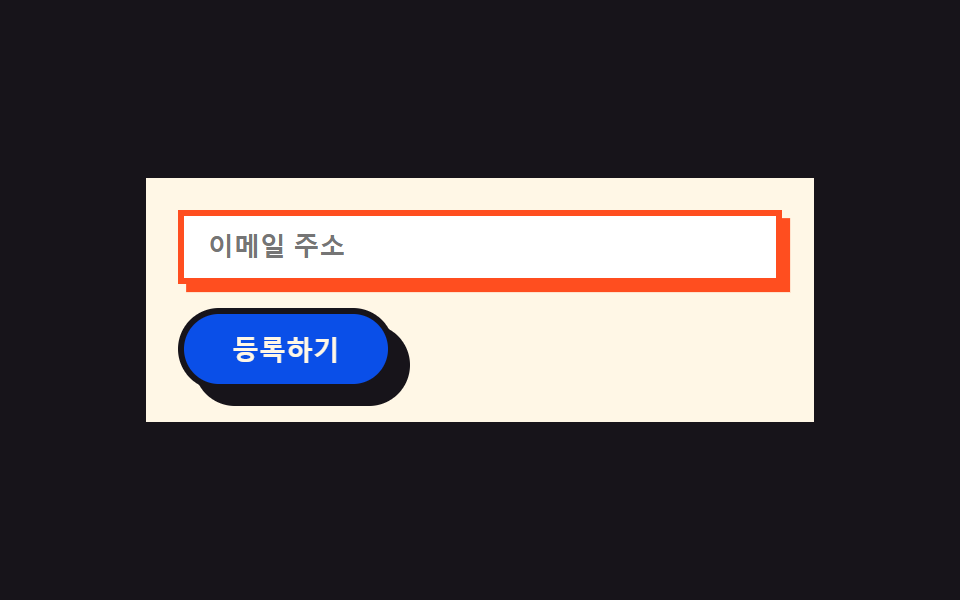
Pressing the button moves its body by the exact shadow offset while the shadow shrinks to zero at the same instant, so the button looks like it sinks into where its own shadow used to be; the input's shadow pops from nothing on focus.
Best forForm submit buttons, newsletter inputs
press 오프셋 이동radius pill(버튼만)focus 그림자 팝
<main class="stage">
  <form class="form">
    <label class="form__field">
      <input class="form__input is-demo" type="email" placeholder="Email address" readonly>
    </label>
    <button class="form__btn is-demo" type="button">Sign up</button>
  </form>
</main>
@use "../../../../site/static/demo-tokens" as *;
$duration: $dur-loop;
$easing: $ease-pop;
$color: $subject-blue; // 버튼 색
$border: 3px;
@include stage($stage-ink);
.form {
box-sizing: border-box;
display: flex;
flex-direction: column;
gap: $sp-3;
width: clamp(240px, 82vw, 340px);
padding: $sp-4;
border: $border solid $subject-ink;
border-radius: 0;
background: $subject-cream;
box-shadow: $sp-2 $sp-2 0 $subject-ink;
}
.form__field { display: block; }
.form__input {
box-sizing: border-box;
width: 100%;
border: $border solid $subject-ink;
border-radius: 0;
background: $stage-paper;
padding: $sp-2 $sp-3;
color: $subject-ink;
font-weight: 600;
font-size: clamp(12px, 2.8vw, 13px);
box-shadow: 0 0 0 rgba($stage-orange, 0);
animation: focusPop $duration $easing infinite;
}
.form__btn {
box-sizing: border-box;
align-self: flex-start;
border: $border solid $subject-ink;
border-radius: $r-pill;
background: $subject-blue-deep;
color: $subject-cream;
padding: $sp-2 $sp-6;
font-weight: 800;
font-size: clamp(12px, 2.8vw, 14px);
box-shadow: $sp-2 $sp-2 0 $subject-ink;
animation: pressInto $duration $easing infinite;
animation-delay: -1s;
}
// 데모: 버튼은 그림자 오프셋만큼 정확히 이동하며 그림자가 동시에 0 으로 줄어 "그림자 자리로 파고드는" 느낌을 준다.
// 입력창은 초점 링이 0에서 뿅 나타났다 사라진다
@keyframes pressInto {
0%, 50%, 100% { transform: translate(0, 0); box-shadow: $sp-2 $sp-2 0 $subject-ink; }
70% { transform: translate($sp-2, $sp-2); box-shadow: 0 0 0 $subject-ink; }
}
@keyframes focusPop {
0%, 60%, 100% { box-shadow: 0 0 0 rgba($stage-orange, 0); border-color: $subject-ink; }
80% { box-shadow: $sp-1 $sp-1 0 $stage-orange; border-color: $stage-orange; }
}
@media (prefers-reduced-motion: reduce) {
.form__btn {
animation: none !important;
transform: none;
box-shadow: $sp-2 $sp-2 0 $subject-ink;
}
.form__input {
animation: none !important;
box-shadow: 0 0 0 rgba($stage-orange, 0);
border-color: $subject-ink;
}
}html, body {
margin: 0;
overflow: hidden;
}
.stage {
box-sizing: border-box;
min-height: 100vh;
display: grid;
place-items: center;
margin: 0;
background: #17141a;
font-family: -apple-system, "Segoe UI", "Noto Sans KR", sans-serif;
padding: clamp(8px, 4vw, 24px);
}
.form {
box-sizing: border-box;
display: flex;
flex-direction: column;
gap: 12px;
width: clamp(240px, 82vw, 340px);
padding: 16px;
border: 3px solid #17141a;
border-radius: 0;
background: #fff7e6;
box-shadow: 8px 8px 0 #17141a;
}
.form__field {
display: block;
}
.form__input {
box-sizing: border-box;
width: 100%;
border: 3px solid #17141a;
border-radius: 0;
background: #ffffff;
padding: 8px 12px;
color: #17141a;
font-weight: 600;
font-size: clamp(12px, 2.8vw, 13px);
box-shadow: 0 0 0 rgba(255, 77, 31, 0);
animation: focusPop 2s cubic-bezier(0.2, 1.4, 0.4, 1) infinite;
}
.form__btn {
box-sizing: border-box;
align-self: flex-start;
border: 3px solid #17141a;
border-radius: 999px;
background: #0a4fe8;
color: #fff7e6;
padding: 8px 24px;
font-weight: 800;
font-size: clamp(12px, 2.8vw, 14px);
box-shadow: 8px 8px 0 #17141a;
animation: pressInto 2s cubic-bezier(0.2, 1.4, 0.4, 1) infinite;
animation-delay: -1s;
}
@keyframes pressInto {
0%, 50%, 100% {
transform: translate(0, 0);
box-shadow: 8px 8px 0 #17141a;
}
70% {
transform: translate(8px, 8px);
box-shadow: 0 0 0 #17141a;
}
}
@keyframes focusPop {
0%, 60%, 100% {
box-shadow: 0 0 0 rgba(255, 77, 31, 0);
border-color: #17141a;
}
80% {
box-shadow: 4px 4px 0 #ff4d1f;
border-color: #ff4d1f;
}
}
@media (prefers-reduced-motion: reduce) {
.form__btn {
animation: none !important;
transform: none;
box-shadow: 8px 8px 0 #17141a;
}
.form__input {
animation: none !important;
box-shadow: 0 0 0 rgba(255, 77, 31, 0);
border-color: #17141a;
}
}import type { CSSProperties } from "react";
import styles from "./ButtonsInputsBrutalist.module.scss";
export type ButtonsInputsBrutalistProps = {
placeholder?: string;
cta?: string;
duration?: number;
easing?: string;
color?: string;
};
type Vars = CSSProperties & { "--duration"?: string; "--easing"?: string; "--color"?: string };
export default function ButtonsInputsBrutalist({
placeholder = "이메일 주소",
cta = "등록하기",
duration = 2000,
easing = "cubic-bezier(.2,1.4,.4,1)",
color = "#0a4fe8",
}: ButtonsInputsBrutalistProps) {
const vars: Vars = { "--duration": `${duration}ms`, "--easing": easing, "--color": color };
return (
<form className={styles.form} style={vars}>
<label className={styles.field}>
<input className={styles.input} type="email" placeholder={placeholder} readOnly />
</label>
<button type="button" className={styles.btn}>{cta}</button>
</form>
);
}09 Press-into-shadow button — Measured area 5.142% · moving frames 19/23Original by GODRICH · SCSS and React ship in the zip · Neobrutalism UI Kit: 9 Landing Sections, No Blur
The post this demo lives in
 Neobrutalism UI Kit: 9 Landing Sections, No BlurA neobrutalism UI kit trades soft, blurred drop shadows for thick black borders and flat right-angle corners — and the s See all demos in this post