02Lifted paper tab nav
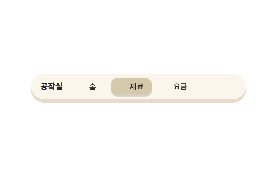
Instead of an underline, a yellow paper chip hops one tab at a time behind the labels, lifting slightly on each move.
Best forTop navigation on bright-toned sites
고정 폭 탭왕복 이동radius 12
<main class="stage">
  <nav class="navpaper" aria-label="Demo navigation">
    <span class="navpaper__brand">Craft Room</span>
    <div class="navpaper__tabs">
      <span class="navpaper__chip" aria-hidden="true"></span>
      <span class="navpaper__tab">Home</span>
      <span class="navpaper__tab">Materials</span>
      <span class="navpaper__tab">Pricing</span>
    </div>
  </nav>
</main>
@use "../../../../site/static/demo-tokens" as *;
// 페이퍼컷 팔레트 (01 과 같은 값. zip 에서는 tokens.css 한 곳을 링크한다)
$paper-base: #fbf6ec;
$paper-sheet: #ffffff;
$paper-ink: #2a2320;
$paper-stone: #5c5048;
$paper-coral: #b97b71;
$paper-sky: #6a8db5;
$paper-leaf: #2b7d5a;
$paper-butter: #d6c9ab;
$paper-edge: #e7dccb;
$duration: $dur-loop; // 칩이 세 탭을 왕복하는 한 주기
$easing: $ease-spring; // 종이 조각이 자리에 앉는 느낌
$color: $paper-butter; // 들린 탭 종이의 색
$step: 76px; // 탭 하나 + 간격. 칩 이동량은 이 값의 배수뿐이다
@include stage($paper-sheet);
.navpaper {
box-sizing: border-box;
display: flex;
align-items: center;
gap: $sp-4;
width: clamp(268px, 82vw, 372px);
padding: $sp-3 $sp-4;
border-radius: $r-pill;
background: $paper-base;
box-shadow: 0 6px 0 $paper-edge;
}
.navpaper__brand {
flex: 0 0 auto;
color: $paper-ink;
font-weight: 800; font-size: 14px; line-height: 1;
font-family: inherit;
white-space: nowrap;
}
.navpaper__tabs {
position: relative;
display: flex;
gap: $sp-1;
--step: #{$step};
}
// 들린 종이 칩 — 탭 뒤에서 움직인다. 탭은 고정 폭이라 이동량과 실제 렌더 폭이 어긋나지 않는다 (BD19)
.navpaper__chip {
position: absolute;
left: 0;
top: -4px;
width: 72px;
height: calc(100% + 8px);
border-radius: $r-control;
background: $color;
box-shadow: 0 4px 0 rgba($paper-ink, .18);
animation: chipHop $duration $easing infinite;
}
.navpaper__tab {
position: relative;
z-index: 1;
flex: 0 0 72px;
text-align: center;
color: $paper-ink;
font-weight: 700; font-size: 13px; line-height: 1.6;
font-family: inherit;
white-space: nowrap;
}
// 데모: 0 → 1 → 2 → 1 → 0 으로 왕복한다. 끝에서 처음으로 순간이동하지 않는다
@keyframes chipHop {
0% { transform: translateX(0) translateY(0); }
12% { transform: translateX(0) translateY(-5px); }
25% { transform: translateX(var(--step)) translateY(0); }
37% { transform: translateX(var(--step)) translateY(-5px); }
50% { transform: translateX(calc(var(--step) * 2)) translateY(0); }
62% { transform: translateX(calc(var(--step) * 2)) translateY(-5px); }
75% { transform: translateX(var(--step)) translateY(0); }
87% { transform: translateX(var(--step)) translateY(-5px); }
100% { transform: translateX(0) translateY(0); }
}
@media (max-width: 340px), (max-height: 220px) {
.navpaper { width: 244px; gap: $sp-2; padding: $sp-2 $sp-3; }
.navpaper__brand { font-size: 12px; }
.navpaper__tabs { --step: 56px; }
.navpaper__chip { width: 52px; }
.navpaper__tab { flex: 0 0 52px; font-size: 11px; }
}
@media (prefers-reduced-motion: reduce) {
.navpaper__chip { animation: none !important; transform: none; }
}html, body {
margin: 0;
overflow: hidden;
}
.stage {
box-sizing: border-box;
min-height: 100vh;
display: grid;
place-items: center;
margin: 0;
background: #ffffff;
font-family: -apple-system, "Segoe UI", "Noto Sans KR", sans-serif;
padding: clamp(8px, 4vw, 24px);
}
.navpaper {
box-sizing: border-box;
display: flex;
align-items: center;
gap: 16px;
width: clamp(268px, 82vw, 372px);
padding: 12px 16px;
border-radius: 999px;
background: #fbf6ec;
box-shadow: 0 6px 0 #e7dccb;
}
.navpaper__brand {
flex: 0 0 auto;
color: #2a2320;
font-weight: 800;
font-size: 14px;
line-height: 1;
font-family: inherit;
white-space: nowrap;
}
.navpaper__tabs {
position: relative;
display: flex;
gap: 4px;
--step: 76px;
}
.navpaper__chip {
position: absolute;
left: 0;
top: -4px;
width: 72px;
height: calc(100% + 8px);
border-radius: 12px;
background: #d6c9ab;
box-shadow: 0 4px 0 rgba(42, 35, 32, 0.18);
animation: chipHop 2s cubic-bezier(0.2, 0.8, 0.2, 1) infinite;
}
.navpaper__tab {
position: relative;
z-index: 1;
flex: 0 0 72px;
text-align: center;
color: #2a2320;
font-weight: 700;
font-size: 13px;
line-height: 1.6;
font-family: inherit;
white-space: nowrap;
}
@keyframes chipHop {
0% {
transform: translateX(0) translateY(0);
}
12% {
transform: translateX(0) translateY(-5px);
}
25% {
transform: translateX(var(--step)) translateY(0);
}
37% {
transform: translateX(var(--step)) translateY(-5px);
}
50% {
transform: translateX(calc(var(--step) * 2)) translateY(0);
}
62% {
transform: translateX(calc(var(--step) * 2)) translateY(-5px);
}
75% {
transform: translateX(var(--step)) translateY(0);
}
87% {
transform: translateX(var(--step)) translateY(-5px);
}
100% {
transform: translateX(0) translateY(0);
}
}
@media (max-width: 340px), (max-height: 220px) {
.navpaper {
width: 244px;
gap: 8px;
padding: 8px 12px;
}
.navpaper__brand {
font-size: 12px;
}
.navpaper__tabs {
--step: 56px;
}
.navpaper__chip {
width: 52px;
}
.navpaper__tab {
flex: 0 0 52px;
font-size: 11px;
}
}
@media (prefers-reduced-motion: reduce) {
.navpaper__chip {
animation: none !important;
transform: none;
}
}import type { CSSProperties } from "react";
import styles from "./NavPaper.module.scss";
export type NavPaperProps = {
brand?: string;
/** 탭 이름 3개. 칩은 이 개수 안에서만 왕복한다 */
tabs?: string[];
/** 한 주기(기본 2000ms) */
duration?: number;
easing?: string;
color?: string;
/** 탭 하나 + 간격. 칩 이동량은 이 값의 배수뿐이다 */
step?: number;
};
type Vars = CSSProperties & {
"--duration"?: string; "--easing"?: string; "--color"?: string; "--step"?: string;
};
export default function NavPaper({
brand = "공작실",
tabs = ["홈", "재료", "요금"],
duration = 2000,
easing = "cubic-bezier(.2,.8,.2,1)",
color = "#f6c453",
step = 76,
}: NavPaperProps) {
const vars: Vars = {
"--duration": `${duration}ms`, "--easing": easing, "--color": color, "--step": `${step}px`,
};
return (
<nav className={styles.navpaper} style={vars} aria-label="데모 내비게이션">
<span className={styles.brand}>{brand}</span>
<div className={styles.tabs}>
<span className={styles.chip} aria-hidden="true" />
{tabs.map((t) => <span key={t} className={styles.tab}>{t}</span>)}
</div>
</nav>
);
}02 Lifted paper tab nav — Measured area 5.53% · moving frames 23/23Original by GODRICH · SCSS and React ship in the zip · Paper Cutout Design: 9 Layered Landing Sections
The post this demo lives in
 Paper Cutout Design: 9 Layered Landing SectionsPaper cutout design is a layout style where every surface looks like it was cut with scissors and glued down: each panel See all demos in this post