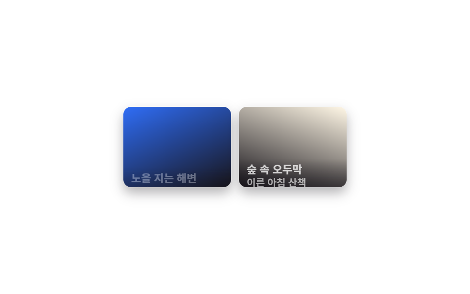
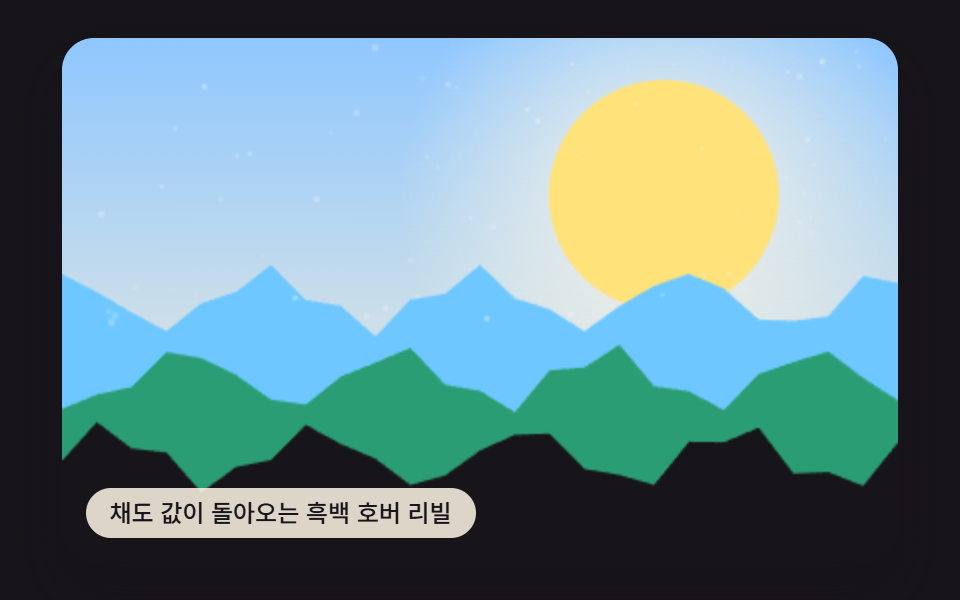
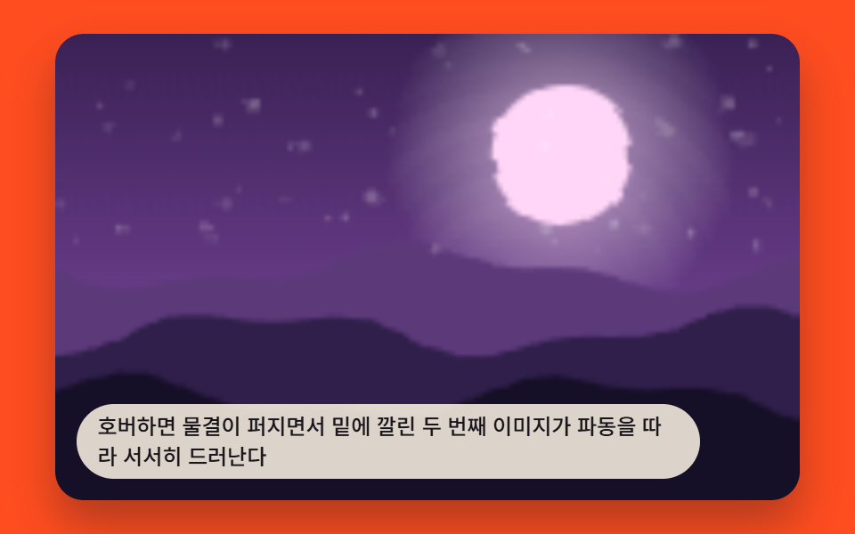
08Scrim caption reveal gallery
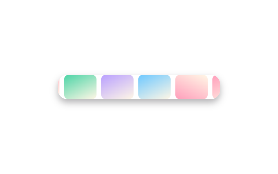
Photos show plain until hover, when a dark scrim spreads across the whole image and the title and description fade up together in the center.
Best forA portfolio that pairs each piece with a short caption, a brand-collaboration gallery that overlays a name plainly on the photo
radial-gradient 스크림opacity 페이드업translateY(6px) 텍스트
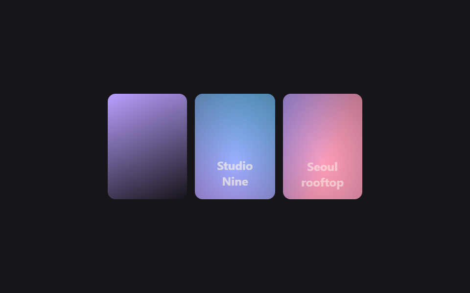
<main class="stage">
  <ul class="cr-gallery is-demo" aria-label="A gallery of photos with captions">
    <li class="cr-card" tabindex="0">
      <span class="cr-card__img cr-card__img--a"></span>
      <span class="cr-card__scrim" aria-hidden="true"></span>
      <span class="cr-card__caption">Kyoto, 2024</span>
    </li>
    <li class="cr-card" tabindex="0">
      <span class="cr-card__img cr-card__img--b"></span>
      <span class="cr-card__scrim" aria-hidden="true"></span>
      <span class="cr-card__caption">Studio Nine</span>
    </li>
    <li class="cr-card" tabindex="0">
      <span class="cr-card__img cr-card__img--c"></span>
      <span class="cr-card__scrim" aria-hidden="true"></span>
      <span class="cr-card__caption">Seoul rooftop</span>
    </li>
  </ul>
</main>
@use "../../../../site/static/demo-tokens" as *;
$duration: $dur-base; // 스크림·캡션 리빌 시간
$easing: $ease-out;
$color: $subject-lilac; // 사진 그러데이션 포인트
@include stage($stage-ink);
.cr-gallery {
display: flex;
gap: $sp-2;
list-style: none;
margin: 0;
padding: 0;
width: min(260px, 84vw);
}
.cr-card {
position: relative;
flex: 1 1 0;
aspect-ratio: 3 / 4;
overflow: hidden;
border-radius: $r-sm;
outline: none;
cursor: pointer;
}
.cr-card__img { position: absolute; inset: 0; }
.cr-card__img--a { background: linear-gradient(155deg, $color 0%, $stage-ink 100%); }
.cr-card__img--b { background: linear-gradient(205deg, $subject-sky 0%, $color 100%); }
.cr-card__img--c { background: linear-gradient(115deg, $color 0%, $subject-pink 60%); }
// 132 편의 "하단 띠" 방식과 달리, 사진 전체가 어두워지는 스크림 방식
.cr-card__scrim {
position: absolute;
inset: 0;
background: radial-gradient(120% 120% at 50% 65%, rgba(23, 20, 26, 0) 0%, rgba(23, 20, 26, .86) 100%);
opacity: 0;
transition: opacity $duration $easing;
}
.cr-card__caption {
position: absolute;
left: $sp-2; right: $sp-2; bottom: $sp-3;
color: $subject-cream;
font: 700 12px/1.4 -apple-system, "Segoe UI", "Noto Sans KR", sans-serif;
font-family: inherit;
text-align: center;
opacity: 0;
transform: translateY(6px);
transition: opacity $duration $easing, transform $duration $easing;
}
.cr-card:hover .cr-card__scrim, .cr-card:focus-visible .cr-card__scrim { opacity: 1; }
.cr-card:hover .cr-card__caption, .cr-card:focus-visible .cr-card__caption { opacity: 1; transform: translateY(0); }
.cr-gallery.is-demo .cr-card:nth-child(1) .cr-card__scrim,
.cr-gallery.is-demo .cr-card:nth-child(1) .cr-card__caption { animation-delay: 0s; }
.cr-gallery.is-demo .cr-card:nth-child(2) .cr-card__scrim,
.cr-gallery.is-demo .cr-card:nth-child(2) .cr-card__caption { animation-delay: -0.67s; }
.cr-gallery.is-demo .cr-card:nth-child(3) .cr-card__scrim,
.cr-gallery.is-demo .cr-card:nth-child(3) .cr-card__caption { animation-delay: -1.33s; }
.cr-gallery.is-demo .cr-card__scrim { animation: scrim-loop $dur-loop $easing infinite; }
.cr-gallery.is-demo .cr-card__caption { animation: caption-loop $dur-loop $easing infinite; }
@keyframes scrim-loop {
0%, 10% { opacity: 0; }
25%, 45% { opacity: 1; }
60%, 100% { opacity: 0; }
}
@keyframes caption-loop {
0%, 10% { opacity: 0; transform: translateY(6px); }
25%, 45% { opacity: 1; transform: translateY(0); }
60%, 100% { opacity: 0; transform: translateY(6px); }
}
@media (prefers-reduced-motion: reduce) {
.cr-card__scrim, .cr-card__caption { transition: none; }
.cr-gallery.is-demo .cr-card__scrim, .cr-gallery.is-demo .cr-card__caption { animation: none; }
}html, body {
margin: 0;
overflow: hidden;
}
.stage {
box-sizing: border-box;
min-height: 100vh;
display: grid;
place-items: center;
margin: 0;
background: #17141a;
font-family: -apple-system, "Segoe UI", "Noto Sans KR", sans-serif;
padding: clamp(8px, 4vw, 24px);
}
.cr-gallery {
display: flex;
gap: 8px;
list-style: none;
margin: 0;
padding: 0;
width: min(260px, 84vw);
}
.cr-card {
position: relative;
flex: 1 1 0;
aspect-ratio: 3/4;
overflow: hidden;
border-radius: 8px;
outline: none;
cursor: pointer;
}
.cr-card__img {
position: absolute;
inset: 0;
}
.cr-card__img--a {
background: linear-gradient(155deg, #b9a0ff 0%, #17141a 100%);
}
.cr-card__img--b {
background: linear-gradient(205deg, #6ec8ff 0%, #b9a0ff 100%);
}
.cr-card__img--c {
background: linear-gradient(115deg, #b9a0ff 0%, #ff9ebb 60%);
}
.cr-card__scrim {
position: absolute;
inset: 0;
background: radial-gradient(120% 120% at 50% 65%, rgba(23, 20, 26, 0) 0%, rgba(23, 20, 26, 0.86) 100%);
opacity: 0;
transition: opacity 300ms ease-out;
}
.cr-card__caption {
position: absolute;
left: 8px;
right: 8px;
bottom: 12px;
color: #fff7e6;
font: 700 12px/1.4 -apple-system, "Segoe UI", "Noto Sans KR", sans-serif;
font-family: inherit;
text-align: center;
opacity: 0;
transform: translateY(6px);
transition: opacity 300ms ease-out, transform 300ms ease-out;
}
.cr-card:hover .cr-card__scrim, .cr-card:focus-visible .cr-card__scrim {
opacity: 1;
}
.cr-card:hover .cr-card__caption, .cr-card:focus-visible .cr-card__caption {
opacity: 1;
transform: translateY(0);
}
.cr-gallery.is-demo .cr-card:nth-child(1) .cr-card__scrim,
.cr-gallery.is-demo .cr-card:nth-child(1) .cr-card__caption {
animation-delay: 0s;
}
.cr-gallery.is-demo .cr-card:nth-child(2) .cr-card__scrim,
.cr-gallery.is-demo .cr-card:nth-child(2) .cr-card__caption {
animation-delay: -0.67s;
}
.cr-gallery.is-demo .cr-card:nth-child(3) .cr-card__scrim,
.cr-gallery.is-demo .cr-card:nth-child(3) .cr-card__caption {
animation-delay: -1.33s;
}
.cr-gallery.is-demo .cr-card__scrim {
animation: scrim-loop 2s ease-out infinite;
}
.cr-gallery.is-demo .cr-card__caption {
animation: caption-loop 2s ease-out infinite;
}
@keyframes scrim-loop {
0%, 10% {
opacity: 0;
}
25%, 45% {
opacity: 1;
}
60%, 100% {
opacity: 0;
}
}
@keyframes caption-loop {
0%, 10% {
opacity: 0;
transform: translateY(6px);
}
25%, 45% {
opacity: 1;
transform: translateY(0);
}
60%, 100% {
opacity: 0;
transform: translateY(6px);
}
}
@media (prefers-reduced-motion: reduce) {
.cr-card__scrim, .cr-card__caption {
transition: none;
}
.cr-gallery.is-demo .cr-card__scrim, .cr-gallery.is-demo .cr-card__caption {
animation: none;
}
}import type { CSSProperties } from "react";
import styles from "./CaptionRevealHoverScrim.module.scss";
export type CaptionRevealHoverScrimProps = {
duration?: number;
easing?: string;
/** 사진 그러데이션 포인트 색 */
color?: string;
};
type Vars = CSSProperties & { "--duration"?: string; "--easing"?: string; "--color"?: string };
const CARDS = [
{ tone: "a", caption: "Kyoto, 2024" },
{ tone: "b", caption: "Studio Nine" },
{ tone: "c", caption: "Seoul rooftop" },
];
/** 커서를 올리면 사진 전체 위로 어두운 스크림이 번지듯 깔리며 캡션이 함께 떠오른다 */
export default function CaptionRevealHoverScrim({
duration = 300,
easing = "ease-out",
color = "#b9a0ff",
}: CaptionRevealHoverScrimProps) {
const vars: Vars = { "--duration": `${duration}ms`, "--easing": easing, "--color": color };
return (
<ul className={styles.gallery} style={vars} aria-label="A gallery of photos with captions">
{CARDS.map((c, i) => (
<li key={i} className={styles.card} tabIndex={0}>
<span className={`${styles.img} ${styles["img-" + c.tone]}`} />
<span className={styles.scrim} aria-hidden="true" />
<span className={styles.caption}>{c.caption}</span>
</li>
))}
</ul>
);
}08 Scrim caption reveal gallery — Measured area 17.063% · moving frames 12/23Original by GODRICH · SCSS and React ship in the zip · Portfolio Gallery HTML CSS: 9 UI Patterns
The post this demo lives in
 Portfolio Gallery HTML CSS: 9 UI PatternsA portfolio gallery html css layout arranges photos in a grid that zooms, filters, or morphs into a single view on hover See all demos in this post