01Billing toggle that rolls the number
Switching the billing period does not swap the price in one jump; the figure counts from the old value to the new one while a discount badge pops beside it.
Best forSubscription pricing tables that compare a monthly and a yearly price in one view
@propertycounter-resetaria-checked
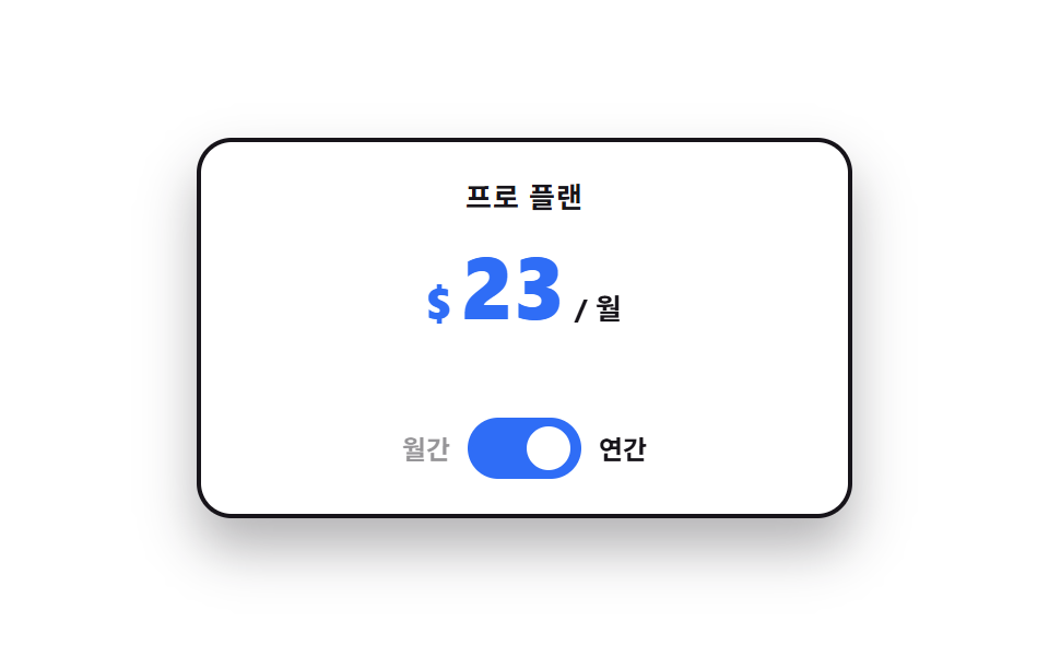
<main class="stage">
  <div class="bt is-demo" data-period="month">
    <p class="bt__plan">Pro plan</p>
    <div class="bt__price" aria-live="polite">
      <span class="bt__cur">$</span>
      <span class="bt__num"></span>
      <span class="bt__unit">/ mo</span>
    </div>
    <div class="bt__badgerow">
      <span class="bt__badge">Save 20%</span>
    </div>
    <div class="bt__switch" role="group" aria-label="Billing period">
      <span class="bt__lab" data-side="m">Monthly</span>
      <button class="bt__pill" type="button" role="switch" aria-checked="false" aria-label="Billing period" id="bt-sw">
        <span class="bt__knob" aria-hidden="true"></span>
      </button>
      <span class="bt__lab" data-side="y">Yearly</span>
    </div>
  </div>
</main>
@use "../../../../site/static/demo-tokens" as *;
// 가격 숫자를 굴리는 핵심 — 등록하지 않은 커스텀 속성은 보간되지 않는다.
// <integer> 로 등록해야 29 → 23 사이가 한 자리씩 채워진다
@property --n {
syntax: "<integer>";
initial-value: 29;
inherits: false;
}
$duration: $dur-quick;
$easing: $ease-spring;
$color: $subject-blue;
$roll: 520ms; // 숫자가 굴러가는 시간 — 자리가 넘어가는 게 눈에 보이는 길이
@include stage($stage-paper);
.bt {
--travel: 24px; // 손잡이가 미끄러지는 거리 — 알약 안폭(48) - 손잡이(20) - 양옆 2
box-sizing: border-box;
width: min(300px, 86vw);
display: flex;
flex-direction: column;
align-items: center;
gap: $sp-2;
padding: $sp-4;
border: 2px solid $subject-ink;
border-radius: $r-card;
background: $stage-paper;
box-shadow: $shadow-raised;
font-family: -apple-system, "Segoe UI", "Noto Sans KR", sans-serif;
color: $subject-ink;
}
.bt__plan {
margin: 0;
font-size: 13px;
line-height: 18px;
font-weight: 700;
letter-spacing: .04em;
}
.bt__price {
display: flex;
align-items: baseline;
gap: $sp-1;
color: $color;
}
.bt__cur {
font-size: 20px;
line-height: 28px;
font-weight: 800;
}
// 숫자는 텍스트 노드가 아니라 카운터로 그린다 — --n 이 보간되는 동안 그 정수가 그대로 글자가 된다
.bt__num {
--n: 29;
counter-reset: n var(--n);
font-size: 40px;
line-height: 46px;
font-weight: 800;
font-variant-numeric: tabular-nums;
}
.bt__num::after { content: counter(n); }
.bt__unit {
font-size: 13px;
line-height: 18px;
font-weight: 700;
color: $subject-ink;
}
.bt__badgerow {
display: flex;
align-items: center;
justify-content: center;
height: 22px;
}
.bt__badge {
padding: $sp-1 $sp-2;
border-radius: $r-pill;
background: $color;
color: $stage-paper;
font-size: 11px;
line-height: 14px;
font-weight: 800;
opacity: 0;
transform: scale(.7) translateY(6px);
}
.bt__switch {
display: flex;
align-items: center;
gap: $sp-2;
}
.bt__lab {
font-size: 12px;
line-height: 16px;
font-weight: 700;
opacity: .45;
}
.bt__pill {
position: relative;
box-sizing: border-box;
margin: 0;
padding: 0;
flex: 0 0 auto;
width: 52px;
height: 28px;
border: 2px solid $subject-ink;
border-radius: $r-pill;
background: $stage-paper;
cursor: pointer;
}
.bt__pill:focus-visible { outline: 2px solid $color; outline-offset: 2px; }
.bt__knob {
position: absolute;
left: 2px;
top: 2px;
width: 20px;
height: 20px;
border-radius: 50%;
background: $subject-ink;
}
// ── 사람이 만진 뒤(정적 경로) — 상태는 aria-checked 와 data-period 에만 들어 있다 ──
.bt__pill[aria-checked="true"] {
background: $color;
border-color: $color;
}
.bt__pill[aria-checked="true"] .bt__knob {
transform: translateX(var(--travel));
background: $stage-paper;
}
.bt[data-period="month"] .bt__lab[data-side="m"],
.bt[data-period="year"] .bt__lab[data-side="y"] { opacity: 1; }
.bt[data-period="year"] .bt__num { --n: 23; }
.bt[data-period="year"] .bt__badge {
opacity: 1;
transform: scale(1) translateY(0);
}
.bt:not(.is-demo) .bt__num {
transition-property: --n;
transition-duration: $roll;
transition-timing-function: $easing;
}
.bt:not(.is-demo) .bt__knob {
transition-property: transform, background-color;
transition-duration: $duration;
transition-timing-function: $easing;
}
.bt:not(.is-demo) .bt__badge {
transition-property: transform, opacity;
transition-duration: $duration;
transition-timing-function: $ease-pop;
}
// ── 자동 루프(2초) — 월간 29 → 연간 23 → 다시 월간. 복귀는 88% 에 끝난다 ──
.bt.is-demo .bt__num {
animation-name: bt-roll;
animation-duration: $dur-loop;
animation-timing-function: $easing;
animation-iteration-count: infinite;
}
@keyframes bt-roll {
0% { --n: 29; }
12% { --n: 29; }
36% { --n: 23; }
64% { --n: 23; }
88% { --n: 29; }
100% { --n: 29; }
}
// 손잡이는 미끄러지고(부드럽게), 손잡이 색은 컷으로 바뀐다
.bt.is-demo .bt__knob {
animation-name: bt-knob, bt-knobc;
animation-duration: $dur-loop, $dur-loop;
animation-timing-function: $easing, steps(1, end);
animation-iteration-count: infinite, infinite;
}
@keyframes bt-knob {
0%, 12% { transform: translateX(0); }
36%, 64% { transform: translateX(var(--travel)); }
88%, 100% { transform: translateX(0); }
}
@keyframes bt-knobc {
0% { background-color: $subject-ink; }
24% { background-color: $stage-paper; }
76% { background-color: $stage-paper; }
88% { background-color: $subject-ink; }
100% { background-color: $subject-ink; }
}
.bt.is-demo .bt__pill {
animation-name: bt-pill;
animation-duration: $dur-loop;
animation-timing-function: steps(1, end);
animation-iteration-count: infinite;
}
@keyframes bt-pill {
0% { background-color: $stage-paper; border-color: $subject-ink; }
24% { background-color: $color; border-color: $color; }
76% { background-color: $color; border-color: $color; }
88% { background-color: $stage-paper; border-color: $subject-ink; }
100% { background-color: $stage-paper; border-color: $subject-ink; }
}
// 라벨 강조도 같은 시계로 — 손잡이만 움직이면 어느 쪽이 켜졌는지 어긋나 보인다
.bt.is-demo .bt__lab {
animation-duration: $dur-loop;
animation-timing-function: steps(1, end);
animation-iteration-count: infinite;
}
.bt.is-demo .bt__lab[data-side="m"] { animation-name: bt-lab-m; }
.bt.is-demo .bt__lab[data-side="y"] { animation-name: bt-lab-y; }
@keyframes bt-lab-m {
0% { opacity: 1; }
24% { opacity: .45; }
82% { opacity: 1; }
100% { opacity: 1; }
}
@keyframes bt-lab-y {
0% { opacity: .45; }
24% { opacity: 1; }
82% { opacity: .45; }
100% { opacity: .45; }
}
// 배지는 나타남만 컷, 튀어오름은 $ease-pop 으로 — 두 축을 따로 돌린다
.bt.is-demo .bt__badge {
animation-name: bt-badge-face, bt-badge-pop;
animation-duration: $dur-loop, $dur-loop;
animation-timing-function: steps(1, end), $ease-pop;
animation-iteration-count: infinite, infinite;
}
@keyframes bt-badge-face {
0% { opacity: 0; }
30% { opacity: 1; }
82% { opacity: 0; }
100% { opacity: 0; }
}
@keyframes bt-badge-pop {
0%, 30% { transform: scale(.7) translateY(6px); }
44% { transform: scale(1.06) translateY(0); }
54%, 100% { transform: scale(1) translateY(0); }
}
// 숫자가 굴러가는 동안 가격 덩어리가 한 번 눌렸다 편다 — 컷 옆에 움직인 프레임을 채운다
.bt.is-demo .bt__price {
animation-name: bt-pop;
animation-duration: $dur-loop;
animation-timing-function: $ease-pop;
animation-iteration-count: infinite;
}
@keyframes bt-pop {
0%, 10% { transform: scale(1); }
22% { transform: scale(1.06); }
34%, 74% { transform: scale(1); }
84% { transform: scale(1.05); }
94%, 100% { transform: scale(1); }
}
@media (max-width: 340px) {
.bt {
width: min(260px, 90vw);
gap: $sp-1;
padding: $sp-3;
}
.bt__plan { font-size: 12px; line-height: 16px; }
.bt__cur { font-size: 16px; line-height: 22px; }
.bt__num { font-size: 30px; line-height: 34px; }
.bt__badgerow { height: 20px; }
.bt { --travel: 22px; } // 좁은 화면에서는 알약도 손잡이도 작아진다 (46 - 4 - 16 - 4)
.bt__pill { width: 46px; height: 24px; }
.bt__knob { width: 16px; height: 16px; }
}
@media (prefers-reduced-motion: reduce) {
.bt.is-demo .bt__num,
.bt.is-demo .bt__knob,
.bt.is-demo .bt__pill,
.bt.is-demo .bt__lab,
.bt.is-demo .bt__badge,
.bt.is-demo .bt__price { animation: none !important; }
.bt:not(.is-demo) .bt__num,
.bt:not(.is-demo) .bt__knob,
.bt:not(.is-demo) .bt__badge { transition: none !important; }
.bt.is-demo .bt__lab[data-side="m"] { opacity: 1; }
}@property --n {
syntax: "<integer>";
initial-value: 29;
inherits: false;
}
html, body {
margin: 0;
overflow: hidden;
}
.stage {
box-sizing: border-box;
min-height: 100vh;
display: grid;
place-items: center;
margin: 0;
background: #ffffff;
font-family: -apple-system, "Segoe UI", "Noto Sans KR", sans-serif;
padding: clamp(8px, 4vw, 24px);
}
.bt {
--travel: 24px;
box-sizing: border-box;
width: min(300px, 86vw);
display: flex;
flex-direction: column;
align-items: center;
gap: 8px;
padding: 16px;
border: 2px solid #17141a;
border-radius: 16px;
background: #ffffff;
box-shadow: 0 14px 24px rgba(23, 20, 26, 0.32);
font-family: -apple-system, "Segoe UI", "Noto Sans KR", sans-serif;
color: #17141a;
}
.bt__plan {
margin: 0;
font-size: 13px;
line-height: 18px;
font-weight: 700;
letter-spacing: 0.04em;
}
.bt__price {
display: flex;
align-items: baseline;
gap: 4px;
color: #2f6df6;
}
.bt__cur {
font-size: 20px;
line-height: 28px;
font-weight: 800;
}
.bt__num {
--n: 29;
counter-reset: n var(--n);
font-size: 40px;
line-height: 46px;
font-weight: 800;
font-variant-numeric: tabular-nums;
}
.bt__num::after {
content: counter(n);
}
.bt__unit {
font-size: 13px;
line-height: 18px;
font-weight: 700;
color: #17141a;
}
.bt__badgerow {
display: flex;
align-items: center;
justify-content: center;
height: 22px;
}
.bt__badge {
padding: 4px 8px;
border-radius: 999px;
background: #2f6df6;
color: #ffffff;
font-size: 11px;
line-height: 14px;
font-weight: 800;
opacity: 0;
transform: scale(0.7) translateY(6px);
}
.bt__switch {
display: flex;
align-items: center;
gap: 8px;
}
.bt__lab {
font-size: 12px;
line-height: 16px;
font-weight: 700;
opacity: 0.45;
}
.bt__pill {
position: relative;
box-sizing: border-box;
margin: 0;
padding: 0;
flex: 0 0 auto;
width: 52px;
height: 28px;
border: 2px solid #17141a;
border-radius: 999px;
background: #ffffff;
cursor: pointer;
}
.bt__pill:focus-visible {
outline: 2px solid #2f6df6;
outline-offset: 2px;
}
.bt__knob {
position: absolute;
left: 2px;
top: 2px;
width: 20px;
height: 20px;
border-radius: 50%;
background: #17141a;
}
.bt__pill[aria-checked=true] {
background: #2f6df6;
border-color: #2f6df6;
}
.bt__pill[aria-checked=true] .bt__knob {
transform: translateX(var(--travel));
background: #ffffff;
}
.bt[data-period=month] .bt__lab[data-side=m],
.bt[data-period=year] .bt__lab[data-side=y] {
opacity: 1;
}
.bt[data-period=year] .bt__num {
--n: 23;
}
.bt[data-period=year] .bt__badge {
opacity: 1;
transform: scale(1) translateY(0);
}
.bt:not(.is-demo) .bt__num {
transition-property: --n;
transition-duration: 520ms;
transition-timing-function: cubic-bezier(0.2, 0.8, 0.2, 1);
}
.bt:not(.is-demo) .bt__knob {
transition-property: transform, background-color;
transition-duration: 220ms;
transition-timing-function: cubic-bezier(0.2, 0.8, 0.2, 1);
}
.bt:not(.is-demo) .bt__badge {
transition-property: transform, opacity;
transition-duration: 220ms;
transition-timing-function: cubic-bezier(0.2, 1.4, 0.4, 1);
}
.bt.is-demo .bt__num {
animation-name: bt-roll;
animation-duration: 2s;
animation-timing-function: cubic-bezier(0.2, 0.8, 0.2, 1);
animation-iteration-count: infinite;
}
@keyframes bt-roll {
0% {
--n: 29;
}
12% {
--n: 29;
}
36% {
--n: 23;
}
64% {
--n: 23;
}
88% {
--n: 29;
}
100% {
--n: 29;
}
}
.bt.is-demo .bt__knob {
animation-name: bt-knob, bt-knobc;
animation-duration: 2s, 2s;
animation-timing-function: cubic-bezier(0.2, 0.8, 0.2, 1), steps(1, end);
animation-iteration-count: infinite, infinite;
}
@keyframes bt-knob {
0%, 12% {
transform: translateX(0);
}
36%, 64% {
transform: translateX(var(--travel));
}
88%, 100% {
transform: translateX(0);
}
}
@keyframes bt-knobc {
0% {
background-color: #17141a;
}
24% {
background-color: #ffffff;
}
76% {
background-color: #ffffff;
}
88% {
background-color: #17141a;
}
100% {
background-color: #17141a;
}
}
.bt.is-demo .bt__pill {
animation-name: bt-pill;
animation-duration: 2s;
animation-timing-function: steps(1, end);
animation-iteration-count: infinite;
}
@keyframes bt-pill {
0% {
background-color: #ffffff;
border-color: #17141a;
}
24% {
background-color: #2f6df6;
border-color: #2f6df6;
}
76% {
background-color: #2f6df6;
border-color: #2f6df6;
}
88% {
background-color: #ffffff;
border-color: #17141a;
}
100% {
background-color: #ffffff;
border-color: #17141a;
}
}
.bt.is-demo .bt__lab {
animation-duration: 2s;
animation-timing-function: steps(1, end);
animation-iteration-count: infinite;
}
.bt.is-demo .bt__lab[data-side=m] {
animation-name: bt-lab-m;
}
.bt.is-demo .bt__lab[data-side=y] {
animation-name: bt-lab-y;
}
@keyframes bt-lab-m {
0% {
opacity: 1;
}
24% {
opacity: 0.45;
}
82% {
opacity: 1;
}
100% {
opacity: 1;
}
}
@keyframes bt-lab-y {
0% {
opacity: 0.45;
}
24% {
opacity: 1;
}
82% {
opacity: 0.45;
}
100% {
opacity: 0.45;
}
}
.bt.is-demo .bt__badge {
animation-name: bt-badge-face, bt-badge-pop;
animation-duration: 2s, 2s;
animation-timing-function: steps(1, end), cubic-bezier(0.2, 1.4, 0.4, 1);
animation-iteration-count: infinite, infinite;
}
@keyframes bt-badge-face {
0% {
opacity: 0;
}
30% {
opacity: 1;
}
82% {
opacity: 0;
}
100% {
opacity: 0;
}
}
@keyframes bt-badge-pop {
0%, 30% {
transform: scale(0.7) translateY(6px);
}
44% {
transform: scale(1.06) translateY(0);
}
54%, 100% {
transform: scale(1) translateY(0);
}
}
.bt.is-demo .bt__price {
animation-name: bt-pop;
animation-duration: 2s;
animation-timing-function: cubic-bezier(0.2, 1.4, 0.4, 1);
animation-iteration-count: infinite;
}
@keyframes bt-pop {
0%, 10% {
transform: scale(1);
}
22% {
transform: scale(1.06);
}
34%, 74% {
transform: scale(1);
}
84% {
transform: scale(1.05);
}
94%, 100% {
transform: scale(1);
}
}
@media (max-width: 340px) {
.bt {
width: min(260px, 90vw);
gap: 4px;
padding: 12px;
}
.bt__plan {
font-size: 12px;
line-height: 16px;
}
.bt__cur {
font-size: 16px;
line-height: 22px;
}
.bt__num {
font-size: 30px;
line-height: 34px;
}
.bt__badgerow {
height: 20px;
}
.bt {
--travel: 22px;
}
.bt__pill {
width: 46px;
height: 24px;
}
.bt__knob {
width: 16px;
height: 16px;
}
}
@media (prefers-reduced-motion: reduce) {
.bt.is-demo .bt__num,
.bt.is-demo .bt__knob,
.bt.is-demo .bt__pill,
.bt.is-demo .bt__lab,
.bt.is-demo .bt__badge,
.bt.is-demo .bt__price {
animation: none !important;
}
.bt:not(.is-demo) .bt__num,
.bt:not(.is-demo) .bt__knob,
.bt:not(.is-demo) .bt__badge {
transition: none !important;
}
.bt.is-demo .bt__lab[data-side=m] {
opacity: 1;
}
}// 실제 동작: 스위치를 누르면 aria-checked 가 뒤집히고 뿌리의 data-period 가 바뀐다.
// 가격 숫자는 CSS 가 굴린다 — @property 로 등록한 --n 을 transition 이 정수로 보간하고
// counter-reset: n var(--n) + content: counter(n) 이 그 값을 글자로 그린다.
var root = document.querySelector('.bt');
var sw = document.getElementById('bt-sw');
sw.addEventListener('click', function () {
root.classList.remove('is-demo');
var on = sw.getAttribute('aria-checked') === 'true';
sw.setAttribute('aria-checked', String(!on));
root.setAttribute('data-period', on ? 'month' : 'year');
});import { useState } from "react";
import type { CSSProperties } from "react";
import styles from "./BillingToggleRoll.module.scss";
export type BillingToggleRollProps = {
planName?: string;
monthLabel?: string;
yearLabel?: string;
groupLabel?: string;
saveLabel?: string;
unit?: string;
currency?: string;
monthly?: number;
yearly?: number;
duration?: number;
easing?: string;
color?: string;
};
type Vars = CSSProperties & {
"--duration"?: string;
"--easing"?: string;
"--color"?: string;
};
type NumVars = CSSProperties & { "--n"?: string };
export default function BillingToggleRoll({
planName = "Pro plan",
monthLabel = "Monthly",
yearLabel = "Yearly",
groupLabel = "Billing period",
saveLabel = "Save 20%",
unit = "/ mo",
currency = "$",
monthly = 29,
yearly = 23,
duration = 220,
easing = "cubic-bezier(.2,.8,.2,1)",
color = "#2f6df6",
}: BillingToggleRollProps) {
const [demo, setDemo] = useState(true);
const [year, setYear] = useState(false);
const vars: Vars = { "--duration": `${duration}ms`, "--easing": easing, "--color": color };
// --n 은 @property 로 등록된 정수라 값을 바꾸면 transition 이 한 자리씩 굴린다.
// 자동 루프가 도는 동안에는 keyframes 가 이 인라인 값보다 우선한다(애니메이션이 캐스케이드에서 위)
const numVars: NumVars = { "--n": String(year ? yearly : monthly) };
function toggle() {
setDemo(false);
setYear((v) => !v);
}
return (
<div
className={`${styles.bt} ${demo ? styles.isDemo : ""}`}
data-period={year ? "year" : "month"}
style={vars}
>
<p className={styles.plan}>{planName}</p>
<div className={styles.price} aria-live="polite">
<span className={styles.cur}>{currency}</span>
<span className={styles.num} style={numVars} />
<span className={styles.unit}>{unit}</span>
</div>
<div className={styles.badgerow}>
<span className={styles.badge}>{saveLabel}</span>
</div>
<div className={styles.switch} role="group" aria-label={groupLabel}>
<span className={styles.lab} data-side="m">{monthLabel}</span>
<button
className={styles.pill}
type="button"
role="switch"
aria-checked={year}
aria-label={groupLabel}
onClick={toggle}
>
<span className={styles.knob} aria-hidden="true" />
</button>
<span className={styles.lab} data-side="y">{yearLabel}</span>
</div>
</div>
);
}01 Billing toggle that rolls the number — Measured area 3.012% · moving frames 19/23Original by GODRICH · SCSS and React ship in the zip · Pricing Table Design: 9 Live Interactions
The post this demo lives in
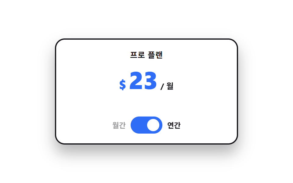 Pricing Table Design: 9 Live InteractionsIn pricing table design, the work happens on top of the cards, not inside them. All nine run on vanilla JS and SCSS, and See all demos in this post
If you like this effect - similar demos
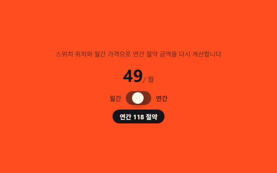 Landing sections03 Billing toggle — a switch that derives its own savings badge from its position9 Pricing Page Design Sections (Copy-Paste)
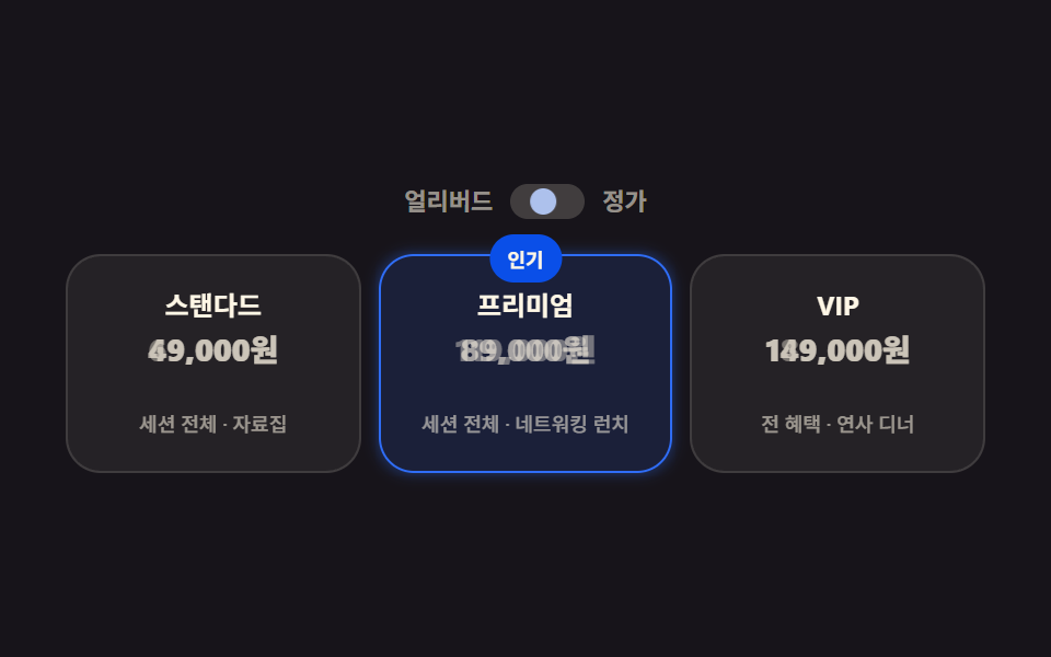 Landing sections05 Ticket pricing9 Event Landing Page Templates — Copy-Paste
 Landing sections05 Spinning gradient border9 Profile Card Design Styles, Copy-Paste Ready