01Vertical splitter
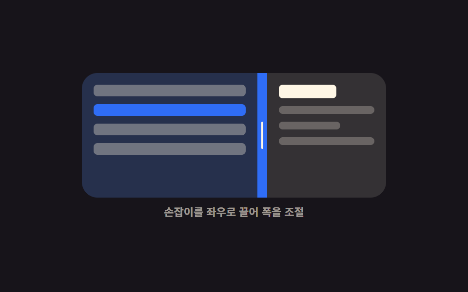
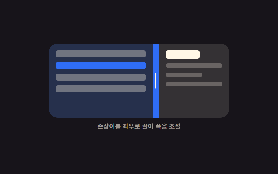
Dragging the middle handle sideways makes the left panel width follow the pointer exactly, and it stops dead once either side hits its minimum width.
Best forMailbox and admin screens showing a list beside a detail view, when the reading side needs more room
setPointerCapturegrid-template-columnsaria-valuenow
<main class="stage">
  <div class="vs is-demo" id="vs-root">
    <div class="vs__box" id="vs-box">
      <section class="vs__pane vs__pane--list" aria-label="Mail list">
        <span class="vs__row"></span>
        <span class="vs__row"></span>
        <span class="vs__row"></span>
        <span class="vs__row"></span>
      </section>
      <div class="vs__bar" id="vs-bar" role="separator" tabindex="0"
           aria-orientation="vertical" aria-label="List width" aria-valuemin="20" aria-valuemax="80" aria-valuenow="50">
        <i class="vs__grip" aria-hidden="true"></i>
      </div>
      <section class="vs__pane vs__pane--read" aria-label="Mail body">
        <b class="vs__title"></b>
        <span class="vs__line"></span>
        <span class="vs__line vs__line--short"></span>
        <span class="vs__line"></span>
      </section>
    </div>
    <p class="vs__cap">Drag the handle sideways to set the width</p>
  </div>
</main>
@use "../../../../site/static/demo-tokens" as *;
$duration: $dur-quick;
$easing: $ease-spring;
$color: $subject-blue;
@include stage($stage-ink);
// 등록해야 키프레임에서 보간된다 — 등록 안 하면 --split 은 문자열이라 27% 에서 툭 끊긴다
@property --split {
syntax: "<percentage>";
inherits: true;
initial-value: 50%;
}
.vs {
--split: 50%;
width: min(312px, 88vw);
display: flex;
flex-direction: column;
gap: $sp-2;
}
.vs__box {
display: grid;
grid-template-columns: var(--split) 10px 1fr;
height: 128px;
border-radius: $r-card;
overflow: hidden;
background: rgba(255, 255, 255, .06);
}
.vs__pane {
box-sizing: border-box;
display: flex;
flex-direction: column;
gap: $sp-2;
padding: $sp-3;
overflow: hidden;
}
.vs__pane--list { background: rgba(47, 109, 246, .18); }
.vs__pane--read { background: rgba(255, 247, 230, .07); }
.vs__row {
flex: 0 0 auto;
height: 12px;
border-radius: $r-xs;
background: rgba(255, 247, 230, .34);
}
.vs__row:nth-child(2) { background: $color; }
.vs__title {
flex: 0 0 auto;
height: 14px;
width: 60%;
border-radius: $r-xs;
background: $subject-cream;
}
.vs__line {
flex: 0 0 auto;
height: 8px;
border-radius: $r-xs;
background: rgba(255, 247, 230, .26);
}
.vs__line--short { width: 64%; }
.vs__bar {
display: grid;
place-items: center;
background: rgba(255, 247, 230, .14);
cursor: col-resize;
touch-action: none;
transition: background $duration $easing;
}
.vs__grip {
display: block;
width: 2px;
height: 28px;
border-radius: $r-pill;
background: $subject-cream;
transition: transform $duration $easing;
}
.vs__bar:hover,
.vs.is-drag .vs__bar { background: $color; }
.vs__bar:hover .vs__grip,
.vs.is-drag .vs__grip { transform: scaleY(1.5); }
.vs__bar:focus-visible { outline: 2px solid $subject-cream; outline-offset: -2px; }
.vs__cap {
margin: 0;
font-size: 11px;
line-height: 14px;
font-weight: 600;
color: rgba(255, 247, 230, .58);
text-align: center;
}
// ── 자동 루프: 50% → 좁게 → 넓게 → 50%. 복귀는 88% 안에서 끝난다 ──
.vs.is-demo { animation: vs-split $dur-loop $easing infinite; }
@keyframes vs-split {
0%, 8% { --split: 50%; }
36% { --split: 26%; }
64% { --split: 72%; }
88%, 100% { --split: 50%; }
}
.vs.is-demo .vs__bar { animation: vs-hot $dur-loop $easing infinite; }
@keyframes vs-hot {
0%, 8% { background: rgba(255, 247, 230, .14); }
20%, 76% { background: $subject-blue; }
88%, 100% { background: rgba(255, 247, 230, .14); }
}
@media (prefers-reduced-motion: reduce) {
.vs.is-demo,
.vs.is-demo .vs__bar { animation: none !important; }
.vs__bar, .vs__grip { transition: none; }
}
@media (max-width: 340px) {
.vs__box { height: 112px; }
.vs__pane { padding: $sp-2; }
}html, body {
margin: 0;
overflow: hidden;
}
.stage {
box-sizing: border-box;
min-height: 100vh;
display: grid;
place-items: center;
margin: 0;
background: #17141a;
font-family: -apple-system, "Segoe UI", "Noto Sans KR", sans-serif;
padding: clamp(8px, 4vw, 24px);
}
@property --split {
syntax: "<percentage>";
inherits: true;
initial-value: 50%;
}
.vs {
--split: 50%;
width: min(312px, 88vw);
display: flex;
flex-direction: column;
gap: 8px;
}
.vs__box {
display: grid;
grid-template-columns: var(--split) 10px 1fr;
height: 128px;
border-radius: 16px;
overflow: hidden;
background: rgba(255, 255, 255, 0.06);
}
.vs__pane {
box-sizing: border-box;
display: flex;
flex-direction: column;
gap: 8px;
padding: 12px;
overflow: hidden;
}
.vs__pane--list {
background: rgba(47, 109, 246, 0.18);
}
.vs__pane--read {
background: rgba(255, 247, 230, 0.07);
}
.vs__row {
flex: 0 0 auto;
height: 12px;
border-radius: 4px;
background: rgba(255, 247, 230, 0.34);
}
.vs__row:nth-child(2) {
background: #2f6df6;
}
.vs__title {
flex: 0 0 auto;
height: 14px;
width: 60%;
border-radius: 4px;
background: #fff7e6;
}
.vs__line {
flex: 0 0 auto;
height: 8px;
border-radius: 4px;
background: rgba(255, 247, 230, 0.26);
}
.vs__line--short {
width: 64%;
}
.vs__bar {
display: grid;
place-items: center;
background: rgba(255, 247, 230, 0.14);
cursor: col-resize;
touch-action: none;
transition: background 220ms cubic-bezier(0.2, 0.8, 0.2, 1);
}
.vs__grip {
display: block;
width: 2px;
height: 28px;
border-radius: 999px;
background: #fff7e6;
transition: transform 220ms cubic-bezier(0.2, 0.8, 0.2, 1);
}
.vs__bar:hover,
.vs.is-drag .vs__bar {
background: #2f6df6;
}
.vs__bar:hover .vs__grip,
.vs.is-drag .vs__grip {
transform: scaleY(1.5);
}
.vs__bar:focus-visible {
outline: 2px solid #fff7e6;
outline-offset: -2px;
}
.vs__cap {
margin: 0;
font-size: 11px;
line-height: 14px;
font-weight: 600;
color: rgba(255, 247, 230, 0.58);
text-align: center;
}
.vs.is-demo {
animation: vs-split 2s cubic-bezier(0.2, 0.8, 0.2, 1) infinite;
}
@keyframes vs-split {
0%, 8% {
--split: 50%;
}
36% {
--split: 26%;
}
64% {
--split: 72%;
}
88%, 100% {
--split: 50%;
}
}
.vs.is-demo .vs__bar {
animation: vs-hot 2s cubic-bezier(0.2, 0.8, 0.2, 1) infinite;
}
@keyframes vs-hot {
0%, 8% {
background: rgba(255, 247, 230, 0.14);
}
20%, 76% {
background: #2f6df6;
}
88%, 100% {
background: rgba(255, 247, 230, 0.14);
}
}
@media (prefers-reduced-motion: reduce) {
.vs.is-demo,
.vs.is-demo .vs__bar {
animation: none !important;
}
.vs__bar, .vs__grip {
transition: none;
}
}
@media (max-width: 340px) {
.vs__box {
height: 112px;
}
.vs__pane {
padding: 8px;
}
}// 실제 동작: 포인터 델타 → 왼쪽 트랙 폭(--split). 최소 폭 64px 에서 클램프. 화살표 키는 4%씩.
var root = document.getElementById('vs-root');
var box = document.getElementById('vs-box');
var bar = document.getElementById('vs-bar');
var MIN = 64, BAR = 10, dragging = false;
function set(pct) {
var w = box.clientWidth;
var lo = MIN / w * 100, hi = (w - MIN - BAR) / w * 100;
var v = Math.max(lo, Math.min(pct, hi));
root.style.setProperty('--split', v.toFixed(1) + '%');
bar.setAttribute('aria-valuenow', String(Math.round(v)));
}
function stop() { root.classList.remove('is-demo'); }
bar.addEventListener('pointerdown', function (e) {
stop();
dragging = true;
bar.setPointerCapture(e.pointerId);
root.classList.add('is-drag');
e.preventDefault();
});
bar.addEventListener('pointermove', function (e) {
if (!dragging) return;
set((e.clientX - box.getBoundingClientRect().left) / box.clientWidth * 100);
});
function drop() { dragging = false; root.classList.remove('is-drag'); }
bar.addEventListener('pointerup', drop);
bar.addEventListener('pointercancel', drop);
bar.addEventListener('keydown', function (e) {
var now = Number(bar.getAttribute('aria-valuenow'));
var d = e.key === 'ArrowLeft' ? -4 : e.key === 'ArrowRight' ? 4 : 0;
if (!d) return;
stop();
set(now + d);
bar.focus({ preventScroll: true });
e.preventDefault();
});import { useRef, useState } from "react";
import type { CSSProperties } from "react";
import styles from "./VerticalSplitter.module.scss";
export type VerticalSplitterProps = {
/** 시작 비율 (%) */
start?: number;
/** 양쪽 최소 폭 (px) */
minWidth?: number;
duration?: number;
easing?: string;
color?: string;
};
type PEvt = { clientX: number; pointerId: number; preventDefault(): void; currentTarget: { setPointerCapture(id: number): void } };
type KeyEvt = { key: string; preventDefault(): void };
type Vars = CSSProperties & { "--split"?: string; "--duration"?: string; "--easing"?: string; "--color"?: string };
const BAR = 10;
export default function VerticalSplitter({
start = 50,
minWidth = 64,
duration = 220,
easing = "cubic-bezier(.2,.8,.2,1)",
color = "#2f6df6",
}: VerticalSplitterProps) {
const [split, setSplit] = useState(start);
const [drag, setDrag] = useState(false);
const boxRef = useRef<HTMLDivElement>(null);
function set(pct: number): void {
const box = boxRef.current;
if (!box) return;
const w = box.clientWidth;
const lo = (minWidth / w) * 100;
const hi = ((w - minWidth - BAR) / w) * 100;
setSplit(Math.max(lo, Math.min(pct, hi)));
}
function onDown(e: PEvt): void {
setDrag(true);
e.currentTarget.setPointerCapture(e.pointerId);
e.preventDefault();
}
function onMove(e: PEvt): void {
const box = boxRef.current;
if (!drag || !box) return;
set(((e.clientX - box.getBoundingClientRect().left) / box.clientWidth) * 100);
}
function onUp(): void { setDrag(false); }
function onKey(e: KeyEvt): void {
const d = e.key === "ArrowLeft" ? -4 : e.key === "ArrowRight" ? 4 : 0;
if (!d) return;
set(split + d);
e.preventDefault();
}
const vars: Vars = {
"--split": `${split.toFixed(1)}%`,
"--duration": `${duration}ms`,
"--easing": easing,
"--color": color,
};
return (
<div className={drag ? `${styles.vs} ${styles.isDrag}` : styles.vs} style={vars}>
<div className={styles.box} ref={boxRef}>
<section className={`${styles.pane} ${styles.paneList}`} aria-label="Mail list">
<span className={styles.row} />
<span className={`${styles.row} ${styles.rowOn}`} />
<span className={styles.row} />
<span className={styles.row} />
</section>
<div
className={styles.bar}
role="separator"
tabIndex={0}
aria-orientation="vertical"
aria-label="List width"
aria-valuemin={20}
aria-valuemax={80}
aria-valuenow={Math.round(split)}
onPointerDown={onDown}
onPointerMove={onMove}
onPointerUp={onUp}
onPointerCancel={onUp}
onKeyDown={onKey}
>
<i className={styles.grip} aria-hidden="true" />
</div>
<section className={`${styles.pane} ${styles.paneRead}`} aria-label="Mail body">
<b className={styles.title} />
<span className={styles.line} />
<span className={`${styles.line} ${styles.lineShort}`} />
<span className={styles.line} />
</section>
</div>
<p className={styles.cap}>Drag the handle sideways to set the width</p>
</div>
);
}01 Vertical splitter — Measured area 14.942% · moving frames 19/23Original by GODRICH · SCSS and React ship in the zip · 9 Resizable Split Pane Layouts With No Library
The post this demo lives in
 9 Resizable Split Pane Layouts With No LibraryA resizable split pane is a layout whose panes share one draggable boundary, so widening one side narrows the other. Eig See all demos in this post