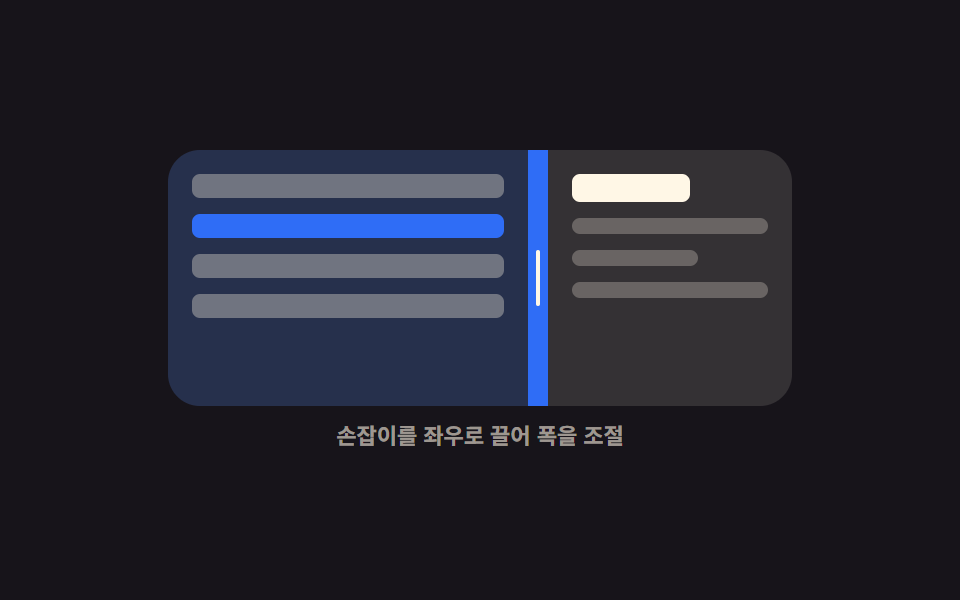
04Double-click collapse
Double-clicking the handle folds the neighboring panel into a thin rail in one move, and a second double-click restores the exact width it had before.
Best forScreens where the sidebar is hidden and shown all day and one handle should do the job without an extra button
dblclickaria-expandedtransition

<main class="stage">
  <div class="dc is-demo" id="dc-root">
    <div class="dc__box" id="dc-box">
      <section class="dc__side" id="dc-side" aria-label="Sidebar">
        <span class="dc__ico"><svg viewBox="0 0 256 256" aria-hidden="true"><g fill="currentColor"><path d="M88 48v160H40a8 8 0 0 1-8-8V56a8 8 0 0 1 8-8Z" opacity=".2"/><path d="M216 40H40a16 16 0 0 0-16 16v144a16 16 0 0 0 16 16h176a16 16 0 0 0 16-16V56a16 16 0 0 0-16-16M40 56h40v144H40Zm176 144H96V56h120z"/></g></svg></span>
        <span class="dc__row"></span>
        <span class="dc__row"></span>
        <span class="dc__row"></span>
      </section>
      <div class="dc__bar" id="dc-bar" role="separator" tabindex="0"
           aria-orientation="vertical" aria-label="Sidebar width" aria-expanded="true" aria-valuemin="4" aria-valuemax="60" aria-valuenow="34">
        <i class="dc__grip" aria-hidden="true"></i>
      </div>
      <section class="dc__main" aria-label="Main">
        <b class="dc__head"></b>
        <span class="dc__line"></span>
        <span class="dc__line dc__line--short"></span>
      </section>
    </div>
    <p class="dc__cap">Double-click the handle to fold</p>
  </div>
</main>
@use "../../../../site/static/demo-tokens" as *;
$duration: $dur-base;
$easing: $ease-spring;
$color: $subject-blue;
@include stage($stage-yellow);
@property --split {
syntax: "<percentage>";
inherits: true;
initial-value: 34%;
}
.dc {
--split: 34%;
width: min(300px, 88vw);
display: flex;
flex-direction: column;
gap: $sp-2;
}
.dc__box {
display: grid;
grid-template-columns: var(--split) 10px 1fr;
height: 124px;
border-radius: $r-card;
overflow: hidden;
background: $subject-ink;
}
// 손이 끌고 있을 때만 transition 을 끈다 — 접기는 부드럽게, 드래그는 즉시
// @property 로 등록된 --split 이라 transition 대상이 될 수 있다
.dc:not(.is-live) { transition: --split $duration $easing; }
.dc__side,
.dc__main {
box-sizing: border-box;
display: flex;
flex-direction: column;
gap: $sp-2;
padding: $sp-3;
overflow: hidden;
}
.dc__side { background: rgba(47, 109, 246, .34); }
.dc__main { background: rgba(255, 247, 230, .06); }
.dc__ico {
flex: 0 0 auto;
width: 16px;
height: 16px;
color: $subject-cream;
transition: opacity $dur-quick $easing;
}
.dc__ico svg { display: block; width: 16px; height: 16px; }
.dc.is-folded .dc__ico { opacity: 0; }
.dc__row {
flex: 0 0 auto;
height: 8px;
border-radius: $r-xs;
background: rgba(255, 247, 230, .42);
}
.dc__head {
flex: 0 0 auto;
height: 14px;
width: 56%;
border-radius: $r-xs;
background: $subject-cream;
}
.dc__line {
flex: 0 0 auto;
height: 8px;
border-radius: $r-xs;
background: rgba(255, 247, 230, .26);
}
.dc__line--short { width: 62%; }
.dc__bar {
display: grid;
place-items: center;
background: rgba(255, 247, 230, .2);
cursor: col-resize;
touch-action: none;
transition: background $dur-quick $easing;
}
.dc__grip {
display: block;
width: 2px;
height: 24px;
border-radius: $r-pill;
background: $subject-cream;
}
.dc__bar:hover { background: $color; }
.dc__bar:focus-visible { outline: 2px solid $subject-cream; outline-offset: -2px; }
.dc__cap {
margin: 0;
font-size: 11px;
line-height: 14px;
font-weight: 700;
color: rgba(23, 20, 26, .68);
text-align: center;
}
// ── 자동 루프: 펼침 → 접힘 → 펼침. 접기 전 폭 34% 로 정확히 돌아온다 ──
.dc.is-demo { animation: dc-fold $dur-loop $easing infinite; }
@keyframes dc-fold {
0%, 14% { --split: 34%; }
38%, 56% { --split: 4%; }
82%, 100% { --split: 34%; }
}
.dc.is-demo .dc__ico { animation: dc-ico $dur-loop steps(1, end) infinite; }
@keyframes dc-ico {
0%, 29% { opacity: 1; }
30%, 63% { opacity: 0; }
64%, 100% { opacity: 1; }
}
@media (prefers-reduced-motion: reduce) {
.dc.is-demo,
.dc.is-demo .dc__ico { animation: none !important; }
.dc, .dc__bar, .dc__ico { transition: none; }
}
@media (max-width: 340px) {
.dc__box { height: 108px; }
.dc__side, .dc__main { padding: $sp-2; }
}html, body {
margin: 0;
overflow: hidden;
}
.stage {
box-sizing: border-box;
min-height: 100vh;
display: grid;
place-items: center;
margin: 0;
background: #ffd23f;
font-family: -apple-system, "Segoe UI", "Noto Sans KR", sans-serif;
padding: clamp(8px, 4vw, 24px);
}
@property --split {
syntax: "<percentage>";
inherits: true;
initial-value: 34%;
}
.dc {
--split: 34%;
width: min(300px, 88vw);
display: flex;
flex-direction: column;
gap: 8px;
}
.dc__box {
display: grid;
grid-template-columns: var(--split) 10px 1fr;
height: 124px;
border-radius: 16px;
overflow: hidden;
background: #17141a;
}
.dc:not(.is-live) {
transition: --split 300ms cubic-bezier(0.2, 0.8, 0.2, 1);
}
.dc__side,
.dc__main {
box-sizing: border-box;
display: flex;
flex-direction: column;
gap: 8px;
padding: 12px;
overflow: hidden;
}
.dc__side {
background: rgba(47, 109, 246, 0.34);
}
.dc__main {
background: rgba(255, 247, 230, 0.06);
}
.dc__ico {
flex: 0 0 auto;
width: 16px;
height: 16px;
color: #fff7e6;
transition: opacity 220ms cubic-bezier(0.2, 0.8, 0.2, 1);
}
.dc__ico svg {
display: block;
width: 16px;
height: 16px;
}
.dc.is-folded .dc__ico {
opacity: 0;
}
.dc__row {
flex: 0 0 auto;
height: 8px;
border-radius: 4px;
background: rgba(255, 247, 230, 0.42);
}
.dc__head {
flex: 0 0 auto;
height: 14px;
width: 56%;
border-radius: 4px;
background: #fff7e6;
}
.dc__line {
flex: 0 0 auto;
height: 8px;
border-radius: 4px;
background: rgba(255, 247, 230, 0.26);
}
.dc__line--short {
width: 62%;
}
.dc__bar {
display: grid;
place-items: center;
background: rgba(255, 247, 230, 0.2);
cursor: col-resize;
touch-action: none;
transition: background 220ms cubic-bezier(0.2, 0.8, 0.2, 1);
}
.dc__grip {
display: block;
width: 2px;
height: 24px;
border-radius: 999px;
background: #fff7e6;
}
.dc__bar:hover {
background: #2f6df6;
}
.dc__bar:focus-visible {
outline: 2px solid #fff7e6;
outline-offset: -2px;
}
.dc__cap {
margin: 0;
font-size: 11px;
line-height: 14px;
font-weight: 700;
color: rgba(23, 20, 26, 0.68);
text-align: center;
}
.dc.is-demo {
animation: dc-fold 2s cubic-bezier(0.2, 0.8, 0.2, 1) infinite;
}
@keyframes dc-fold {
0%, 14% {
--split: 34%;
}
38%, 56% {
--split: 4%;
}
82%, 100% {
--split: 34%;
}
}
.dc.is-demo .dc__ico {
animation: dc-ico 2s steps(1, end) infinite;
}
@keyframes dc-ico {
0%, 29% {
opacity: 1;
}
30%, 63% {
opacity: 0;
}
64%, 100% {
opacity: 1;
}
}
@media (prefers-reduced-motion: reduce) {
.dc.is-demo,
.dc.is-demo .dc__ico {
animation: none !important;
}
.dc, .dc__bar, .dc__ico {
transition: none;
}
}
@media (max-width: 340px) {
.dc__box {
height: 108px;
}
.dc__side, .dc__main {
padding: 8px;
}
}// 실제 동작: dblclick 한 번에 접힘 ↔ 접기 직전 폭. 폭 자체는 CSS transition 이 옮긴다.
var root = document.getElementById('dc-root');
var box = document.getElementById('dc-box');
var bar = document.getElementById('dc-bar');
var RAIL = 4, last = 34, folded = false, dragging = false;
function set(pct, fold) {
root.style.setProperty('--split', pct.toFixed(1) + '%');
bar.setAttribute('aria-valuenow', String(Math.round(pct)));
bar.setAttribute('aria-expanded', String(!fold));
root.classList.toggle('is-folded', fold);
}
function stop() { root.classList.remove('is-demo'); }
bar.addEventListener('dblclick', function () {
stop();
folded = !folded;
if (folded) set(RAIL, true);
else set(last, false);
});
bar.addEventListener('pointerdown', function (e) {
stop();
dragging = true;
bar.setPointerCapture(e.pointerId);
e.preventDefault();
});
bar.addEventListener('pointermove', function (e) {
if (!dragging) return;
root.classList.add('is-live');
var pct = (e.clientX - box.getBoundingClientRect().left) / box.clientWidth * 100;
last = Math.max(14, Math.min(pct, 60));
folded = false;
set(last, false);
});
function drop() { dragging = false; root.classList.remove('is-live'); }
bar.addEventListener('pointerup', drop);
bar.addEventListener('pointercancel', drop);
bar.addEventListener('keydown', function (e) {
if (e.key !== 'Enter' && e.key !== ' ') return;
stop();
folded = !folded;
set(folded ? RAIL : last, folded);
bar.focus({ preventScroll: true });
e.preventDefault();
});import { useRef, useState } from "react";
import type { CSSProperties } from "react";
import styles from "./CollapsiblePanel.module.scss";
export type CollapsiblePanelProps = {
start?: number;
/** 접혔을 때 남는 띠 폭 (%) */
rail?: number;
duration?: number;
easing?: string;
color?: string;
};
type PEvt = { clientX: number; pointerId: number; preventDefault(): void; currentTarget: { setPointerCapture(id: number): void } };
type KeyEvt = { key: string; preventDefault(): void };
type Box<T> = { current: T };
type Vars = CSSProperties & { "--split"?: string; "--duration"?: string; "--easing"?: string; "--color"?: string };
export default function CollapsiblePanel({
start = 34,
rail = 4,
duration = 300,
easing = "cubic-bezier(.2,.8,.2,1)",
color = "#2f6df6",
}: CollapsiblePanelProps) {
const [split, setSplit] = useState(start);
const [folded, setFolded] = useState(false);
const [live, setLive] = useState(false);
const last = useRef(start) as Box<number>;
const boxRef = useRef<HTMLDivElement>(null);
const dragging = useRef(false) as Box<boolean>;
function toggle(): void {
const next = !folded;
setFolded(next);
setSplit(next ? rail : last.current);
}
function onDown(e: PEvt): void {
dragging.current = true;
e.currentTarget.setPointerCapture(e.pointerId);
e.preventDefault();
}
function onMove(e: PEvt): void {
const box = boxRef.current;
if (!dragging.current || !box) return;
setLive(true);
const pct = ((e.clientX - box.getBoundingClientRect().left) / box.clientWidth) * 100;
last.current = Math.max(14, Math.min(pct, 60));
setFolded(false);
setSplit(last.current);
}
function onUp(): void { dragging.current = false; setLive(false); }
function onKey(e: KeyEvt): void {
if (e.key !== "Enter" && e.key !== " ") return;
toggle();
e.preventDefault();
}
const vars: Vars = {
"--split": `${split.toFixed(1)}%`,
"--duration": `${duration}ms`,
"--easing": easing,
"--color": color,
};
const cls = [styles.dc, folded ? styles.isFolded : "", live ? styles.isLive : ""].join(" ").trim();
return (
<div className={cls} style={vars}>
<div className={styles.box} ref={boxRef}>
<section className={styles.side} aria-label="Sidebar">
<span className={styles.ico}>
<svg viewBox="0 0 256 256" aria-hidden="true"><g fill="currentColor"><path d="M88 48v160H40a8 8 0 0 1-8-8V56a8 8 0 0 1 8-8Z" opacity=".2" /><path d="M216 40H40a16 16 0 0 0-16 16v144a16 16 0 0 0 16 16h176a16 16 0 0 0 16-16V56a16 16 0 0 0-16-16M40 56h40v144H40Zm176 144H96V56h120z" /></g></svg>
</span>
<span className={styles.row} />
<span className={styles.row} />
<span className={styles.row} />
</section>
<div
className={styles.bar}
role="separator"
tabIndex={0}
aria-orientation="vertical"
aria-label="Sidebar width"
aria-expanded={!folded}
aria-valuemin={4}
aria-valuemax={60}
aria-valuenow={Math.round(split)}
onDoubleClick={toggle}
onPointerDown={onDown}
onPointerMove={onMove}
onPointerUp={onUp}
onPointerCancel={onUp}
onKeyDown={onKey}
>
<i className={styles.grip} aria-hidden="true" />
</div>
<section className={styles.main} aria-label="Main">
<b className={styles.head} />
<span className={styles.line} />
<span className={`${styles.line} ${styles.lineShort}`} />
</section>
</div>
<p className={styles.cap}>Double-click the handle to fold</p>
</div>
);
}04 Double-click collapse — Measured area 9.474% · moving frames 12/23Original by GODRICH · SCSS and React ship in the zip · 9 Resizable Split Pane Layouts With No Library
The post this demo lives in
 9 Resizable Split Pane Layouts With No LibraryA resizable split pane is a layout whose panes share one draggable boundary, so widening one side narrows the other. Eig See all demos in this post