06Handle grip feedback
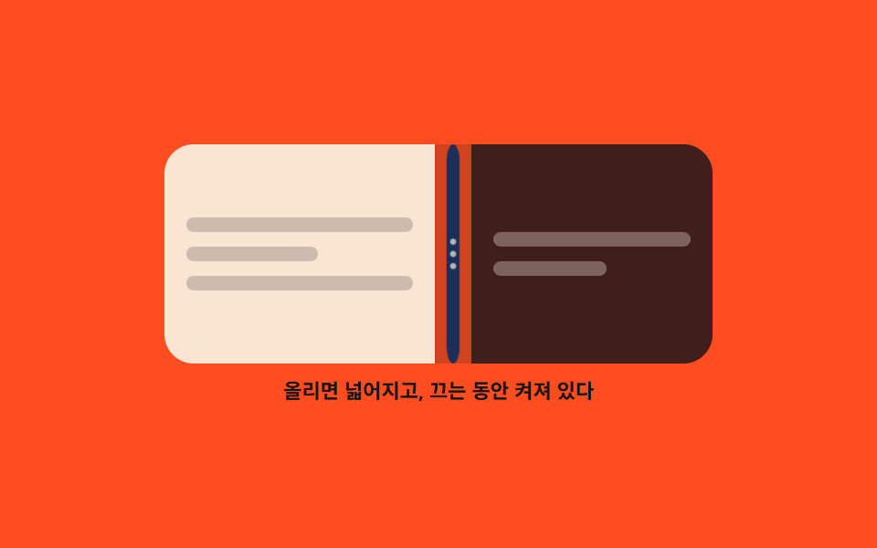
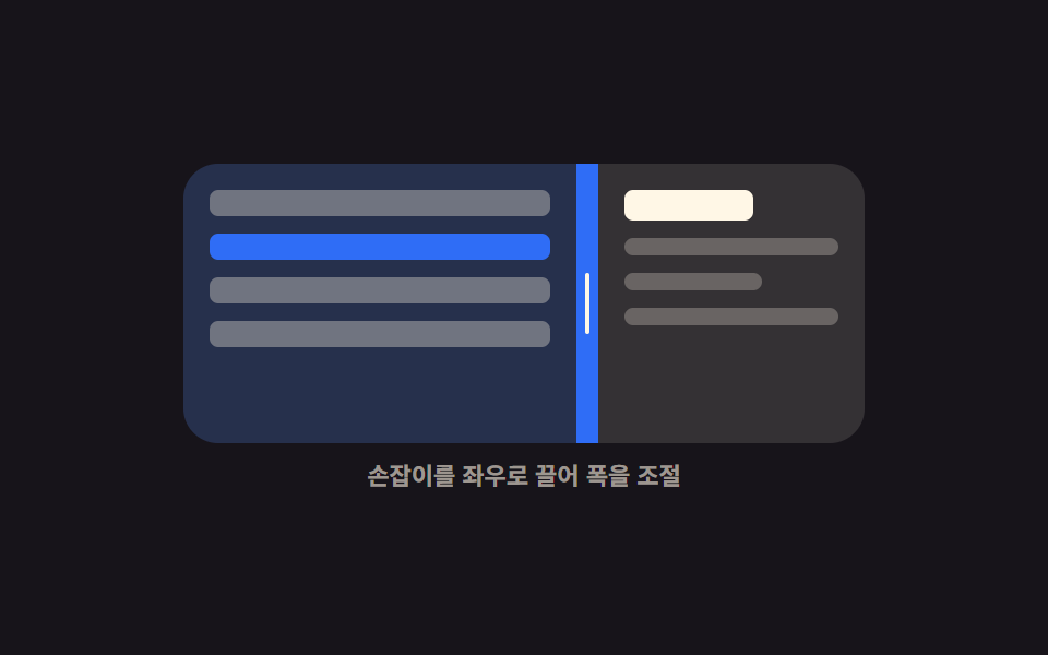
The handle is a hairline at rest, widens and shows three grip dots on hover, and stays highlighted for as long as the drag lasts.
Best forFixing layouts where nobody realizes the divider can be dragged because the handle is invisible
scaleXcubic-beziercursor
<main class="stage">
  <div class="hg is-demo" id="hg-root">
    <div class="hg__box" id="hg-box">
      <section class="hg__pane hg__pane--l" aria-label="Left pane">
        <span class="hg__ln"></span>
        <span class="hg__ln hg__ln--s"></span>
        <span class="hg__ln"></span>
      </section>
      <div class="hg__bar" id="hg-bar" role="separator" tabindex="0"
           aria-orientation="vertical" aria-label="Split width" aria-valuemin="20" aria-valuemax="80" aria-valuenow="46">
        <i class="hg__hair" aria-hidden="true"></i>
        <i class="hg__dots" aria-hidden="true"><s></s><s></s><s></s></i>
      </div>
      <section class="hg__pane hg__pane--r" aria-label="Right pane">
        <span class="hg__ln hg__ln--d"></span>
        <span class="hg__ln hg__ln--d hg__ln--s"></span>
      </section>
    </div>
    <p class="hg__cap">It widens on hover and stays lit while you drag</p>
  </div>
</main>
@use "../../../../site/static/demo-tokens" as *;
$duration: $dur-quick;
$easing: cubic-bezier(.2, .8, .2, 1);
$color: $subject-cream;
@include stage($stage-orange);
@property --split {
syntax: "<percentage>";
inherits: true;
initial-value: 46%;
}
.hg {
--split: 46%;
width: min(300px, 88vw);
display: flex;
flex-direction: column;
gap: $sp-2;
}
.hg__box {
display: grid;
grid-template-columns: var(--split) 20px 1fr;
height: 120px;
border-radius: $r-card;
overflow: hidden;
background: rgba(23, 20, 26, .2);
}
.hg__pane {
box-sizing: border-box;
display: flex;
flex-direction: column;
justify-content: center;
gap: $sp-2;
padding: $sp-3;
overflow: hidden;
}
.hg__ln {
flex: 0 0 auto;
height: 8px;
border-radius: $r-xs;
background: rgba(23, 20, 26, .2);
}
.hg__ln--d { background: rgba(255, 247, 230, .32); }
.hg__ln--s { width: 58%; }
.hg__pane--l { background: rgba(255, 247, 230, .9); }
.hg__pane--r { background: rgba(23, 20, 26, .78); }
.hg__bar {
position: relative;
display: grid;
place-items: center;
background: transparent;
cursor: col-resize;
touch-action: none;
}
// 평소엔 머리카락 한 줄. 호버·드래그에서 넓어진다
.hg__hair {
position: absolute;
top: 0;
bottom: 0;
left: 50%;
width: 20px;
border-radius: $r-pill;
background: $subject-ink;
transform: translateX(-10px) scaleX(.1);
transition: transform $duration $easing, background $duration $easing;
}
.hg__dots {
position: relative;
display: flex;
flex-direction: column;
gap: $sp-1;
opacity: 0;
transform: scale(.5);
transition: opacity $duration $easing, transform $duration $easing;
}
.hg__dots s {
display: block;
width: 4px;
height: 4px;
border-radius: 50%;
background: $color;
}
.hg.is-near .hg__hair,
.hg__bar:hover .hg__hair { transform: translateX(-10px) scaleX(1); }
.hg.is-near .hg__dots,
.hg__bar:hover .hg__dots { opacity: 1; transform: scale(1); }
.hg.is-drag .hg__hair { background: $subject-blue; }
.hg__bar:focus-visible { outline: 2px solid $subject-ink; outline-offset: -2px; }
.hg__cap {
margin: 0;
font-size: 11px;
line-height: 14px;
font-weight: 700;
color: $subject-ink; // AA 4.5: cream on orange 2.76 -> ink 5.50
text-align: center;
}
// ── 자동 루프: 가는 선 → 넓어짐 + 점 등장 → 끌림(파랑) → 되돌아옴 ──
.hg.is-demo .hg__hair {
animation-name: hg-hair;
animation-duration: $dur-loop;
animation-timing-function: $easing;
animation-iteration-count: infinite;
}
@keyframes hg-hair {
0%, 10% { transform: translateX(-10px) scaleX(.1); background: $subject-ink; }
26%, 34% { transform: translateX(-10px) scaleX(1); background: $subject-ink; }
44%, 72% { transform: translateX(-10px) scaleX(1); background: $subject-blue; }
86%, 100% { transform: translateX(-10px) scaleX(.1); background: $subject-ink; }
}
.hg.is-demo .hg__dots {
animation-name: hg-dots;
animation-duration: $dur-loop;
animation-timing-function: $easing;
animation-iteration-count: infinite;
}
@keyframes hg-dots {
0%, 12% { opacity: 0; transform: scale(.5); }
28%, 74% { opacity: 1; transform: scale(1); }
86%, 100% { opacity: 0; transform: scale(.5); }
}
.hg.is-demo {
animation-name: hg-split;
animation-duration: $dur-loop;
animation-timing-function: $easing;
animation-iteration-count: infinite;
}
@keyframes hg-split {
0%, 40% { --split: 46%; }
70% { --split: 66%; }
86%, 100% { --split: 46%; }
}
@media (prefers-reduced-motion: reduce) {
.hg.is-demo,
.hg.is-demo .hg__hair,
.hg.is-demo .hg__dots { animation: none !important; }
.hg__hair, .hg__dots { transition: none; }
}
@media (max-width: 340px) {
.hg__box { height: 104px; }
}html, body {
margin: 0;
overflow: hidden;
}
.stage {
box-sizing: border-box;
min-height: 100vh;
display: grid;
place-items: center;
margin: 0;
background: #ff4d1f;
font-family: -apple-system, "Segoe UI", "Noto Sans KR", sans-serif;
padding: clamp(8px, 4vw, 24px);
}
@property --split {
syntax: "<percentage>";
inherits: true;
initial-value: 46%;
}
.hg {
--split: 46%;
width: min(300px, 88vw);
display: flex;
flex-direction: column;
gap: 8px;
}
.hg__box {
display: grid;
grid-template-columns: var(--split) 20px 1fr;
height: 120px;
border-radius: 16px;
overflow: hidden;
background: rgba(23, 20, 26, 0.2);
}
.hg__pane {
box-sizing: border-box;
display: flex;
flex-direction: column;
justify-content: center;
gap: 8px;
padding: 12px;
overflow: hidden;
}
.hg__ln {
flex: 0 0 auto;
height: 8px;
border-radius: 4px;
background: rgba(23, 20, 26, 0.2);
}
.hg__ln--d {
background: rgba(255, 247, 230, 0.32);
}
.hg__ln--s {
width: 58%;
}
.hg__pane--l {
background: rgba(255, 247, 230, 0.9);
}
.hg__pane--r {
background: rgba(23, 20, 26, 0.78);
}
.hg__bar {
position: relative;
display: grid;
place-items: center;
background: transparent;
cursor: col-resize;
touch-action: none;
}
.hg__hair {
position: absolute;
top: 0;
bottom: 0;
left: 50%;
width: 20px;
border-radius: 999px;
background: #17141a;
transform: translateX(-10px) scaleX(0.1);
transition: transform 220ms cubic-bezier(0.2, 0.8, 0.2, 1), background 220ms cubic-bezier(0.2, 0.8, 0.2, 1);
}
.hg__dots {
position: relative;
display: flex;
flex-direction: column;
gap: 4px;
opacity: 0;
transform: scale(0.5);
transition: opacity 220ms cubic-bezier(0.2, 0.8, 0.2, 1), transform 220ms cubic-bezier(0.2, 0.8, 0.2, 1);
}
.hg__dots s {
display: block;
width: 4px;
height: 4px;
border-radius: 50%;
background: #fff7e6;
}
.hg.is-near .hg__hair,
.hg__bar:hover .hg__hair {
transform: translateX(-10px) scaleX(1);
}
.hg.is-near .hg__dots,
.hg__bar:hover .hg__dots {
opacity: 1;
transform: scale(1);
}
.hg.is-drag .hg__hair {
background: #2f6df6;
}
.hg__bar:focus-visible {
outline: 2px solid #17141a;
outline-offset: -2px;
}
.hg__cap {
margin: 0;
font-size: 11px;
line-height: 14px;
font-weight: 700;
color: #17141a;
text-align: center;
}
.hg.is-demo .hg__hair {
animation-name: hg-hair;
animation-duration: 2s;
animation-timing-function: cubic-bezier(0.2, 0.8, 0.2, 1);
animation-iteration-count: infinite;
}
@keyframes hg-hair {
0%, 10% {
transform: translateX(-10px) scaleX(0.1);
background: #17141a;
}
26%, 34% {
transform: translateX(-10px) scaleX(1);
background: #17141a;
}
44%, 72% {
transform: translateX(-10px) scaleX(1);
background: #2f6df6;
}
86%, 100% {
transform: translateX(-10px) scaleX(0.1);
background: #17141a;
}
}
.hg.is-demo .hg__dots {
animation-name: hg-dots;
animation-duration: 2s;
animation-timing-function: cubic-bezier(0.2, 0.8, 0.2, 1);
animation-iteration-count: infinite;
}
@keyframes hg-dots {
0%, 12% {
opacity: 0;
transform: scale(0.5);
}
28%, 74% {
opacity: 1;
transform: scale(1);
}
86%, 100% {
opacity: 0;
transform: scale(0.5);
}
}
.hg.is-demo {
animation-name: hg-split;
animation-duration: 2s;
animation-timing-function: cubic-bezier(0.2, 0.8, 0.2, 1);
animation-iteration-count: infinite;
}
@keyframes hg-split {
0%, 40% {
--split: 46%;
}
70% {
--split: 66%;
}
86%, 100% {
--split: 46%;
}
}
@media (prefers-reduced-motion: reduce) {
.hg.is-demo,
.hg.is-demo .hg__hair,
.hg.is-demo .hg__dots {
animation: none !important;
}
.hg__hair, .hg__dots {
transition: none;
}
}
@media (max-width: 340px) {
.hg__box {
height: 104px;
}
}// 실제 동작: 손잡이 상태는 CSS 가 그린다. JS 는 끌기 시작·끝만 클래스로 알려 준다.
var root = document.getElementById('hg-root');
var box = document.getElementById('hg-box');
var bar = document.getElementById('hg-bar');
var dragging = false;
function set(pct) {
var v = Math.max(20, Math.min(pct, 80));
root.style.setProperty('--split', v.toFixed(1) + '%');
bar.setAttribute('aria-valuenow', String(Math.round(v)));
}
bar.addEventListener('pointerenter', function () { root.classList.add('is-near'); });
bar.addEventListener('pointerleave', function () { if (!dragging) root.classList.remove('is-near'); });
bar.addEventListener('pointerdown', function (e) {
root.classList.remove('is-demo');
dragging = true;
root.classList.add('is-drag');
bar.setPointerCapture(e.pointerId);
e.preventDefault();
});
bar.addEventListener('pointermove', function (e) {
if (!dragging) return;
set((e.clientX - box.getBoundingClientRect().left) / box.clientWidth * 100);
});
function drop() {
dragging = false;
root.classList.remove('is-drag');
root.classList.remove('is-near');
}
bar.addEventListener('pointerup', drop);
bar.addEventListener('pointercancel', drop);
bar.addEventListener('keydown', function (e) {
var d = e.key === 'ArrowLeft' ? -4 : e.key === 'ArrowRight' ? 4 : 0;
if (!d) return;
root.classList.remove('is-demo');
set(Number(bar.getAttribute('aria-valuenow')) + d);
bar.focus({ preventScroll: true });
e.preventDefault();
});import { useRef, useState } from "react";
import type { CSSProperties } from "react";
import styles from "./GripHandle.module.scss";
export type GripHandleProps = {
start?: number;
duration?: number;
easing?: string;
color?: string;
};
type PEvt = { clientX: number; pointerId: number; preventDefault(): void; currentTarget: { setPointerCapture(id: number): void } };
type KeyEvt = { key: string; preventDefault(): void };
type Vars = CSSProperties & { "--split"?: string; "--duration"?: string; "--easing"?: string; "--color"?: string };
export default function GripHandle({
start = 46,
duration = 220,
easing = "cubic-bezier(.2,.8,.2,1)",
color = "#2f6df6",
}: GripHandleProps) {
const [split, setSplit] = useState(start);
const [near, setNear] = useState(false);
const [drag, setDrag] = useState(false);
const boxRef = useRef<HTMLDivElement>(null);
function set(pct: number): void { setSplit(Math.max(20, Math.min(pct, 80))); }
function onDown(e: PEvt): void {
setDrag(true);
e.currentTarget.setPointerCapture(e.pointerId);
e.preventDefault();
}
function onMove(e: PEvt): void {
const box = boxRef.current;
if (!drag || !box) return;
set(((e.clientX - box.getBoundingClientRect().left) / box.clientWidth) * 100);
}
function onUp(): void { setDrag(false); setNear(false); }
function onKey(e: KeyEvt): void {
const d = e.key === "ArrowLeft" ? -4 : e.key === "ArrowRight" ? 4 : 0;
if (!d) return;
set(split + d);
e.preventDefault();
}
const vars: Vars = {
"--split": `${split.toFixed(1)}%`,
"--duration": `${duration}ms`,
"--easing": easing,
"--color": color,
};
const cls = [styles.hg, near ? styles.isNear : "", drag ? styles.isDrag : ""].join(" ").trim();
return (
<div className={cls} style={vars}>
<div className={styles.box} ref={boxRef}>
<section className={`${styles.pane} ${styles.paneL}`} aria-label="Left pane">
<span className={styles.ln} />
<span className={`${styles.ln} ${styles.lnShort}`} />
<span className={styles.ln} />
</section>
<div
className={styles.bar}
role="separator"
tabIndex={0}
aria-orientation="vertical"
aria-label="Split width"
aria-valuemin={20}
aria-valuemax={80}
aria-valuenow={Math.round(split)}
onPointerEnter={(): void => setNear(true)}
onPointerLeave={(): void => { if (!drag) setNear(false); }}
onPointerDown={onDown}
onPointerMove={onMove}
onPointerUp={onUp}
onPointerCancel={onUp}
onKeyDown={onKey}
>
<i className={styles.hair} aria-hidden="true" />
<i className={styles.dots} aria-hidden="true"><s /><s /><s /></i>
</div>
<section className={`${styles.pane} ${styles.paneR}`} aria-label="Right pane">
<span className={`${styles.ln} ${styles.lnDark}`} />
<span className={`${styles.ln} ${styles.lnDark} ${styles.lnShort}`} />
</section>
</div>
<p className={styles.cap}>It widens on hover and stays lit while you drag</p>
</div>
);
}06 Handle grip feedback — Measured area 7.308% · moving frames 18/23Original by GODRICH · SCSS and React ship in the zip · 9 Resizable Split Pane Layouts With No Library
The post this demo lives in
 9 Resizable Split Pane Layouts With No LibraryA resizable split pane is a layout whose panes share one draggable boundary, so widening one side narrows the other. Eig See all demos in this post