03Depth badges that light up every quarter
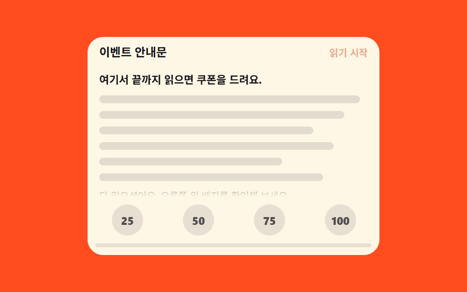
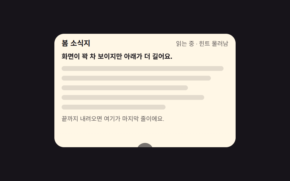
Four badges for 25, 50, 75, and 100 swap color in a single frame with steps(1, end) the instant you reach that depth, and pop once. The bar underneath fills by the same ratio with scaleX, and each newly lit depth is announced through aria-live.
Best forNotices that hand out a coupon for reading to the end, in-house training docs that measure read depth
aria-livesteps(1, end)scaleX
<main class="stage">
  <section class="db is-demo" id="db" aria-label="Read-depth badges">
    <header class="db__head">
      <p class="db__title">Event notice</p>
      <p class="db__live" id="db-live" aria-live="polite">Just started</p>
    </header>
    <div class="db__view" id="db-view" tabindex="0" role="region" aria-label="Notice body">
      <div class="db__pad">
        <p class="db__lede">Read this to the end and a coupon is yours.</p>
        <p class="db__line"></p>
        <p class="db__line"></p>
        <p class="db__line"></p>
        <p class="db__line"></p>
        <p class="db__line"></p>
        <p class="db__line"></p>
        <p class="db__tail">You have read it all. Check the badges at the top right.</p>
      </div>
    </div>
    <footer class="db__foot">
      <div class="db__row" role="progressbar" aria-label="Read depth" aria-valuemin="0" aria-valuemax="100" aria-valuenow="0" id="db-bar-role">
        <span class="db__cell"><b class="db__chip" data-milestone="25">25</b></span>
        <span class="db__cell"><b class="db__chip" data-milestone="50">50</b></span>
        <span class="db__cell"><b class="db__chip" data-milestone="75">75</b></span>
        <span class="db__cell"><b class="db__chip" data-milestone="100">100</b></span>
      </div>
      <span class="db__fill" id="db-fill" aria-hidden="true"></span>
    </footer>
  </section>
</main>@use "../../../../site/static/demo-tokens" as *;
// 읽기 깊이 배지 — 25·50·75·100 배지가 steps(1,end) 컷으로 색을 갈아입고 한 번 튀어오른다
$duration: $dur-loop;
$easing: $ease-pop;
$color: $subject-orange-deep;
@include stage($stage-orange);
.db {
position: relative;
box-sizing: border-box;
width: min(300px, 92vw);
border-radius: $r-card;
background: $subject-cream;
color: $subject-ink;
font-family: -apple-system, "Segoe UI", "Noto Sans KR", sans-serif;
overflow: hidden;
}
.db__head {
display: flex;
align-items: baseline;
justify-content: space-between;
gap: $sp-2;
padding: $sp-2 $sp-3 0;
}
.db__title {
margin: 0;
font-size: 12px;
font-weight: 700;
line-height: 1.3;
}
.db__live {
margin: 0;
font-size: 10px;
line-height: 1.3;
color: $color;
font-weight: 700;
}
.db__view {
box-sizing: border-box;
height: 132px;
margin: $sp-2 $sp-2 0;
padding-right: $sp-2;
overflow-y: auto;
scrollbar-width: none;
// 창 아래 모서리에서 글줄이 반토막으로 잘려 보이는 걸 막는다 — 마지막 12px 을 흐리게 내린다
mask-image: linear-gradient(to bottom, #000 calc(100% - 12px), transparent);
&::-webkit-scrollbar { display: none; }
&:focus-visible { outline: 2px solid $color; outline-offset: 2px; }
}
.db__pad {
display: grid;
gap: $sp-2;
padding: $sp-1 $sp-1 104px;
}
.db__lede {
margin: 0;
font-size: 11px;
font-weight: 700;
line-height: 1.5;
}
.db__line {
height: 8px;
margin: 0;
border-radius: $r-pill;
background: rgba(23, 20, 26, .12);
}
.db__pad .db__line:nth-child(3) { width: 94%; }
.db__pad .db__line:nth-child(4) { width: 82%; }
.db__pad .db__line:nth-child(5) { width: 90%; }
.db__pad .db__line:nth-child(6) { width: 70%; }
.db__pad .db__line:nth-child(7) { width: 86%; }
.db__tail {
margin: 0;
font-size: 10px;
line-height: 1.5;
color: rgba($stage-ink, .72);
}
// ── 배지 줄: 게이지 칸은 grid 로 짠다 (BD19 오탐 회피 · 칸 폭이 정확히 균등) ──
.db__foot {
position: relative;
margin: 0 $sp-2 $sp-2;
padding: $sp-2 0 0;
}
.db__row {
display: grid;
grid-template-columns: repeat(4, 1fr);
justify-items: center;
gap: $sp-2;
}
.db__chip {
display: inline-grid;
place-items: center;
width: 32px;
height: 32px;
border-radius: 50%;
background: rgba(23, 20, 26, .1);
color: rgba($stage-ink, .72);
font-size: 11px;
font-weight: 800;
line-height: 1;
// 정적 경로 — 실제로는 .is-on 이 붙는 순간 컷으로 색이 바뀐다
transition: background $dur-instant steps(1, end), color $dur-instant steps(1, end);
}
.db__chip.is-on {
background: $color;
color: #fff;
animation-name: db-pop;
animation-duration: $dur-base;
animation-timing-function: $easing;
animation-iteration-count: 1;
}
@keyframes db-pop {
0% { transform: scale(1); }
45% { transform: scale(1.22); }
100% { transform: scale(1); }
}
// 같은 비율만큼 차오르는 막대 — grid 칸 아래를 지나가는 길
.db__fill {
display: block;
height: 4px;
margin-top: $sp-2;
border-radius: $r-pill;
background: rgba(23, 20, 26, .1);
overflow: hidden;
&::after {
content: "";
display: block;
height: 100%;
border-radius: $r-pill;
background: $color;
transform: scaleX(0);
transform-origin: left center; // 규칙8: 진행막대 left 채움
}
}
.db.is-demo .db__fill::after {
animation-name: db-fill;
animation-duration: $duration;
animation-timing-function: $ease-out;
animation-iteration-count: infinite;
animation-fill-mode: backwards;
}
@keyframes db-fill {
0% { transform: scaleX(0); }
88% { transform: scaleX(1); }
90%, 100% { transform: scaleX(0); }
}
// ── 격자 미리보기 루프: 배지 넷이 제 각각의 순간에 컷으로 켜지고 튀어오른다 ──
@keyframes db-cut-1 { 0%, 21% { background: rgba(23, 20, 26, .1); color: rgba($stage-ink, .72); } 22%, 88% { background: $color; color: #fff; } 89%, 100% { background: rgba(23, 20, 26, .1); color: rgba($stage-ink, .72); } }
@keyframes db-cut-2 { 0%, 41% { background: rgba(23, 20, 26, .1); color: rgba($stage-ink, .72); } 42%, 88% { background: $color; color: #fff; } 89%, 100% { background: rgba(23, 20, 26, .1); color: rgba($stage-ink, .72); } }
@keyframes db-cut-3 { 0%, 61% { background: rgba(23, 20, 26, .1); color: rgba($stage-ink, .72); } 62%, 88% { background: $color; color: #fff; } 89%, 100% { background: rgba(23, 20, 26, .1); color: rgba($stage-ink, .72); } }
@keyframes db-cut-4 { 0%, 81% { background: rgba(23, 20, 26, .1); color: rgba($stage-ink, .72); } 82%, 88% { background: $color; color: #fff; } 89%, 100% { background: rgba(23, 20, 26, .1); color: rgba($stage-ink, .72); } }
@keyframes db-hop-1 { 0%, 21% { transform: scale(1); } 24% { transform: scale(1.22); } 30%, 100% { transform: scale(1); } }
@keyframes db-hop-2 { 0%, 41% { transform: scale(1); } 44% { transform: scale(1.22); } 50%, 100% { transform: scale(1); } }
@keyframes db-hop-3 { 0%, 61% { transform: scale(1); } 64% { transform: scale(1.22); } 70%, 100% { transform: scale(1); } }
@keyframes db-hop-4 { 0%, 81% { transform: scale(1); } 84% { transform: scale(1.22); } 90%, 100% { transform: scale(1); } }
@keyframes db-say {
0%, 21% { opacity: 1; }
22%, 41% { opacity: .4; }
42%, 61% { opacity: 1; }
62%, 81% { opacity: .4; }
82%, 88% { opacity: 1; }
89%, 100% { opacity: .4; }
}
.db.is-demo {
.db__chip[data-milestone="25"] { animation-name: db-hop-1; animation-duration: $duration; animation-timing-function: $easing; animation-iteration-count: infinite; }
.db__chip[data-milestone="50"] { animation-name: db-hop-2; animation-duration: $duration; animation-timing-function: $easing; animation-iteration-count: infinite; }
.db__chip[data-milestone="75"] { animation-name: db-hop-3; animation-duration: $duration; animation-timing-function: $easing; animation-iteration-count: infinite; }
.db__chip[data-milestone="100"] { animation-name: db-hop-4; animation-duration: $duration; animation-timing-function: $easing; animation-iteration-count: infinite; }
}
// 색 컷은 별도 애니메이션 두 개를 겹친다 — 낱개 속성으로 써야 지연 리셋 함정을 피한다
.db.is-demo .db__chip[data-milestone="25"] { animation-name: db-hop-1, db-cut-1; animation-duration: $duration, $duration; animation-timing-function: $easing, steps(1, end); animation-iteration-count: infinite, infinite; }
.db.is-demo .db__chip[data-milestone="50"] { animation-name: db-hop-2, db-cut-2; animation-duration: $duration, $duration; animation-timing-function: $easing, steps(1, end); animation-iteration-count: infinite, infinite; }
.db.is-demo .db__chip[data-milestone="75"] { animation-name: db-hop-3, db-cut-3; animation-duration: $duration, $duration; animation-timing-function: $easing, steps(1, end); animation-iteration-count: infinite, infinite; }
.db.is-demo .db__chip[data-milestone="100"] { animation-name: db-hop-4, db-cut-4; animation-duration: $duration, $duration; animation-timing-function: $easing, steps(1, end); animation-iteration-count: infinite, infinite; }
.db.is-demo .db__live {
animation-name: db-say;
animation-duration: $duration;
animation-timing-function: steps(1, end);
animation-iteration-count: infinite;
}
@media (max-width: 340px) {
// 폰 320×200 무대의 세로 여유는 174px — 머리 24 + 배지줄 56 을 빼면 읽기 창은 84px 이 상한
.db__view { height: 84px; }
.db__chip { width: 28px; height: 28px; font-size: 10px; }
}
@media (prefers-reduced-motion: reduce) {
.db.is-demo .db__chip,
.db.is-demo .db__fill::after,
.db.is-demo .db__live { animation: none !important; }
// 정지 상태에서도 깊이를 알 수 있게 절반까지 켜진 모습으로 둔다
.db.is-demo .db__chip[data-milestone="25"],
.db.is-demo .db__chip[data-milestone="50"] { background: $color !important; color: #fff !important; }
.db.is-demo .db__fill::after { transform: scaleX(.5) !important; }
}html, body {
margin: 0;
overflow: hidden;
}
.stage {
box-sizing: border-box;
min-height: 100vh;
display: grid;
place-items: center;
margin: 0;
background: #ff4d1f;
font-family: -apple-system, "Segoe UI", "Noto Sans KR", sans-serif;
padding: clamp(8px, 4vw, 24px);
}
.db {
position: relative;
box-sizing: border-box;
width: min(300px, 92vw);
border-radius: 16px;
background: #fff7e6;
color: #17141a;
font-family: -apple-system, "Segoe UI", "Noto Sans KR", sans-serif;
overflow: hidden;
}
.db__head {
display: flex;
align-items: baseline;
justify-content: space-between;
gap: 8px;
padding: 8px 12px 0;
}
.db__title {
margin: 0;
font-size: 12px;
font-weight: 700;
line-height: 1.3;
}
.db__live {
margin: 0;
font-size: 10px;
line-height: 1.3;
color: #c93000;
font-weight: 700;
}
.db__view {
box-sizing: border-box;
height: 132px;
margin: 8px 8px 0;
padding-right: 8px;
overflow-y: auto;
scrollbar-width: none;
mask-image: linear-gradient(to bottom, #000 calc(100% - 12px), transparent);
}
.db__view::-webkit-scrollbar {
display: none;
}
.db__view:focus-visible {
outline: 2px solid #c93000;
outline-offset: 2px;
}
.db__pad {
display: grid;
gap: 8px;
padding: 4px 4px 104px;
}
.db__lede {
margin: 0;
font-size: 11px;
font-weight: 700;
line-height: 1.5;
}
.db__line {
height: 8px;
margin: 0;
border-radius: 999px;
background: rgba(23, 20, 26, 0.12);
}
.db__pad .db__line:nth-child(3) {
width: 94%;
}
.db__pad .db__line:nth-child(4) {
width: 82%;
}
.db__pad .db__line:nth-child(5) {
width: 90%;
}
.db__pad .db__line:nth-child(6) {
width: 70%;
}
.db__pad .db__line:nth-child(7) {
width: 86%;
}
.db__tail {
margin: 0;
font-size: 10px;
line-height: 1.5;
color: rgba(23, 20, 26, 0.72);
}
.db__foot {
position: relative;
margin: 0 8px 8px;
padding: 8px 0 0;
}
.db__row {
display: grid;
grid-template-columns: repeat(4, 1fr);
justify-items: center;
gap: 8px;
}
.db__chip {
display: inline-grid;
place-items: center;
width: 32px;
height: 32px;
border-radius: 50%;
background: rgba(23, 20, 26, 0.1);
color: rgba(23, 20, 26, 0.72);
font-size: 11px;
font-weight: 800;
line-height: 1;
transition: background 140ms steps(1, end), color 140ms steps(1, end);
}
.db__chip.is-on {
background: #c93000;
color: #fff;
animation-name: db-pop;
animation-duration: 300ms;
animation-timing-function: cubic-bezier(0.2, 1.4, 0.4, 1);
animation-iteration-count: 1;
}
@keyframes db-pop {
0% {
transform: scale(1);
}
45% {
transform: scale(1.22);
}
100% {
transform: scale(1);
}
}
.db__fill {
display: block;
height: 4px;
margin-top: 8px;
border-radius: 999px;
background: rgba(23, 20, 26, 0.1);
overflow: hidden;
}
.db__fill::after {
content: "";
display: block;
height: 100%;
border-radius: 999px;
background: #c93000;
transform: scaleX(0);
transform-origin: left center;
}
.db.is-demo .db__fill::after {
animation-name: db-fill;
animation-duration: 2s;
animation-timing-function: ease-out;
animation-iteration-count: infinite;
animation-fill-mode: backwards;
}
@keyframes db-fill {
0% {
transform: scaleX(0);
}
88% {
transform: scaleX(1);
}
90%, 100% {
transform: scaleX(0);
}
}
@keyframes db-cut-1 {
0%, 21% {
background: rgba(23, 20, 26, 0.1);
color: rgba(23, 20, 26, 0.72);
}
22%, 88% {
background: #c93000;
color: #fff;
}
89%, 100% {
background: rgba(23, 20, 26, 0.1);
color: rgba(23, 20, 26, 0.72);
}
}
@keyframes db-cut-2 {
0%, 41% {
background: rgba(23, 20, 26, 0.1);
color: rgba(23, 20, 26, 0.72);
}
42%, 88% {
background: #c93000;
color: #fff;
}
89%, 100% {
background: rgba(23, 20, 26, 0.1);
color: rgba(23, 20, 26, 0.72);
}
}
@keyframes db-cut-3 {
0%, 61% {
background: rgba(23, 20, 26, 0.1);
color: rgba(23, 20, 26, 0.72);
}
62%, 88% {
background: #c93000;
color: #fff;
}
89%, 100% {
background: rgba(23, 20, 26, 0.1);
color: rgba(23, 20, 26, 0.72);
}
}
@keyframes db-cut-4 {
0%, 81% {
background: rgba(23, 20, 26, 0.1);
color: rgba(23, 20, 26, 0.72);
}
82%, 88% {
background: #c93000;
color: #fff;
}
89%, 100% {
background: rgba(23, 20, 26, 0.1);
color: rgba(23, 20, 26, 0.72);
}
}
@keyframes db-hop-1 {
0%, 21% {
transform: scale(1);
}
24% {
transform: scale(1.22);
}
30%, 100% {
transform: scale(1);
}
}
@keyframes db-hop-2 {
0%, 41% {
transform: scale(1);
}
44% {
transform: scale(1.22);
}
50%, 100% {
transform: scale(1);
}
}
@keyframes db-hop-3 {
0%, 61% {
transform: scale(1);
}
64% {
transform: scale(1.22);
}
70%, 100% {
transform: scale(1);
}
}
@keyframes db-hop-4 {
0%, 81% {
transform: scale(1);
}
84% {
transform: scale(1.22);
}
90%, 100% {
transform: scale(1);
}
}
@keyframes db-say {
0%, 21% {
opacity: 1;
}
22%, 41% {
opacity: 0.4;
}
42%, 61% {
opacity: 1;
}
62%, 81% {
opacity: 0.4;
}
82%, 88% {
opacity: 1;
}
89%, 100% {
opacity: 0.4;
}
}
.db.is-demo .db__chip[data-milestone="25"] {
animation-name: db-hop-1;
animation-duration: 2s;
animation-timing-function: cubic-bezier(0.2, 1.4, 0.4, 1);
animation-iteration-count: infinite;
}
.db.is-demo .db__chip[data-milestone="50"] {
animation-name: db-hop-2;
animation-duration: 2s;
animation-timing-function: cubic-bezier(0.2, 1.4, 0.4, 1);
animation-iteration-count: infinite;
}
.db.is-demo .db__chip[data-milestone="75"] {
animation-name: db-hop-3;
animation-duration: 2s;
animation-timing-function: cubic-bezier(0.2, 1.4, 0.4, 1);
animation-iteration-count: infinite;
}
.db.is-demo .db__chip[data-milestone="100"] {
animation-name: db-hop-4;
animation-duration: 2s;
animation-timing-function: cubic-bezier(0.2, 1.4, 0.4, 1);
animation-iteration-count: infinite;
}
.db.is-demo .db__chip[data-milestone="25"] {
animation-name: db-hop-1, db-cut-1;
animation-duration: 2s, 2s;
animation-timing-function: cubic-bezier(0.2, 1.4, 0.4, 1), steps(1, end);
animation-iteration-count: infinite, infinite;
}
.db.is-demo .db__chip[data-milestone="50"] {
animation-name: db-hop-2, db-cut-2;
animation-duration: 2s, 2s;
animation-timing-function: cubic-bezier(0.2, 1.4, 0.4, 1), steps(1, end);
animation-iteration-count: infinite, infinite;
}
.db.is-demo .db__chip[data-milestone="75"] {
animation-name: db-hop-3, db-cut-3;
animation-duration: 2s, 2s;
animation-timing-function: cubic-bezier(0.2, 1.4, 0.4, 1), steps(1, end);
animation-iteration-count: infinite, infinite;
}
.db.is-demo .db__chip[data-milestone="100"] {
animation-name: db-hop-4, db-cut-4;
animation-duration: 2s, 2s;
animation-timing-function: cubic-bezier(0.2, 1.4, 0.4, 1), steps(1, end);
animation-iteration-count: infinite, infinite;
}
.db.is-demo .db__live {
animation-name: db-say;
animation-duration: 2s;
animation-timing-function: steps(1, end);
animation-iteration-count: infinite;
}
@media (max-width: 340px) {
.db__view {
height: 84px;
}
.db__chip {
width: 28px;
height: 28px;
font-size: 10px;
}
}
@media (prefers-reduced-motion: reduce) {
.db.is-demo .db__chip,
.db.is-demo .db__fill::after,
.db.is-demo .db__live {
animation: none !important;
}
.db.is-demo .db__chip[data-milestone="25"],
.db.is-demo .db__chip[data-milestone="50"] {
background: #c93000 !important;
color: #fff !important;
}
.db.is-demo .db__fill::after {
transform: scaleX(0.5) !important;
}
}// Read-depth badges — 25·50·75·100 에 닿으면 배지가 켜지고 한 번 튀어오른다
var db = document.getElementById('db');
var view = document.getElementById('db-view');
var live = document.getElementById('db-live');
var fill = document.getElementById('db-fill');
var role = document.getElementById('db-bar-role');
var chips = document.querySelectorAll('.db__chip');
var lit = 0;
view.addEventListener('scroll', function () {
db.classList.remove('is-demo');
var max = view.scrollHeight - view.clientHeight;
var pct = max > 0 ? Math.round(view.scrollTop / max * 100) : 0;
fill.style.transform = 'scaleX(' + (pct / 100) + ')';
role.setAttribute('aria-valuenow', pct);
var told = [ 'A quarter read', 'Half read', 'Three quarters read', 'All read' ];
chips.forEach(function (c) {
var m = Number(c.dataset.milestone);
var on = pct >= m;
if (on && !c.classList.contains('is-on') && m > lit * 25) {
lit = m / 25;
live.textContent = told[m / 25 - 1];
}
c.classList.toggle('is-on', on);
});
});import { useRef, useState } from "react";
import type { CSSProperties } from "react";
import styles from "./DepthMilestoneBadges.module.scss";
export type DepthMilestoneBadgesProps = {
title?: string;
lede?: string;
tail?: string;
liveStart?: string;
liveSaid?: [string, string, string, string];
groupLabel?: string;
bodyLabel?: string;
barLabel?: string;
/** 격자 미리보기용 2초 자동 루프. 사람이 손대면 꺼진다 */
demo?: boolean;
duration?: number;
easing?: string;
color?: string;
};
type Vars = CSSProperties & { "--duration"?: string; "--easing"?: string; "--color"?: string };
// ambient 가 얇아 DOM 요소 타입을 못 쓴다 — 필요한 꼴만 로컬 타입으로 선언
type ScrollBox = { scrollTop: number; scrollHeight: number; clientHeight: number };
const MILESTONES = [25, 50, 75, 100];
export default function DepthMilestoneBadges({
title = "이벤트 안내문",
lede = "여기서 끝까지 읽으면 쿠폰을 드려요.",
tail = "다 읽으셨어요. 오른쪽 위 배지를 확인해 보세요.",
liveStart = "읽기 시작",
liveSaid = ["4분의 1 읽었어요", "절반 읽었어요", "4분의 3 읽었어요", "다 읽었어요"],
groupLabel = "읽기 깊이 배지",
bodyLabel = "안내문 본문",
barLabel = "읽은 깊이",
demo = true,
duration = 2000,
easing = "cubic-bezier(.2,1.4,.4,1)",
color = "#ff4d1f",
}: DepthMilestoneBadgesProps) {
const [pct, setPct] = useState(0);
const [said, setSaid] = useState(-1);
const [live, setLive] = useState(demo);
const viewRef = useRef<ScrollBox>(null);
const lastLitRef = useRef(0);
const vars: Vars = { "--duration": `${duration}ms`, "--easing": easing, "--color": color };
// 25·50·75·100 — 닿는 순간 배지가 켜지고 한 번 튀어오른다
function onScroll() {
const el = viewRef.current;
if (!el) return;
setLive(false);
const max = el.scrollHeight - el.clientHeight;
const now = max > 0 ? Math.round((el.scrollTop / max) * 100) : 0;
setPct(now);
MILESTONES.forEach((m, i) => {
if (now >= m && m > (lastLitRef.current || 0) * 25) {
lastLitRef.current = i + 1;
setSaid(i);
}
});
}
const cls = [styles.db, live ? styles.isDemo : ""].filter(Boolean).join(" ");
return (
<section className={cls} style={vars} aria-label={groupLabel}>
<header className={styles.head}>
<p className={styles.dtitle}>{title}</p>
<p className={styles.live} aria-live="polite">{said >= 0 ? liveSaid[said] : liveStart}</p>
</header>
<div className={styles.view} ref={viewRef} onScroll={onScroll} tabIndex={0} role="region" aria-label={bodyLabel}>
<div className={styles.pad}>
<p className={styles.lede}>{lede}</p>
<p className={styles.line}></p>
<p className={styles.line}></p>
<p className={styles.line}></p>
<p className={styles.line}></p>
<p className={styles.line}></p>
<p className={styles.tail}>{tail}</p>
</div>
</div>
<footer className={styles.foot}>
<div className={styles.row} role="progressbar" aria-label={barLabel} aria-valuemin={0} aria-valuemax={100} aria-valuenow={pct}>
{MILESTONES.map((m) => (
<span className={styles.cell} key={m}>
<b className={`${styles.chip} ${pct >= m ? styles.on : ""} ${styles["m" + m]}`}>{m}</b>
</span>
))}
</div>
<span className={styles.fill} aria-hidden="true"></span>
</footer>
</section>
);
}03 Depth badges that light up every quarter — Measured area 4.192% · moving frames 22/23Original by GODRICH · SCSS and React ship in the zip · 9 Reading Progress Bar CSS Patterns, No Library
The post this demo lives in
 9 Reading Progress Bar CSS Patterns, No LibraryA reading progress bar css pattern is any on-page marker that tells a reader how much of a document is already behind th See all demos in this post