01Toggle lever switch
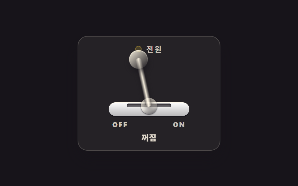
A metal lever tilts around its pivot to pick on or off, and on release it springs once before settling. The on state shows as both an LED dot and the word ON, and reports itself through role="switch" with aria-checked.
Best forThe power panel of an audio rack, mode switching on a device settings screen
role="switch"aria-checkedcubic-bezier(.2,1.4,.4,1)linear-gradient
<main class="stage">
<div class="tl is-demo" id="tl">
  <section class="tl__panel">
    <p class="tl__head"><span class="tl__led" aria-hidden="true"></span><span class="tl__name">Power</span></p>
    <div class="tl__assembly">
      <span class="tl__bracket" aria-hidden="true"></span>
      <span class="tl__slot" aria-hidden="true"></span>
      <span class="tl__dome" aria-hidden="true"></span>
      <button class="tl__hit" id="tlLever" type="button" role="switch" aria-checked="false" aria-label="Power lever">
        <span class="tl__armWrap" aria-hidden="true"><span class="tl__grip"></span></span>
      </button>
    </div>
    <p class="tl__marks" aria-hidden="true"><span class="tl__mark tl__mark--off">OFF</span><span class="tl__mark tl__mark--on">ON</span></p>
    <p class="tl__state" role="status"><span class="tl__wordOff">Off</span><span class="tl__wordOn">On</span></p>
  </section>
</div>
</main>
@use "../../../../site/static/demo-tokens" as *;
// 토글 레버 스위치 — 금속 레버가 관절(돔)을 축으로 좌우로 기울어 on·off 를 가른다.
// 손을 떼는 순간의 스프링 튕김은 $easing(오버슈트 베지에)이 transition 한 번으로 만든다.
// 켜짐은 LED 점과 ON 글자 둘로 알린다(색만으로 상태를 말하지 않는다). role="switch" + aria-checked.
// 미리보기(.is-demo)는 레버가 좌우로 왕복하며 LED·글자가 steps(1,end) 컷으로 따라 바뀐다.
$duration: $dur-quick;
$easing: cubic-bezier(.2, 1.4, .4, 1); // = $ease-pop — 칩 값 그대로 노출
$color: $stage-paper;
@include stage($stage-ink);
.tl { display: grid; place-items: center; width: 100%; }
.tl__panel {
box-sizing: border-box; width: clamp(190px, 60vw, 230px);
display: flex; flex-direction: column; align-items: center; gap: $sp-2;
padding: $sp-3; border-radius: $r-card;
background: rgba($subject-cream, .06);
border: 1px solid rgba($subject-cream, .18);
box-shadow: $shadow-raised;
}
.tl__head { display: flex; align-items: center; gap: $sp-2; margin: 0; height: 16px; }
.tl__led {
width: 10px; height: 10px; border-radius: 50%; flex: 0 0 auto;
background: rgba($stage-yellow, .16);
box-shadow: inset 0 0 0 1px rgba($stage-yellow, .35);
}
.tl__name {
font-weight: 700; font-size: clamp(10px, 2.6vw, 12px); line-height: 1;
letter-spacing: .18em; color: rgba($subject-cream, .78);
}
// ── 레버 어셈블리 ────────────────────────────────────────────
.tl__assembly { position: relative; width: 130px; height: 92px; }
.tl__bracket {
position: absolute; left: 0; bottom: 0; width: 130px; height: 22px;
border-radius: $r-control;
background: linear-gradient(180deg, $color, rgba($subject-ink, .30)), $color;
box-shadow: 0 2px 0 rgba($stage-ink, .8), inset 0 1px 0 rgba($subject-cream, .8);
}
.tl__slot {
position: absolute; left: 50%; top: 72px; width: 72px; height: 6px;
margin-left: -36px; border-radius: $r-pill; background: rgba($stage-ink, .6);
box-shadow: inset 0 2px 3px rgba($stage-ink, .9), 0 1px 0 rgba($subject-cream, .16);
}
.tl__dome {
position: absolute; left: calc(50% - 13px); bottom: 3px; width: 26px; height: 26px;
border-radius: 50%;
background: linear-gradient(155deg, rgba($subject-cream, .95), rgba($subject-cream, .35) 55%, rgba($stage-ink, .65));
box-shadow: 0 1px 2px rgba($stage-ink, .9);
}
.tl__hit {
position: absolute; inset: 0; z-index: 5; margin: 0; padding: 0;
border: 0; background: transparent; cursor: pointer;
}
.tl__hit:focus-visible { outline: 2px solid $stage-yellow; outline-offset: 2px; border-radius: $r-control; }
// 레버 팔 — transform-origin 을 팔 밑(돔 중심)에 두고 좌우로 기울어진다
.tl__armWrap {
position: absolute; left: calc(50% - 5px); bottom: 15px; width: 10px; height: 80px;
border-radius: $r-pill; transform-origin: 50% 100%; transform: rotate(-24deg);
transition: transform $duration $easing;
background: linear-gradient(90deg,
rgba($stage-ink, .55), rgba($subject-cream, .82) 42%,
rgba($subject-cream, .95) 50%, rgba($subject-cream, .70) 62%, rgba($stage-ink, .50));
box-shadow: 0 4px 8px rgba($stage-ink, .55);
}
.tl__grip {
position: absolute; top: -13px; left: calc(50% - 15px); width: 30px; height: 30px;
border-radius: 50%;
background: linear-gradient(150deg, rgba($subject-cream, .96), rgba($subject-cream, .45) 48%, rgba($stage-ink, .55));
box-shadow: 0 6px 10px rgba($stage-ink, .6), inset 0 1px 1px rgba($subject-cream, .9);
}
// ── 상태 ─────────────────────────────────────────────────────
.tl__marks { display: flex; justify-content: space-between; width: 118px; margin: 0; }
.tl__mark {
font-weight: 800; font-size: clamp(9px, 2.4vw, 11px); line-height: 1; letter-spacing: .14em;
}
.tl__mark--off { color: rgba($subject-cream, .78); }
.tl__mark--on { color: rgba($subject-cream, .72); }
.tl__state { position: relative; margin: 0; width: 60px; height: 16px; }
.tl__wordOff, .tl__wordOn {
position: absolute; inset: 0; display: flex; align-items: center; justify-content: center;
font-weight: 800; font-size: clamp(11px, 2.8vw, 13px); line-height: 1;
}
.tl__wordOff { color: rgba($subject-cream, .85); }
.tl__wordOn { color: $stage-yellow; display: none; }
// 켜짐 — 레버 기울기 · LED · ON 글자 · 상태 단어가 함께 바뀐다
.tl.is-on .tl__armWrap { transform: rotate(24deg); }
.tl.is-on .tl__led {
background: $stage-yellow;
box-shadow: 0 0 10px rgba($stage-yellow, .85), 0 0 0 3px rgba($stage-yellow, .25);
}
.tl.is-on .tl__mark--on { color: $stage-yellow; }
.tl.is-on .tl__mark--off { color: rgba($subject-cream, .72); }
.tl.is-on .tl__wordOn { display: flex; }
.tl.is-on .tl__wordOff { display: none; }
// ── 미리보기 루프(2초 한 바퀴) ────────────────────────────────
// 레버는 오버슈트를 넣었다가 제자리로 돌아온다. LED·글자는 steps(1,end) 컷.
.tl.is-demo .tl__armWrap {
animation-name: tlSwing; animation-duration: $dur-loop;
animation-timing-function: $easing; animation-iteration-count: infinite;
}
@keyframes tlSwing {
0% { transform: rotate(-24deg); }
8% { transform: rotate(-24deg); }
38% { transform: rotate(28deg); }
44% { transform: rotate(23deg); }
48% { transform: rotate(24deg); }
68% { transform: rotate(24deg); }
88% { transform: rotate(-28deg); }
94% { transform: rotate(-23deg); }
97% { transform: rotate(-24deg); }
100% { transform: rotate(-24deg); }
}
.tl.is-demo .tl__led {
animation-name: tlLed; animation-duration: $dur-loop;
animation-timing-function: steps(1, end); animation-iteration-count: infinite;
}
@keyframes tlLed {
0% { background: rgba($stage-yellow, .16); box-shadow: inset 0 0 0 1px rgba($stage-yellow, .35); }
46% { background: $stage-yellow; box-shadow: 0 0 10px rgba($stage-yellow, .85), 0 0 0 3px rgba($stage-yellow, .25); }
70% { background: rgba($stage-yellow, .16); box-shadow: inset 0 0 0 1px rgba($stage-yellow, .35); }
100% { background: rgba($stage-yellow, .16); box-shadow: inset 0 0 0 1px rgba($stage-yellow, .35); }
}
.tl.is-demo .tl__mark--on {
animation-name: tlMarkOn; animation-duration: $dur-loop;
animation-timing-function: steps(1, end); animation-iteration-count: infinite;
}
@keyframes tlMarkOn {
0% { color: rgba($subject-cream, .72); }
46% { color: $stage-yellow; }
70% { color: rgba($subject-cream, .72); }
100% { color: rgba($subject-cream, .72); }
}
.tl.is-demo .tl__mark--off {
animation-name: tlMarkOff; animation-duration: $dur-loop;
animation-timing-function: steps(1, end); animation-iteration-count: infinite;
}
@keyframes tlMarkOff {
0% { color: rgba($subject-cream, .78); }
46% { color: rgba($subject-cream, .72); }
70% { color: rgba($subject-cream, .78); }
100% { color: rgba($subject-cream, .78); }
}
// 상태 단어는 루프에서 둘 다 띄운 뒤 opacity 컷으로 갈아 낀다(정적 규칙의 display 는 건드리지 않는다)
.tl.is-demo .tl__wordOn { display: flex; opacity: 0; }
.tl.is-demo .tl__wordOff { opacity: 1; }
.tl.is-demo .tl__wordOn {
animation-name: tlWordOn; animation-duration: $dur-loop;
animation-timing-function: steps(1, end); animation-iteration-count: infinite;
}
@keyframes tlWordOn {
0% { opacity: 0; }
46% { opacity: 1; }
70% { opacity: 0; }
100% { opacity: 0; }
}
.tl.is-demo .tl__wordOff {
animation-name: tlWordOff; animation-duration: $dur-loop;
animation-timing-function: steps(1, end); animation-iteration-count: infinite;
}
@keyframes tlWordOff {
0% { opacity: 1; }
46% { opacity: 0; }
70% { opacity: 1; }
100% { opacity: 1; }
}
@media (max-width: 340px) {
.tl__panel { gap: $sp-1; padding: $sp-2; }
.tl__assembly { width: 110px; height: 66px; }
.tl__bracket { width: 110px; height: 18px; }
.tl__slot { top: 52px; left: calc(50% - 30px); width: 60px; }
.tl__dome { width: 20px; height: 20px; left: calc(50% - 10px); bottom: 2px; }
.tl__armWrap { height: 56px; bottom: 11px; }
.tl__grip { width: 24px; height: 24px; left: calc(50% - 12px); top: -10px; }
.tl__marks { width: 100px; }
.tl__state { height: 14px; }
}
@media (prefers-reduced-motion: reduce) {
.tl.is-demo .tl__armWrap { animation: none !important; transform: rotate(-24deg) !important; }
.tl.is-demo .tl__led { animation: none !important; }
.tl.is-demo .tl__mark--on { animation: none !important; }
.tl.is-demo .tl__mark--off { animation: none !important; }
.tl.is-demo .tl__wordOn { animation: none !important; opacity: 0 !important; }
.tl.is-demo .tl__wordOff { animation: none !important; opacity: 1 !important; }
}html, body {
margin: 0;
overflow: hidden;
}
.stage {
box-sizing: border-box;
min-height: 100vh;
display: grid;
place-items: center;
margin: 0;
background: #17141a;
font-family: -apple-system, "Segoe UI", "Noto Sans KR", sans-serif;
padding: clamp(8px, 4vw, 24px);
}
.tl {
display: grid;
place-items: center;
width: 100%;
}
.tl__panel {
box-sizing: border-box;
width: clamp(190px, 60vw, 230px);
display: flex;
flex-direction: column;
align-items: center;
gap: 8px;
padding: 12px;
border-radius: 16px;
background: rgba(255, 247, 230, 0.06);
border: 1px solid rgba(255, 247, 230, 0.18);
box-shadow: 0 14px 24px rgba(23, 20, 26, 0.32);
}
.tl__head {
display: flex;
align-items: center;
gap: 8px;
margin: 0;
height: 16px;
}
.tl__led {
width: 10px;
height: 10px;
border-radius: 50%;
flex: 0 0 auto;
background: rgba(255, 210, 63, 0.16);
box-shadow: inset 0 0 0 1px rgba(255, 210, 63, 0.35);
}
.tl__name {
font-weight: 700;
font-size: clamp(10px, 2.6vw, 12px);
line-height: 1;
letter-spacing: 0.18em;
color: rgba(255, 247, 230, 0.78);
}
.tl__assembly {
position: relative;
width: 130px;
height: 92px;
}
.tl__bracket {
position: absolute;
left: 0;
bottom: 0;
width: 130px;
height: 22px;
border-radius: 12px;
background: linear-gradient(180deg, #ffffff, rgba(23, 20, 26, 0.3)), #ffffff;
box-shadow: 0 2px 0 rgba(23, 20, 26, 0.8), inset 0 1px 0 rgba(255, 247, 230, 0.8);
}
.tl__slot {
position: absolute;
left: 50%;
top: 72px;
width: 72px;
height: 6px;
margin-left: -36px;
border-radius: 999px;
background: rgba(23, 20, 26, 0.6);
box-shadow: inset 0 2px 3px rgba(23, 20, 26, 0.9), 0 1px 0 rgba(255, 247, 230, 0.16);
}
.tl__dome {
position: absolute;
left: calc(50% - 13px);
bottom: 3px;
width: 26px;
height: 26px;
border-radius: 50%;
background: linear-gradient(155deg, rgba(255, 247, 230, 0.95), rgba(255, 247, 230, 0.35) 55%, rgba(23, 20, 26, 0.65));
box-shadow: 0 1px 2px rgba(23, 20, 26, 0.9);
}
.tl__hit {
position: absolute;
inset: 0;
z-index: 5;
margin: 0;
padding: 0;
border: 0;
background: transparent;
cursor: pointer;
}
.tl__hit:focus-visible {
outline: 2px solid #ffd23f;
outline-offset: 2px;
border-radius: 12px;
}
.tl__armWrap {
position: absolute;
left: calc(50% - 5px);
bottom: 15px;
width: 10px;
height: 80px;
border-radius: 999px;
transform-origin: 50% 100%;
transform: rotate(-24deg);
transition: transform 220ms cubic-bezier(0.2, 1.4, 0.4, 1);
background: linear-gradient(90deg, rgba(23, 20, 26, 0.55), rgba(255, 247, 230, 0.82) 42%, rgba(255, 247, 230, 0.95) 50%, rgba(255, 247, 230, 0.7) 62%, rgba(23, 20, 26, 0.5));
box-shadow: 0 4px 8px rgba(23, 20, 26, 0.55);
}
.tl__grip {
position: absolute;
top: -13px;
left: calc(50% - 15px);
width: 30px;
height: 30px;
border-radius: 50%;
background: linear-gradient(150deg, rgba(255, 247, 230, 0.96), rgba(255, 247, 230, 0.45) 48%, rgba(23, 20, 26, 0.55));
box-shadow: 0 6px 10px rgba(23, 20, 26, 0.6), inset 0 1px 1px rgba(255, 247, 230, 0.9);
}
.tl__marks {
display: flex;
justify-content: space-between;
width: 118px;
margin: 0;
}
.tl__mark {
font-weight: 800;
font-size: clamp(9px, 2.4vw, 11px);
line-height: 1;
letter-spacing: 0.14em;
}
.tl__mark--off {
color: rgba(255, 247, 230, 0.78);
}
.tl__mark--on {
color: rgba(255, 247, 230, 0.72);
}
.tl__state {
position: relative;
margin: 0;
width: 60px;
height: 16px;
}
.tl__wordOff, .tl__wordOn {
position: absolute;
inset: 0;
display: flex;
align-items: center;
justify-content: center;
font-weight: 800;
font-size: clamp(11px, 2.8vw, 13px);
line-height: 1;
}
.tl__wordOff {
color: rgba(255, 247, 230, 0.85);
}
.tl__wordOn {
color: #ffd23f;
display: none;
}
.tl.is-on .tl__armWrap {
transform: rotate(24deg);
}
.tl.is-on .tl__led {
background: #ffd23f;
box-shadow: 0 0 10px rgba(255, 210, 63, 0.85), 0 0 0 3px rgba(255, 210, 63, 0.25);
}
.tl.is-on .tl__mark--on {
color: #ffd23f;
}
.tl.is-on .tl__mark--off {
color: rgba(255, 247, 230, 0.72);
}
.tl.is-on .tl__wordOn {
display: flex;
}
.tl.is-on .tl__wordOff {
display: none;
}
.tl.is-demo .tl__armWrap {
animation-name: tlSwing;
animation-duration: 2s;
animation-timing-function: cubic-bezier(0.2, 1.4, 0.4, 1);
animation-iteration-count: infinite;
}
@keyframes tlSwing {
0% {
transform: rotate(-24deg);
}
8% {
transform: rotate(-24deg);
}
38% {
transform: rotate(28deg);
}
44% {
transform: rotate(23deg);
}
48% {
transform: rotate(24deg);
}
68% {
transform: rotate(24deg);
}
88% {
transform: rotate(-28deg);
}
94% {
transform: rotate(-23deg);
}
97% {
transform: rotate(-24deg);
}
100% {
transform: rotate(-24deg);
}
}
.tl.is-demo .tl__led {
animation-name: tlLed;
animation-duration: 2s;
animation-timing-function: steps(1, end);
animation-iteration-count: infinite;
}
@keyframes tlLed {
0% {
background: rgba(255, 210, 63, 0.16);
box-shadow: inset 0 0 0 1px rgba(255, 210, 63, 0.35);
}
46% {
background: #ffd23f;
box-shadow: 0 0 10px rgba(255, 210, 63, 0.85), 0 0 0 3px rgba(255, 210, 63, 0.25);
}
70% {
background: rgba(255, 210, 63, 0.16);
box-shadow: inset 0 0 0 1px rgba(255, 210, 63, 0.35);
}
100% {
background: rgba(255, 210, 63, 0.16);
box-shadow: inset 0 0 0 1px rgba(255, 210, 63, 0.35);
}
}
.tl.is-demo .tl__mark--on {
animation-name: tlMarkOn;
animation-duration: 2s;
animation-timing-function: steps(1, end);
animation-iteration-count: infinite;
}
@keyframes tlMarkOn {
0% {
color: rgba(255, 247, 230, 0.72);
}
46% {
color: #ffd23f;
}
70% {
color: rgba(255, 247, 230, 0.72);
}
100% {
color: rgba(255, 247, 230, 0.72);
}
}
.tl.is-demo .tl__mark--off {
animation-name: tlMarkOff;
animation-duration: 2s;
animation-timing-function: steps(1, end);
animation-iteration-count: infinite;
}
@keyframes tlMarkOff {
0% {
color: rgba(255, 247, 230, 0.78);
}
46% {
color: rgba(255, 247, 230, 0.72);
}
70% {
color: rgba(255, 247, 230, 0.78);
}
100% {
color: rgba(255, 247, 230, 0.78);
}
}
.tl.is-demo .tl__wordOn {
display: flex;
opacity: 0;
}
.tl.is-demo .tl__wordOff {
opacity: 1;
}
.tl.is-demo .tl__wordOn {
animation-name: tlWordOn;
animation-duration: 2s;
animation-timing-function: steps(1, end);
animation-iteration-count: infinite;
}
@keyframes tlWordOn {
0% {
opacity: 0;
}
46% {
opacity: 1;
}
70% {
opacity: 0;
}
100% {
opacity: 0;
}
}
.tl.is-demo .tl__wordOff {
animation-name: tlWordOff;
animation-duration: 2s;
animation-timing-function: steps(1, end);
animation-iteration-count: infinite;
}
@keyframes tlWordOff {
0% {
opacity: 1;
}
46% {
opacity: 0;
}
70% {
opacity: 1;
}
100% {
opacity: 1;
}
}
@media (max-width: 340px) {
.tl__panel {
gap: 4px;
padding: 8px;
}
.tl__assembly {
width: 110px;
height: 66px;
}
.tl__bracket {
width: 110px;
height: 18px;
}
.tl__slot {
top: 52px;
left: calc(50% - 30px);
width: 60px;
}
.tl__dome {
width: 20px;
height: 20px;
left: calc(50% - 10px);
bottom: 2px;
}
.tl__armWrap {
height: 56px;
bottom: 11px;
}
.tl__grip {
width: 24px;
height: 24px;
left: calc(50% - 12px);
top: -10px;
}
.tl__marks {
width: 100px;
}
.tl__state {
height: 14px;
}
}
@media (prefers-reduced-motion: reduce) {
.tl.is-demo .tl__armWrap {
animation: none !important;
transform: rotate(-24deg) !important;
}
.tl.is-demo .tl__led {
animation: none !important;
}
.tl.is-demo .tl__mark--on {
animation: none !important;
}
.tl.is-demo .tl__mark--off {
animation: none !important;
}
.tl.is-demo .tl__wordOn {
animation: none !important;
opacity: 0 !important;
}
.tl.is-demo .tl__wordOff {
animation: none !important;
opacity: 1 !important;
}
}var root = document.getElementById('tl');
var lever = document.getElementById('tlLever');
function setOn(on) {
lever.setAttribute('aria-checked', on ? 'true' : 'false');
root.classList.toggle('is-on', on);
}
function toggle() {
root.classList.remove('is-demo');
setOn(lever.getAttribute('aria-checked') !== 'true');
}
lever.addEventListener('pointerdown', function () { root.classList.remove('is-demo'); });
lever.addEventListener('click', toggle);// ToggleLever — vanilla 판(run/013/demo/01-skeuo-toggle-lever/index.html) 의 React 포트.
// 금속 레버가 관절을 축으로 좌우로 기울어 on·off 를 가르고, transition 이 오버슈트로 한 번 튕긴다.
// 값·키프레임은 vanilla 와 같다(다시 타이핑하지 않는다). 클릭하면 미리보기 루프를 뗀다.
import { useState } from "react";
import styles from "./ToggleLever.module.scss";
export type ToggleLeverProps = {
duration?: number;
easing?: string;
color?: string;
};
type Vars = { [k: string]: any };
const NAME_TEXT = "전원";
const STATE_OFF = "꺼짐";
const STATE_ON = "켜짐";
const LEVER_LABEL = "전원 레버";
export default function ToggleLever({
duration = 220,
easing = "cubic-bezier(.2, 1.4, .4, 1)", // = $ease-pop
color = "#ffffff",
}: ToggleLeverProps) {
const [on, setOn] = useState(false);
const [demo, setDemo] = useState(true);
const vars: Vars = {
"--duration": `${duration}ms`,
"--easing": easing,
"--color": color,
};
const cls = [styles.root, demo ? styles.isDemo : "", on ? styles.isOn : ""].filter(Boolean).join(" ");
function toggle() {
setDemo(false);
setOn((prev) => !prev);
}
function wake() {
setDemo(false);
}
return (
<main className={styles.stage}>
<div className={cls} style={vars}>
<section className={styles.panel}>
<p className={styles.head}><span className={styles.led} aria-hidden="true"></span><span className={styles.name}>{NAME_TEXT}</span></p>
<div className={styles.assembly}>
<span className={styles.bracket} aria-hidden="true"></span>
<span className={styles.slot} aria-hidden="true"></span>
<span className={styles.dome} aria-hidden="true"></span>
<button
className={styles.hit}
type="button"
role="switch"
aria-checked={on}
aria-label={LEVER_LABEL}
onPointerDown={wake}
onClick={toggle}
>
<span className={styles.armWrap} aria-hidden="true"><span className={styles.grip}></span></span>
</button>
</div>
<p className={styles.marks} aria-hidden="true">
<span className={`${styles.mark} ${styles.markOff}`}>OFF</span>
<span className={`${styles.mark} ${styles.markOn}`}>ON</span>
</p>
<p className={styles.state} role="status">
<span className={styles.wordOff}>{STATE_OFF}</span>
<span className={styles.wordOn}>{STATE_ON}</span>
</p>
</section>
</div>
</main>
);
}01 Toggle lever switch — Measured area 4.119% · moving frames 18/23Original by GODRICH · SCSS and React ship in the zip · CSS Switch Button 9 Ways — Rocker to Tape Eject
The post this demo lives in
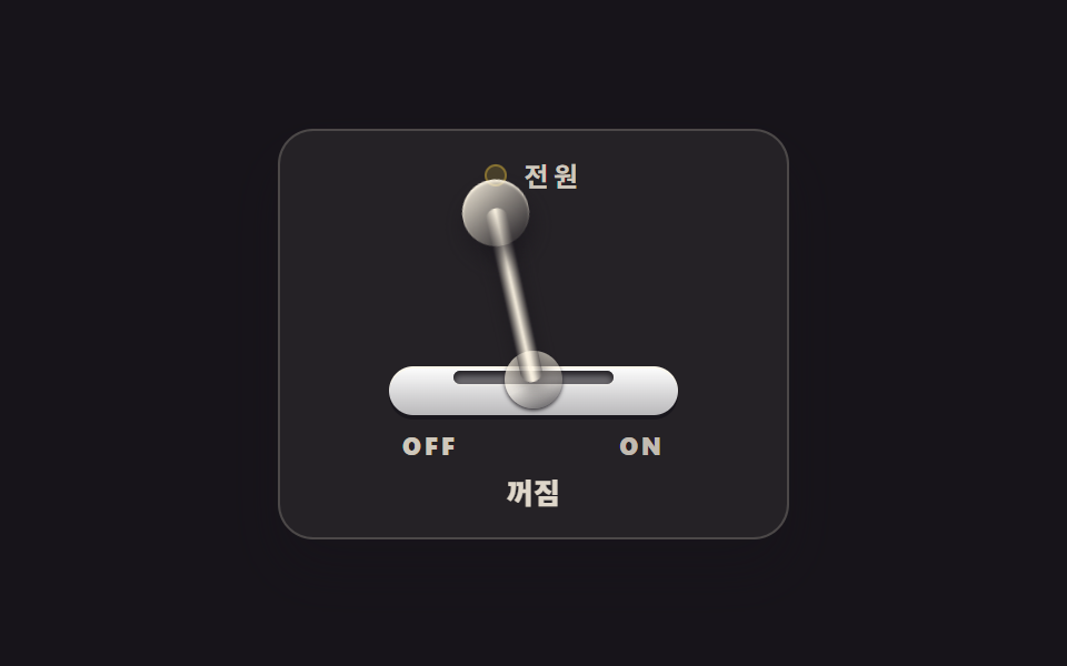 CSS Switch Button 9 Ways — Rocker to Tape EjectA css switch button is a control drawn to behave like the physical switch it stands in for: a lever that tilts, a knob t See all demos in this post
If you like this effect - similar demos
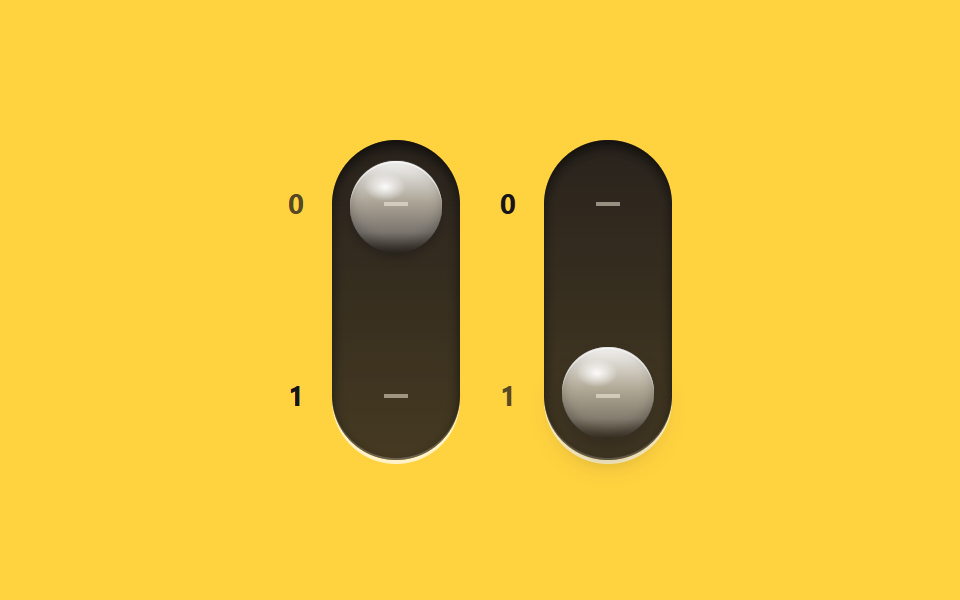 Buttons02 Vertical glass-gloss toggle pairCSS Toggle Switch: 9 Realistic Switches to Paste
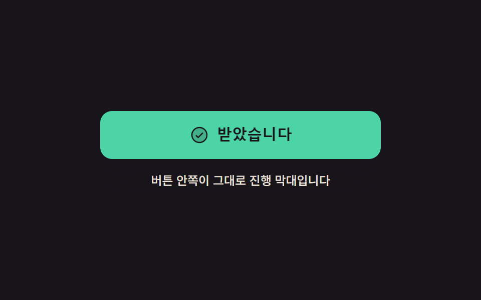 Buttons05 The button becomes its own progress bar9 button state css patterns, loading to done
 Buttons01 Accordion-reveal value toggle — when the button's open value changes, its rounding and shadow values change along, presenting the content belowExpanding Button UI: 9 Shape-Morph Patterns