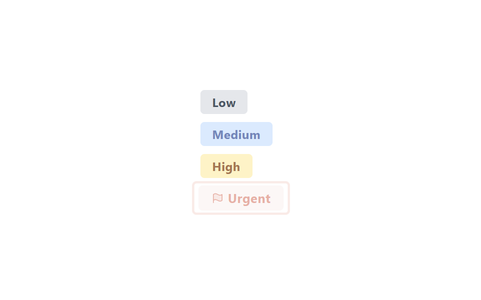
03Priority label badge (low/medium/high/urgent)
The low, medium, and high labels sit fixed with only their color different, while the urgent label alone flashes between opacity 1↔.5 and scale(1↔1.05) so it's the first thing your eye catches when scanning a list.
Best forIssue-tracker priority tags, sorting customer-support tickets
opacity+scale flashflag Phosphor duotone정적 3단+동적 1단
<main class="stage is-demo">
  <ul class="labels" aria-label="Priority list">
    <li class="label label--low">Low</li>
    <li class="label label--medium">Medium</li>
    <li class="label label--high">High</li>
    <li class="label label--urgent">
      <svg viewBox="0 0 256 256" width="12" height="12" aria-hidden="true"><g fill="currentColor"><path d="M224,56V176c-64,55.43-112-55.43-176,0V56C112,.57,160,111.43,224,56Z" opacity=".2"/><path d="M42.76,50A8,8,0,0,0,40,56V224a8,8,0,0,0,16,0V179.77c26.79-21.16,49.87-9.75,76.45,3.41,16.4,8.11,34.06,16.85,53,16.85,13.93,0,28.54-4.75,43.82-18a8,8,0,0,0,2.76-6V56A8,8,0,0,0,218.76,50c-28,24.23-51.72,12.49-79.21-1.12C111.07,34.76,78.78,18.79,42.76,50ZM216,172.25c-26.79,21.16-49.87,9.74-76.45-3.41-25-12.35-52.81-26.13-83.55-8.4V59.79c26.79-21.16,49.87-9.75,76.45,3.4,25,12.35,52.82,26.13,83.55,8.4Z"/></g></svg>
      Urgent
    </li>
  </ul>
</main>
@use "../../../../site/static/demo-tokens" as *;
// ── 변수 3개 ──────────────────────────────────────────
$duration: $dur-loop; // 2s — 긴급 라벨 깜빡임 한 주기
$easing: $ease-out;
$color: $error;
@include stage($stage-paper);
.labels {
display: flex; flex-direction: column; gap: $sp-2;
margin: 0; padding: 0; list-style: none;
}
.label {
display: inline-flex; align-items: center; gap: $sp-1;
width: fit-content;
padding: $sp-1 $sp-3;
border-radius: $r-xs;
font-family: -apple-system, "Segoe UI", "Noto Sans KR", sans-serif;
font-weight: 700;
font-size: 12px;
letter-spacing: .02em;
}
.label--low { background: #e5e7eb; color: #4b5563; }
.label--medium { background: #dbeafe; color: #7386ba; }
.label--high { background: #fef3c7; color: #a47551; }
.label--urgent {
background: $stage-paper;
color: $color;
transform-origin: center;
}
// 긴급만 애니메이션 — opacity 만, 레이아웃은 그대로
.stage.is-demo .label--urgent {
animation: urgent-flash $duration $easing infinite;
}
@keyframes urgent-flash {
0%, 40% { opacity: 1; transform: scale(1); }
55% { opacity: .5; transform: scale(1.05); }
70%, 100% { opacity: 1; transform: scale(1); }
}
// ── 한 겹: 긴급 강조(55%) 순간 레드 링 파문 + 색 전이 ──
// urgent-flash 의 scale·opacity 는 그대로 두고, 링과 글자색만 별도 keyframes 로 움직인다
.label--urgent { position: relative; }
.label--urgent::after {
content: "";
position: absolute;
inset: -3px;
border-radius: $r-xs;
border: 2px solid rgba($color, 0);
transform: scale(.9);
pointer-events: none;
}
.stage.is-demo .label--urgent {
animation: urgent-flash $duration $easing infinite, urgent-tint $duration $ease-out infinite;
}
.stage.is-demo .label--urgent::after {
animation: urgent-ring $duration $easing infinite;
}
@keyframes urgent-tint {
0%, 40% { color: $color; background-color: $stage-paper; }
55% { color: mix(#fff, $color, 22%); background-color: mix(#fff, $color, 92%); }
70%, 100% { color: $color; background-color: $stage-paper; }
}
@keyframes urgent-ring {
0%, 40% { transform: scale(.9); opacity: 0; border-color: rgba($color, 0); }
50% { transform: scale(1); opacity: .75; border-color: rgba(mix(#ffd9c9, $color, 35%), .85); }
70%, 100% { transform: scale(1.22); opacity: 0; border-color: rgba($color, 0); }
}
@media (prefers-reduced-motion: reduce) {
.stage.is-demo .label--urgent { animation: none; }
.stage.is-demo .label--urgent::after { animation: none; opacity: 0; }
}html, body {
margin: 0;
overflow: hidden;
}
.stage {
box-sizing: border-box;
min-height: 100vh;
display: grid;
place-items: center;
margin: 0;
background: #ffffff;
font-family: -apple-system, "Segoe UI", "Noto Sans KR", sans-serif;
padding: clamp(8px, 4vw, 24px);
}
.labels {
display: flex;
flex-direction: column;
gap: 8px;
margin: 0;
padding: 0;
list-style: none;
}
.label {
display: inline-flex;
align-items: center;
gap: 4px;
width: fit-content;
padding: 4px 12px;
border-radius: 4px;
font-family: -apple-system, "Segoe UI", "Noto Sans KR", sans-serif;
font-weight: 700;
font-size: 12px;
letter-spacing: 0.02em;
}
.label--low {
background: #e5e7eb;
color: #4b5563;
}
.label--medium {
background: #dbeafe;
color: #7386ba;
}
.label--high {
background: #fef3c7;
color: #a47551;
}
.label--urgent {
background: #ffffff;
color: #c2361a;
transform-origin: center;
}
.stage.is-demo .label--urgent {
animation: urgent-flash 2s ease-out infinite;
}
@keyframes urgent-flash {
0%, 40% {
opacity: 1;
transform: scale(1);
}
55% {
opacity: 0.5;
transform: scale(1.05);
}
70%, 100% {
opacity: 1;
transform: scale(1);
}
}
.label--urgent {
position: relative;
}
.label--urgent::after {
content: "";
position: absolute;
inset: -3px;
border-radius: 4px;
border: 2px solid rgba(194, 54, 26, 0);
transform: scale(0.9);
pointer-events: none;
}
.stage.is-demo .label--urgent {
animation: urgent-flash 2s ease-out infinite, urgent-tint 2s ease-out infinite;
}
.stage.is-demo .label--urgent::after {
animation: urgent-ring 2s ease-out infinite;
}
@keyframes urgent-tint {
0%, 40% {
color: #c2361a;
background-color: #ffffff;
}
55% {
color: rgb(81.3411764706%, 38.5176470588%, 29.9529411765%);
background-color: rgb(98.0862745098%, 93.6941176471%, 92.8156862745%);
}
70%, 100% {
color: #c2361a;
background-color: #ffffff;
}
}
@keyframes urgent-ring {
0%, 40% {
transform: scale(0.9);
opacity: 0;
border-color: rgba(194, 54, 26, 0);
}
50% {
transform: scale(1);
opacity: 0.75;
border-color: rgba(84.4509803922%, 43.5490196078%, 34.2156862745%, 0.85);
}
70%, 100% {
transform: scale(1.22);
opacity: 0;
border-color: rgba(194, 54, 26, 0);
}
}
@media (prefers-reduced-motion: reduce) {
.stage.is-demo .label--urgent {
animation: none;
}
.stage.is-demo .label--urgent::after {
animation: none;
opacity: 0;
}
}import type { CSSProperties } from "react";
import styles from "./PriorityLabelBadge.module.scss";
export type PriorityLabelBadgeProps = {
duration?: number;
easing?: string;
color?: string;
};
export default function PriorityLabelBadge({
duration = 2000,
easing = "ease-out",
color = "#c2361a",
}: PriorityLabelBadgeProps) {
const vars: CSSProperties = { "--duration": `${duration}ms`, "--easing": easing, "--color": color } as CSSProperties;
return (
<ul className={styles.labels} style={vars} aria-label="priority list">
<li className={`${styles.label} ${styles.low}`}>Low</li>
<li className={`${styles.label} ${styles.medium}`}>Medium</li>
<li className={`${styles.label} ${styles.high}`}>High</li>
<li className={`${styles.label} ${styles.urgent}`}>
<svg viewBox="0 0 256 256" width={12} height={12} aria-hidden="true">
<g fill="currentColor">
<path d="M224,56V176c-64,55.43-112-55.43-176,0V56C112,.57,160,111.43,224,56Z" opacity=".2" />
<path d="M42.76,50A8,8,0,0,0,40,56V224a8,8,0,0,0,16,0V179.77c26.79-21.16,49.87-9.75,76.45,3.41,16.4,8.11,34.06,16.85,53,16.85,13.93,0,28.54-4.75,43.82-18a8,8,0,0,0,2.76-6V56A8,8,0,0,0,218.76,50c-28,24.23-51.72,12.49-79.21-1.12C111.07,34.76,78.78,18.79,42.76,50ZM216,172.25c-26.79,21.16-49.87,9.74-76.45-3.41-25-12.35-52.81-26.13-83.55-8.4V59.79c26.79-21.16,49.87-9.75,76.45,3.4,25,12.35,52.82,26.13,83.55,8.4Z" />
</g>
</svg>
Urgent
</li>
</ul>
);
}03 Priority label badge (low/medium/high/urgent) — Measured area 1.069% · moving frames 9/23Original by GODRICH · SCSS and React ship in the zip · Status Badge Design UI — 9 CSS Ideas to Copy
The post this demo lives in
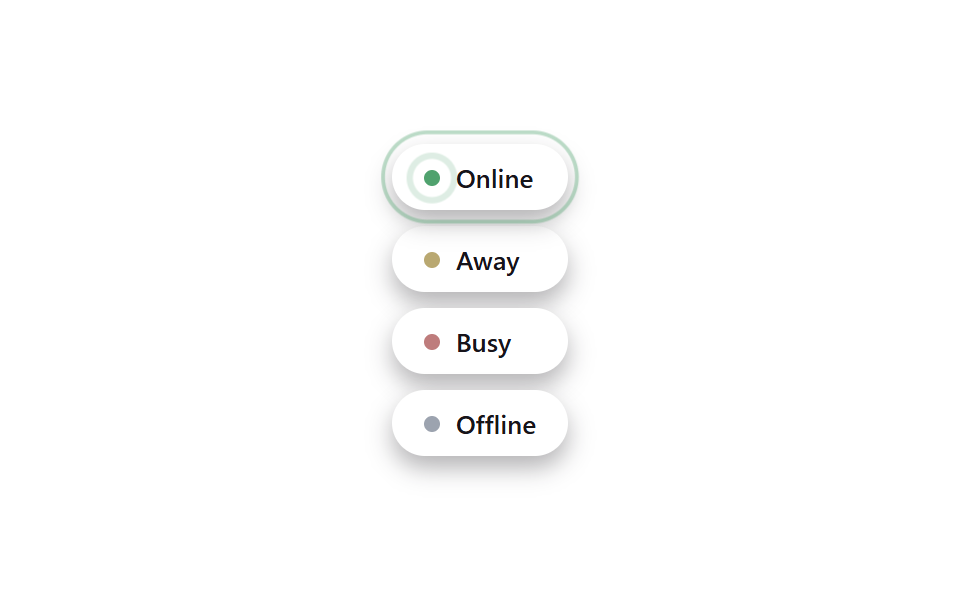 Status Badge Design UI — 9 CSS Ideas to CopyThis status badge design ui roundup turns a small detail — one dot, one label — into instant feedback: online or away, u See all demos in this post