05ギフトカードの反転
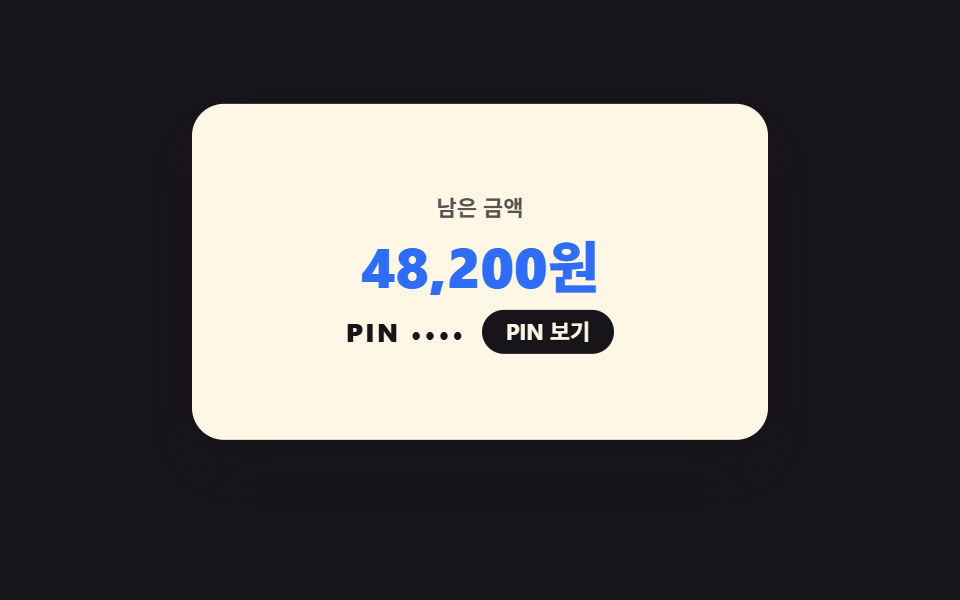
ギフト用カード。裏返すと残高とPINの隠し板が出てきます。反転はrotateYとbackface-visibilityの組み合わせで二面が一枚のように噛み合って回ります。
使いどころギフトページ、金額チケット選択カード
preserve-3drotateYbackface-visibility
<main class="stage">
<div class="gc is-demo" id="gc">
  <div class="gc__bob">
  <div class="gc__card" id="card">
    <div class="gc__face gc__face--front">
      <p class="gc__brand"><svg xmlns="http://www.w3.org/2000/svg" viewBox="0 0 256 256" fill="currentColor" class="gc__ico" aria-hidden="true"><path d="M208,128v72a8,8,0,0,1-8,8H56a8,8,0,0,1-8-8V128Z" opacity="0.2"/><path d="M216,72H180.92c.39-.33.79-.65,1.17-1A29.53,29.53,0,0,0,192,49.57,32.62,32.62,0,0,0,158.44,16,29.53,29.53,0,0,0,137,25.91a54.94,54.94,0,0,0-9,14.48,54.94,54.94,0,0,0-9-14.48A29.53,29.53,0,0,0,97.56,16,32.62,32.62,0,0,0,64,49.57,29.53,29.53,0,0,0,73.91,71c.38.33.78.65,1.17,1H40A16,16,0,0,0,24,88v32a16,16,0,0,0,16,16v64a16,16,0,0,0,16,16H200a16,16,0,0,0,16-16V136a16,16,0,0,0,16-16V88A16,16,0,0,0,216,72ZM149,36.51a13.69,13.69,0,0,1,10-4.5h.49A16.62,16.62,0,0,1,176,49.08a13.69,13.69,0,0,1-4.5,10c-9.49,8.4-25.24,11.36-35,12.4C137.7,60.89,141,45.5,149,36.51Zm-64.09.36A16.63,16.63,0,0,1,96.59,32h.49a13.69,13.69,0,0,1,10,4.5c8.39,9.48,11.35,25.2,12.39,34.92-9.72-1-25.44-4-34.92-12.39a13.69,13.69,0,0,1-4.5-10A16.6,16.6,0,0,1,84.87,36.87ZM40,88h80v32H40Zm16,48h64v64H56Zm144,64H136V136h64Zm16-80H136V88h80v32Z"/></svg><span>GIFT CARD</span></p>
      <p class="gc__amount">50,000ウォン</p>
      <p class="gc__hint">タップで裏返す</p>
    </div>
    <div class="gc__face gc__face--back" aria-hidden="true">
      <p class="gc__balLabel">残高</p>
      <p class="gc__bal">48,200ウォン</p>
      <div class="gc__pinRow">
        <span class="gc__pinDots" id="pinDots">PIN ••••</span>
        <button type="button" class="gc__pinBtn" id="pinBtn">PINを見る</button>
      </div>
    </div>
  </div>
  </div>
  <p class="gc__live" id="live" aria-live="polite"></p>
</div>
</main>
@use "../../../../site/static/demo-tokens" as *;
// 기프트 카드 뒤집기 — rotateY + backface-visibility 로 두 판이 한 장처럼 맞물린다.
// 격자 미리보기(.is-demo)는 뒤집힘을 steps 컷으로 보여준다(회전 중간은 모서리뷰 한 줄이라 포스터가 죽는다 — 252-07 함정).
// 실제 클릭은 부드러운 transition 회전 그대로.
$duration: $dur-enter;
$easing: $ease-spring;
$color: $subject-lilac;
@include stage($stage-ink);
.gc { display: flex; flex-direction: column; align-items: center; gap: $sp-2; width: 100%; }
.gc__bob { display: flex; justify-content: center; width: 100%; }
.gc__card {
position: relative; width: min(100%, 288px); aspect-ratio: 288 / 168;
transform-style: preserve-3d; cursor: pointer;
transition: transform 600ms $easing;
}
.gc__card:focus-visible { outline: 3px solid $stage-yellow; outline-offset: 4px; border-radius: $r-card; }
.gc.is-flipped .gc__card { transform: rotateY(180deg); }
.gc__face {
position: absolute; inset: 0; display: flex; flex-direction: column;
align-items: center; justify-content: center; gap: $sp-1;
border-radius: $r-card; box-shadow: $shadow-raised;
backface-visibility: hidden; -webkit-backface-visibility: hidden;
padding: $sp-4;
}
.gc__face--front { background: $subject-lilac; color: $subject-ink; }
.gc__face--back { background: $subject-cream; color: $subject-ink; transform: rotateY(180deg); gap: $sp-2; }
.gc__brand { display: flex; align-items: center; gap: $sp-1; margin: 0; font-weight: 800; font-size: clamp(10px, 2.8vw, 12px); letter-spacing: .2em; color: rgba(23,20,26,.78); }
.gc__ico { width: 18px; height: 18px; color: $subject-ink; }
.gc__amount { margin: 0; font-weight: 800; font-size: clamp(28px, 8vw, 38px); line-height: 1; color: $subject-ink; }
.gc__hint { margin: 0; font-weight: 700; font-size: clamp(10px, 2.8vw, 11px); color: rgba(23,20,26,.78); }
.gc__balLabel { margin: 0; font-weight: 700; font-size: clamp(10px, 2.8vw, 11px); color: rgba(23,20,26,.72); }
.gc__bal { margin: 0; font-weight: 800; font-size: clamp(22px, 6.4vw, 28px); line-height: 1; color: $subject-blue; }
.gc__pinRow { display: flex; align-items: center; gap: $sp-2; }
.gc__pinDots { font-weight: 800; font-size: clamp(11px, 3.2vw, 13px); letter-spacing: .1em; color: $subject-ink; }
.gc__pinBtn {
border: 0; cursor: pointer; background: $subject-ink; color: $subject-cream;
border-radius: $r-pill; font-family: inherit; font-weight: 700;
font-size: clamp(10px, 2.8vw, 11px); padding: $sp-1 $sp-3; line-height: 1.3;
}
.gc__pinBtn:focus-visible { outline: 3px solid $subject-lilac; outline-offset: 2px; }
.gc__live { margin: 0; min-height: 1.2em; font-weight: 700; font-size: clamp(10px, 2.8vw, 11px); color: $subject-cream; }
// ── 격자 미리보기 루프: 바깥 .gc__bob 은 살짝 둥둥(연속), .gc__card 는 steps 컷으로
// 앞면 → 뒷면 → 앞면. 회전 중간(모서리뷰)을 그리지 않는다(252-07 함정).
.gc.is-demo .gc__bob { animation: gcFloat 2s ease-in-out infinite; }
@keyframes gcFloat { 0%, 100% { transform: translateY(0); } 50% { transform: translateY(-4px); } }
.gc.is-demo .gc__card { animation: gcCut 2s steps(1, end) infinite; transition: none; }
@keyframes gcCut { 0%, 30% { transform: rotateY(0deg); } 30.5%, 85% { transform: rotateY(180deg); } 85.5%, 100% { transform: rotateY(0deg); } }
.gc.is-demo .gc__pinDots { animation: gcPin 2s steps(1, end) infinite; }
@keyframes gcPin { 0%, 46% { opacity: 1; } 46.5%, 60% { opacity: .35; } 60.5%, 100% { opacity: 1; } }
@media (max-width: 340px) {
.gc__face { padding: $sp-2; }
.gc__card { width: min(100%, 232px); }
.gc { gap: $sp-1; }
}
@media (prefers-reduced-motion: reduce) {
.gc.is-demo .gc__bob,
.gc.is-demo .gc__card,
.gc.is-demo .gc__pinDots { animation: none !important; }
.gc__card { transition: none !important; }
.gc.is-demo .gc__card { transform: rotateY(180deg); }
}html, body {
margin: 0;
overflow: hidden;
}
.stage {
box-sizing: border-box;
min-height: 100vh;
display: grid;
place-items: center;
margin: 0;
background: #17141a;
font-family: -apple-system, "Segoe UI", "Noto Sans KR", sans-serif;
padding: clamp(8px, 4vw, 24px);
}
.gc {
display: flex;
flex-direction: column;
align-items: center;
gap: 8px;
width: 100%;
}
.gc__bob {
display: flex;
justify-content: center;
width: 100%;
}
.gc__card {
position: relative;
width: min(100%, 288px);
aspect-ratio: 288/168;
transform-style: preserve-3d;
cursor: pointer;
transition: transform 600ms cubic-bezier(0.2, 0.8, 0.2, 1);
}
.gc__card:focus-visible {
outline: 3px solid #ffd23f;
outline-offset: 4px;
border-radius: 16px;
}
.gc.is-flipped .gc__card {
transform: rotateY(180deg);
}
.gc__face {
position: absolute;
inset: 0;
display: flex;
flex-direction: column;
align-items: center;
justify-content: center;
gap: 4px;
border-radius: 16px;
box-shadow: 0 14px 24px rgba(23, 20, 26, 0.32);
backface-visibility: hidden;
-webkit-backface-visibility: hidden;
padding: 16px;
}
.gc__face--front {
background: #b9a0ff;
color: #17141a;
}
.gc__face--back {
background: #fff7e6;
color: #17141a;
transform: rotateY(180deg);
gap: 8px;
}
.gc__brand {
display: flex;
align-items: center;
gap: 4px;
margin: 0;
font-weight: 800;
font-size: clamp(10px, 2.8vw, 12px);
letter-spacing: 0.2em;
color: rgba(23, 20, 26, 0.78);
}
.gc__ico {
width: 18px;
height: 18px;
color: #17141a;
}
.gc__amount {
margin: 0;
font-weight: 800;
font-size: clamp(28px, 8vw, 38px);
line-height: 1;
color: #17141a;
}
.gc__hint {
margin: 0;
font-weight: 700;
font-size: clamp(10px, 2.8vw, 11px);
color: rgba(23, 20, 26, 0.78);
}
.gc__balLabel {
margin: 0;
font-weight: 700;
font-size: clamp(10px, 2.8vw, 11px);
color: rgba(23, 20, 26, 0.72);
}
.gc__bal {
margin: 0;
font-weight: 800;
font-size: clamp(22px, 6.4vw, 28px);
line-height: 1;
color: #2f6df6;
}
.gc__pinRow {
display: flex;
align-items: center;
gap: 8px;
}
.gc__pinDots {
font-weight: 800;
font-size: clamp(11px, 3.2vw, 13px);
letter-spacing: 0.1em;
color: #17141a;
}
.gc__pinBtn {
border: 0;
cursor: pointer;
background: #17141a;
color: #fff7e6;
border-radius: 999px;
font-family: inherit;
font-weight: 700;
font-size: clamp(10px, 2.8vw, 11px);
padding: 4px 12px;
line-height: 1.3;
}
.gc__pinBtn:focus-visible {
outline: 3px solid #b9a0ff;
outline-offset: 2px;
}
.gc__live {
margin: 0;
min-height: 1.2em;
font-weight: 700;
font-size: clamp(10px, 2.8vw, 11px);
color: #fff7e6;
}
.gc.is-demo .gc__bob {
animation: gcFloat 2s ease-in-out infinite;
}
@keyframes gcFloat {
0%, 100% {
transform: translateY(0);
}
50% {
transform: translateY(-4px);
}
}
.gc.is-demo .gc__card {
animation: gcCut 2s steps(1, end) infinite;
transition: none;
}
@keyframes gcCut {
0%, 30% {
transform: rotateY(0deg);
}
30.5%, 85% {
transform: rotateY(180deg);
}
85.5%, 100% {
transform: rotateY(0deg);
}
}
.gc.is-demo .gc__pinDots {
animation: gcPin 2s steps(1, end) infinite;
}
@keyframes gcPin {
0%, 46% {
opacity: 1;
}
46.5%, 60% {
opacity: 0.35;
}
60.5%, 100% {
opacity: 1;
}
}
@media (max-width: 340px) {
.gc__face {
padding: 8px;
}
.gc__card {
width: min(100%, 232px);
}
.gc {
gap: 4px;
}
}
@media (prefers-reduced-motion: reduce) {
.gc.is-demo .gc__bob,
.gc.is-demo .gc__card,
.gc.is-demo .gc__pinDots {
animation: none !important;
}
.gc__card {
transition: none !important;
}
.gc.is-demo .gc__card {
transform: rotateY(180deg);
}
}var gc = document.getElementById('gc');
var card = document.getElementById('card');
var pinBtn = document.getElementById('pinBtn');
var pinDots = document.getElementById('pinDots');
var live = document.getElementById('live');
var pinTimer = null;
var faces = {
front: document.querySelector('.gc__face--front'),
back: document.querySelector('.gc__face--back')
};
card.addEventListener('click', function () {
gc.classList.remove('is-demo');
var flipped = gc.classList.toggle('is-flipped');
faces.back.setAttribute('aria-hidden', flipped ? 'false' : 'true');
live.textContent = flipped ? 'カードの裏面です' : 'カードの表面です';
});
pinBtn.addEventListener('click', function (e) {
e.stopPropagation();
gc.classList.remove('is-demo');
pinDots.textContent = 'PIN 4820';
live.textContent = 'PINを3秒間表示します';
window.clearTimeout(pinTimer);
pinTimer = window.setTimeout(function () {
pinDots.textContent = 'PIN ••••';
}, 3000);
});// GiftCardFlip — vanilla 판(run/283/demo/05-coupon-giftcard-flip/index.html) 의 React 포트.
// 카드를 누르면 rotateY 로 뒤집히고, PIN 보기는 3초 동안만 숫자를 드러냈다가 점으로 되돌아간다.
import { useEffect, useRef, useState } from "react";
import type { CSSProperties, MouseEvent as ReactMouseEvent } from "react";
import styles from "./GiftCardFlip.module.scss";
export type GiftCardFlipProps = {
duration?: number;
easing?: string;
color?: string;
};
type Vars = CSSProperties & { "--duration"?: string; "--easing"?: string; "--color"?: string };
const PIN_MASK = "PIN ••••";
const PIN_PLAIN = "PIN 4820";
const PIN_HOLD = 3000;
export default function GiftCardFlip({
duration = 600,
easing = "cubic-bezier(.2, .8, .2, 1)",
color = "#b9a0ff",
}: GiftCardFlipProps) {
const pinTimerRef = useRef<number>(0);
const [demo, setDemo] = useState(true);
const [flipped, setFlipped] = useState(false);
const [pinText, setPinText] = useState(PIN_MASK);
const [live, setLive] = useState("");
const vars: Vars = { "--duration": `${duration}ms`, "--easing": easing, "--color": color };
// 컴포넌트가 사라질 때 PIN 되돌리기 타이머를 남기지 않는다
useEffect(() => {
return () => window.clearTimeout(pinTimerRef.current ?? 0);
}, []);
function onCardClick(): void {
setDemo(false);
const next = !flipped;
setFlipped(next);
setLive(next ? "카드 뒷면이에요" : "카드 앞면이에요");
}
function onPinClick(event: ReactMouseEvent<HTMLButtonElement>): void {
event.stopPropagation();
setDemo(false);
setPinText(PIN_PLAIN);
setLive("PIN 을 3초간 보여줘요");
window.clearTimeout(pinTimerRef.current ?? 0);
pinTimerRef.current = window.setTimeout(() => {
setPinText(PIN_MASK);
}, PIN_HOLD);
}
const cls = [styles.root, demo ? styles.isDemo : "", flipped ? styles.isFlipped : ""].filter(Boolean).join(" ");
return (
<main className={styles.stage}>
<div className={cls} style={vars}>
<div className={styles.bob}>
<div className={styles.card} onClick={onCardClick}>
<div className={`${styles.face} ${styles.front}`}>
<p className={styles.brand}>
<svg xmlns="http://www.w3.org/2000/svg" viewBox="0 0 256 256" fill="currentColor" className={styles.ico} aria-hidden="true"><path d="M208,128v72a8,8,0,0,1-8,8H56a8,8,0,0,1-8-8V128Z" opacity="0.2"/><path d="M216,72H180.92c.39-.33.79-.65,1.17-1A29.53,29.53,0,0,0,192,49.57,32.62,32.62,0,0,0,158.44,16,29.53,29.53,0,0,0,137,25.91a54.94,54.94,0,0,0-9,14.48,54.94,54.94,0,0,0-9-14.48A29.53,29.53,0,0,0,97.56,16,32.62,32.62,0,0,0,64,49.57,29.53,29.53,0,0,0,73.91,71c.38.33.78.65,1.17,1H40A16,16,0,0,0,24,88v32a16,16,0,0,0,16,16v64a16,16,0,0,0,16,16H200a16,16,0,0,0,16-16V136a16,16,0,0,0,16-16V88A16,16,0,0,0,216,72ZM149,36.51a13.69,13.69,0,0,1,10-4.5h.49A16.62,16.62,0,0,1,176,49.08a13.69,13.69,0,0,1-4.5,10c-9.49,8.4-25.24,11.36-35,12.4C137.7,60.89,141,45.5,149,36.51Zm-64.09.36A16.63,16.63,0,0,1,96.59,32h.49a13.69,13.69,0,0,1,10,4.5c8.39,9.48,11.35,25.2,12.39,34.92-9.72-1-25.44-4-34.92-12.39a13.69,13.69,0,0,1-4.5-10A16.6,16.6,0,0,1,84.87,36.87ZM40,88h80v32H40Zm16,48h64v64H56Zm144,64H136V136h64Zm16-80H136V88h80v32Z"/></svg>
<span>GIFT CARD</span>
</p>
<p className={styles.amount}>50,000원</p>
<p className={styles.hint}>눌러서 뒤집기</p>
</div>
<div className={`${styles.face} ${styles.back}`} aria-hidden={flipped ? "false" : "true"}>
<p className={styles.balLabel}>남은 금액</p>
<p className={styles.bal}>48,200원</p>
<div className={styles.pinRow}>
<span className={styles.pinDots}>{pinText}</span>
<button type="button" className={styles.pinBtn} onClick={onPinClick}>PIN 보기</button>
</div>
</div>
</div>
</div>
<p className={styles.live} aria-live="polite">{live}</p>
</div>
</main>
);
}05 ギフトカードの反転 — 計測 累積面積 34.278% · 動いたフレーム 23/23GODRICH オリジナル · SCSS と React は zip に同梱 · クーポン デザイン 9選 — スタンプからルーレットまで
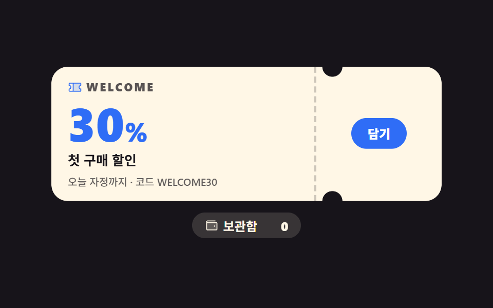
このデモが属する記事
 クーポン デザイン 9選 — スタンプからルーレットまでクーポン デザインとは、割引を配るための見た目(チケット、スタンプカード、ルーレット、スクラッチ)をHTMLとCSSで組み立てる仕事です。9つとも480×300の舞台で実際に動かして測り、320px幅でもはみ出さないところまで直してあります この記事のデモをすべて見る