クーポン デザイン 9選 — スタンプからルーレットまで
クーポン デザインとは、割引を配るための見た目(チケット、スタンプカード、ルーレット、スクラッチ)をHTMLとCSSで組み立てる仕事です。9つとも480×300の舞台で実際に動かして測り、320px幅でもはみ出さないところまで直してあります。
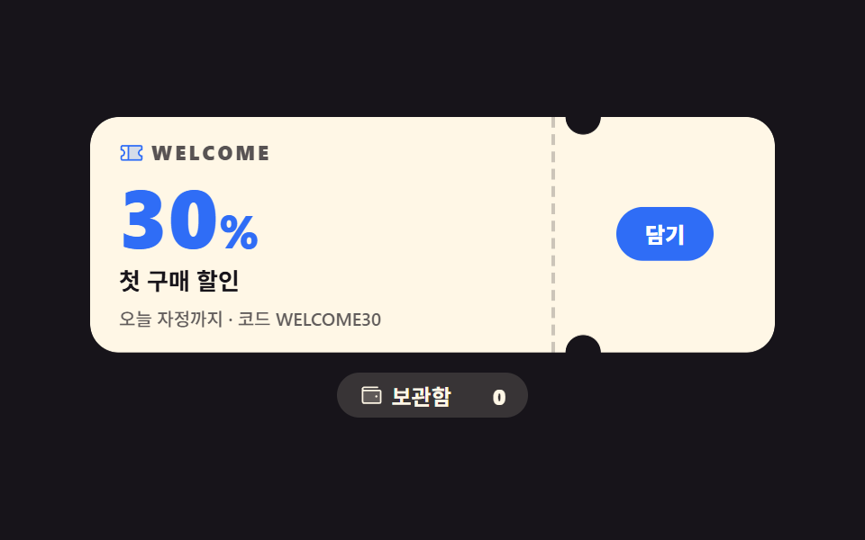 01 coupon-ticket-notch
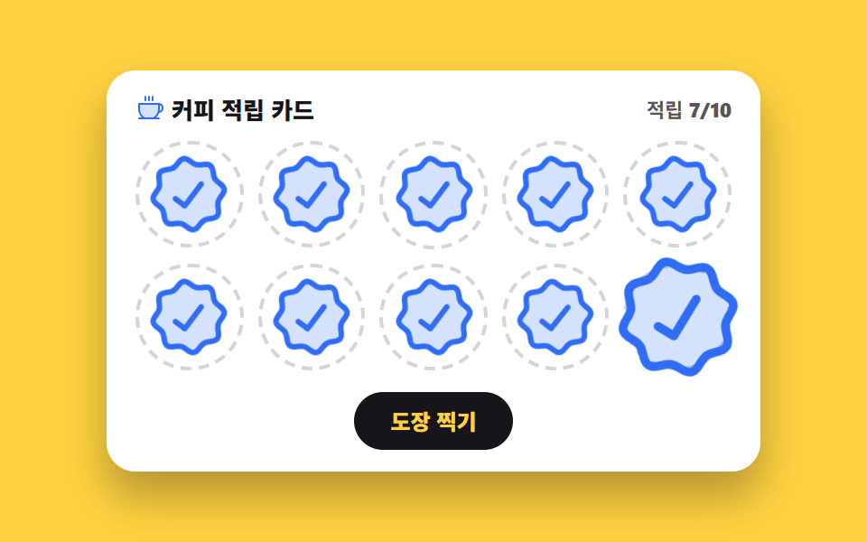 02 coupon-stamp-card
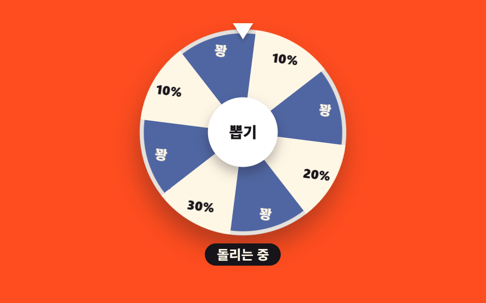 03 coupon-spin-wheel
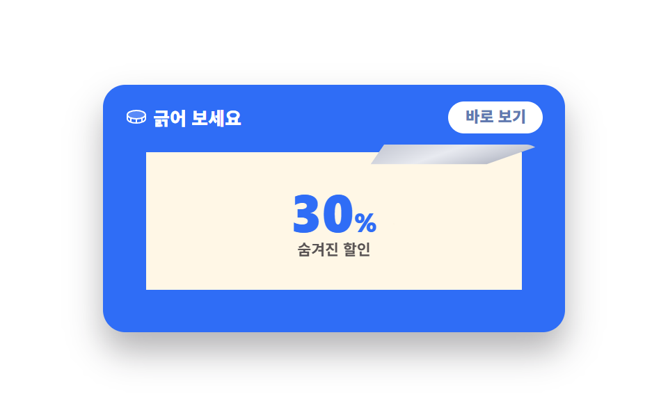 04 coupon-scratch-reveal
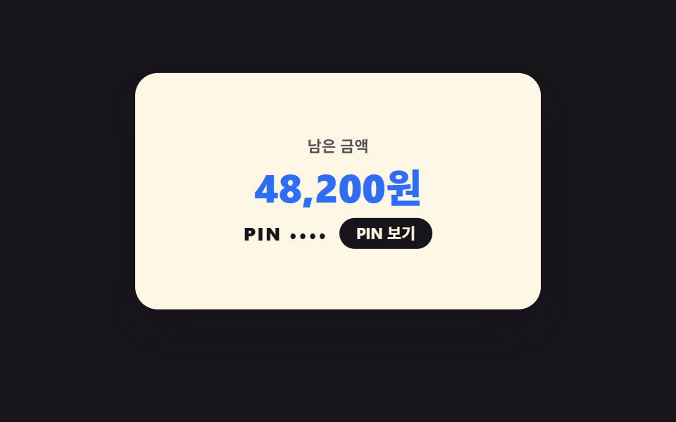 05 coupon-giftcard-flip
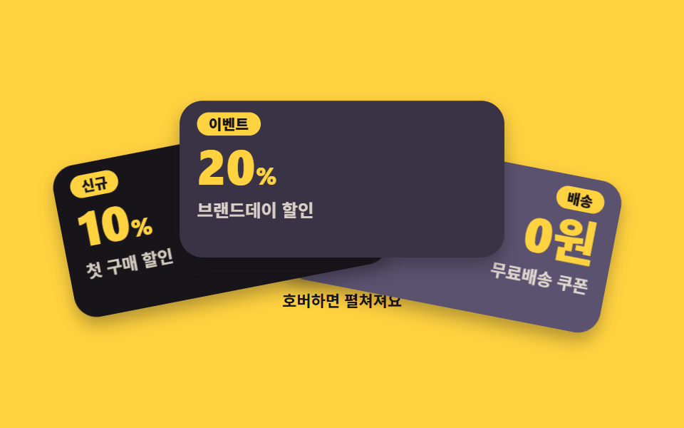 06 coupon-stack-fan
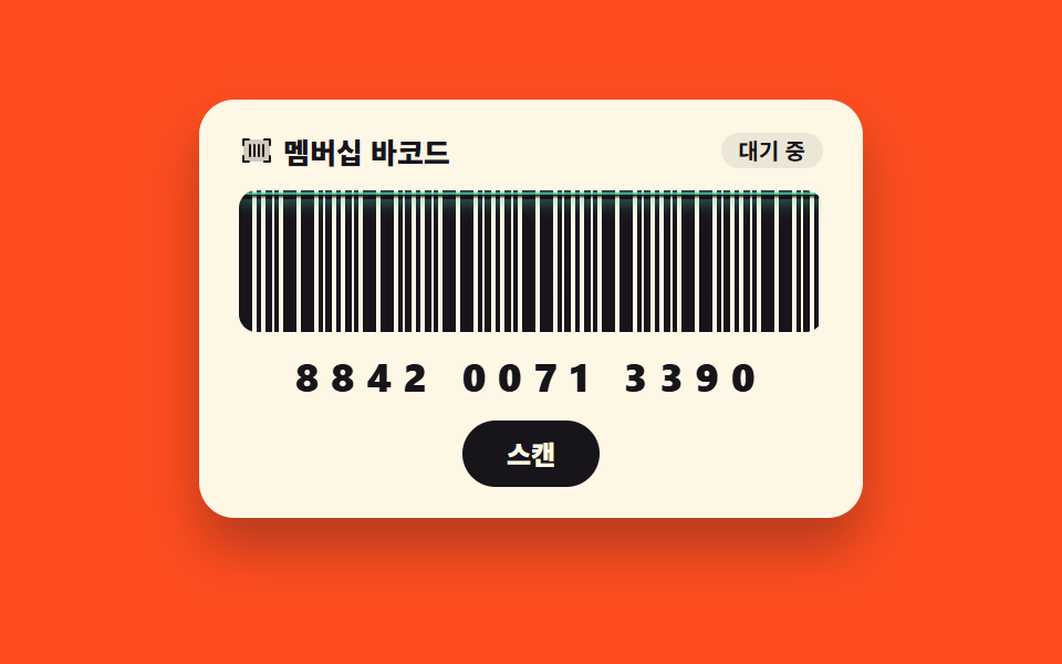 07 coupon-barcode-scan
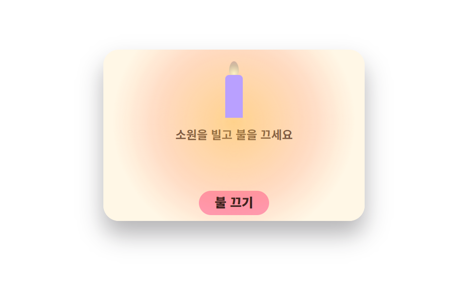 08 coupon-birthday-candle
 09 coupon-expiry-fade
自動再生 · タイルを押すとその項目へ · すべて1つのzip
- 01 ノッチ付きチケットクーポン
- 02 スタンプカード
- 03 ルーレットクーポン
- 04 スクラッチクーポン
- 05 ギフトカードの反転
- 06 クーポン束の扇ひろげ
- 07 バーコードスキャンクーポン
- 08 誕生日クーポン
- 09 期限間近クーポン
9つは クーポン デザイン テンプレート の技術の難しさ順ではなく、買い物客がクーポンに出会う順に並べています。まず手元に受け取る3つ — ミシン目の付いたチケットを保存する01、通うたびに枠が埋まるスタンプカード02、盤を回して割引を引くルーレット03。次は「開けてみる」楽しみの3つ — コインで削るスクラッチ04、裏に残高とPINを隠したギフトカード05、3枚を扇状に広げて見比べるウォレット06。最後は使い切るまでの3つ — レジで読ませるバーコード07、ろうそくを消すと割引が確定する誕生日カード08、0秒になるとグレーに沈む期限間近クーポン09です。舞台色は墨・イエロー・オレンジ・紙で回し、隣り合う2つが同じ明るさにならないようにしました。カートに載せたあとの割引行や合計の見せ方は決済画面 デザイン 9選、配ったクーポンをメールの中でどう組むかはメルマガ デザイン 9種、「新規」「送料無料」のような小さなラベルはステータス バッジ UI 9選が受け持ちます。同じ紙の箱を記事の中に敷けば引用 デザインになり、配ったクーポンがどれだけ使われたかを数字で読み返す席はダッシュボード グラフの操作が担います。
01ノッチ付きチケットクーポン
クーポン デザイン css で何が見えるか
ミシン目の上下にある半円のえぐれは画像ではなく、radial-gradientを2枚重ねたmaskで前面を本当にくり抜いています。プレビューではカードが2秒かけて4px上下し、45%で「保存」が「保存済み」へ、54%でウォレットの数字が0から1へ切り替わります(面積変化5.972%、23フレーム中23フレームが動きます)。
<main class="stage">
<div class="tk is-demo" id="tk">
  <div class="tk__card" aria-label="初回購入30%チケットクーポン">
    <div class="tk__main">
      <p class="tk__brand"><svg xmlns="http://www.w3.org/2000/svg" viewBox="0 0 256 256" fill="currentColor" class="tk__ico" aria-hidden="true"><path d="M200,128a32,32,0,0,0,32,32v32a8,8,0,0,1-8,8H96V56H224a8,8,0,0,1,8,8V96A32,32,0,0,0,200,128Z" opacity="0.2"/><path d="M232,104a8,8,0,0,0,8-8V64a16,16,0,0,0-16-16H32A16,16,0,0,0,16,64V96a8,8,0,0,0,8,8,24,24,0,0,1,0,48,8,8,0,0,0-8,8v32a16,16,0,0,0,16,16H224a16,16,0,0,0,16-16V160a8,8,0,0,0-8-8,24,24,0,0,1,0-48ZM32,167.2a40,40,0,0,0,0-78.4V64H88V192H32Zm192,0V192H104V64H224V88.8a40,40,0,0,0,0,78.4Z"/></svg><span>WELCOME</span></p>
      <p class="tk__pct">30<i>%</i></p>
      <p class="tk__label">初回購入割引</p>
      <p class="tk__meta">今日の24時まで · コードWELCOME30</p>
    </div>
    <div class="tk__stub">
      <button type="button" class="tk__btn" id="saveBtn" aria-pressed="false" aria-label="クーポンをウォレットに保存">
        <span class="tk__btnLabel tk__btnLabel--save">保存</span>
        <span class="tk__btnLabel tk__btnLabel--done" aria-hidden="true"><svg xmlns="http://www.w3.org/2000/svg" viewBox="0 0 256 256" fill="currentColor" class="tk__tick" aria-hidden="true"><path d="M232,56V200a16,16,0,0,1-16,16H40a16,16,0,0,1-16-16V56A16,16,0,0,1,40,40H216A16,16,0,0,1,232,56Z" opacity="0.2"/><path d="M205.66,85.66l-96,96a8,8,0,0,1-11.32,0l-40-40a8,8,0,0,1,11.32-11.32L104,164.69l90.34-90.35a8,8,0,0,1,11.32,11.32Z"/></svg>保存済み</span>
      </button>
    </div>
  </div>
  <p class="tk__wallet" id="wallet" aria-live="polite">
    <svg xmlns="http://www.w3.org/2000/svg" viewBox="0 0 256 256" fill="currentColor" class="tk__ico" aria-hidden="true"><path d="M224,80V192a8,8,0,0,1-8,8H56a16,16,0,0,1-16-16V56A16,16,0,0,0,56,72H216A8,8,0,0,1,224,80Z" opacity="0.2"/><path d="M216,64H56a8,8,0,0,1,0-16H192a8,8,0,0,0,0-16H56A24,24,0,0,0,32,56V184a24,24,0,0,0,24,24H216a16,16,0,0,0,16-16V80A16,16,0,0,0,216,64Zm0,128H56a8,8,0,0,1-8-8V78.63A23.84,23.84,0,0,0,56,80H216Zm-48-60a12,12,0,1,1,12,12A12,12,0,0,1,168,132Z"/></svg>
    <span>ウォレット</span>
    <span class="tk__count"><b class="tk__num tk__num--zero" aria-hidden="true">0</b><b class="tk__num tk__num--one" aria-hidden="true">1</b><span class="tk__srNum" id="srNum">0枚</span></span>
  </p>
</div>
</main>
@use "../../../../site/static/demo-tokens" as *;
// 노치 티켓 쿠폰 — 반원 노치는 mask + radial-gradient 로 진짜로 파고,
// 재단선은 점선 border. 격자 미리보기(.is-demo)는 2초 루프로 담기 동작을 보여준다.
$duration: $dur-loop;
$easing: $ease-pop;
$color: $subject-blue;
@include stage($stage-ink);
.tk { display: flex; flex-direction: column; align-items: center; gap: $sp-2; width: 100%; }
.tk__card {
display: flex; width: min(100%, 380px); background: $subject-cream; border-radius: $r-card;
box-shadow: $shadow-raised; overflow: hidden;
// 반원 노치 두 개 — 오른쪽 경계 72% 지점 위·아래. mask-composite 로 두 구멍을 동시에.
-webkit-mask:
radial-gradient(circle 10px at 72% 0, transparent 96%, #000 100%),
radial-gradient(circle 10px at 72% 100%, transparent 96%, #000 100%);
-webkit-mask-composite: destination-in;
mask:
radial-gradient(circle 10px at 72% 0, transparent 96%, #000 100%),
radial-gradient(circle 10px at 72% 100%, transparent 96%, #000 100%);
mask-composite: intersect;
}
.tk.is-demo .tk__card { animation: tkFloat 2s ease-in-out infinite; }
.tk__main { flex: 1 1 72%; padding: $sp-3 $sp-4; min-width: 0; }
.tk__brand { display: flex; align-items: center; gap: $sp-1; margin: 0; font-weight: 800; font-size: clamp(9px, 2.6vw, 11px); letter-spacing: .14em; color: rgba(23,20,26,.72); }
.tk__ico { width: 14px; height: 14px; flex: 0 0 auto; color: $subject-blue; }
.tk__pct { margin: $sp-1 0 0; font-weight: 800; font-size: clamp(34px, 10vw, 46px); line-height: 1; color: $subject-blue; }
.tk__pct i { font-style: normal; font-size: .55em; }
.tk__label { margin: $sp-1 0 0; font-weight: 700; font-size: clamp(11px, 3.2vw, 13px); color: $subject-ink; }
.tk__meta { margin: $sp-1 0 0; font-weight: 500; font-size: clamp(9px, 2.6vw, 10px); color: rgba(23,20,26,.68); }
.tk__stub {
flex: 0 0 28%; border-left: 2px dashed rgba(23,20,26,.22);
display: flex; align-items: center; justify-content: center; padding: $sp-3 $sp-2;
}
.tk__btn {
position: relative; border: 0; cursor: pointer; background: $subject-blue; color: $stage-paper;
border-radius: $r-pill; font-weight: 800; font-size: clamp(11px, 3vw, 12px);
padding: $sp-2 $sp-4; font-family: inherit; line-height: 1.2;
transition: transform 140ms cubic-bezier(.2,.8,.2,1);
}
.tk__btn:focus-visible { outline: 3px solid $stage-yellow; outline-offset: 2px; }
.tk__btnLabel { display: inline-flex; align-items: center; gap: 4px; }
.tk__btnLabel--done { position: absolute; inset: 0; justify-content: center; visibility: hidden; }
.tk.is-saved .tk__btnLabel--save { visibility: hidden; }
.tk.is-saved .tk__btnLabel--done { visibility: visible; }
.tk__tick { width: 12px; height: 12px; }
.tk__wallet {
display: inline-flex; align-items: center; gap: $sp-1; margin: 0;
background: rgba(255,247,230,.14); color: $subject-cream; border-radius: $r-pill;
padding: $sp-1 $sp-3; font-weight: 700; font-size: clamp(10px, 2.8vw, 12px);
}
.tk__wallet .tk__ico { color: $subject-cream; }
.tk__count { position: relative; display: inline-block; min-width: 2.2em; text-align: right; font-weight: 800; }
.tk__num { position: absolute; right: 0; top: 50%; transform: translateY(-50%); }
.tk__num--one { visibility: hidden; }
.tk.is-saved .tk__num--zero { visibility: hidden; }
.tk.is-saved .tk__num--one { visibility: visible; }
.tk__srNum { position: absolute; width: 1px; height: 1px; overflow: hidden; clip-path: inset(50%); margin: 0; }
// ── 격자 미리보기 루프: 카드 둥둥(연속) + 버튼 눌림(42%) + 보관함 숫자 컷(55%) → 90% 복귀
@keyframes tkFloat { 0%, 100% { transform: translateY(0); } 50% { transform: translateY(-4px); } }
.tk.is-demo .tk__btn { animation: tkPress 2s $easing infinite; }
@keyframes tkPress {
0%, 40% { transform: scale(1); }
43% { transform: scale(.9); }
47%, 100% { transform: scale(1); }
}
.tk.is-demo .tk__btnLabel--save { animation: tkCutSave 2s steps(1, end) infinite; }
@keyframes tkCutSave { 0%, 45% { visibility: visible; } 45.5%, 89% { visibility: hidden; } 89.5%, 100% { visibility: visible; } }
.tk.is-demo .tk__btnLabel--done { animation: tkCutDone 2s steps(1, end) infinite; }
@keyframes tkCutDone { 0%, 45% { visibility: hidden; } 45.5%, 89% { visibility: visible; } 89.5%, 100% { visibility: hidden; } }
.tk.is-demo .tk__num--zero { animation: tkCutZero 2s steps(1, end) infinite; }
@keyframes tkCutZero { 0%, 54% { visibility: visible; } 54.5%, 89% { visibility: hidden; } 89.5%, 100% { visibility: visible; } }
.tk.is-demo .tk__num--one { animation: tkCutOne 2s steps(1, end) infinite; }
@keyframes tkCutOne { 0%, 54% { visibility: hidden; } 54.5%, 89% { visibility: visible; } 89.5%, 100% { visibility: hidden; } }
@media (max-width: 340px) {
.tk__main { padding: $sp-2 $sp-3; }
.tk__stub { padding: $sp-2 $sp-1; }
}
@media (prefers-reduced-motion: reduce) {
.tk.is-demo .tk__card,
.tk.is-demo .tk__btn,
.tk.is-demo .tk__btnLabel--save,
.tk.is-demo .tk__btnLabel--done,
.tk.is-demo .tk__num--zero,
.tk.is-demo .tk__num--one { animation: none !important; }
.tk__btn { transition: none !important; }
}html, body {
margin: 0;
overflow: hidden;
}
.stage {
box-sizing: border-box;
min-height: 100vh;
display: grid;
place-items: center;
margin: 0;
background: #17141a;
font-family: -apple-system, "Segoe UI", "Noto Sans KR", sans-serif;
padding: clamp(8px, 4vw, 24px);
}
.tk {
display: flex;
flex-direction: column;
align-items: center;
gap: 8px;
width: 100%;
}
.tk__card {
display: flex;
width: min(100%, 380px);
background: #fff7e6;
border-radius: 16px;
box-shadow: 0 14px 24px rgba(23, 20, 26, 0.32);
overflow: hidden;
-webkit-mask: radial-gradient(circle 10px at 72% 0, transparent 96%, #000 100%), radial-gradient(circle 10px at 72% 100%, transparent 96%, #000 100%);
-webkit-mask-composite: destination-in;
mask: radial-gradient(circle 10px at 72% 0, transparent 96%, #000 100%), radial-gradient(circle 10px at 72% 100%, transparent 96%, #000 100%);
mask-composite: intersect;
}
.tk.is-demo .tk__card {
animation: tkFloat 2s ease-in-out infinite;
}
.tk__main {
flex: 1 1 72%;
padding: 12px 16px;
min-width: 0;
}
.tk__brand {
display: flex;
align-items: center;
gap: 4px;
margin: 0;
font-weight: 800;
font-size: clamp(9px, 2.6vw, 11px);
letter-spacing: 0.14em;
color: rgba(23, 20, 26, 0.72);
}
.tk__ico {
width: 14px;
height: 14px;
flex: 0 0 auto;
color: #2f6df6;
}
.tk__pct {
margin: 4px 0 0;
font-weight: 800;
font-size: clamp(34px, 10vw, 46px);
line-height: 1;
color: #2f6df6;
}
.tk__pct i {
font-style: normal;
font-size: 0.55em;
}
.tk__label {
margin: 4px 0 0;
font-weight: 700;
font-size: clamp(11px, 3.2vw, 13px);
color: #17141a;
}
.tk__meta {
margin: 4px 0 0;
font-weight: 500;
font-size: clamp(9px, 2.6vw, 10px);
color: rgba(23, 20, 26, 0.68);
}
.tk__stub {
flex: 0 0 28%;
border-left: 2px dashed rgba(23, 20, 26, 0.22);
display: flex;
align-items: center;
justify-content: center;
padding: 12px 8px;
}
.tk__btn {
position: relative;
border: 0;
cursor: pointer;
background: #2f6df6;
color: #ffffff;
border-radius: 999px;
font-weight: 800;
font-size: clamp(11px, 3vw, 12px);
padding: 8px 16px;
font-family: inherit;
line-height: 1.2;
transition: transform 140ms cubic-bezier(0.2, 0.8, 0.2, 1);
}
.tk__btn:focus-visible {
outline: 3px solid #ffd23f;
outline-offset: 2px;
}
.tk__btnLabel {
display: inline-flex;
align-items: center;
gap: 4px;
}
.tk__btnLabel--done {
position: absolute;
inset: 0;
justify-content: center;
visibility: hidden;
}
.tk.is-saved .tk__btnLabel--save {
visibility: hidden;
}
.tk.is-saved .tk__btnLabel--done {
visibility: visible;
}
.tk__tick {
width: 12px;
height: 12px;
}
.tk__wallet {
display: inline-flex;
align-items: center;
gap: 4px;
margin: 0;
background: rgba(255, 247, 230, 0.14);
color: #fff7e6;
border-radius: 999px;
padding: 4px 12px;
font-weight: 700;
font-size: clamp(10px, 2.8vw, 12px);
}
.tk__wallet .tk__ico {
color: #fff7e6;
}
.tk__count {
position: relative;
display: inline-block;
min-width: 2.2em;
text-align: right;
font-weight: 800;
}
.tk__num {
position: absolute;
right: 0;
top: 50%;
transform: translateY(-50%);
}
.tk__num--one {
visibility: hidden;
}
.tk.is-saved .tk__num--zero {
visibility: hidden;
}
.tk.is-saved .tk__num--one {
visibility: visible;
}
.tk__srNum {
position: absolute;
width: 1px;
height: 1px;
overflow: hidden;
clip-path: inset(50%);
margin: 0;
}
@keyframes tkFloat {
0%, 100% {
transform: translateY(0);
}
50% {
transform: translateY(-4px);
}
}
.tk.is-demo .tk__btn {
animation: tkPress 2s cubic-bezier(0.2, 1.4, 0.4, 1) infinite;
}
@keyframes tkPress {
0%, 40% {
transform: scale(1);
}
43% {
transform: scale(0.9);
}
47%, 100% {
transform: scale(1);
}
}
.tk.is-demo .tk__btnLabel--save {
animation: tkCutSave 2s steps(1, end) infinite;
}
@keyframes tkCutSave {
0%, 45% {
visibility: visible;
}
45.5%, 89% {
visibility: hidden;
}
89.5%, 100% {
visibility: visible;
}
}
.tk.is-demo .tk__btnLabel--done {
animation: tkCutDone 2s steps(1, end) infinite;
}
@keyframes tkCutDone {
0%, 45% {
visibility: hidden;
}
45.5%, 89% {
visibility: visible;
}
89.5%, 100% {
visibility: hidden;
}
}
.tk.is-demo .tk__num--zero {
animation: tkCutZero 2s steps(1, end) infinite;
}
@keyframes tkCutZero {
0%, 54% {
visibility: visible;
}
54.5%, 89% {
visibility: hidden;
}
89.5%, 100% {
visibility: visible;
}
}
.tk.is-demo .tk__num--one {
animation: tkCutOne 2s steps(1, end) infinite;
}
@keyframes tkCutOne {
0%, 54% {
visibility: hidden;
}
54.5%, 89% {
visibility: visible;
}
89.5%, 100% {
visibility: hidden;
}
}
@media (max-width: 340px) {
.tk__main {
padding: 8px 12px;
}
.tk__stub {
padding: 8px 4px;
}
}
@media (prefers-reduced-motion: reduce) {
.tk.is-demo .tk__card,
.tk.is-demo .tk__btn,
.tk.is-demo .tk__btnLabel--save,
.tk.is-demo .tk__btnLabel--done,
.tk.is-demo .tk__num--zero,
.tk.is-demo .tk__num--one {
animation: none !important;
}
.tk__btn {
transition: none !important;
}
}var tk = document.getElementById('tk');
var saveBtn = document.getElementById('saveBtn');
var srNum = document.getElementById('srNum');
saveBtn.addEventListener('click', function () {
tk.classList.remove('is-demo');
var saved = tk.classList.toggle('is-saved');
saveBtn.setAttribute('aria-pressed', saved ? 'true' : 'false');
srNum.textContent = saved ? '1枚' : '0枚';
});// TicketNotchCoupon — vanilla 판(run/283/demo/01-coupon-ticket-notch/index.html) 의 React 포트.
// 반원 노치는 mask + radial-gradient 로 진짜로 파고, 재단선은 점선 border.
// 담기를 누르면 미리보기 루프가 꺼지고 보관함 장수가 0↔1 로 바뀐다(vanilla 와 같은 동작).
import { useState } from "react";
import type { CSSProperties } from "react";
import styles from "./TicketNotchCoupon.module.scss";
export type TicketNotchCouponProps = {
/** 격자 미리보기용 2초 자동 루프. 사람이 손대면 꺼진다 */
demo?: boolean;
duration?: number;
easing?: string;
color?: string;
};
type Vars = CSSProperties & { "--duration"?: string; "--easing"?: string; "--color"?: string };
export default function TicketNotchCoupon({
demo = true,
duration = 2000,
easing = "cubic-bezier(.2, 1.4, .4, 1)",
color = "#2f6df6",
}: TicketNotchCouponProps) {
const [live, setLive] = useState(demo);
const [saved, setSaved] = useState(false);
const vars: Vars = { "--duration": `${duration}ms`, "--easing": easing, "--color": color };
// vanilla 의 click 핸들러와 같은 순서: 미리보기 루프를 떼고 보관 상태를 뒤집는다
function applySave() {
setLive(false);
setSaved((prev: boolean) => !prev);
}
const cls = [styles.root, live ? styles.isDemo : "", saved ? styles.isSaved : ""].filter(Boolean).join(" ");
return (
<main className={styles.stage} style={vars}>
<div className={cls}>
<div className={styles.card} aria-label="첫 구매 30% 티켓 쿠폰">
<div className={styles.main}>
<p className={styles.brand}>
<svg xmlns="http://www.w3.org/2000/svg" viewBox="0 0 256 256" fill="currentColor" className={styles.ico} aria-hidden="true">
<path d="M200,128a32,32,0,0,0,32,32v32a8,8,0,0,1-8,8H96V56H224a8,8,0,0,1,8,8V96A32,32,0,0,0,200,128Z" opacity="0.2" />
<path d="M232,104a8,8,0,0,0,8-8V64a16,16,0,0,0-16-16H32A16,16,0,0,0,16,64V96a8,8,0,0,0,8,8,24,24,0,0,1,0,48,8,8,0,0,0-8,8v32a16,16,0,0,0,16,16H224a16,16,0,0,0,16-16V160a8,8,0,0,0-8-8,24,24,0,0,1,0-48ZM32,167.2a40,40,0,0,0,0-78.4V64H88V192H32Zm192,0V192H104V64H224V88.8a40,40,0,0,0,0,78.4Z" />
</svg>
<span>WELCOME</span>
</p>
<p className={styles.pct}>30<i>%</i></p>
<p className={styles.label}>첫 구매 할인</p>
<p className={styles.meta}>오늘 자정까지 · 코드 WELCOME30</p>
</div>
<div className={styles.stub}>
<button
type="button"
className={styles.btn}
aria-pressed={saved ? "true" : "false"}
aria-label="쿠폰 보관함에 담기"
onClick={applySave}
>
<span className={`${styles.btnLabel} ${styles.btnLabelSave}`}>담기</span>
<span className={`${styles.btnLabel} ${styles.btnLabelDone}`} aria-hidden="true">
<svg xmlns="http://www.w3.org/2000/svg" viewBox="0 0 256 256" fill="currentColor" className={styles.tick} aria-hidden="true">
<path d="M232,56V200a16,16,0,0,1-16,16H40a16,16,0,0,1-16-16V56A16,16,0,0,1,40,40H216A16,16,0,0,1,232,56Z" opacity="0.2" />
<path d="M205.66,85.66l-96,96a8,8,0,0,1-11.32,0l-40-40a8,8,0,0,1,11.32-11.32L104,164.69l90.34-90.35a8,8,0,0,1,11.32,11.32Z" />
</svg>담김
</span>
</button>
</div>
</div>
<p className={styles.wallet} aria-live="polite">
<svg xmlns="http://www.w3.org/2000/svg" viewBox="0 0 256 256" fill="currentColor" className={styles.ico} aria-hidden="true">
<path d="M224,80V192a8,8,0,0,1-8,8H56a16,16,0,0,1-16-16V56A16,16,0,0,0,56,72H216A8,8,0,0,1,224,80Z" opacity="0.2" />
<path d="M216,64H56a8,8,0,0,1,0-16H192a8,8,0,0,0,0-16H56A24,24,0,0,0,32,56V184a24,24,0,0,0,24,24H216a16,16,0,0,0,16-16V80A16,16,0,0,0,216,64Zm0,128H56a8,8,0,0,1-8-8V78.63A23.84,23.84,0,0,0,56,80H216Zm-48-60a12,12,0,1,1,12,12A12,12,0,0,1,168,132Z" />
</svg>
<span>보관함</span>
<span className={styles.count}>
<b className={`${styles.num} ${styles.numZero}`} aria-hidden="true">0</b>
<b className={`${styles.num} ${styles.numOne}`} aria-hidden="true">1</b>
<span className={styles.srNum}>{saved ? "1장" : "0장"}</span>
</span>
</p>
</div>
</main>
);
}01 · ノッチ付きチケットクーポン — 計測 累積面積 5.972% · 動いたフレーム 23/23GODRICH オリジナル · SCSS と React は zip に同梱 · パスワードを見る
コードのどこを見るか
初回購入クーポンのダウンロードカードや、LPのクーポンカードに使います。
.tk__card {
  display: flex; width: min(100%, 380px); background: $subject-cream; border-radius: $r-card;
  box-shadow: $shadow-raised; overflow: hidden;
  // 半円のノッチ2つ — 右の境界72%の位置の上と下。mask-composite で2つの穴を同時に
  -webkit-mask:
    radial-gradient(circle 10px at 72% 0, transparent 96%, #000 100%),
    radial-gradient(circle 10px at 72% 100%, transparent 96%, #000 100%);
  -webkit-mask-composite: destination-in;
  mask:
    radial-gradient(circle 10px at 72% 0, transparent 96%, #000 100%),
    radial-gradient(circle 10px at 72% 100%, transparent 96%, #000 100%);
  mask-composite: intersect;
}
02スタンプカード
画面で起きること
スタンプは1.6倍の大きさ・-14degの傾きから、1倍・-8degへ叩き込まれます。プレビューでは10枠が120ms差で順に埋まり、72%で「スタンプを押す」ボタンが消えて発行チップが跳ね出ます(面積変化19.372%、23フレーム中19フレームが動きます)。
<svg width="0" height="0" style="position:absolute" aria-hidden="true">
  <defs>
    <symbol id="seal" viewBox="0 0 256 256" fill="currentColor"><path d="M232,128c0,12.51-17.82,21.95-22.68,33.69-4.68,11.32,1.42,30.65-7.78,39.85s-28.53,3.1-39.85,7.78C150,214.18,140.5,232,128,232s-22-17.82-33.69-22.68c-11.32-4.68-30.65,1.42-39.85-7.78s-3.1-28.53-7.78-39.85C41.82,150,24,140.5,24,128s17.82-22,22.68-33.69C51.36,83,45.26,63.66,54.46,54.46S83,51.36,94.31,46.68C106.05,41.82,115.5,24,128,24S150,41.82,161.69,46.68c11.32,4.68,30.65-1.42,39.85,7.78s3.1,28.53,7.78,39.85C214.18,106.05,232,115.5,232,128Z" opacity="0.2"/><path d="M225.86,102.82c-3.77-3.94-7.67-8-9.14-11.57-1.36-3.27-1.44-8.69-1.52-13.94-.15-9.76-.31-20.82-8-28.51s-18.75-7.85-28.51-8c-5.25-.08-10.67-.16-13.94-1.52-3.56-1.47-7.63-5.37-11.57-9.14C146.28,23.51,138.44,16,128,16s-18.27,7.51-25.18,14.14c-3.94,3.77-8,7.67-11.57,9.14C88,40.64,82.56,40.72,77.31,40.8c-9.76.15-20.82.31-28.51,8S41,67.55,40.8,77.31c-.08,5.25-.16,10.67-1.52,13.94-1.47,3.56-5.37,7.63-9.14,11.57C23.51,109.72,16,117.56,16,128s7.51,18.27,14.14,25.18c3.77,3.94,7.67,8,9.14,11.57,1.36,3.27,1.44,8.69,1.52,13.94.15,9.76.31,20.82,8,28.51s18.75,7.85,28.51,8c5.25.08,10.67.16,13.94,1.52,3.56,1.47,7.63,5.37,11.57,9.14C109.72,232.49,117.56,240,128,240s18.27-7.51,25.18-14.14c3.94-3.77,8-7.67,11.57-9.14,3.27-1.36,8.69-1.44,13.94-1.52,9.76-.15,20.82-.31,28.51-8s7.85-18.75,8-28.51c.08-5.25.16-10.67,1.52-13.94,1.47-3.56,5.37-7.63,9.14-11.57C232.49,146.28,240,138.44,240,128S232.49,109.73,225.86,102.82Zm-11.55,39.29c-4.79,5-9.75,10.17-12.38,16.52-2.52,6.1-2.63,13.07-2.73,19.82-.1,7-.21,14.33-3.32,17.43s-10.39,3.22-17.43,3.32c-6.75.1-13.72.21-19.82,2.73-6.35,2.63-11.52,7.59-16.52,12.38S132,224,128,224s-9.15-4.92-14.11-9.69-10.17-9.75-16.52-12.38c-6.1-2.52-13.07-2.63-19.82-2.73-7-.1-14.33-.21-17.43-3.32s-3.22-10.39-3.32-17.43c-.1-6.75-.21-13.72-2.73-19.82-2.63-6.35-7.59-11.52-12.38-16.52S32,132,32,128s4.92-9.15,9.69-14.11,9.75-10.17,12.38-16.52c2.52-6.1,2.63-13.07,2.73-19.82.1-7,.21-14.33,3.32-17.43S70.51,56.9,77.55,56.8c6.75-.1,13.72-.21,19.82-2.73,6.35-2.63,11.52-7.59,16.52-12.38S124,32,128,32s9.15,4.92,14.11,9.69,10.17,9.75,16.52,12.38c6.1,2.52,13.07,2.63,19.82,2.73,7,.1,14.33.21,17.43,3.32s3.22,10.39,3.32,17.43c.1,6.75.21,13.72,2.73,19.82,2.63,6.35,7.59,11.52,12.38,16.52S224,124,224,128,219.08,137.15,214.31,142.11ZM173.66,98.34a8,8,0,0,1,0,11.32l-56,56a8,8,0,0,1-11.32,0l-24-24a8,8,0,0,1,11.32-11.32L112,148.69l50.34-50.35A8,8,0,0,1,173.66,98.34Z"/></symbol>
    <symbol id="coffee" viewBox="0 0 256 256" fill="currentColor"><path d="M208,88v48a88,88,0,0,1-51.3,80H83.3A88,88,0,0,1,32,136V88Z" opacity="0.2"/><path d="M80,56V24a8,8,0,0,1,16,0V56a8,8,0,0,1-16,0Zm40,8a8,8,0,0,0,8-8V24a8,8,0,0,0-16,0V56A8,8,0,0,0,120,64Zm32,0a8,8,0,0,0,8-8V24a8,8,0,0,0-16,0V56A8,8,0,0,0,152,64Zm96,56v8a40,40,0,0,1-37.51,39.91,96.59,96.59,0,0,1-27,40.09H208a8,8,0,0,1,0,16H32a8,8,0,0,1,0-16H56.54A96.3,96.3,0,0,1,24,136V88a8,8,0,0,1,8-8H208A40,40,0,0,1,248,120ZM200,96H40v40a80.27,80.27,0,0,0,45.12,72h69.76A80.27,80.27,0,0,0,200,136Zm32,24a24,24,0,0,0-16-22.62V136a95.78,95.78,0,0,1-1.2,15A24,24,0,0,0,232,128Z"/></symbol>
  </defs>
</svg>
<main class="stage">
<div class="sp is-demo" id="sp">
  <div class="sp__card">
    <div class="sp__head">
      <p class="sp__title"><svg class="sp__ico" aria-hidden="true"><use href="#coffee"/></svg><span>コーヒーのスタンプカード</span></p>
      <p class="sp__count"><span>スタンプ</span> <b id="countNum">7/10</b></p>
    </div>
    <div class="sp__grid" role="progressbar" aria-label="スタンプの進み具合" aria-valuemin="0" aria-valuemax="10" aria-valuenow="7" id="bar">

      <span class="sp__slot"><span class="sp__stamp sp__stamp--in"><svg aria-hidden="true"><use href="#seal"/></svg></span></span>
      <span class="sp__slot"><span class="sp__stamp sp__stamp--in"><svg aria-hidden="true"><use href="#seal"/></svg></span></span>
      <span class="sp__slot"><span class="sp__stamp sp__stamp--in"><svg aria-hidden="true"><use href="#seal"/></svg></span></span>
      <span class="sp__slot"><span class="sp__stamp sp__stamp--in"><svg aria-hidden="true"><use href="#seal"/></svg></span></span>
      <span class="sp__slot"><span class="sp__stamp sp__stamp--in"><svg aria-hidden="true"><use href="#seal"/></svg></span></span>
      <span class="sp__slot"><span class="sp__stamp sp__stamp--in"><svg aria-hidden="true"><use href="#seal"/></svg></span></span>
      <span class="sp__slot"><span class="sp__stamp sp__stamp--in"><svg aria-hidden="true"><use href="#seal"/></svg></span></span>
      <span class="sp__slot"><span class="sp__stamp sp__stamp--in sp__stamp--idle"><svg aria-hidden="true"><use href="#seal"/></svg></span></span>
      <span class="sp__slot"><span class="sp__stamp sp__stamp--in sp__stamp--idle"><svg aria-hidden="true"><use href="#seal"/></svg></span></span>
      <span class="sp__slot"><span class="sp__stamp sp__stamp--in sp__stamp--idle"><svg aria-hidden="true"><use href="#seal"/></svg></span></span>
    </div>
    <div class="sp__foot">
      <button type="button" class="sp__btn" id="stampBtn">スタンプを押す</button>
      <p class="sp__issued" id="issued" aria-live="polite"><span class="sp__issuedChip">クーポン発行完了</span></p>
    </div>
  </div>
</div>
</main>@use "../../../../site/static/demo-tokens" as *;
// 스탬프 적립 카드 — 도장은 scale 2→1 내리찍기 + 살짝 기울임. 진행률은 aria-valuenow 에 반영.
// 격자 미리보기(.is-demo)는 열 도장이 순서대로 찍히고 마지막에 쿠폰 발급 배지가 뜨는 2초 루프.
$duration: $dur-loop;
$easing: $ease-pop;
$color: $subject-blue;
@include stage($stage-yellow);
.sp { display: flex; justify-content: center; width: 100%; }
.sp__card {
width: min(100%, 330px); background: $stage-paper; border-radius: $r-card;
box-shadow: $shadow-raised; padding: $sp-3 $sp-4; overflow: hidden;
}
.sp__head { display: flex; align-items: center; justify-content: space-between; gap: $sp-2; }
.sp__title { display: flex; align-items: center; gap: $sp-1; margin: 0; font-weight: 800; font-size: clamp(11px, 3.2vw, 13px); color: $subject-ink; }
.sp__ico { width: 16px; height: 16px; color: $subject-blue; }
.sp__count { margin: 0; font-weight: 700; font-size: clamp(10px, 2.8vw, 11px); color: rgba(23,20,26,.72); }
.sp__grid { display: grid; grid-template-columns: repeat(5, 1fr); gap: $sp-2; margin-top: $sp-2; }
.sp__slot {
display: flex; align-items: center; justify-content: center; aspect-ratio: 1;
border: 2px dashed rgba(23,20,26,.18); border-radius: 50%; min-width: 0;
}
.sp__stamp { display: flex; width: 88%; height: 88%; color: $subject-blue; }
.sp__stamp svg { width: 100%; height: 100%; }
.sp__stamp--in { transform: rotate(-8deg); }
.sp__slot:nth-child(3n) .sp__stamp--in { transform: rotate(5deg); }
.sp__slot:nth-child(4n) .sp__stamp--in { transform: rotate(-3deg); }
.sp__stamp--new { animation: spStampIn 300ms $easing both; transform-origin: 50% 50%; }
@keyframes spStampIn {
  0% { transform: scale(1.6) rotate(-14deg); }
  70% { transform: scale(.94) rotate(-6deg); }
  100% { transform: scale(1) rotate(-8deg); }
}
.sp__foot { position: relative; display: flex; justify-content: center; margin-top: $sp-3; min-height: 32px; }
.sp__btn {
border: 0; cursor: pointer; background: $subject-ink; color: $stage-yellow;
border-radius: $r-pill; font-weight: 800; font-size: clamp(11px, 3vw, 12px);
padding: $sp-2 $sp-5; font-family: inherit; line-height: 1.2;
transition: transform 140ms cubic-bezier(.2,.8,.2,1);
}
.sp__btn:active { transform: scale(.94); }
.sp__btn:focus-visible { outline: 3px solid $subject-blue; outline-offset: 2px; }
.sp__btn:disabled { cursor: default; }
.sp__issued { position: absolute; inset: 0; display: flex; align-items: center; justify-content: center; margin: 0; visibility: hidden; }
.sp__issued.is-on { visibility: visible; }
.sp__issuedChip {
background: #a86253; color: $subject-cream; border-radius: $r-pill;
font-weight: 800; font-size: clamp(11px, 3vw, 12px); padding: $sp-2 $sp-4;
animation: spBadgeIn 300ms $easing both;
}
@keyframes spBadgeIn { 0% { transform: scale(.4); } 70% { transform: scale(1.08); } 100% { transform: scale(1); } }
// ── 격자 미리보기 루프: 정적 도장 7개는 그대로 두고, 남은 3칸 + 리셋 컷으로 2초를 채운다.
// is-demo 동안은 정적 7개를 감추고 0→10 전체 시퀀스를 보여준다 (delay 는 낱개 속성 — 단축 리셋 함정).
.sp.is-demo .sp__stamp--in { visibility: hidden; }
.sp.is-demo .sp__slot:nth-child(n) .sp__stamp--in { animation: spLoop 2s ease-out infinite; animation-delay: calc(var(--k, 0) * 120ms); animation-fill-mode: backwards; }
.sp.is-demo .sp__slot:nth-child(1) .sp__stamp--in { --k: 0; }
.sp.is-demo .sp__slot:nth-child(2) .sp__stamp--in { --k: 1; }
.sp.is-demo .sp__slot:nth-child(3) .sp__stamp--in { --k: 2; }
.sp.is-demo .sp__slot:nth-child(4) .sp__stamp--in { --k: 3; }
.sp.is-demo .sp__slot:nth-child(5) .sp__stamp--in { --k: 4; }
.sp.is-demo .sp__slot:nth-child(6) .sp__stamp--in { --k: 5; }
.sp.is-demo .sp__slot:nth-child(7) .sp__stamp--in { --k: 6; }
.sp.is-demo .sp__slot:nth-child(8) .sp__stamp--in { --k: 7; }
.sp.is-demo .sp__slot:nth-child(9) .sp__stamp--in { --k: 8; }
.sp.is-demo .sp__slot:nth-child(10) .sp__stamp--in { --k: 9; }
// 슬롯 8~10 의 도장은 정적 상태에서는 비어 있는 칸으로 보이고 루프에서만 찍힌다
.sp:not(.is-demo) .sp__stamp--idle { visibility: hidden; }
@keyframes spLoop {
0% { visibility: hidden; transform: scale(1.6) rotate(-14deg); }
1.5% { visibility: visible; }
8% { transform: scale(.94) rotate(-6deg); }
12%, 96% { visibility: visible; transform: scale(1) rotate(-8deg); }
96.5%, 100% { visibility: hidden; transform: scale(1) rotate(-8deg); }
}
.sp.is-demo .sp__btn { animation: spBtnHide 2s steps(1, end) infinite; }
@keyframes spBtnHide { 0%, 72% { visibility: visible; } 72.5%, 96% { visibility: hidden; } 96.5%, 100% { visibility: visible; } }
.sp.is-demo .sp__issued { visibility: visible; }
.sp.is-demo .sp__issuedChip { animation: spBadgeLoop 2s ease-out infinite; }
@keyframes spBadgeLoop {
0%, 71% { transform: scale(0); }
74% { transform: scale(1.1); }
77%, 95% { transform: scale(1); }
97%, 100% { transform: scale(0); }
}
@media (max-width: 340px) {
.sp__card { padding: $sp-2 $sp-3; }
.sp__grid { gap: $sp-1; margin-top: $sp-1; }
.sp__foot { margin-top: $sp-1; min-height: 24px; }
.sp__slot { border-width: 1px; }
.sp__btn { padding: $sp-1 $sp-4; }
.sp__issuedChip { padding: $sp-1 $sp-3; }
}
@media (prefers-reduced-motion: reduce) {
.sp.is-demo .sp__slot .sp__stamp--in,
.sp.is-demo .sp__btn,
.sp.is-demo .sp__issuedChip,
.sp__stamp--new,
.sp__issuedChip { animation: none !important; }
.sp.is-demo .sp__stamp--in { visibility: visible !important; }
.sp__btn { transition: none !important; }
}html, body {
margin: 0;
overflow: hidden;
}
.stage {
box-sizing: border-box;
min-height: 100vh;
display: grid;
place-items: center;
margin: 0;
background: #ffd23f;
font-family: -apple-system, "Segoe UI", "Noto Sans KR", sans-serif;
padding: clamp(8px, 4vw, 24px);
}
.sp {
display: flex;
justify-content: center;
width: 100%;
}
.sp__card {
width: min(100%, 330px);
background: #ffffff;
border-radius: 16px;
box-shadow: 0 14px 24px rgba(23, 20, 26, 0.32);
padding: 12px 16px;
overflow: hidden;
}
.sp__head {
display: flex;
align-items: center;
justify-content: space-between;
gap: 8px;
}
.sp__title {
display: flex;
align-items: center;
gap: 4px;
margin: 0;
font-weight: 800;
font-size: clamp(11px, 3.2vw, 13px);
color: #17141a;
}
.sp__ico {
width: 16px;
height: 16px;
color: #2f6df6;
}
.sp__count {
margin: 0;
font-weight: 700;
font-size: clamp(10px, 2.8vw, 11px);
color: rgba(23, 20, 26, 0.72);
}
.sp__grid {
display: grid;
grid-template-columns: repeat(5, 1fr);
gap: 8px;
margin-top: 8px;
}
.sp__slot {
display: flex;
align-items: center;
justify-content: center;
aspect-ratio: 1;
border: 2px dashed rgba(23, 20, 26, 0.18);
border-radius: 50%;
min-width: 0;
}
.sp__stamp {
display: flex;
width: 88%;
height: 88%;
color: #2f6df6;
}
.sp__stamp svg {
width: 100%;
height: 100%;
}
.sp__stamp--in {
transform: rotate(-8deg);
}
.sp__slot:nth-child(3n) .sp__stamp--in {
transform: rotate(5deg);
}
.sp__slot:nth-child(4n) .sp__stamp--in {
transform: rotate(-3deg);
}
.sp__stamp--new {
animation: spStampIn 300ms cubic-bezier(0.2, 1.4, 0.4, 1) both;
transform-origin: 50% 50%;
}
@keyframes spStampIn {
0% {
transform: scale(1.6) rotate(-14deg);
}
70% {
transform: scale(0.94) rotate(-6deg);
}
100% {
transform: scale(1) rotate(-8deg);
}
}
.sp__foot {
position: relative;
display: flex;
justify-content: center;
margin-top: 12px;
min-height: 32px;
}
.sp__btn {
border: 0;
cursor: pointer;
background: #17141a;
color: #ffd23f;
border-radius: 999px;
font-weight: 800;
font-size: clamp(11px, 3vw, 12px);
padding: 8px 20px;
font-family: inherit;
line-height: 1.2;
transition: transform 140ms cubic-bezier(0.2, 0.8, 0.2, 1);
}
.sp__btn:active {
transform: scale(0.94);
}
.sp__btn:focus-visible {
outline: 3px solid #2f6df6;
outline-offset: 2px;
}
.sp__btn:disabled {
cursor: default;
}
.sp__issued {
position: absolute;
inset: 0;
display: flex;
align-items: center;
justify-content: center;
margin: 0;
visibility: hidden;
}
.sp__issued.is-on {
visibility: visible;
}
.sp__issuedChip {
background: #a86253;
color: #fff7e6;
border-radius: 999px;
font-weight: 800;
font-size: clamp(11px, 3vw, 12px);
padding: 8px 16px;
animation: spBadgeIn 300ms cubic-bezier(0.2, 1.4, 0.4, 1) both;
}
@keyframes spBadgeIn {
0% {
transform: scale(0.4);
}
70% {
transform: scale(1.08);
}
100% {
transform: scale(1);
}
}
.sp.is-demo .sp__stamp--in {
visibility: hidden;
}
.sp.is-demo .sp__slot:nth-child(n) .sp__stamp--in {
animation: spLoop 2s ease-out infinite;
animation-delay: calc(var(--k, 0) * 120ms);
animation-fill-mode: backwards;
}
.sp.is-demo .sp__slot:nth-child(1) .sp__stamp--in {
--k: 0;
}
.sp.is-demo .sp__slot:nth-child(2) .sp__stamp--in {
--k: 1;
}
.sp.is-demo .sp__slot:nth-child(3) .sp__stamp--in {
--k: 2;
}
.sp.is-demo .sp__slot:nth-child(4) .sp__stamp--in {
--k: 3;
}
.sp.is-demo .sp__slot:nth-child(5) .sp__stamp--in {
--k: 4;
}
.sp.is-demo .sp__slot:nth-child(6) .sp__stamp--in {
--k: 5;
}
.sp.is-demo .sp__slot:nth-child(7) .sp__stamp--in {
--k: 6;
}
.sp.is-demo .sp__slot:nth-child(8) .sp__stamp--in {
--k: 7;
}
.sp.is-demo .sp__slot:nth-child(9) .sp__stamp--in {
--k: 8;
}
.sp.is-demo .sp__slot:nth-child(10) .sp__stamp--in {
--k: 9;
}
.sp:not(.is-demo) .sp__stamp--idle {
visibility: hidden;
}
@keyframes spLoop {
0% {
visibility: hidden;
transform: scale(1.6) rotate(-14deg);
}
1.5% {
visibility: visible;
}
8% {
transform: scale(0.94) rotate(-6deg);
}
12%, 96% {
visibility: visible;
transform: scale(1) rotate(-8deg);
}
96.5%, 100% {
visibility: hidden;
transform: scale(1) rotate(-8deg);
}
}
.sp.is-demo .sp__btn {
animation: spBtnHide 2s steps(1, end) infinite;
}
@keyframes spBtnHide {
0%, 72% {
visibility: visible;
}
72.5%, 96% {
visibility: hidden;
}
96.5%, 100% {
visibility: visible;
}
}
.sp.is-demo .sp__issued {
visibility: visible;
}
.sp.is-demo .sp__issuedChip {
animation: spBadgeLoop 2s ease-out infinite;
}
@keyframes spBadgeLoop {
0%, 71% {
transform: scale(0);
}
74% {
transform: scale(1.1);
}
77%, 95% {
transform: scale(1);
}
97%, 100% {
transform: scale(0);
}
}
@media (max-width: 340px) {
.sp__card {
padding: 8px 12px;
}
.sp__grid {
gap: 4px;
margin-top: 4px;
}
.sp__foot {
margin-top: 4px;
min-height: 24px;
}
.sp__slot {
border-width: 1px;
}
.sp__btn {
padding: 4px 16px;
}
.sp__issuedChip {
padding: 4px 12px;
}
}
@media (prefers-reduced-motion: reduce) {
.sp.is-demo .sp__slot .sp__stamp--in,
.sp.is-demo .sp__btn,
.sp.is-demo .sp__issuedChip,
.sp__stamp--new,
.sp__issuedChip {
animation: none !important;
}
.sp.is-demo .sp__stamp--in {
visibility: visible !important;
}
.sp__btn {
transition: none !important;
}
}var sp = document.getElementById('sp');
var slots = Array.prototype.slice.call(document.querySelectorAll('.sp__slot'));
var stampBtn = document.getElementById('stampBtn');
var bar = document.getElementById('bar');
var issued = document.getElementById('issued');
var countNum = document.getElementById('countNum');
var count = 7;
function render() {
bar.setAttribute('aria-valuenow', String(count));
countNum.textContent = count + '/10';
var full = count >= 10;
issued.classList.toggle('is-on', full);
stampBtn.disabled = full;
}
stampBtn.addEventListener('click', function () {
sp.classList.remove('is-demo');
if (count >= 10) { return; }
var target = slots[count].querySelector('.sp__stamp');
target.classList.remove('sp__stamp--idle');
target.classList.add('sp__stamp--new');
count = count + 1;
render();
});
render();// StampCard — vanilla 판(run/283/demo/02-coupon-stamp-card/index.html) 의 React 포트.
// 도장은 scale 1.6→1 내리찍기 + 살짝 기울임. 진행률은 role="progressbar" 의 aria-valuenow 에 그대로 실린다.
import { useState } from "react";
import type { CSSProperties } from "react";
import styles from "./StampCard.module.scss";
export type StampCardProps = {
/** 격자 미리보기용 2초 자동 루프. 사람이 손대면 꺼진다 */
demo?: boolean;
duration?: number;
easing?: string;
color?: string;
};
type Vars = CSSProperties & { "--duration"?: string; "--easing"?: string; "--color"?: string };
/** 칸 열 개 — vanilla 의 열 개 .sp__slot 과 같은 수 */
const SLOTS: number[] = [0, 1, 2, 3, 4, 5, 6, 7, 8, 9];
/** 처음 찍혀 있는 도장 수. 이보다 뒤 칸은 이번에 찍은 것이라 내리찍기 애니메이션이 붙는다 */
const START = 7;
const GOAL = 10;
export default function StampCard({
demo = true,
duration = 2000,
easing = "cubic-bezier(.2, 1.4, .4, 1)",
color = "#2f6df6",
}: StampCardProps) {
const [live, setLive] = useState(demo);
const [count, setCount] = useState(START);
const vars: Vars = { "--duration": `${duration}ms`, "--easing": easing, "--color": color };
const full = count >= GOAL;
// vanilla 의 click 핸들러와 같은 순서: 미리보기 루프를 떼고 다음 칸에 도장을 찍는다
function applyStamp() {
setLive(false);
if (count >= GOAL) {
return;
}
setCount(count + 1);
}
const cls = [styles.root, live ? styles.isDemo : ""].filter(Boolean).join(" ");
return (
<main className={styles.stage} style={vars}>
<svg width="0" height="0" style={{ position: "absolute" }} aria-hidden="true">
<defs>
<symbol id="seal" viewBox="0 0 256 256" fill="currentColor">
<path d="M232,128c0,12.51-17.82,21.95-22.68,33.69-4.68,11.32,1.42,30.65-7.78,39.85s-28.53,3.1-39.85,7.78C150,214.18,140.5,232,128,232s-22-17.82-33.69-22.68c-11.32-4.68-30.65,1.42-39.85-7.78s-3.1-28.53-7.78-39.85C41.82,150,24,140.5,24,128s17.82-22,22.68-33.69C51.36,83,45.26,63.66,54.46,54.46S83,51.36,94.31,46.68C106.05,41.82,115.5,24,128,24S150,41.82,161.69,46.68c11.32,4.68,30.65-1.42,39.85,7.78s3.1,28.53,7.78,39.85C214.18,106.05,232,115.5,232,128Z" opacity="0.2" />
<path d="M225.86,102.82c-3.77-3.94-7.67-8-9.14-11.57-1.36-3.27-1.44-8.69-1.52-13.94-.15-9.76-.31-20.82-8-28.51s-18.75-7.85-28.51-8c-5.25-.08-10.67-.16-13.94-1.52-3.56-1.47-7.63-5.37-11.57-9.14C146.28,23.51,138.44,16,128,16s-18.27,7.51-25.18,14.14c-3.94,3.77-8,7.67-11.57,9.14C88,40.64,82.56,40.72,77.31,40.8c-9.76.15-20.82.31-28.51,8S41,67.55,40.8,77.31c-.08,5.25-.16,10.67-1.52,13.94-1.47,3.56-5.37,7.63-9.14,11.57C23.51,109.72,16,117.56,16,128s7.51,18.27,14.14,25.18c3.77,3.94,7.67,8,9.14,11.57,1.36,3.27,1.44,8.69,1.52,13.94.15,9.76.31,20.82,8,28.51s18.75,7.85,28.51,8c5.25.08,10.67.16,13.94,1.52,3.56,1.47,7.63,5.37,11.57,9.14C109.72,232.49,117.56,240,128,240s18.27-7.51,25.18-14.14c3.94-3.77,8-7.67,11.57-9.14,3.27-1.36,8.69-1.44,13.94-1.52,9.76-.15,20.82-.31,28.51-8s7.85-18.75,8-28.51c.08-5.25.16-10.67,1.52-13.94,1.47-3.56,5.37-7.63,9.14-11.57C232.49,146.28,240,138.44,240,128S232.49,109.73,225.86,102.82Zm-11.55,39.29c-4.79,5-9.75,10.17-12.38,16.52-2.52,6.1-2.63,13.07-2.73,19.82-.1,7-.21,14.33-3.32,17.43s-10.39,3.22-17.43,3.32c-6.75.1-13.72.21-19.82,2.73-6.35,2.63-11.52,7.59-16.52,12.38S132,224,128,224s-9.15-4.92-14.11-9.69-10.17-9.75-16.52-12.38c-6.1-2.52-13.07-2.63-19.82-2.73-7-.1-14.33-.21-17.43-3.32s-3.22-10.39-3.32-17.43c-.1-6.75-.21-13.72-2.73-19.82-2.63-6.35-7.59-11.52-12.38-16.52S32,132,32,128s4.92-9.15,9.69-14.11,9.75-10.17,12.38-16.52c2.52-6.1,2.63-13.07,2.73-19.82.1-7,.21-14.33,3.32-17.43S70.51,56.9,77.55,56.8c6.75-.1,13.72-.21,19.82-2.73,6.35-2.63,11.52-7.59,16.52-12.38S124,32,128,32s9.15,4.92,14.11,9.69,10.17,9.75,16.52,12.38c6.1,2.52,13.07,2.63,19.82,2.73,7,.1,14.33.21,17.43,3.32s3.22,10.39,3.32,17.43c.1,6.75.21,13.72,2.73,19.82,2.63,6.35,7.59,11.52,12.38,16.52S224,124,224,128,219.08,137.15,214.31,142.11ZM173.66,98.34a8,8,0,0,1,0,11.32l-56,56a8,8,0,0,1-11.32,0l-24-24a8,8,0,0,1,11.32-11.32L112,148.69l50.34-50.35A8,8,0,0,1,173.66,98.34Z" />
</symbol>
<symbol id="coffee" viewBox="0 0 256 256" fill="currentColor">
<path d="M208,88v48a88,88,0,0,1-51.3,80H83.3A88,88,0,0,1,32,136V88Z" opacity="0.2" />
<path d="M80,56V24a8,8,0,0,1,16,0V56a8,8,0,0,1-16,0Zm40,8a8,8,0,0,0,8-8V24a8,8,0,0,0-16,0V56A8,8,0,0,0,120,64Zm32,0a8,8,0,0,0,8-8V24a8,8,0,0,0-16,0V56A8,8,0,0,0,152,64Zm96,56v8a40,40,0,0,1-37.51,39.91,96.59,96.59,0,0,1-27,40.09H208a8,8,0,0,1,0,16H32a8,8,0,0,1,0-16H56.54A96.3,96.3,0,0,1,24,136V88a8,8,0,0,1,8-8H208A40,40,0,0,1,248,120ZM200,96H40v40a80.27,80.27,0,0,0,45.12,72h69.76A80.27,80.27,0,0,0,200,136Zm32,24a24,24,0,0,0-16-22.62V136a95.78,95.78,0,0,1-1.2,15A24,24,0,0,0,232,128Z" />
</symbol>
</defs>
</svg>
<div className={cls}>
<div className={styles.card}>
<div className={styles.head}>
<p className={styles.title}>
<svg className={styles.ico} aria-hidden="true"><use href="#coffee" /></svg>
<span>커피 적립 카드</span>
</p>
<p className={styles.count}><span>적립</span> <b>{count}/{GOAL}</b></p>
</div>
<div
className={styles.grid}
role="progressbar"
aria-label="적립 도장 진행"
aria-valuemin={0}
aria-valuemax={GOAL}
aria-valuenow={count}
>
{SLOTS.map(function (i: number) {
const idle = i >= count;
const fresh = i >= START && i < count;
const stampCls = [
styles.stamp,
styles.stampIn,
idle ? styles.stampIdle : "",
fresh ? styles.stampNew : "",
].filter(Boolean).join(" ");
return (
<span className={styles.slot} key={i}>
<span className={stampCls}><svg aria-hidden="true"><use href="#seal" /></svg></span>
</span>
);
})}
</div>
<div className={styles.foot}>
<button type="button" className={styles.btn} onClick={applyStamp} disabled={full}>도장 찍기</button>
<p className={`${styles.issued} ${full ? styles.issuedOn : ""}`} aria-live="polite">
<span className={styles.issuedChip}>쿠폰 발급 완료</span>
</p>
</div>
</div>
</div>
</main>
);
}02 · スタンプカード — 計測 累積面積 19.372% · 動いたフレーム 19/23GODRICH オリジナル · SCSS と React は zip に同梱 · パスワードを見る
コードの読み方
カフェや会員のスタンプカード、注文完了画面のスタンプボードに使います。
.sp__stamp { display: flex; width: 88%; height: 88%; color: $subject-blue; }
.sp__stamp svg { width: 100%; height: 100%; }
.sp__stamp--in { transform: rotate(-8deg); }
.sp__slot:nth-child(3n) .sp__stamp--in { transform: rotate(5deg); }
.sp__slot:nth-child(4n) .sp__stamp--in { transform: rotate(-3deg); }
.sp__stamp--new { animation: spStampIn 300ms $easing both; transform-origin: 50% 50%; }
@keyframes spStampIn {
0% { transform: scale(1.6) rotate(-14deg); }
70% { transform: scale(.94) rotate(-6deg); }
100% { transform: scale(1) rotate(-8deg); }
}
03ルーレットクーポン
どんな動きか
8分割の盤は画像を使わず、conic-gradient一行で塗っています。「引く」ボタンを押すと1800 + (360 - (idx * 45 + 22.5))度まで1.8秒の減速イージングで回り、当たり枠の中心がポインターの真下で止まります(面積変化32.835%、23フレーム中21フレームが動きます)。
<main class="stage">
<div class="wh is-demo" id="wh">
  <div class="wh__rig">
    <div class="wh__pointer" aria-hidden="true"></div>
    <div class="wh__disc" id="disc">
      <div class="wh__ring" aria-hidden="true"></div>
      <span class="wh__lbl" style="--k: 0"><b>10%</b></span>
      <span class="wh__lbl wh__lbl--b" style="--k: 1"><b>ハズレ</b></span>
      <span class="wh__lbl" style="--k: 2"><b>20%</b></span>
      <span class="wh__lbl wh__lbl--b" style="--k: 3"><b>ハズレ</b></span>
      <span class="wh__lbl" style="--k: 4"><b>30%</b></span>
      <span class="wh__lbl wh__lbl--b" style="--k: 5"><b>ハズレ</b></span>
      <span class="wh__lbl" style="--k: 6"><b>10%</b></span>
      <span class="wh__lbl wh__lbl--b" style="--k: 7"><b>ハズレ</b></span>
    </div>
    <button type="button" class="wh__hub" id="hub">引く</button>
  </div>
  <p class="wh__result" aria-live="polite"><span class="wh__msg wh__msg--idle">盤を回して割引を引いてみて</span><span class="wh__msg wh__msg--spin" aria-hidden="true">回転中</span><span class="wh__msg wh__msg--win" aria-hidden="true">30%割引が当たりました!</span></p>
</div>
</main>
@use "../../../../site/static/demo-tokens" as *;
// 돌림판 쿠폰 룰렛 — 여덟 칸은 conic-gradient 한 줄로 칠한다.
// 미리보기 루프는 1800deg(정확히 5바퀴)를 돌아 처음과 같은 각으로 돌아온다 — 텔레포트 없음.
// 실제 클릭은 transition 감속 회전(랜덤 당첨칸), 격자 루프와 별개.
$duration: $dur-loop;
$easing: $ease-out;
$color: $subject-cream;
@include stage($stage-orange);
.wh { display: flex; flex-direction: column; align-items: center; gap: $sp-2; width: 100%; }
.wh__rig { position: relative; width: clamp(168px, 48vw, 204px); aspect-ratio: 1; }
.wh__pointer {
position: absolute; top: -6px; left: 50%; transform: translateX(-50%);
width: 0; height: 0; border-left: 10px solid transparent; border-right: 10px solid transparent;
border-top: 16px solid $stage-paper; z-index: 2; filter: drop-shadow(0 2px 2px rgba(23,20,26,.3));
}
.wh__disc {
position: relative; width: 100%; height: 100%; border-radius: 50%;
background:
conic-gradient(
$subject-cream 0deg 45deg,
#5066a2 45deg 90deg,
$subject-cream 90deg 135deg,
#5066a2 135deg 180deg,
$subject-cream 180deg 225deg,
#5066a2 225deg 270deg,
$subject-cream 270deg 315deg,
#5066a2 315deg 360deg
);
box-shadow: $shadow-raised;
transition: transform 1.8s cubic-bezier(.12, .8, .08, 1);
}
// 링은 disc 안쪽에 — 바깥(-6px)에 두면 회전한 경계 상자가 무대를 넘어 BD9 가 깨진다
.wh__ring { position: absolute; inset: 0; border-radius: 50%; border: 4px solid rgba(255,247,230,.85); }
// 라벨은 칸마다 작은 조각으로 — inset:0 짜리 판을 통째로 돌리면 회전한 경계 상자가
// 원판 지름의 √2 배(224 → 310px)로 부풀어 무대를 넘는다(BD9 실측).
.wh__lbl {
position: absolute; left: calc(50% - 22px); top: calc(50% - 10px);
width: 44px; height: 20px; pointer-events: none;
// 칸 하나가 45deg 이므로 라벨은 칸 **중앙**인 k*45+22.5deg 에 놓는다
transform: rotate(calc(var(--k) * 45deg + 22.5deg)) translateY(var(--label-r, -84px));
}
.wh__lbl b {
display: block; text-align: center; line-height: 20px;
font-weight: 800; font-size: clamp(10px, 3vw, 13px); color: $subject-ink;
transform: rotate(calc(var(--k) * -45deg - 22.5deg));
}
.wh__lbl--b b { color: $subject-cream; }
// 허브는 판(.wh__disc) 밖 — 판 안에 두면 회전과 함께 「뽑기」 글자까지 거꾸로 돈다(클릭 실측)
.wh__hub {
position: absolute; left: 50%; top: 50%; transform: translate(-50%, -50%);
width: 34%; aspect-ratio: 1; border: 0; cursor: pointer; border-radius: 50%;
background: $stage-paper; color: $subject-ink; font-family: inherit;
font-weight: 800; font-size: clamp(12px, 3.6vw, 15px); line-height: 1;
box-shadow: $shadow-press; z-index: 1;
transition: transform 140ms cubic-bezier(.2,.8,.2,1);
}
.wh__hub:active { transform: translate(-50%, -50%) scale(.92); }
.wh__hub:focus-visible { outline: 3px solid $stage-yellow; outline-offset: 3px; }
// 주황 무대 위 흰 글자는 3.32:1 로 AA 미달(실측) — 문구는 잉크 알약 위에 올린다
.wh__result { position: relative; margin: 0; min-height: 1.9em; width: min(100%, 300px); text-align: center; }
.wh__msg {
display: inline-block; font-weight: 700; font-size: clamp(11px, 3.2vw, 13px);
color: $subject-cream; background: $subject-ink; border-radius: $r-pill; padding: 0 $sp-3; line-height: 1.7;
}
.wh__msg--spin, .wh__msg--win { position: absolute; left: 50%; top: 0; transform: translateX(-50%); visibility: hidden; }
.wh__msg--win { color: $stage-yellow; }
.wh.is-spinning .wh__msg--idle { visibility: hidden; }
.wh.is-spinning .wh__msg--spin { visibility: visible; }
.wh.is-won .wh__msg--idle { visibility: hidden; }
.wh.is-won .wh__msg--win { visibility: visible; }
// ── 격자 미리보기 루프: 5바퀴 감속 회전 → 82% 에 결과 컷 → 95% 복귀(회전각은 정확히 0으로)
.wh.is-demo .wh__disc { animation: whSpin 2s cubic-bezier(.12, .8, .08, 1) infinite; transition: none; }
@keyframes whSpin {
0% { transform: rotate(0deg); }
82%, 100% { transform: rotate(1800deg); }
}
.wh.is-demo .wh__msg--idle { animation: whCutIdle 2s steps(1, end) infinite; }
@keyframes whCutIdle { 0%, 8% { visibility: visible; } 8.5%, 94% { visibility: hidden; } 94.5%, 100% { visibility: visible; } }
.wh.is-demo .wh__msg--spin { animation: whCutSpin 2s steps(1, end) infinite; }
@keyframes whCutSpin { 0%, 8% { visibility: hidden; } 8.5%, 81% { visibility: visible; } 81.5%, 100% { visibility: hidden; } }
.wh.is-demo .wh__msg--win { animation: whCutWin 2s steps(1, end) infinite; }
@keyframes whCutWin { 0%, 81% { visibility: hidden; } 81.5%, 94% { visibility: visible; } 94.5%, 100% { visibility: hidden; } }
@media (max-width: 340px) {
// 320px 무대의 세로 여유는 174px 뿐 — 판 지름을 먼저 줄인다
.wh__rig { width: 132px; }
.wh { gap: $sp-1; --label-r: -48px; }
.wh__msg { font-size: 10px; padding: 0 $sp-2; }
.wh__lbl b { font-size: 10px; }
}
@media (prefers-reduced-motion: reduce) {
.wh.is-demo .wh__disc,
.wh.is-demo .wh__msg--idle,
.wh.is-demo .wh__msg--spin,
.wh.is-demo .wh__msg--win { animation: none !important; }
.wh__disc, .wh__hub { transition: none !important; }
// 회전 없이 결과만 즉시 보여준다
.wh.is-demo .wh__msg--idle { visibility: hidden; }
.wh.is-demo .wh__msg--win { visibility: visible; }
}html, body {
margin: 0;
overflow: hidden;
}
.stage {
box-sizing: border-box;
min-height: 100vh;
display: grid;
place-items: center;
margin: 0;
background: #ff4d1f;
font-family: -apple-system, "Segoe UI", "Noto Sans KR", sans-serif;
padding: clamp(8px, 4vw, 24px);
}
.wh {
display: flex;
flex-direction: column;
align-items: center;
gap: 8px;
width: 100%;
}
.wh__rig {
position: relative;
width: clamp(168px, 48vw, 204px);
aspect-ratio: 1;
}
.wh__pointer {
position: absolute;
top: -6px;
left: 50%;
transform: translateX(-50%);
width: 0;
height: 0;
border-left: 10px solid transparent;
border-right: 10px solid transparent;
border-top: 16px solid #ffffff;
z-index: 2;
filter: drop-shadow(0 2px 2px rgba(23, 20, 26, 0.3));
}
.wh__disc {
position: relative;
width: 100%;
height: 100%;
border-radius: 50%;
background: conic-gradient(#fff7e6 0deg 45deg, #5066a2 45deg 90deg, #fff7e6 90deg 135deg, #5066a2 135deg 180deg, #fff7e6 180deg 225deg, #5066a2 225deg 270deg, #fff7e6 270deg 315deg, #5066a2 315deg 360deg);
box-shadow: 0 14px 24px rgba(23, 20, 26, 0.32);
transition: transform 1.8s cubic-bezier(0.12, 0.8, 0.08, 1);
}
.wh__ring {
position: absolute;
inset: 0;
border-radius: 50%;
border: 4px solid rgba(255, 247, 230, 0.85);
}
.wh__lbl {
position: absolute;
left: calc(50% - 22px);
top: calc(50% - 10px);
width: 44px;
height: 20px;
pointer-events: none;
transform: rotate(calc(var(--k) * 45deg + 22.5deg)) translateY(var(--label-r, -84px));
}
.wh__lbl b {
display: block;
text-align: center;
line-height: 20px;
font-weight: 800;
font-size: clamp(10px, 3vw, 13px);
color: #17141a;
transform: rotate(calc(var(--k) * -45deg - 22.5deg));
}
.wh__lbl--b b {
color: #fff7e6;
}
.wh__hub {
position: absolute;
left: 50%;
top: 50%;
transform: translate(-50%, -50%);
width: 34%;
aspect-ratio: 1;
border: 0;
cursor: pointer;
border-radius: 50%;
background: #ffffff;
color: #17141a;
font-family: inherit;
font-weight: 800;
font-size: clamp(12px, 3.6vw, 15px);
line-height: 1;
box-shadow: 0 6px 12px rgba(23, 20, 26, 0.32);
z-index: 1;
transition: transform 140ms cubic-bezier(0.2, 0.8, 0.2, 1);
}
.wh__hub:active {
transform: translate(-50%, -50%) scale(0.92);
}
.wh__hub:focus-visible {
outline: 3px solid #ffd23f;
outline-offset: 3px;
}
.wh__result {
position: relative;
margin: 0;
min-height: 1.9em;
width: min(100%, 300px);
text-align: center;
}
.wh__msg {
display: inline-block;
font-weight: 700;
font-size: clamp(11px, 3.2vw, 13px);
color: #fff7e6;
background: #17141a;
border-radius: 999px;
padding: 0 12px;
line-height: 1.7;
}
.wh__msg--spin, .wh__msg--win {
position: absolute;
left: 50%;
top: 0;
transform: translateX(-50%);
visibility: hidden;
}
.wh__msg--win {
color: #ffd23f;
}
.wh.is-spinning .wh__msg--idle {
visibility: hidden;
}
.wh.is-spinning .wh__msg--spin {
visibility: visible;
}
.wh.is-won .wh__msg--idle {
visibility: hidden;
}
.wh.is-won .wh__msg--win {
visibility: visible;
}
.wh.is-demo .wh__disc {
animation: whSpin 2s cubic-bezier(0.12, 0.8, 0.08, 1) infinite;
transition: none;
}
@keyframes whSpin {
0% {
transform: rotate(0deg);
}
82%, 100% {
transform: rotate(1800deg);
}
}
.wh.is-demo .wh__msg--idle {
animation: whCutIdle 2s steps(1, end) infinite;
}
@keyframes whCutIdle {
0%, 8% {
visibility: visible;
}
8.5%, 94% {
visibility: hidden;
}
94.5%, 100% {
visibility: visible;
}
}
.wh.is-demo .wh__msg--spin {
animation: whCutSpin 2s steps(1, end) infinite;
}
@keyframes whCutSpin {
0%, 8% {
visibility: hidden;
}
8.5%, 81% {
visibility: visible;
}
81.5%, 100% {
visibility: hidden;
}
}
.wh.is-demo .wh__msg--win {
animation: whCutWin 2s steps(1, end) infinite;
}
@keyframes whCutWin {
0%, 81% {
visibility: hidden;
}
81.5%, 94% {
visibility: visible;
}
94.5%, 100% {
visibility: hidden;
}
}
@media (max-width: 340px) {
.wh__rig {
width: 132px;
}
.wh {
gap: 4px;
--label-r: -48px;
}
.wh__msg {
font-size: 10px;
padding: 0 8px;
}
.wh__lbl b {
font-size: 10px;
}
}
@media (prefers-reduced-motion: reduce) {
.wh.is-demo .wh__disc,
.wh.is-demo .wh__msg--idle,
.wh.is-demo .wh__msg--spin,
.wh.is-demo .wh__msg--win {
animation: none !important;
}
.wh__disc, .wh__hub {
transition: none !important;
}
.wh.is-demo .wh__msg--idle {
visibility: hidden;
}
.wh.is-demo .wh__msg--win {
visibility: visible;
}
}var wh = document.getElementById('wh');
var disc = document.getElementById('disc');
var hub = document.getElementById('hub');
var spinning = false;
hub.addEventListener('click', function () {
if (spinning) { return; }
wh.classList.remove('is-demo');
spinning = true;
wh.classList.add('is-spinning');
var picks = [0, 2, 4, 6];
var idx = picks[Math.floor(Math.random() * picks.length)];
var perSlice = 45;
var target = 1800 + (360 - (idx * perSlice + perSlice / 2));
disc.style.transform = 'rotate(' + target + 'deg)';
window.setTimeout(function () {
wh.classList.remove('is-spinning');
wh.classList.add('is-won');
spinning = false;
}, 1900);
});// SpinWheelCoupon — vanilla 판(run/283/demo/03-coupon-spin-wheel/index.html) 의 React 포트.
// 여덟 칸은 conic-gradient 한 줄, 라벨은 칸 중앙(k*45+22.5deg)에 놓고 글자만 역회전시킨다.
// 실제 클릭은 transition 감속 회전(랜덤 당첨칸), 격자 미리보기 루프와 별개.
import { useEffect, useRef, useState } from "react";
import type { CSSProperties } from "react";
import styles from "./SpinWheelCoupon.module.scss";
export type SpinWheelCouponProps = {
/** 격자 미리보기용 2초 자동 루프. 사람이 손대면 꺼진다 */
demo?: boolean;
duration?: number;
easing?: string;
color?: string;
};
type Vars = CSSProperties & { "--duration"?: string; "--easing"?: string; "--color"?: string };
type SliceVars = CSSProperties & { "--k"?: number };
type Slice = { k: number; text: string };
/** 여덟 칸 — 짝수 칸이 당첨(크림 바탕), 홀수 칸이 꽝(파란 바탕) */
const SLICES: Slice[] = [
{ k: 0, text: "10%" },
{ k: 1, text: "꽝" },
{ k: 2, text: "20%" },
{ k: 3, text: "꽝" },
{ k: 4, text: "30%" },
{ k: 5, text: "꽝" },
{ k: 6, text: "10%" },
{ k: 7, text: "꽝" },
];
/** 멈출 수 있는 칸(당첨칸만) — vanilla 의 picks 와 같다 */
const PICKS: number[] = [0, 2, 4, 6];
const PER_SLICE = 45;
/** 감속 회전이 끝나는 시각(ms) — vanilla 의 setTimeout 1900 과 같다 */
const SETTLE_MS = 1900;
export default function SpinWheelCoupon({
demo = true,
duration = 2000,
easing = "ease-out",
color = "#fff7e6",
}: SpinWheelCouponProps) {
const [live, setLive] = useState(demo);
const [spinning, setSpinning] = useState(false);
const [won, setWon] = useState(false);
const [angle, setAngle] = useState(0);
const timer = useRef<number>(null);
const vars: Vars = { "--duration": `${duration}ms`, "--easing": easing, "--color": color };
useEffect(function () {
return function () {
if (timer.current !== null) {
window.clearTimeout(timer.current);
}
};
}, []);
// vanilla 의 click 핸들러와 같은 순서·같은 수치
function applySpin() {
if (spinning) {
return;
}
setLive(false);
setWon(false);
setSpinning(true);
const idx = PICKS[Math.floor(Math.random() * PICKS.length)];
const target = 1800 + (360 - (idx * PER_SLICE + PER_SLICE / 2));
setAngle(target);
timer.current = window.setTimeout(function () {
setSpinning(false);
setWon(true);
}, SETTLE_MS);
}
const cls = [
styles.root,
live ? styles.isDemo : "",
spinning ? styles.isSpinning : "",
won ? styles.isWon : "",
].filter(Boolean).join(" ");
const discStyle: CSSProperties = live ? {} : { transform: `rotate(${angle}deg)` };
return (
<main className={styles.stage} style={vars}>
<div className={cls}>
<div className={styles.rig}>
<div className={styles.pointer} aria-hidden="true"></div>
<div className={styles.disc} style={discStyle}>
<div className={styles.ring} aria-hidden="true"></div>
{SLICES.map(function (slice: Slice) {
const sliceVars: SliceVars = { "--k": slice.k };
const lblCls = [styles.lbl, slice.k % 2 === 1 ? styles.lblB : ""].filter(Boolean).join(" ");
return (
<span className={lblCls} style={sliceVars} key={slice.k}><b>{slice.text}</b></span>
);
})}
<button type="button" className={styles.hub} onClick={applySpin}>뽑기</button>
</div>
</div>
<p className={styles.result} aria-live="polite">
<span className={`${styles.msg} ${styles.msgIdle}`}>판을 돌려 할인을 뽑아보세요</span>
<span className={`${styles.msg} ${styles.msgSpin}`} aria-hidden="true">돌리는 중</span>
<span className={`${styles.msg} ${styles.msgWin}`} aria-hidden="true">30% 할인 당첨!</span>
</p>
</div>
</main>
);
}03 · ルーレットクーポン — 計測 累積面積 32.835% · 動いたフレーム 21/23GODRICH オリジナル · SCSS と React は zip に同梱 · パスワードを見る
どこを変えるか
会員登録のウェルカムポップアップや、初回起動のルーレットに使います。
.wh__disc {
  position: relative; width: 100%; height: 100%; border-radius: 50%;
  background:
    conic-gradient(
      $subject-cream 0deg 45deg,
      #1c3f9e 45deg 90deg,
      $subject-cream 90deg 135deg,
      #1c3f9e 135deg 180deg,
      $subject-cream 180deg 225deg,
      #1c3f9e 225deg 270deg,
      $subject-cream 270deg 315deg,
      #1c3f9e 315deg 360deg
    );
  box-shadow: $shadow-raised;
  transition: transform 1.8s cubic-bezier(.12, .8, .08, 1);
}
04スクラッチクーポン
何が見えるか
銀箔はcanvasに塗り、pointermoveのたびに半径16pxの円をdestination-outで本当に削ります。剥がれた量はアルファ値が40未満の画素を数えて実測し、55%を超えた瞬間に残りを一気に消して割引を出します(面積変化22.853%、23フレーム中19フレームが動きます)。
<main class="stage">
<div class="sc is-demo" id="sc">
  <div class="sc__card">
    <div class="sc__head">
      <p class="sc__title"><svg xmlns="http://www.w3.org/2000/svg" viewBox="0 0 256 256" fill="currentColor" class="sc__ico" aria-hidden="true"><path d="M232,104c0,24-40,48-104,48S24,128,24,104,64,56,128,56,232,80,232,104Z" opacity="0.2"/><path d="M207.58,63.84C186.85,53.48,159.33,48,128,48S69.15,53.48,48.42,63.84,16,88.78,16,104v48c0,15.22,11.82,29.85,32.42,40.16S96.67,208,128,208s58.85-5.48,79.58-15.84S240,167.22,240,152V104C240,88.78,228.18,74.15,207.58,63.84ZM128,64c62.64,0,96,23.23,96,40s-33.36,40-96,40-96-23.23-96-40S65.36,64,128,64Zm-8,95.86v32c-19-.62-35-3.42-48-7.49V153.05A203.43,203.43,0,0,0,120,159.86Zm16,0a203.43,203.43,0,0,0,48-6.81v31.31c-13,4.07-29,6.87-48,7.49ZM32,152V133.53a82.88,82.88,0,0,0,16.42,10.63c2.43,1.21,5,2.35,7.58,3.43V178C40.17,170.16,32,160.29,32,152Zm168,26V147.59c2.61-1.08,5.15-2.22,7.58-3.43A82.88,82.88,0,0,0,224,133.53V152C224,160.29,215.83,170.16,200,178Z"/></svg><span>こすって見て</span></p>
      <button type="button" class="sc__reveal" id="revealBtn">すぐ見る</button>
    </div>
    <div class="sc__zone" id="zone">
      <div class="sc__prize">
        <p class="sc__pct">30<i>%</i></p>
        <p class="sc__say">隠された割引</p>
      </div>
      <canvas class="sc__foil" id="foil" width="240" height="88" aria-hidden="true"></canvas>
      <div class="sc__demoFoil" aria-hidden="true"><span class="sc__demoText">銀箔をこすってください</span></div>
      <div class="sc__remnant" aria-hidden="true"></div>
      <div class="sc__coin" aria-hidden="true"></div>
    </div>
    <p class="sc__live" id="live" aria-live="polite"></p>
  </div>
</div>
</main>
@use "../../../../site/static/demo-tokens" as *;
// 스크래치 쿠폰 — 실제 긁기는 canvas 의 destination-out(포인터를 따라 은박을 지운다).
// 격자 미리보기(.is-demo)는 동전이 지나간 자리를 clip-path 로 wipe 해 긁히는 모양을 재현한다.
$duration: $dur-loop;
$easing: $ease-out;
$color: $subject-blue;
@include stage($stage-paper);
.sc { display: flex; justify-content: center; width: 100%; }
.sc__card {
width: min(100%, 300px); background: $subject-blue; border-radius: $r-card;
box-shadow: $shadow-raised; padding: $sp-3 $sp-4 $sp-2;
}
.sc__head { display: flex; align-items: center; justify-content: space-between; gap: $sp-2; }
.sc__title { display: flex; align-items: center; gap: $sp-1; margin: 0; font-weight: 800; font-size: clamp(11px, 3.2vw, 13px); color: $stage-paper; }
.sc__ico { width: 16px; height: 16px; color: $stage-paper; }
.sc__reveal {
border: 0; cursor: pointer; background: $stage-paper; color: #6079b0;
border-radius: $r-pill; font-family: inherit; font-weight: 800;
font-size: clamp(10px, 2.8vw, 11px); padding: $sp-1 $sp-3; line-height: 1.3;
}
.sc__reveal:focus-visible { outline: 3px solid $subject-ink; outline-offset: 2px; }
.sc__zone { position: relative; margin-top: $sp-2; border-radius: $r-control; overflow: hidden; }
.sc__prize {
display: flex; flex-direction: column; align-items: center; justify-content: center; gap: 0;
aspect-ratio: 240 / 88; background: $subject-cream;
}
.sc__pct { margin: 0; font-weight: 800; font-size: clamp(30px, 9vw, 42px); line-height: 1; color: $subject-blue; }
.sc__pct i { font-style: normal; font-size: .5em; }
.sc__say { margin: 0; font-weight: 700; font-size: clamp(10px, 2.8vw, 12px); color: rgba(23,20,26,.72); }
.sc__foil, .sc__demoFoil, .sc__remnant { position: absolute; inset: 0; }
.sc__foil { width: 100%; height: 100%; touch-action: none; }
.sc.is-open .sc__foil { visibility: hidden; }
.sc__demoFoil, .sc__remnant {
display: none; background: linear-gradient(100deg, #c9ccd6, #e8eaf0 45%, #b9bdc9);
}
.sc__demoFoil { align-items: center; justify-content: center; }
.sc__demoText { font-weight: 800; font-size: clamp(12px, 3.6vw, 15px); color: #4a4750; letter-spacing: .08em; }
.sc__remnant { left: 62%; transform-origin: top center; }
.sc__coin {
display: none; width: 30px; height: 30px; border-radius: 50%; top: calc(50% - 15px); left: 4%;
background: radial-gradient(circle at 34% 30%, #ebe6d6, #cab893 68%, #b59b69);
box-shadow: 0 4px 8px rgba(23,20,26,.35); border: 2px solid #ad9059;
}
.sc__live { margin: $sp-1 0 0; min-height: 1.2em; font-weight: 700; font-size: clamp(10px, 2.8vw, 11px); color: $stage-paper; }
// ── 격자 미리보기 루프: 동전이 왼쪽 62% 를 지나가며 wipe, 64% 에 남은 오른쪽 조각이
// 위로 말려 올라가고(rotateX) 76% 에 할인 확정 → 94% 복귀. zone 에 perspective.
.sc__zone { perspective: 300px; }
.sc.is-demo .sc__foil { visibility: hidden; }
.sc.is-demo .sc__demoFoil {
display: flex; clip-path: inset(0 0 0 0);
animation: scWipe 2s ease-out infinite;
}
@keyframes scWipe {
0%, 6% { clip-path: inset(0 0 0 0); }
63% { clip-path: inset(0 0 0 62%); }
63.5%, 100% { clip-path: inset(0 0 0 100%); }
}
.sc.is-demo .sc__remnant {
display: block;
animation: scCurl 2s ease-in-out infinite;
}
@keyframes scCurl {
0%, 63% { transform: rotateX(0deg); }
73%, 100% { transform: rotateX(-100deg); }
}
.sc.is-demo .sc__coin {
display: block; position: absolute;
animation: scCoin 2s ease-in-out infinite;
}
@keyframes scCoin {
0%, 6% { transform: translateX(0) rotate(0deg); }
63% { transform: translateX(var(--travel, 154px)) rotate(240deg); }
67% { transform: translateX(var(--travel, 154px)) rotate(240deg) scale(.6); }
71%, 100% { transform: translateX(calc(var(--travel, 154px) + 10px)) rotate(240deg) scale(0); }
}
.sc.is-demo .sc__prize { animation: scPop 2s ease-out infinite; }
@keyframes scPop {
0%, 74% { transform: scale(.9); }
79%, 93% { transform: scale(1); }
96%, 100% { transform: scale(.9); }
}
@media (max-width: 340px) {
.sc__card { padding: $sp-2 $sp-3; }
}
@media (prefers-reduced-motion: reduce) {
.sc.is-demo .sc__demoFoil,
.sc.is-demo .sc__remnant,
.sc.is-demo .sc__coin,
.sc.is-demo .sc__prize { animation: none !important; }
.sc.is-demo .sc__coin { display: none !important; }
// 움직임 없이 은박이 62% 까지 걷힌 정적 상태로 — 코인과 남은 조각은 감춘다
.sc.is-demo .sc__demoFoil { clip-path: inset(0 0 0 62%); }
.sc.is-demo .sc__remnant { display: none; }
}html, body {
margin: 0;
overflow: hidden;
}
.stage {
box-sizing: border-box;
min-height: 100vh;
display: grid;
place-items: center;
margin: 0;
background: #ffffff;
font-family: -apple-system, "Segoe UI", "Noto Sans KR", sans-serif;
padding: clamp(8px, 4vw, 24px);
}
.sc {
display: flex;
justify-content: center;
width: 100%;
}
.sc__card {
width: min(100%, 300px);
background: #2f6df6;
border-radius: 16px;
box-shadow: 0 14px 24px rgba(23, 20, 26, 0.32);
padding: 12px 16px 8px;
}
.sc__head {
display: flex;
align-items: center;
justify-content: space-between;
gap: 8px;
}
.sc__title {
display: flex;
align-items: center;
gap: 4px;
margin: 0;
font-weight: 800;
font-size: clamp(11px, 3.2vw, 13px);
color: #ffffff;
}
.sc__ico {
width: 16px;
height: 16px;
color: #ffffff;
}
.sc__reveal {
border: 0;
cursor: pointer;
background: #ffffff;
color: #6079b0;
border-radius: 999px;
font-family: inherit;
font-weight: 800;
font-size: clamp(10px, 2.8vw, 11px);
padding: 4px 12px;
line-height: 1.3;
}
.sc__reveal:focus-visible {
outline: 3px solid #17141a;
outline-offset: 2px;
}
.sc__zone {
position: relative;
margin-top: 8px;
border-radius: 12px;
overflow: hidden;
}
.sc__prize {
display: flex;
flex-direction: column;
align-items: center;
justify-content: center;
gap: 0;
aspect-ratio: 240/88;
background: #fff7e6;
}
.sc__pct {
margin: 0;
font-weight: 800;
font-size: clamp(30px, 9vw, 42px);
line-height: 1;
color: #2f6df6;
}
.sc__pct i {
font-style: normal;
font-size: 0.5em;
}
.sc__say {
margin: 0;
font-weight: 700;
font-size: clamp(10px, 2.8vw, 12px);
color: rgba(23, 20, 26, 0.72);
}
.sc__foil, .sc__demoFoil, .sc__remnant {
position: absolute;
inset: 0;
}
.sc__foil {
width: 100%;
height: 100%;
touch-action: none;
}
.sc.is-open .sc__foil {
visibility: hidden;
}
.sc__demoFoil, .sc__remnant {
display: none;
background: linear-gradient(100deg, #c9ccd6, #e8eaf0 45%, #b9bdc9);
}
.sc__demoFoil {
align-items: center;
justify-content: center;
}
.sc__demoText {
font-weight: 800;
font-size: clamp(12px, 3.6vw, 15px);
color: #4a4750;
letter-spacing: 0.08em;
}
.sc__remnant {
left: 62%;
transform-origin: top center;
}
.sc__coin {
display: none;
width: 30px;
height: 30px;
border-radius: 50%;
top: calc(50% - 15px);
left: 4%;
background: radial-gradient(circle at 34% 30%, #ebe6d6, #cab893 68%, #b59b69);
box-shadow: 0 4px 8px rgba(23, 20, 26, 0.35);
border: 2px solid #ad9059;
}
.sc__live {
margin: 4px 0 0;
min-height: 1.2em;
font-weight: 700;
font-size: clamp(10px, 2.8vw, 11px);
color: #ffffff;
}
.sc__zone {
perspective: 300px;
}
.sc.is-demo .sc__foil {
visibility: hidden;
}
.sc.is-demo .sc__demoFoil {
display: flex;
clip-path: inset(0 0 0 0);
animation: scWipe 2s ease-out infinite;
}
@keyframes scWipe {
0%, 6% {
clip-path: inset(0 0 0 0);
}
63% {
clip-path: inset(0 0 0 62%);
}
63.5%, 100% {
clip-path: inset(0 0 0 100%);
}
}
.sc.is-demo .sc__remnant {
display: block;
animation: scCurl 2s ease-in-out infinite;
}
@keyframes scCurl {
0%, 63% {
transform: rotateX(0deg);
}
73%, 100% {
transform: rotateX(-100deg);
}
}
.sc.is-demo .sc__coin {
display: block;
position: absolute;
animation: scCoin 2s ease-in-out infinite;
}
@keyframes scCoin {
0%, 6% {
transform: translateX(0) rotate(0deg);
}
63% {
transform: translateX(var(--travel, 154px)) rotate(240deg);
}
67% {
transform: translateX(var(--travel, 154px)) rotate(240deg) scale(0.6);
}
71%, 100% {
transform: translateX(calc(var(--travel, 154px) + 10px)) rotate(240deg) scale(0);
}
}
.sc.is-demo .sc__prize {
animation: scPop 2s ease-out infinite;
}
@keyframes scPop {
0%, 74% {
transform: scale(0.9);
}
79%, 93% {
transform: scale(1);
}
96%, 100% {
transform: scale(0.9);
}
}
@media (max-width: 340px) {
.sc__card {
padding: 8px 12px;
}
}
@media (prefers-reduced-motion: reduce) {
.sc.is-demo .sc__demoFoil,
.sc.is-demo .sc__remnant,
.sc.is-demo .sc__coin,
.sc.is-demo .sc__prize {
animation: none !important;
}
.sc.is-demo .sc__coin {
display: none !important;
}
.sc.is-demo .sc__demoFoil {
clip-path: inset(0 0 0 62%);
}
.sc.is-demo .sc__remnant {
display: none;
}
}var sc = document.getElementById('sc');
var zone = document.getElementById('zone');
var foil = document.getElementById('foil');
var ctx = foil.getContext('2d');
var revealBtn = document.getElementById('revealBtn');
var live = document.getElementById('live');
var scratched = false;
// 은박 칠 — 작은 틈 균열 무늬까지
function paintFoil() {
ctx.globalCompositeOperation = 'source-over';
ctx.clearRect(0, 0, foil.width, foil.height);
var grad = ctx.createLinearGradient(0, 0, foil.width, 0);
grad.addColorStop(0, '#c9ccd6');
grad.addColorStop(.5, '#e8eaf0');
grad.addColorStop(1, '#b9bdc9');
ctx.fillStyle = grad;
ctx.fillRect(0, 0, foil.width, foil.height);
ctx.strokeStyle = 'rgba(23,20,26,.14)';
ctx.lineWidth = 1;
for (var i = 0; i < 26; i++) {
ctx.beginPath();
var x = Math.random() * foil.width, y = Math.random() * foil.height;
ctx.moveTo(x, y);
ctx.lineTo(x + (Math.random() * 24 - 12), y + (Math.random() * 10 - 5));
ctx.stroke();
}
}
paintFoil();
// 실제 긁기 — pointermove 로 destination-out 원을 계속 지운다
var drawing = false;
function scratchAt(x, y) {
ctx.globalCompositeOperation = 'destination-out';
ctx.beginPath();
ctx.arc(x, y, 16, 0, Math.PI * 2);
ctx.fill();
}
function pos(e) {
var r = foil.getBoundingClientRect();
return { x: (e.clientX - r.left) * (foil.width / r.width), y: (e.clientY - r.top) * (foil.height / r.height) };
}
zone.addEventListener('pointerdown', function (e) {
if (scratched) { return; }
sc.classList.remove('is-demo');
drawing = true;
var p = pos(e);
scratchAt(p.x, p.y);
if (foil.setPointerCapture) { foil.setPointerCapture(e.pointerId); }
});
zone.addEventListener('pointermove', function (e) {
if (!drawing || scratched) { return; }
var p = pos(e);
scratchAt(p.x, p.y);
if (clearedRatio() > .55) { finish(); }
});
window.addEventListener('pointerup', function () { drawing = false; });
// 얼마나 벗겨졌나 — 알파 샘플로 실측
function clearedRatio() {
var data = ctx.getImageData(0, 0, foil.width, foil.height).data;
var clear = 0, total = data.length / 4;
for (var i = 3; i < data.length; i += 4) { if (data[i] < 40) { clear++; } }
return clear / total;
}
function finish() {
scratched = true;
ctx.globalCompositeOperation = 'destination-out';
ctx.fillRect(0, 0, foil.width, foil.height);
sc.classList.add('is-open');
live.textContent = '割引率は30%でした';
}
revealBtn.addEventListener('click', function () { if (!scratched) { finish(); } });// ScratchCoupon — vanilla 판(run/283/demo/04-coupon-scratch-reveal/index.html) 의 React 포트.
// canvas 에 은박을 칠하고 포인터를 따라 destination-out 으로 지운다. 알파 샘플로 벗겨진 비율을
// 실측해 55% 를 넘으면 통째로 지우고 할인율을 알린다. 값·수치는 vanilla 와 같다.
import { useEffect, useRef, useState } from "react";
import type { CSSProperties, PointerEvent as ReactPointerEvent } from "react";
import styles from "./ScratchCoupon.module.scss";
export type ScratchCouponProps = {
duration?: number;
easing?: string;
color?: string;
};
type Vars = CSSProperties & { "--duration"?: string; "--easing"?: string; "--color"?: string };
const FOIL_WIDTH = 240;
const FOIL_HEIGHT = 88;
const BRUSH_RADIUS = 16;
const CLEAR_THRESHOLD = 0.55;
// 은박 칠 — 작은 틈 균열 무늬까지
function applyPaint(ctx: CanvasRenderingContext2D, width: number, height: number): void {
ctx.globalCompositeOperation = "source-over";
ctx.clearRect(0, 0, width, height);
const grad = ctx.createLinearGradient(0, 0, width, 0);
grad.addColorStop(0, "#c9ccd6");
grad.addColorStop(0.5, "#e8eaf0");
grad.addColorStop(1, "#b9bdc9");
ctx.fillStyle = grad;
ctx.fillRect(0, 0, width, height);
ctx.strokeStyle = "rgba(23,20,26,.14)";
ctx.lineWidth = 1;
for (let i = 0; i < 26; i++) {
ctx.beginPath();
const x = Math.random() * width;
const y = Math.random() * height;
ctx.moveTo(x, y);
ctx.lineTo(x + (Math.random() * 24 - 12), y + (Math.random() * 10 - 5));
ctx.stroke();
}
}
// 실제 긁기 — destination-out 원을 계속 지운다
function applyScratch(ctx: CanvasRenderingContext2D, x: number, y: number): void {
ctx.globalCompositeOperation = "destination-out";
ctx.beginPath();
ctx.arc(x, y, BRUSH_RADIUS, 0, Math.PI * 2);
ctx.fill();
}
// 얼마나 벗겨졌나 — 알파 샘플로 실측
function clearedRatio(ctx: CanvasRenderingContext2D, width: number, height: number): number {
const data = ctx.getImageData(0, 0, width, height).data;
let clear = 0;
const total = data.length / 4;
for (let i = 3; i < data.length; i += 4) {
if (data[i] < 40) {
clear++;
}
}
return clear / total;
}
export default function ScratchCoupon({
duration = 2000,
easing = "ease-out",
color = "#2f6df6",
}: ScratchCouponProps) {
const foilRef = useRef<HTMLCanvasElement>(null);
const drawingRef = useRef<boolean>(false);
const [demo, setDemo] = useState(true);
const [scratched, setScratched] = useState(false);
const [live, setLive] = useState("");
const vars: Vars = { "--duration": `${duration}ms`, "--easing": easing, "--color": color };
// 은박은 마운트 때 한 번 칠한다 — 다시 칠하면 긁은 자리가 되살아난다
useEffect(() => {
const canvas = foilRef.current;
if (!canvas) return;
const ctx = canvas.getContext("2d");
if (!ctx) return;
applyPaint(ctx, FOIL_WIDTH, FOIL_HEIGHT);
}, []);
// 포인터를 떼면 어디서 떼든 긋기를 끝낸다
useEffect(() => {
function onUp(): void {
drawingRef.current = false;
}
window.addEventListener("pointerup", onUp);
return () => window.removeEventListener("pointerup", onUp);
}, []);
function getContext(): CanvasRenderingContext2D | null {
const canvas = foilRef.current;
if (!canvas) return null;
return canvas.getContext("2d");
}
function toCanvasPoint(event: ReactPointerEvent<HTMLDivElement>): { x: number; y: number } | null {
const canvas = foilRef.current;
if (!canvas) return null;
const r = canvas.getBoundingClientRect();
return {
x: (event.clientX - r.left) * (FOIL_WIDTH / r.width),
y: (event.clientY - r.top) * (FOIL_HEIGHT / r.height),
};
}
function applyFinish(ctx: CanvasRenderingContext2D): void {
setScratched(true);
ctx.globalCompositeOperation = "destination-out";
ctx.fillRect(0, 0, FOIL_WIDTH, FOIL_HEIGHT);
setLive("할인율은 30%였어요");
}
function onPointerDown(event: ReactPointerEvent<HTMLDivElement>): void {
if (scratched) return;
setDemo(false);
drawingRef.current = true;
const ctx = getContext();
const p = toCanvasPoint(event);
if (!ctx || !p) return;
applyScratch(ctx, p.x, p.y);
const canvas = foilRef.current;
if (canvas && canvas.setPointerCapture) {
canvas.setPointerCapture(event.pointerId);
}
}
function onPointerMove(event: ReactPointerEvent<HTMLDivElement>): void {
if (!drawingRef.current || scratched) return;
const ctx = getContext();
const p = toCanvasPoint(event);
if (!ctx || !p) return;
applyScratch(ctx, p.x, p.y);
if (clearedRatio(ctx, FOIL_WIDTH, FOIL_HEIGHT) > CLEAR_THRESHOLD) {
applyFinish(ctx);
}
}
function onReveal(): void {
if (scratched) return;
const ctx = getContext();
if (!ctx) return;
applyFinish(ctx);
}
const cls = [styles.root, demo ? styles.isDemo : "", scratched ? styles.isOpen : ""].filter(Boolean).join(" ");
return (
<main className={styles.stage}>
<div className={cls} style={vars}>
<div className={styles.card}>
<div className={styles.head}>
<p className={styles.title}>
<svg xmlns="http://www.w3.org/2000/svg" viewBox="0 0 256 256" fill="currentColor" className={styles.ico} aria-hidden="true"><path d="M232,104c0,24-40,48-104,48S24,128,24,104,64,56,128,56,232,80,232,104Z" opacity="0.2"/><path d="M207.58,63.84C186.85,53.48,159.33,48,128,48S69.15,53.48,48.42,63.84,16,88.78,16,104v48c0,15.22,11.82,29.85,32.42,40.16S96.67,208,128,208s58.85-5.48,79.58-15.84S240,167.22,240,152V104C240,88.78,228.18,74.15,207.58,63.84ZM128,64c62.64,0,96,23.23,96,40s-33.36,40-96,40-96-23.23-96-40S65.36,64,128,64Zm-8,95.86v32c-19-.62-35-3.42-48-7.49V153.05A203.43,203.43,0,0,0,120,159.86Zm16,0a203.43,203.43,0,0,0,48-6.81v31.31c-13,4.07-29,6.87-48,7.49ZM32,152V133.53a82.88,82.88,0,0,0,16.42,10.63c2.43,1.21,5,2.35,7.58,3.43V178C40.17,170.16,32,160.29,32,152Zm168,26V147.59c2.61-1.08,5.15-2.22,7.58-3.43A82.88,82.88,0,0,0,224,133.53V152C224,160.29,215.83,170.16,200,178Z"/></svg>
<span>긁어 보세요</span>
</p>
<button type="button" className={styles.reveal} onClick={onReveal}>바로 보기</button>
</div>
<div className={styles.zone} onPointerDown={onPointerDown} onPointerMove={onPointerMove}>
<div className={styles.prize}>
<p className={styles.pct}>30<i>%</i></p>
<p className={styles.say}>숨겨진 할인</p>
</div>
<canvas className={styles.foil} ref={foilRef} width={FOIL_WIDTH} height={FOIL_HEIGHT} aria-hidden="true"></canvas>
<div className={styles.demoFoil} aria-hidden="true"><span className={styles.demoText}>은박을 긁어 주세요</span></div>
<div className={styles.remnant} aria-hidden="true"></div>
<div className={styles.coin} aria-hidden="true"></div>
</div>
<p className={styles.live} aria-live="polite">{live}</p>
</div>
</div>
</main>
);
}04 · スクラッチクーポン — 計測 累積面積 22.853% · 動いたフレーム 19/23GODRICH オリジナル · SCSS と React は zip に同梱 · パスワードを見る
コードのどこを見るか
ランダム報酬クーポンや、キャンペーン応募の結果カードに使います。
// 実際のこすり — pointermove で destination-out の円を消し続ける
function scratchAt(x, y) {
  ctx.globalCompositeOperation = 'destination-out';
  ctx.beginPath();
  ctx.arc(x, y, 16, 0, Math.PI * 2);
  ctx.fill();
}
// どれだけ剥がれたか — アルファ値のサンプルで実測
function clearedRatio() {
  var data = ctx.getImageData(0, 0, foil.width, foil.height).data;
  var clear = 0, total = data.length / 4;
  for (var i = 3; i < data.length; i += 4) { if (data[i] < 40) { clear++; } }
  return clear / total;
}
05ギフトカードの反転
画面で起きること
表と裏は同じ場所に重ねた2枚で、裏面にだけ最初からrotateY(180deg)を当てておき、親を180度回すと2枚が一枚のように噛み合います。プレビューは回転の途中(紙の小口だけが見える瞬間)を描かないsteps(1, end)のカットで、30%で裏返り85%で戻ります(面積変化34.278%、23フレーム中23フレームが動きます)。
<main class="stage">
<div class="gc is-demo" id="gc">
  <div class="gc__bob">
  <div class="gc__card" id="card">
    <div class="gc__face gc__face--front">
      <p class="gc__brand"><svg xmlns="http://www.w3.org/2000/svg" viewBox="0 0 256 256" fill="currentColor" class="gc__ico" aria-hidden="true"><path d="M208,128v72a8,8,0,0,1-8,8H56a8,8,0,0,1-8-8V128Z" opacity="0.2"/><path d="M216,72H180.92c.39-.33.79-.65,1.17-1A29.53,29.53,0,0,0,192,49.57,32.62,32.62,0,0,0,158.44,16,29.53,29.53,0,0,0,137,25.91a54.94,54.94,0,0,0-9,14.48,54.94,54.94,0,0,0-9-14.48A29.53,29.53,0,0,0,97.56,16,32.62,32.62,0,0,0,64,49.57,29.53,29.53,0,0,0,73.91,71c.38.33.78.65,1.17,1H40A16,16,0,0,0,24,88v32a16,16,0,0,0,16,16v64a16,16,0,0,0,16,16H200a16,16,0,0,0,16-16V136a16,16,0,0,0,16-16V88A16,16,0,0,0,216,72ZM149,36.51a13.69,13.69,0,0,1,10-4.5h.49A16.62,16.62,0,0,1,176,49.08a13.69,13.69,0,0,1-4.5,10c-9.49,8.4-25.24,11.36-35,12.4C137.7,60.89,141,45.5,149,36.51Zm-64.09.36A16.63,16.63,0,0,1,96.59,32h.49a13.69,13.69,0,0,1,10,4.5c8.39,9.48,11.35,25.2,12.39,34.92-9.72-1-25.44-4-34.92-12.39a13.69,13.69,0,0,1-4.5-10A16.6,16.6,0,0,1,84.87,36.87ZM40,88h80v32H40Zm16,48h64v64H56Zm144,64H136V136h64Zm16-80H136V88h80v32Z"/></svg><span>GIFT CARD</span></p>
      <p class="gc__amount">50,000ウォン</p>
      <p class="gc__hint">タップで裏返す</p>
    </div>
    <div class="gc__face gc__face--back" aria-hidden="true">
      <p class="gc__balLabel">残高</p>
      <p class="gc__bal">48,200ウォン</p>
      <div class="gc__pinRow">
        <span class="gc__pinDots" id="pinDots">PIN ••••</span>
        <button type="button" class="gc__pinBtn" id="pinBtn">PINを見る</button>
      </div>
    </div>
  </div>
  </div>
  <p class="gc__live" id="live" aria-live="polite"></p>
</div>
</main>
@use "../../../../site/static/demo-tokens" as *;
// 기프트 카드 뒤집기 — rotateY + backface-visibility 로 두 판이 한 장처럼 맞물린다.
// 격자 미리보기(.is-demo)는 뒤집힘을 steps 컷으로 보여준다(회전 중간은 모서리뷰 한 줄이라 포스터가 죽는다 — 252-07 함정).
// 실제 클릭은 부드러운 transition 회전 그대로.
$duration: $dur-enter;
$easing: $ease-spring;
$color: $subject-lilac;
@include stage($stage-ink);
.gc { display: flex; flex-direction: column; align-items: center; gap: $sp-2; width: 100%; }
.gc__bob { display: flex; justify-content: center; width: 100%; }
.gc__card {
  position: relative; width: min(100%, 288px); aspect-ratio: 288 / 168;
  transform-style: preserve-3d; cursor: pointer;
  transition: transform 600ms $easing;
}
.gc__card:focus-visible { outline: 3px solid $stage-yellow; outline-offset: 4px; border-radius: $r-card; }
.gc.is-flipped .gc__card { transform: rotateY(180deg); }
.gc__face {
  position: absolute; inset: 0; display: flex; flex-direction: column;
  align-items: center; justify-content: center; gap: $sp-1;
  border-radius: $r-card; box-shadow: $shadow-raised;
  backface-visibility: hidden; -webkit-backface-visibility: hidden;
  padding: $sp-4;
}
.gc__face--front { background: $subject-lilac; color: $subject-ink; }
.gc__face--back { background: $subject-cream; color: $subject-ink; transform: rotateY(180deg); gap: $sp-2; }
.gc__brand { display: flex; align-items: center; gap: $sp-1; margin: 0; font-weight: 800; font-size: clamp(10px, 2.8vw, 12px); letter-spacing: .2em; color: rgba(23,20,26,.78); }
.gc__ico { width: 18px; height: 18px; color: $subject-ink; }
.gc__amount { margin: 0; font-weight: 800; font-size: clamp(28px, 8vw, 38px); line-height: 1; color: $subject-ink; }
.gc__hint { margin: 0; font-weight: 700; font-size: clamp(10px, 2.8vw, 11px); color: rgba(23,20,26,.78); }
.gc__balLabel { margin: 0; font-weight: 700; font-size: clamp(10px, 2.8vw, 11px); color: rgba(23,20,26,.72); }
.gc__bal { margin: 0; font-weight: 800; font-size: clamp(22px, 6.4vw, 28px); line-height: 1; color: $subject-blue; }
.gc__pinRow { display: flex; align-items: center; gap: $sp-2; }
.gc__pinDots { font-weight: 800; font-size: clamp(11px, 3.2vw, 13px); letter-spacing: .1em; color: $subject-ink; }
.gc__pinBtn {
border: 0; cursor: pointer; background: $subject-ink; color: $subject-cream;
border-radius: $r-pill; font-family: inherit; font-weight: 700;
font-size: clamp(10px, 2.8vw, 11px); padding: $sp-1 $sp-3; line-height: 1.3;
}
.gc__pinBtn:focus-visible { outline: 3px solid $subject-lilac; outline-offset: 2px; }
.gc__live { margin: 0; min-height: 1.2em; font-weight: 700; font-size: clamp(10px, 2.8vw, 11px); color: $subject-cream; }
// ── 격자 미리보기 루프: 바깥 .gc__bob 은 살짝 둥둥(연속), .gc__card 는 steps 컷으로
// 앞면 → 뒷면 → 앞면. 회전 중간(모서리뷰)을 그리지 않는다(252-07 함정).
.gc.is-demo .gc__bob { animation: gcFloat 2s ease-in-out infinite; }
@keyframes gcFloat { 0%, 100% { transform: translateY(0); } 50% { transform: translateY(-4px); } }
.gc.is-demo .gc__card { animation: gcCut 2s steps(1, end) infinite; transition: none; }
@keyframes gcCut { 0%, 30% { transform: rotateY(0deg); } 30.5%, 85% { transform: rotateY(180deg); } 85.5%, 100% { transform: rotateY(0deg); } }
.gc.is-demo .gc__pinDots { animation: gcPin 2s steps(1, end) infinite; }
@keyframes gcPin { 0%, 46% { opacity: 1; } 46.5%, 60% { opacity: .35; } 60.5%, 100% { opacity: 1; } }
@media (max-width: 340px) {
.gc__face { padding: $sp-2; }
.gc__card { width: min(100%, 232px); }
.gc { gap: $sp-1; }
}
@media (prefers-reduced-motion: reduce) {
.gc.is-demo .gc__bob,
.gc.is-demo .gc__card,
.gc.is-demo .gc__pinDots { animation: none !important; }
.gc__card { transition: none !important; }
.gc.is-demo .gc__card { transform: rotateY(180deg); }
}html, body {
margin: 0;
overflow: hidden;
}
.stage {
box-sizing: border-box;
min-height: 100vh;
display: grid;
place-items: center;
margin: 0;
background: #17141a;
font-family: -apple-system, "Segoe UI", "Noto Sans KR", sans-serif;
padding: clamp(8px, 4vw, 24px);
}
.gc {
display: flex;
flex-direction: column;
align-items: center;
gap: 8px;
width: 100%;
}
.gc__bob {
display: flex;
justify-content: center;
width: 100%;
}
.gc__card {
position: relative;
width: min(100%, 288px);
aspect-ratio: 288/168;
transform-style: preserve-3d;
cursor: pointer;
transition: transform 600ms cubic-bezier(0.2, 0.8, 0.2, 1);
}
.gc__card:focus-visible {
outline: 3px solid #ffd23f;
outline-offset: 4px;
border-radius: 16px;
}
.gc.is-flipped .gc__card {
transform: rotateY(180deg);
}
.gc__face {
position: absolute;
inset: 0;
display: flex;
flex-direction: column;
align-items: center;
justify-content: center;
gap: 4px;
border-radius: 16px;
box-shadow: 0 14px 24px rgba(23, 20, 26, 0.32);
backface-visibility: hidden;
-webkit-backface-visibility: hidden;
padding: 16px;
}
.gc__face--front {
background: #b9a0ff;
color: #17141a;
}
.gc__face--back {
background: #fff7e6;
color: #17141a;
transform: rotateY(180deg);
gap: 8px;
}
.gc__brand {
display: flex;
align-items: center;
gap: 4px;
margin: 0;
font-weight: 800;
font-size: clamp(10px, 2.8vw, 12px);
letter-spacing: 0.2em;
color: rgba(23, 20, 26, 0.78);
}
.gc__ico {
width: 18px;
height: 18px;
color: #17141a;
}
.gc__amount {
margin: 0;
font-weight: 800;
font-size: clamp(28px, 8vw, 38px);
line-height: 1;
color: #17141a;
}
.gc__hint {
margin: 0;
font-weight: 700;
font-size: clamp(10px, 2.8vw, 11px);
color: rgba(23, 20, 26, 0.78);
}
.gc__balLabel {
margin: 0;
font-weight: 700;
font-size: clamp(10px, 2.8vw, 11px);
color: rgba(23, 20, 26, 0.72);
}
.gc__bal {
margin: 0;
font-weight: 800;
font-size: clamp(22px, 6.4vw, 28px);
line-height: 1;
color: #2f6df6;
}
.gc__pinRow {
display: flex;
align-items: center;
gap: 8px;
}
.gc__pinDots {
font-weight: 800;
font-size: clamp(11px, 3.2vw, 13px);
letter-spacing: 0.1em;
color: #17141a;
}
.gc__pinBtn {
border: 0;
cursor: pointer;
background: #17141a;
color: #fff7e6;
border-radius: 999px;
font-family: inherit;
font-weight: 700;
font-size: clamp(10px, 2.8vw, 11px);
padding: 4px 12px;
line-height: 1.3;
}
.gc__pinBtn:focus-visible {
outline: 3px solid #b9a0ff;
outline-offset: 2px;
}
.gc__live {
margin: 0;
min-height: 1.2em;
font-weight: 700;
font-size: clamp(10px, 2.8vw, 11px);
color: #fff7e6;
}
.gc.is-demo .gc__bob {
animation: gcFloat 2s ease-in-out infinite;
}
@keyframes gcFloat {
0%, 100% {
transform: translateY(0);
}
50% {
transform: translateY(-4px);
}
}
.gc.is-demo .gc__card {
animation: gcCut 2s steps(1, end) infinite;
transition: none;
}
@keyframes gcCut {
0%, 30% {
transform: rotateY(0deg);
}
30.5%, 85% {
transform: rotateY(180deg);
}
85.5%, 100% {
transform: rotateY(0deg);
}
}
.gc.is-demo .gc__pinDots {
animation: gcPin 2s steps(1, end) infinite;
}
@keyframes gcPin {
0%, 46% {
opacity: 1;
}
46.5%, 60% {
opacity: 0.35;
}
60.5%, 100% {
opacity: 1;
}
}
@media (max-width: 340px) {
.gc__face {
padding: 8px;
}
.gc__card {
width: min(100%, 232px);
}
.gc {
gap: 4px;
}
}
@media (prefers-reduced-motion: reduce) {
.gc.is-demo .gc__bob,
.gc.is-demo .gc__card,
.gc.is-demo .gc__pinDots {
animation: none !important;
}
.gc__card {
transition: none !important;
}
.gc.is-demo .gc__card {
transform: rotateY(180deg);
}
}var gc = document.getElementById('gc');
var card = document.getElementById('card');
var pinBtn = document.getElementById('pinBtn');
var pinDots = document.getElementById('pinDots');
var live = document.getElementById('live');
var pinTimer = null;
var faces = {
front: document.querySelector('.gc__face--front'),
back: document.querySelector('.gc__face--back')
};
card.addEventListener('click', function () {
gc.classList.remove('is-demo');
var flipped = gc.classList.toggle('is-flipped');
faces.back.setAttribute('aria-hidden', flipped ? 'false' : 'true');
live.textContent = flipped ? 'カードの裏面です' : 'カードの表面です';
});
pinBtn.addEventListener('click', function (e) {
e.stopPropagation();
gc.classList.remove('is-demo');
pinDots.textContent = 'PIN 4820';
live.textContent = 'PINを3秒間表示します';
window.clearTimeout(pinTimer);
pinTimer = window.setTimeout(function () {
pinDots.textContent = 'PIN ••••';
}, 3000);
});// GiftCardFlip — vanilla 판(run/283/demo/05-coupon-giftcard-flip/index.html) 의 React 포트.
// 카드를 누르면 rotateY 로 뒤집히고, PIN 보기는 3초 동안만 숫자를 드러냈다가 점으로 되돌아간다.
import { useEffect, useRef, useState } from "react";
import type { CSSProperties, MouseEvent as ReactMouseEvent } from "react";
import styles from "./GiftCardFlip.module.scss";
export type GiftCardFlipProps = {
duration?: number;
easing?: string;
color?: string;
};
type Vars = CSSProperties & { "--duration"?: string; "--easing"?: string; "--color"?: string };
const PIN_MASK = "PIN ••••";
const PIN_PLAIN = "PIN 4820";
const PIN_HOLD = 3000;
export default function GiftCardFlip({
duration = 600,
easing = "cubic-bezier(.2, .8, .2, 1)",
color = "#b9a0ff",
}: GiftCardFlipProps) {
const pinTimerRef = useRef<number>(0);
const [demo, setDemo] = useState(true);
const [flipped, setFlipped] = useState(false);
const [pinText, setPinText] = useState(PIN_MASK);
const [live, setLive] = useState("");
const vars: Vars = { "--duration": `${duration}ms`, "--easing": easing, "--color": color };
// 컴포넌트가 사라질 때 PIN 되돌리기 타이머를 남기지 않는다
useEffect(() => {
return () => window.clearTimeout(pinTimerRef.current ?? 0);
}, []);
function onCardClick(): void {
setDemo(false);
const next = !flipped;
setFlipped(next);
setLive(next ? "카드 뒷면이에요" : "카드 앞면이에요");
}
function onPinClick(event: ReactMouseEvent<HTMLButtonElement>): void {
event.stopPropagation();
setDemo(false);
setPinText(PIN_PLAIN);
setLive("PIN 을 3초간 보여줘요");
window.clearTimeout(pinTimerRef.current ?? 0);
pinTimerRef.current = window.setTimeout(() => {
setPinText(PIN_MASK);
}, PIN_HOLD);
}
const cls = [styles.root, demo ? styles.isDemo : "", flipped ? styles.isFlipped : ""].filter(Boolean).join(" ");
return (
<main className={styles.stage}>
<div className={cls} style={vars}>
<div className={styles.bob}>
<div className={styles.card} onClick={onCardClick}>
<div className={`${styles.face} ${styles.front}`}>
<p className={styles.brand}>
<svg xmlns="http://www.w3.org/2000/svg" viewBox="0 0 256 256" fill="currentColor" className={styles.ico} aria-hidden="true"><path d="M208,128v72a8,8,0,0,1-8,8H56a8,8,0,0,1-8-8V128Z" opacity="0.2"/><path d="M216,72H180.92c.39-.33.79-.65,1.17-1A29.53,29.53,0,0,0,192,49.57,32.62,32.62,0,0,0,158.44,16,29.53,29.53,0,0,0,137,25.91a54.94,54.94,0,0,0-9,14.48,54.94,54.94,0,0,0-9-14.48A29.53,29.53,0,0,0,97.56,16,32.62,32.62,0,0,0,64,49.57,29.53,29.53,0,0,0,73.91,71c.38.33.78.65,1.17,1H40A16,16,0,0,0,24,88v32a16,16,0,0,0,16,16v64a16,16,0,0,0,16,16H200a16,16,0,0,0,16-16V136a16,16,0,0,0,16-16V88A16,16,0,0,0,216,72ZM149,36.51a13.69,13.69,0,0,1,10-4.5h.49A16.62,16.62,0,0,1,176,49.08a13.69,13.69,0,0,1-4.5,10c-9.49,8.4-25.24,11.36-35,12.4C137.7,60.89,141,45.5,149,36.51Zm-64.09.36A16.63,16.63,0,0,1,96.59,32h.49a13.69,13.69,0,0,1,10,4.5c8.39,9.48,11.35,25.2,12.39,34.92-9.72-1-25.44-4-34.92-12.39a13.69,13.69,0,0,1-4.5-10A16.6,16.6,0,0,1,84.87,36.87ZM40,88h80v32H40Zm16,48h64v64H56Zm144,64H136V136h64Zm16-80H136V88h80v32Z"/></svg>
<span>GIFT CARD</span>
</p>
<p className={styles.amount}>50,000원</p>
<p className={styles.hint}>눌러서 뒤집기</p>
</div>
<div className={`${styles.face} ${styles.back}`} aria-hidden={flipped ? "false" : "true"}>
<p className={styles.balLabel}>남은 금액</p>
<p className={styles.bal}>48,200원</p>
<div className={styles.pinRow}>
<span className={styles.pinDots}>{pinText}</span>
<button type="button" className={styles.pinBtn} onClick={onPinClick}>PIN 보기</button>
</div>
</div>
</div>
</div>
<p className={styles.live} aria-live="polite">{live}</p>
</div>
</main>
);
}05 · ギフトカードの反転 — 計測 累積面積 34.278% · 動いたフレーム 23/23GODRICH オリジナル · SCSS と React は zip に同梱 · パスワードを見る
コードの読み方
ギフトページや、金額チケットの選択カードに使います。
.gc__card {
position: relative; width: min(100%, 288px); aspect-ratio: 288 / 168;
transform-style: preserve-3d; cursor: pointer;
transition: transform 600ms $easing;
}
.gc__card:focus-visible { outline: 3px solid $stage-yellow; outline-offset: 4px; border-radius: $r-card; }
.gc.is-flipped .gc__card { transform: rotateY(180deg); }
.gc__face {
position: absolute; inset: 0; display: flex; flex-direction: column;
align-items: center; justify-content: center; gap: $sp-1;
border-radius: $r-card; box-shadow: $shadow-raised;
backface-visibility: hidden; -webkit-backface-visibility: hidden;
padding: $sp-4;
}
.gc__face--front { background: $subject-lilac; color: $subject-ink; }
.gc__face--back { background: $subject-cream; color: $subject-ink; transform: rotateY(180deg); gap: $sp-2; }
06クーポン束の扇ひろげ
どんな動きか
3枚のカードは同じ場所にinset: 0で重なっていて、束にホバーかフォーカスが入るとrotateとtranslateXで左右へ開きます。後ろの2枚は地の色を明るくずらし(#3a3346・#5b5270)、一番奥の1枚だけ内容を右端に寄せて、開いたときに前のカードに丸ごと隠れないようにしました(面積変化29.548%、23フレーム中23フレームが動きます)。
<main class="stage">
<div class="fan is-demo" id="fan">
  <div class="fan__stack" id="stack" role="group" aria-label="ウォレットのクーポン3枚">
    <button type="button" class="fan__card fan__card--1" style="--i: 0" data-msg="初回購入10%を決済に上げました" aria-pressed="false">
      <span class="fan__tag">新規</span>
      <span class="fan__pct">10<i>%</i></span>
      <span class="fan__name">初回購入割引</span>
    </button>
    <button type="button" class="fan__card fan__card--2" style="--i: 1" data-msg="ブランドデー20%を決済に上げました" aria-pressed="false">
      <span class="fan__tag">イベント</span>
      <span class="fan__pct">20<i>%</i></span>
      <span class="fan__name">ブランドデー割引</span>
    </button>
    <button type="button" class="fan__card fan__card--3" style="--i: 2" data-msg="送料無料クーポンを決済に上げました" aria-pressed="false">
      <span class="fan__tag">配送</span>
      <span class="fan__pct">無料</span>
      <span class="fan__name">送料無料クーポン</span>
    </button>
  </div>
  <p class="fan__live" id="live" aria-live="polite">ホバーで広がります</p>
</div>
</main>
@use "../../../../site/static/demo-tokens" as *;
// 쿠폰 더미 부채꼴 — 겹친 카드가 --i 순서대로 rotate + translateX 로 부채꼴로 펼쳐진다.
// 실제 조작은 :hover / :focus-within 트랜지션, 격자 미리보기(.is-demo)는 펼침·접힘 루프.
$duration: $dur-base;
$easing: $ease-spring;
$color: $subject-cream;
@include stage($stage-yellow);
.fan { display: flex; flex-direction: column; align-items: center; gap: $sp-3; width: 100%; }
.fan__stack { position: relative; width: min(72%, 224px); aspect-ratio: 224 / 108; }
.fan__card {
position: absolute; inset: 0; display: flex; flex-direction: column; align-items: flex-start;
gap: 0; border: 0; cursor: pointer; border-radius: $r-card; padding: $sp-2 $sp-3;
background: $subject-ink; color: $subject-cream; font-family: inherit; text-align: left;
box-shadow: $shadow-press;
transition: transform 300ms $easing, box-shadow 300ms $easing;
}
.fan__card:focus-visible { outline: 3px solid $subject-blue; outline-offset: 3px; }
.fan__card--1 { z-index: 3; }
// 겹친 카드는 배경을 확실히 벌린다 — 비슷한 먹색끼리는 펼쳐도 몇 장인지 안 보인다(포스터 실측)
.fan__card--2 { z-index: 2; background: #3a3346; }
// 맨 뒤 장은 내용을 오른쪽 끝에 붙인다 — 왼쪽 위에 두면 앞 카드에 통째로 가린다(포스터 실측)
.fan__card--3 { z-index: 1; background: #5b5270; align-items: flex-end; text-align: right; }
.fan__tag {
background: $stage-yellow; color: $subject-ink; border-radius: $r-pill;
font-weight: 800; font-size: clamp(8px, 2.4vw, 10px); padding: 0 $sp-2; line-height: 1.6;
}
.fan__pct { margin-top: $sp-1; font-weight: 800; font-size: clamp(24px, 7vw, 34px); line-height: 1; color: $stage-yellow; }
.fan__pct i { font-style: normal; font-size: .5em; }
.fan__name { margin-top: $sp-1; font-weight: 700; font-size: clamp(10px, 3vw, 12px); color: rgba(255,247,230,.8); }
// 실제 조작: 스택에 호버·초점이 닿거나(마우스·키보드) 한 번 누르면(터치) 부채꼴로 펼침
.fan__stack:hover .fan__card--1,
.fan__stack:focus-within .fan__card--1,
.fan__stack.is-fanned .fan__card--1 { transform: rotate(-8deg) translateX(min(-34px, -9vw)) translateY(-4px); }
.fan__stack:hover .fan__card--2,
.fan__stack:focus-within .fan__card--2,
.fan__stack.is-fanned .fan__card--2 { transform: translateY(-12px); }
.fan__stack:hover .fan__card--3,
.fan__stack:focus-within .fan__card--3,
.fan__stack.is-fanned .fan__card--3 { transform: rotate(8deg) translateX(min(40px, 11vw)) translateY(8px); }
.fan__card[aria-pressed="true"] { transform: translateY(-8px); box-shadow: $shadow-raised; z-index: 4; }
// ── 격자 미리보기 루프: **펼친 상태를 유지**하고 그 안에서 한 장을 골라 들어올린다.
// 접었다 펴는 왕복을 루프에 넣으면 접히는 구간이 프레임당 변화가 가장 커서 대표 이미지가
// 늘 「겹쳐 있는 더미」가 된다(실측 3회) — 주제인 부채꼴이 안 보인다. 255-03 계열의 함정.
// 접힘→펼침 자체는 실사용 :hover / :focus-within 트랜지션으로 보여준다.
.fan.is-demo .fan__card {
transform: rotate(calc((var(--i) - 1) * 9deg)) translateX(calc((var(--i) - 1) * min(58px, 16vw))) translateY(calc(var(--i) * -4px));
}
.fan.is-demo .fan__card--1 { animation-name: fanSideL; animation-duration: 2s; animation-timing-function: ease-in-out; animation-iteration-count: infinite; }
.fan.is-demo .fan__card--3 { animation-name: fanSideR; animation-duration: 2s; animation-timing-function: ease-in-out; animation-iteration-count: infinite; }
@keyframes fanSideL {
0%, 100% { transform: rotate(-9deg) translateX(min(-58px, -16vw)) translateY(0px); }
50% { transform: rotate(-13deg) translateX(min(-72px, -20vw)) translateY(-4px); }
}
// 오른쪽 카드는 조금 더 벌리고 아래로 — 가운데 카드가 들리면 내용이 통째로 가린다(포스터 실측)
@keyframes fanSideR {
0%, 100% { transform: rotate(9deg) translateX(min(76px, 21vw)) translateY(12px); }
50% { transform: rotate(13deg) translateX(min(88px, 24vw)) translateY(8px); }
}
// 가운데 카드는 「이걸 고른다」로 들렸다 내려온다. 들린 동안은 맨 앞으로 온다
.fan.is-demo .fan__card--2 { animation-name: fanPick, fanPickZ; animation-duration: 2s, 2s; animation-timing-function: ease-in-out, steps(1, end); animation-iteration-count: infinite, infinite; }
@keyframes fanPickZ { 0%, 24% { z-index: 2; } 24.5%, 84% { z-index: 5; } 84.5%, 100% { z-index: 2; } }
@keyframes fanPick {
0%, 16% { transform: translateY(-4px) scale(1); }
40%, 70% { transform: translateY(-26px) scale(1.06); }
88%, 100% { transform: translateY(-4px) scale(1); }
}
.fan__live { margin: 0; min-height: 1.2em; font-weight: 700; font-size: clamp(10px, 2.8vw, 11px); color: $subject-ink; }
@media (max-width: 340px) {
// 부채꼴은 카드 폭 + 좌우 이동량이 전부 화면 안에 들어와야 한다(320px 실측 334px)
.fan__stack { width: 140px; }
.fan__card { padding: $sp-1 $sp-2; }
.fan { gap: $sp-2; }
}
@media (prefers-reduced-motion: reduce) {
.fan.is-demo .fan__card { animation: none !important; transform: rotate(calc((var(--i) - 1) * 9deg)) translateX(calc((var(--i) - 1) * min(58px, 16vw))) translateY(calc(var(--i) * -4px)); }
.fan__card { transition: none !important; }
}html, body {
margin: 0;
overflow: hidden;
}
.stage {
box-sizing: border-box;
min-height: 100vh;
display: grid;
place-items: center;
margin: 0;
background: #ffd23f;
font-family: -apple-system, "Segoe UI", "Noto Sans KR", sans-serif;
padding: clamp(8px, 4vw, 24px);
}
.fan {
display: flex;
flex-direction: column;
align-items: center;
gap: 12px;
width: 100%;
}
.fan__stack {
position: relative;
width: min(72%, 224px);
aspect-ratio: 224/108;
}
.fan__card {
position: absolute;
inset: 0;
display: flex;
flex-direction: column;
align-items: flex-start;
gap: 0;
border: 0;
cursor: pointer;
border-radius: 16px;
padding: 8px 12px;
background: #17141a;
color: #fff7e6;
font-family: inherit;
text-align: left;
box-shadow: 0 6px 12px rgba(23, 20, 26, 0.32);
transition: transform 300ms cubic-bezier(0.2, 0.8, 0.2, 1), box-shadow 300ms cubic-bezier(0.2, 0.8, 0.2, 1);
}
.fan__card:focus-visible {
outline: 3px solid #2f6df6;
outline-offset: 3px;
}
.fan__card--1 {
z-index: 3;
}
.fan__card--2 {
z-index: 2;
background: #3a3346;
}
.fan__card--3 {
z-index: 1;
background: #5b5270;
align-items: flex-end;
text-align: right;
}
.fan__tag {
background: #ffd23f;
color: #17141a;
border-radius: 999px;
font-weight: 800;
font-size: clamp(8px, 2.4vw, 10px);
padding: 0 8px;
line-height: 1.6;
}
.fan__pct {
margin-top: 4px;
font-weight: 800;
font-size: clamp(24px, 7vw, 34px);
line-height: 1;
color: #ffd23f;
}
.fan__pct i {
font-style: normal;
font-size: 0.5em;
}
.fan__name {
margin-top: 4px;
font-weight: 700;
font-size: clamp(10px, 3vw, 12px);
color: rgba(255, 247, 230, 0.8);
}
.fan__stack:hover .fan__card--1,
.fan__stack:focus-within .fan__card--1,
.fan__stack.is-fanned .fan__card--1 {
transform: rotate(-8deg) translateX(min(-34px, -9vw)) translateY(-4px);
}
.fan__stack:hover .fan__card--2,
.fan__stack:focus-within .fan__card--2,
.fan__stack.is-fanned .fan__card--2 {
transform: translateY(-12px);
}
.fan__stack:hover .fan__card--3,
.fan__stack:focus-within .fan__card--3,
.fan__stack.is-fanned .fan__card--3 {
transform: rotate(8deg) translateX(min(40px, 11vw)) translateY(8px);
}
.fan__card[aria-pressed=true] {
transform: translateY(-8px);
box-shadow: 0 14px 24px rgba(23, 20, 26, 0.32);
z-index: 4;
}
.fan.is-demo .fan__card {
transform: rotate(calc((var(--i) - 1) * 9deg)) translateX(calc((var(--i) - 1) * min(58px, 16vw))) translateY(calc(var(--i) * -4px));
}
.fan.is-demo .fan__card--1 {
animation-name: fanSideL;
animation-duration: 2s;
animation-timing-function: ease-in-out;
animation-iteration-count: infinite;
}
.fan.is-demo .fan__card--3 {
animation-name: fanSideR;
animation-duration: 2s;
animation-timing-function: ease-in-out;
animation-iteration-count: infinite;
}
@keyframes fanSideL {
0%, 100% {
transform: rotate(-9deg) translateX(min(-58px, -16vw)) translateY(0px);
}
50% {
transform: rotate(-13deg) translateX(min(-72px, -20vw)) translateY(-4px);
}
}
@keyframes fanSideR {
0%, 100% {
transform: rotate(9deg) translateX(min(76px, 21vw)) translateY(12px);
}
50% {
transform: rotate(13deg) translateX(min(88px, 24vw)) translateY(8px);
}
}
.fan.is-demo .fan__card--2 {
animation-name: fanPick, fanPickZ;
animation-duration: 2s, 2s;
animation-timing-function: ease-in-out, steps(1, end);
animation-iteration-count: infinite, infinite;
}
@keyframes fanPickZ {
0%, 24% {
z-index: 2;
}
24.5%, 84% {
z-index: 5;
}
84.5%, 100% {
z-index: 2;
}
}
@keyframes fanPick {
0%, 16% {
transform: translateY(-4px) scale(1);
}
40%, 70% {
transform: translateY(-26px) scale(1.06);
}
88%, 100% {
transform: translateY(-4px) scale(1);
}
}
.fan__live {
margin: 0;
min-height: 1.2em;
font-weight: 700;
font-size: clamp(10px, 2.8vw, 11px);
color: #17141a;
}
@media (max-width: 340px) {
.fan__stack {
width: 140px;
}
.fan__card {
padding: 4px 8px;
}
.fan {
gap: 8px;
}
}
@media (prefers-reduced-motion: reduce) {
.fan.is-demo .fan__card {
animation: none !important;
transform: rotate(calc((var(--i) - 1) * 9deg)) translateX(calc((var(--i) - 1) * min(58px, 16vw))) translateY(calc(var(--i) * -4px));
}
.fan__card {
transition: none !important;
}
}var fan = document.getElementById('fan');
var stack = document.getElementById('stack');
var live = document.getElementById('live');
var cards = Array.prototype.slice.call(document.querySelectorAll('.fan__card'));
// 호버가 없는 터치 기기에서는 겹친 뒤 카드를 영영 누를 수 없다 — 첫 탭이 더미를 펼친다
stack.addEventListener('pointerdown', function () {
fan.classList.remove('is-demo');
stack.classList.add('is-fanned');
});
cards.forEach(function (c) {
c.addEventListener('click', function () {
fan.classList.remove('is-demo');
var on = c.getAttribute('aria-pressed') === 'true';
cards.forEach(function (o) { o.setAttribute('aria-pressed', 'false'); });
c.setAttribute('aria-pressed', on ? 'false' : 'true');
live.textContent = on ? '選択を解除しました' : c.getAttribute('data-msg');
});
});// CouponStackFan — vanilla 판(run/283/demo/06-coupon-stack-fan/index.html) 의 React 포트.
// 겹친 쿠폰 세 장이 --i 순서대로 부채꼴로 펼쳐지고, 한 장을 고르면 그 장만 위로 들린다.
import { useState } from "react";
import type { CSSProperties } from "react";
import styles from "./CouponStackFan.module.scss";
export type CouponStackFanProps = {
duration?: number;
easing?: string;
color?: string;
};
type Vars = CSSProperties & { "--duration"?: string; "--easing"?: string; "--color"?: string };
type CardVars = CSSProperties & { "--i"?: number };
type FanCard = {
id: string;
tag: string;
/** 큰 숫자 — unit 이 있으면 작은 글씨 단위가 뒤에 붙는다 */
amount: string;
unit: string;
name: string;
message: string;
};
const CARDS: FanCard[] = [
{ id: "first", tag: "신규", amount: "10", unit: "%", name: "첫 구매 할인", message: "첫 구매 10%을 결제에 올렸어요" },
{ id: "brandday", tag: "이벤트", amount: "20", unit: "%", name: "브랜드데이 할인", message: "브랜드데이 20%을 결제에 올렸어요" },
{ id: "shipping", tag: "배송", amount: "0원", unit: "", name: "무료배송 쿠폰", message: "무료배송 쿠폰을 결제에 올렸어요" },
];
const ORDER_CLASS = [styles.card1, styles.card2, styles.card3];
export default function CouponStackFan({
duration = 300,
easing = "cubic-bezier(.2, .8, .2, 1)",
color = "#fff7e6",
}: CouponStackFanProps) {
const [demo, setDemo] = useState(true);
const [picked, setPicked] = useState(-1);
const [live, setLive] = useState("호버하면 펼쳐져요");
const vars: Vars = { "--duration": `${duration}ms`, "--easing": easing, "--color": color };
// 한 장만 눌린 상태를 유지한다 — 눌린 장을 다시 누르면 해제
function applyPick(index: number): void {
setDemo(false);
const on = picked === index;
setPicked(on ? -1 : index);
setLive(on ? "선택을 해제했어요" : CARDS[index].message);
}
const cls = [styles.root, demo ? styles.isDemo : ""].filter(Boolean).join(" ");
return (
<main className={styles.stage}>
<div className={cls} style={vars}>
<div className={styles.stack} role="group" aria-label="보관함 쿠폰 세 장">
{CARDS.map((card, i) => {
const cardVars: CardVars = { ["--i" as string]: i };
return (
<button
key={card.id}
type="button"
className={`${styles.card} ${ORDER_CLASS[i]}`}
style={cardVars}
aria-pressed={picked === i ? "true" : "false"}
onClick={() => applyPick(i)}
>
<span className={styles.tag}>{card.tag}</span>
<span className={styles.pct}>{card.amount}{card.unit ? <i>{card.unit}</i> : null}</span>
<span className={styles.name}>{card.name}</span>
</button>
);
})}
</div>
<p className={styles.live} aria-live="polite">{live}</p>
</div>
</main>
);
}06 · クーポン束の扇ひろげ — 計測 累積面積 29.548% · 動いたフレーム 23/23GODRICH オリジナル · SCSS と React は zip に同梱 · パスワードを見る
どこを変えるか
マイページのクーポンウォレットや、決済前のクーポン選択に使います。
// 実際の操作: 束にホバー・フォーカスが触れるか(マウス・キーボード)、一度タップすると(タッチ)扇に開く
.fan__stack:hover .fan__card--1,
.fan__stack:focus-within .fan__card--1,
.fan__stack.is-fanned .fan__card--1 { transform: rotate(-8deg) translateX(min(-34px, -9vw)) translateY(-4px); }
.fan__stack:hover .fan__card--2,
.fan__stack:focus-within .fan__card--2,
.fan__stack.is-fanned .fan__card--2 { transform: translateY(-12px); }
.fan__stack:hover .fan__card--3,
.fan__stack:focus-within .fan__card--3,
.fan__stack.is-fanned .fan__card--3 { transform: rotate(8deg) translateX(min(40px, 11vw)) translateY(8px); }
.fan__card[aria-pressed="true"] { transform: translateY(-8px); box-shadow: $shadow-raised; z-index: 4; }
07バーコードスキャンクーポン
何が見えるか
バーコードは画像でもSVGでもなく、周期4pxと9pxのrepeating-linear-gradientを2枚重ねて不規則な太さの縞にしています。「スキャン」を押すと高さ4pxの光の帯が800msで60px下り、プレビューでは73%のカットで縞が薄くなって決済完了へ変わります(面積変化12.737%、23フレーム中15フレームが動きます)。
<main class="stage">
<div class="bc is-demo" id="bc">
  <div class="bc__card" id="card">
    <div class="bc__head">
      <p class="bc__title"><svg xmlns="http://www.w3.org/2000/svg" viewBox="0 0 256 256" fill="currentColor" class="bc__ico" aria-hidden="true"><path d="M224,48V208H32V48Z" opacity="0.2"/><path d="M232,48V88a8,8,0,0,1-16,0V56H184a8,8,0,0,1,0-16h40A8,8,0,0,1,232,48ZM72,200H40V168a8,8,0,0,0-16,0v40a8,8,0,0,0,8,8H72a8,8,0,0,0,0-16Zm152-40a8,8,0,0,0-8,8v32H184a8,8,0,0,0,0,16h40a8,8,0,0,0,8-8V168A8,8,0,0,0,224,160ZM32,96a8,8,0,0,0,8-8V56H72a8,8,0,0,0,0-16H32a8,8,0,0,0-8,8V88A8,8,0,0,0,32,96ZM80,80a8,8,0,0,0-8,8v80a8,8,0,0,0,16,0V88A8,8,0,0,0,80,80Zm104,88V88a8,8,0,0,0-16,0v80a8,8,0,0,0,16,0ZM144,80a8,8,0,0,0-8,8v80a8,8,0,0,0,16,0V88A8,8,0,0,0,144,80Zm-32,0a8,8,0,0,0-8,8v80a8,8,0,0,0,16,0V88A8,8,0,0,0,112,80Z"/></svg><span>会員バーコード</span></p>
      <span class="bc__state" id="stateTxt">待機中</span>
    </div>
    <div class="bc__bars" aria-hidden="true">
      <span class="bc__beam"></span>
    </div>
    <p class="bc__digits">8842 0071 3390</p>
    <div class="bc__foot">
      <button type="button" class="bc__btn" id="scanBtn">スキャン</button>
      <p class="bc__done" id="done"><svg xmlns="http://www.w3.org/2000/svg" viewBox="0 0 256 256" fill="currentColor" class="bc__tick" aria-hidden="true"><path d="M232,56V200a16,16,0,0,1-16,16H40a16,16,0,0,1-16-16V56A16,16,0,0,1,40,40H216A16,16,0,0,1,232,56Z" opacity="0.2"/><path d="M205.66,85.66l-96,96a8,8,0,0,1-11.32,0l-40-40a8,8,0,0,1,11.32-11.32L104,164.69l90.34-90.35a8,8,0,0,1,11.32,11.32Z"/></svg><span>決済完了</span></p>
    </div>
  </div>
  <p class="bc__live" id="live" aria-live="polite"></p>
</div>
</main>
@use "../../../../site/static/demo-tokens" as *;
// 바코드 스캔 쿠폰 — 바코드는 repeating-linear-gradient 두 겹(주기 4px·9px)로 불규칙한 막대를 만들고,
// 스캔 빔이 translateY 로 훑고 지나간 뒤 결제 완료 상태로 컷 전환한다.
$duration: $dur-quick;
$easing: $ease-out;
$color: $subject-cream;
@include stage($stage-orange);
.bc { display: flex; flex-direction: column; align-items: center; gap: $sp-2; width: 100%; }
.bc__card {
width: min(100%, 264px); background: $subject-cream; border-radius: $r-card;
box-shadow: $shadow-raised; padding: $sp-3 $sp-4; border: 2px solid transparent;
}
.bc__head { display: flex; align-items: center; justify-content: space-between; gap: $sp-2; }
.bc__title { display: flex; align-items: center; gap: $sp-1; margin: 0; font-weight: 800; font-size: clamp(11px, 3.2vw, 13px); color: $subject-ink; }
.bc__ico { width: 16px; height: 16px; color: $subject-ink; }
.bc__state {
background: rgba(23,20,26,.08); color: $subject-ink; border-radius: $r-pill;
font-weight: 700; font-size: clamp(9px, 2.6vw, 10px); padding: 0 $sp-2; line-height: 1.6;
}
.bc__bars {
  position: relative; margin-top: $sp-2; height: 64px; border-radius: $r-sm; overflow: hidden;
  background:
    repeating-linear-gradient(90deg, $subject-ink 0 2px, transparent 2px 4px),
    repeating-linear-gradient(90deg, $subject-ink 0 3px, transparent 3px 9px);
  background-position: 0 0, 3px 0;
}
.bc__beam {
  position: absolute; left: 0; right: 0; top: 0; height: 4px; visibility: hidden;
  background: linear-gradient(180deg, transparent, rgba(76,212,166,.95) 40%, rgba(23,20,26,.9) 55%, transparent);
  box-shadow: 0 0 8px rgba(76,212,166,.8);
}
.bc.is-scanning .bc__beam { visibility: visible; animation: bcBeamOnce 800ms ease-in-out; }
@keyframes bcBeamOnce { 0% { transform: translateY(0); } 100% { transform: translateY(60px); } }
.bc__digits { margin: $sp-2 0 0; font-weight: 800; font-size: clamp(14px, 4.2vw, 18px); letter-spacing: .3em; color: $subject-ink; text-align: center; }
.bc__foot { position: relative; display: flex; justify-content: center; margin-top: $sp-2; min-height: 30px; }
.bc__btn {
border: 0; cursor: pointer; background: $subject-ink; color: $subject-cream;
border-radius: $r-pill; font-family: inherit; font-weight: 800;
font-size: clamp(11px, 3vw, 12px); padding: $sp-1 $sp-5; line-height: 1.4;
transition: transform 140ms cubic-bezier(.2,.8,.2,1);
}
.bc__btn:active { transform: scale(.94); }
.bc__btn:focus-visible { outline: 3px solid $subject-blue; outline-offset: 2px; }
.bc__done { position: absolute; inset: 0; display: flex; align-items: center; justify-content: center; gap: $sp-1; margin: 0; visibility: hidden; }
.bc.is-done .bc__done { visibility: visible; }
.bc.is-done .bc__btn { visibility: hidden; }
.bc.is-done .bc__bars { opacity: .3; }
.bc.is-done .bc__digits { text-decoration: line-through; color: rgba(23,20,26,.4); }
.bc__tick { width: 14px; height: 14px; color: #479074; }
.bc__done span { font-weight: 800; font-size: clamp(11px, 3vw, 12px); color: #479074; }
.bc__live { margin: 0; min-height: 1.2em; font-weight: 700; font-size: clamp(10px, 2.8vw, 11px); color: $subject-cream; }
// ── 격자 미리보기 루프: 빔이 위→아래로 훑고(10~68%) 74% 결제 완료 컷 → 94% 복귀
.bc.is-demo .bc__beam { visibility: visible; animation: bcBeamLoop 2s ease-in-out infinite; }
@keyframes bcBeamLoop {
0%, 10% { transform: translateY(0); }
68% { transform: translateY(60px); }
68.5%, 93% { transform: translateY(60px); opacity: 0; }
93.5%, 100% { transform: translateY(0); opacity: 1; }
}
.bc.is-demo .bc__btn { animation: bcBtnCut 2s steps(1, end) infinite; }
@keyframes bcBtnCut { 0%, 73% { visibility: visible; } 73.5%, 93% { visibility: hidden; } 93.5%, 100% { visibility: visible; } }
.bc.is-demo .bc__done { visibility: visible; }
.bc.is-demo .bc__done { animation: bcDonePop 2s ease-out infinite; }
@keyframes bcDonePop { 0%, 73% { transform: scale(0); } 77%, 92% { transform: scale(1); } 94%, 100% { transform: scale(0); } }
.bc.is-demo .bc__bars { animation: bcBarsCut 2s steps(1, end) infinite; }
@keyframes bcBarsCut { 0%, 73% { opacity: 1; } 73.5%, 93% { opacity: .3; } 93.5%, 100% { opacity: 1; } }
.bc.is-demo .bc__digits { animation: bcDigitsCut 2s steps(1, end) infinite; }
@keyframes bcDigitsCut { 0%, 73% { opacity: 1; } 73.5%, 93% { opacity: .4; } 93.5%, 100% { opacity: 1; } }
@media (max-width: 340px) {
.bc__card { padding: $sp-2 $sp-3; }
.bc__bars { height: 40px; margin-top: $sp-1; }
.bc__digits { margin-top: $sp-1; }
.bc__foot { margin-top: $sp-1; min-height: 26px; }
.bc { gap: $sp-1; }
}
@media (prefers-reduced-motion: reduce) {
.bc.is-demo .bc__beam,
.bc.is-demo .bc__btn,
.bc.is-demo .bc__done,
.bc.is-demo .bc__bars,
.bc.is-demo .bc__digits { animation: none !important; }
.bc__btn { transition: none !important; }
.bc.is-demo .bc__beam { transform: translateY(28px); }
.bc.is-demo .bc__done { transform: scale(1); }
.bc.is-demo .bc__btn { visibility: hidden; }
.bc.is-demo .bc__bars { opacity: .3; }
.bc.is-demo .bc__digits { opacity: .4; }
}html, body {
margin: 0;
overflow: hidden;
}
.stage {
box-sizing: border-box;
min-height: 100vh;
display: grid;
place-items: center;
margin: 0;
background: #ff4d1f;
font-family: -apple-system, "Segoe UI", "Noto Sans KR", sans-serif;
padding: clamp(8px, 4vw, 24px);
}
.bc {
display: flex;
flex-direction: column;
align-items: center;
gap: 8px;
width: 100%;
}
.bc__card {
width: min(100%, 264px);
background: #fff7e6;
border-radius: 16px;
box-shadow: 0 14px 24px rgba(23, 20, 26, 0.32);
padding: 12px 16px;
border: 2px solid transparent;
}
.bc__head {
display: flex;
align-items: center;
justify-content: space-between;
gap: 8px;
}
.bc__title {
display: flex;
align-items: center;
gap: 4px;
margin: 0;
font-weight: 800;
font-size: clamp(11px, 3.2vw, 13px);
color: #17141a;
}
.bc__ico {
width: 16px;
height: 16px;
color: #17141a;
}
.bc__state {
background: rgba(23, 20, 26, 0.08);
color: #17141a;
border-radius: 999px;
font-weight: 700;
font-size: clamp(9px, 2.6vw, 10px);
padding: 0 8px;
line-height: 1.6;
}
.bc__bars {
position: relative;
margin-top: 8px;
height: 64px;
border-radius: 8px;
overflow: hidden;
background: repeating-linear-gradient(90deg, #17141a 0 2px, transparent 2px 4px), repeating-linear-gradient(90deg, #17141a 0 3px, transparent 3px 9px);
background-position: 0 0, 3px 0;
}
.bc__beam {
position: absolute;
left: 0;
right: 0;
top: 0;
height: 4px;
visibility: hidden;
background: linear-gradient(180deg, transparent, rgba(76, 212, 166, 0.95) 40%, rgba(23, 20, 26, 0.9) 55%, transparent);
box-shadow: 0 0 8px rgba(76, 212, 166, 0.8);
}
.bc.is-scanning .bc__beam {
visibility: visible;
animation: bcBeamOnce 800ms ease-in-out;
}
@keyframes bcBeamOnce {
0% {
transform: translateY(0);
}
100% {
transform: translateY(60px);
}
}
.bc__digits {
margin: 8px 0 0;
font-weight: 800;
font-size: clamp(14px, 4.2vw, 18px);
letter-spacing: 0.3em;
color: #17141a;
text-align: center;
}
.bc__foot {
position: relative;
display: flex;
justify-content: center;
margin-top: 8px;
min-height: 30px;
}
.bc__btn {
border: 0;
cursor: pointer;
background: #17141a;
color: #fff7e6;
border-radius: 999px;
font-family: inherit;
font-weight: 800;
font-size: clamp(11px, 3vw, 12px);
padding: 4px 20px;
line-height: 1.4;
transition: transform 140ms cubic-bezier(0.2, 0.8, 0.2, 1);
}
.bc__btn:active {
transform: scale(0.94);
}
.bc__btn:focus-visible {
outline: 3px solid #2f6df6;
outline-offset: 2px;
}
.bc__done {
position: absolute;
inset: 0;
display: flex;
align-items: center;
justify-content: center;
gap: 4px;
margin: 0;
visibility: hidden;
}
.bc.is-done .bc__done {
visibility: visible;
}
.bc.is-done .bc__btn {
visibility: hidden;
}
.bc.is-done .bc__bars {
opacity: 0.3;
}
.bc.is-done .bc__digits {
text-decoration: line-through;
color: rgba(23, 20, 26, 0.4);
}
.bc__tick {
width: 14px;
height: 14px;
color: #479074;
}
.bc__done span {
font-weight: 800;
font-size: clamp(11px, 3vw, 12px);
color: #479074;
}
.bc__live {
margin: 0;
min-height: 1.2em;
font-weight: 700;
font-size: clamp(10px, 2.8vw, 11px);
color: #fff7e6;
}
.bc.is-demo .bc__beam {
visibility: visible;
animation: bcBeamLoop 2s ease-in-out infinite;
}
@keyframes bcBeamLoop {
0%, 10% {
transform: translateY(0);
}
68% {
transform: translateY(60px);
}
68.5%, 93% {
transform: translateY(60px);
opacity: 0;
}
93.5%, 100% {
transform: translateY(0);
opacity: 1;
}
}
.bc.is-demo .bc__btn {
animation: bcBtnCut 2s steps(1, end) infinite;
}
@keyframes bcBtnCut {
0%, 73% {
visibility: visible;
}
73.5%, 93% {
visibility: hidden;
}
93.5%, 100% {
visibility: visible;
}
}
.bc.is-demo .bc__done {
visibility: visible;
}
.bc.is-demo .bc__done {
animation: bcDonePop 2s ease-out infinite;
}
@keyframes bcDonePop {
0%, 73% {
transform: scale(0);
}
77%, 92% {
transform: scale(1);
}
94%, 100% {
transform: scale(0);
}
}
.bc.is-demo .bc__bars {
animation: bcBarsCut 2s steps(1, end) infinite;
}
@keyframes bcBarsCut {
0%, 73% {
opacity: 1;
}
73.5%, 93% {
opacity: 0.3;
}
93.5%, 100% {
opacity: 1;
}
}
.bc.is-demo .bc__digits {
animation: bcDigitsCut 2s steps(1, end) infinite;
}
@keyframes bcDigitsCut {
0%, 73% {
opacity: 1;
}
73.5%, 93% {
opacity: 0.4;
}
93.5%, 100% {
opacity: 1;
}
}
@media (max-width: 340px) {
.bc__card {
padding: 8px 12px;
}
.bc__bars {
height: 40px;
margin-top: 4px;
}
.bc__digits {
margin-top: 4px;
}
.bc__foot {
margin-top: 4px;
min-height: 26px;
}
.bc {
gap: 4px;
}
}
@media (prefers-reduced-motion: reduce) {
.bc.is-demo .bc__beam,
.bc.is-demo .bc__btn,
.bc.is-demo .bc__done,
.bc.is-demo .bc__bars,
.bc.is-demo .bc__digits {
animation: none !important;
}
.bc__btn {
transition: none !important;
}
.bc.is-demo .bc__beam {
transform: translateY(28px);
}
.bc.is-demo .bc__done {
transform: scale(1);
}
.bc.is-demo .bc__btn {
visibility: hidden;
}
.bc.is-demo .bc__bars {
opacity: 0.3;
}
.bc.is-demo .bc__digits {
opacity: 0.4;
}
}var bc = document.getElementById('bc');
var scanBtn = document.getElementById('scanBtn');
var stateTxt = document.getElementById('stateTxt');
var live = document.getElementById('live');
var bars = document.querySelector('.bc__bars');
scanBtn.addEventListener('click', function () {
bc.classList.remove('is-demo');
if (bc.classList.contains('is-done')) { return; }
bc.classList.add('is-scanning');
stateTxt.textContent = 'スキャン中';
window.setTimeout(function () {
bc.classList.remove('is-scanning');
bc.classList.add('is-done');
stateTxt.textContent = '決済完了';
live.textContent = 'バーコードを読み取って決済を完了しました';
}, 800);
});// BarcodeScanCoupon — vanilla 판(run/283/demo/07-coupon-barcode-scan/index.html) 의 React 포트.
// 스캔 버튼을 누르면 미리보기 루프에서 빠져나와 빔이 한 번 훑고(800ms) 결제 완료로 컷 전환한다.
import { useEffect, useRef, useState } from "react";
import type { CSSProperties } from "react";
import styles from "./BarcodeScanCoupon.module.scss";
export type BarcodeScanCouponProps = {
/** 격자 미리보기 루프 한 바퀴 (vanilla 2s) */
duration?: number;
easing?: string;
color?: string;
};
type Vars = CSSProperties & { "--duration"?: string; "--easing"?: string; "--color"?: string };
/** 빔이 바코드를 훑는 시간 — scss 의 bcBeamOnce 800ms 와 같은 값 */
const SCAN_MS = 800;
export default function BarcodeScanCoupon({
duration = 2000,
easing = "ease-out",
color = "#fff7e6",
}: BarcodeScanCouponProps) {
const [demo, setDemo] = useState(true);
const [scanning, setScanning] = useState(false);
const [done, setDone] = useState(false);
const [stateText, setStateText] = useState("대기 중");
const [liveText, setLiveText] = useState("");
const timerRef = useRef<number>(null);
useEffect(() => {
return () => {
if (timerRef.current !== null) { window.clearTimeout(timerRef.current); }
};
}, []);
function applyScan(): void {
setDemo(false);
if (done) { return; }
setScanning(true);
setStateText("스캔 중");
timerRef.current = window.setTimeout(() => {
setScanning(false);
setDone(true);
setStateText("결제 완료");
setLiveText("바코드를 읽어 결제를 끝냈어요");
}, SCAN_MS);
}
const vars: Vars = { "--duration": `${duration}ms`, "--easing": easing, "--color": color };
const cls: string = [
styles.root,
demo ? styles.isDemo : "",
scanning ? styles.isScanning : "",
done ? styles.isDone : "",
].filter(Boolean).join(" ");
return (
<main className={styles.stage}>
<div className={cls} style={vars}>
<div className={styles.card}>
<div className={styles.head}>
<p className={styles.title}>
<svg xmlns="http://www.w3.org/2000/svg" viewBox="0 0 256 256" fill="currentColor" className={styles.ico} aria-hidden="true"><path d="M224,48V208H32V48Z" opacity="0.2" /><path d="M232,48V88a8,8,0,0,1-16,0V56H184a8,8,0,0,1,0-16h40A8,8,0,0,1,232,48ZM72,200H40V168a8,8,0,0,0-16,0v40a8,8,0,0,0,8,8H72a8,8,0,0,0,0-16Zm152-40a8,8,0,0,0-8,8v32H184a8,8,0,0,0,0,16h40a8,8,0,0,0,8-8V168A8,8,0,0,0,224,160ZM32,96a8,8,0,0,0,8-8V56H72a8,8,0,0,0,0-16H32a8,8,0,0,0-8,8V88A8,8,0,0,0,32,96ZM80,80a8,8,0,0,0-8,8v80a8,8,0,0,0,16,0V88A8,8,0,0,0,80,80Zm104,88V88a8,8,0,0,0-16,0v80a8,8,0,0,0,16,0ZM144,80a8,8,0,0,0-8,8v80a8,8,0,0,0,16,0V88A8,8,0,0,0,144,80Zm-32,0a8,8,0,0,0-8,8v80a8,8,0,0,0,16,0V88A8,8,0,0,0,112,80Z" /></svg>
<span>멤버십 바코드</span>
</p>
<span className={styles.state}>{stateText}</span>
</div>
<div className={styles.bars} aria-hidden="true">
<span className={styles.beam} />
</div>
<p className={styles.digits}>8842 0071 3390</p>
<div className={styles.foot}>
<button type="button" className={styles.btn} onClick={applyScan}>스캔</button>
<p className={styles.done}>
<svg xmlns="http://www.w3.org/2000/svg" viewBox="0 0 256 256" fill="currentColor" className={styles.tick} aria-hidden="true"><path d="M232,56V200a16,16,0,0,1-16,16H40a16,16,0,0,1-16-16V56A16,16,0,0,1,40,40H216A16,16,0,0,1,232,56Z" opacity="0.2" /><path d="M205.66,85.66l-96,96a8,8,0,0,1-11.32,0l-40-40a8,8,0,0,1,11.32-11.32L104,164.69l90.34-90.35a8,8,0,0,1,11.32,11.32Z" /></svg>
<span>결제 완료</span>
</p>
</div>
</div>
<p className={styles.live} aria-live="polite">{liveText}</p>
</div>
</main>
);
}07 · バーコードスキャンクーポン — 計測 累積面積 12.737% · 動いたフレーム 15/23GODRICH オリジナル · SCSS と React は zip に同梱 · パスワードを見る
コードのどこを見るか
店頭の決済画面や、会員バーコードカードに使います。
.bc__bars {
position: relative; margin-top: $sp-2; height: 64px; border-radius: $r-sm; overflow: hidden;
background:
repeating-linear-gradient(90deg, $subject-ink 0 2px, transparent 2px 4px),
repeating-linear-gradient(90deg, $subject-ink 0 3px, transparent 3px 9px);
background-position: 0 0, 3px 0;
}
.bc__beam {
position: absolute; left: 0; right: 0; top: 0; height: 4px; visibility: hidden;
background: linear-gradient(180deg, transparent, rgba(76,212,166,.95) 40%, rgba(23,20,26,.9) 55%, transparent);
box-shadow: 0 0 8px rgba(76,212,166,.8);
}
.bc.is-scanning .bc__beam { visibility: visible; animation: bcBeamOnce 800ms ease-in-out; }
@keyframes bcBeamOnce { 0% { transform: translateY(0); } 100% { transform: translateY(60px); } }
08誕生日クーポン
画面で起きること
炎はtransform-origin: 50% 100%の下端を軸にskewXとscaleYで揺れ、その足元にblur(4px)のにじみを重ねています。火が灯っている間だけカードの地に暖色のradial-gradientがかかり、「火を消す」ボタンを押すとis-lit-offが炎をscaleY(0)に畳んで割引が確定します(面積変化22.044%、23フレーム中17フレームが動きます)。
<main class="stage">
<div class="bd is-demo" id="bd">
  <div class="bd__card" id="card">
    <div class="bd__closed">
      <p class="bd__closedTitle"><svg xmlns="http://www.w3.org/2000/svg" viewBox="0 0 256 256" fill="currentColor" class="bd__ico" aria-hidden="true"><path d="M104,48c0-24,24-40,24-40s24,16,24,40a24,24,0,0,1-48,0ZM208,96H48a16,16,0,0,0-16,16v23.33c0,17.44,13.67,32.18,31.1,32.66A32,32,0,0,0,96,136a32,32,0,0,0,64,0,32,32,0,0,0,32.9,32c17.43-.48,31.1-15.22,31.1-32.66V112A16,16,0,0,0,208,96Z" opacity="0.2"/><path d="M232,112a24,24,0,0,0-24-24H136V79a32.06,32.06,0,0,0,24-31c0-28-26.44-45.91-27.56-46.66a8,8,0,0,0-8.88,0C122.44,2.09,96,20,96,48a32.06,32.06,0,0,0,24,31v9H48a24,24,0,0,0-24,24v23.33a40.84,40.84,0,0,0,8,24.24V200a24,24,0,0,0,24,24H200a24,24,0,0,0,24-24V159.57a40.84,40.84,0,0,0,8-24.24ZM112,48c0-13.57,10-24.46,16-29.79,6,5.33,16,16.22,16,29.79a16,16,0,0,1-32,0ZM40,112a8,8,0,0,1,8-8H208a8,8,0,0,1,8,8v23.33c0,13.25-10.46,24.31-23.32,24.66A24,24,0,0,1,168,136a8,8,0,0,0-16,0,24,24,0,0,1-48,0,8,8,0,0,0-16,0,24,24,0,0,1-24.68,24C50.46,159.64,40,148.58,40,135.33Zm160,96H56a8,8,0,0,1-8-8V172.56A38.77,38.77,0,0,0,62.88,176a39.69,39.69,0,0,0,29-11.31A40.36,40.36,0,0,0,96,160a40,40,0,0,0,64,0,40.36,40.36,0,0,0,4.13,4.67A39.67,39.67,0,0,0,192,176c.38,0,.76,0,1.14,0A38.77,38.77,0,0,0,208,172.56V200A8,8,0,0,1,200,208Z"/></svg><span>お誕生日おめでとう!</span></p>
      <button type="button" class="bd__openBtn" id="openBtn">リボンをほどく</button>
    </div>
    <div class="bd__open" aria-hidden="true">
      <span class="bd__room" aria-hidden="true"></span>
      <div class="bd__candle">
        <span class="bd__flame" aria-hidden="true"></span>
        <span class="bd__glow" aria-hidden="true"></span>
        <span class="bd__wax" aria-hidden="true"></span>
      </div>
      <p class="bd__say">願い事をして火を消して</p>
      <p class="bd__pct">誕生日 <b>20%</b></p>
      <button type="button" class="bd__blowBtn" id="blowBtn">火を消す</button>
    </div>
  </div>
  <p class="bd__live" id="live" aria-live="polite"></p>
</div>
</main>
@use "../../../../site/static/demo-tokens" as *;
// 생일 쿠폰 — 리본을 풀면(clip-path 개봉) 촛불이 나타나고, 불꽃은 아래 고정축(transform-origin)으로 흔들린다.
// 불 끄기 → 불꽃이 스르르 줄어들고(역시 아래축) 연기 오르며 할인 확정.
$duration: $dur-enter;
$easing: $ease-spring;
$color: $subject-pink;
@include stage($stage-paper);
.bd { display: flex; flex-direction: column; align-items: center; gap: $sp-2; width: 100%; }
.bd__card {
position: relative; width: min(100%, 268px); aspect-ratio: 268 / 176;
background: $subject-cream; border-radius: $r-card; box-shadow: $shadow-raised; overflow: hidden;
}
.bd__closed, .bd__open { position: absolute; inset: 0; display: flex; flex-direction: column; align-items: center; justify-content: center; gap: $sp-2; }
.bd__closed { background: linear-gradient(160deg, $subject-pink, #ebd6dc); }
.bd__closedTitle { display: flex; align-items: center; gap: $sp-1; margin: 0; font-weight: 800; font-size: clamp(15px, 4.6vw, 20px); color: $subject-ink; }
.bd__ico { width: 22px; height: 22px; color: $subject-ink; }
.bd__openBtn {
border: 0; cursor: pointer; background: $subject-ink; color: $subject-cream;
border-radius: $r-pill; font-family: inherit; font-weight: 800;
font-size: clamp(11px, 3.2vw, 13px); padding: $sp-2 $sp-5; line-height: 1.2;
transition: transform 140ms cubic-bezier(.2,.8,.2,1);
}
.bd__openBtn:active { transform: scale(.94); }
.bd__openBtn:focus-visible { outline: 3px solid $subject-blue; outline-offset: 2px; }
.bd__open { background: $subject-cream; clip-path: inset(0 0 100% 0); }
.bd.is-open .bd__open { clip-path: inset(0 0 0 0); transition: clip-path 600ms $ease-out; }
.bd.is-open .bd__closed { visibility: hidden; }
.bd__candle { position: relative; width: 24px; height: 64px; }
.bd__wax {
position: absolute; left: 50%; bottom: 0; transform: translateX(-50%);
width: 18px; height: 44px; border-radius: $r-xs $r-xs 0 0; background: $subject-lilac;
}
.bd__flame {
position: absolute; left: calc(50% - 5px); bottom: 42px;
width: 10px; height: 16px; border-radius: 50% 50% 50% 50% / 62% 62% 38% 38%;
background: radial-gradient(circle at 50% 78%, #fff3c4, #d1bda1 62%, #d1ada1 100%);
transform-origin: 50% 100%;
}
.bd__glow {
position: absolute; left: calc(50% - 13px); bottom: 32px;
width: 26px; height: 26px; border-radius: 50%;
background: radial-gradient(circle, rgba(255,176,58,.5), transparent 70%);
filter: blur(4px);
}
// 촛불이 방 전체를 물들인다 — 불이 켜진 동안만 카드 바탕이 따뜻해진다
.bd__room {
position: absolute; inset: 0; pointer-events: none; opacity: 0;
background: radial-gradient(circle at 50% 42%, rgba(255,176,58,.55), rgba(255,109,58,.22) 46%, transparent 74%);
}
.bd.is-lit-off .bd__room { opacity: 0 !important; animation: none !important; }
.bd__say { margin: 0; font-weight: 700; font-size: clamp(10px, 3vw, 12px); color: rgba(23,20,26,.78); }
.bd__pct { margin: 0; font-weight: 700; font-size: clamp(13px, 4vw, 16px); color: $subject-ink; }
.bd__pct b { font-weight: 800; font-size: 1.6em; color: $subject-blue; }
.bd__blowBtn {
border: 0; cursor: pointer; background: $subject-pink; color: $subject-ink;
border-radius: $r-pill; font-family: inherit; font-weight: 800;
font-size: clamp(11px, 3.2vw, 13px); padding: $sp-1 $sp-4; line-height: 1.3;
transition: transform 140ms cubic-bezier(.2,.8,.2,1);
}
.bd__blowBtn:active { transform: scale(.94); }
.bd__blowBtn:focus-visible { outline: 3px solid $subject-blue; outline-offset: 2px; }
.bd.is-lit-off .bd__flame { animation: none; transform: scaleY(0); }
.bd.is-lit-off .bd__glow { animation: none; opacity: 0; }
.bd.is-lit-off .bd__say { visibility: hidden; }
.bd__live { margin: 0; min-height: 1.2em; font-weight: 700; font-size: clamp(10px, 2.8vw, 11px); color: rgba(23,20,26,.6); }
// 불꽃 흔들림 — 실사용에서도 계속 산다(장식이 아니라 상태 표시)
.bd__flame { animation: bdFlicker 900ms ease-in-out infinite; }
@keyframes bdFlicker {
0%, 100% { transform: skewX(0deg) scaleY(1) scaleX(1); }
25% { transform: skewX(4deg) scaleY(1.08) scaleX(.94); }
55% { transform: skewX(-3deg) scaleY(.94) scaleX(1.05); }
80% { transform: skewX(2deg) scaleY(1.05) scaleX(.97); }
}
.bd__glow { animation: bdGlow 900ms ease-in-out infinite; }
@keyframes bdGlow { 0%, 100% { transform: scale(1); opacity: .9; } 50% { transform: scale(1.25); opacity: .55; } }
// ── 격자 미리보기 루프: 카드는 **열린 채로** 시작한다. 개봉 wipe 를 루프에 넣으면
// 그 중간 프레임이 언제나 최대 변화라 대표 이미지가 닫힌 분홍 카드가 된다(실측) —
// 주인공인 촛불이 안 보인다. 점화(10%) → 흔들림 → 62% 불 끄기 → 70% 할인 확정 → 94% 복귀
.bd.is-demo .bd__open { clip-path: inset(0 0 0 0); }
.bd.is-demo .bd__closed { visibility: hidden; }
.bd.is-demo .bd__flame { animation: bdFlameLoop 2s ease-in-out infinite; }
@keyframes bdFlameLoop {
0%, 10% { transform: scaleY(0); }
16% { transform: scaleY(1); }
22% { transform: skewX(4deg) scaleY(1.08) scaleX(.94); }
30% { transform: skewX(-3deg) scaleY(.94) scaleX(1.05); }
38% { transform: skewX(2deg) scaleY(1.05) scaleX(.97); }
46% { transform: skewX(-4deg) scaleY(1.1) scaleX(.93); }
54% { transform: skewX(3deg) scaleY(.96) scaleX(1.04); }
62% { transform: skewX(0deg) scaleY(1); }
67%, 92% { transform: scaleY(0); }
92.5%, 100% { transform: scaleY(0); }
}
.bd.is-demo .bd__glow { animation: bdGlowLoop 2s ease-in-out infinite; }
@keyframes bdGlowLoop {
0%, 16% { transform: scale(.6); opacity: 0; }
22% { transform: scale(1); opacity: .9; }
40% { transform: scale(1.2); opacity: .6; }
56% { transform: scale(1.05); opacity: .85; }
62%, 92% { transform: scale(.4); opacity: 0; }
92.5%, 100% { transform: scale(.4); opacity: 0; }
}
// 점화는 한 프레임 컷 — 방이 밝아지는 그 장이 대표 이미지(poster)가 되게 한다.
// 서서히 밝히면 최대 변화 프레임이 「아직 어두운 중간」 이라 촛불빛이 안 찍힌다(실측).
.bd.is-demo .bd__room { animation: bdRoom 2s infinite; }
@keyframes bdRoom {
0%, 13% { opacity: 0; animation-timing-function: steps(1, end); }
14%, 40% { opacity: .95; animation-timing-function: ease-in-out; }
52% { opacity: .7; }
60% { opacity: .95; animation-timing-function: steps(1, end); }
62%, 100% { opacity: 0; }
}
// 불이 켜져 있는 동안은 실사용에서도 방이 밝다
.bd.is-open:not(.is-lit-off) .bd__room { opacity: .85; animation: bdRoomLive 900ms ease-in-out infinite; }
@keyframes bdRoomLive { 0%, 100% { opacity: .85; } 50% { opacity: .62; } }
.bd.is-demo .bd__pct { animation: bdPop 2s ease-out infinite; }
@keyframes bdPop { 0%, 68% { transform: scale(.6); opacity: 0; } 74%, 92% { transform: scale(1); opacity: 1; } 94%, 100% { transform: scale(.6); opacity: 0; } }
.bd.is-demo .bd__say { animation: bdSayCut 2s steps(1, end) infinite; }
@keyframes bdSayCut { 0%, 62% { visibility: visible; } 62.5%, 92% { visibility: hidden; } 92.5%, 100% { visibility: visible; } }
@media (max-width: 340px) {
.bd__candle { height: 44px; width: 20px; }
.bd__wax { height: 28px; width: 14px; }
.bd__flame { bottom: 26px; }
.bd__glow { bottom: 16px; }
.bd__card { width: min(100%, 228px); }
.bd__closed, .bd__open { gap: $sp-1; }
.bd { gap: $sp-1; }
}
@media (prefers-reduced-motion: reduce) {
.bd.is-demo .bd__flame,
.bd.is-demo .bd__glow,
.bd.is-demo .bd__room,
.bd.is-demo .bd__pct,
.bd.is-demo .bd__say,
.bd.is-open:not(.is-lit-off) .bd__room,
.bd__flame,
.bd__glow { animation: none !important; }
.bd.is-demo .bd__room { opacity: .85; }
.bd__openBtn, .bd__blowBtn { transition: none !important; }
.bd.is-demo .bd__flame { transform: scaleY(1); }
.bd.is-demo .bd__glow { transform: scale(1); opacity: .8; }
.bd.is-demo .bd__pct { transform: scale(1); opacity: 1; }
.bd.is-demo .bd__say { visibility: hidden; }
}html, body {
margin: 0;
overflow: hidden;
}
.stage {
box-sizing: border-box;
min-height: 100vh;
display: grid;
place-items: center;
margin: 0;
background: #ffffff;
font-family: -apple-system, "Segoe UI", "Noto Sans KR", sans-serif;
padding: clamp(8px, 4vw, 24px);
}
.bd {
display: flex;
flex-direction: column;
align-items: center;
gap: 8px;
width: 100%;
}
.bd__card {
position: relative;
width: min(100%, 268px);
aspect-ratio: 268/176;
background: #fff7e6;
border-radius: 16px;
box-shadow: 0 14px 24px rgba(23, 20, 26, 0.32);
overflow: hidden;
}
.bd__closed, .bd__open {
position: absolute;
inset: 0;
display: flex;
flex-direction: column;
align-items: center;
justify-content: center;
gap: 8px;
}
.bd__closed {
background: linear-gradient(160deg, #ff9ebb, #ebd6dc);
}
.bd__closedTitle {
display: flex;
align-items: center;
gap: 4px;
margin: 0;
font-weight: 800;
font-size: clamp(15px, 4.6vw, 20px);
color: #17141a;
}
.bd__ico {
width: 22px;
height: 22px;
color: #17141a;
}
.bd__openBtn {
border: 0;
cursor: pointer;
background: #17141a;
color: #fff7e6;
border-radius: 999px;
font-family: inherit;
font-weight: 800;
font-size: clamp(11px, 3.2vw, 13px);
padding: 8px 20px;
line-height: 1.2;
transition: transform 140ms cubic-bezier(0.2, 0.8, 0.2, 1);
}
.bd__openBtn:active {
transform: scale(0.94);
}
.bd__openBtn:focus-visible {
outline: 3px solid #2f6df6;
outline-offset: 2px;
}
.bd__open {
background: #fff7e6;
clip-path: inset(0 0 100% 0);
}
.bd.is-open .bd__open {
clip-path: inset(0 0 0 0);
transition: clip-path 600ms ease-out;
}
.bd.is-open .bd__closed {
visibility: hidden;
}
.bd__candle {
position: relative;
width: 24px;
height: 64px;
}
.bd__wax {
position: absolute;
left: 50%;
bottom: 0;
transform: translateX(-50%);
width: 18px;
height: 44px;
border-radius: 4px 4px 0 0;
background: #b9a0ff;
}
.bd__flame {
position: absolute;
left: calc(50% - 5px);
bottom: 42px;
width: 10px;
height: 16px;
border-radius: 50% 50% 50% 50%/62% 62% 38% 38%;
background: radial-gradient(circle at 50% 78%, #fff3c4, #d1bda1 62%, #d1ada1 100%);
transform-origin: 50% 100%;
}
.bd__glow {
position: absolute;
left: calc(50% - 13px);
bottom: 32px;
width: 26px;
height: 26px;
border-radius: 50%;
background: radial-gradient(circle, rgba(255, 176, 58, 0.5), transparent 70%);
filter: blur(4px);
}
.bd__room {
position: absolute;
inset: 0;
pointer-events: none;
opacity: 0;
background: radial-gradient(circle at 50% 42%, rgba(255, 176, 58, 0.55), rgba(255, 109, 58, 0.22) 46%, transparent 74%);
}
.bd.is-lit-off .bd__room {
opacity: 0 !important;
animation: none !important;
}
.bd__say {
margin: 0;
font-weight: 700;
font-size: clamp(10px, 3vw, 12px);
color: rgba(23, 20, 26, 0.78);
}
.bd__pct {
margin: 0;
font-weight: 700;
font-size: clamp(13px, 4vw, 16px);
color: #17141a;
}
.bd__pct b {
font-weight: 800;
font-size: 1.6em;
color: #2f6df6;
}
.bd__blowBtn {
border: 0;
cursor: pointer;
background: #ff9ebb;
color: #17141a;
border-radius: 999px;
font-family: inherit;
font-weight: 800;
font-size: clamp(11px, 3.2vw, 13px);
padding: 4px 16px;
line-height: 1.3;
transition: transform 140ms cubic-bezier(0.2, 0.8, 0.2, 1);
}
.bd__blowBtn:active {
transform: scale(0.94);
}
.bd__blowBtn:focus-visible {
outline: 3px solid #2f6df6;
outline-offset: 2px;
}
.bd.is-lit-off .bd__flame {
animation: none;
transform: scaleY(0);
}
.bd.is-lit-off .bd__glow {
animation: none;
opacity: 0;
}
.bd.is-lit-off .bd__say {
visibility: hidden;
}
.bd__live {
margin: 0;
min-height: 1.2em;
font-weight: 700;
font-size: clamp(10px, 2.8vw, 11px);
color: rgba(23, 20, 26, 0.6);
}
.bd__flame {
animation: bdFlicker 900ms ease-in-out infinite;
}
@keyframes bdFlicker {
0%, 100% {
transform: skewX(0deg) scaleY(1) scaleX(1);
}
25% {
transform: skewX(4deg) scaleY(1.08) scaleX(0.94);
}
55% {
transform: skewX(-3deg) scaleY(0.94) scaleX(1.05);
}
80% {
transform: skewX(2deg) scaleY(1.05) scaleX(0.97);
}
}
.bd__glow {
animation: bdGlow 900ms ease-in-out infinite;
}
@keyframes bdGlow {
0%, 100% {
transform: scale(1);
opacity: 0.9;
}
50% {
transform: scale(1.25);
opacity: 0.55;
}
}
.bd.is-demo .bd__open {
clip-path: inset(0 0 0 0);
}
.bd.is-demo .bd__closed {
visibility: hidden;
}
.bd.is-demo .bd__flame {
animation: bdFlameLoop 2s ease-in-out infinite;
}
@keyframes bdFlameLoop {
0%, 10% {
transform: scaleY(0);
}
16% {
transform: scaleY(1);
}
22% {
transform: skewX(4deg) scaleY(1.08) scaleX(0.94);
}
30% {
transform: skewX(-3deg) scaleY(0.94) scaleX(1.05);
}
38% {
transform: skewX(2deg) scaleY(1.05) scaleX(0.97);
}
46% {
transform: skewX(-4deg) scaleY(1.1) scaleX(0.93);
}
54% {
transform: skewX(3deg) scaleY(0.96) scaleX(1.04);
}
62% {
transform: skewX(0deg) scaleY(1);
}
67%, 92% {
transform: scaleY(0);
}
92.5%, 100% {
transform: scaleY(0);
}
}
.bd.is-demo .bd__glow {
animation: bdGlowLoop 2s ease-in-out infinite;
}
@keyframes bdGlowLoop {
0%, 16% {
transform: scale(0.6);
opacity: 0;
}
22% {
transform: scale(1);
opacity: 0.9;
}
40% {
transform: scale(1.2);
opacity: 0.6;
}
56% {
transform: scale(1.05);
opacity: 0.85;
}
62%, 92% {
transform: scale(0.4);
opacity: 0;
}
92.5%, 100% {
transform: scale(0.4);
opacity: 0;
}
}
.bd.is-demo .bd__room {
animation: bdRoom 2s infinite;
}
@keyframes bdRoom {
0%, 13% {
opacity: 0;
animation-timing-function: steps(1, end);
}
14%, 40% {
opacity: 0.95;
animation-timing-function: ease-in-out;
}
52% {
opacity: 0.7;
}
60% {
opacity: 0.95;
animation-timing-function: steps(1, end);
}
62%, 100% {
opacity: 0;
}
}
.bd.is-open:not(.is-lit-off) .bd__room {
opacity: 0.85;
animation: bdRoomLive 900ms ease-in-out infinite;
}
@keyframes bdRoomLive {
0%, 100% {
opacity: 0.85;
}
50% {
opacity: 0.62;
}
}
.bd.is-demo .bd__pct {
animation: bdPop 2s ease-out infinite;
}
@keyframes bdPop {
0%, 68% {
transform: scale(0.6);
opacity: 0;
}
74%, 92% {
transform: scale(1);
opacity: 1;
}
94%, 100% {
transform: scale(0.6);
opacity: 0;
}
}
.bd.is-demo .bd__say {
animation: bdSayCut 2s steps(1, end) infinite;
}
@keyframes bdSayCut {
0%, 62% {
visibility: visible;
}
62.5%, 92% {
visibility: hidden;
}
92.5%, 100% {
visibility: visible;
}
}
@media (max-width: 340px) {
.bd__candle {
height: 44px;
width: 20px;
}
.bd__wax {
height: 28px;
width: 14px;
}
.bd__flame {
bottom: 26px;
}
.bd__glow {
bottom: 16px;
}
.bd__card {
width: min(100%, 228px);
}
.bd__closed, .bd__open {
gap: 4px;
}
.bd {
gap: 4px;
}
}
@media (prefers-reduced-motion: reduce) {
.bd.is-demo .bd__flame,
.bd.is-demo .bd__glow,
.bd.is-demo .bd__room,
.bd.is-demo .bd__pct,
.bd.is-demo .bd__say,
.bd.is-open:not(.is-lit-off) .bd__room,
.bd__flame,
.bd__glow {
animation: none !important;
}
.bd.is-demo .bd__room {
opacity: 0.85;
}
.bd__openBtn, .bd__blowBtn {
transition: none !important;
}
.bd.is-demo .bd__flame {
transform: scaleY(1);
}
.bd.is-demo .bd__glow {
transform: scale(1);
opacity: 0.8;
}
.bd.is-demo .bd__pct {
transform: scale(1);
opacity: 1;
}
.bd.is-demo .bd__say {
visibility: hidden;
}
}var bd = document.getElementById('bd');
var openBtn = document.getElementById('openBtn');
var blowBtn = document.getElementById('blowBtn');
var openPane = document.querySelector('.bd__open');
var live = document.getElementById('live');
openBtn.addEventListener('click', function () {
bd.classList.remove('is-demo');
bd.classList.add('is-open');
openPane.setAttribute('aria-hidden', 'false');
live.textContent = '誕生日クーポンが開きました';
});
blowBtn.addEventListener('click', function () {
bd.classList.remove('is-demo');
bd.classList.add('is-lit-off');
live.textContent = '火を消しました — 20%割引が確定しました';
});// BirthdayCandleCoupon — vanilla 판(run/283/demo/08-coupon-birthday-candle/index.html) 의 React 포트.
// 「리본 풀기」로 카드를 열고(clip-path), 「불 끄기」로 촛불을 꺼서 할인을 확정한다.
import { useState } from "react";
import type { CSSProperties } from "react";
import styles from "./BirthdayCandleCoupon.module.scss";
export type BirthdayCandleCouponProps = {
/** 격자 미리보기 루프 한 바퀴 (vanilla 2s) */
duration?: number;
easing?: string;
color?: string;
};
type Vars = CSSProperties & { "--duration"?: string; "--easing"?: string; "--color"?: string };
export default function BirthdayCandleCoupon({
duration = 2000,
easing = "cubic-bezier(.2, .8, .2, 1)",
color = "#ff9ebb",
}: BirthdayCandleCouponProps) {
const [demo, setDemo] = useState(true);
const [opened, setOpened] = useState(false);
const [litOff, setLitOff] = useState(false);
const [liveText, setLiveText] = useState("");
function applyOpen(): void {
setDemo(false);
setOpened(true);
setLiveText("생일 쿠폰이 열렸어요");
}
function applyBlow(): void {
setDemo(false);
setLitOff(true);
setLiveText("불을 껐어요 — 20% 할인이 확정됐어요");
}
const vars: Vars = { "--duration": `${duration}ms`, "--easing": easing, "--color": color };
const cls: string = [
styles.root,
demo ? styles.isDemo : "",
opened ? styles.isOpen : "",
litOff ? styles.isLitOff : "",
].filter(Boolean).join(" ");
return (
<main className={styles.stage}>
<div className={cls} style={vars}>
<div className={styles.card}>
<div className={styles.closed}>
<p className={styles.closedTitle}>
<svg xmlns="http://www.w3.org/2000/svg" viewBox="0 0 256 256" fill="currentColor" className={styles.ico} aria-hidden="true"><path d="M104,48c0-24,24-40,24-40s24,16,24,40a24,24,0,0,1-48,0ZM208,96H48a16,16,0,0,0-16,16v23.33c0,17.44,13.67,32.18,31.1,32.66A32,32,0,0,0,96,136a32,32,0,0,0,64,0,32,32,0,0,0,32.9,32c17.43-.48,31.1-15.22,31.1-32.66V112A16,16,0,0,0,208,96Z" opacity="0.2" /><path d="M232,112a24,24,0,0,0-24-24H136V79a32.06,32.06,0,0,0,24-31c0-28-26.44-45.91-27.56-46.66a8,8,0,0,0-8.88,0C122.44,2.09,96,20,96,48a32.06,32.06,0,0,0,24,31v9H48a24,24,0,0,0-24,24v23.33a40.84,40.84,0,0,0,8,24.24V200a24,24,0,0,0,24,24H200a24,24,0,0,0,24-24V159.57a40.84,40.84,0,0,0,8-24.24ZM112,48c0-13.57,10-24.46,16-29.79,6,5.33,16,16.22,16,29.79a16,16,0,0,1-32,0ZM40,112a8,8,0,0,1,8-8H208a8,8,0,0,1,8,8v23.33c0,13.25-10.46,24.31-23.32,24.66A24,24,0,0,1,168,136a8,8,0,0,0-16,0,24,24,0,0,1-48,0,8,8,0,0,0-16,0,24,24,0,0,1-24.68,24C50.46,159.64,40,148.58,40,135.33Zm160,96H56a8,8,0,0,1-8-8V172.56A38.77,38.77,0,0,0,62.88,176a39.69,39.69,0,0,0,29-11.31A40.36,40.36,0,0,0,96,160a40,40,0,0,0,64,0,40.36,40.36,0,0,0,4.13,4.67A39.67,39.67,0,0,0,192,176c.38,0,.76,0,1.14,0A38.77,38.77,0,0,0,208,172.56V200A8,8,0,0,1,200,208Z" /></svg>
<span>생일 축하해요!</span>
</p>
<button type="button" className={styles.openBtn} onClick={applyOpen}>리본 풀기</button>
</div>
<div className={styles.open} aria-hidden={opened ? "false" : "true"}>
<span className={styles.room} aria-hidden="true" />
<div className={styles.candle}>
<span className={styles.flame} aria-hidden="true" />
<span className={styles.glow} aria-hidden="true" />
<span className={styles.wax} aria-hidden="true" />
</div>
<p className={styles.say}>소원을 빌고 불을 끄세요</p>
<p className={styles.pct}>생일 <b>20%</b></p>
<button type="button" className={styles.blowBtn} onClick={applyBlow}>불 끄기</button>
</div>
</div>
<p className={styles.live} aria-live="polite">{liveText}</p>
</div>
</main>
);
}08 · 誕生日クーポン — 計測 累積面積 22.044% · 動いたフレーム 17/23GODRICH オリジナル · SCSS と React は zip に同梱 · パスワードを見る
コードの読み方
誕生日のメッセージカードや、記念日クーポンに使います。
// 炎のゆらぎ — 実使用でも生き続けます(飾りではなく状態の表示です)
.bd__flame { animation: bdFlicker 900ms ease-in-out infinite; }
@keyframes bdFlicker {
  0%, 100% { transform: skewX(0deg) scaleY(1) scaleX(1); }
  25% { transform: skewX(4deg) scaleY(1.08) scaleX(.94); }
  55% { transform: skewX(-3deg) scaleY(.94) scaleX(1.05); }
  80% { transform: skewX(2deg) scaleY(1.05) scaleX(.97); }
}
.bd__glow { animation: bdGlow 900ms ease-in-out infinite; }
@keyframes bdGlow { 0%, 100% { transform: scale(1); opacity: .9; } 50% { transform: scale(1.25); opacity: .55; } }
09期限間近クーポン
どんな動きか
残り時間はrequestAnimationFrameで毎フレーム計算し、数字のリールをtranslateY(-Nem)で12 - sec番目のセルまでずらして見せます。0になるとis-expiredが付き、カード全体にgrayscale(1)、コード文字にline-throughがかかって使い終わったクーポンに変わります(面積変化22.603%、23フレーム中15フレームが動きます)。
<main class="stage">
<div class="ex is-demo" id="ex">
  <div class="ex__card" id="card">
    <div class="ex__top">
      <p class="ex__title"><svg xmlns="http://www.w3.org/2000/svg" viewBox="0 0 256 256" fill="currentColor" class="ex__ico" aria-hidden="true"><path d="M216,136a88,88,0,1,1-88-88A88,88,0,0,1,216,136Z" opacity="0.2"/><path d="M128,40a96,96,0,1,0,96,96A96.11,96.11,0,0,0,128,40Zm0,176a80,80,0,1,1,80-80A80.09,80.09,0,0,1,128,216ZM173.66,90.34a8,8,0,0,1,0,11.32l-40,40a8,8,0,0,1-11.32-11.32l40-40A8,8,0,0,1,173.66,90.34ZM96,16a8,8,0,0,1,8-8h48a8,8,0,0,1,0,16H104A8,8,0,0,1,96,16Z"/></svg><span>本日限りの30%クーポン</span></p>
      <span class="ex__code" id="code">FALL30</span>
    </div>
    <div class="ex__timer" aria-hidden="true">
      <span class="ex__digit"><span class="ex__reel ex__reel--ten"><b>1</b><b>0</b></span></span>
      <span class="ex__digit"><span class="ex__reel ex__reel--one"><b>2</b><b>1</b><b>0</b><b>9</b><b>8</b><b>7</b><b>6</b><b>5</b><b>4</b><b>3</b><b>2</b><b>1</b><b>0</b></span></span>
      <span class="ex__unit">秒</span>
    </div>
    <p class="ex__warn" id="warn" aria-live="polite"><span class="ex__warnMsg">残り時間が少ないです</span></p>
    <div class="ex__stampWrap"><span class="ex__stamp">期限切れ</span></div>
  </div>
  <button type="button" class="ex__again" id="again">もう一度受け取る</button>
</div>
</main>
@use "../../../../site/static/demo-tokens" as *;
// 만료 임박 쿠폰 — 남은 시간은 숫자 릴 두 개(steps)로 세고, 0 이 되면 회색 필터와 취소선으로 지나간 쿠폰이 된다.
// 실사용은 requestAnimationFrame 실시간 카운트다운, 격자 미리보기(.is-demo)는 2초로 압축한 루프.
$duration: $dur-loop;
$easing: $ease-out;
$color: $subject-cream;
@include stage($stage-ink);
.ex { display: flex; flex-direction: column; align-items: center; gap: $sp-2; width: 100%; }
.ex__card {
position: relative; width: min(100%, 268px); background: $subject-cream;
border-radius: $r-card; box-shadow: $shadow-raised; padding: $sp-3 $sp-4 $sp-2;
overflow: hidden;
}
.ex__top { display: flex; align-items: center; justify-content: space-between; gap: $sp-2; }
.ex__title { display: flex; align-items: center; gap: $sp-1; margin: 0; font-weight: 800; font-size: clamp(11px, 3.2vw, 13px); color: $subject-ink; }
.ex__ico { width: 15px; height: 15px; color: $subject-blue; }
.ex__code {
background: rgba(23,20,26,.08); border-radius: $r-pill; color: $subject-ink;
font-weight: 800; font-size: clamp(9px, 2.6vw, 10px); letter-spacing: .12em; padding: 0 $sp-2; line-height: 1.6;
}
.ex.is-expired .ex__code { text-decoration: line-through; color: rgba(23,20,26,.4); }
.ex__timer { display: flex; align-items: baseline; justify-content: center; gap: 0; margin-top: $sp-2; font-weight: 800; color: $subject-ink; }
.ex__digit { display: inline-block; height: 1em; overflow: hidden; line-height: 1; font-size: clamp(34px, 10vw, 44px); }
.ex__reel { display: flex; flex-direction: column; }
.ex__reel b { display: block; height: 1em; line-height: 1; }
.ex__unit { margin-left: $sp-1; font-weight: 800; font-size: clamp(12px, 3.6vw, 16px); color: rgba(23,20,26,.68); }
.ex.is-urgent .ex__timer { color: $error; }
.ex__warn { margin: $sp-1 0 0; text-align: center; font-weight: 700; font-size: clamp(10px, 2.8vw, 11px); color: rgba(23,20,26,.68); min-height: 1.2em; }
.ex.is-urgent .ex__warn { color: $error; }
.ex.is-expired .ex__warn { visibility: hidden; }
.ex.is-expired .ex__card { filter: grayscale(1); }
// 도장은 숫자 위가 아니라 카드 아래쪽 — 겹치면 남은 시간을 못 읽는다(포스터 실측)
.ex__stampWrap { position: absolute; inset: auto 0 $sp-2 0; display: flex; align-items: center; justify-content: center; pointer-events: none; visibility: hidden; }
.ex.is-expired .ex__stampWrap { visibility: visible; }
.ex__stamp {
background: $error; color: $subject-cream; border-radius: $r-pill;
font-weight: 800; font-size: clamp(14px, 4.4vw, 18px); padding: $sp-1 $sp-5;
transform: rotate(-8deg); box-shadow: $shadow-press;
}
.ex__again {
border: 0; cursor: pointer; background: rgba(255,247,230,.16); color: $subject-cream;
border-radius: $r-pill; font-family: inherit; font-weight: 700;
font-size: clamp(10px, 2.8vw, 11px); padding: $sp-1 $sp-3; line-height: 1.3;
transition: transform 140ms cubic-bezier(.2,.8,.2,1), opacity 300ms ease-out;
}
.ex:not(.is-expired) .ex__again { opacity: .4; }
.ex__again:active { transform: scale(.94); }
.ex__again:focus-visible { outline: 3px solid $stage-yellow; outline-offset: 2px; }
// ── 격자 미리보기 루프: 카운트다운 12→00 (5~80%, steps 13칸) → 80% 만료 컷(회색+취소선+도장)
// → 94% 복귀. 일의 자릿수 릴은 구간마다 타이밍을 달리 한다(셀 구간 steps, 복귀 컷).
.ex.is-demo .ex__reel--one { animation: exOnes 2s infinite; }
@keyframes exOnes {
0%, 5% { transform: translateY(0); animation-timing-function: steps(13, end); }
80%, 94% { transform: translateY(-12em); animation-timing-function: steps(1, end); }
94.5%, 100% { transform: translateY(0); }
}
.ex.is-demo .ex__reel--ten { animation: exTens 2s steps(1, end) infinite; }
@keyframes exTens { 0%, 21% { transform: translateY(0); } 21.5%, 94% { transform: translateY(-1em); } 94.5%, 100% { transform: translateY(0); } }
.ex.is-demo .ex__card { animation: exCard 2s steps(1, end) infinite; }
@keyframes exCard { 0%, 79% { filter: grayscale(0); } 79.5%, 93% { filter: grayscale(1); } 93.5%, 100% { filter: grayscale(0); } }
.ex.is-demo .ex__stampWrap { visibility: visible; }
.ex.is-demo .ex__stampWrap { animation: exStamp 2s ease-out infinite; }
@keyframes exStamp { 0%, 79% { transform: scale(0); opacity: 0; } 84%, 92% { transform: scale(1); opacity: 1; } 94%, 100% { transform: scale(0); opacity: 0; } }
.ex.is-demo .ex__code { animation: exCode 2s steps(1, end) infinite; }
@keyframes exCode {
0%, 79% { text-decoration-line: none; color: $subject-ink; }
79.5%, 93% { text-decoration-line: line-through; color: rgba(23,20,26,.4); }
93.5%, 100% { text-decoration-line: none; color: $subject-ink; }
}
@media (max-width: 340px) {
.ex__card { padding: $sp-2 $sp-3 $sp-1; }
}
@media (prefers-reduced-motion: reduce) {
.ex.is-demo .ex__reel--one,
.ex.is-demo .ex__reel--ten,
.ex.is-demo .ex__card,
.ex.is-demo .ex__stampWrap,
.ex.is-demo .ex__code { animation: none !important; }
.ex__again { transition: none !important; }
// 정지 상태: 카운트 초반(12초)의 생생한 쿠폰
.ex.is-demo .ex__reel--ten { transform: translateY(0); }
.ex.is-demo .ex__reel--one { transform: translateY(0); }
.ex.is-demo .ex__card { filter: grayscale(0); }
.ex.is-demo .ex__stampWrap { visibility: hidden; }
}html, body {
margin: 0;
overflow: hidden;
}
.stage {
box-sizing: border-box;
min-height: 100vh;
display: grid;
place-items: center;
margin: 0;
background: #17141a;
font-family: -apple-system, "Segoe UI", "Noto Sans KR", sans-serif;
padding: clamp(8px, 4vw, 24px);
}
.ex {
display: flex;
flex-direction: column;
align-items: center;
gap: 8px;
width: 100%;
}
.ex__card {
position: relative;
width: min(100%, 268px);
background: #fff7e6;
border-radius: 16px;
box-shadow: 0 14px 24px rgba(23, 20, 26, 0.32);
padding: 12px 16px 8px;
overflow: hidden;
}
.ex__top {
display: flex;
align-items: center;
justify-content: space-between;
gap: 8px;
}
.ex__title {
display: flex;
align-items: center;
gap: 4px;
margin: 0;
font-weight: 800;
font-size: clamp(11px, 3.2vw, 13px);
color: #17141a;
}
.ex__ico {
width: 15px;
height: 15px;
color: #2f6df6;
}
.ex__code {
background: rgba(23, 20, 26, 0.08);
border-radius: 999px;
color: #17141a;
font-weight: 800;
font-size: clamp(9px, 2.6vw, 10px);
letter-spacing: 0.12em;
padding: 0 8px;
line-height: 1.6;
}
.ex.is-expired .ex__code {
text-decoration: line-through;
color: rgba(23, 20, 26, 0.4);
}
.ex__timer {
display: flex;
align-items: baseline;
justify-content: center;
gap: 0;
margin-top: 8px;
font-weight: 800;
color: #17141a;
}
.ex__digit {
display: inline-block;
height: 1em;
overflow: hidden;
line-height: 1;
font-size: clamp(34px, 10vw, 44px);
}
.ex__reel {
display: flex;
flex-direction: column;
}
.ex__reel b {
display: block;
height: 1em;
line-height: 1;
}
.ex__unit {
margin-left: 4px;
font-weight: 800;
font-size: clamp(12px, 3.6vw, 16px);
color: rgba(23, 20, 26, 0.68);
}
.ex.is-urgent .ex__timer {
color: #c2361a;
}
.ex__warn {
margin: 4px 0 0;
text-align: center;
font-weight: 700;
font-size: clamp(10px, 2.8vw, 11px);
color: rgba(23, 20, 26, 0.68);
min-height: 1.2em;
}
.ex.is-urgent .ex__warn {
color: #c2361a;
}
.ex.is-expired .ex__warn {
visibility: hidden;
}
.ex.is-expired .ex__card {
filter: grayscale(1);
}
.ex__stampWrap {
position: absolute;
inset: auto 0 8px 0;
display: flex;
align-items: center;
justify-content: center;
pointer-events: none;
visibility: hidden;
}
.ex.is-expired .ex__stampWrap {
visibility: visible;
}
.ex__stamp {
background: #c2361a;
color: #fff7e6;
border-radius: 999px;
font-weight: 800;
font-size: clamp(14px, 4.4vw, 18px);
padding: 4px 20px;
transform: rotate(-8deg);
box-shadow: 0 6px 12px rgba(23, 20, 26, 0.32);
}
.ex__again {
border: 0;
cursor: pointer;
background: rgba(255, 247, 230, 0.16);
color: #fff7e6;
border-radius: 999px;
font-family: inherit;
font-weight: 700;
font-size: clamp(10px, 2.8vw, 11px);
padding: 4px 12px;
line-height: 1.3;
transition: transform 140ms cubic-bezier(0.2, 0.8, 0.2, 1), opacity 300ms ease-out;
}
.ex:not(.is-expired) .ex__again {
opacity: 0.4;
}
.ex__again:active {
transform: scale(0.94);
}
.ex__again:focus-visible {
outline: 3px solid #ffd23f;
outline-offset: 2px;
}
.ex.is-demo .ex__reel--one {
animation: exOnes 2s infinite;
}
@keyframes exOnes {
0%, 5% {
transform: translateY(0);
animation-timing-function: steps(13, end);
}
80%, 94% {
transform: translateY(-12em);
animation-timing-function: steps(1, end);
}
94.5%, 100% {
transform: translateY(0);
}
}
.ex.is-demo .ex__reel--ten {
animation: exTens 2s steps(1, end) infinite;
}
@keyframes exTens {
0%, 21% {
transform: translateY(0);
}
21.5%, 94% {
transform: translateY(-1em);
}
94.5%, 100% {
transform: translateY(0);
}
}
.ex.is-demo .ex__card {
animation: exCard 2s steps(1, end) infinite;
}
@keyframes exCard {
0%, 79% {
filter: grayscale(0);
}
79.5%, 93% {
filter: grayscale(1);
}
93.5%, 100% {
filter: grayscale(0);
}
}
.ex.is-demo .ex__stampWrap {
visibility: visible;
}
.ex.is-demo .ex__stampWrap {
animation: exStamp 2s ease-out infinite;
}
@keyframes exStamp {
0%, 79% {
transform: scale(0);
opacity: 0;
}
84%, 92% {
transform: scale(1);
opacity: 1;
}
94%, 100% {
transform: scale(0);
opacity: 0;
}
}
.ex.is-demo .ex__code {
animation: exCode 2s steps(1, end) infinite;
}
@keyframes exCode {
0%, 79% {
text-decoration-line: none;
color: #17141a;
}
79.5%, 93% {
text-decoration-line: line-through;
color: rgba(23, 20, 26, 0.4);
}
93.5%, 100% {
text-decoration-line: none;
color: #17141a;
}
}
@media (max-width: 340px) {
.ex__card {
padding: 8px 12px 4px;
}
}
@media (prefers-reduced-motion: reduce) {
.ex.is-demo .ex__reel--one,
.ex.is-demo .ex__reel--ten,
.ex.is-demo .ex__card,
.ex.is-demo .ex__stampWrap,
.ex.is-demo .ex__code {
animation: none !important;
}
.ex__again {
transition: none !important;
}
.ex.is-demo .ex__reel--ten {
transform: translateY(0);
}
.ex.is-demo .ex__reel--one {
transform: translateY(0);
}
.ex.is-demo .ex__card {
filter: grayscale(0);
}
.ex.is-demo .ex__stampWrap {
visibility: hidden;
}
}var ex = document.getElementById('ex');
var again = document.getElementById('again');
var warn = document.getElementById('warn');
var code = document.getElementById('code');
var start = null;
var DURATION = 12000;
function tick(ts) {
if (ex.classList.contains('is-demo')) { requestAnimationFrame(tick); return; } // 격자 루프 중에는 실시간 만료를 멈춘다
if (start === null) { start = ts; }
var left = Math.max(0, DURATION - (ts - start));
var sec = Math.min(12, Math.ceil(left / 1000));
var oneK = 12 - sec; // 릴 셀: 2, 1, 0, 그다음 9 부터 0 까지 — 위에서부터 12-sec 칸째
var tenK = sec >= 10 ? 0 : 1;
document.querySelector('.ex__reel--ten').style.transform = 'translateY(' + (-tenK) + 'em)';
document.querySelector('.ex__reel--one').style.transform = 'translateY(' + (-oneK) + 'em)';
if (left <= 0) {
ex.classList.add('is-expired');
warn.textContent = 'クーポンの期限が切れました';
return;
}
if (sec <= 5) { ex.classList.add('is-urgent'); }
requestAnimationFrame(tick);
}
again.addEventListener('click', function () {
if (!ex.classList.contains('is-expired')) { return; }
ex.classList.remove('is-expired', 'is-urgent');
start = null;
warn.textContent = '残り時間が少ないです';
requestAnimationFrame(tick);
});
requestAnimationFrame(tick);// ExpiringCoupon — vanilla 판(run/283/demo/09-coupon-expiry-fade/index.html) 의 React 포트.
// 실사용은 requestAnimationFrame 실시간 카운트다운(12초), 격자 미리보기(demo)는 CSS 루프에 맡기고
// vanilla 처럼 세는 일을 건너뛴다. React 에선 정리 함수에서 cancelAnimationFrame 을 반드시 부른다.
import { useEffect, useState } from "react";
import type { CSSProperties } from "react";
import styles from "./ExpiringCoupon.module.scss";
export type ExpiringCouponProps = {
/** 격자 미리보기 루프 한 바퀴 (vanilla 2s) */
duration?: number;
easing?: string;
color?: string;
};
type Vars = CSSProperties & { "--duration"?: string; "--easing"?: string; "--color"?: string };
/** 실시간 카운트다운 길이 — vanilla 의 DURATION 과 같은 값 */
const COUNTDOWN_MS = 12000;
const WARN_LEFT = "시간이 얼마 안 남았어요";
const WARN_OVER = "쿠폰 기한이 지났어요";
/** 일의 자릿수 릴 셀: 2, 1, 0, 그다음 9 부터 0 까지 */
const ONE_CELLS: string[] = ["2", "1", "0", "9", "8", "7", "6", "5", "4", "3", "2", "1", "0"];
const TEN_CELLS: string[] = ["1", "0"];
export default function ExpiringCoupon({
duration = 2000,
easing = "ease-out",
color = "#fff7e6",
}: ExpiringCouponProps) {
const [demo] = useState(true);
const [expired, setExpired] = useState(false);
const [urgent, setUrgent] = useState(false);
const [warnText, setWarnText] = useState(WARN_LEFT);
const [tenK, setTenK] = useState(0);
const [oneK, setOneK] = useState(0);
/** 다시 받기를 누를 때마다 올려 rAF 루프를 처음부터 다시 건다 */
const [runId, setRunId] = useState(0);
useEffect(() => {
let raf = 0;
let start: number | null = null;
let stopped = false;
function tick(ts: number): void {
if (stopped) { return; }
// 격자 루프 중에는 실시간 만료를 멈춘다
if (demo) { raf = window.requestAnimationFrame(tick); return; }
if (start === null) { start = ts; }
const base: number = start ?? ts;
const left = Math.max(0, COUNTDOWN_MS - (ts - base));
const sec = Math.min(12, Math.ceil(left / 1000));
setOneK(12 - sec);
setTenK(sec >= 10 ? 0 : 1);
if (left <= 0) {
setExpired(true);
setWarnText(WARN_OVER);
return;
}
if (sec <= 5) { setUrgent(true); }
raf = window.requestAnimationFrame(tick);
}
raf = window.requestAnimationFrame(tick);
return () => {
stopped = true;
window.cancelAnimationFrame(raf);
};
}, [demo, runId]);
function applyAgain(): void {
if (!expired) { return; }
setExpired(false);
setUrgent(false);
setWarnText(WARN_LEFT);
setRunId((p) => p + 1);
}
/** 미리보기 루프 중에는 인라인 transform 을 얹지 않는다 — CSS 애니메이션이 릴을 돌린다 */
function reelStyle(cell: number): CSSProperties | undefined {
return demo ? undefined : { transform: `translateY(${-cell}em)` };
}
const vars: Vars = { "--duration": `${duration}ms`, "--easing": easing, "--color": color };
const cls: string = [
styles.root,
demo ? styles.isDemo : "",
urgent ? styles.isUrgent : "",
expired ? styles.isExpired : "",
].filter(Boolean).join(" ");
return (
<main className={styles.stage}>
<div className={cls} style={vars}>
<div className={styles.card}>
<div className={styles.top}>
<p className={styles.title}>
<svg xmlns="http://www.w3.org/2000/svg" viewBox="0 0 256 256" fill="currentColor" className={styles.ico} aria-hidden="true"><path d="M216,136a88,88,0,1,1-88-88A88,88,0,0,1,216,136Z" opacity="0.2" /><path d="M128,40a96,96,0,1,0,96,96A96.11,96.11,0,0,0,128,40Zm0,176a80,80,0,1,1,80-80A80.09,80.09,0,0,1,128,216ZM173.66,90.34a8,8,0,0,1,0,11.32l-40,40a8,8,0,0,1-11.32-11.32l40-40A8,8,0,0,1,173.66,90.34ZM96,16a8,8,0,0,1,8-8h48a8,8,0,0,1,0,16H104A8,8,0,0,1,96,16Z" /></svg>
<span>오늘까지 30% 쿠폰</span>
</p>
<span className={styles.code}>FALL30</span>
</div>
<div className={styles.timer} aria-hidden="true">
<span className={styles.digit}>
<span className={`${styles.reel} ${styles.reelTen}`} style={reelStyle(tenK)}>
{TEN_CELLS.map((n, i) => <b key={`ten-${i}`}>{n}</b>)}
</span>
</span>
<span className={styles.digit}>
<span className={`${styles.reel} ${styles.reelOne}`} style={reelStyle(oneK)}>
{ONE_CELLS.map((n, i) => <b key={`one-${i}`}>{n}</b>)}
</span>
</span>
<span className={styles.unit}>초</span>
</div>
<p className={styles.warn} aria-live="polite">{warnText}</p>
<div className={styles.stampWrap}><span className={styles.stamp}>기한 지남</span></div>
</div>
<button type="button" className={styles.again} onClick={applyAgain}>다시 받기</button>
</div>
</main>
);
}09 · 期限間近クーポン — 計測 累積面積 22.603% · 動いたフレーム 15/23GODRICH オリジナル · SCSS と React は zip に同梱 · パスワードを見る
どこを変えるか
キャンペーンの締め切り案内や、カートクーポンの期限切れ通知に使います。
function tick(ts) {
  if (ex.classList.contains('is-demo')) { requestAnimationFrame(tick); return; }  // 格子ループ中はリアルタイムの期限切れを止める
  if (start === null) { start = ts; }
  var left = Math.max(0, DURATION - (ts - start));
  var sec = Math.min(12, Math.ceil(left / 1000));
  var oneK = 12 - sec;                       // リールのセル: 2, 1, 0, そのあと 9 から 0 まで — 上から 12-sec 番目
  var tenK = sec >= 10 ? 0 : 1;
  document.querySelector('.ex__reel--ten').style.transform = 'translateY(' + (-tenK) + 'em)';
  document.querySelector('.ex__reel--one').style.transform = 'translateY(' + (-oneK) + 'em)';
  if (left <= 0) {
    ex.classList.add('is-expired');
    warn.textContent = 'クーポンの期限が切れました';
    return;
  }
  if (sec <= 5) { ex.classList.add('is-urgent'); }
  requestAnimationFrame(tick);
}
どこで壊れるか — 落とし穴
一番手こずったのは03のルーレットです。最初はラベルをinset: 0の板にまとめて円盤ごと回していたのですが、回転後のバウンディングボックスの高さが円盤の直径の√2倍(224px → 310px、修理前にPlaywrightのgetBoundingClientRectで実測)に膨らみ、舞台の高さ300pxを超えてはみ出しました。そこでラベルを44×20pxの小片に分け、rotate(k * 45deg + 22.5deg) translateY(var(--label-r))で枠の中央へ置き直したところ、同じ測り方で257pxに収まっています。22.5degを抜くとラベルが枠の境界にまたがって、どの枠の文字なのか読めなくなります。ラベルの半径もtranslateY(-84px)の固定pxのままでは、狭い画面(円盤132px、半径66px)でラベルが円盤の外へ18px飛び出したのでvar(--label-r)に切り出し、340px以下では-48pxにしました。もう一つ、「引く」ボタンを円盤の中に置いていたときは、盤と一緒に文字まで逆さまに回りました。クリックして初めて分かる種類の壊れ方で、円盤の外の兄弟要素へ移して直しています。
プレビューのループでは、06と08が同じ罠にはまりました。06で「たたむ→広げる」の往復をループに入れると、たたむ区間のフレームごとの変化が最も大きく、再レンダリング3回とも代表画像(poster)が「重なった束」になりました。主役の扇が写らないので、ループは広げた状態を保ち、1枚を持ち上げる演出だけ残しています。たたむ→広げる自体は実使用の:hover・:focus-withinのトランジションに任せました。08も同じで、開封のワイプをループに入れるとposterがいつも閉じたピンクのカードになり、ろうそくが写りません。ループは開いた状態から始め、さらに点火をゆっくり明るくすると最大変化のフレームが「まだ暗い途中」になるため、steps(1, end)の一コマのカットにしています。06にはもう一つ、ホバーのない端末では重なった後ろのカードをいつまでも押せないという問題があり、最初のタップで束が広がるis-fannedの経路を足しました。
色と幅は数字で詰めました。Playwrightで画面上の文字のコントラストを全数測定したところ、修理前の時点で22件が足りていませんでした — ここから挙げる値はどれも直す前のもので、出荷したソースからは再現しません。03の案内文はオレンジの舞台の上にクリーム文字で3.11:1、白に上げても3.32:1で届かず、最後は墨色のピルの上へ移しました。06の扇のタグはオレンジ地(#ff4d1f)にクリーム文字で3.11:1だったので、黄色のタグに墨色の文字へ替えていまは12.63:1です。クリーム地の薄い墨色2.78〜4.04:1(01・02・04・05・08・09)は不透明度を.5〜.6から.68〜.78へ上げました。修理前の実測はソースの隣の_수리전실측.jsonに残してあります。320×200でも修理前は6項目(02・03・05・06・07・08)が5〜32pxはみ出していましたが、狭い画面のメディアクエリでは余白を広げずに狭めて解決しました — スタンプ枠の線を2pxから1pxへ、円盤を204pxから132pxへ、カード幅を268pxから228pxへ。ブラウザ対応もcaniuseで確認済みで(2026-09-12時点)、conic-gradient()は全体96.44%(Chrome 69+・Safari 12.1+・Firefox 83+・Edge 79+、Opera Miniは非対応)、CSS masksは全体97.03%で完全対応はChrome 120 / Safari 15.4 / Firefox 53以降です。それ以前は部分対応なので、01のノッチは-webkit-mask・-webkit-mask-composite: destination-inと標準のmask-composite: intersectを併記してあります。仕様の読み方はMDN の conic-gradientが手早いです。これらのクーポンを管理画面の1枠に載せるときの寸法は、ウィジェット単体のUI部品と同じです。ここまでの直しをすべて入れた9つのソースは圧縮ファイルにまとめてあり、開くためのパスワードは rnpgy6qn です。
変形3つ
値をひとつ差し替えるだけで別のキャンペーンになります。
| 名前 | 変えた値 | 一行の印象 |
|---|---|---|
| ノッチの位置 | 01 .tk__cardのmaskのat 72%をat 50%へ |
えぐれがカード中央へ移り、二つ折りの招待券の顔になります(ミシン目もそろえるなら.tk__stubのflex: 0 0 28%を0 0 50%へ) |
| 枠の並び | 02 .sp__gridのrepeat(5, 1fr)をrepeat(4, 1fr)へ |
10枠が4列3段に組み替わり、縦に伸びたカードになります |
| 開き角 | 06 .fan.is-demo .fan__cardの9degを14degへ |
扇が大きく開き、3枚より多い束にも耐えます |
AIプロンプト
コードごと作らせるより、配色と役割だけ先に決めさせるほうが速く収まります。下の指示はそのまま貼って使えます。
ECサイトのクーポンカードを1枚、HTMLとSCSSで作れ。
条件:
- 幅は最大380px、高さは可変。画像とアイコンフォントは使うな
- ミシン目の上下にある半円の切り欠きは mask と radial-gradient で作れ。画像で代用するな
- 保存ボタンは1つだけ。押したら aria-pressed を切り替え、枚数を aria-live で知らせろ
- 色はクリーム地(#fff7e6)に青(#1c3f9e)のアクセント1色まで
- すべてのアニメーションを prefers-reduced-motion: reduce で止め、最終状態を残せ
- 320px幅で横にはみ出さないこと。確認した幅を最後に書け
出力はHTMLとSCSSのみ。説明文は付けるな。
アクセシビリティ
prefers-reduced-motion: reduceでは9つとも動きを止めますが、消すのではなく「終わった状態」を残します。01はカードの浮きとボタンの押し込みを止め、02は10枠を押された姿のまま見せ、03は回転せずに当たりの文言だけを出します。04はコインと銀箔の残り片をdisplay: noneにし、銀箔が62%まで削れた静止状態で割引率を見せ、05は裏返した面で固定、07は帯を途中で止めて決済完了の姿に、08は炎を灯ったまま静止させ、09は残り12秒の生きたカードで止めます。動き以外の手当ても入れてあります。02の進み具合はaria-valuenowに写し、01の枚数・04の結果・07の決済完了・09の期限切れはいずれもaria-liveの領域が読み上げます。ボタンはすべて:focus-visibleに3pxのアウトラインを持ち、06はホバーだけでなく:focus-withinでも扇が開くので、キーボードだけでも3枚を見比べられます。
FAQ
クーポン券 デザイン のルーレットの当たりをサーバーで決めたいときは?
引く角度を決めているtargetの計算だけを差し替えます。当選枠の番号をAPIから受け取り、idxにそのまま入れれば、回転の見た目には一切手を入れずに結果だけをサーバー側へ移せます。演出は1.8秒なので、応答を待ってから回し始めても違和感はありません。割引の幅を料金プランの画面で切り替えながら比べたいなら、料金表 デザインの実装が計算まで動かしてくれます。
スクラッチはスマホの指でも削れますか?
pointerdown・pointermoveを使っているので、マウス・指・ペンのどれでも同じ経路で削れます。canvasにはtouch-action: noneを当ててあり、削っている最中にページが一緒にスクロールすることはありません。削れない環境のために「すぐ見る」ボタンも並べてあります。
スタンプの数を10個から変えても崩れませんか?
.sp__gridのrepeat(5, 1fr)を変えれば列数が、HTMLの枠を足し引きすれば総数が変わります。枠はaspect-ratio: 1の円なので列数に合わせて自動で縮み、320px幅では枠線を1pxに落とすメディアクエリが効きます。ループの遅延は--kに入れた通し番号×120msなので、枠を足したらその番号も続けて振ってください。
こんな記事もどうぞ
 LPセクション料金表 デザイン 実装9選 — 切り替えも計算も動く
 LPセクションcss カード デザイン 9種 — 街・チーム・ショートカット
 LPセクションチーム紹介 デザイン9選 — 人数・自己紹介の長さ・時差まで計算して見せる
 LPセクション価格表 デザイン9選 — 年払い切替・割引率まで計算して見せる
 LPセクションプロフィールカード デザイン 9選 — コピペOKのスタイル集
 LPセクションお客様の声 デザインの型9選、そのまま貼れる
 LPセクション引用 デザイン CSS 9選 — コピペで決まる引用ブロック
 LPセクション導入事例 web デザイン9選 — 成果数値まで計算して見せる
 LPセクションファーストビュー アニメーション css 9選 — 統計カウンターまで
 ボタン【コピペOK】CSS ボタン アニメーション 9選(SCSS + React)