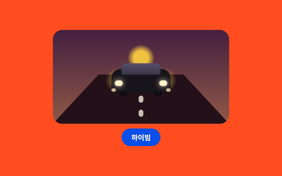
03近づく車と路面
夕暮れの道を突っ込んでくる車 — 車体は大きくなり、路面の標示は足元へ流れ、ハイビームで光の塊が倍に膨らみウインカーが点滅する。
使いどころ自動車・配達サービスのランディングヒーロー
scalebox-shadowsteps(1, end)
<main class="stage">
<div class="ca is-demo" id="caRoot">
  <div class="ca__scene">
    <span class="ca__lowsun"></span>
    <div class="ca__road">
      <div class="ca__marks">
        <span class="ca__dash"></span>
        <span class="ca__dash"></span>
        <span class="ca__dash"></span>
        <span class="ca__dash"></span>
        <span class="ca__dash"></span>
        <span class="ca__dash"></span>
      </div>
    </div>
    <div class="ca__car">
      <span class="ca__glow ca__glow--l"></span>
      <span class="ca__glow ca__glow--r"></span>
      <span class="ca__body"></span>
      <span class="ca__shield"></span>
      <span class="ca__grille"></span>
      <span class="ca__lamp ca__lamp--l"></span>
      <span class="ca__lamp ca__lamp--r"></span>
      <span class="ca__indi ca__indi--l"></span>
      <span class="ca__indi ca__indi--r"></span>
      <span class="ca__wheel ca__wheel--l"></span>
      <span class="ca__wheel ca__wheel--r"></span>
    </div>
  </div>
  <button class="ca__btn" id="caBtn" type="button" aria-pressed="false">ハイビーム</button>
</div>
</main>@use "../../../../site/static/demo-tokens" as *;
// 다가오는 자동차와 노면 — 정면 차를 도형으로만 그린다(이미지 파일 0).
// 다가옴은 차 몸체의 scale, 속도감은 노면 표시가 발밑으로 흐르는 세로 트랙(2세트 반복),
// 방향지시등은 steps(1, end) 컷으로 깜빡인다. 빛 덩어리는 헤드라이트 뒤 큰 원 두 개.
$duration: $dur-loop;
$easing: ease-in-out;
$color: $stage-yellow;
$dusk-top: #452040;
$dusk-bottom: #905947;
$asphalt: #241019;
$bodydark: $subject-ink;
$shield: #3a3547;
$lampcore: #fff2c8;
$amber: #c8b48f;
@include stage($stage-orange);
.ca {
display: flex; flex-direction: column; align-items: center; gap: $sp-2;
width: min(100%, 300px);
}
.ca__scene {
position: relative; box-sizing: border-box;
width: 100%; height: 160px;
border-radius: $r-card; overflow: hidden;
background: linear-gradient(180deg, $dusk-top 0%, $dusk-bottom 100%);
}
// 지평선에 걸린 해: 차 지붕 위로 반쯤 뜬 노을 해
.ca__lowsun {
position: absolute; left: 50%; top: 26px; width: 44px; height: 44px;
margin-left: -22px; border-radius: 50%;
background: radial-gradient(circle, rgba(255, 210, 63, .9) 0 40%, rgba(255, 210, 63, 0) 75%);
}
// ── 노면: 위가 좁고 아래가 넓은 사다리꼴. 표시가 발밑으로 흐른다
.ca__road {
position: absolute; left: 0; right: 0; bottom: 0; height: 84px;
clip-path: polygon(26% 0, 74% 0, 100% 100%, 0 100%);
background: $asphalt; overflow: hidden;
}
.ca__marks {
position: absolute; left: 50%; top: -72px; width: 8px; height: 144px;
margin-left: -4px;
animation-name: caFlow; animation-duration: $duration;
animation-timing-function: linear; animation-iteration-count: infinite;
}
// 간격은 margin-bottom(무한 트랙에는 gap 을 쓰지 않는다 — 2N 개 사이 gap 은 2N-1 개)
.ca__dash {
display: block; width: 8px; height: 12px; margin-bottom: 12px;
border-radius: $r-xs; background: rgba(255, 247, 230, .75);
}
// ── 차. 다가옴 = 그룹 scale
.ca__car {
position: absolute; left: 50%; bottom: 46px; width: 104px; height: 58px;
margin-left: -52px;
animation-name: caNear; animation-duration: $duration;
animation-timing-function: $easing; animation-iteration-count: infinite;
animation-direction: alternate;
}
.ca__body {
position: absolute; left: 0; right: 0; top: 10px; bottom: 6px;
border-radius: $r-card $r-card $r-sm $r-sm;
background: $bodydark;
}
.ca__shield {
position: absolute; left: 18px; right: 18px; top: 0; height: 20px;
border-radius: $r-sm $r-sm 0 0;
background: linear-gradient(180deg, #55506b 0%, $shield 100%);
}
.ca__grille {
position: absolute; left: 30px; right: 30px; top: 34px; height: 6px;
border-radius: $r-pill; background: #17141f;
}
.ca__lamp {
position: absolute; top: 30px; width: 14px; height: 10px;
border-radius: $r-pill; background: $lampcore;
box-shadow: 0 0 10px rgba(255, 242, 200, .9);
}
.ca__lamp--l { left: 6px; }
.ca__lamp--r { right: 6px; }
.ca__glow {
position: absolute; top: 8px; width: 44px; height: 44px; border-radius: 50%;
background: radial-gradient(circle, rgba(255, 210, 63, .55) 0 38%, rgba(255, 210, 63, 0) 72%);
animation-name: caGlow; animation-duration: $duration;
animation-timing-function: $easing; animation-iteration-count: infinite;
animation-direction: alternate;
transition: transform $dur-base $ease-out, opacity $dur-base $ease-out;
}
.ca__glow--l { left: -10px; }
.ca__glow--r { right: -10px; }
// 하이빔: 켜진 동안에는 맥동 애니메이션을 끄고 커진 빛을 유지한다
// (애니메이션의 transform 이 transition 보다 항상 이기므로, 겹치면 토글이 묻힌다 — 실측 2026-09-14)
.ca.is-beam .ca__glow {
animation-name: none;
transform: scale(1.7); opacity: 1;
}
.ca__indi {
position: absolute; top: 44px; width: 8px; height: 6px;
border-radius: $r-pill; background: $amber;
animation-name: caBlink; animation-duration: 500ms;
animation-timing-function: steps(1, end); animation-iteration-count: infinite;
}
.ca__indi--l { left: 0; }
.ca__indi--r { right: 0; }
.ca__wheel {
position: absolute; bottom: 0; width: 16px; height: 8px;
border-radius: 0 0 $r-pill $r-pill; background: #0e0c12;
}
.ca__wheel--l { left: 14px; }
.ca__wheel--r { right: 14px; }
.ca__btn {
box-sizing: border-box; padding: $sp-2 $sp-4; border: 0;
border-radius: $r-pill; background: $subject-blue-deep; color: $subject-cream;
font-family: inherit; font-weight: 700; font-size: 12px; line-height: 1.2;
cursor: pointer;
}
@keyframes caNear {
from { transform: scale(.84); }
to { transform: scale(1.1); }
}
@keyframes caGlow {
from { transform: scale(.92); opacity: .5; }
to { transform: scale(1.08); opacity: .8; }
}
@keyframes caFlow {
from { transform: translateY(0); }
to { transform: translateY(72px); }
}
@keyframes caBlink {
0% { opacity: 1; }
50% { opacity: .12; }
100% { opacity: 1; }
}
// 사람이 고른 상태: 다가옴 루프만 끊고(정지 사진), 깜빡임·유리·빛은 그대로
.ca:not(.is-demo) .ca__car { animation-name: none; }
@media (max-width: 340px) {
.ca__scene { height: 126px; }
.ca__road { height: 64px; }
.ca__car { bottom: 34px; width: 88px; margin-left: -44px; }
.ca__glow { width: 36px; height: 36px; }
.ca__btn { padding: $sp-1 $sp-3; font-size: 11px; }
}
@media (prefers-reduced-motion: reduce) {
.ca__car, .ca__glow, .ca__marks, .ca__indi { animation-name: none !important; }
.ca__glow { transition: none !important; }
}html, body {
margin: 0;
overflow: hidden;
}
.stage {
box-sizing: border-box;
min-height: 100vh;
display: grid;
place-items: center;
margin: 0;
background: #ff4d1f;
font-family: -apple-system, "Segoe UI", "Noto Sans KR", sans-serif;
padding: clamp(8px, 4vw, 24px);
}
.ca {
display: flex;
flex-direction: column;
align-items: center;
gap: 8px;
width: min(100%, 300px);
}
.ca__scene {
position: relative;
box-sizing: border-box;
width: 100%;
height: 160px;
border-radius: 16px;
overflow: hidden;
background: linear-gradient(180deg, #452040 0%, #905947 100%);
}
.ca__lowsun {
position: absolute;
left: 50%;
top: 26px;
width: 44px;
height: 44px;
margin-left: -22px;
border-radius: 50%;
background: radial-gradient(circle, rgba(255, 210, 63, 0.9) 0 40%, rgba(255, 210, 63, 0) 75%);
}
.ca__road {
position: absolute;
left: 0;
right: 0;
bottom: 0;
height: 84px;
clip-path: polygon(26% 0, 74% 0, 100% 100%, 0 100%);
background: #241019;
overflow: hidden;
}
.ca__marks {
position: absolute;
left: 50%;
top: -72px;
width: 8px;
height: 144px;
margin-left: -4px;
animation-name: caFlow;
animation-duration: 2s;
animation-timing-function: linear;
animation-iteration-count: infinite;
}
.ca__dash {
display: block;
width: 8px;
height: 12px;
margin-bottom: 12px;
border-radius: 4px;
background: rgba(255, 247, 230, 0.75);
}
.ca__car {
position: absolute;
left: 50%;
bottom: 46px;
width: 104px;
height: 58px;
margin-left: -52px;
animation-name: caNear;
animation-duration: 2s;
animation-timing-function: ease-in-out;
animation-iteration-count: infinite;
animation-direction: alternate;
}
.ca__body {
position: absolute;
left: 0;
right: 0;
top: 10px;
bottom: 6px;
border-radius: 16px 16px 8px 8px;
background: #17141a;
}
.ca__shield {
position: absolute;
left: 18px;
right: 18px;
top: 0;
height: 20px;
border-radius: 8px 8px 0 0;
background: linear-gradient(180deg, #55506b 0%, #3a3547 100%);
}
.ca__grille {
position: absolute;
left: 30px;
right: 30px;
top: 34px;
height: 6px;
border-radius: 999px;
background: #17141f;
}
.ca__lamp {
position: absolute;
top: 30px;
width: 14px;
height: 10px;
border-radius: 999px;
background: #fff2c8;
box-shadow: 0 0 10px rgba(255, 242, 200, 0.9);
}
.ca__lamp--l {
left: 6px;
}
.ca__lamp--r {
right: 6px;
}
.ca__glow {
position: absolute;
top: 8px;
width: 44px;
height: 44px;
border-radius: 50%;
background: radial-gradient(circle, rgba(255, 210, 63, 0.55) 0 38%, rgba(255, 210, 63, 0) 72%);
animation-name: caGlow;
animation-duration: 2s;
animation-timing-function: ease-in-out;
animation-iteration-count: infinite;
animation-direction: alternate;
transition: transform 300ms ease-out, opacity 300ms ease-out;
}
.ca__glow--l {
left: -10px;
}
.ca__glow--r {
right: -10px;
}
.ca.is-beam .ca__glow {
animation-name: none;
transform: scale(1.7);
opacity: 1;
}
.ca__indi {
position: absolute;
top: 44px;
width: 8px;
height: 6px;
border-radius: 999px;
background: #c8b48f;
animation-name: caBlink;
animation-duration: 500ms;
animation-timing-function: steps(1, end);
animation-iteration-count: infinite;
}
.ca__indi--l {
left: 0;
}
.ca__indi--r {
right: 0;
}
.ca__wheel {
position: absolute;
bottom: 0;
width: 16px;
height: 8px;
border-radius: 0 0 999px 999px;
background: #0e0c12;
}
.ca__wheel--l {
left: 14px;
}
.ca__wheel--r {
right: 14px;
}
.ca__btn {
box-sizing: border-box;
padding: 8px 16px;
border: 0;
border-radius: 999px;
background: #0a4fe8;
color: #fff7e6;
font-family: inherit;
font-weight: 700;
font-size: 12px;
line-height: 1.2;
cursor: pointer;
}
@keyframes caNear {
from {
transform: scale(0.84);
}
to {
transform: scale(1.1);
}
}
@keyframes caGlow {
from {
transform: scale(0.92);
opacity: 0.5;
}
to {
transform: scale(1.08);
opacity: 0.8;
}
}
@keyframes caFlow {
from {
transform: translateY(0);
}
to {
transform: translateY(72px);
}
}
@keyframes caBlink {
0% {
opacity: 1;
}
50% {
opacity: 0.12;
}
100% {
opacity: 1;
}
}
.ca:not(.is-demo) .ca__car {
animation-name: none;
}
@media (max-width: 340px) {
.ca__scene {
height: 126px;
}
.ca__road {
height: 64px;
}
.ca__car {
bottom: 34px;
width: 88px;
margin-left: -44px;
}
.ca__glow {
width: 36px;
height: 36px;
}
.ca__btn {
padding: 4px 12px;
font-size: 11px;
}
}
@media (prefers-reduced-motion: reduce) {
.ca__car, .ca__glow, .ca__marks, .ca__indi {
animation-name: none !important;
}
.ca__glow {
transition: none !important;
}
}// 하이빔은 .is-beam 하나. 빛 덩어리가 커지며 밝아진다.
// 손이 닿는 순간 미리보기 루프(.is-demo)를 떼고 사람이 고른 상태를 유지한다.
(function () {
var root = document.getElementById('caRoot');
var btn = document.getElementById('caBtn');
var label = 'ハイビーム';
btn.addEventListener('click', function () {
root.classList.remove('is-demo');
var beam = root.classList.toggle('is-beam');
btn.setAttribute('aria-pressed', beam ? 'true' : 'false');
});
})();// CarApproach — vanilla 판(run/078/demo/03-object-car-approach/index.html) 의 React 포트.
// 하이빔은 beam 하나로 갈리고, 첫 클릭에 미리보기 루프(is-demo)를 뗀다.
import { useState } from "react";
import type { CSSProperties } from "react";
import styles from "./CarApproach.module.scss";
export type CarApproachProps = {
duration?: number;
easing?: string;
color?: string;
initialBeam?: boolean;
};
type Vars = CSSProperties & { "--duration"?: string; "--easing"?: string; "--color"?: string };
export default function CarApproach(props: CarApproachProps) {
const duration = props.duration ?? 2000;
const easing = props.easing ?? "ease-in-out";
const color = props.color ?? "#ffd23f";
const [beam, setBeam] = useState<boolean>(props.initialBeam ?? false);
const [preview, setPreview] = useState<boolean>(true);
const vars: Vars = { "--duration": duration + "ms", "--easing": easing, "--color": color };
const rootClass = ["ca", preview ? "is-demo" : "", beam ? "is-beam" : ""]
.filter(Boolean).map((c) => (styles as { [k: string]: string })[c]).join(" ");
return (
<main className={styles.stage}>
<div className={rootClass} style={vars}>
<div className={styles["ca__scene"]}>
<span className={styles["ca__lowsun"]}></span>
<div className={styles["ca__road"]}>
<div className={styles["ca__marks"]}>
<span className={styles["ca__dash"]}></span>
<span className={styles["ca__dash"]}></span>
<span className={styles["ca__dash"]}></span>
<span className={styles["ca__dash"]}></span>
<span className={styles["ca__dash"]}></span>
<span className={styles["ca__dash"]}></span>
</div>
</div>
<div className={styles["ca__car"]}>
<span className={styles["ca__glow"] + " " + styles["ca__glow--l"]}></span>
<span className={styles["ca__glow"] + " " + styles["ca__glow--r"]}></span>
<span className={styles["ca__body"]}></span>
<span className={styles["ca__shield"]}></span>
<span className={styles["ca__grille"]}></span>
<span className={styles["ca__lamp"] + " " + styles["ca__lamp--l"]}></span>
<span className={styles["ca__lamp"] + " " + styles["ca__lamp--r"]}></span>
<span className={styles["ca__indi"] + " " + styles["ca__indi--l"]}></span>
<span className={styles["ca__indi"] + " " + styles["ca__indi--r"]}></span>
<span className={styles["ca__wheel"] + " " + styles["ca__wheel--l"]}></span>
<span className={styles["ca__wheel"] + " " + styles["ca__wheel--r"]}></span>
</div>
</div>
<button
className={styles["ca__btn"]}
type="button"
aria-pressed={beam ? "true" : "false"}
onClick={() => { setPreview(false); setBeam((b) => !b); }}
>
하이빔
</button>
</div>
</main>
);
}03 近づく車と路面 — 計測 累積面積 3.342% · 動いたフレーム 23/23GODRICH オリジナル · SCSS と React は zip に同梱 · CSS アニメーション サンプル 9選 — 洗濯機・家・車を図形で動かす
このデモが属する記事
 CSS アニメーション サンプル 9選 — 洗濯機・家・車を図形で動かすcss アニメーション サンプルとして、洗濯機・家・車などの身の回りの物を、画像を一枚も使わずに色付きの箱いくつかで描いて動かす作り方を9つまとめました。どれも純粋な CSS の図形だけで、下のグリッドの中で今動いています。 この記事のデモをすべて見る