02손 흔드는 인사
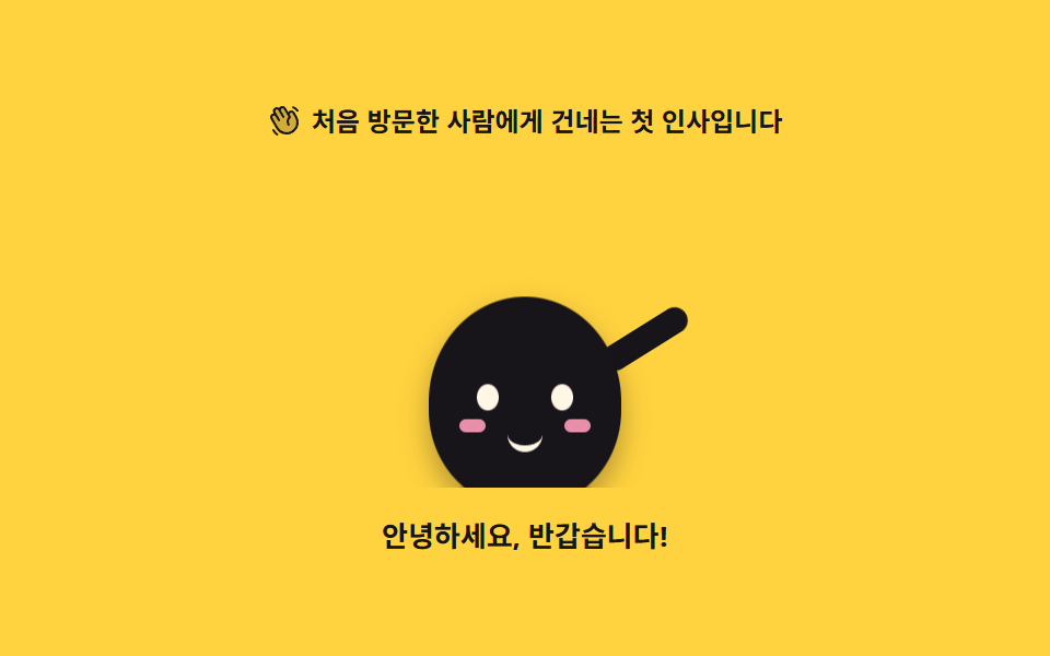
아래에서 올라온 캐릭터가 팔을 좌우로 흔들며 몸을 반대쪽으로 기울입니다. 팔은 어깨 지점을 축으로 돌아갑니다.
쓰임가입 직후 환영 화면, 처음 방문한 사람에게 서비스를 소개하는 첫 단계
rotatetransform-originanimation-fill-modetranslateY
<svg width="0" height="0" style="position:absolute" aria-hidden="true">
  <defs>
    <symbol id="ico-hand" viewBox="0 0 256 256" fill="currentColor"><path d="M184 213.27A80 80 0 0 1 74.7 184l-40-69.32a20 20 0 0 1 34.64-20L55.08 70a20 20 0 0 1 34.65-20l6.92 12a20 20 0 0 1 34.64-20l30 52A20 20 0 0 1 196 74l17.31 30A80 80 0 0 1 184 213.27" opacity=".2"/><path d="m220.17 100l-17.31-30a28 28 0 0 0-38.24-10.25a27.7 27.7 0 0 0-9 8.34L138.2 38a28 28 0 0 0-48.48 0a28 28 0 0 0-41.57 36l1.59 2.76A27.7 27.7 0 0 0 38 80.41a28 28 0 0 0-10.24 38.25l40 69.32a87.47 87.47 0 0 0 53.43 41a88.6 88.6 0 0 0 22.92 3a88 88 0 0 0 76.06-132Zm-6.66 62.64A72 72 0 0 1 81.62 180l-40-69.32a12 12 0 0 1 20.78-12L81.63 132a8 8 0 1 0 13.85-8L62 66a12 12 0 1 1 20.78-12L114 108a8 8 0 1 0 13.85-8l-24.28-42a12 12 0 1 1 20.78-12l33.42 57.9a48 48 0 0 0-5.54 60.6a8 8 0 0 0 13.24-9a32 32 0 0 1 7.31-43.5a8 8 0 0 0 2.13-10.4L168.23 90A12 12 0 1 1 189 78l17.31 30a71.56 71.56 0 0 1 7.2 54.62ZM184.25 31.71A8 8 0 0 1 194 26a59.62 59.62 0 0 1 36.53 28l.33.57a8 8 0 1 1-13.85 8l-.33-.57a43.67 43.67 0 0 0-26.8-20.5a8 8 0 0 1-5.63-9.79M80.89 237a8 8 0 0 1-11.23 1.33A119.6 119.6 0 0 1 40.06 204a8 8 0 0 1 13.86-8a103.7 103.7 0 0 0 25.64 29.72A8 8 0 0 1 80.89 237"/></symbol>
  </defs>
</svg>
<main class="stage">
<div class="wg is-demo" id="wg">
  <p class="wg__hint">
    <svg class="wg__ico" aria-hidden="true"><use href="#ico-hand"/></svg>
    <span>처음 방문한 사람에게 건네는 첫 인사입니다</span>
  </p>

  <div class="wg__floor">
    <!-- 캐릭터는 01 대기 포즈와 같은 몸·눈·볼에 팔 하나만 얹는다(피사체라 손으로 그린다).
         등장 translateY 는 바닥 아래에서 시작하므로 0프레임은 빈 무대이고,
         흔들기는 등장이 끝난 뒤 지연 + backwards 로 시작한다. -->
    <div class="wg__char" aria-label="손을 흔들어 인사하는 마스코트" role="img">
      <div class="wg__riser">
        <i class="wg__arm"></i>
        <span class="wg__body">
          <i class="wg__eye wg__eye--l"></i>
          <i class="wg__eye wg__eye--r"></i>
          <i class="wg__cheek wg__cheek--l"></i>
          <i class="wg__cheek wg__cheek--r"></i>
          <i class="wg__mouth"></i>
        </span>
      </div>
      <span class="wg__shadow"></span>
    </div>
  </div>

  <p class="wg__say">안녕하세요, 반갑습니다!</p>
</div>
</main>@use "../../../../site/static/demo-tokens" as *;
// 손 흔드는 인사 — 바닥 아래에서 올라온 캐릭터가 팔을 좌우로 흔들며 몸을 반대쪽으로 기울인다.
// 팔은 어깨(아래 끝)를 축으로 돈다. 흔들기는 등장(26%)이 끝난 뒤 시작하므로 animation-delay 와
// animation-fill-mode: backwards 를 함께 쓴다 — fill-mode 가 없으면 지연 구간에 팔이 기본 자세로
// 0프레임에 번쩍였다가 사라진다(252-08 실패표). 루프는 2s(설정 초)의 약수이고
// 복귀(팔·기울기 정지)는 88% 안에 끝난다. 100% 에서 0% 로 되돌아가는 내려가기는
// 두 프레임 사이의 루프 경계라 24장 어디에도 잡히지 않는다.
$duration: $dur-loop;
$easing: $ease-pop;
$color: $subject-ink;
@include stage($stage-yellow);
// 노랑 무대 위 글자는 잉크만 쓴다(설계 대비 표 — 크림은 노랑 위에서 AA 미달)
.wg { display: flex; flex-direction: column; align-items: center; gap: $sp-3; width: 100%; max-width: 320px; }
.wg__hint {
display: flex; align-items: center; gap: $sp-1; margin: 0;
font-weight: 700; font-size: clamp(10px, 2.8vw, 12px); color: $subject-ink;
}
.wg__ico { width: 16px; height: 16px; flex: 0 0 auto; color: $subject-ink; }
// 바닥 아래 등장을 자르는 상자 — translateY 로 내려간 몸이 무대 scrollHeight 를 부풀리지 않게 한다
.wg__floor { position: relative; width: 100%; height: 148px; overflow: hidden; display: grid; place-items: end center; }
.wg__char { position: relative; width: 150px; height: 140px; }
.wg__riser { position: absolute; inset: 0; }
// 몸 — 01 과 같은 타원. 숨은 없고, 착지 눌림과 기울기가 이 요소의 transform 하나에서 나온다.
// 기울기의 축은 발바닥(50% 100%) — 캐릭터의 발은 바닥에 붙어 있어 중심 회전보다 자연스럽다(규칙 8 예외)
.wg__body {
position: absolute; left: 50%; bottom: 0; width: 88px; height: 96px;
margin-left: -44px;
border-radius: 50% 50% 46% 46%;
background: $color;
transform-origin: 50% 100%;
box-shadow: $shadow-press;
}
.wg__eye {
position: absolute; top: 40px; width: 10px; height: 12px;
border-radius: 50%; background: $subject-cream;
}
.wg__eye--l { left: 22px; }
.wg__eye--r { right: 22px; }
.wg__cheek {
position: absolute; top: 56px; width: 12px; height: 6px;
border-radius: $r-pill; background: $subject-pink; opacity: .9;
}
.wg__cheek--l { left: 14px; }
.wg__cheek--r { right: 14px; }
.wg__mouth {
position: absolute; top: 60px; left: 50%; width: 16px; height: 8px;
margin-left: -8px;
border-bottom: 3px solid $subject-cream;
border-radius: 0 0 $r-pill $r-pill;
}
// 팔 — 몸 뒤에 붙는 캡슐 하나. 축은 어깨(아래 끝, 50% 95%)다: 팔은 어깨에 붙어 있어
// 중심이 아니라 붙는 지점에서 돌아간다(규칙 8 예외). 기본 자세는 팔을 든 인사 모양.
.wg__arm {
position: absolute; left: 107px; top: 32px; width: 12px; height: 44px;
border-radius: $r-pill; background: $color;
transform-origin: 50% 95%;
transform: rotate(24deg);
}
// 그림자는 바닥에 눌린 면 — 몸과 함께 올라오지 않고, 착지할 때 넓어진다
.wg__shadow {
position: absolute; left: 50%; bottom: -6px; width: 72px; height: 10px;
margin-left: -36px;
border-radius: 50%;
background: rgba(23, 20, 26, .18);
}
.wg__say { margin: 0; font-weight: 700; font-size: clamp(11px, 3vw, 13px); color: $subject-ink; }
// ── 미리보기 루프 ────────────────────────────────────────────
// 등장 0~26% · 인사 28~88% · 정지 88~100%. 한 바퀴가 2s 다.
@keyframes wgRise {
0% { transform: translateY(36px); }
26%, 100% { transform: translateY(0); }
}
@keyframes wgWave {
0%, 28% { transform: rotate(58deg); }
32% { transform: rotate(24deg); }
40% { transform: rotate(52deg); }
48% { transform: rotate(24deg); }
56% { transform: rotate(52deg); }
64% { transform: rotate(24deg); }
72% { transform: rotate(52deg); }
80% { transform: rotate(24deg); }
88%, 100% { transform: rotate(24deg); }
}
// 몸 기울기는 팔과 반대 위상(팔이 바깥으로 가면 몸은 안쪽으로) + 착지 눌림 한 번
@keyframes wgTilt {
0%, 28% { transform: rotate(0deg) scaleY(1); }
31% { transform: rotate(3deg) scaleY(.94); }
36% { transform: rotate(-3deg) scaleY(1); }
44% { transform: rotate(3deg) scaleY(1); }
52% { transform: rotate(-3deg) scaleY(1); }
60% { transform: rotate(3deg) scaleY(1); }
68% { transform: rotate(-3deg) scaleY(1); }
76% { transform: rotate(3deg) scaleY(1); }
88%, 100% { transform: rotate(0deg) scaleY(1); }
}
@keyframes wgShadow {
0% { transform: scaleX(.4); }
26%, 100% { transform: scaleX(1); }
}
// 등장 애니메이션에 fill-mode backwards — 0프레임이 완성 상태로 번쩍이지 않게(작업지시)
.wg.is-demo .wg__riser {
animation-name: wgRise;
animation-duration: $duration;
animation-timing-function: $easing;
animation-iteration-count: infinite;
animation-fill-mode: backwards;
}
// 팔·몸은 560ms(26%) 뒤 시작 — 지연 구간은 0% 키프레임(팔 내린 자세)으로 채운다
.wg.is-demo .wg__arm {
animation-name: wgWave;
animation-duration: $duration;
animation-timing-function: $easing;
animation-iteration-count: infinite;
animation-delay: 560ms;
animation-fill-mode: backwards;
}
.wg.is-demo .wg__body {
animation-name: wgTilt;
animation-duration: $duration;
animation-timing-function: $easing;
animation-iteration-count: infinite;
animation-delay: 560ms;
animation-fill-mode: backwards;
}
.wg.is-demo .wg__shadow {
animation-name: wgShadow;
animation-duration: $duration;
animation-timing-function: $easing;
animation-iteration-count: infinite;
animation-fill-mode: backwards;
}
@media (max-width: 340px) {
.wg { gap: $sp-2; }
.wg__floor { height: 118px; }
.wg__char { width: 118px; height: 112px; }
.wg__body { width: 72px; height: 80px; margin-left: -36px; }
.wg__eye { top: 33px; width: 9px; height: 11px; }
.wg__eye--l { left: 18px; }
.wg__eye--r { right: 18px; }
.wg__cheek { top: 47px; width: 10px; height: 5px; }
.wg__cheek--l { left: 12px; }
.wg__cheek--r { right: 12px; }
.wg__mouth { top: 50px; width: 14px; height: 7px; margin-left: -7px; }
.wg__arm { left: 84px; top: 24px; width: 10px; height: 36px; }
.wg__shadow { width: 60px; margin-left: -30px; }
}
// reduce 에서는 든 인사 자세 한 장으로 세운다(애니메이션을 꺼도 화면이 성립한다).
// 특이도에 밀리지 않게 !important 로 끈다.
@media (prefers-reduced-motion: reduce) {
.wg.is-demo .wg__riser,
.wg.is-demo .wg__arm,
.wg.is-demo .wg__body,
.wg.is-demo .wg__shadow { animation: none !important; }
}html, body {
margin: 0;
overflow: hidden;
}
.stage {
box-sizing: border-box;
min-height: 100vh;
display: grid;
place-items: center;
margin: 0;
background: #ffd23f;
font-family: -apple-system, "Segoe UI", "Noto Sans KR", sans-serif;
padding: clamp(8px, 4vw, 24px);
}
.wg {
display: flex;
flex-direction: column;
align-items: center;
gap: 12px;
width: 100%;
max-width: 320px;
}
.wg__hint {
display: flex;
align-items: center;
gap: 4px;
margin: 0;
font-weight: 700;
font-size: clamp(10px, 2.8vw, 12px);
color: #17141a;
}
.wg__ico {
width: 16px;
height: 16px;
flex: 0 0 auto;
color: #17141a;
}
.wg__floor {
position: relative;
width: 100%;
height: 148px;
overflow: hidden;
display: grid;
place-items: end center;
}
.wg__char {
position: relative;
width: 150px;
height: 140px;
}
.wg__riser {
position: absolute;
inset: 0;
}
.wg__body {
position: absolute;
left: 50%;
bottom: 0;
width: 88px;
height: 96px;
margin-left: -44px;
border-radius: 50% 50% 46% 46%;
background: #17141a;
transform-origin: 50% 100%;
box-shadow: 0 6px 12px rgba(23, 20, 26, 0.32);
}
.wg__eye {
position: absolute;
top: 40px;
width: 10px;
height: 12px;
border-radius: 50%;
background: #fff7e6;
}
.wg__eye--l {
left: 22px;
}
.wg__eye--r {
right: 22px;
}
.wg__cheek {
position: absolute;
top: 56px;
width: 12px;
height: 6px;
border-radius: 999px;
background: #ff9ebb;
opacity: 0.9;
}
.wg__cheek--l {
left: 14px;
}
.wg__cheek--r {
right: 14px;
}
.wg__mouth {
position: absolute;
top: 60px;
left: 50%;
width: 16px;
height: 8px;
margin-left: -8px;
border-bottom: 3px solid #fff7e6;
border-radius: 0 0 999px 999px;
}
.wg__arm {
position: absolute;
left: 107px;
top: 32px;
width: 12px;
height: 44px;
border-radius: 999px;
background: #17141a;
transform-origin: 50% 95%;
transform: rotate(24deg);
}
.wg__shadow {
position: absolute;
left: 50%;
bottom: -6px;
width: 72px;
height: 10px;
margin-left: -36px;
border-radius: 50%;
background: rgba(23, 20, 26, 0.18);
}
.wg__say {
margin: 0;
font-weight: 700;
font-size: clamp(11px, 3vw, 13px);
color: #17141a;
}
@keyframes wgRise {
0% {
transform: translateY(36px);
}
26%, 100% {
transform: translateY(0);
}
}
@keyframes wgWave {
0%, 28% {
transform: rotate(58deg);
}
32% {
transform: rotate(24deg);
}
40% {
transform: rotate(52deg);
}
48% {
transform: rotate(24deg);
}
56% {
transform: rotate(52deg);
}
64% {
transform: rotate(24deg);
}
72% {
transform: rotate(52deg);
}
80% {
transform: rotate(24deg);
}
88%, 100% {
transform: rotate(24deg);
}
}
@keyframes wgTilt {
0%, 28% {
transform: rotate(0deg) scaleY(1);
}
31% {
transform: rotate(3deg) scaleY(0.94);
}
36% {
transform: rotate(-3deg) scaleY(1);
}
44% {
transform: rotate(3deg) scaleY(1);
}
52% {
transform: rotate(-3deg) scaleY(1);
}
60% {
transform: rotate(3deg) scaleY(1);
}
68% {
transform: rotate(-3deg) scaleY(1);
}
76% {
transform: rotate(3deg) scaleY(1);
}
88%, 100% {
transform: rotate(0deg) scaleY(1);
}
}
@keyframes wgShadow {
0% {
transform: scaleX(0.4);
}
26%, 100% {
transform: scaleX(1);
}
}
.wg.is-demo .wg__riser {
animation-name: wgRise;
animation-duration: 2s;
animation-timing-function: cubic-bezier(0.2, 1.4, 0.4, 1);
animation-iteration-count: infinite;
animation-fill-mode: backwards;
}
.wg.is-demo .wg__arm {
animation-name: wgWave;
animation-duration: 2s;
animation-timing-function: cubic-bezier(0.2, 1.4, 0.4, 1);
animation-iteration-count: infinite;
animation-delay: 560ms;
animation-fill-mode: backwards;
}
.wg.is-demo .wg__body {
animation-name: wgTilt;
animation-duration: 2s;
animation-timing-function: cubic-bezier(0.2, 1.4, 0.4, 1);
animation-iteration-count: infinite;
animation-delay: 560ms;
animation-fill-mode: backwards;
}
.wg.is-demo .wg__shadow {
animation-name: wgShadow;
animation-duration: 2s;
animation-timing-function: cubic-bezier(0.2, 1.4, 0.4, 1);
animation-iteration-count: infinite;
animation-fill-mode: backwards;
}
@media (max-width: 340px) {
.wg {
gap: 8px;
}
.wg__floor {
height: 118px;
}
.wg__char {
width: 118px;
height: 112px;
}
.wg__body {
width: 72px;
height: 80px;
margin-left: -36px;
}
.wg__eye {
top: 33px;
width: 9px;
height: 11px;
}
.wg__eye--l {
left: 18px;
}
.wg__eye--r {
right: 18px;
}
.wg__cheek {
top: 47px;
width: 10px;
height: 5px;
}
.wg__cheek--l {
left: 12px;
}
.wg__cheek--r {
right: 12px;
}
.wg__mouth {
top: 50px;
width: 14px;
height: 7px;
margin-left: -7px;
}
.wg__arm {
left: 84px;
top: 24px;
width: 10px;
height: 36px;
}
.wg__shadow {
width: 60px;
margin-left: -30px;
}
}
@media (prefers-reduced-motion: reduce) {
.wg.is-demo .wg__riser,
.wg.is-demo .wg__arm,
.wg.is-demo .wg__body,
.wg.is-demo .wg__shadow {
animation: none !important;
}
}// WaveGreeting — vanilla 판(run/300/demo/02-mascot-wave-greeting/index.html) 의 React 포트.
// 이 데모는 CSS 만으로 성립해서 상태가 없다 — 훅 없이 그린다.
// duration·easing·color 는 props 로 받아 CSS 변수로 넘긴다(기본값은 vanilla 의 셋과 같다).
import type { CSSProperties } from "react";
import styles from "./WaveGreeting.module.scss";
export type WaveGreetingProps = {
duration?: number;
easing?: string;
color?: string;
};
type Vars = CSSProperties & { "--duration"?: string; "--easing"?: string; "--color"?: string };
const HINT = "처음 방문한 사람에게 건네는 첫 인사입니다";
const SAY = "안녕하세요, 반갑습니다!";
const CHAR_LABEL = "손을 흔들어 인사하는 마스코트";
export default function WaveGreeting({
duration = 2000,
easing = "cubic-bezier(.2, 1.4, .4, 1)",
color = "#17141a",
}: WaveGreetingProps) {
const vars: Vars = { "--duration": `${duration}ms`, "--easing": easing, "--color": color };
return (
<main className={styles.stage}>
<svg width="0" height="0" style={{ position: "absolute" }} aria-hidden="true">
<defs>
<symbol id="ico-hand" viewBox="0 0 256 256" fill="currentColor"><path d="M184 213.27A80 80 0 0 1 74.7 184l-40-69.32a20 20 0 0 1 34.64-20L55.08 70a20 20 0 0 1 34.65-20l6.92 12a20 20 0 0 1 34.64-20l30 52A20 20 0 0 1 196 74l17.31 30A80 80 0 0 1 184 213.27" opacity=".2" /><path d="m220.17 100l-17.31-30a28 28 0 0 0-38.24-10.25a27.7 27.7 0 0 0-9 8.34L138.2 38a28 28 0 0 0-48.48 0a28 28 0 0 0-41.57 36l1.59 2.76A27.7 27.7 0 0 0 38 80.41a28 28 0 0 0-10.24 38.25l40 69.32a87.47 87.47 0 0 0 53.43 41a88.6 88.6 0 0 0 22.92 3a88 88 0 0 0 76.06-132Zm-6.66 62.64A72 72 0 0 1 81.62 180l-40-69.32a12 12 0 0 1 20.78-12L81.63 132a8 8 0 1 0 13.85-8L62 66a12 12 0 1 1 20.78-12L114 108a8 8 0 1 0 13.85-8l-24.28-42a12 12 0 1 1 20.78-12l33.42 57.9a48 48 0 0 0-5.54 60.6a8 8 0 0 0 13.24-9a32 32 0 0 1 7.31-43.5a8 8 0 0 0 2.13-10.4L168.23 90A12 12 0 1 1 189 78l17.31 30a71.56 71.56 0 0 1 7.2 54.62ZM184.25 31.71A8 8 0 0 1 194 26a59.62 59.62 0 0 1 36.53 28l.33.57a8 8 0 1 1-13.85 8l-.33-.57a43.67 43.67 0 0 0-26.8-20.5a8 8 0 0 1-5.63-9.79M80.89 237a8 8 0 0 1-11.23 1.33A119.6 119.6 0 0 1 40.06 204a8 8 0 0 1 13.86-8a103.7 103.7 0 0 0 25.64 29.72A8 8 0 0 1 80.89 237" /></symbol>
</defs>
</svg>
<div className={`${styles.root} ${styles.isDemo}`} style={vars}>
<p className={styles.hint}>
<svg className={styles.ico} aria-hidden="true"><use href="#ico-hand" /></svg>
<span>{HINT}</span>
</p>
<div className={styles.floor}>
<div className={styles.char} aria-label={CHAR_LABEL} role="img">
<div className={styles.riser}>
<i className={styles.arm}></i>
<span className={styles.body}>
<i className={`${styles.eye} ${styles.eyeL}`}></i>
<i className={`${styles.eye} ${styles.eyeR}`}></i>
<i className={`${styles.cheek} ${styles.cheekL}`}></i>
<i className={`${styles.cheek} ${styles.cheekR}`}></i>
<i className={styles.mouth}></i>
</span>
</div>
<span className={styles.shadow}></span>
</div>
</div>
<p className={styles.say}>{SAY}</p>
</div>
</main>
);
}02 손 흔드는 인사 — 측정 누적면적 5.653% · 움직인 프레임 16/23GODRICH 원작 · zip 에 SCSS·React 포함 · 마스코트 애니메이션 9종 — 인사부터 잠들기까지
이 데모가 속한 글
 마스코트 애니메이션 9종 — 인사부터 잠들기까지마스코트 애니메이션은 서비스 화면에 사는 캐릭터가 상황마다 다른 몸짓과 표정으로 사람에게 말을 거는 움직임입니다. 여기 실은 아홉 개는 그림 파일도 라이브러리도 없이 타원 하나에 눈·볼·입만 얹어 CSS 로 그렸고, 이 글의 데모 전부 보기