05Mờ dần hai mé cuộn
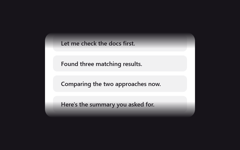
Mép trên và mép dưới của khung chat có thanh cuộn được làm nhòe bằng gradient mask-image, gợi rằng còn nội dung mà không cắt lửng chữ nào.
Dùng choVùng cuộn hội thoại dài, panel log·timeline
mask-imagetranslateYoverflow: hidden
<main class="stage">
  <div class="sf-viewport">
    <div class="sf-track is-demo">
      <div class="sf-msg">Here's the summary you asked for.</div>
      <div class="sf-msg">Let me check the docs first.</div>
      <div class="sf-msg">Found three matching results.</div>
      <div class="sf-msg">Comparing the two approaches now.</div>
      <div class="sf-msg">Here's the summary you asked for.</div>
      <div class="sf-msg">Let me check the docs first.</div>
      <div class="sf-msg">Found three matching results.</div>
      <div class="sf-msg">Comparing the two approaches now.</div>
    </div>
  </div>
</main>
@use "../../../../site/static/demo-tokens" as *;
// ── 변수 3개 ──────────────────────────────────────────
$duration: 6s;
$easing: linear;
$color: $subject-ink;
@include stage($stage-ink);
.sf-viewport {
width: min(300px, 88vw);
height: 170px;
overflow: hidden;
box-sizing: border-box;
border-radius: $r-card;
background: $stage-paper;
box-shadow: $shadow-raised;
// 가장자리 페이드 — 이 마스크는 고정. 움직이는 건 안의 트랙뿐
-webkit-mask-image: linear-gradient(to bottom, transparent 0, #000 $sp-8, #000 calc(100% - #{$sp-8}), transparent 100%);
mask-image: linear-gradient(to bottom, transparent 0, #000 $sp-8, #000 calc(100% - #{$sp-8}), transparent 100%);
padding: $sp-4 0;
}
.sf-track {
display: flex;
flex-direction: column;
}
.sf-msg {
padding: $sp-2 $sp-4;
margin: 0 $sp-4 $sp-2;
border-radius: $r-sm;
background: rgba(23, 20, 26, .06);
color: $color;
font: 500 12px/1.4 -apple-system, "Segoe UI", sans-serif;
}
// 실사용: 새 메시지가 올 때마다 scrollTop 을 내린다. 데모는 같은 목록 두 벌을 이어 -50% 루프로 흉내낸다
@keyframes sf-scroll {
from { transform: translateY(0); }
to { transform: translateY(-50%); }
}
.sf-track.is-demo {
animation: sf-scroll $duration $easing infinite;
}
@media (prefers-reduced-motion: reduce) {
.sf-track.is-demo {
animation: none !important;
transform: none !important;
}
}html, body {
margin: 0;
overflow: hidden;
}
.stage {
box-sizing: border-box;
min-height: 100vh;
display: grid;
place-items: center;
margin: 0;
background: #17141a;
font-family: -apple-system, "Segoe UI", "Noto Sans KR", sans-serif;
padding: clamp(8px, 4vw, 24px);
}
.sf-viewport {
width: min(300px, 88vw);
height: 170px;
overflow: hidden;
box-sizing: border-box;
border-radius: 16px;
background: #ffffff;
box-shadow: 0 14px 24px rgba(23, 20, 26, 0.32);
-webkit-mask-image: linear-gradient(to bottom, transparent 0, #000 32px, #000 calc(100% - 32px), transparent 100%);
mask-image: linear-gradient(to bottom, transparent 0, #000 32px, #000 calc(100% - 32px), transparent 100%);
padding: 16px 0;
}
.sf-track {
display: flex;
flex-direction: column;
}
.sf-msg {
padding: 8px 16px;
margin: 0 16px 8px;
border-radius: 8px;
background: rgba(23, 20, 26, 0.06);
color: #17141a;
font: 500 12px/1.4 -apple-system, "Segoe UI", sans-serif;
}
@keyframes sf-scroll {
from {
transform: translateY(0);
}
to {
transform: translateY(-50%);
}
}
.sf-track.is-demo {
animation: sf-scroll 6s linear infinite;
}
@media (prefers-reduced-motion: reduce) {
.sf-track.is-demo {
animation: none !important;
transform: none !important;
}
}import { CSSProperties } from "react";
import styles from "./ScrollFadeEdges.module.scss";
type Vars = CSSProperties & {
"--duration"?: string;
"--easing"?: string;
"--color"?: string;
};
export interface ScrollFadeEdgesProps {
duration?: string;
easing?: string;
color?: string;
messages?: string[];
}
const DEFAULT_MESSAGES = [
"Here's the summary you asked for.",
"Let me check the docs first.",
"Found three matching results.",
"Comparing the two approaches now.",
];
export default function ScrollFadeEdges({
duration = "6s",
easing = "linear",
color = "#17141a",
messages = DEFAULT_MESSAGES,
}: ScrollFadeEdgesProps) {
const style: Vars = {
"--duration": duration,
"--easing": easing,
"--color": color,
};
const doubled = [...messages, ...messages];
return (
<div className={styles.viewport} style={style}>
<div className={styles.track}>
{doubled.map((m, i) => (
<div className={styles.msg} key={i}>{m}</div>
))}
</div>
</div>
);
}05 Mờ dần hai mé cuộn — Diện tích đo được 27.117% · khung hình chuyển động 23/23Nguyên tác GODRICH · SCSS và React nằm trong tệp zip · 9 css loading animation cho AI chat, copy-paste
Bài viết chứa demo này
 9 css loading animation cho AI chat, copy-pasteBa chấm nhấp nhô, con trỏ chớp tắt, chữ hiện dần lúc bạn chờ câu trả lời trong khung chat AI như ChatGPT hay Claude đều Xem tất cả demo trong bài này