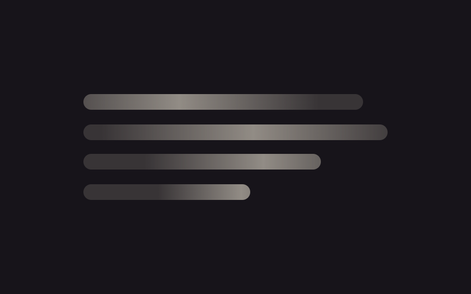
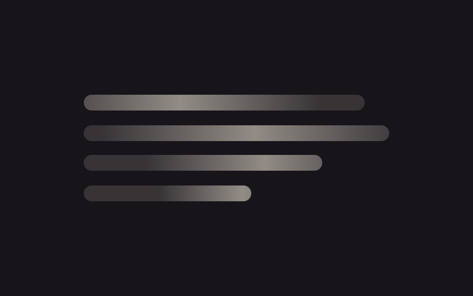
01Dòng chữ lấp lánh
Thanh xám thay chỗ cho dòng chữ, ánh sáng quét qua.
Dùng choDanh sách bài viết, bình luận
1.4s느리게 2s빛 없이
<main class="stage">
  <div class="lines">
    <div class="line"></div>
    <div class="line"></div>
    <div class="line"></div>
    <div class="line"></div>
  </div>
</main>
@use "../../../../site/static/demo-tokens" as *;
// ── 변수 3개. 변형은 이것만 바꾼다 ──────────────────────────
$duration: $dur-loop; // 빛이 줄 하나를 다 훑는 시간
$easing: $ease-out; // 시작은 빠르고 끝은 느리게
$color: $subject-cream; // 막대·빛의 바탕 색 (어두운 무대라 크림)
// ── 데모 무대 ──────────────────────────────────────────
@include stage($stage-ink);
.lines {
width: clamp(180px, 70%, 360px);
display: grid;
gap: clamp(10px, 3vw, 16px);
}
// ── 줄 막대 ──────────────────────────────────────────
.line {
position: relative;
overflow: hidden; // 빛이 막대 밖으로 안 나가게
height: clamp(12px, 4vw, 16px);
border-radius: $r-control;
background: rgba($color, .14);
&::after {
content: "";
position: absolute;
inset: 0;
background: linear-gradient(90deg, transparent, rgba($color, .45), transparent);
transform: translateX(-120%); // 위치가 아니라 transform 으로만 이동
animation: shimmer $duration $easing infinite;
}
&:nth-child(1) { width: 92%; }
&:nth-child(2) { width: 100%; }
&:nth-child(3) { width: 78%; }
&:nth-child(4) { width: 55%; }
&:nth-child(2)::after { animation-delay: -140ms; } // 줄마다 살짝 어긋나게 시작 (음수 지연 = 이미 진행 중인 상태로 시작)
&:nth-child(3)::after { animation-delay: -280ms; }
&:nth-child(4)::after { animation-delay: -420ms; }
}
@keyframes shimmer {
to { transform: translateX(120%); }
}
// ── 접근성: 움직임 줄이기 설정이면 스침 대신 옅은 밝기만 ────────
@media (prefers-reduced-motion: reduce) {
.line::after { animation: none !important; opacity: .45; transform: translateX(0); }
}html, body {
margin: 0;
overflow: hidden;
}
.stage {
box-sizing: border-box;
min-height: 100vh;
display: grid;
place-items: center;
margin: 0;
background: #17141a;
font-family: -apple-system, "Segoe UI", "Noto Sans KR", sans-serif;
padding: clamp(8px, 4vw, 24px);
}
.lines {
width: clamp(180px, 70%, 360px);
display: grid;
gap: clamp(10px, 3vw, 16px);
}
.line {
position: relative;
overflow: hidden;
height: clamp(12px, 4vw, 16px);
border-radius: 12px;
background: rgba(255, 247, 230, 0.14);
}
.line::after {
content: "";
position: absolute;
inset: 0;
background: linear-gradient(90deg, transparent, rgba(255, 247, 230, 0.45), transparent);
transform: translateX(-120%);
animation: shimmer 2s ease-out infinite;
}
.line:nth-child(1) {
width: 92%;
}
.line:nth-child(2) {
width: 100%;
}
.line:nth-child(3) {
width: 78%;
}
.line:nth-child(4) {
width: 55%;
}
.line:nth-child(2)::after {
animation-delay: -140ms;
}
.line:nth-child(3)::after {
animation-delay: -280ms;
}
.line:nth-child(4)::after {
animation-delay: -420ms;
}
@keyframes shimmer {
to {
transform: translateX(120%);
}
}
@media (prefers-reduced-motion: reduce) {
.line::after {
animation: none !important;
opacity: 0.45;
transform: translateX(0);
}
}import type { CSSProperties } from "react";
import styles from "./ShimmerLines.module.scss";
export type ShimmerLinesProps = {
/** 빛이 줄 하나를 훑는 시간 (기본 2000ms) */
duration?: number;
/** CSS easing (기본 ease-out) */
easing?: string;
/** 막대·빛의 바탕 색 */
color?: string;
/** 줄 수 (기본 4) */
lines?: number;
className?: string;
};
const WIDTHS = ["92%", "100%", "78%", "55%"];
export default function ShimmerLines({
duration = 2000,
easing = "ease-out",
color = "#fff7e6",
lines = 4,
className = "",
}: ShimmerLinesProps) {
const vars = { "--duration": `${duration}ms`, "--easing": easing, "--color": color } as CSSProperties;
return (
<div className={`${styles.lines} ${className}`} style={vars}>
{Array.from({ length: lines }).map((_, i) => (
<div
key={i}
className={styles.line}
style={{ width: WIDTHS[i % WIDTHS.length], animationDelay: `${-i * 140}ms` } as CSSProperties}
/>
))}
</div>
);
}01 Dòng chữ lấp lánh — Diện tích đo được 11.078% · khung hình chuyển động 21/23Nguyên tác GODRICH · SCSS và React nằm trong tệp zip · 9 hiệu ứng css skeleton loading copy-paste
Bài viết chứa demo này
 9 hiệu ứng css skeleton loading copy-pasteCss skeleton loading là kỹ thuật hiện khối xám giữ đúng hình dạng của nội dung thật trong lúc chờ dữ liệu, thay cho màn Xem tất cả demo trong bài này