07Fade-in từng từ
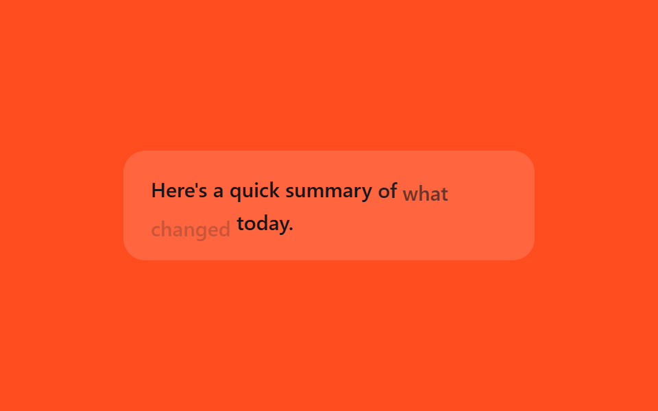
Thay vì cả câu hoàn chỉnh hiện lên một lần, từng từ trồi dậy nhẹ nhàng bằng opacity và translateY theo trình tự, tạo cảm giác token đang nối đuôi nhau trong thời gian thực.
Dùng choDiễn cảnh lộ câu trả lời stream, mở dần kết quả tóm tắt
translateYanimation-delaynth-child
<main class="stage">
  <p class="wf-line is-demo"><span>Here's</span> <span>a</span> <span>quick</span> <span>summary</span> <span>of</span> <span>what</span> <span>changed</span> <span>today.</span></p>
</main>
@use "../../../../site/static/demo-tokens" as *;
// ── 변수 3개 ──────────────────────────────────────────
$duration: 2s;
$easing: $ease-out;
$color: $subject-ink;
@include stage($stage-orange);
.wf-line {
width: min(300px, 88vw);
margin: 0;
padding: $sp-4 $sp-5;
border-radius: $r-card;
box-sizing: border-box;
background: rgba(255, 255, 255, .14);
color: $color;
font: 500 15px/1.6 -apple-system, "Segoe UI", sans-serif;
}
.wf-line span {
display: inline-block;
}
// 실사용: 토큰이 도착할 때마다 새 <span> 을 붙인다. 데모는 같은 문장을 순서대로 반복한다
@keyframes wf-word {
0%, 100% { opacity: 0; transform: translateY(6px); }
15%, 78% { opacity: 1; transform: translateY(0); }
92% { opacity: 0; transform: translateY(6px); }
}
.wf-line.is-demo span {
animation: wf-word $duration $easing infinite;
}
.wf-line.is-demo span:nth-child(1) { animation-delay: 0ms; }
.wf-line.is-demo span:nth-child(2) { animation-delay: 90ms; }
.wf-line.is-demo span:nth-child(3) { animation-delay: 180ms; }
.wf-line.is-demo span:nth-child(4) { animation-delay: 270ms; }
.wf-line.is-demo span:nth-child(5) { animation-delay: 360ms; }
.wf-line.is-demo span:nth-child(6) { animation-delay: 450ms; }
.wf-line.is-demo span:nth-child(7) { animation-delay: 540ms; }
.wf-line.is-demo span:nth-child(8) { animation-delay: 630ms; }
@media (prefers-reduced-motion: reduce) {
.wf-line.is-demo span {
animation: none !important;
opacity: 1 !important;
transform: none !important;
}
}html, body {
margin: 0;
overflow: hidden;
}
.stage {
box-sizing: border-box;
min-height: 100vh;
display: grid;
place-items: center;
margin: 0;
background: #ff4d1f;
font-family: -apple-system, "Segoe UI", "Noto Sans KR", sans-serif;
padding: clamp(8px, 4vw, 24px);
}
.wf-line {
width: min(300px, 88vw);
margin: 0;
padding: 16px 20px;
border-radius: 16px;
box-sizing: border-box;
background: rgba(255, 255, 255, 0.14);
color: #17141a;
font: 500 15px/1.6 -apple-system, "Segoe UI", sans-serif;
}
.wf-line span {
display: inline-block;
}
@keyframes wf-word {
0%, 100% {
opacity: 0;
transform: translateY(6px);
}
15%, 78% {
opacity: 1;
transform: translateY(0);
}
92% {
opacity: 0;
transform: translateY(6px);
}
}
.wf-line.is-demo span {
animation: wf-word 2s ease-out infinite;
}
.wf-line.is-demo span:nth-child(1) {
animation-delay: 0ms;
}
.wf-line.is-demo span:nth-child(2) {
animation-delay: 90ms;
}
.wf-line.is-demo span:nth-child(3) {
animation-delay: 180ms;
}
.wf-line.is-demo span:nth-child(4) {
animation-delay: 270ms;
}
.wf-line.is-demo span:nth-child(5) {
animation-delay: 360ms;
}
.wf-line.is-demo span:nth-child(6) {
animation-delay: 450ms;
}
.wf-line.is-demo span:nth-child(7) {
animation-delay: 540ms;
}
.wf-line.is-demo span:nth-child(8) {
animation-delay: 630ms;
}
@media (prefers-reduced-motion: reduce) {
.wf-line.is-demo span {
animation: none !important;
opacity: 1 !important;
transform: none !important;
}
}import { CSSProperties } from "react";
import styles from "./TokenFadeWords.module.scss";
type Vars = CSSProperties & {
"--duration"?: string;
"--easing"?: string;
"--color"?: string;
};
export interface TokenFadeWordsProps {
duration?: string;
easing?: string;
color?: string;
words?: string[];
}
const DEFAULT_WORDS = ["Here's", "a", "quick", "summary", "of", "what", "changed", "today."];
export default function TokenFadeWords({
duration = "2s",
easing = "ease-out",
color = "#17141a",
words = DEFAULT_WORDS,
}: TokenFadeWordsProps) {
const style: Vars = {
"--duration": duration,
"--easing": easing,
"--color": color,
};
return (
<p className={styles.line} style={style}>
{words.map((w, i) => (
<span key={i} className={styles.word} style={{ animationDelay: `${i * 90}ms` }}>
{w}{" "}
</span>
))}
</p>
);
}07 Fade-in từng từ — Diện tích đo được 2.202% · khung hình chuyển động 16/23Nguyên tác GODRICH · SCSS và React nằm trong tệp zip · 9 css loading animation cho AI chat, copy-paste
Bài viết chứa demo này
 9 css loading animation cho AI chat, copy-pasteBa chấm nhấp nhô, con trỏ chớp tắt, chữ hiện dần lúc bạn chờ câu trả lời trong khung chat AI như ChatGPT hay Claude đều Xem tất cả demo trong bài này