03Aurora mờ
Hai ba khối màu nhỏ được filter: blur làm mờ, xếp chồng bán trong suốt và chỉ di chuyển bằng transform (dịch chuyển, xoay) để tạo cảm giác dải aurora đang trôi qua nhau.
Dùng choNền hero chế độ tối, ánh sáng nền cho landing cao cấp
filter: blur반투명 레이어transform 회전
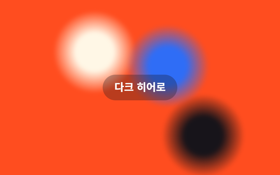
<main class="stage">
  <span class="aurora a1" aria-hidden="true"></span>
  <span class="aurora a2" aria-hidden="true"></span>
  <span class="aurora a3" aria-hidden="true"></span>
  <p class="hint">Hero tối</p>
</main>
@use "../../../../site/static/demo-tokens" as *;
// ── 변수 3개 ──────────────────────────────────────────
$duration: $dur-loop; // 덩어리 하나가 경로를 한 바퀴 도는 시간
$easing: $ease-out;
$color: $subject-blue; // 덩어리 색 하나
// ── 데모 무대 ──────────────────────────────────────────
@include stage($stage-orange);
.stage {
position: relative;
overflow: hidden;
}
// filter: blur 로 흐린 덩어리를 겹치고, transform(translate·rotate)으로만 움직인다
.aurora {
position: absolute;
width: 38%;
aspect-ratio: 1;
border-radius: 50%;
filter: blur(3px);
opacity: 1;
}
.a1 { background: radial-gradient($subject-cream 0%, $subject-cream 25%, transparent 55%); top: -8%; left: 8%; animation: spin1 $duration linear infinite; }
.a2 { background: radial-gradient($stage-ink 0%, $stage-ink 25%, transparent 55%); bottom: -12%; right: 4%; animation: spin2 $duration linear infinite; animation-delay: -1s; }
.a3 { background: radial-gradient($color 0%, $color 25%, transparent 55%); top: 22%; right: 28%; animation: spin3 $duration linear infinite; animation-delay: -.5s; }
@keyframes spin1 { 0% { transform: translate(0, 0) rotate(0deg); } 50% { transform: translate(56px, 38px) rotate(180deg); } 100% { transform: translate(0, 0) rotate(360deg); } }
@keyframes spin2 { 0% { transform: translate(0, 0) rotate(0deg); } 50% { transform: translate(-50px, -30px) rotate(-160deg); } 100% { transform: translate(0, 0) rotate(-360deg); } }
@keyframes spin3 { 0% { transform: translate(0, 0) rotate(0deg); } 50% { transform: translate(36px, -48px) rotate(150deg); } 100% { transform: translate(0, 0) rotate(300deg); } }
.hint {
position: relative;
margin: 0;
padding: 10px 20px;
border-radius: $r-pill;
background: rgba($stage-ink, .3);
color: $stage-paper;
font: 700 clamp(14px, 4vw, 18px)/1.3 -apple-system, "Segoe UI", "Noto Sans KR", sans-serif;
}
@media (prefers-reduced-motion: reduce) {
.aurora { animation: none; }
}html, body {
margin: 0;
overflow: hidden;
}
.stage {
box-sizing: border-box;
min-height: 100vh;
display: grid;
place-items: center;
margin: 0;
background: #ff4d1f;
font-family: -apple-system, "Segoe UI", "Noto Sans KR", sans-serif;
padding: clamp(8px, 4vw, 24px);
}
.stage {
position: relative;
overflow: hidden;
}
.aurora {
position: absolute;
width: 38%;
aspect-ratio: 1;
border-radius: 50%;
filter: blur(3px);
opacity: 1;
}
.a1 {
background: radial-gradient(#fff7e6 0%, #fff7e6 25%, transparent 55%);
top: -8%;
left: 8%;
animation: spin1 2s linear infinite;
}
.a2 {
background: radial-gradient(#17141a 0%, #17141a 25%, transparent 55%);
bottom: -12%;
right: 4%;
animation: spin2 2s linear infinite;
animation-delay: -1s;
}
.a3 {
background: radial-gradient(#2f6df6 0%, #2f6df6 25%, transparent 55%);
top: 22%;
right: 28%;
animation: spin3 2s linear infinite;
animation-delay: -0.5s;
}
@keyframes spin1 {
0% {
transform: translate(0, 0) rotate(0deg);
}
50% {
transform: translate(56px, 38px) rotate(180deg);
}
100% {
transform: translate(0, 0) rotate(360deg);
}
}
@keyframes spin2 {
0% {
transform: translate(0, 0) rotate(0deg);
}
50% {
transform: translate(-50px, -30px) rotate(-160deg);
}
100% {
transform: translate(0, 0) rotate(-360deg);
}
}
@keyframes spin3 {
0% {
transform: translate(0, 0) rotate(0deg);
}
50% {
transform: translate(36px, -48px) rotate(150deg);
}
100% {
transform: translate(0, 0) rotate(300deg);
}
}
.hint {
position: relative;
margin: 0;
padding: 10px 20px;
border-radius: 999px;
background: rgba(23, 20, 26, 0.3);
color: #ffffff;
font: 700 clamp(14px, 4vw, 18px)/1.3 -apple-system, "Segoe UI", "Noto Sans KR", sans-serif;
}
@media (prefers-reduced-motion: reduce) {
.aurora {
animation: none;
}
}import type { CSSProperties, ReactNode } from "react";
import styles from "./AuroraBlurBg.module.scss";
export type AuroraBlurBgProps = {
children?: ReactNode;
/** 덩어리 하나가 경로를 한 바퀴 도는 시간 (기본 2000ms) */
duration?: number;
easing?: string;
/** 덩어리 색 하나 */
color?: string;
className?: string;
};
type Vars = CSSProperties & { "--duration"?: string; "--color"?: string };
export default function AuroraBlurBg({
children,
duration = 2000,
easing = "linear",
color = "#2f6df6",
className = "",
}: AuroraBlurBgProps) {
const vars: Vars = { "--duration": `${duration}ms`, "--color": color };
void easing; // linear 고정 — spin 키프레임은 등속이 자연스럽다
return (
<div className={`${styles.stage} ${className}`} style={vars}>
<span className={`${styles.aurora} ${styles.a1}`} aria-hidden="true" />
<span className={`${styles.aurora} ${styles.a2}`} aria-hidden="true" />
<span className={`${styles.aurora} ${styles.a3}`} aria-hidden="true" />
{children}
</div>
);
}03 Aurora mờ — Diện tích đo được 41.671% · khung hình chuyển động 23/23Nguyên tác GODRICH · SCSS và React nằm trong tệp zip · 9 hiệu ứng css background animation dán là chạy
Bài viết chứa demo này
 9 hiệu ứng css background animation dán là chạyCss background animation là cách khiến nền sau nội dung — gradient, lưới, chấm, nhiễu — tự chuyển động mà không cần ảnh Xem tất cả demo trong bài này