05Mờ rồi nét dần
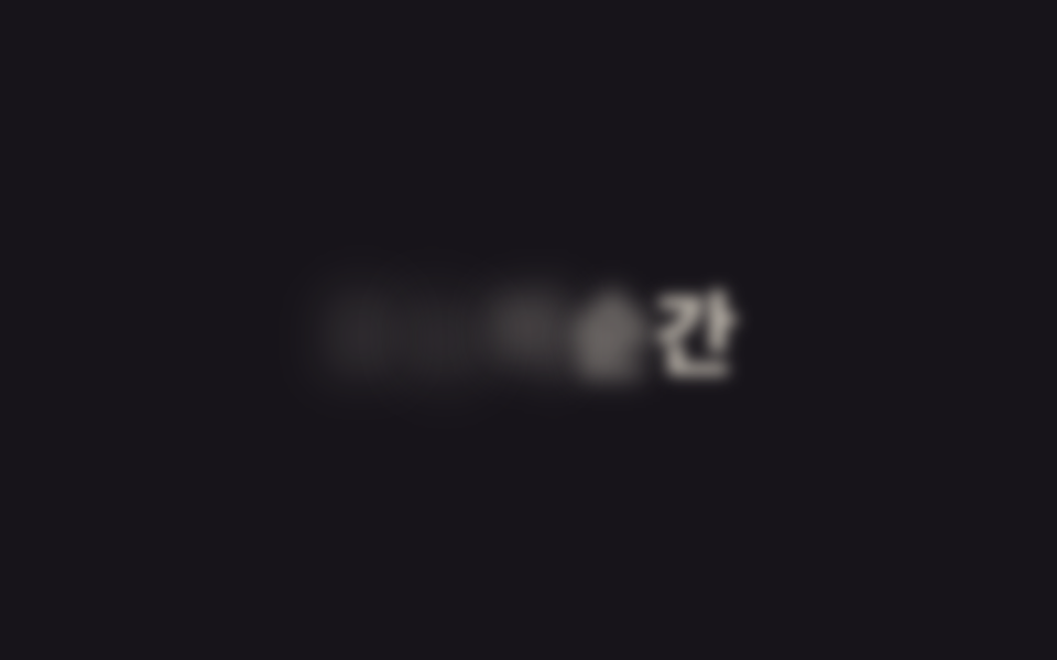
filter: blur chuyển từ 14px về 0 cùng lúc opacity đi từ 0 lên 1, nên câu chữ nét dần lên đúng như đang lấy nét ống kính. Không một thuộc tính transform nào được động tới, vị trí chữ đứng yên suốt, chỉ độ sắc nét thay đổi.
Dùng choTiêu đề modal, overlay xuất hiện, caption ảnh fade in
filter: bluropacity12px→0
<main class="stage">
  <h1 class="blur" data-split>Khoảnh khắc hôm nay</h1>
</main>
@use "../../../../site/static/demo-tokens" as *;
$duration: $dur-loop; // 흐림에서 초점까지 한 주기
$easing: $ease-out;
$blur: 14px; // 시작 흐림 정도
@include stage($stage-ink);
.blur {
margin: 0;
font-weight: 800; font-size: clamp(28px, 8.6vw, 44px); line-height: 1.2; font-family: inherit;
color: $subject-cream;
text-align: center;
}
.blur .letter {
display: inline-block;
animation: blur-focus $duration $easing infinite;
animation-delay: calc(var(--i) * 40ms + var(--n) * 80ms); // 글자마다 흐림이 풀리는 순간을 흩뜨린다
}
@keyframes blur-focus {
0%, 4% { opacity: 0; filter: blur(#{$blur}); }
30%, 76% { opacity: 1; filter: blur(0); }
96%, 100% { opacity: 0; filter: blur(#{$blur}); }
}
@media (prefers-reduced-motion: reduce) {
.blur .letter { animation: none; opacity: 1; filter: none; }
}html, body {
margin: 0;
overflow: hidden;
}
.stage {
box-sizing: border-box;
min-height: 100vh;
display: grid;
place-items: center;
margin: 0;
background: #17141a;
font-family: -apple-system, "Segoe UI", "Noto Sans KR", sans-serif;
padding: clamp(8px, 4vw, 24px);
}
.blur {
margin: 0;
font-weight: 800;
font-size: clamp(28px, 8.6vw, 44px);
line-height: 1.2;
font-family: inherit;
color: #fff7e6;
text-align: center;
}
.blur .letter {
display: inline-block;
animation: blur-focus 2s ease-out infinite;
animation-delay: calc(var(--i) * 40ms + var(--n) * 80ms);
}
@keyframes blur-focus {
0%, 4% {
opacity: 0;
filter: blur(14px);
}
30%, 76% {
opacity: 1;
filter: blur(0);
}
96%, 100% {
opacity: 0;
filter: blur(14px);
}
}
@media (prefers-reduced-motion: reduce) {
.blur .letter {
animation: none;
opacity: 1;
filter: none;
}
}(function(){
function splitLetters(el){
var text = el.textContent;
el.textContent = "";
Array.from(text).forEach(function(ch, i){
var span = document.createElement("span");
span.className = "letter";
var seed = Math.sin((i + 1) * 12.9898) * 43758.5453;
var noise = seed - Math.floor(seed);
span.style.setProperty("--i", i);
span.style.setProperty("--n", noise.toFixed(3));
span.textContent = ch === " " ? " " : ch;
el.appendChild(span);
});
}
document.querySelectorAll("[data-split]").forEach(splitLetters);
})();import type { CSSProperties } from "react";
import styles from "./BlurFocus.module.scss";
type Vars = CSSProperties & { "--i"?: number; "--n"?: number };
function noise(i: number): number {
const s = Math.sin((i + 1) * 12.9898) * 43758.5453;
return Number((s - Math.floor(s)).toFixed(3));
}
export type BlurFocusProps = {
text: string;
/** 흐림에서 초점까지 한 주기 (기본 2000ms) */
duration?: number;
color?: string;
};
export default function BlurFocus({ text, duration = 2000, color = "#fff7e6" }: BlurFocusProps) {
const vars = { "--duration": `${duration}ms`, "--color": color } as CSSProperties;
const chars = Array.from(text);
return (
<h1 className={styles.blur} style={vars}>
{chars.map((ch, i) => (
<span key={i} className={styles.letter} style={{ "--i": i, "--n": noise(i) } as Vars}>
{ch === " " ? " " : ch}
</span>
))}
</h1>
);
}05 Mờ rồi nét dần — Diện tích đo được 6.333% · khung hình chuyển động 15/23Nguyên tác GODRICH · SCSS và React nằm trong tệp zip · 9 CSS Text Animation Effects — dán 1 dòng là chạy
Bài viết chứa demo này
 9 CSS Text Animation Effects — dán 1 dòng là chạyCSS text animation effects là các chuyển động chữ dựng thuần bằng CSS, không cần JavaScript, giúp tiêu đề hay câu chữ xu Xem tất cả demo trong bài này