08Sọc chéo di chuyển
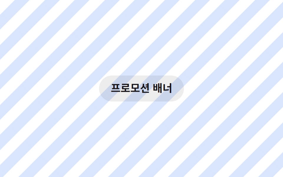
Sọc repeating-linear-gradient nghiêng 45 độ có background-position dịch theo đúng hướng chéo đó nên các sọc trông như đang diễu hành trên bề mặt.
Dùng choNền banner sale khuyến mãi, nền trạng thái đang xử lý
repeating-linear-gradient45degbackground-position
<main class="stage">
  <p class="hint">Banner khuyến mãi</p>
</main>
@use "../../../../site/static/demo-tokens" as *;
// ── 변수 3개 ──────────────────────────────────────────
$duration: $dur-loop; // 줄무늬 한 칸만큼 행진하는 시간
$easing: linear;
$color: $subject-blue; // 줄무늬 색
// ── 데모 무대 ──────────────────────────────────────────
@include stage($stage-paper);
.stage {
position: relative;
overflow: hidden;
}
// 세로 줄무늬를 그린 뒤 통째로 45도 회전시켜 대각선으로 보이게 하고, background-position 은 회전 전 좌표계에서 가로로만 한 칸(36px) 이동시킨다
// (45deg 로 기울인 채로 background-position 을 대각선으로 움직이면 이동 방향이 줄무늬와 나란해져 화면이 안 바뀐다 — 실측 2026-09-09)
.stage::before {
content: "";
position: absolute;
inset: -150% -150%;
transform: rotate(45deg);
background-image: repeating-linear-gradient(90deg, rgba($color, .18) 0 18px, transparent 18px 36px);
animation: stripemove $duration $easing infinite;
}
.hint {
position: relative;
margin: 0;
padding: 10px 20px;
border-radius: $r-pill;
background: rgba($stage-ink, .08);
color: $stage-ink;
font: 700 clamp(14px, 4vw, 18px)/1.3 -apple-system, "Segoe UI", "Noto Sans KR", sans-serif;
}
@keyframes stripemove {
from { background-position: 0 0; }
to { background-position: 36px 0; }
}
@media (prefers-reduced-motion: reduce) {
.stage::before { animation: none; }
}html, body {
margin: 0;
overflow: hidden;
}
.stage {
box-sizing: border-box;
min-height: 100vh;
display: grid;
place-items: center;
margin: 0;
background: #ffffff;
font-family: -apple-system, "Segoe UI", "Noto Sans KR", sans-serif;
padding: clamp(8px, 4vw, 24px);
}
.stage {
position: relative;
overflow: hidden;
}
.stage::before {
content: "";
position: absolute;
inset: -150% -150%;
transform: rotate(45deg);
background-image: repeating-linear-gradient(90deg, rgba(47, 109, 246, 0.18) 0 18px, transparent 18px 36px);
animation: stripemove 2s linear infinite;
}
.hint {
position: relative;
margin: 0;
padding: 10px 20px;
border-radius: 999px;
background: rgba(23, 20, 26, 0.08);
color: #17141a;
font: 700 clamp(14px, 4vw, 18px)/1.3 -apple-system, "Segoe UI", "Noto Sans KR", sans-serif;
}
@keyframes stripemove {
from {
background-position: 0 0;
}
to {
background-position: 36px 0;
}
}
@media (prefers-reduced-motion: reduce) {
.stage::before {
animation: none;
}
}import type { CSSProperties, ReactNode } from "react";
import styles from "./StripesDiagonalBg.module.scss";
export type StripesDiagonalBgProps = {
children?: ReactNode;
/** 줄무늬 한 칸만큼 행진하는 시간 (기본 2000ms) */
duration?: number;
/** 줄무늬 색 */
color?: string;
className?: string;
};
type Vars = CSSProperties & { "--duration"?: string; "--color"?: string };
export default function StripesDiagonalBg({
children,
duration = 2000,
color = "#2f6df6",
className = "",
}: StripesDiagonalBgProps) {
const vars: Vars = { "--duration": `${duration}ms`, "--color": color };
return (
<div className={`${styles.stage} ${className}`} style={vars}>
<div className={styles.stripes} aria-hidden="true" />
{children}
</div>
);
}08 Sọc chéo di chuyển — Diện tích đo được 99.674% · khung hình chuyển động 23/23Nguyên tác GODRICH · SCSS và React nằm trong tệp zip · 9 hiệu ứng css background animation dán là chạy
Bài viết chứa demo này
 9 hiệu ứng css background animation dán là chạyCss background animation là cách khiến nền sau nội dung — gradient, lưới, chấm, nhiễu — tự chuyển động mà không cần ảnh Xem tất cả demo trong bài này