03Nét đứt chạy quanh viền
Mỗi cạnh trong bốn cạnh mang một nền gradient nét đứt riêng, và trượt background-position theo hướng cạnh đó khiến nét đứt trông như đang chạy theo chiều kim đồng hồ quanh khung.
Dùng choViền card đang trong lúc tải lên, biểu thị trạng thái chờ
repeating-linear-gradientbackground-position2초
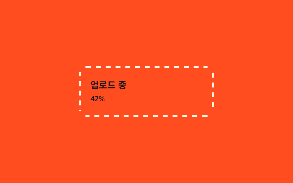
<main class="stage">
  <div class="frame is-demo">
    <span class="frame__edge frame__edge--top" aria-hidden="true"></span>
    <span class="frame__edge frame__edge--right" aria-hidden="true"></span>
    <span class="frame__edge frame__edge--bottom" aria-hidden="true"></span>
    <span class="frame__edge frame__edge--left" aria-hidden="true"></span>
    <div class="frame__body">
      <p class="frame__label">Đang tải lên</p>
      <p class="frame__pct">42%</p>
    </div>
  </div>
</main>
@use "../../../../site/static/demo-tokens" as *;
$duration: $dur-loop; // 한 바퀴 도는 시간
$easing: linear;
$color: $subject-cream; // 점선 색
@include stage($stage-orange);
.stage { padding: clamp(6px, 2.4vw, 16px); }
.frame {
position: relative;
width: min(220px, 70vw);
border-radius: 10px;
}
// 네 변을 따로 두고 각자의 방향으로 점선 배경을 흘려보낸다 — 한꺼번에 돌면 시계 방향으로 도는 것처럼 보인다
.frame__edge { position: absolute; }
.frame__edge--top, .frame__edge--bottom {
left: 10px; right: 10px; height: 3px;
background-image: repeating-linear-gradient(90deg, $color 0 8px, transparent 8px 16px);
}
.frame__edge--left, .frame__edge--right {
top: 10px; bottom: 10px; width: 3px;
background-image: repeating-linear-gradient(180deg, $color 0 8px, transparent 8px 16px);
}
.frame__edge--top { top: 0; }
.frame__edge--bottom { bottom: 0; }
.frame__edge--left { left: 0; }
.frame__edge--right { right: 0; }
.frame.is-demo .frame__edge--top { animation: run-x $duration $easing infinite; }
.frame.is-demo .frame__edge--bottom { animation: run-x-rev $duration $easing infinite; }
.frame.is-demo .frame__edge--left { animation: run-y-rev $duration $easing infinite; }
.frame.is-demo .frame__edge--right { animation: run-y $duration $easing infinite; }
@keyframes run-x { to { background-position: 32px 0; } }
@keyframes run-x-rev { to { background-position: -32px 0; } }
@keyframes run-y { to { background-position: 0 32px; } }
@keyframes run-y-rev { to { background-position: 0 -32px; } }
.frame__body { padding: 22px 18px; }
.frame__label { margin: 0 0 4px; font-weight: 700; font-size: clamp(13px, 3.6vw, 15px); line-height: 1.3; font-family: inherit; color: $subject-ink; }
.frame__pct { margin: 0; font-weight: 500; font-size: clamp(11px, 3vw, 12px); line-height: 1.3; font-family: inherit; color: $subject-ink; }
@media (prefers-reduced-motion: reduce) {
.frame.is-demo .frame__edge { animation: none; }
}html, body {
margin: 0;
overflow: hidden;
}
.stage {
box-sizing: border-box;
min-height: 100vh;
display: grid;
place-items: center;
margin: 0;
background: #ff4d1f;
font-family: -apple-system, "Segoe UI", "Noto Sans KR", sans-serif;
padding: clamp(8px, 4vw, 24px);
}
.stage {
padding: clamp(6px, 2.4vw, 16px);
}
.frame {
position: relative;
width: min(220px, 70vw);
border-radius: 10px;
}
.frame__edge {
position: absolute;
}
.frame__edge--top, .frame__edge--bottom {
left: 10px;
right: 10px;
height: 3px;
background-image: repeating-linear-gradient(90deg, #fff7e6 0 8px, transparent 8px 16px);
}
.frame__edge--left, .frame__edge--right {
top: 10px;
bottom: 10px;
width: 3px;
background-image: repeating-linear-gradient(180deg, #fff7e6 0 8px, transparent 8px 16px);
}
.frame__edge--top {
top: 0;
}
.frame__edge--bottom {
bottom: 0;
}
.frame__edge--left {
left: 0;
}
.frame__edge--right {
right: 0;
}
.frame.is-demo .frame__edge--top {
animation: run-x 2s linear infinite;
}
.frame.is-demo .frame__edge--bottom {
animation: run-x-rev 2s linear infinite;
}
.frame.is-demo .frame__edge--left {
animation: run-y-rev 2s linear infinite;
}
.frame.is-demo .frame__edge--right {
animation: run-y 2s linear infinite;
}
@keyframes run-x {
to {
background-position: 32px 0;
}
}
@keyframes run-x-rev {
to {
background-position: -32px 0;
}
}
@keyframes run-y {
to {
background-position: 0 32px;
}
}
@keyframes run-y-rev {
to {
background-position: 0 -32px;
}
}
.frame__body {
padding: 22px 18px;
}
.frame__label {
margin: 0 0 4px;
font-weight: 700;
font-size: clamp(13px, 3.6vw, 15px);
line-height: 1.3;
font-family: inherit;
color: #17141a;
}
.frame__pct {
margin: 0;
font-weight: 500;
font-size: clamp(11px, 3vw, 12px);
line-height: 1.3;
font-family: inherit;
color: #17141a;
}
@media (prefers-reduced-motion: reduce) {
.frame.is-demo .frame__edge {
animation: none;
}
}import type { CSSProperties } from "react";
import styles from "./DashedRunFrame.module.scss";
export type DashedRunFrameProps = {
label: string;
pct: string;
/** 한 바퀴 도는 시간 (기본 2000ms) */
duration?: number;
easing?: string;
/** 점선 색 */
color?: string;
};
type Vars = CSSProperties & { "--duration"?: string; "--easing"?: string; "--color"?: string };
export default function DashedRunFrame({
label,
pct,
duration = 2000,
easing = "linear",
color = "#fff7e6",
}: DashedRunFrameProps) {
const vars: Vars = { "--duration": `${duration}ms`, "--easing": easing, "--color": color };
return (
<div className={styles.frame} style={vars}>
<span className={`${styles.edge} ${styles.top}`} aria-hidden="true" />
<span className={`${styles.edge} ${styles.right}`} aria-hidden="true" />
<span className={`${styles.edge} ${styles.bottom}`} aria-hidden="true" />
<span className={`${styles.edge} ${styles.left}`} aria-hidden="true" />
<div className={styles.body}>
<p className={styles.label}>{label}</p>
<p className={styles.pct}>{pct}</p>
</div>
</div>
);
}03 Nét đứt chạy quanh viền — Diện tích đo được 1.1% · khung hình chuyển động 23/23Nguyên tác GODRICH · SCSS và React nằm trong tệp zip · 9 CSS Border Animations — dán 1 dòng là chạy
Bài viết chứa demo này
 9 CSS Border Animations — dán 1 dòng là chạyCSS border animation là hiệu ứng viền của card hay ô nhập di chuyển, phát sáng hoặc đổi màu bằng thuần CSS để báo một tr Xem tất cả demo trong bài này