07Đường chấm mọc dần
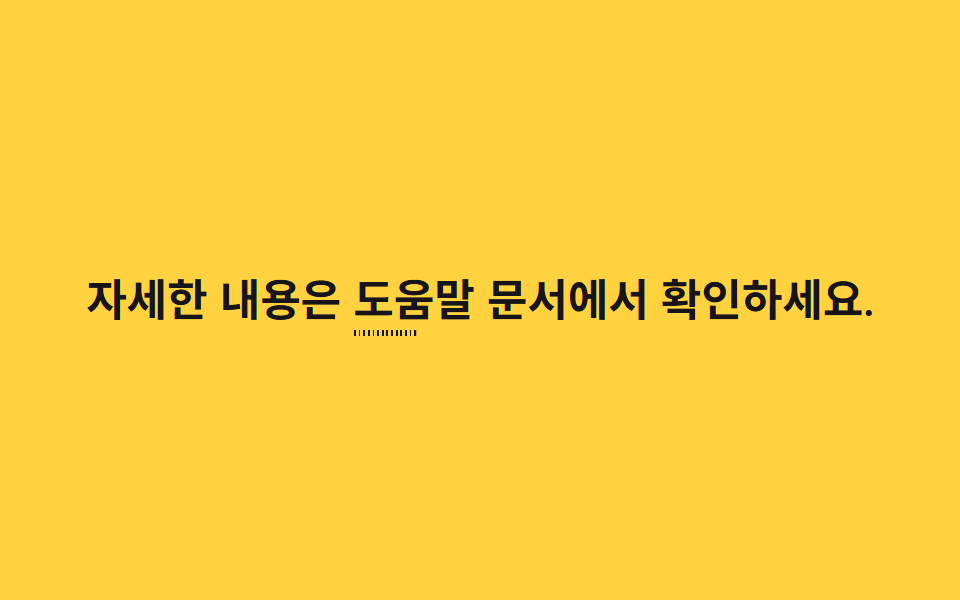
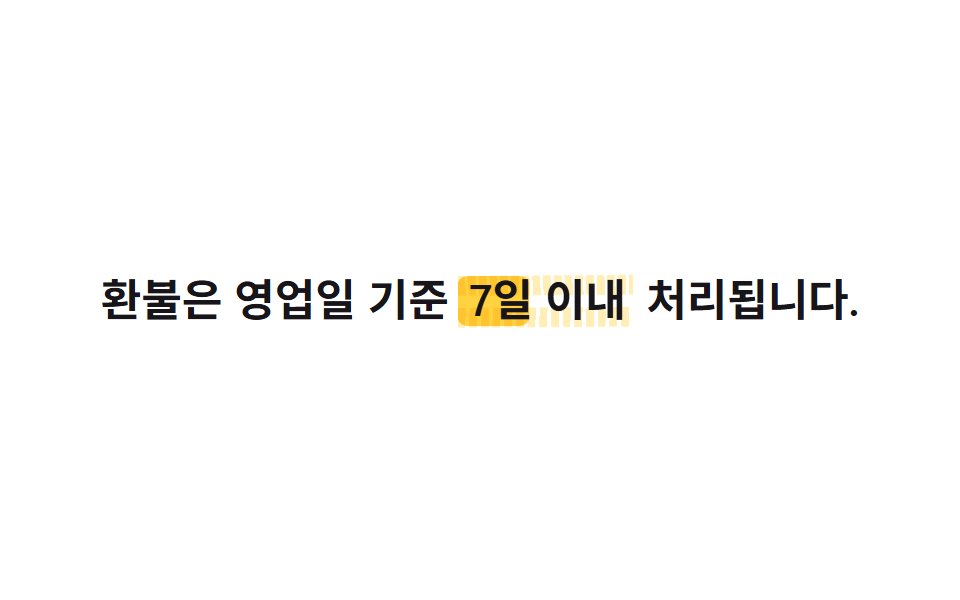
Một thanh mảnh vẽ chấm cách đều bằng repeating-linear-gradient nằm dưới chữ và mọc rộng qua transform: scaleX(0 → 1), nên đường chấm trông như đang nối thêm từng chấm một từ trái.
Dùng choĐường dẫn tiến độ trong hướng dẫn từng bước, đường nối chú thích
repeating-linear-gradienttransform:scaleX700ms
<main class="stage">
  <p class="line">Xem chi tiết tại <span class="hl">tài liệu trợ giúp<span class="hl__dots" aria-hidden="true"></span></span>.</p>
</main>
@use "../../../../site/static/demo-tokens" as *;
// ── 변수 3개 ─────────────────────────────
$duration: 700ms;
$easing: $ease-out;
$color: $stage-ink; // 점선 색
// ── 데모 무대 ───────────────────────────────
@include stage($stage-yellow);
.line {
max-width: 92%;
margin: 0;
color: $stage-ink;
font-weight: 600;
font-size: clamp(16px, 4.6vw, 22px);
line-height: 1.6;
font-family: inherit;
text-align: center;
}
.hl {
position: relative;
font-weight: 700;
}
// 일정 간격의 점을 그린 얇은 막대를 글자 아래 두고 왼쪽부터 늘린다
.hl__dots {
position: absolute;
left: 0;
right: 0;
bottom: -4px;
height: 3px;
background-image: repeating-linear-gradient(90deg, $color 0 3px, transparent 3px 8px);
transform: scaleX(0);
transform-origin: left center; // 규칙8: 점선 왼쪽에서 늘어남
animation: grow $duration $easing infinite, grow-thick $duration $easing infinite;
}
@keyframes grow {
0% { transform: scaleX(0); }
40% { transform: scaleX(1); }
80% { transform: scaleX(1); }
100% { transform: scaleX(0); }
}
// 페인트 물성: 점선 두께(펜 압력)가 늘어나는 주기와 같은 리듬으로 불규칙 진동 — height 는 transform 아님
@keyframes grow-thick {
0% { height: 3px; }
15% { height: 4px; }
30% { height: 2.5px; }
45% { height: 3.5px; }
60% { height: 2.5px; }
75% { height: 4px; }
90% { height: 3px; }
100% { height: 3px; }
}
@media (prefers-reduced-motion: reduce) {
.hl__dots { animation: none; transform: scaleX(1); }
}html, body {
margin: 0;
overflow: hidden;
}
.stage {
box-sizing: border-box;
min-height: 100vh;
display: grid;
place-items: center;
margin: 0;
background: #ffd23f;
font-family: -apple-system, "Segoe UI", "Noto Sans KR", sans-serif;
padding: clamp(8px, 4vw, 24px);
}
.line {
max-width: 92%;
margin: 0;
color: #17141a;
font-weight: 600;
font-size: clamp(16px, 4.6vw, 22px);
line-height: 1.6;
font-family: inherit;
text-align: center;
}
.hl {
position: relative;
font-weight: 700;
}
.hl__dots {
position: absolute;
left: 0;
right: 0;
bottom: -4px;
height: 3px;
background-image: repeating-linear-gradient(90deg, #17141a 0 3px, transparent 3px 8px);
transform: scaleX(0);
transform-origin: left center;
animation: grow 700ms ease-out infinite, grow-thick 700ms ease-out infinite;
}
@keyframes grow {
0% {
transform: scaleX(0);
}
40% {
transform: scaleX(1);
}
80% {
transform: scaleX(1);
}
100% {
transform: scaleX(0);
}
}
@keyframes grow-thick {
0% {
height: 3px;
}
15% {
height: 4px;
}
30% {
height: 2.5px;
}
45% {
height: 3.5px;
}
60% {
height: 2.5px;
}
75% {
height: 4px;
}
90% {
height: 3px;
}
100% {
height: 3px;
}
}
@media (prefers-reduced-motion: reduce) {
.hl__dots {
animation: none;
transform: scaleX(1);
}
}import type { CSSProperties, ReactNode } from "react";
import styles from "./DottedGrow.module.scss";
export type DottedGrowProps = {
before: ReactNode;
keyword: ReactNode;
after?: ReactNode;
/** 점선이 다 자라는 시간 (기본 700ms) */
duration?: number;
easing?: string;
/** 점선 색 */
color?: string;
};
type Vars = CSSProperties & {
"--duration"?: string;
"--easing"?: string;
"--color"?: string;
};
export default function DottedGrow({
before,
keyword,
after,
duration = 700,
easing = "ease-out",
color = "#17141a",
}: DottedGrowProps) {
const vars: Vars = {
"--duration": `${duration}ms`,
"--easing": easing,
"--color": color,
};
return (
<p className={styles.line} style={vars}>
{before} <span className={styles.hl}>{keyword}<span className={styles.dots} aria-hidden="true" /></span>{after}
</p>
);
}07 Đường chấm mọc dần — Diện tích đo được 0.312% · khung hình chuyển động 23/23Nguyên tác GODRICH · SCSS và React nằm trong tệp zip · 9 CSS Text Highlight Animation: dán 1 dòng là chạy
Bài viết chứa demo này
 9 CSS Text Highlight Animation: dán 1 dòng là chạyCSS text highlight animation là hiệu ứng CSS thuần giúp tô sáng, gạch chân hoặc gạch ngang một từ trong câu ngay khi tra Xem tất cả demo trong bài này