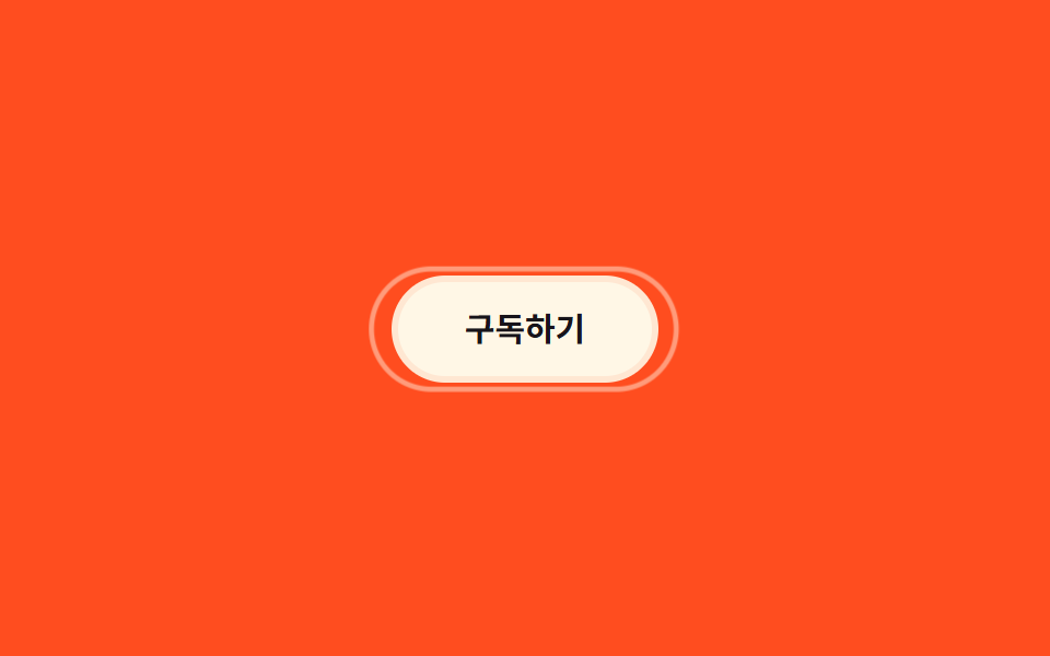
07Viền vòng đôi
Một vòng thứ hai đặt ngay ngoài viền trong cố định, khi hover scale lớn dần trong khi opacity tăng từ 0 lên 1, lan ra như gợn sóng.
Dùng choNhấn mạnh khi hover trên nút, làm nổi bật icon thông báo
box-shadow 2겹transform: scale0.3초
<main class="stage">
  <button class="btn is-demo" type="button">Đăng ký</button>
</main>
@use "../../../../site/static/demo-tokens" as *;
$duration: $dur-base; // 실제 호버 시 바깥 링이 퍼지는 시간
$easing: $ease-out;
$color: $subject-cream; // 링 색
@include stage($stage-orange);
.stage { padding: clamp(6px, 2.4vw, 16px); }
.btn {
position: relative;
border: 0;
border-radius: $r-pill;
padding: 14px 30px;
font-weight: 700; font-size: clamp(13px, 3.6vw, 15px); line-height: 1; font-family: inherit;
color: $stage-ink;
background: $color;
cursor: pointer;
box-shadow: 0 0 0 3px rgba($color, .9); // 안쪽 고정 링
}
.btn::after { // 바깥 링 — 평소엔 숨어 있다
content: "";
position: absolute;
inset: -3px;
border-radius: inherit;
border: 2px solid $color;
opacity: 0;
transform: scale(1);
transition: transform $duration $easing, opacity $duration $easing;
}
.btn:hover::after, .btn:focus-visible::after { opacity: 1; transform: scale(1.3); }
.btn.is-demo::after { animation: ring-pulse $dur-loop $easing infinite; }
@keyframes ring-pulse {
0%, 15% { transform: scale(1); opacity: .9; }
70% { transform: scale(1.35); opacity: 0; }
100% { transform: scale(1.35); opacity: 0; }
}
@media (prefers-reduced-motion: reduce) {
.btn::after { transition: none; }
.btn.is-demo::after { animation: none; opacity: 0; }
}html, body {
margin: 0;
overflow: hidden;
}
.stage {
box-sizing: border-box;
min-height: 100vh;
display: grid;
place-items: center;
margin: 0;
background: #ff4d1f;
font-family: -apple-system, "Segoe UI", "Noto Sans KR", sans-serif;
padding: clamp(8px, 4vw, 24px);
}
.stage {
padding: clamp(6px, 2.4vw, 16px);
}
.btn {
position: relative;
border: 0;
border-radius: 999px;
padding: 14px 30px;
font-weight: 700;
font-size: clamp(13px, 3.6vw, 15px);
line-height: 1;
font-family: inherit;
color: #17141a;
background: #fff7e6;
cursor: pointer;
box-shadow: 0 0 0 3px rgba(255, 247, 230, 0.9);
}
.btn::after {
content: "";
position: absolute;
inset: -3px;
border-radius: inherit;
border: 2px solid #fff7e6;
opacity: 0;
transform: scale(1);
transition: transform 300ms ease-out, opacity 300ms ease-out;
}
.btn:hover::after, .btn:focus-visible::after {
opacity: 1;
transform: scale(1.3);
}
.btn.is-demo::after {
animation: ring-pulse 2s ease-out infinite;
}
@keyframes ring-pulse {
0%, 15% {
transform: scale(1);
opacity: 0.9;
}
70% {
transform: scale(1.35);
opacity: 0;
}
100% {
transform: scale(1.35);
opacity: 0;
}
}
@media (prefers-reduced-motion: reduce) {
.btn::after {
transition: none;
}
.btn.is-demo::after {
animation: none;
opacity: 0;
}
}import type { CSSProperties } from "react";
import styles from "./DoubleRingButton.module.scss";
export type DoubleRingButtonProps = {
label: string;
/** 실제 호버 시 바깥 링이 퍼지는 시간 (기본 300ms) */
duration?: number;
easing?: string;
/** 링 색 */
color?: string;
};
type Vars = CSSProperties & { "--duration"?: string; "--easing"?: string; "--color"?: string };
export default function DoubleRingButton({
label,
duration = 300,
easing = "ease-out",
color = "#fff7e6",
}: DoubleRingButtonProps) {
const vars: Vars = { "--duration": `${duration}ms`, "--easing": easing, "--color": color };
return (
<button className={styles.btn} style={vars} type="button">
{label}
</button>
);
}07 Viền vòng đôi — Diện tích đo được 2.954% · khung hình chuyển động 12/23Nguyên tác GODRICH · SCSS và React nằm trong tệp zip · 9 CSS Border Animations — dán 1 dòng là chạy
Bài viết chứa demo này
 9 CSS Border Animations — dán 1 dòng là chạyCSS border animation là hiệu ứng viền của card hay ô nhập di chuyển, phát sáng hoặc đổi màu bằng thuần CSS để báo một tr Xem tất cả demo trong bài này