04Nền blob kính di chuyển
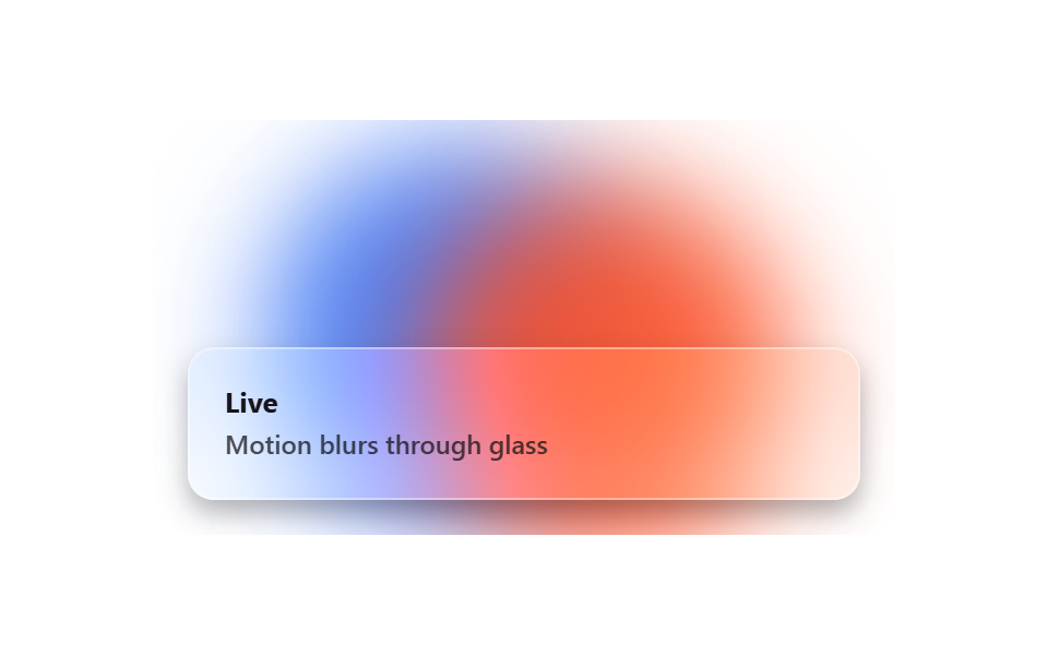
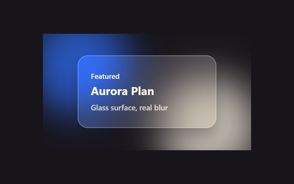
Phía sau tấm kính, hai blob nhòe hai màu khác nhau chậm rãi đổi chỗ và trôi nổi bằng transform, còn backdrop-filter của panel hắt chuyển động đó thành vệt mờ xuyên qua mặt kính.
Dùng choNền hero section, nền màn hình đăng nhập
transformblur(40px)2s loop
<main class="stage">
  <div class="bb-scene">
    <span class="bb-blob bb-blob--a"></span>
    <span class="bb-blob bb-blob--b"></span>
    <div class="bb-panel">
      <span class="bb-panel__title">Live</span>
      <span class="bb-panel__desc">Motion blurs through glass</span>
    </div>
  </div>
</main>
@use "../../../../site/static/demo-tokens" as *;
// ── 변수 3개 ──────────────────────────────────────────
$duration: $dur-loop;
$easing: linear;
$color: $subject-blue;
@include stage($stage-paper);
.bb-scene {
position: relative;
width: min(340px, 90vw);
aspect-ratio: 340 / 190;
overflow: hidden;
border-radius: $r-card;
}
// 블롭 두 개는 배경(무대)이 아니라 이 안의 장식 레이어다 — .stage 자체 배경은 여전히 단색
// blur(40px) 는 인접 프레임 간 픽셀차를 문턱(12) 바로 아래로 뭉갰다(실측: 모든 프레임 쌍이 11~12) —
// 블러를 26px 로 낮추고 이동 폭을 키워 프레임마다 확실히 문턱을 넘게 했다
.bb-blob {
position: absolute;
width: 170px;
height: 170px;
border-radius: 50%;
filter: blur(26px);
opacity: .88;
}
.bb-blob--a { background: $color; top: -40px; left: -30px; animation: bb-drift-a $duration $easing infinite; }
.bb-blob--b { background: $stage-orange; bottom: -50px; right: -20px; animation: bb-drift-b $duration $easing infinite; }
@keyframes bb-drift-a {
0%, 100% { transform: translate(0, 0); }
50% { transform: translate(110px, 70px); }
}
@keyframes bb-drift-b {
0%, 100% { transform: translate(0, 0); }
50% { transform: translate(-90px, -55px); }
}
.bb-panel {
position: absolute;
inset: auto $sp-4 $sp-4 $sp-4;
box-sizing: border-box;
padding: $sp-4;
border-radius: $r-control;
background: rgba(255, 255, 255, .22);
border: 1px solid rgba(255, 255, 255, .4);
backdrop-filter: blur(18px) saturate(160%);
-webkit-backdrop-filter: blur(18px) saturate(160%);
box-shadow: $shadow-press;
display: flex;
flex-direction: column;
gap: $sp-1;
color: $subject-ink;
font: 600 12px/1.3 -apple-system, "Segoe UI", sans-serif;
}
.bb-panel__title { font-weight: 700; font-size: 13px; }
.bb-panel__desc { opacity: .75; }
@media (prefers-reduced-motion: reduce) {
.bb-blob { animation: none !important; }
}html, body {
margin: 0;
overflow: hidden;
}
.stage {
box-sizing: border-box;
min-height: 100vh;
display: grid;
place-items: center;
margin: 0;
background: #ffffff;
font-family: -apple-system, "Segoe UI", "Noto Sans KR", sans-serif;
padding: clamp(8px, 4vw, 24px);
}
.bb-scene {
position: relative;
width: min(340px, 90vw);
aspect-ratio: 340/190;
overflow: hidden;
border-radius: 16px;
}
.bb-blob {
position: absolute;
width: 170px;
height: 170px;
border-radius: 50%;
filter: blur(26px);
opacity: 0.88;
}
.bb-blob--a {
background: #2f6df6;
top: -40px;
left: -30px;
animation: bb-drift-a 2s linear infinite;
}
.bb-blob--b {
background: #ff4d1f;
bottom: -50px;
right: -20px;
animation: bb-drift-b 2s linear infinite;
}
@keyframes bb-drift-a {
0%, 100% {
transform: translate(0, 0);
}
50% {
transform: translate(110px, 70px);
}
}
@keyframes bb-drift-b {
0%, 100% {
transform: translate(0, 0);
}
50% {
transform: translate(-90px, -55px);
}
}
.bb-panel {
position: absolute;
inset: auto 16px 16px 16px;
box-sizing: border-box;
padding: 16px;
border-radius: 12px;
background: rgba(255, 255, 255, 0.22);
border: 1px solid rgba(255, 255, 255, 0.4);
backdrop-filter: blur(18px) saturate(160%);
-webkit-backdrop-filter: blur(18px) saturate(160%);
box-shadow: 0 6px 12px rgba(23, 20, 26, 0.32);
display: flex;
flex-direction: column;
gap: 4px;
color: #17141a;
font: 600 12px/1.3 -apple-system, "Segoe UI", sans-serif;
}
.bb-panel__title {
font-weight: 700;
font-size: 13px;
}
.bb-panel__desc {
opacity: 0.75;
}
@media (prefers-reduced-motion: reduce) {
.bb-blob {
animation: none !important;
}
}import { CSSProperties } from "react";
import styles from "./GlassBlobBackground.module.scss";
type Vars = CSSProperties & {
"--duration"?: string;
"--color"?: string;
};
export interface GlassBlobBackgroundProps {
duration?: string;
color?: string;
}
export default function GlassBlobBackground({
duration = "2000ms",
color = "#2f6df6",
}: GlassBlobBackgroundProps) {
const style: Vars = { "--duration": duration, "--color": color };
return (
<div className={styles.scene} style={style}>
<span className={`${styles.blob} ${styles.blobA}`} />
<span className={`${styles.blob} ${styles.blobB}`} />
<div className={styles.panel}>
<span className={styles.panelTitle}>Live</span>
<span className={styles.panelDesc}>Motion blurs through glass</span>
</div>
</div>
);
}04 Nền blob kính di chuyển — Diện tích đo được 41.944% · khung hình chuyển động 23/23Nguyên tác GODRICH · SCSS và React nằm trong tệp zip · 9 css glassmorphism — dán một file là chạy
Bài viết chứa demo này
 9 css glassmorphism — dán một file là chạyGlassmorphism là đặt một tấm kính mờ lên màn hình: nền phía sau hiện lên mờ mềm còn chữ phía trên vẫn rõ nét. Chín hiệu Xem tất cả demo trong bài này