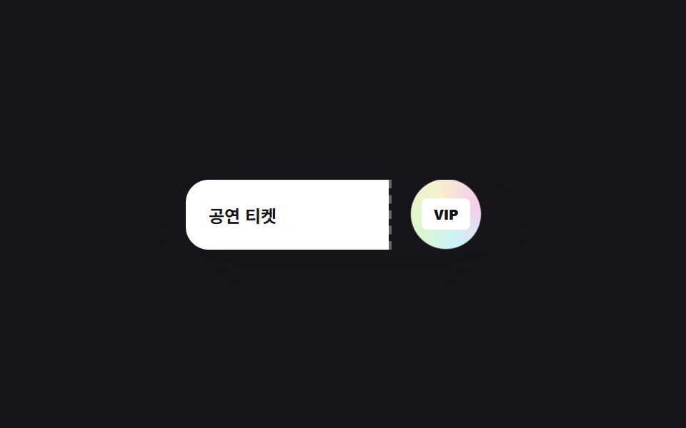
05Con dấu holographic trên cuống vé
Con dấu tròn trên cuống vé xoay nhẹ nhàng bằng conic-gradient, khi rê chuột sẽ to hơn và sáng hơn một chút.
Dùng choUI vé concert/sự kiện, dấu xác thực trên vé vào cửa dạng số
conic-gradienttransform: scalebox-shadow 확산
<main class="stage">
  <div class="ticket">
    <div class="ticket__main">
      <span class="ticket__label">Vé xem concert</span>
    </div>
    <div class="ticket__stub">
      <span class="ticket__stampwrap is-demo" tabindex="0">
        <span class="ticket__stamp" aria-hidden="true"></span>
      </span>
      <span class="ticket__stamp-text">VIP</span>
    </div>
  </div>
</main>
@use "../../../../site/static/demo-tokens" as *;
$duration: $dur-loop; // 스탬프가 커지는 펄스 한 번의 시간
$easing: $ease-out;
$color: $subject-blue; // 사용 안 함(참고용)
@include stage($stage-ink);
.ticket {
display: flex;
width: min(220px, 66vw);
border-radius: $r-card;
overflow: hidden;
box-shadow: $shadow-raised;
}
.ticket__main {
flex: 1;
background: $stage-paper;
padding: $sp-4;
display: flex; align-items: center;
}
.ticket__label { font-weight: 700; font-size: 12px; color: $stage-ink; font-family: inherit; }
.ticket__stub {
position: relative;
width: 76px;
background: $stage-ink;
display: grid; place-items: center;
border-left: 2px dashed rgba($stage-paper, .35);
}
.ticket__stampwrap {
position: relative;
width: 46px; height: 46px;
outline: none;
transition: transform $duration $easing, filter $duration $easing;
}
.ticket__stamp {
position: absolute; inset: 0;
border-radius: $r-pill;
background: conic-gradient(from 0deg, #dcb9d1, #b9d9dc, #c8dcb9, #dcdab9, #dcb9d1);
filter: saturate(1.1);
animation: stamp-spin 3s linear infinite;
}
.ticket__stamp-text {
position: absolute;
font-size: 10px; font-weight: 800; color: $stage-ink;
background: $stage-paper; padding: $sp-1 $sp-2; border-radius: $r-xs;
}
.ticket__stampwrap:hover,
.ticket__stampwrap:focus-visible { transform: scale(1.15); filter: brightness(1.2); }
.ticket__stampwrap.is-demo { animation: stamp-pulse $dur-loop $easing infinite; }
@keyframes stamp-spin { to { transform: rotate(360deg); } }
@keyframes stamp-pulse {
0%, 20% { transform: scale(1); filter: brightness(1); }
50% { transform: scale(1.15); filter: brightness(1.25); }
80%, 100% { transform: scale(1); filter: brightness(1); }
}
@media (prefers-reduced-motion: reduce) {
.ticket__stampwrap { transition: none; }
.ticket__stamp { animation: none; }
.ticket__stampwrap.is-demo { animation: none; }
}html, body {
margin: 0;
overflow: hidden;
}
.stage {
box-sizing: border-box;
min-height: 100vh;
display: grid;
place-items: center;
margin: 0;
background: #17141a;
font-family: -apple-system, "Segoe UI", "Noto Sans KR", sans-serif;
padding: clamp(8px, 4vw, 24px);
}
.ticket {
display: flex;
width: min(220px, 66vw);
border-radius: 16px;
overflow: hidden;
box-shadow: 0 14px 24px rgba(23, 20, 26, 0.32);
}
.ticket__main {
flex: 1;
background: #ffffff;
padding: 16px;
display: flex;
align-items: center;
}
.ticket__label {
font-weight: 700;
font-size: 12px;
color: #17141a;
font-family: inherit;
}
.ticket__stub {
position: relative;
width: 76px;
background: #17141a;
display: grid;
place-items: center;
border-left: 2px dashed rgba(255, 255, 255, 0.35);
}
.ticket__stampwrap {
position: relative;
width: 46px;
height: 46px;
outline: none;
transition: transform 2s ease-out, filter 2s ease-out;
}
.ticket__stamp {
position: absolute;
inset: 0;
border-radius: 999px;
background: conic-gradient(from 0deg, #dcb9d1, #b9d9dc, #c8dcb9, #dcdab9, #dcb9d1);
filter: saturate(1.1);
animation: stamp-spin 3s linear infinite;
}
.ticket__stamp-text {
position: absolute;
font-size: 10px;
font-weight: 800;
color: #17141a;
background: #ffffff;
padding: 4px 8px;
border-radius: 4px;
}
.ticket__stampwrap:hover,
.ticket__stampwrap:focus-visible {
transform: scale(1.15);
filter: brightness(1.2);
}
.ticket__stampwrap.is-demo {
animation: stamp-pulse 2s ease-out infinite;
}
@keyframes stamp-spin {
to {
transform: rotate(360deg);
}
}
@keyframes stamp-pulse {
0%, 20% {
transform: scale(1);
filter: brightness(1);
}
50% {
transform: scale(1.15);
filter: brightness(1.25);
}
80%, 100% {
transform: scale(1);
filter: brightness(1);
}
}
@media (prefers-reduced-motion: reduce) {
.ticket__stampwrap {
transition: none;
}
.ticket__stamp {
animation: none;
}
.ticket__stampwrap.is-demo {
animation: none;
}
}import type { CSSProperties } from "react";
import styles from "./TicketStubStamp.module.scss";
export type TicketStubStampProps = {
label: string;
stampText: string;
/** 스탬프가 커지는 펄스 한 번의 시간 (기본 2000ms) */
duration?: number;
easing?: string;
/** 사용 안 함(참고용) */
color?: string;
};
type Vars = CSSProperties & { "--duration"?: string; "--easing"?: string; "--color"?: string };
export default function TicketStubStamp({
label,
stampText,
duration = 2000,
easing = "ease-out",
color = "#2f6df6",
}: TicketStubStampProps) {
const vars: Vars = { "--duration": `${duration}ms`, "--easing": easing, "--color": color };
return (
<div className={styles.ticket} style={vars}>
<div className={styles.main}>
<span className={styles.label}>{label}</span>
</div>
<div className={styles.stub}>
<span className={styles.stampwrap} tabIndex={0}>
<span className={styles.stamp} aria-hidden="true" />
</span>
<span className={styles.stampText}>{stampText}</span>
</div>
</div>
);
}05 Con dấu holographic trên cuống vé — Diện tích đo được 1.053% · khung hình chuyển động 23/23Nguyên tác GODRICH · SCSS và React nằm trong tệp zip · 9 hiệu ứng CSS Holographic Card Effect copy-paste
Bài viết chứa demo này
 9 hiệu ứng CSS Holographic Card Effect copy-pasteHiệu ứng css holographic card effect giả lập cách lá thiếc phản chiếu ánh sáng theo góc nhìn, chỉ bằng CSS — lấp lánh nh Xem tất cả demo trong bài này