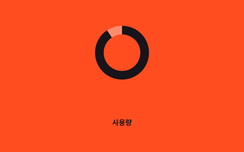
05Quét conic-gradient
Một conic-gradient xoay không cần ảnh nền, vẽ vòng tròn mờ dần mượt mà.
Dùng choMàn hình loading nhấn mạnh màu thương hiệu, chờ thanh toán
conic-gradientmask 처리그라디언트

<main class="stage">
  <div class="spinner" role="status" aria-label="Đang tải"></div>
</main>
@use "../../../../site/static/demo-tokens" as *;
$duration: 1.1s; // 한 바퀴 도는 시간
$easing: linear;
$color: $subject-blue; // 그라디언트 진한 구간
@include stage($stage-ink);
.spinner {
width: clamp(56px, 16vw, 84px);
height: clamp(56px, 16vw, 84px);
border-radius: 50%;
background: conic-gradient($color 0deg 270deg, rgba($subject-cream, .18) 270deg 360deg);
// 가운데를 뚫어 링으로 보이게 한다 — 그라디언트 자체는 그대로 두고 통째로 돌린다
-webkit-mask: radial-gradient(farthest-side, transparent calc(100% - 8px), #000 calc(100% - 8px));
mask: radial-gradient(farthest-side, transparent calc(100% - 8px), #000 calc(100% - 8px));
animation: spin $duration $easing infinite;
}
@keyframes spin {
to { transform: rotate(360deg); }
}
@media (prefers-reduced-motion: reduce) {
.spinner { animation: none; }
}html, body {
margin: 0;
overflow: hidden;
}
.stage {
box-sizing: border-box;
min-height: 100vh;
display: grid;
place-items: center;
margin: 0;
background: #17141a;
font-family: -apple-system, "Segoe UI", "Noto Sans KR", sans-serif;
padding: clamp(8px, 4vw, 24px);
}
.spinner {
width: clamp(56px, 16vw, 84px);
height: clamp(56px, 16vw, 84px);
border-radius: 50%;
background: conic-gradient(#2f6df6 0deg 270deg, rgba(255, 247, 230, 0.18) 270deg 360deg);
-webkit-mask: radial-gradient(farthest-side, transparent calc(100% - 8px), #000 calc(100% - 8px));
mask: radial-gradient(farthest-side, transparent calc(100% - 8px), #000 calc(100% - 8px));
animation: spin 1.1s linear infinite;
}
@keyframes spin {
to {
transform: rotate(360deg);
}
}
@media (prefers-reduced-motion: reduce) {
.spinner {
animation: none;
}
}import type { CSSProperties } from "react";
import styles from "./ConicSweepSpinner.module.scss";
export type ConicSweepSpinnerProps = {
/** 스피너 지름 (기본 68px) */
size?: number;
/** 한 바퀴 도는 시간 (기본 1100ms) */
duration?: number;
/** 그라디언트 진한 구간 색 */
color?: string;
label?: string;
};
type Vars = CSSProperties & { "--size"?: string; "--duration"?: string; "--color"?: string };
export default function ConicSweepSpinner({
size = 68,
duration = 1100,
color = "#2f6df6",
label = "Loading",
}: ConicSweepSpinnerProps) {
const vars: Vars = {
"--size": `${size}px`,
"--duration": `${duration}ms`,
"--color": color,
};
return <div className={styles.spinner} style={vars} role="status" aria-label={label} />;
}05 Quét conic-gradient — Diện tích đo được 1.473% · khung hình chuyển động 23/23Nguyên tác GODRICH · SCSS và React nằm trong tệp zip · 9 hiệu ứng css loading spinner animation gọn nhẹ
Bài viết chứa demo này
 9 hiệu ứng css loading spinner animation gọn nhẹCSS loading spinner animation là một khối nhỏ tự xoay, tự nảy hoặc tự đổi độ sáng bằng thuần CSS để báo cho người dùng b Xem tất cả demo trong bài này