08Lóe lấp lánh (kira)
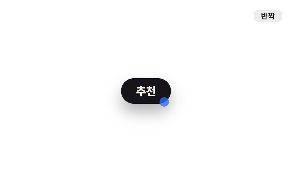
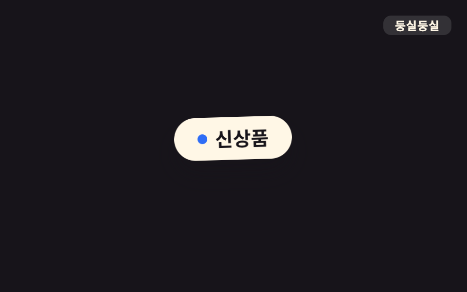
`.o-kira` làm hai ngôi sao nhỏ dựng bằng ::before·::after lóe lên qua scale·opacity với delay lệch nhau, khiến badge 'đề xuất' lấp lánh theo chu kỳ.
Dùng choBadge đề xuất, icon premium, dấu tính năng mới
scale+opacity::before/::after1.8s
<main class="stage">
  <div class="badge o-kira">Đề xuất</div>
  <span class="tag">Lấp lánh</span>
</main>
@use "../../../../site/static/demo-tokens" as *;
// ── 변수 3개 ──────────────────────────────────────────
$duration: 1.8s;
$easing: ease-in-out;
$color: $subject-blue;
// ── 데모 무대 ───────────────────────────────
@include stage($stage-paper);
.stage { position: relative; }
.badge {
position: relative;
display: inline-flex;
align-items: center;
padding: $sp-3 $sp-6;
border-radius: $r-pill;
background: $stage-ink;
color: $subject-cream;
font-weight: 700;
font-size: clamp(15px, 4vw, 18px);
line-height: 1;
font-family: inherit;
box-shadow: $shadow-raised;
}
// ── 실제 두 개의 ::before·::after 별을 서로 다른 delay 로 반짝인다 ─────
.badge::before,
.badge::after {
content: "";
position: absolute;
width: 14px;
height: 14px;
border-radius: 50%;
background: $color;
opacity: 0;
}
.badge::before { top: -5px; left: 8px; }
.badge::after { bottom: -4px; right: 4px; }
.badge.o-kira::before { animation: o-kira $duration $easing infinite; }
.badge.o-kira::after { animation: o-kira $duration $easing infinite; animation-delay: .4s; }
@keyframes o-kira {
0%, 45%, 100% { opacity: 0; transform: scale(.4); }
62% { opacity: 1; transform: scale(1.3); }
78% { opacity: 0; transform: scale(.6); }
}
.tag {
position: absolute;
top: $sp-4;
right: $sp-4;
padding: $sp-1 $sp-3;
border-radius: $r-sm;
background: rgba(23, 20, 26, .08);
color: $stage-ink;
font-weight: 700;
font-size: 12px;
line-height: 1;
font-family: inherit;
letter-spacing: .04em;
}
// ── 접근성 ──────────────────────────────────────────
@media (prefers-reduced-motion: reduce) {
.badge.o-kira::before, .badge.o-kira::after { animation: none; }
}html, body {
margin: 0;
overflow: hidden;
}
.stage {
box-sizing: border-box;
min-height: 100vh;
display: grid;
place-items: center;
margin: 0;
background: #ffffff;
font-family: -apple-system, "Segoe UI", "Noto Sans KR", sans-serif;
padding: clamp(8px, 4vw, 24px);
}
.stage {
position: relative;
}
.badge {
position: relative;
display: inline-flex;
align-items: center;
padding: 12px 24px;
border-radius: 999px;
background: #17141a;
color: #fff7e6;
font-weight: 700;
font-size: clamp(15px, 4vw, 18px);
line-height: 1;
font-family: inherit;
box-shadow: 0 14px 24px rgba(23, 20, 26, 0.32);
}
.badge::before,
.badge::after {
content: "";
position: absolute;
width: 14px;
height: 14px;
border-radius: 50%;
background: #2f6df6;
opacity: 0;
}
.badge::before {
top: -5px;
left: 8px;
}
.badge::after {
bottom: -4px;
right: 4px;
}
.badge.o-kira::before {
animation: o-kira 1.8s ease-in-out infinite;
}
.badge.o-kira::after {
animation: o-kira 1.8s ease-in-out infinite;
animation-delay: 0.4s;
}
@keyframes o-kira {
0%, 45%, 100% {
opacity: 0;
transform: scale(0.4);
}
62% {
opacity: 1;
transform: scale(1.3);
}
78% {
opacity: 0;
transform: scale(0.6);
}
}
.tag {
position: absolute;
top: 16px;
right: 16px;
padding: 4px 12px;
border-radius: 8px;
background: rgba(23, 20, 26, 0.08);
color: #17141a;
font-weight: 700;
font-size: 12px;
line-height: 1;
font-family: inherit;
letter-spacing: 0.04em;
}
@media (prefers-reduced-motion: reduce) {
.badge.o-kira::before, .badge.o-kira::after {
animation: none;
}
}import type { CSSProperties, ReactNode } from "react";
import styles from "./SparkleBadge.module.scss";
export type SparkleBadgeProps = {
children: ReactNode;
/** 한 번 반짝이는 주기 (기본 1800ms) */
duration?: number;
easing?: string;
color?: string;
};
type Vars = CSSProperties & {
"--duration"?: string;
"--easing"?: string;
"--color"?: string;
};
export default function SparkleBadge({
children,
duration = 1800,
easing = "ease-in-out",
color = "#2f6df6",
}: SparkleBadgeProps) {
const vars: Vars = {
"--duration": `${duration}ms`,
"--easing": easing,
"--color": color,
};
return (
<div className={styles.badge} style={vars}>
{children}
</div>
);
}08 Lóe lấp lánh (kira) — Diện tích đo được 0.399% · khung hình chuyển động 12/23Nguyên tác GODRICH · SCSS và React nằm trong tệp zip · 9 css bounce animation — dán một dòng là chạy
Bài viết chứa demo này
 9 css bounce animation — dán một dòng là chạycss bounce animation là chuyển động cho phần tử nổi lên, nảy, rung và đung đưa như đang sống. Chín mục gọi theo từ tượng Xem tất cả demo trong bài này