02Sọc chạy animation
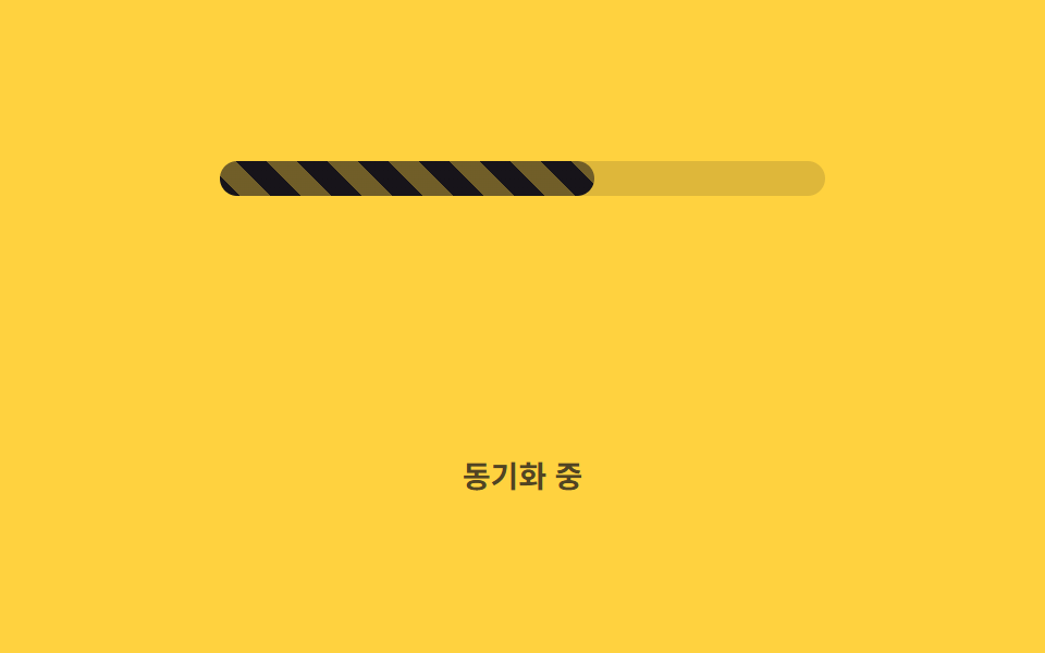
Nền sọc chéo liên tục trôi qua background-position, báo hiệu vẫn đang xử lý ngay cả khi giá trị đứng yên.
Dùng choBáo hiệu đang xử lý dữ liệu hàng loạt, thanh đồng bộ nền
background-positionrepeating-linear-gradient1초 루프
<main class="stage">
  <div class="track" role="progressbar" aria-valuemin="0" aria-valuemax="100" aria-valuenow="62" aria-label="Đang đồng bộ">
    <div class="bar is-demo"></div>
  </div>
  <p class="cap">Đang đồng bộ</p>
</main>
@use "../../../../site/static/demo-tokens" as *;
// ── 변수 3개 ──────────────────────────────────────────
$duration: 1s; // 줄무늬가 한 칸 흐르는 시간
$easing: linear;
$color: $subject-ink; // 줄무늬 색
@include stage($stage-yellow);
.track {
position: relative;
width: clamp(200px, 58vw, 280px);
height: 16px;
border-radius: $r-pill;
background: rgba(23, 20, 26, .14);
overflow: hidden;
}
// 값은 62% 로 고정, 줄무늬만 background-position 으로 흐른다 (026 의 배경 애니메이션과 같은 예외 — 레이아웃이 아니라 페인트만 다시 한다)
.bar {
position: absolute;
inset: 0;
width: 62%;
border-radius: inherit;
background-image: repeating-linear-gradient(45deg, $color 0 10px, rgba($color, .55) 10px 20px);
background-size: 28px 28px;
}
.bar.is-demo { animation: stripe-move $duration $easing infinite; }
@keyframes stripe-move {
from { background-position: 0 0; }
to { background-position: 28px 0; }
}
.cap {
margin: 14px 0 0;
color: rgba(23, 20, 26, .75);
font: 600 clamp(12px, 3.2vw, 14px)/1 -apple-system, "Segoe UI", "Noto Sans KR", sans-serif;
}
@media (prefers-reduced-motion: reduce) {
.bar.is-demo { animation: none; }
}html, body {
margin: 0;
overflow: hidden;
}
.stage {
box-sizing: border-box;
min-height: 100vh;
display: grid;
place-items: center;
margin: 0;
background: #ffd23f;
font-family: -apple-system, "Segoe UI", "Noto Sans KR", sans-serif;
padding: clamp(8px, 4vw, 24px);
}
.track {
position: relative;
width: clamp(200px, 58vw, 280px);
height: 16px;
border-radius: 999px;
background: rgba(23, 20, 26, 0.14);
overflow: hidden;
}
.bar {
position: absolute;
inset: 0;
width: 62%;
border-radius: inherit;
background-image: repeating-linear-gradient(45deg, #17141a 0 10px, rgba(23, 20, 26, 0.55) 10px 20px);
background-size: 28px 28px;
}
.bar.is-demo {
animation: stripe-move 1s linear infinite;
}
@keyframes stripe-move {
from {
background-position: 0 0;
}
to {
background-position: 28px 0;
}
}
.cap {
margin: 14px 0 0;
color: rgba(23, 20, 26, 0.75);
font: 600 clamp(12px, 3.2vw, 14px)/1 -apple-system, "Segoe UI", "Noto Sans KR", sans-serif;
}
@media (prefers-reduced-motion: reduce) {
.bar.is-demo {
animation: none;
}
}import type { CSSProperties } from "react";
import styles from "./StripedBar.module.scss";
export type StripedBarProps = {
/** 0~100 */
percent: number;
duration?: number;
easing?: string;
color?: string;
label?: string;
};
type Vars = CSSProperties & {
"--duration"?: string;
"--easing"?: string;
"--color"?: string;
"--percent"?: number;
};
export default function StripedBar({
percent,
duration = 1000,
easing = "linear",
color = "#17141a",
label,
}: StripedBarProps) {
const p = Math.max(0, Math.min(100, percent));
const vars: Vars = { "--duration": `${duration}ms`, "--easing": easing, "--color": color, "--percent": p };
return (
<div
className={styles.track}
style={vars}
role="progressbar"
aria-valuemin={0}
aria-valuemax={100}
aria-valuenow={p}
aria-label={label}
>
<div className={styles.bar} />
</div>
);
}02 Sọc chạy animation — Diện tích đo được 1.883% · khung hình chuyển động 23/23Nguyên tác GODRICH · SCSS và React nằm trong tệp zip · 9 CSS Progress Bar Circle Gauges — chỉ cần đổi số
Bài viết chứa demo này
 9 CSS Progress Bar Circle Gauges — chỉ cần đổi sốCSS progress bar circle là thanh và vòng tiến trình chỉ cần đổi một con số để vẽ lại toàn bộ. Chín kiểu dưới đây đều chạ Xem tất cả demo trong bài này