08Tiến trình dạng stepper
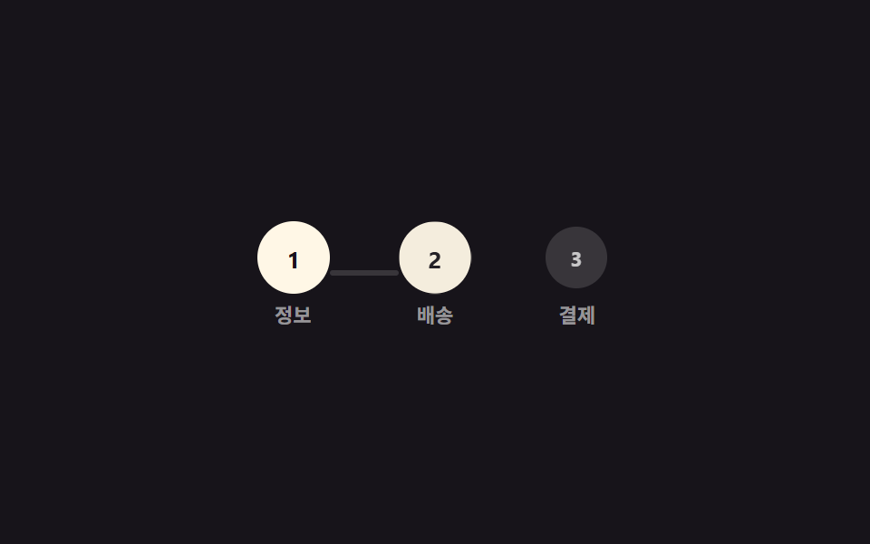
Ba vòng tròn đánh số nối bằng một đường thẳng; mỗi bước hoàn thành thì vòng tròn đó được tô đầy và đoạn nối tương ứng lớn dần qua scaleX.
Dùng choForm đăng ký nhiều bước, hiển thị bước trong quy trình thanh toán
scaleX 연결선원 채움단계 3개
<main class="stage">
  <div class="stepper is-demo" role="list" aria-label="Bước tiến trình">
    <div class="step" role="listitem"><span class="step__dot">1</span><span class="step__label">Thông tin</span></div>
    <div class="line"></div>
    <div class="step" role="listitem"><span class="step__dot">2</span><span class="step__label">Giao hàng</span></div>
    <div class="line"></div>
    <div class="step" role="listitem"><span class="step__dot">3</span><span class="step__label">Thanh toán</span></div>
  </div>
</main>
@use "../../../../site/static/demo-tokens" as *;
// ── 변수 3개 ──────────────────────────────────────────
$duration: 400ms; // 원 하나·선 하나가 채워지는 시간
$easing: $ease-spring;
$color: $subject-cream; // 완료된 원·선 색
@include stage($stage-ink);
.stepper { display: flex; align-items: center; }
.step { display: flex; flex-direction: column; align-items: center; gap: 6px; }
.step__dot {
width: clamp(30px, 9vw, 40px);
height: clamp(30px, 9vw, 40px);
border-radius: 50%;
display: grid;
place-items: center;
background: rgba(255, 255, 255, .14);
color: rgba(255, 255, 255, .72);
font-weight: 700; font-size: 13px; line-height: 1; font-family: inherit;
transform: scale(.85);
}
.step__label { font-weight: 600; font-size: 11px; line-height: 1; font-family: inherit; color: rgba(255, 255, 255, .55); }
.line {
width: clamp(30px, 8vw, 44px);
height: 3px;
border-radius: 2px;
background: rgba(255, 255, 255, .14);
transform: scaleX(0);
transform-origin: left; // 규칙8: 좌변서 차오름
}
// 원 → 선 → 원 → 선 → 원 순서로, 앞 단계가 끝나야 다음이 채워진다 (동시에 시작하지 않는다)
.stepper.is-demo .step__dot { animation: dot-fill $duration $easing both; }
.stepper.is-demo .line { animation: line-grow $duration linear both; }
.stepper.is-demo > :nth-child(1) .step__dot { animation-delay: 0ms; }
.stepper.is-demo > :nth-child(2) { animation-delay: 400ms; }
.stepper.is-demo > :nth-child(3) .step__dot { animation-delay: 800ms; }
.stepper.is-demo > :nth-child(4) { animation-delay: 1200ms; }
.stepper.is-demo > :nth-child(5) .step__dot { animation-delay: 1600ms; }
@keyframes dot-fill {
from { background: rgba(255, 255, 255, .14); color: rgba(255, 255, 255, .72); transform: scale(.85); }
to { background: $color; color: $stage-ink; transform: scale(1); }
}
@keyframes line-grow { from { transform: scaleX(0); } to { transform: scaleX(1); } }
@media (prefers-reduced-motion: reduce) {
.stepper.is-demo .step__dot,
.stepper.is-demo .line { animation: none; background: $color; transform: none; }
.stepper.is-demo .step__dot { color: $stage-ink; }
}html, body {
margin: 0;
overflow: hidden;
}
.stage {
box-sizing: border-box;
min-height: 100vh;
display: grid;
place-items: center;
margin: 0;
background: #17141a;
font-family: -apple-system, "Segoe UI", "Noto Sans KR", sans-serif;
padding: clamp(8px, 4vw, 24px);
}
.stepper {
display: flex;
align-items: center;
}
.step {
display: flex;
flex-direction: column;
align-items: center;
gap: 6px;
}
.step__dot {
width: clamp(30px, 9vw, 40px);
height: clamp(30px, 9vw, 40px);
border-radius: 50%;
display: grid;
place-items: center;
background: rgba(255, 255, 255, 0.14);
color: rgba(255, 255, 255, 0.72);
font-weight: 700;
font-size: 13px;
line-height: 1;
font-family: inherit;
transform: scale(0.85);
}
.step__label {
font-weight: 600;
font-size: 11px;
line-height: 1;
font-family: inherit;
color: rgba(255, 255, 255, 0.55);
}
.line {
width: clamp(30px, 8vw, 44px);
height: 3px;
border-radius: 2px;
background: rgba(255, 255, 255, 0.14);
transform: scaleX(0);
transform-origin: left;
}
.stepper.is-demo .step__dot {
animation: dot-fill 400ms cubic-bezier(0.2, 0.8, 0.2, 1) both;
}
.stepper.is-demo .line {
animation: line-grow 400ms linear both;
}
.stepper.is-demo > :nth-child(1) .step__dot {
animation-delay: 0ms;
}
.stepper.is-demo > :nth-child(2) {
animation-delay: 400ms;
}
.stepper.is-demo > :nth-child(3) .step__dot {
animation-delay: 800ms;
}
.stepper.is-demo > :nth-child(4) {
animation-delay: 1200ms;
}
.stepper.is-demo > :nth-child(5) .step__dot {
animation-delay: 1600ms;
}
@keyframes dot-fill {
from {
background: rgba(255, 255, 255, 0.14);
color: rgba(255, 255, 255, 0.72);
transform: scale(0.85);
}
to {
background: #fff7e6;
color: #17141a;
transform: scale(1);
}
}
@keyframes line-grow {
from {
transform: scaleX(0);
}
to {
transform: scaleX(1);
}
}
@media (prefers-reduced-motion: reduce) {
.stepper.is-demo .step__dot,
.stepper.is-demo .line {
animation: none;
background: #fff7e6;
transform: none;
}
.stepper.is-demo .step__dot {
color: #17141a;
}
}import type { CSSProperties, ReactNode } from "react";
import styles from "./StepperProgress.module.scss";
export type StepperProgressProps = {
/** 완료된 단계 수 (0~labels.length) */
step: number;
labels?: string[];
duration?: number;
easing?: string;
color?: string;
};
type Vars = CSSProperties & {
"--duration"?: string;
"--easing"?: string;
"--color"?: string;
};
export default function StepperProgress({
step,
labels = ["Info", "Shipping", "Payment"],
duration = 400,
easing = "cubic-bezier(.2,.8,.2,1)",
color = "#fff7e6",
}: StepperProgressProps) {
const vars: Vars = { "--duration": `${duration}ms`, "--easing": easing, "--color": color };
const nodes: ReactNode[] = [];
labels.forEach((l, i) => {
if (i > 0) {
nodes.push(<span key={`line-${i}`} className={i <= step - 1 ? `${styles.line} ${styles.on}` : styles.line} />);
}
nodes.push(
<div key={`step-${i}`} className={styles.step} role="listitem">
<span className={i < step ? `${styles.dot} ${styles.on}` : styles.dot}>{i + 1}</span>
<span className={styles.label}>{l}</span>
</div>
);
});
return (
<div className={styles.stepper} style={vars} role="list" aria-label="progress steps">
{nodes}
</div>
);
}08 Tiến trình dạng stepper — Diện tích đo được 2.911% · khung hình chuyển động 23/23Nguyên tác GODRICH · SCSS và React nằm trong tệp zip · 9 CSS Progress Bar Circle Gauges — chỉ cần đổi số
Bài viết chứa demo này
 9 CSS Progress Bar Circle Gauges — chỉ cần đổi sốCSS progress bar circle là thanh và vòng tiến trình chỉ cần đổi một con số để vẽ lại toàn bộ. Chín kiểu dưới đây đều chạ Xem tất cả demo trong bài này