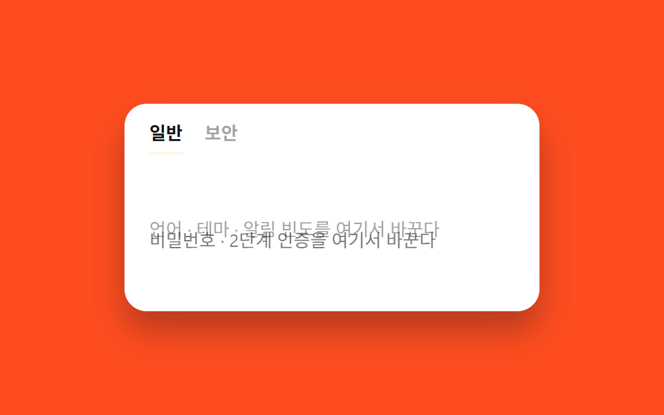
08Tab bounce
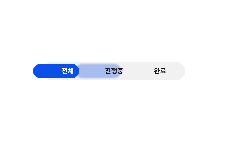
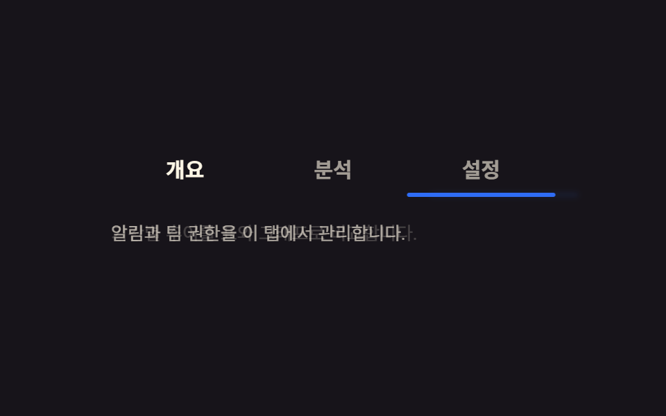
Indicator trượt bằng easing overshoot, lố qua vị trí đích rồi bật nhẹ lại, chữ của tab vừa chọn cũng nảy một lần bằng scale.
Dùng choTab lọc kiểu vui nhộn, tab chọn trong hướng dẫn onboarding
cubic-bezier 스프링scaletranslateX
<main class="stage">
  <div class="bt is-demo">
    <input type="radio" name="bt-tab" id="bt-1" class="bt__radio" checked>
    <input type="radio" name="bt-tab" id="bt-2" class="bt__radio">
    <input type="radio" name="bt-tab" id="bt-3" class="bt__radio">
    <div class="bt__nav">
      <label class="bt__tab" for="bt-1"><span class="bt__text">Tất cả</span></label>
      <label class="bt__tab" for="bt-2"><span class="bt__text">Đang xử lý</span></label>
      <label class="bt__tab" for="bt-3"><span class="bt__text">Hoàn tất</span></label>
      <span class="bt__trail" aria-hidden="true"></span>
      <span class="bt__indicator" aria-hidden="true"></span>
    </div>
  </div>
</main>
@use "../../../../site/static/demo-tokens" as *;
// ── 변수 3개 ──────────────────────────────────────────
$duration: $dur-enter; // 인디케이터가 튕기며 도착하는 시간
$easing: $ease-lerp-settle; // 관성 lerp — 목표를 12.6% 넘겼다가 정착 (2026-09-15 형태 2차 한 겹). 글자 팝(bt-pop)도 같은 곡선을 탄다
$color: $subject-blue-deep; // 잉크 글자가 4.03 으로 미달이라 짙은 파랑으로 (크림 글자 5.98:1)
@include stage($stage-paper);
.bt { width: min(300px, 86vw); }
.bt__radio { position: absolute; opacity: 0; pointer-events: none; }
.bt__nav {
position: relative;
display: grid;
grid-template-columns: repeat(3, 1fr);
padding: $sp-1;
background: rgba(23, 20, 26, .06);
border-radius: $r-pill;
}
// 글자색의 기본은 잉크다 — 무대(흰색) 위에서 16:1. 알약 위에 온(:checked) 글자만 크림(5.98:1)으로 바뀐다.
// 활성 신호는 알약의 위치와 글자의 튕김이 맡고, 데모 루프에서는 bt-ink-* 가 알약과 같은 박자로 글자색을 옮긴다
.bt__tab {
position: relative; z-index: 1;
text-align: center;
padding: $sp-2 $sp-1;
font-weight: 600;
font-size: clamp(12px, 3.4vw, 14px);
line-height: 1;
font-family: inherit;
color: $subject-ink;
cursor: pointer;
-webkit-tap-highlight-color: transparent;
}
.bt__text { display: inline-block; transform: scale(1); }
.bt__indicator {
position: absolute; top: $sp-1; bottom: $sp-1; left: $sp-1;
width: calc((100% - #{$sp-1} * 2) / 3);
background: $color;
border-radius: $r-pill;
transform: translateX(0);
transition: transform $duration $easing;
}
// 이동 궤적 트레일 잔상 — 인디케이터보다 1.8배 느리게 같은 목적지를 쫓아가며 뒤로 흐른다
.bt__trail {
position: absolute; top: $sp-1; bottom: $sp-1; left: $sp-1;
width: calc((100% - #{$sp-1} * 2) / 3);
background: $color;
border-radius: $r-pill;
opacity: .32;
filter: blur(1.5px);
transform: translateX(0);
transition: transform calc($duration * 1.8) ease-out;
}
// ── 실제 동작: :checked 만으로 인디케이터가 튕기며 옮겨간다 ──────────────
#bt-1:checked ~ .bt__nav .bt__indicator { transform: translateX(0%); }
#bt-2:checked ~ .bt__nav .bt__indicator { transform: translateX(100%); }
#bt-3:checked ~ .bt__nav .bt__indicator { transform: translateX(200%); }
#bt-1:checked ~ .bt__nav .bt__trail { transform: translateX(0%); }
#bt-2:checked ~ .bt__nav .bt__trail { transform: translateX(100%); }
#bt-3:checked ~ .bt__nav .bt__trail { transform: translateX(200%); }
// 알약 위에 온 글자만 크림 — 잉크를 그대로 두면 짙은 파랑 위 2.87:1 이다
#bt-1:checked ~ .bt__nav label[for="bt-1"],
#bt-2:checked ~ .bt__nav label[for="bt-2"],
#bt-3:checked ~ .bt__nav label[for="bt-3"] { color: $subject-cream; }
// 실제 클릭으로 :checked 가 바뀔 때만 그 글자가 한 번 튕긴다
#bt-1:checked ~ .bt__nav label[for="bt-1"] .bt__text,
#bt-2:checked ~ .bt__nav label[for="bt-2"] .bt__text,
#bt-3:checked ~ .bt__nav label[for="bt-3"] .bt__text { animation: bt-pop 400ms $easing; }
@keyframes bt-pop { 0% { transform: scale(1); } 55% { transform: scale(1.18); } 100% { transform: scale(1); } }
// ── 데모 루프: 클릭 전까지 인디케이터와 글자가 같은 박자로 세 탭을 오간다 ──────────────
.bt.is-demo .bt__indicator { animation: bt-loop $dur-loop $easing infinite; }
.bt.is-demo .bt__trail { animation: bt-loop $dur-loop $easing infinite; animation-delay: calc($dur-loop * .06); } // 6% 위상만큼 늦게 쫓아가 트레일로 읽힌다
.bt.is-demo .bt__nav label:nth-child(1) .bt__text { animation: bt-pop-1 $dur-loop $easing infinite, bt-ink-1 $dur-loop linear infinite; }
.bt.is-demo .bt__nav label:nth-child(2) .bt__text { animation: bt-pop-2 $dur-loop $easing infinite, bt-ink-2 $dur-loop linear infinite; }
.bt.is-demo .bt__nav label:nth-child(3) .bt__text { animation: bt-pop-3 $dur-loop $easing infinite, bt-ink-3 $dur-loop linear infinite; }
// 글자색도 알약과 같은 박자(0·15/33·48/66·81/100%)로 — 크림 글자가 알약 없는 자리에 남지 않게
@keyframes bt-ink-1 { 0%, 15% { color: $subject-cream; } 23%, 87% { color: $subject-ink; } 95%, 100% { color: $subject-cream; } }
@keyframes bt-ink-2 { 0%, 25% { color: $subject-ink; } 33%, 48% { color: $subject-cream; } 56%, 100% { color: $subject-ink; } }
@keyframes bt-ink-3 { 0%, 58% { color: $subject-ink; } 66%, 81% { color: $subject-cream; } 89%, 100% { color: $subject-ink; } }
@keyframes bt-loop {
0%, 15% { transform: translateX(0%); }
33%, 48% { transform: translateX(100%); }
66%, 81% { transform: translateX(200%); }
100% { transform: translateX(0%); }
}
// 인디케이터가 도착하는 지점(15%·48%·81%·100%→0%)에서 그 탭 글자만 튕긴다
@keyframes bt-pop-1 { 0%, 100% { transform: scale(1.18); } 5%, 96% { transform: scale(1); } }
@keyframes bt-pop-2 { 0%, 43%, 100% { transform: scale(1); } 48% { transform: scale(1.18); } 53% { transform: scale(1); } }
@keyframes bt-pop-3 { 0%, 76%, 100% { transform: scale(1); } 81% { transform: scale(1.18); } 86% { transform: scale(1); } }
@media (prefers-reduced-motion: reduce) {
.bt__indicator, .bt__text, .bt__trail { transition: none; animation: none !important; }
.bt.is-demo .bt__indicator, .bt.is-demo .bt__text, .bt.is-demo .bt__trail { animation: none !important; }
.bt__trail { opacity: 0; } // 관성·트레일 한 겹은 reduced-motion 에서 완전히 꺼진다
}html, body {
margin: 0;
overflow: hidden;
}
.stage {
box-sizing: border-box;
min-height: 100vh;
display: grid;
place-items: center;
margin: 0;
background: #ffffff;
font-family: -apple-system, "Segoe UI", "Noto Sans KR", sans-serif;
padding: clamp(8px, 4vw, 24px);
}
.bt {
width: min(300px, 86vw);
}
.bt__radio {
position: absolute;
opacity: 0;
pointer-events: none;
}
.bt__nav {
position: relative;
display: grid;
grid-template-columns: repeat(3, 1fr);
padding: 4px;
background: rgba(23, 20, 26, 0.06);
border-radius: 999px;
}
.bt__tab {
position: relative;
z-index: 1;
text-align: center;
padding: 8px 4px;
font-weight: 600;
font-size: clamp(12px, 3.4vw, 14px);
line-height: 1;
font-family: inherit;
color: #17141a;
cursor: pointer;
-webkit-tap-highlight-color: transparent;
}
.bt__text {
display: inline-block;
transform: scale(1);
}
.bt__indicator {
position: absolute;
top: 4px;
bottom: 4px;
left: 4px;
width: calc((100% - 4px * 2) / 3);
background: #0a4fe8;
border-radius: 999px;
transform: translateX(0);
transition: transform 600ms linear(0, 0.051, 0.176, 0.341, 0.518, 0.685, 0.831, 0.947, 1.032, 1.087, 1.117, 1.126, 1.121, 1.105, 1.085, 1.062, 1.041, 1.022, 1.008, 0.997, 1);
}
.bt__trail {
position: absolute;
top: 4px;
bottom: 4px;
left: 4px;
width: calc((100% - 4px * 2) / 3);
background: #0a4fe8;
border-radius: 999px;
opacity: 0.32;
filter: blur(1.5px);
transform: translateX(0);
transition: transform 1080ms ease-out;
}
#bt-1:checked ~ .bt__nav .bt__indicator {
transform: translateX(0%);
}
#bt-2:checked ~ .bt__nav .bt__indicator {
transform: translateX(100%);
}
#bt-3:checked ~ .bt__nav .bt__indicator {
transform: translateX(200%);
}
#bt-1:checked ~ .bt__nav .bt__trail {
transform: translateX(0%);
}
#bt-2:checked ~ .bt__nav .bt__trail {
transform: translateX(100%);
}
#bt-3:checked ~ .bt__nav .bt__trail {
transform: translateX(200%);
}
#bt-1:checked ~ .bt__nav label[for=bt-1],
#bt-2:checked ~ .bt__nav label[for=bt-2],
#bt-3:checked ~ .bt__nav label[for=bt-3] {
color: #fff7e6;
}
#bt-1:checked ~ .bt__nav label[for=bt-1] .bt__text,
#bt-2:checked ~ .bt__nav label[for=bt-2] .bt__text,
#bt-3:checked ~ .bt__nav label[for=bt-3] .bt__text {
animation: bt-pop 400ms linear(0, 0.051, 0.176, 0.341, 0.518, 0.685, 0.831, 0.947, 1.032, 1.087, 1.117, 1.126, 1.121, 1.105, 1.085, 1.062, 1.041, 1.022, 1.008, 0.997, 1);
}
@keyframes bt-pop {
0% {
transform: scale(1);
}
55% {
transform: scale(1.18);
}
100% {
transform: scale(1);
}
}
.bt.is-demo .bt__indicator {
animation: bt-loop 2s linear(0, 0.051, 0.176, 0.341, 0.518, 0.685, 0.831, 0.947, 1.032, 1.087, 1.117, 1.126, 1.121, 1.105, 1.085, 1.062, 1.041, 1.022, 1.008, 0.997, 1) infinite;
}
.bt.is-demo .bt__trail {
animation: bt-loop 2s linear(0, 0.051, 0.176, 0.341, 0.518, 0.685, 0.831, 0.947, 1.032, 1.087, 1.117, 1.126, 1.121, 1.105, 1.085, 1.062, 1.041, 1.022, 1.008, 0.997, 1) infinite;
animation-delay: 0.12s;
}
.bt.is-demo .bt__nav label:nth-child(1) .bt__text {
animation: bt-pop-1 2s linear(0, 0.051, 0.176, 0.341, 0.518, 0.685, 0.831, 0.947, 1.032, 1.087, 1.117, 1.126, 1.121, 1.105, 1.085, 1.062, 1.041, 1.022, 1.008, 0.997, 1) infinite, bt-ink-1 2s linear infinite;
}
.bt.is-demo .bt__nav label:nth-child(2) .bt__text {
animation: bt-pop-2 2s linear(0, 0.051, 0.176, 0.341, 0.518, 0.685, 0.831, 0.947, 1.032, 1.087, 1.117, 1.126, 1.121, 1.105, 1.085, 1.062, 1.041, 1.022, 1.008, 0.997, 1) infinite, bt-ink-2 2s linear infinite;
}
.bt.is-demo .bt__nav label:nth-child(3) .bt__text {
animation: bt-pop-3 2s linear(0, 0.051, 0.176, 0.341, 0.518, 0.685, 0.831, 0.947, 1.032, 1.087, 1.117, 1.126, 1.121, 1.105, 1.085, 1.062, 1.041, 1.022, 1.008, 0.997, 1) infinite, bt-ink-3 2s linear infinite;
}
@keyframes bt-ink-1 {
0%, 15% {
color: #fff7e6;
}
23%, 87% {
color: #17141a;
}
95%, 100% {
color: #fff7e6;
}
}
@keyframes bt-ink-2 {
0%, 25% {
color: #17141a;
}
33%, 48% {
color: #fff7e6;
}
56%, 100% {
color: #17141a;
}
}
@keyframes bt-ink-3 {
0%, 58% {
color: #17141a;
}
66%, 81% {
color: #fff7e6;
}
89%, 100% {
color: #17141a;
}
}
@keyframes bt-loop {
0%, 15% {
transform: translateX(0%);
}
33%, 48% {
transform: translateX(100%);
}
66%, 81% {
transform: translateX(200%);
}
100% {
transform: translateX(0%);
}
}
@keyframes bt-pop-1 {
0%, 100% {
transform: scale(1.18);
}
5%, 96% {
transform: scale(1);
}
}
@keyframes bt-pop-2 {
0%, 43%, 100% {
transform: scale(1);
}
48% {
transform: scale(1.18);
}
53% {
transform: scale(1);
}
}
@keyframes bt-pop-3 {
0%, 76%, 100% {
transform: scale(1);
}
81% {
transform: scale(1.18);
}
86% {
transform: scale(1);
}
}
@media (prefers-reduced-motion: reduce) {
.bt__indicator, .bt__text, .bt__trail {
transition: none;
animation: none !important;
}
.bt.is-demo .bt__indicator, .bt.is-demo .bt__text, .bt.is-demo .bt__trail {
animation: none !important;
}
.bt__trail {
opacity: 0;
}
}// 이동은 :checked 만으로 이미 동작한다. 실제 클릭이 오면 데모 루프(.is-demo)만 뗀다.
document.querySelectorAll('.bt__radio').forEach(function (r) {
r.addEventListener('pointerdown', function () { document.querySelector('.bt').classList.remove('is-demo'); });
});import { useState } from "react";
import type { CSSProperties } from "react";
import styles from "./BounceTab.module.scss";
const TABS = ["전체", "진행중", "완료"];
export type BounceTabProps = {
duration?: number;
easing?: string;
color?: string;
};
type Vars = CSSProperties & { "--duration"?: string; "--easing"?: string; "--color"?: string; "--i"?: number };
export default function BounceTab({ duration = 600, easing = "cubic-bezier(.2,1.4,.4,1)", color = "#0a4fe8" }: BounceTabProps) {
const [active, setActive] = useState(0);
const vars: Vars = { "--duration": `${duration}ms`, "--easing": easing, "--color": color, "--i": active };
return (
<div className={styles.bt} style={vars}>
<div className={styles.nav} role="tablist">
{TABS.map((t, i) => (
<button key={t} type="button" role="tab" aria-selected={i === active}
className={styles.tab} onClick={() => setActive(i)}>
<span key={i === active ? "on" : "off"} className={styles.text}>{t}</span>
</button>
))}
<span className={styles.indicator} aria-hidden="true" />
</div>
</div>
);
}08 Tab bounce — Diện tích đo được 7.166% · khung hình chuyển động 21/23Nguyên tác GODRICH · SCSS và React nằm trong tệp zip · 9 CSS Tab Switch Animations — gần như chỉ CSS
Bài viết chứa demo này
 9 CSS Tab Switch Animations — gần như chỉ CSSCSS tab switch animation là hiệu ứng chuyển tab chạy gần như chỉ bằng CSS, dùng trạng thái :checked của radio hoặc role= Xem tất cả demo trong bài này