09Chữ cầu vồng
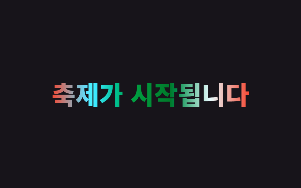
Một gradient cầu vồng nhiều màu cố định được nạp vào chữ qua background-clip:text, rồi thay vì đổi vị trí hay góc, filter:hue-rotate quay liên tục từ 0deg đến 360deg để cả vòng màu tuần hoàn.
Dùng choLogo thương hiệu vui nhộn, tiêu đề lễ hội và sự kiện
filter:hue-rotate고정 그러데이션360° 순환
<main class="stage">
  <h1 class="rainbow">Lễ hội bắt đầu</h1>
</main>
@use "../../../../site/static/demo-tokens" as *;
$duration: $dur-loop; // 색상환이 360도 한 바퀴 도는 시간
$easing: linear;
$color: $subject-blue; // 그러데이션의 시작 색
@include stage($stage-ink);
.rainbow {
margin: 0;
font-weight: 800; font-size: clamp(28px, 8.6vw, 46px); line-height: 1.2; font-family: inherit;
text-align: center;
background: linear-gradient(90deg, $color, $stage-yellow, $stage-orange, $error, $subject-cream, $color);
-webkit-background-clip: text;
background-clip: text;
color: transparent;
-webkit-text-fill-color: transparent;
animation: hue-cycle $duration $easing infinite; // 위치가 아니라 색상환 자체를 돌린다
}
@keyframes hue-cycle {
from { filter: hue-rotate(0deg); }
to { filter: hue-rotate(360deg); }
}
@media (prefers-reduced-motion: reduce) {
.rainbow { animation: none; filter: hue-rotate(0deg); }
}html, body {
margin: 0;
overflow: hidden;
}
.stage {
box-sizing: border-box;
min-height: 100vh;
display: grid;
place-items: center;
margin: 0;
background: #17141a;
font-family: -apple-system, "Segoe UI", "Noto Sans KR", sans-serif;
padding: clamp(8px, 4vw, 24px);
}
.rainbow {
margin: 0;
font-weight: 800;
font-size: clamp(28px, 8.6vw, 46px);
line-height: 1.2;
font-family: inherit;
text-align: center;
background: linear-gradient(90deg, #2f6df6, #ffd23f, #ff4d1f, #c2361a, #fff7e6, #2f6df6);
-webkit-background-clip: text;
background-clip: text;
color: transparent;
-webkit-text-fill-color: transparent;
animation: hue-cycle 2s linear infinite;
}
@keyframes hue-cycle {
from {
filter: hue-rotate(0deg);
}
to {
filter: hue-rotate(360deg);
}
}
@media (prefers-reduced-motion: reduce) {
.rainbow {
animation: none;
filter: hue-rotate(0deg);
}
}import type { CSSProperties } from "react";
import styles from "./RainbowText.module.scss";
export type RainbowTextProps = {
text: string;
/** 색상환이 360도 한 바퀴 도는 시간 (기본 2000ms) */
duration?: number;
easing?: string;
/** 그러데이션 시작 색 */
color?: string;
};
type Vars = CSSProperties & { "--duration"?: string; "--easing"?: string; "--color"?: string };
export default function RainbowText({
text,
duration = 2000,
easing = "linear",
color = "#2f6df6",
}: RainbowTextProps) {
const vars: Vars = { "--duration": `${duration}ms`, "--easing": easing, "--color": color };
return <h1 className={styles.rainbow} style={vars}>{text}</h1>;
}09 Chữ cầu vồng — Diện tích đo được 4.147% · khung hình chuyển động 23/23Nguyên tác GODRICH · SCSS và React nằm trong tệp zip · 9 CSS Text Shine Animation — dán 1 dòng là chạy
Bài viết chứa demo này
 9 CSS Text Shine Animation — dán 1 dòng là chạyCSS text shine animation là các hiệu ứng CSS thuần khiến chữ phát sáng hoặc đổi màu liên tục, không cần ảnh hay JavaScri Xem tất cả demo trong bài này