02Marker chồng lớp
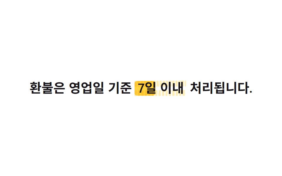
Cùng một khối marker được nhân đôi thành ::before và ::after, mỗi lớp xoay một góc rotate riêng và lớp sau vào trễ .3s ngay trong shorthand animation khi scaleX chạy, nên hai nét chồng lệch như tay tô hai lần.
Dùng choTừ quan trọng nhất trên trang, từ khoá đáp án trong FAQ
::before·::afterrotate + scaleX지연 0/.3s

<main class="stage">
  <p class="line">Điều cốt lõi của gói này là <span class="hl">lưu trữ không giới hạn</span>.</p>
</main>
@use "../../../../site/static/demo-tokens" as *;
// ── 변수 3개 ─────────────────────────────
$duration: $dur-loop;
$easing: $ease-spring;
$color: $subject-blue; // 두 번째 스트로크 색 (첫 번째는 무대 노랑)
// ── 데모 무대 ───────────────────────────────
@include stage($stage-yellow);
.line {
max-width: 92%;
margin: 0;
color: $stage-ink;
font-weight: 700;
font-size: clamp(16px, 4.6vw, 22px);
line-height: 1.6;
font-family: inherit;
text-align: center;
}
// 같은 자리에 두 겹의 마커 스트로크를 서로 다른 각도로 겹쳐 칠한다 (018 체크 게이트와 무관 — 여긴 체크 아이콘이 아니다)
.hl {
position: relative;
isolation: isolate; // z-index:-1 을 이 안에 가둬 무대 배경 뒤로 숨지 않게 한다
padding: 0 $sp-1;
&::before, &::after {
content: "";
position: absolute;
inset: 10% -2% 4%;
border-radius: $r-xs;
transform: scaleX(0);
transform-origin: left center; // 규칙8: 마커 겹칠 왼쪽 칠함
mix-blend-mode: multiply;
z-index: -1;
}
&::before {
background: $stage-yellow;
rotate: -1.2deg;
animation: mark $duration $easing infinite, mark-thick-1 $duration ease-in-out infinite;
}
&::after {
background: $color;
opacity: .55;
rotate: 1deg;
animation: mark $duration $easing infinite .3s, mark-thick-2 $duration ease-in-out infinite .15s;
}
}
@keyframes mark {
0% { transform: scaleX(0); }
20% { transform: scaleX(1); }
75% { transform: scaleX(1); }
100% { transform: scaleX(0); }
}
// 한 겹: 각 스트로크의 위·아래 두께 요동 — inset(top/bottom) 변조라 transform 아님.
// 두 스트로크가 서로 다른 위상으로 출렁여 겹침 가장자리가 살아 움직인다
@keyframes mark-thick-1 {
0% { inset: 10% -2% 4%; }
25% { inset: 8% -2% 5.5%; }
50% { inset: 11.5% -2% 3%; }
75% { inset: 9% -2% 6%; }
100% { inset: 10% -2% 4%; }
}
@keyframes mark-thick-2 {
0% { inset: 10% -2% 4%; }
30% { inset: 12% -2% 2.5%; }
55% { inset: 7.5% -2% 6.5%; }
80% { inset: 11% -2% 3.5%; }
100% { inset: 10% -2% 4%; }
}
@media (prefers-reduced-motion: reduce) {
.hl::before, .hl::after { animation: none; transform: scaleX(1); }
}html, body {
margin: 0;
overflow: hidden;
}
.stage {
box-sizing: border-box;
min-height: 100vh;
display: grid;
place-items: center;
margin: 0;
background: #ffd23f;
font-family: -apple-system, "Segoe UI", "Noto Sans KR", sans-serif;
padding: clamp(8px, 4vw, 24px);
}
.line {
max-width: 92%;
margin: 0;
color: #17141a;
font-weight: 700;
font-size: clamp(16px, 4.6vw, 22px);
line-height: 1.6;
font-family: inherit;
text-align: center;
}
.hl {
position: relative;
isolation: isolate;
padding: 0 4px;
}
.hl::before, .hl::after {
content: "";
position: absolute;
inset: 10% -2% 4%;
border-radius: 4px;
transform: scaleX(0);
transform-origin: left center;
mix-blend-mode: multiply;
z-index: -1;
}
.hl::before {
background: #ffd23f;
rotate: -1.2deg;
animation: mark 2s cubic-bezier(0.2, 0.8, 0.2, 1) infinite, mark-thick-1 2s ease-in-out infinite;
}
.hl::after {
background: #2f6df6;
opacity: 0.55;
rotate: 1deg;
animation: mark 2s cubic-bezier(0.2, 0.8, 0.2, 1) infinite 0.3s, mark-thick-2 2s ease-in-out infinite 0.15s;
}
@keyframes mark {
0% {
transform: scaleX(0);
}
20% {
transform: scaleX(1);
}
75% {
transform: scaleX(1);
}
100% {
transform: scaleX(0);
}
}
@keyframes mark-thick-1 {
0% {
inset: 10% -2% 4%;
}
25% {
inset: 8% -2% 5.5%;
}
50% {
inset: 11.5% -2% 3%;
}
75% {
inset: 9% -2% 6%;
}
100% {
inset: 10% -2% 4%;
}
}
@keyframes mark-thick-2 {
0% {
inset: 10% -2% 4%;
}
30% {
inset: 12% -2% 2.5%;
}
55% {
inset: 7.5% -2% 6.5%;
}
80% {
inset: 11% -2% 3.5%;
}
100% {
inset: 10% -2% 4%;
}
}
@media (prefers-reduced-motion: reduce) {
.hl::before, .hl::after {
animation: none;
transform: scaleX(1);
}
}import type { CSSProperties, ReactNode } from "react";
import styles from "./MarkerOverlap.module.scss";
export type MarkerOverlapProps = {
before: ReactNode;
keyword: ReactNode;
after?: ReactNode;
duration?: number;
easing?: string;
/** 두 번째(위) 스트로크 색 */
color?: string;
};
type Vars = CSSProperties & {
"--duration"?: string;
"--easing"?: string;
"--color"?: string;
};
export default function MarkerOverlap({
before,
keyword,
after,
duration = 2000,
easing = "cubic-bezier(.2,.8,.2,1)",
color = "#2f6df6",
}: MarkerOverlapProps) {
const vars: Vars = {
"--duration": `${duration}ms`,
"--easing": easing,
"--color": color,
};
return (
<p className={styles.line}>
{before} <span className={styles.hl} style={vars}>{keyword}</span>{after}
</p>
);
}02 Marker chồng lớp — Diện tích đo được 1.945% · khung hình chuyển động 14/23Nguyên tác GODRICH · SCSS và React nằm trong tệp zip · 9 CSS Text Highlight Animation: dán 1 dòng là chạy
Bài viết chứa demo này
 9 CSS Text Highlight Animation: dán 1 dòng là chạyCSS text highlight animation là hiệu ứng CSS thuần giúp tô sáng, gạch chân hoặc gạch ngang một từ trong câu ngay khi tra Xem tất cả demo trong bài này